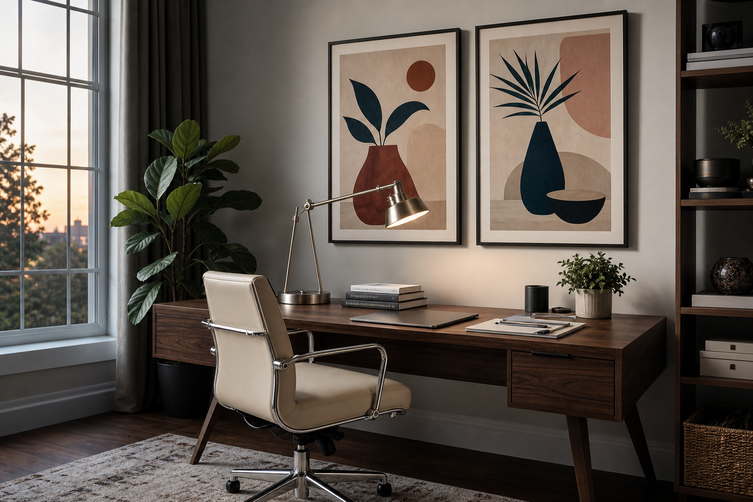
What Makes Illustration Art Prints So Appealing?
Illustration art prints sit in a useful middle ground between fine art and graphic design. They can feel expressive without becoming visually heavy, and decorative without looking generic. That balance makes them especially strong in modern interiors, where furniture often stays simple and the wall art is expected to carry personality. A single illustrated piece can add movement, humour, or narrative in a way a plain abstract shape often cannot.
They are also easier to style across different rooms than many people expect. In a living room, illustration-led artwork can soften hard architectural lines. In a bedroom, it can bring warmth through hand-drawn marks and organic forms. In a home office, bolder compositions can sharpen focus and give the room a more curated edge. If you are building a wall with character rather than just filling empty space, our Illustration collection is one of the most flexible places to start.
Another reason illustration art prints work so well is scale adaptability. A quiet line drawing can hold its own in a 30x40 cm frame on a shelf, while a graphic, colour-led composition can anchor a 70x100 cm wall above a sofa. Because illustration covers everything from delicate ink-style scenes to bold, poster-like graphics, it gives you more visual range than sticking to one narrow category.
The Main Styles: From Line Art to Editorial Graphics
The first major style is minimal line work. These prints rely on contour, negative space, and restraint. They suit pared-back rooms with oak, linen, plaster, and matte black accents. If your home already leans calm and architectural, our Minimalist prints pair naturally with illustration styles that use one or two colours at most. Pieces with simplified forms also work well when you want art that reads clearly from 2 to 3 metres away.
A second style is retro-inspired illustration. These works borrow from older print culture — travel graphics, vintage advertising, early digital imagery, or mid-century shape language. They often use flatter colour blocks, stronger outlines, and slightly nostalgic palettes such as rust, moss, mustard, cream, and faded blue. If your room includes walnut furniture, smoked glass, or curved silhouettes, our Vintage collection and Mid Century Modern art prints create an easy visual connection.

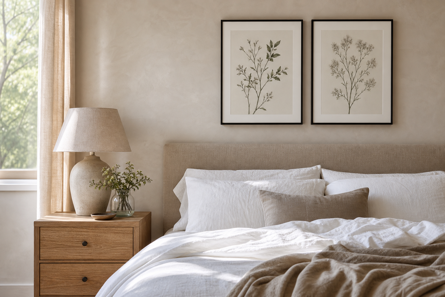
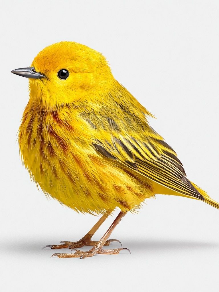
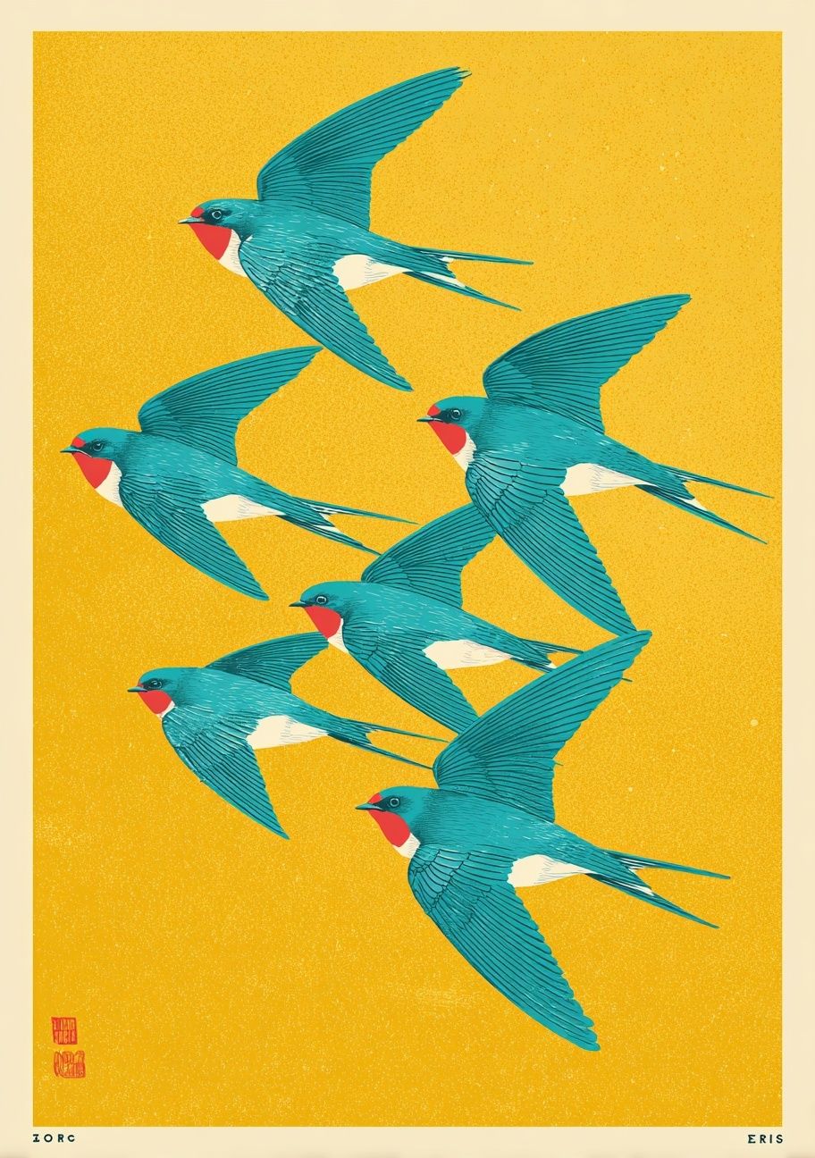
Hand-drawn figurative and nature-based illustration is another strong category. These prints feel looser, more personal, and often more emotional. Birds, botanical details, zodiac motifs, forest scenes, and whimsical characters all sit here. They are ideal when a room needs softness rather than structure. A piece such as Swallows in Flight brings movement without visual noise, especially in bedrooms, reading corners, and entryways.
Bold editorial graphics form the final big group. These pieces tend to use larger areas of colour, sharper composition, and a stronger focal point. They work best in spaces that can handle contrast — think white walls, sculptural lighting, and furniture with clean silhouettes. If you like interiors that feel a little fashion-led, this style adds energy quickly. It also mixes well with Abstract wall art when you want a gallery wall that feels collected rather than matched.
Trends Shaping Illustration Art Prints Right Now
Muted palettes continue to lead, but they are no longer limited to beige and black. Current illustration art prints often use dusty green, chalky blue, clay red, butter yellow, and soft charcoal. These tones photograph well, layer easily with natural materials, and make larger pieces feel more livable. In practical terms, muted colour can let you go up one frame size — for example from 50x70 cm to 70x100 cm — without the art taking over the room.
Nostalgic references are also strong. That does not always mean overtly vintage imagery; often it is about the mood. Early-tech motifs, old-world symbols, folk-inspired drawing, and retro travel colour palettes all feel current because they add story. The appeal is simple: rooms filled only with neutral basics can feel unfinished, while illustration adds reference points the eye can return to.
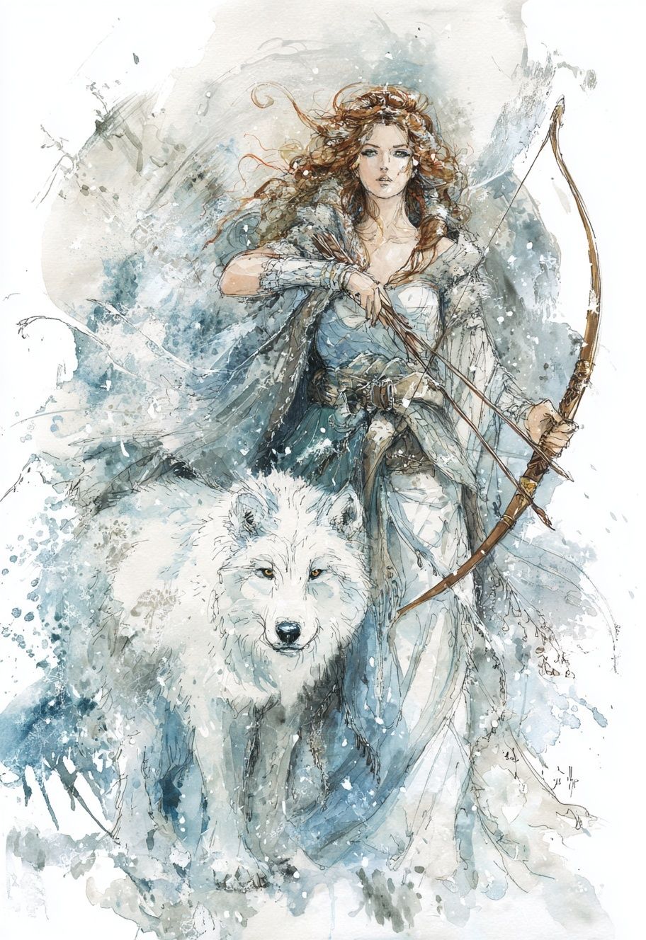


Playful figures and stylised characters are becoming more common in adult interiors, not just children's rooms. The difference is framing and context. A whimsical print in a slim oak frame, paired with a boucle chair and a stone side table, reads design-conscious rather than childish. That shift matters if you want a room to feel relaxed and personal. Cool Yeti with Phone is a good example of a character-led piece that suits a casual office, hallway, or creative corner when the surrounding decor stays clean.
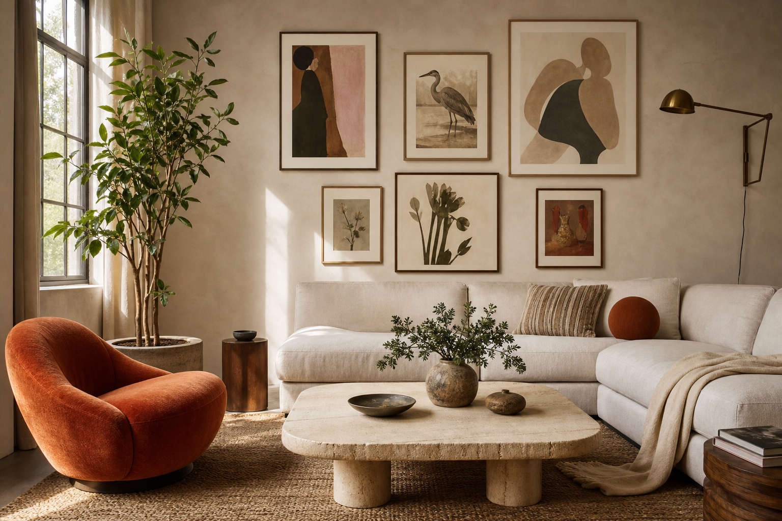
Nature-inspired scenes remain reliable because they bridge two decorating needs at once: they introduce living forms, and they soften geometry. Birds in flight, marine life, floral forests, and stylised landscapes are especially useful when a room has many straight lines — shelving, desks, rectangular rugs, or panelled walls. If you want that effect with a more painterly edge, Fine Art prints can also be mixed with illustration for a layered result.
How to Choose a Style for Your Space
Start with the mood of the room, not the art itself. For a bedroom, illustration that uses curved lines, small-scale detail, or muted tones usually feels more restful than high-contrast graphics. For a dining area or office, stronger colour and bolder shapes often work better because you spend less time looking for calm and more time wanting focus and presence. Matching energy level is more effective than matching every colour exactly.
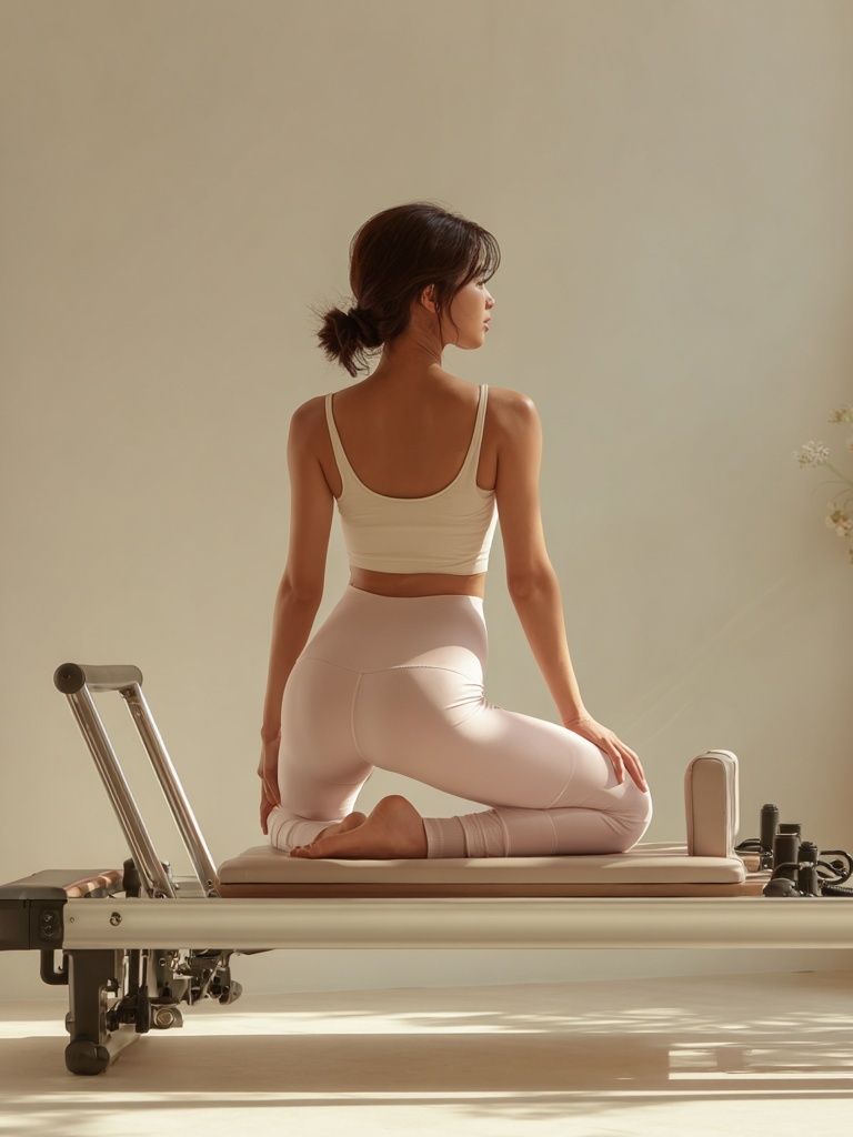
Next, look at what already dominates the room. If your furniture has strong form — low-profile sofas, angular shelving, black metal legs — choose softer illustration styles to balance it. If the room is already full of texture — boucle, rattan, linen, wood grain — cleaner graphic compositions will stop the space from feeling overly loose. This is where Yoga Practice — Minimalist Print can act as a visual reset beside more detailed pieces.
Use colour in proportions rather than exact matches. A useful rule is 60-30-10: around 60% base tone in the room, 30% secondary material or colour, and 10% accent. Your art can either echo the 10% accent to tie the room together, or introduce a new accent if the room feels flat. In a neutral room, even one print with mustard, cobalt, or terracotta can be enough.
Finally, think about how close the art will be viewed. In narrow hallways or above bedside tables, detail-rich illustrations reward closer distance. Above a sofa viewed from 2.5 to 4 metres away, choose stronger silhouettes and clearer composition. The bigger the viewing distance, the less subtle the artwork can afford to be.
Sizing, Framing, and Pairing Tips
For sizing, use the width of the furniture below as your guide. Art above a sofa or bed should cover roughly 60% to 75% of the furniture width. Above a 200 cm sofa, that means a combined art width of about 120 to 150 cm. You can reach that with one 70x100 cm frame, two 50x70 cm frames, or a salon-style arrangement of three to five smaller works. Illustration is particularly good for grouped arrangements because varied styles can still feel cohesive when the colour palette is consistent.
Frames change the read of illustration art prints more than most people expect. Oak frames warm up graphic work and make playful imagery feel more grounded. Black frames sharpen line work and editorial pieces. White frames are useful with pastel-heavy illustrations, but they need enough wall contrast to avoid disappearing. In rooms with warm neutrals, natural wood is usually the safest choice.
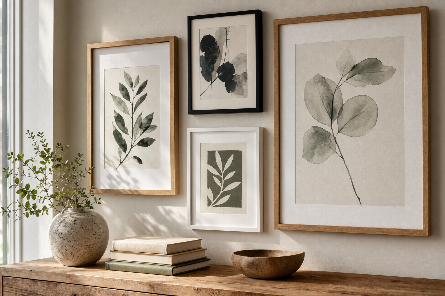
When pairing pieces, repeat at least one of these three things: colour temperature, line quality, or subject matter. For example, a bird illustration can sit beside an abstract wave print if both use soft blue-greens. A whimsical figurative piece can work next to a minimalist print if both rely on clean, open space. If every piece changes colour, density, and style at once, the wall will feel accidental.
A useful gallery-wall formula is one anchor piece, two supporting illustrations, and one tonal bridge. The bridge is often an abstract or minimalist work that keeps the set from feeling too literal. That is why combining pieces from illustration art prints with one work from our Abstract collection often gives a better result than using four highly descriptive images together.
Keep spacing tight and intentional: 5 to 8 cm between smaller frames, 7 to 10 cm for larger ones. If you are leaning the art on a picture shelf instead of hanging it, overlap by 2 to 4 cm so the arrangement feels styled rather than lined up.
Wrapping Up: Picking Prints You’ll Love Long-Term
The best illustration art prints are the ones that still feel interesting after the first week. That usually means choosing work with a clear point of view — distinctive line, memorable colour, or a subject that feels personally relevant — rather than chasing novelty alone. Start with one piece you would still want in a different home, then build around it slowly.
If you want longevity, look for illustration that balances charm with restraint. A playful subject, muted palette, or strong composition will generally age better than a trend-heavy piece that depends on one gimmick. Browse our Illustration range with your room's materials, colours, and scale in mind, and you will end up with walls that feel personal, cohesive, and easy to live with.