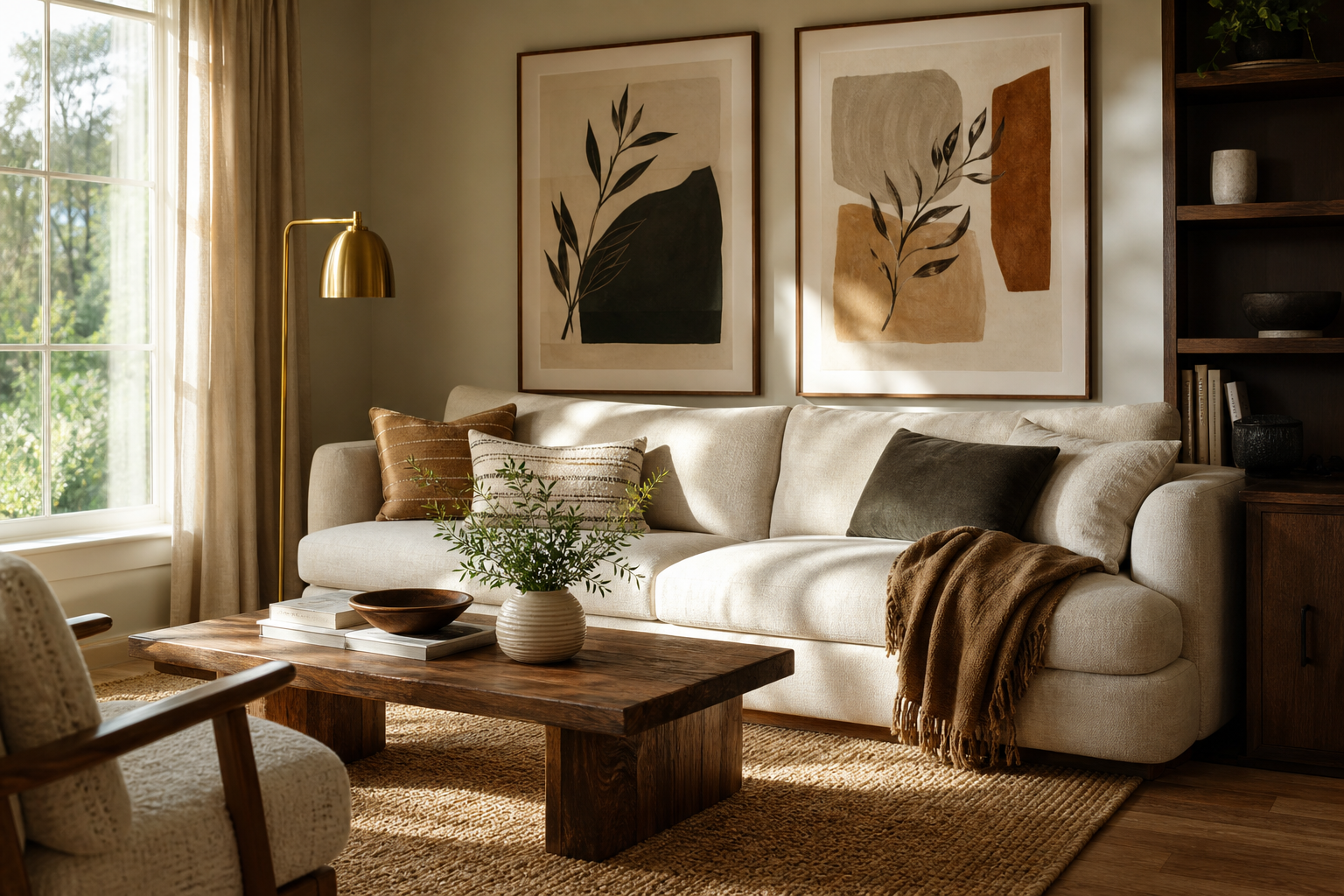
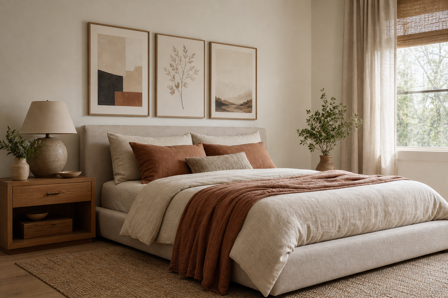
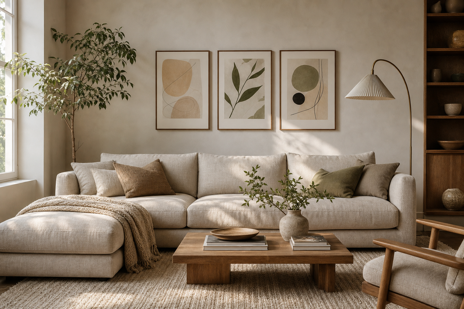
A good vintage living room does not look staged around one era. It feels layered — a little 1930s in the silhouettes, a little 1960s in the wood tones, a little European flea-market charm in the artwork. The key to successful vintage for the living room is restraint: fewer, better pieces with visible character, not a room packed with references.
Wall art does a lot of that work quickly. It introduces age, story, and patina without forcing you to replace every table, lamp, or textile. If you choose the right mix of imagery, frame finish, and spacing, vintage for the living room feels collected over time rather than bought in one weekend.
What Makes a Living Room Feel Vintage
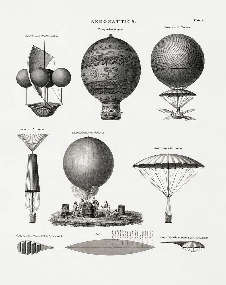
Vintage style usually comes from four cues: softened colour, heritage subject matter, classic line work, and materials that show a bit of age. Think portraits, old-world architecture, natural history illustrations, travel-inspired graphics, and artworks with muted contrast rather than glossy brightness. That is why our Vintage collection works so well in living spaces — the imagery already carries a sense of history.
A room also feels more convincing when you mix decorative eras instead of matching everything precisely. Pair a traditional rug with a cleaner sofa shape, or add a streamlined floor lamp beside older-looking wall art. If every item is equally ornate, the room turns heavy. If one-third of the pieces feel pared back, the vintage elements stand out more clearly.
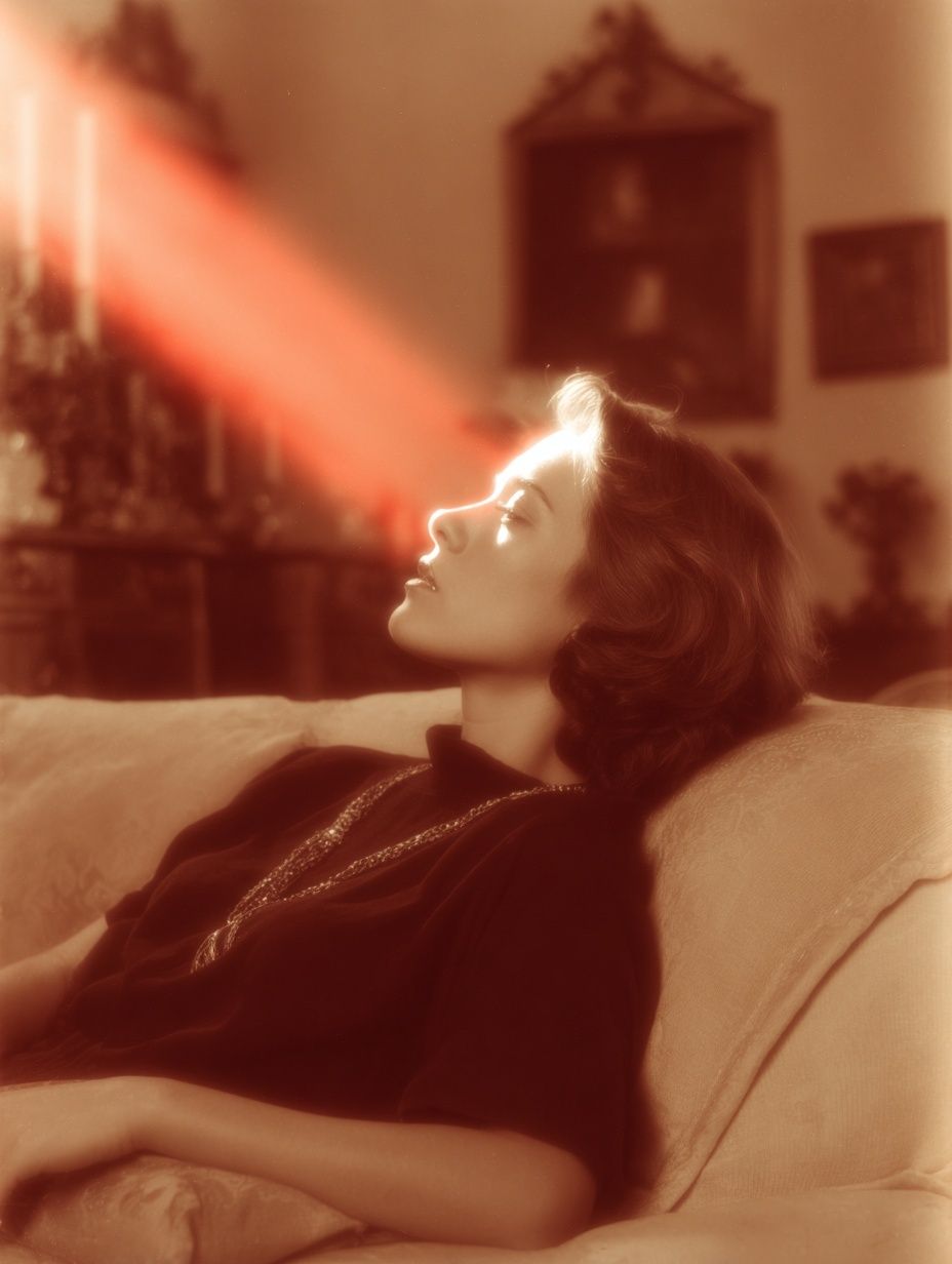
Portraits are especially effective because they add presence without adding clutter. A single figurative piece above a mantel gives the room a focal point and makes surrounding objects — books, candlesticks, ceramics — feel intentional.

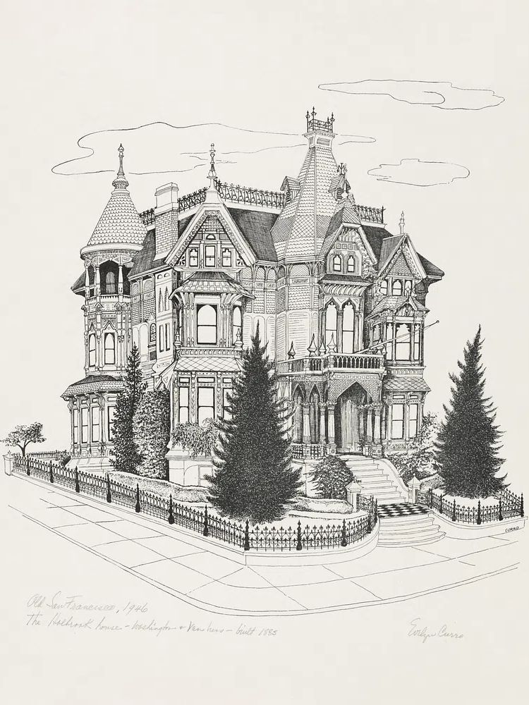
If you prefer a more intellectual, collected look, architecture and illustration are strong alternatives to portraiture. A detailed piece like Victorian Mansion Illustration brings period character, while still reading as refined rather than nostalgic in a literal way.
Choose a Colour Palette That Feels Timeless
Vintage interiors tend to work best with compressed colour palettes. Instead of six competing tones, aim for three main shades plus one accent. A reliable formula is 60% warm neutral, 30% wood and leather browns, and 10% deeper accent colour. Good accent options include olive, ochre, rust, faded burgundy, ink blue, and moss green.

Warm whites are often better than crisp whites in this style. Choose ivory, bone, oatmeal, or light taupe on the wall so older-looking artwork does not feel too stark. Rich walnut, medium oak, and antique brass finishes immediately support the palette. Black can still work — but use it in small amounts, such as frame edges or a floor lamp base, to sharpen the room.
When selecting art, look for colours that echo what is already in the room. A print with tobacco, sepia, and charcoal tones can connect a leather chair to darker wood furniture. For softer rooms, floral and figurative pieces from the Fine Art collection or selected works in our Bohemian art prints can add warmth without making the palette muddy.

How to Style Vintage Posters Without Overcrowding the Room
The fastest way to lose the vintage look is to hang too many pieces too close together. Old-world style needs breathing space. Above a sofa, keep the total arrangement width to roughly 60% to 75% of the sofa width. For a 220 cm sofa, that means art spanning about 132 to 165 cm. Leave 7 to 10 cm between frames in a pair, or 5 to 7 cm in a grid.
A single large statement piece often works better than a dense salon wall in a modern living room. One vintage portrait or architectural print above a mantel gives you the atmosphere without the visual noise. If you do build a grouping, limit the palette and repeat one frame finish across all pieces.

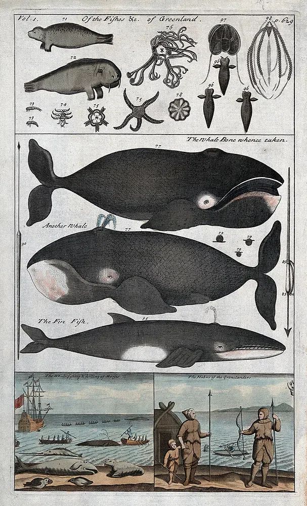
Side walls are useful for narrower vertical pieces, especially near a bookcase, drinks cabinet, or reading chair. These spots let you introduce more personality without making the main seating wall too busy. A natural history print such as Whale Anatomy and Hunting suits these secondary zones well because it adds detail and conversation value.
If your room already has patterned upholstery, use calmer wall art with more negative space. Browse our Minimalist prints or even a subtle crossover piece like Vintage Bicycle in Nature when you want a vintage note that does not compete with textiles.
Framing Ideas That Enhance the Vintage Mood
Frame choice can shift a print from casual to considered in seconds. Medium walnut frames are the safest option for vintage interiors because they echo traditional furniture and soften the artwork. Black frames make vintage prints feel more graphic and editorial. Brass-toned or gold-toned frames add formality — especially with portraits and fine art — but use them selectively so the room does not become ornate.
Distressed finishes can work, though they are easiest to overdo. If the artwork already has aged colour and nostalgic subject matter, one intentionally worn frame style is enough. Too many distressed surfaces in one room can make the space feel themed rather than layered.

Matting also matters. A generous off-white mat gives older-style art a gallery quality and helps intricate imagery breathe. On smaller prints, use a mat width of 5 to 8 cm. On larger focal pieces, 8 to 12 cm often feels more elevated. If you want a cleaner transition between vintage art and modern furniture, slim black frames with wide mats are especially effective.
Mix Vintage Artwork with Modern Pieces
The most interesting living rooms do not commit fully to one period. They combine old references with current shapes. That contrast keeps the room from feeling like a set. A square, low-profile sofa or a simple travertine coffee table can anchor more decorative wall art and make it look intentional.
Architectural and typography-based pieces are useful for this balance because they bridge old and new easily. A room with modern upholstery can handle something classic from the Architecture collection or refined lettering from our Typography prints without losing its contemporary edge.
You can also combine one obviously vintage piece with one simpler companion. For example, a portrait print beside a restrained interior or city image creates tension in a good way. The room feels layered, not matched. That is often the sweet spot for vintage for the living room — enough history to add soul, enough modern structure to keep it calm.
The Best Rooms and Corners for a Vintage Touch
The wall above the sofa is the most obvious placement, but it is not always the most effective. A vintage piece can feel stronger in a quiet corner where it has room to register. Reading nooks are ideal for portraiture, florals, or small architecture prints because the slower pace of the corner suits more detailed imagery.

Media walls also benefit from vintage styling because screens can make a room feel cold. Hanging one or two framed pieces beside the television softens the setup. Choose subjects with enough visual weight to stand up to the screen — portraits, mansion illustrations, or classic figure studies work well here.
Smaller transition zones deserve attention too. The wall between two windows, the space over a console, or the area beside a fireplace can often carry a piece better than a crowded main wall. If you want a softer decorative approach, Floral Bouquet — Bohemian Print or Ethereal Woman with Pot can bring warmth to these in-between spaces.
Final Styling Tips for a Cohesive Vintage Living Room
Start with one anchor piece and build outward. That anchor can be a portrait, an architectural illustration, or a fine art print with softened colour. Then repeat two or three visual cues elsewhere in the room — walnut wood, antique brass, olive textile, black frame line — so the whole space feels joined up. This is the easiest way to make vintage for the living room feel curated instead of accidental.
Edit harder than you shop. If you add a new framed print, remove one object from the mantel or side table. If your artwork is detailed, keep nearby textiles quieter. If your sofa wall already has a three-piece arrangement, let the opposite wall stay simpler. Vintage style works best when each item has enough space to be noticed.
Frequently Asked Questions
What frame size works best for vintage wall art above a standard sofa?
For a sofa around 200 to 230 cm wide, aim for one large piece around 70 x 100 cm, or a pair in 50 x 70 cm. The total art width should stay within roughly 60% to 75% of the sofa width.
Should vintage prints be hung at the same height as modern art?
Yes — keep the centre point around 145 to 150 cm from the floor in most living rooms. Above furniture, leave 15 to 25 cm between the top of the sofa or mantel and the bottom of the frame.
Do warm or cool wall colours suit vintage art better?
Warm wall colours are usually easier: cream, taupe, soft greige, muted olive, or clay-based neutrals. They support aged tones and make sepia, brown, and ochre details look richer.
Can I mix wood frame finishes in one living room?
Yes, but keep them close in temperature. Walnut, medium oak, and antique brass can sit together well, while pale ash and glossy chrome usually feel too sharp against vintage-heavy art.
What pairs well with vintage wall art if my furniture is very simple?
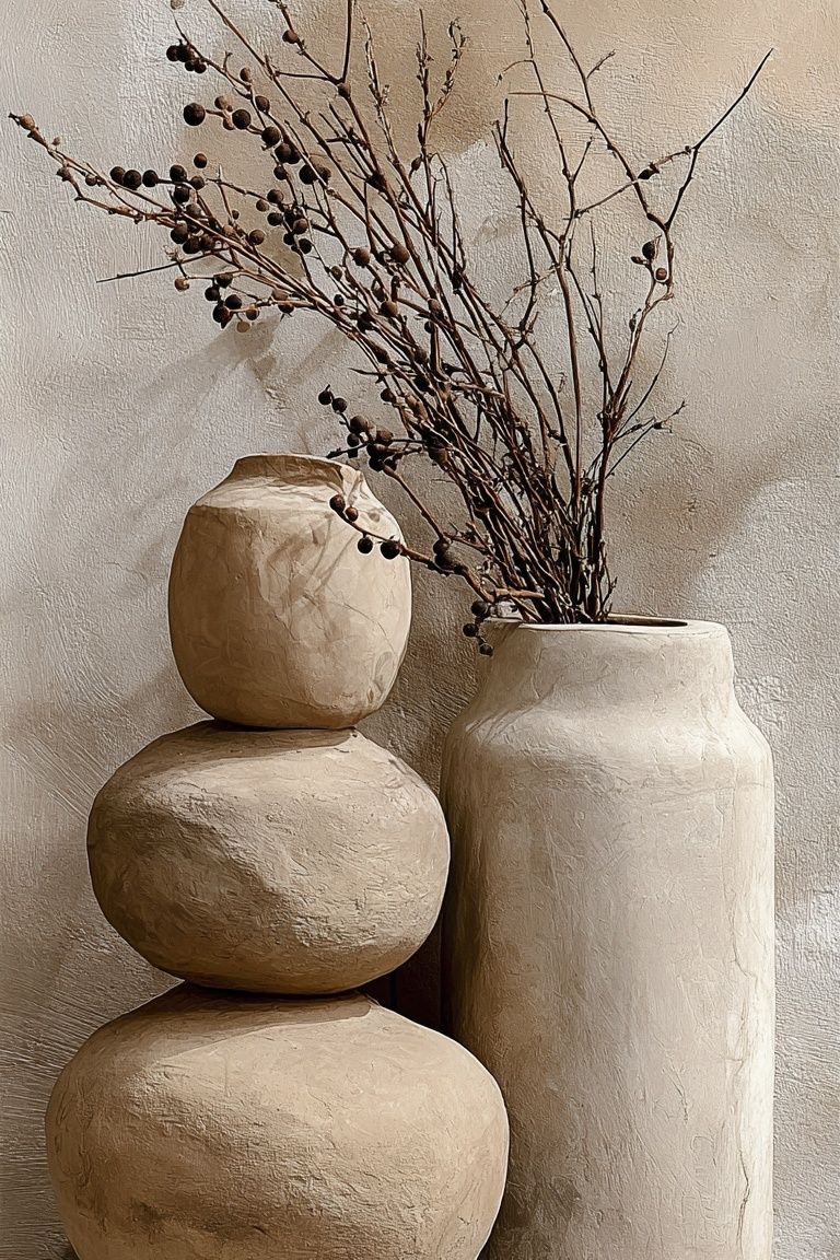
Add one or two tactile elements — a patterned rug, pleated lampshade, leather ottoman, or ceramic vase. Texture helps the art feel grounded without forcing you to change the whole room.