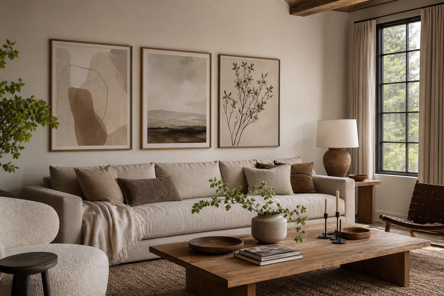
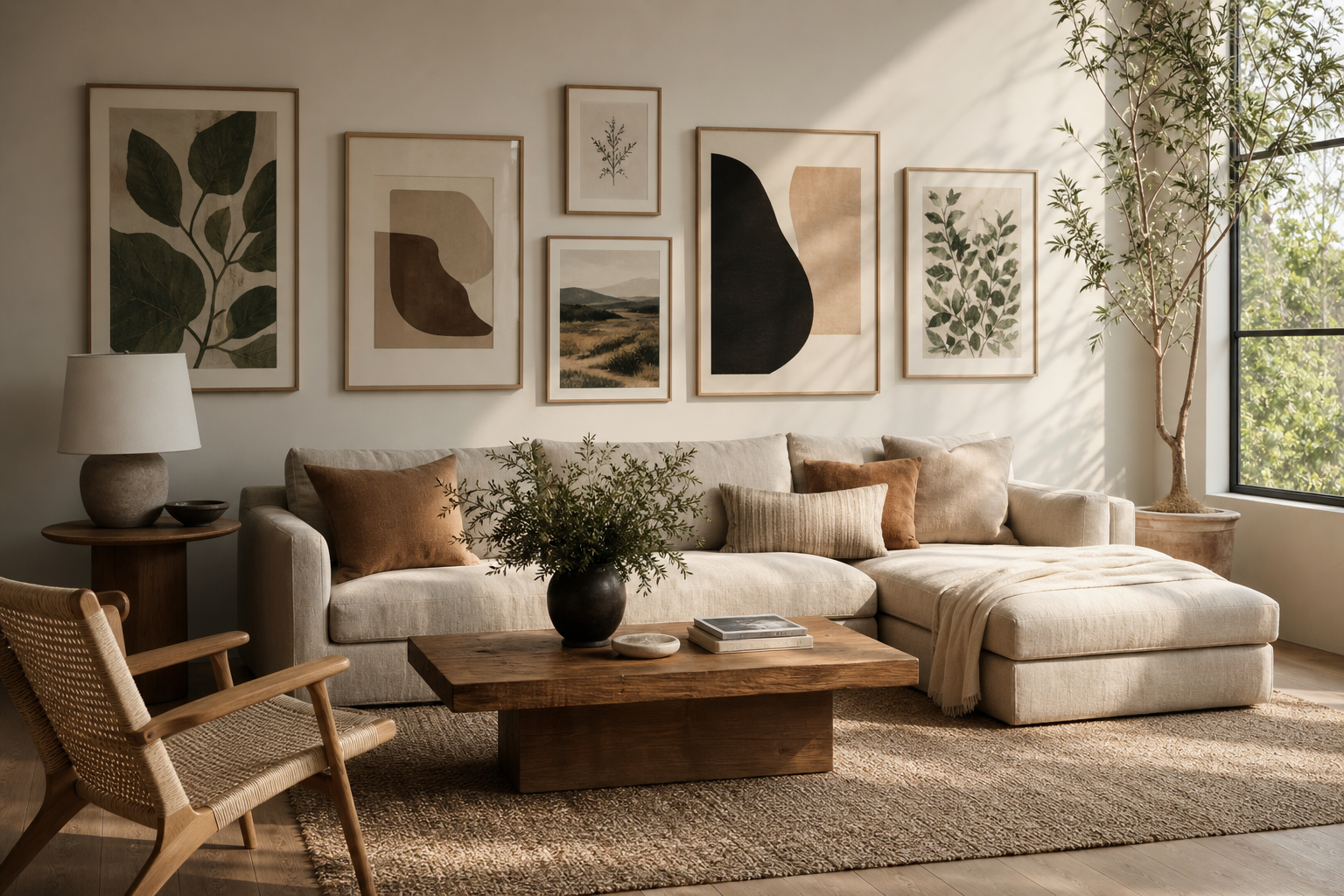
Why Illustration Works So Well in Living Rooms
Illustration for the living room works because it adds character without the visual weight that large photography or very dark paintings can bring. Illustrated pieces often have cleaner shapes, softer edges, and more stylized forms, which makes them easier to layer into a room that already has upholstery, shelving, lighting, and textiles competing for attention. In practical terms, that means you can introduce color, line, or narrative without making the wall feel crowded.
Living rooms also benefit from art that feels conversational. A strong illustration can set the mood in seconds: calm line work makes a room quieter, abstract shapes make it more modern, and vintage-inspired scenes give it depth and familiarity. If you want a flexible starting point, browse our illustration collection alongside fine art wall pieces to compare how stylized and painterly looks change the atmosphere.
Another advantage is range. Illustration for the living room can read refined in a formal space, relaxed in a family room, or playful in a compact apartment. That versatility matters most in multi-use rooms where the sofa area may double as a reading corner, work spot, or social space. A good illustrated print can bridge all three functions more easily than highly thematic art.
Choosing a Style That Matches Your Interior
The safest way to choose a style is to start with the room's dominant shapes and materials. If your living room has clean-lined furniture, pale wood, boucle, or matte black accents, pared-back artwork usually works best. In that setting, minimalist art prints feel precise and calm rather than decorative.

A minimal piece with open space around the subject gives the room breathing room. That is especially effective above a sofa with a long horizontal profile.
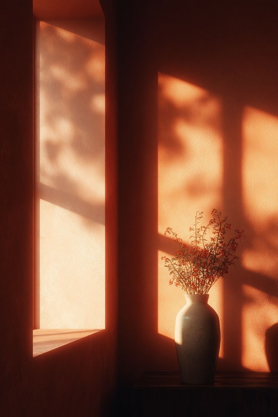
Line art and simplified botanical or object-based imagery tend to suit Scandinavian, Japandi, and modern organic interiors. If your room already includes curved furniture, travertine, boucle, or ribbed glass, a restrained print avoids doubling the amount of texture on the wall. For a lighter, more sculptural look, Vase with Flowers — Minimalist Print is a natural fit.
Vintage-inspired illustration and painterly scenes work better in rooms with depth: walnut furniture, layered rugs, brass, older architectural details, or collected accessories. In those interiors, a polished but slightly nostalgic piece can stop the room from feeling too new. If you want more movement or story, Whimsical Village — Fine Art Print adds charm without becoming overly formal.
Abstract illustration is the most adaptable option for modern living rooms. It ties together mixed furniture styles, especially if you have one contemporary sofa, one vintage chair, and a few handmade accessories. In those cases, abstract wall art helps create a visual bridge because color and shape matter more than subject matter.
Playful artwork suits compact rooms, rental apartments, and spaces that need energy. The key is editing. One playful print in a serious room feels intentional; five unrelated ones can look random. If you want warmth with structure, combine playful illustration with consistent frames and a limited palette.
Getting the Size and Scale Right
Most art-placement mistakes are scale mistakes. Above a sofa, your artwork should usually span 60% to 75% of the sofa width. If your sofa is 200 cm wide, the framed art or total grouped arrangement should be about 120 to 150 cm across. Much smaller than that, and the wall looks unfinished. Much larger, and the art starts to compete with the furniture rather than anchor it.
For one statement piece, aim for a frame width of roughly 70 to 100 cm above an average 180 to 220 cm sofa. This works well when the illustration has strong negative space or a bold central motif. A single oversized work is often best in smaller living rooms because one clear focal point looks cleaner than multiple medium pieces.
If you prefer a pair or trio, keep the spacing tight — usually 5 to 8 cm between frames. Three pieces above a sofa look strongest when the heights are matched and the overall group reads as one unit. Over a console, you can go slightly narrower and taller, especially if you are layering the frames with a table lamp or vase rather than hanging them at full eye level.

For long walls, a four-piece grid can work better than a single panoramic shape because it gives rhythm without demanding a custom frame size.


Hang the center of the arrangement around 145 cm from the floor as a starting point, then adjust for your ceiling height and sofa back. If the wall sits behind a low-profile sofa, dropping the art slightly often makes the room feel more connected. Leave 15 to 25 cm between the top of the sofa and the bottom of the frame grouping.
Color Palettes That Pull the Room Together
The easiest way to make art look intentional is to repeat one or two colors already in the room. That could mean picking up rust from a cushion, green from a plant, black from a lamp, or cream from a rug. You do not need a perfect match. In fact, a 70% similarity usually looks more sophisticated than an exact one because it feels layered rather than purchased as a set.
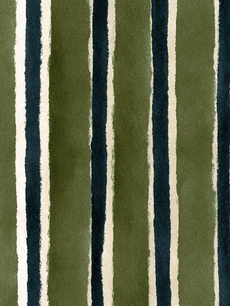
In neutral living rooms, illustration is often what stops the space from feeling flat. Beige, ivory, greige, and warm white interiors benefit from artwork with dusty blush, muted blue, olive, terracotta, or charcoal. Those shades add dimension while keeping the room calm. If you want a gentle tonal lift, Blush Watercolor Abstract Poster is useful for softening a neutral scheme.

For cooler modern interiors — think grey upholstery, glass, black steel, or concrete tones — contrast matters more. Teal, burgundy, deep red, or saturated cobalt can add enough energy to stop the room from reading sterile. The best approach is to let the illustration carry the strongest color in the room, then repeat that shade once in a small accessory such as a book spine, throw, or ceramic piece.
If your space already has several patterns — a rug, curtains, and cushions, for example — choose illustration with a simpler structure. Strong pattern plus detailed art can become visually noisy. In that case, broad shapes from our abstract collection or restrained forms from minimalist wall art will keep the balance.
Framing, Layouts, and Gallery Wall Ideas
Frames change the tone more than most people expect. Thin black metal or black wood frames sharpen illustration and suit modern, industrial, and monochrome rooms. Oak and natural wood frames make the same artwork feel softer and more relaxed. White frames work best when the wall color has enough contrast — on a bright white wall, they can disappear unless the artwork itself has stronger color.

If you are building a gallery wall, consistency matters more than symmetry. Use one of these three formulas: same frame finish with varied art, same palette with varied sizes, or same size with varied subjects. Following all three at once can make the arrangement feel too rigid, while varying everything usually looks accidental.
A simple living room gallery wall often starts with four to six frames. Start on the floor first. Keep outer edges aligned where possible, and maintain 5 to 7 cm gaps between pieces. If your furniture below is wide and low, a horizontal gallery layout usually looks better than a vertical stack. Over a narrow console or reading chair, a vertical grouping can create the height the furniture lacks.
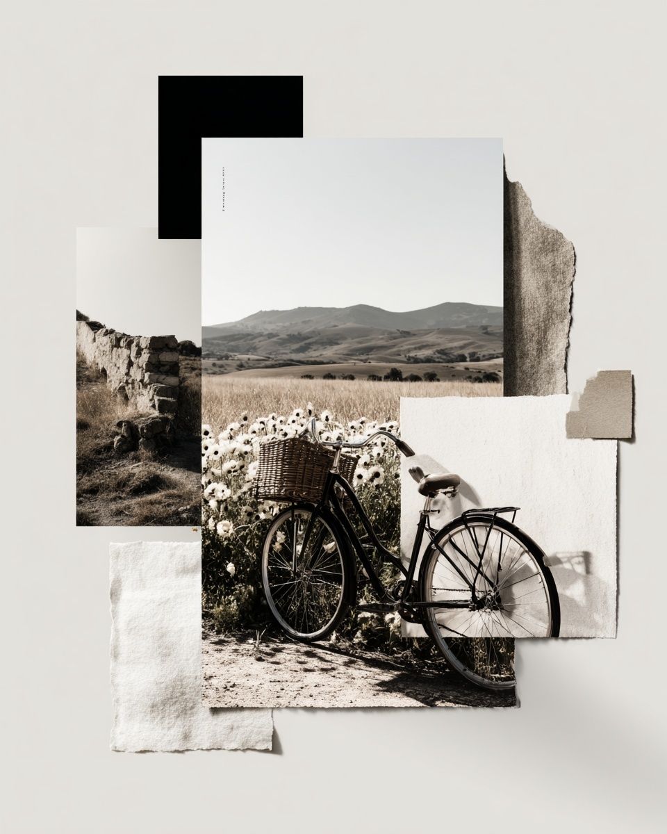
For more character, mix illustration with one or two different visual styles rather than filling the entire wall with one identical look. A minimalist piece beside a painterly work often feels more collected than a perfectly matched set. That is where Window with Sheer Curtain — Fine Art Print can pair beautifully with cleaner illustrations, especially in rooms built around linen, wood, and muted color.

If your interior leans warmer and more layered, look at bohemian wall art for accents that bring softness and ornament. If it is cleaner and more geometric, mid-century modern prints can introduce shape without clutter.
Final Styling Tips for a Polished Finish
The most successful rooms edit aggressively. If your illustration has strong color, keep nearby styling quieter. If the artwork is subtle, let texture do more work through a boucle chair, wool rug, or ceramic accessories. One good rule is to repeat the visual language of the art somewhere else in the room: curved forms in the print can echo a rounded lamp, while earthy tones can return in cushions or a vase.
Before you commit, test the layout with paper templates taped to the wall. Mark the full frame size, not just the artwork area. This shows whether your illustration for the living room is actually large enough and whether the grouping sits at the right height. It also prevents the common mistake of hanging art 10 to 15 cm too high.
If you are mixing illustration with other wall art, keep one unifying element across everything — frame color, palette, subject tone, or spacing. That is what makes mixed walls feel curated rather than pieced together over time. A living room rarely needs more art; it needs better proportion, clearer repetition, and a stronger focal point.
Frequently Asked Questions
What frame color is safest for a living room?
Black and natural oak are the most versatile. Black adds definition in modern spaces, while oak softens the look in neutral or organic interiors.
Should living room art be centered on the wall or on the furniture?
Center it on the furniture, not the entire wall. The sofa or console is the anchor, so the artwork should relate to that footprint first.
Can I mix illustration with photography in one gallery wall?
Yes — keep the palette restrained and use matching or closely related frames. One medium should dominate, with the other used as contrast.
What size works best for a small apartment living room?
A single frame around 50x70 cm or 70x100 cm often works well, depending on sofa width. In compact rooms, one larger piece usually looks cleaner than several small ones.
How do I reduce glare on framed wall art near windows?
Use matte paper or anti-reflective glazing if possible, and avoid hanging directly opposite strong daylight. Even shifting the piece 30 to 50 cm off the brightest axis can help.