Why Fine Art Works So Well in Living Rooms
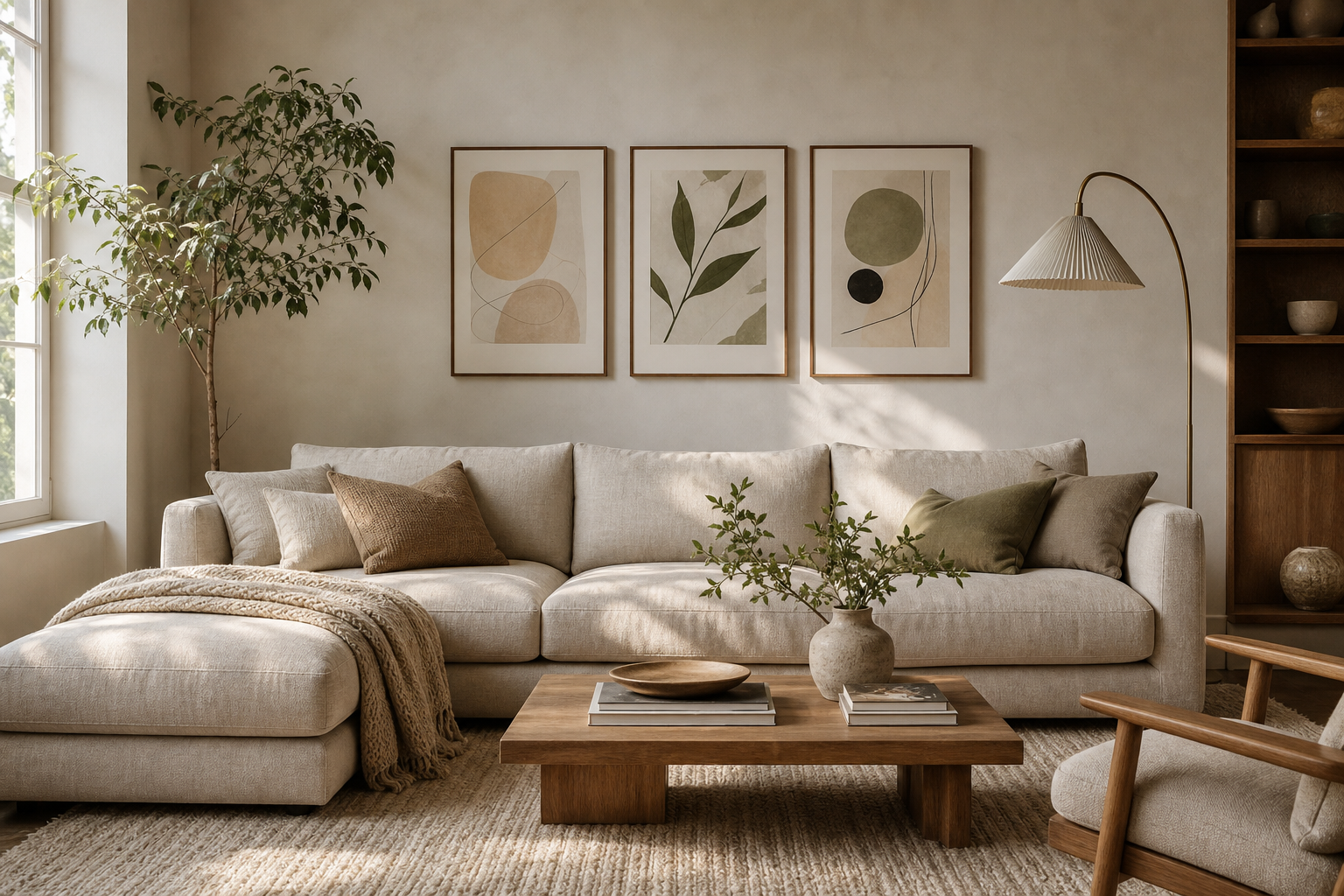
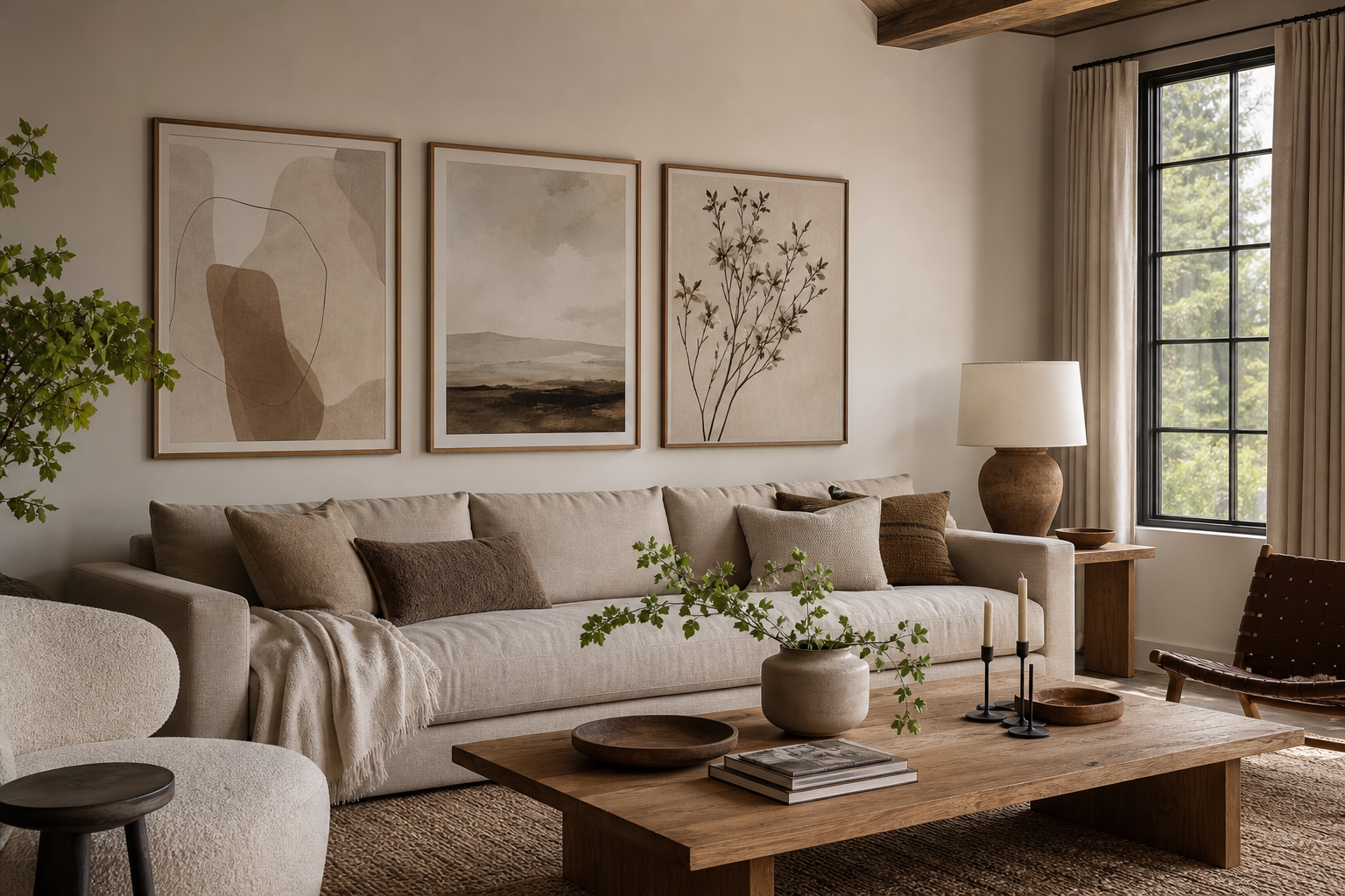
The living room is where most homes need visual structure. Upholstery, lighting, and storage handle comfort, but art gives the room a point of view. Good fine art prints add weight to a wall, guide the eye, and stop a seating area from feeling like separate furniture pieces pushed together. That is why fine art for the living room often feels more settled than generic decor — it creates a focal point without adding clutter.
Fine art also works because it carries atmosphere better than trend-led graphics. A soft landscape can calm a room with hard edges. A figurative piece can make a neutral scheme feel more human. A painterly interior scene can echo the layered quality of textiles, books, and wood finishes already in the space. If your room feels complete but still forgettable, art is usually the missing element.

Choosing the Right Subject Matter
Subject matter should match the emotional tone of the room before it matches any color. Abstract work is useful when your space already has many lines and objects — shelving, media units, patterned rugs, or architectural details. It gives the eye a place to rest while still adding depth. If that is your direction, browse our abstract wall art collection and look for pieces with two or three dominant tones rather than ten.
Landscapes are the easiest fit for most living rooms because they open the space visually. They introduce horizon lines, sky, water, or foliage, which can make a wall feel less flat. A piece such as Water Lilies — Fine Art Print works especially well in rooms with curved lamps, bouclé, linen, or soft-edged furniture because the brushwork reinforces that gentler language.

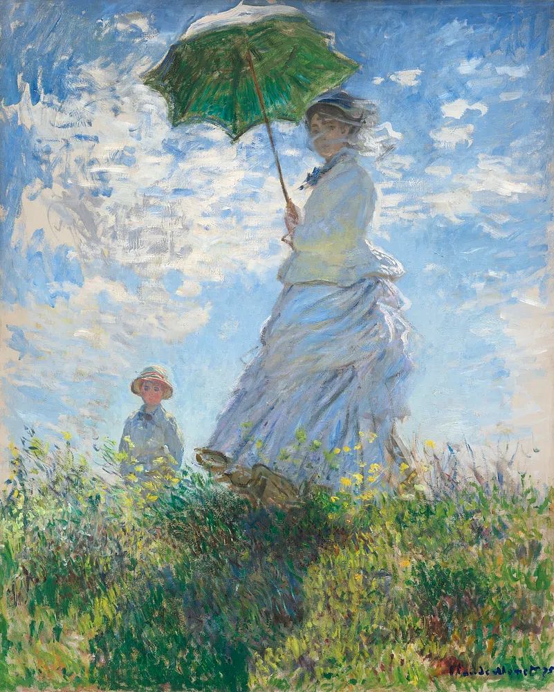
Figurative art adds personality faster than any other style, but it benefits from restraint around it. If you choose a portrait or a human figure, keep the nearby styling simple — one table lamp, a stack of books, one ceramic object. That gives the artwork room to lead. For a brighter, more romantic note, Woman with a Parasol suits airy rooms with pale oak, ivory upholstery, and natural daylight.
Still-life and interior scenes are often overlooked, yet they are among the best choices for fine art for the living room. They feel intimate, domestic, and collected. Pieces that depict windows, flowers, vessels, or quiet interiors tend to support daily living rather than dominate it. If you prefer a softer, quieter wall, Window with Sheer Curtain is a strong example of art that reads as refined from both near and far.
Getting Scale and Placement Right
Most hanging mistakes are scale mistakes. As a rule, art above a sofa should span around 60% to 75% of the sofa width. Above a 220 cm sofa, aim for art or a grouped arrangement about 132 to 165 cm wide. Anything much smaller looks disconnected, no matter how beautiful the piece is.
The hanging height matters just as much. The center of the composition usually works best at about 145 to 152 cm from the floor. If the piece sits above furniture, leave 15 to 25 cm between the bottom of the frame and the top of the sofa or mantel. That distance keeps the arrangement visually attached to the furniture instead of floating too high.

A single oversized piece works best when the room already has enough texture from curtains, rugs, and side tables. A pair of medium works is better when you want balance on a longer wall. A four-piece arrangement suits homes where you want a curated look without committing to one dominant image. If you like that approach, this mix shows how painterly, landscape, and interior subjects can sit together without feeling busy.




For empty side walls, narrower vertical works are often more useful than one wide image. Near a reading chair or between two windows, vertical pieces create rhythm and use wall height well. Architectural subjects can be especially effective there — architecture prints bring strong lines that complement shelves, fireplaces, and paneled walls.
Palette, Mood, and the Rest of the Room
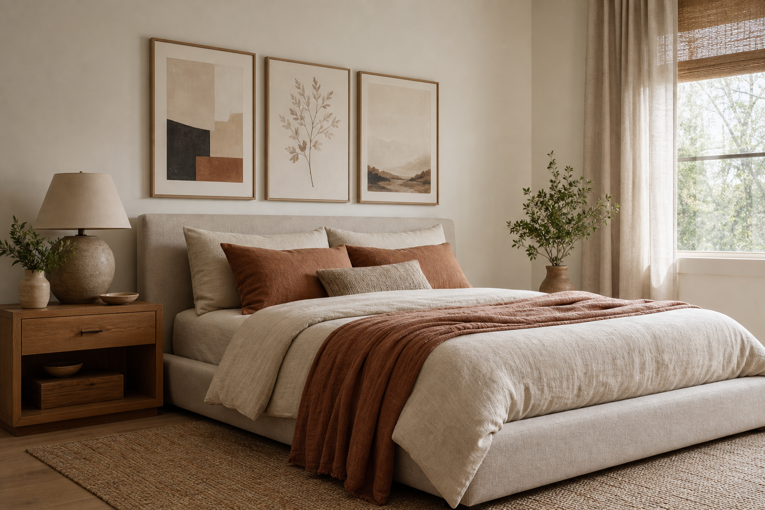
The best rooms do not match art to the sofa exactly. They repeat color in a controlled way. A useful formula is 70% base tone, 20% secondary tone, 10% accent. If your living room is mostly warm neutrals — sand, oatmeal, walnut, cream — the art can carry the accent through muted blue, olive, rust, or charcoal. That creates connection without making the room feel staged.
If your scheme is minimal, choose one artwork that introduces softness rather than more severity. Rooms with clean-lined sectionals, black accents, and simple storage often benefit from painterly pieces or landscapes. You can also borrow ideas from minimalist art prints and combine them with fine art to keep the room edited.
For more layered spaces, pull one color from the artwork into a cushion, throw, or vase — just one or two repeats are enough. A yellow note in art can reappear in a lamp base or book spine. Green from a landscape can echo a plant or muted rug border. That is all the coordination a room usually needs.
Nature-based work is especially useful when the room needs calm. Soft greens, misty blues, and earth browns tend to lower visual noise and work well with wood, stone, and woven textures. If that sounds right for your space, nature wall art offers an easy bridge between classic fine art and relaxed contemporary interiors.
Framing Choices That Elevate the Piece
A good frame can make modestly priced art look far more intentional. In most living rooms, the safest choices are black, walnut, oak, or off-white wood. Black gives structure and contrast. Walnut adds warmth and suits traditional or mid-tone interiors. Oak keeps things lighter and pairs well with Scandinavian and Japandi rooms. Off-white works best when you want the image to fade softly into the wall.
Mounts matter too. A generous white mount can make a smaller piece feel more substantial and gallery-like. For works under 50 x 70 cm, a mount often adds the visual breathing room the image needs. For large art — 70 x 100 cm and up — a slim frame with little or no mount usually feels cleaner and more contemporary.

Frame finish should connect to the room's materials, not compete with them. If your coffee table, shelving, or flooring is warm wood, echo that warmth in the frame. If the room leans monochrome, a black frame can sharpen the whole composition. For homes with a more relaxed collected feel, pieces from our bohemian collection can look unexpectedly polished when framed simply in thin oak or walnut rather than ornate styles.
How to Build a Living Room Collection Over Time
A collected wall rarely appears in one purchase. The easiest method is to start with one anchor piece, then add secondary works over a few months. The anchor should be the largest work in the room, usually above the sofa or mantel. Everything else can support it at 50% to 70% of its visual weight.
If you want a statement piece with a classic presence, choose something with recognisable movement or strong atmosphere. Starry Night — Fine Art Print has enough energy to anchor a quiet room, especially if the surrounding decor is restrained — plain upholstery, simple lighting, and a limited accessory palette.

Then build contrast around it. Pair a dramatic main piece with one quieter landscape, one interior scene, or one architectural print on a nearby wall. Mix subjects, but keep one consistent thread: frame finish, tonal range, or era. You can also use smaller works on shelves and consoles before committing them to the wall. This lets you test proportion and color in the room first.
Rotating art seasonally also helps a living room feel fresh without redecorating. Lighter landscapes and floral works suit spring and summer; moodier pieces with deeper blues, browns, or charcoal work well in autumn and winter. That approach keeps fine art for the living room feeling active and personal rather than fixed forever.
Wrap-Up: Simple Shop Tips for a More Curated Space
When shopping, start with the wall, not the artwork. Measure the available width, note the dominant room tones, and decide whether you need one focal piece or a group. Then narrow by subject and palette. That order prevents impulse buys that are beautiful on screen but wrong for the room.
A well-curated living room usually relies on just three decisions: the right scale, a palette that echoes rather than matches, and framing that relates to your furniture and finishes. Once those are right, fine art for the living room feels easy to style — and the whole room looks more intentional with very little extra effort.
Frequently Asked Questions
What size art works best above a standard three-seat sofa?
For a sofa around 200 to 230 cm wide, aim for art or a grouped arrangement roughly 120 to 165 cm wide. If using one piece, 70 x 100 cm or 100 x 140 cm often works well depending on ceiling height.
Should all the frames in a living room match?
No — but they should relate. Keeping the same frame color or similar profile across 70% to 80% of the pieces is usually enough to make the room feel cohesive.
Is glass or acrylic better for framed living room art?
Acrylic is lighter and safer for large formats, especially above sofas or mantels. Glass offers a crisper surface but can be heavier and more reflective in bright rooms.
What colors are safest if I redecorate often?
Look for art with layered neutrals, soft greens, dusty blues, or warm earth tones. These shades adapt easily to new cushions, rugs, and upholstery over time.
How do I stop a gallery wall from looking messy?
Use equal spacing — usually 5 to 8 cm between frames — and plan the layout on the floor first. Repeating one frame finish and one shared color family keeps the arrangement controlled.