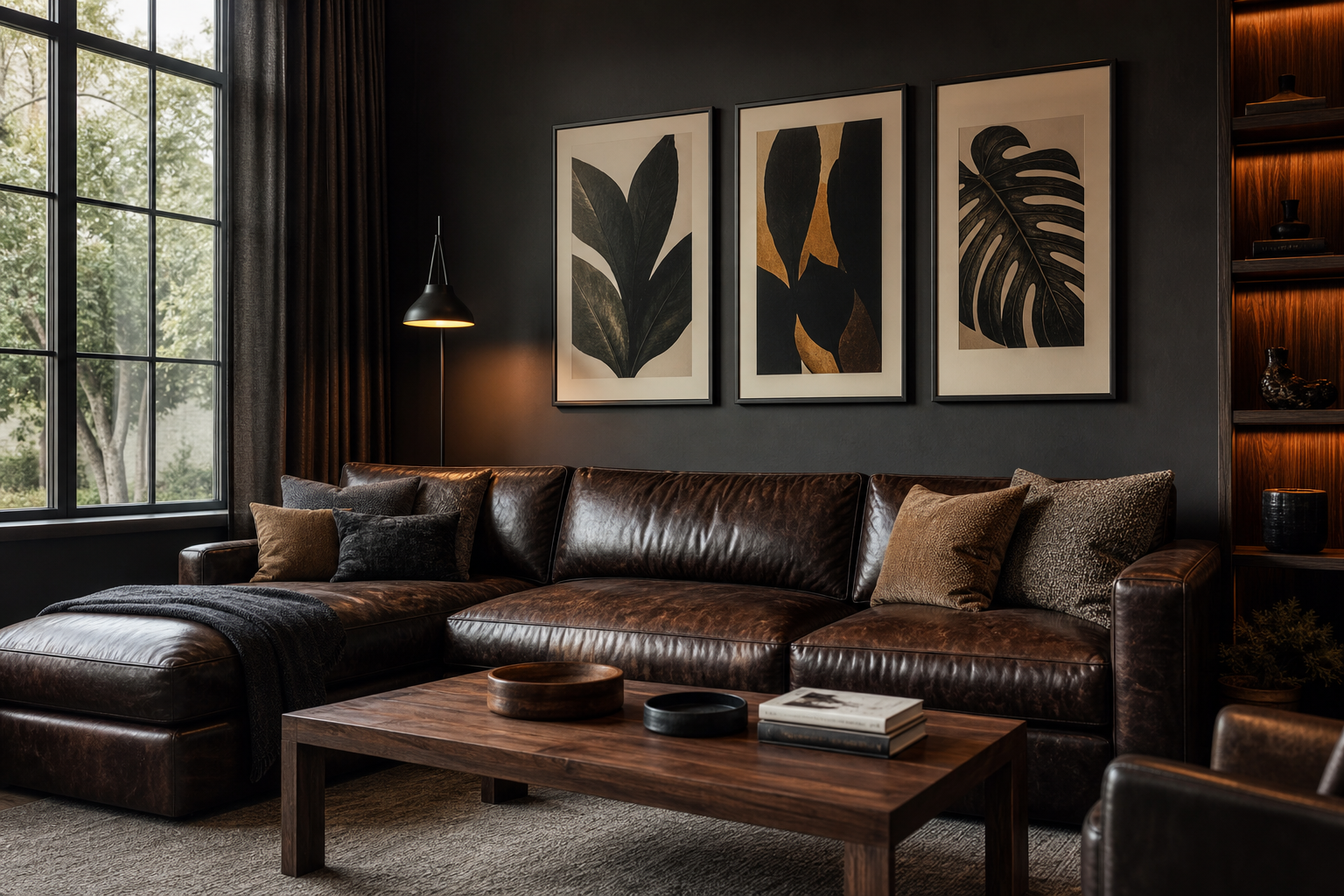
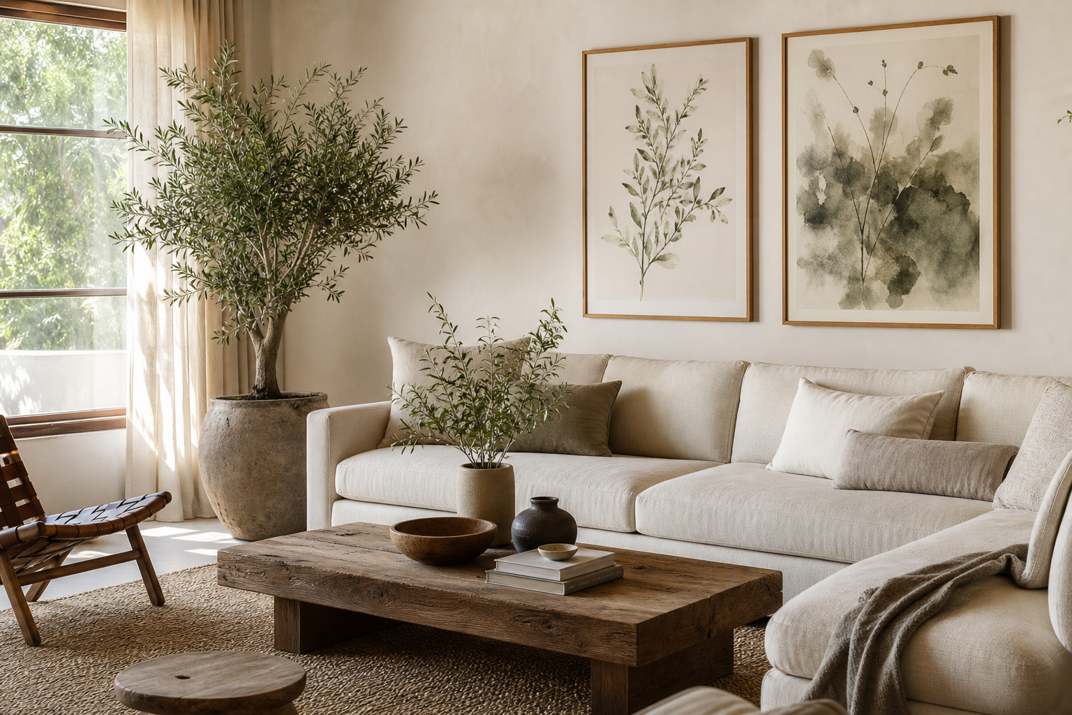
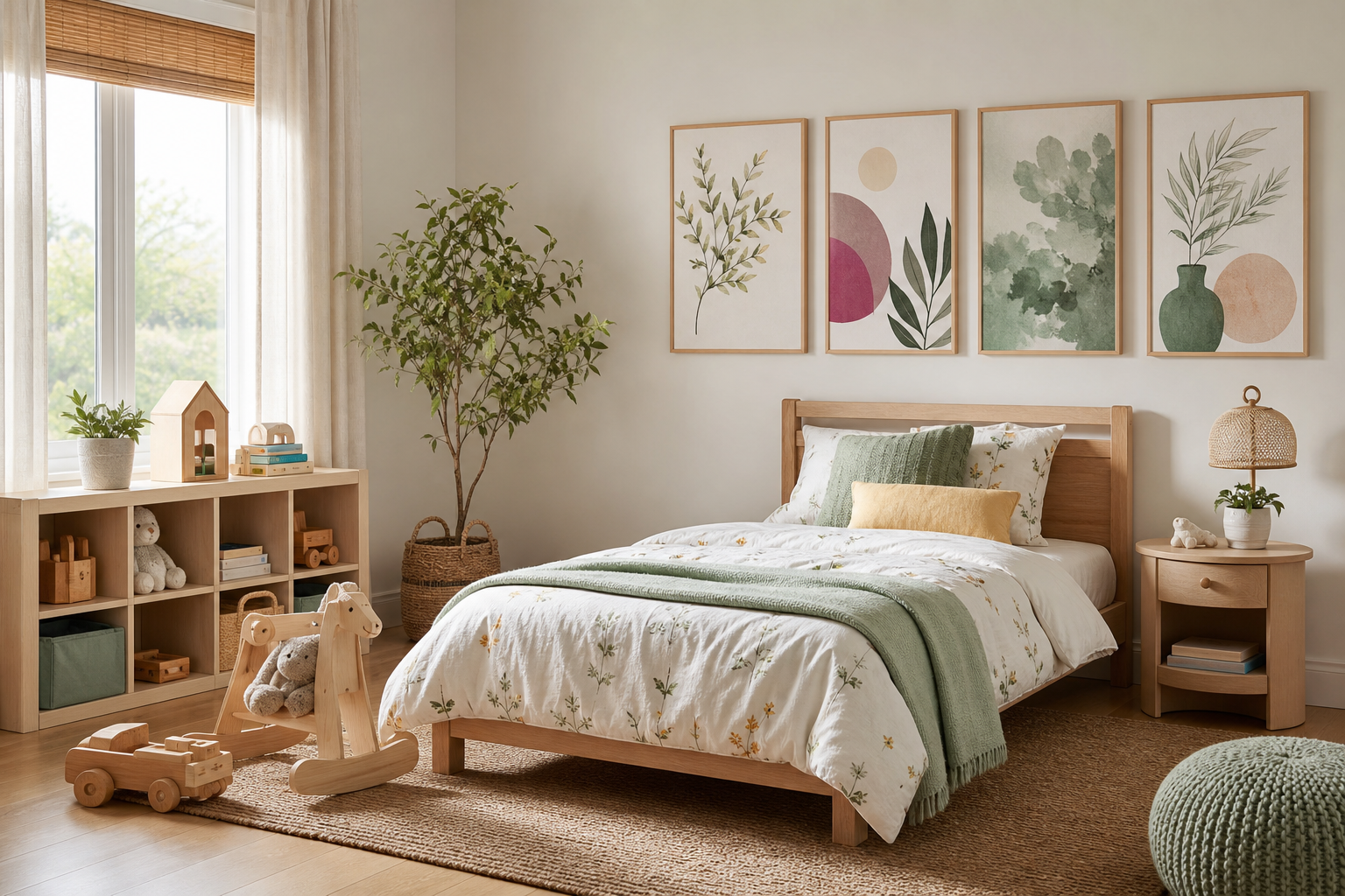
Why Posters Work So Well in Bedrooms
Bedrooms need visual interest, but they also need restraint. That is why posters for bedroom spaces work so well: they add identity without taking up floor space, and they can shift the mood of the room faster than a new bedframe or paint colour. A well-chosen print above the bed, dresser, or reading chair can make the room feel finished in under 10 minutes.
Unlike heavy decor pieces, wall art is easy to update as your style changes. If your room moves from crisp and minimal to softer and more romantic, you can swap artwork while keeping the same furniture. This flexibility matters in bedrooms, where textiles, lighting, and wall colour often evolve seasonally. If you prefer quiet styling, start with our Minimalist collection or browse Fine Art prints for softer bedrooms for pieces that add detail without visual noise.
A bedroom also gives art more intimacy than a living room does. People spend hours there at close range, so subtle textures, low-contrast palettes, and slower imagery tend to work better than loud graphics. That is why posters for bedroom walls usually look best when they support the room rather than compete with it.

Choosing the Right Mood for Your Room
The first choice is not size or frame. It is mood. If you want the room to feel calm, look for low-saturation imagery: soft landscapes, white textures, muted botanicals, or watercolour forms. A piece like Window with Sheer Curtain works because it echoes the softness already found in bedding, curtains, and diffused light.

For a minimalist bedroom, stick to one of three directions: tonal texture, single-object composition, or spare landscape. Pieces from our Abstract collection and Minimalist wall art often succeed because they leave breathing room on the wall. Elegant White Fabric is a good example of art that adds movement without adding clutter.
If you want a romantic bedroom, avoid cliché red accents and choose warmth instead. Dusty blush, faded peach, cream, and dusk tones feel more mature. A subtle piece from our Love Romantic selection can soften a neutral room without making it look themed.
Creative bedrooms can take more contrast, but keep it controlled. One expressive print near a desk or vanity is often enough. A bedroom should still support rest, so it helps to limit bold colour to 15 to 20 percent of the visual field and let the other 80 percent stay calm.
Best Sizes and Placements for Bedroom Walls
Scale is where most bedroom walls go wrong. Art above a bed should usually span 50 to 75 percent of the headboard width. For a 160 cm queen bed, that means a total art width of roughly 80 to 120 cm. If you hang a single small frame in the middle of a wide bed wall, it will look disconnected. If you overfill the wall edge to edge, the room starts to feel busy.
Above the headboard, keep the bottom of the frame or arrangement 15 to 25 cm above the bed. Above a dresser, leave 10 to 20 cm. For a narrow nook, such as the wall beside a wardrobe or a corner reading chair, one vertical piece often works better than a gallery grouping because it elongates the space.




For a small bedroom, try one medium statement piece rather than several small ones. A 50 x 70 cm or 60 x 80 cm print can anchor the room more effectively than four scattered A4 frames. If your room includes a desk, keep the art there lighter and cleaner than office decor would be. Bedrooms benefit from softer subject matter, such as Serene Landscape or Blush Watercolor Abstract, instead of high-energy graphics.
Colour Palettes That Feel Restful
Bedrooms respond best to compressed colour palettes. That means two to four main tones, repeated through art, bedding, curtains, and rugs. Good combinations include warm white with sand and taupe, dusty rose with cream and walnut, or sage with stone and soft black. These schemes feel stable because they avoid harsh jumps in value.
Art can be the bridge between materials that otherwise feel unrelated. If you have white bedding, oak furniture, and a grey rug, a textured neutral print can connect those elements. White Cream Texture does this especially well because it sits between cool and warm tones.

Nature-based blues and greens also work in bedrooms, but they need softness. Think misty forest, muted water, winter light, or washed sky rather than bright tropical colour. Prints from our Nature collection are especially useful if you want the room to feel slower and more grounded. A piece such as Walking in the Misty Forest adds depth without overstimulating the eye.

Framing, Pairing, and Creating a Gallery Wall
A frame changes how bedroom art reads. Oak frames warm up neutral prints, black frames sharpen minimal compositions, and white frames nearly disappear against pale walls. In bedrooms, slimmer profiles usually look better than heavy ornate frames unless the whole room leans classic. A 1.5 to 2 cm frame width is enough for most 30 x 40 cm and 50 x 70 cm prints.
Pairing works best when there is one clear common thread: colour, subject, or composition. You can pair a texture print with a landscape if both share the same tonal range. You can also mix a floral with an abstract if both use muted beige, rust, or sage. What makes a wall feel curated is consistency, not sameness.

A simple gallery wall above a bed often needs only two or three pieces. Keep the total width within that 50 to 75 percent rule, and maintain 5 to 8 cm between frames. If you want more than three pieces, place the arrangement over a dresser or along a side wall instead of the bed wall. Bedrooms look better when the main sleep zone stays visually calm.

Style Ideas for Different Bedroom Types
In shared bedrooms, symmetry helps. Two matching bedside lamps and a centered pair of prints create order quickly. Look for balanced pieces from Abstract wall art or classic options from Fine Art bedroom prints that both people can live with long term.
Small bedrooms need visual lift. Vertical art beside the bed, above a chest of drawers, or between a window and wardrobe can make a tight layout feel taller. Keep the palette light, and choose subjects with openness — sky, mist, fabric texture, or soft negative space. Busy detail shrinks a room faster than dark paint does.
Teen bedrooms can carry more personality, but the best approach is still edited. One bolder print over the desk, one calmer piece near the bed, and maybe a small pair above a shelf is often enough. The mix should feel intentional, not crowded. If the room already has patterned bedding and open shelving, the wall art should be simpler.
For grown-up retreats, lean into materials. Linen bedding, wood, brushed metal, wool, and plaster all pair well with textured or painterly art. Boho bedrooms often benefit from pieces in clay, sand, and botanical tones — our Bohemian collection is useful here, especially if the room includes rattan, woven lighting, or ceramics.
Final Tips for Choosing Posters You’ll Love Long-Term
The safest buy is not the most neutral piece. It is the one that still feels right when the bedding changes. Choose artwork that connects to something more stable: your preferred colours, a landscape you return to, a texture you always wear, or a style of room you naturally create. That is what gives posters for bedroom spaces staying power.
Think in layers. Start with one strong anchor piece, then add a second only if the wall still feels empty. Leave some walls blank. Bedrooms do not need constant decoration; they need rhythm, softness, and a few things worth looking at every day. When you choose posters for bedroom walls with the same care you give to bedding and lighting, the room feels more personal and more complete.
Frequently Asked Questions
What size frame is best for a bedroom nightstand wall?
A 30 x 40 cm frame is usually enough for the wall above or beside a nightstand. In very small rooms, even 21 x 30 cm can work if the piece is vertically oriented and not competing with a large lamp.
Should bedroom art match the bedding exactly?
No. Aim for shared undertones rather than exact colour matches. If your bedding is warm beige, artwork with cream, clay, or muted blush will look more natural than a perfect copy of the same shade.
Is glass or acrylic better for framed bedroom prints?
Acrylic is lighter and safer if you are hanging art above a bed. Glass has a slightly crisper surface, but it is heavier and can reflect more in rooms with bedside lamps.
How do I hang art above a bed without damaging the wall too much?
Use two hooks instead of one for better stability, especially for wider frames. If you rent, lightweight frames with removable hanging strips can work, but always check the weight limit first.
What wall art works best in a dark bedroom?
Choose pieces with lighter values than the wall colour — creams, soft greys, muted landscapes, or pale abstract textures. They create contrast without making the room feel stark.