Why the right poster theme matters in a reading nook
A reading nook works best when it feels separate from the rest of the room, even if it only occupies 1.5 square metres beside a shelf or window. The right reading nook wall art helps create that boundary. Calm imagery, thoughtful colour, and a clear theme tell the eye to slow down. Busy, high-contrast art can energise a hallway or desk area, but in a reading corner it often pulls focus away from the page.
Artwork also sets the emotional tone of the space in seconds. A single nature print can make a nook feel quiet and restorative. A typography piece can make it feel personal and literary. A vintage study-style print can add structure and gravitas. Good reading nook wall art does not need to dominate the wall — it needs to support the ritual of sitting down, opening a book, and staying there for 30 minutes or more.
If your nook sits inside a larger living room or bedroom, use art to give it identity. Pair a reading chair with pieces that differ slightly from the rest of the room — softer palettes, smaller frames, or more intimate subject matter. This is where our minimalist art prints and illustration-led wall art often work well, because they create atmosphere without adding visual noise.
Literary posters that celebrate books and stories
The most obvious choice for a reading corner is literary art, but it works best when it avoids feeling too literal. Instead of covering a wall with oversized text, choose one or two typography-led pieces with elegant spacing, restrained colour, and enough negative space to breathe. A quote print or monogram can feel refined when framed in oak, walnut, or thin black metal.
For a more narrative approach, look for art that depicts the act of reading itself. Illustrations of quiet figures, books in hand, immediately reinforce the mood of the nook without becoming gimmicky. They are especially effective in small spaces where one focal piece needs to do most of the work.
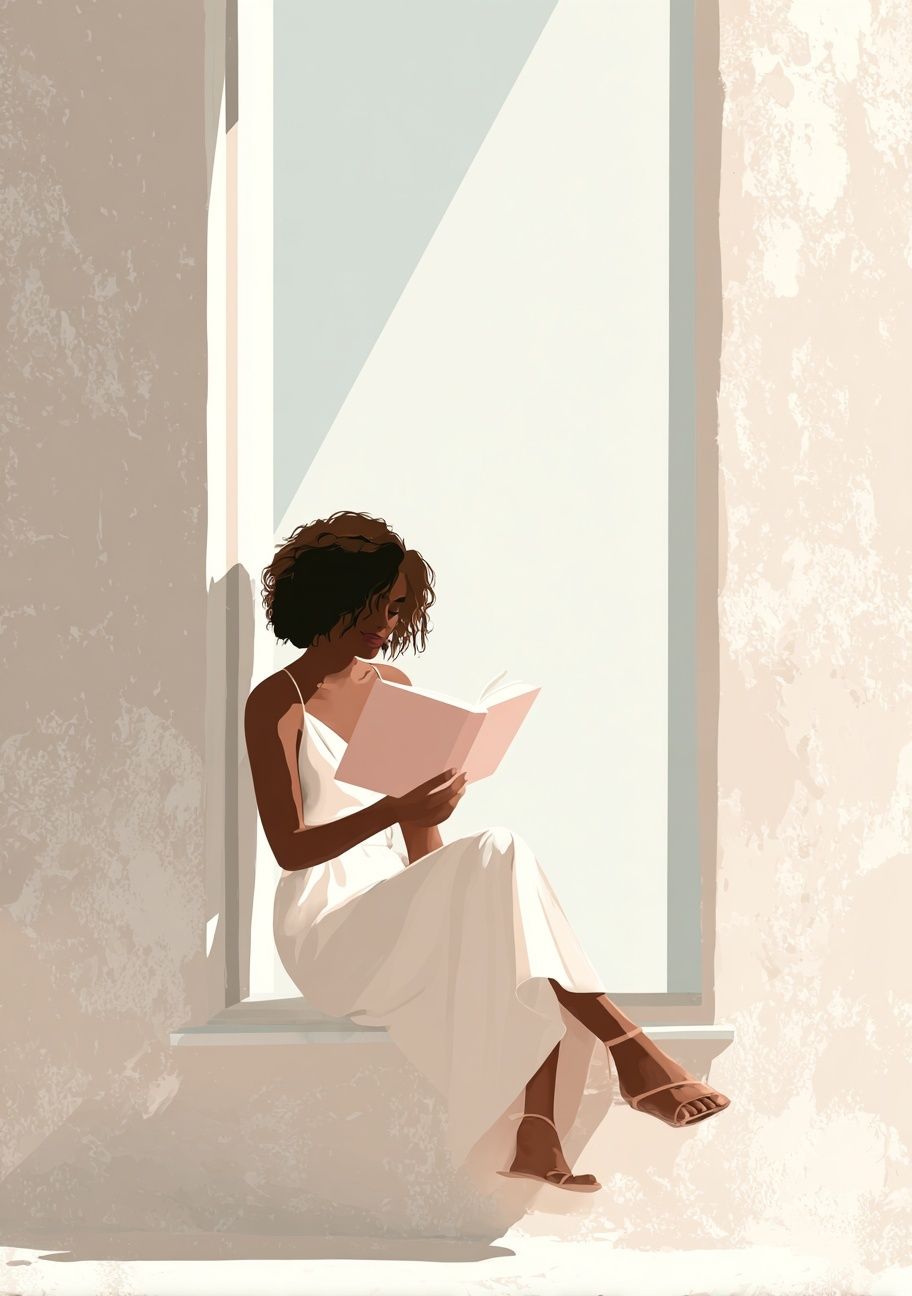
"Woman Reading in Sunlight" suits a chair-and-lamp setup particularly well because the composition already suggests stillness and warm indoor light. If your reading corner gets morning sun, this kind of piece will echo the room's natural rhythm. For softer, more text-forward styling, you can also explore our typography collection or use a refined statement piece like the Ornate Monogram Typography Poster above a small shelf or book stack.

Typography should stay proportional to the nook. For a wall area around 90 to 120 cm wide, one 40 x 50 cm frame is often enough. If you want two pieces, try two 30 x 40 cm frames with 5 to 7 cm spacing. That gap matters — it keeps the arrangement calm rather than crowded.
Nature-inspired themes for a calm, inviting feel
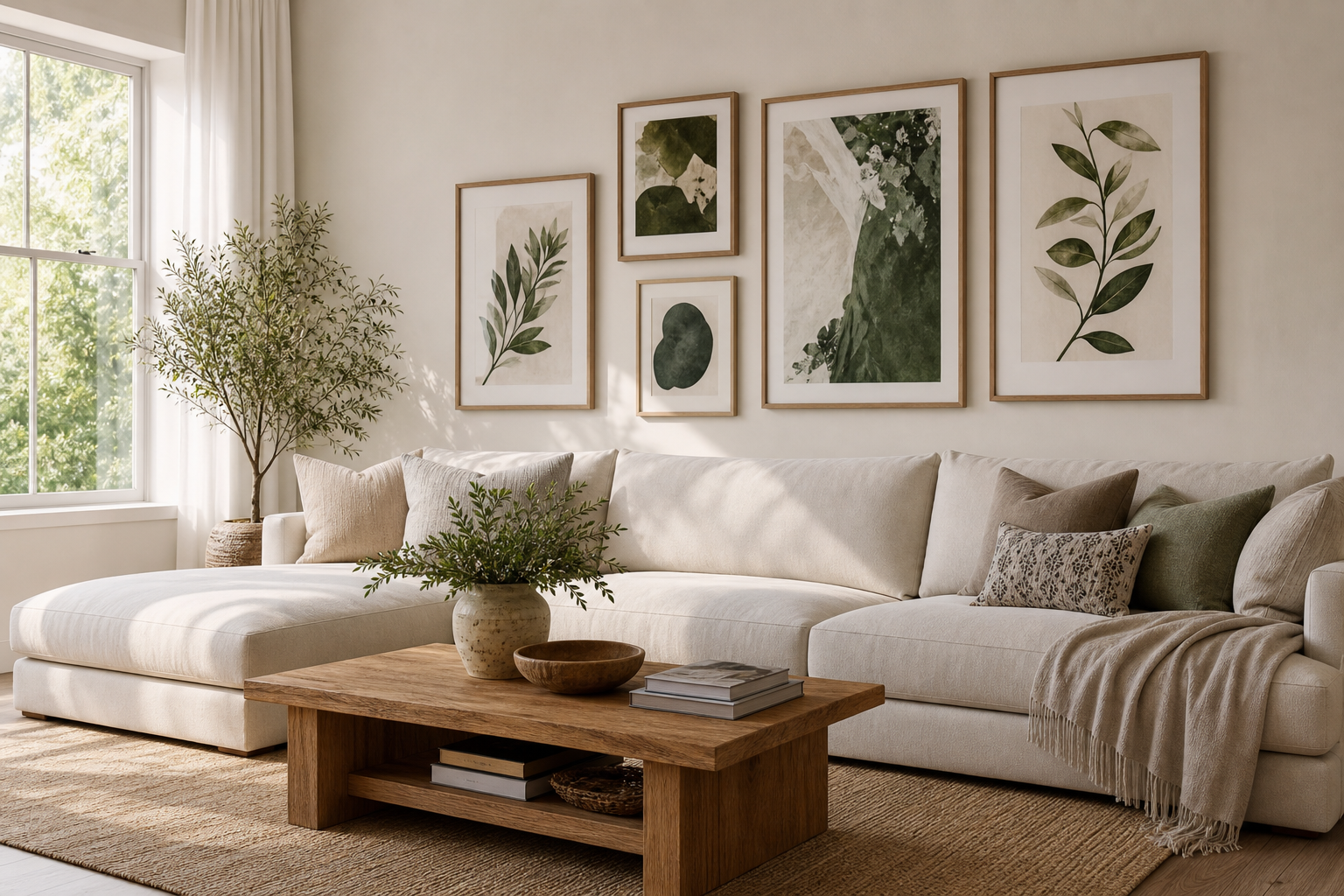
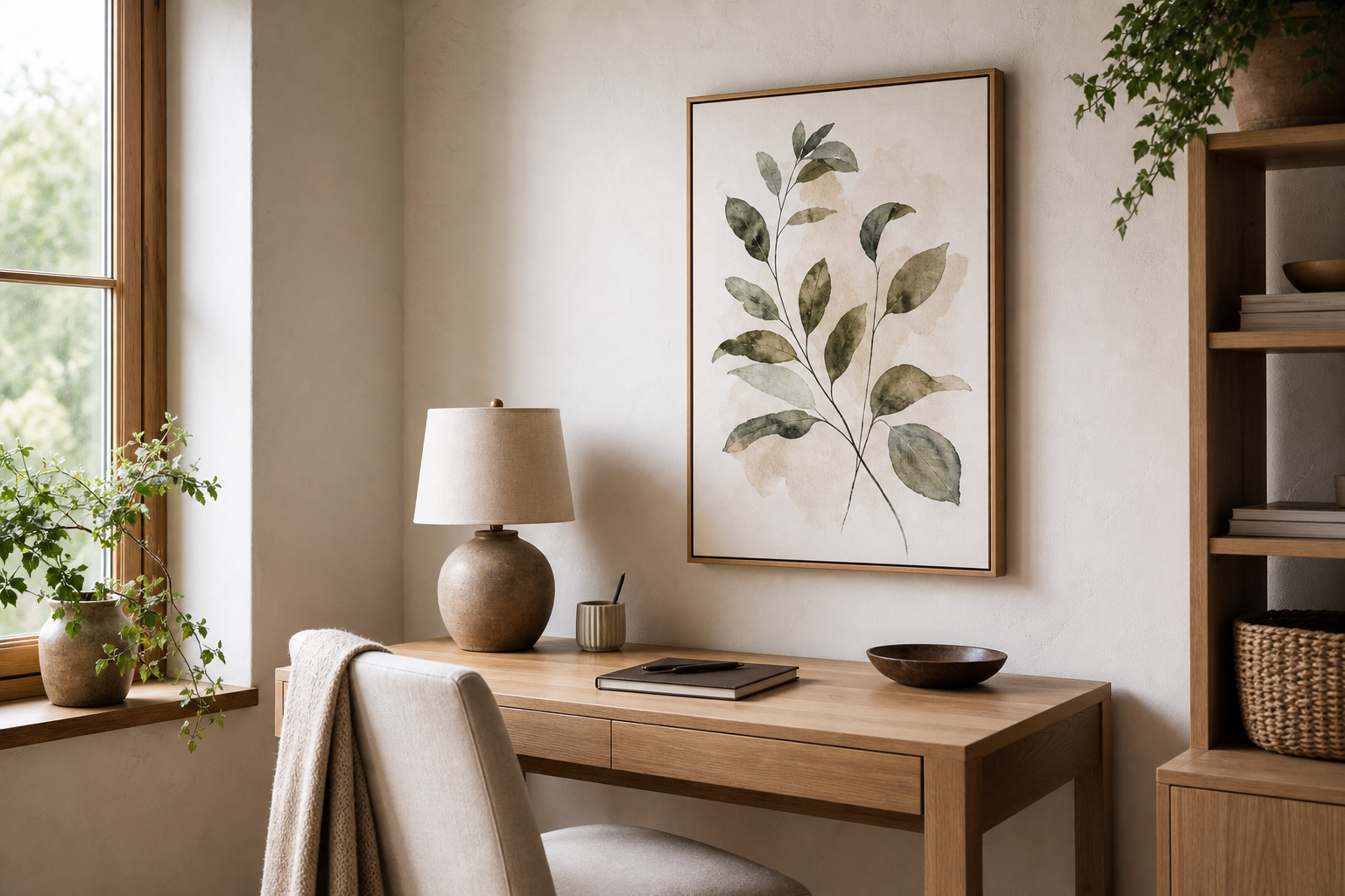
Nature themes are among the easiest ways to make a reading corner feel restful. Botanical silhouettes, gentle landscapes, sunrises, branches, and sky-based imagery all reduce the visual temperature of the space. In practical terms, that means fewer hard lines, fewer competing details, and more room for the eye to settle between paragraphs.
Minimal floral and landscape pieces work especially well in nooks with textured materials such as boucle, linen, jute, or light wood. They bring softness without adding clutter. If your chair fabric is patterned, choose simpler art. If your upholstery is plain, you can introduce a little more movement through organic shapes or layered brushwork.

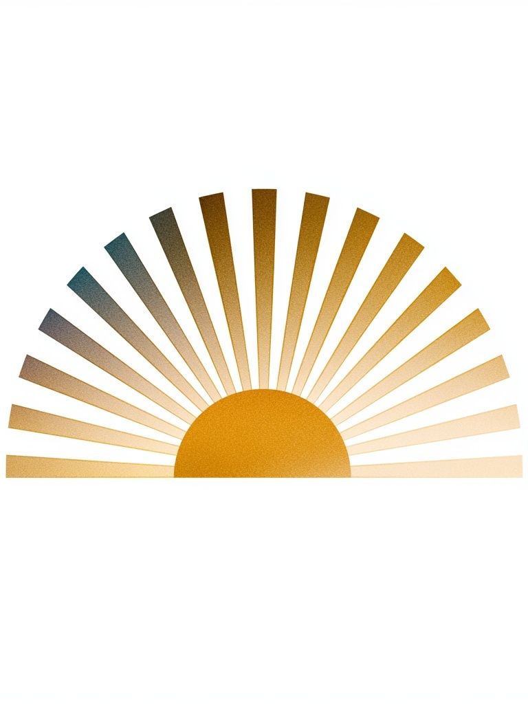
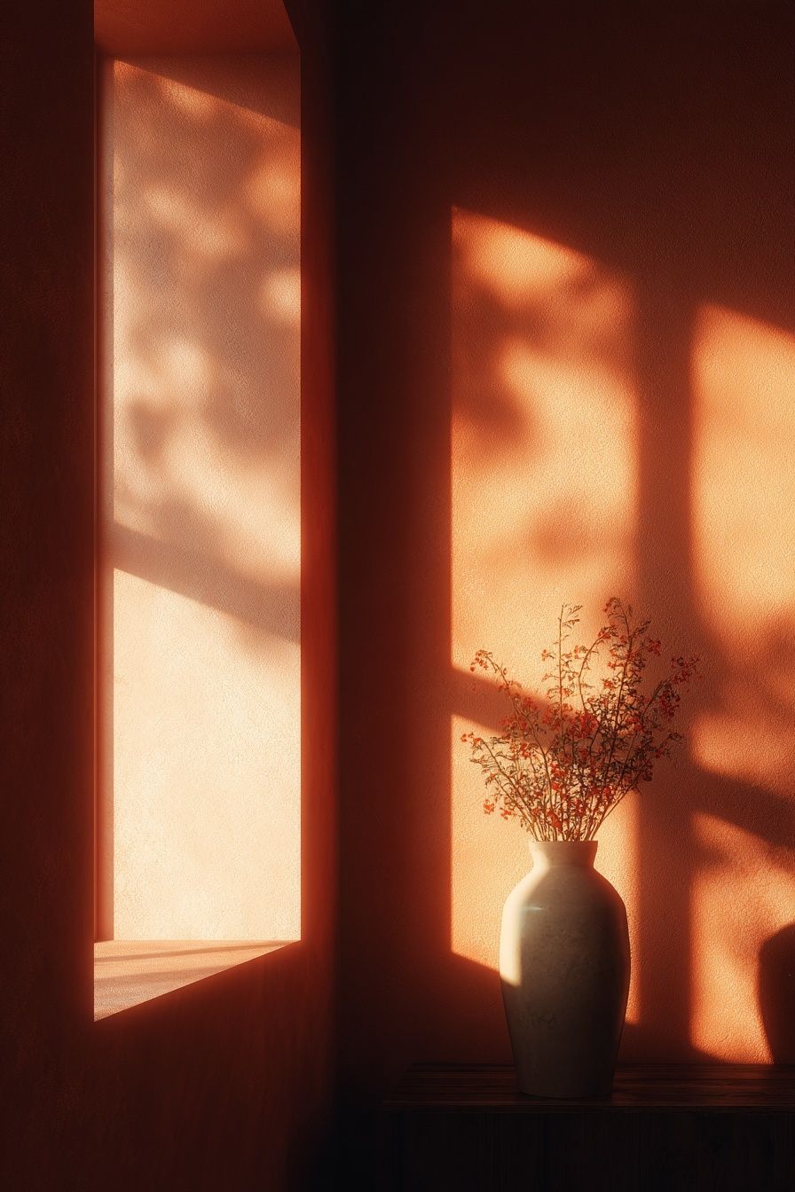

For readers who want a very quiet backdrop, White Flower Silhouette or Golden Sunrise Minimalist Poster are easy choices. They carry enough presence for a reading wall without competing with books, lamp shapes, or shelf styling. If you prefer a little more texture, our bohemian collection adds warmth through earthy surfaces and looser forms.
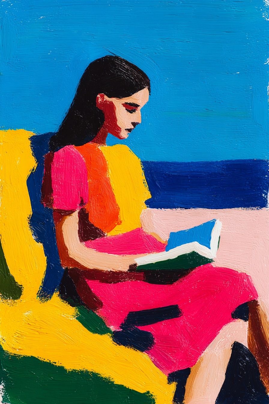
A reading figure placed in an outdoor setting can also open up a small nook visually. "Woman Reading by the Sea" is useful in windowless corners or deep alcoves, where the scene adds a sense of distance and air.
Vintage, classic, and scholarly styles
If you want your nook to feel like a private library rather than a casual corner, vintage and archival-style art is the strongest route. Old scientific diagrams, aeronautical studies, portraits, and antique-inspired prints all bring structure and intellect to the wall. These themes work particularly well with dark wood shelves, leather or faux-leather seating, brass task lamps, and heavier textiles such as velvet or wool.

The key is restraint. One 50 x 70 cm scholarly print above a reading chair often feels more convincing than a large cluster. Vintage themes already carry visual detail, so they do not need help. Pieces like our vintage wall art are most effective when paired with simple mats and traditional frame finishes — dark walnut, black, or antique gold.
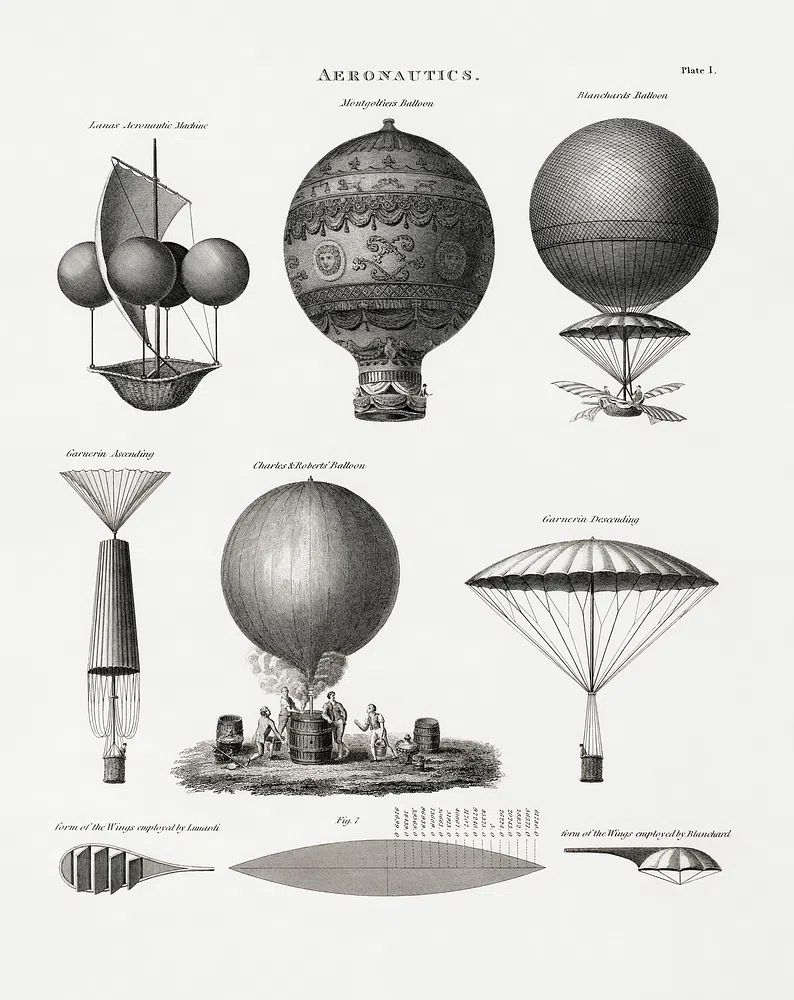
An aeronautics print gives a library corner an instantly collected feel, especially in studies or shared living rooms where you want the reading area to feel mature rather than decorative. If you like a softer take on the same idea, Ethereal Woman with Pot brings age and elegance without the technical feel of archival diagrams.
Choosing colours, sizes, and framing
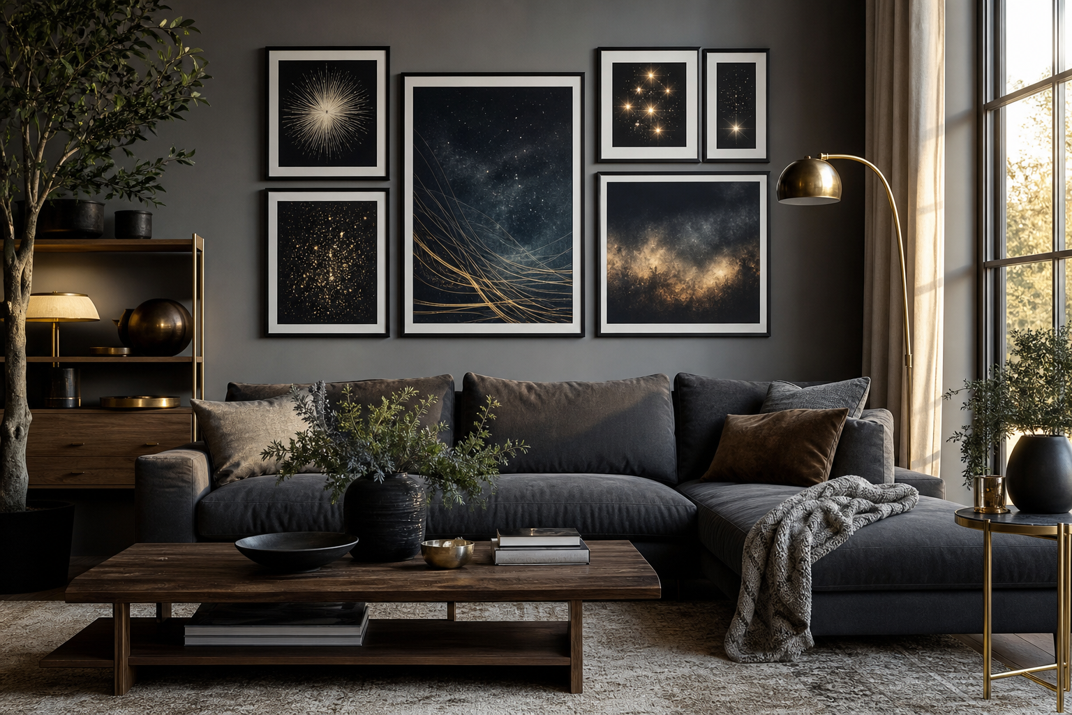
Colour should follow the seating and lighting first, not the other way around. If your nook has warm light bulbs around 2700K and oak or walnut furniture, cream, moss, rust, muted blue, and charcoal usually sit comfortably. If the space is cooler — grey upholstery, black shelving, north-facing light — try off-white, soft taupe, faded green, or monochrome line work to avoid a flat look.
Scale is where many small nooks go wrong. Art that is too small looks incidental; art that is too large presses down on the chair. A reliable rule is to keep the total width of the arrangement at roughly 60 to 75% of the furniture beneath it. Above a 70 cm-wide armchair, aim for artwork spanning about 42 to 52 cm. Above a compact bench or daybed, 70 to 100 cm total width usually feels balanced.
Frames should simplify the composition. Thin black metal sharpens modern nooks. Oak softens Scandinavian or airy interiors. Walnut deepens classic spaces. White frames can work, but only when the wall colour is not also bright white — otherwise the art risks disappearing. For quiet corners, matting is often worth it. A 4 to 6 cm mat can make a modest 30 x 40 cm piece feel more substantial and gallery-like.
How to build a small gallery wall without crowding the space
A reading nook gallery wall should be smaller and looser than a main living-room arrangement. The goal is intimacy, not impact. The easiest format is a vertical pair: two 30 x 40 cm frames stacked with 6 to 8 cm between them. This layout works beautifully beside tall shelving because it echoes the upright lines of books.

Another dependable option is a three-piece row above a narrow bench, using three 30 x 40 cm frames with 5 cm gaps. Keep one theme consistent — all botanical, all vintage, or all typography-led — and vary only the image content. Mixing too many subjects in a confined zone makes the nook feel busier than the rest of the room.
If you want contrast, pair one detailed piece with one quieter work. For example, a vintage diagram beside a minimalist floral creates tension without clutter. You can also borrow balance from mindfulness-inspired wall art when you need the arrangement to feel calmer. Pieces with water, branches, or meditative silhouettes are often useful visual pauses between busier prints.
Final touches and styling tips for a cozy library corner
The best reading nooks feel layered, but the layers should stay functional. Add one throw, one cushion, one lamp, and one small surface for a mug or current book. Then place the artwork at seated eye level whenever possible — typically with the centre of the frame around 145 cm from the floor, or slightly lower if the nook is tucked under shelving. In compact corners, off-centre placement often looks better than forcing everything into a symmetrical composition.
If shelves already fill the wall, use art in the gaps rather than above the entire setup. A single framed piece leaning on a shelf can work, but hanging it 10 to 15 cm above the shelf line usually looks more intentional. For softer, textured styling, consider pieces from Ceramic Vases with Dried Branches or a subtle textural print like Woven Bamboo Texture Poster to bring warmth without stealing attention from the books.
Putting it together
The strongest reading nook wall art supports concentration, comfort, and personality at the same time. Literary illustrations, restrained typography, nature themes, and vintage scholarly prints all work — but each creates a different kind of retreat. Choose the one that matches how you want the corner to feel when you sit down.
Start with one piece, size it properly, and let the wall breathe. A reading nook does not need many elements to feel finished. It needs the right ones.
Frequently Asked Questions
What frame size works best for a very small reading nook?
For tight corners, start with 30 x 40 cm or 40 x 50 cm. Those sizes add presence without overwhelming a chair, lamp, and shelf arrangement.
Should reading nook art match the rest of the room exactly?
No. It should relate through one or two shared colours, but the nook can have a slightly softer or more personal theme to create separation.
Are glass frames practical in a reading corner?
Yes, especially in low-traffic areas. If the nook gets strong daylight, choose reduced-glare glazing so reflections from windows or lamps do not interrupt the artwork.
How high should I hang art above a reading chair?
Leave about 15 to 25 cm between the top of the chair and the bottom of the frame. That keeps the art visually connected to the seating.
What pairs well with dark bookshelves?
Vintage prints, muted botanicals, and off-white typography pieces work especially well. They lighten the wall visually without fighting the depth of the shelving.