The appeal of poster stars is simple: they bring energy to a wall without making a room feel busy. A strong print can anchor a sofa, sharpen a hallway, or give a home office a clearer identity in under 10 minutes of styling. The best results come from choosing artwork with one clear job — add colour, introduce contrast, or create a focal point — rather than asking one wall to do all three at once.
Poster Stars works especially well in interiors that already have a clean base. Neutral walls, oak furniture, black metal lighting, and textured fabrics give art room to stand out. If you like sharp silhouettes, bold colour fields, or modern line-driven compositions, start with our abstract collection and minimalist art prints — both are easy to mix into modern spaces without overcrowding the room.
What Makes Poster Stars Stand Out
Poster stars stand out when the artwork has enough visual weight to hold attention from 2 to 3 metres away. That usually means one of three things: high contrast, a clear central form, or a memorable colour accent. In practical terms, a large abstract in black and cream will read faster across a room than a print with six similar mid-tones.
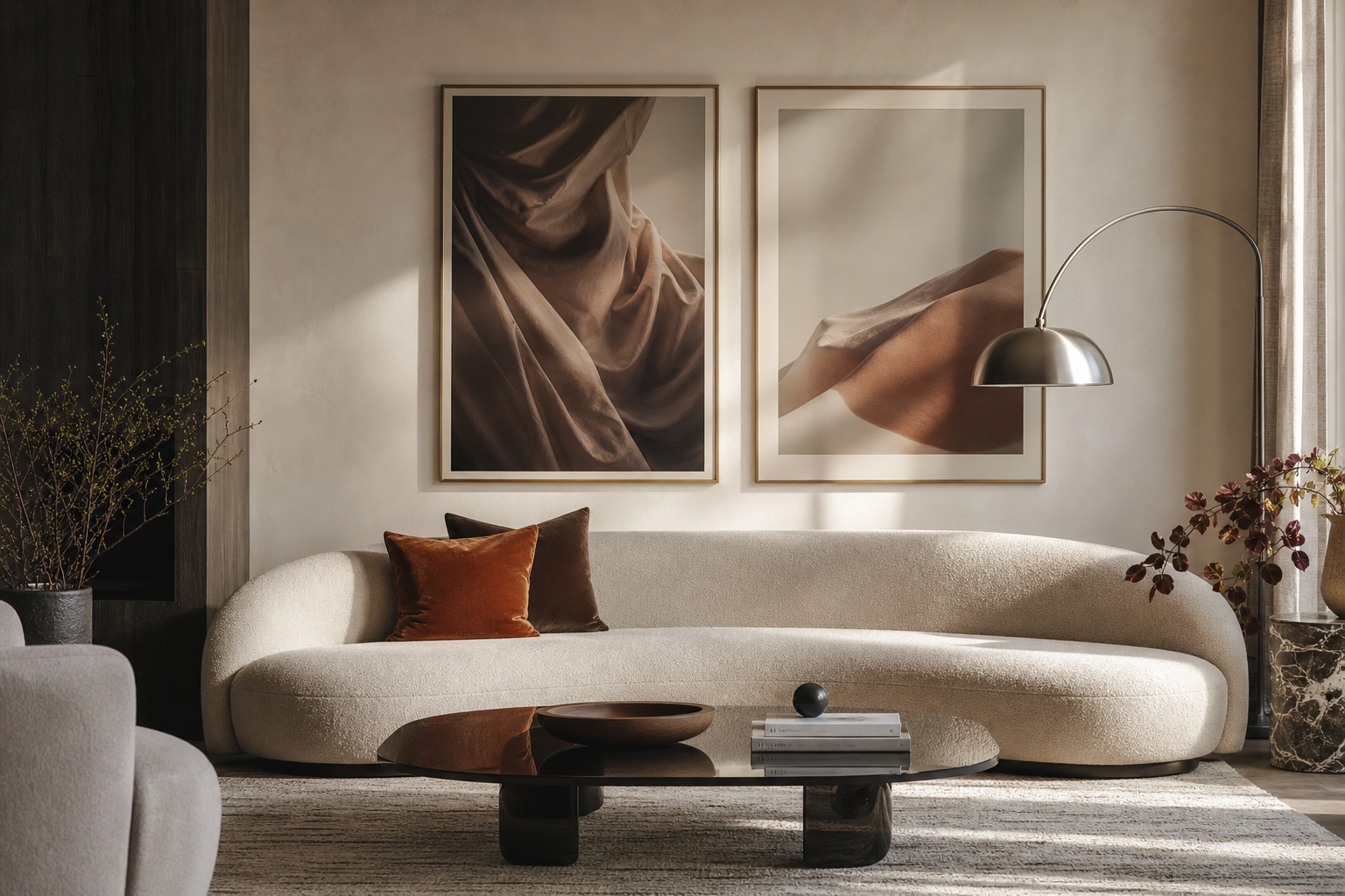
If you want a piece that acts as a true focal point, choose artwork with movement or radiating forms. A design like this works well above a 180 to 220 cm sofa, where the wall needs a centre of gravity.

Artwork with celestial or luminous imagery also suits rooms that need atmosphere rather than decoration alone. In a dim corner, near a reading chair, or above a desk, star-inspired prints can make the space feel more intentional. For a bolder direction, Celestial Starship brings a sci-fi edge, while the broader illustration collection is better if you want more playful or narrative imagery.
Choosing the Right Poster for Your Space
A good rule is to size art at 60 to 75% of the width of the furniture below it. Over a 200 cm sofa, that means a single large piece around 120 to 150 cm wide, or a grouped arrangement filling a similar span. Over a 140 cm bed, aim for 84 to 105 cm. In narrow hallways, one vertical piece around 50 x 70 cm often looks cleaner than a busy cluster.
Living rooms can handle stronger contrast and larger scale because you usually view them from farther away. Bedrooms need a softer visual rhythm, so muted colour and simpler forms work better. Home offices sit between the two — enough detail to keep the wall interesting, but not so much that it distracts from a screen or desk task.

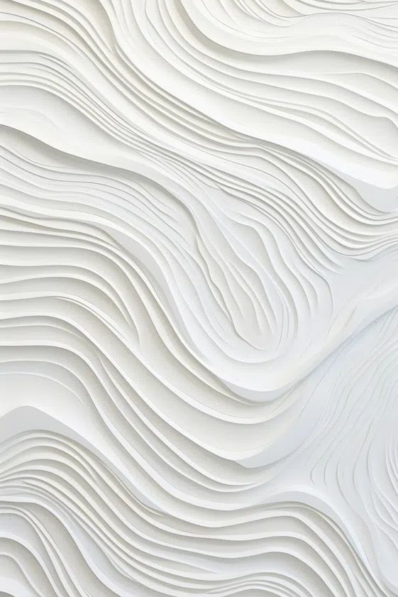
For calm rooms, lean into pale neutrals, restrained texture, and open compositions. Textured White Abstract is a strong fit for Scandinavian-style bedrooms and quiet entryways because it adds depth without demanding saturated colour.

If your room already has muted finishes — beige upholstery, white walls, ash wood, stone — one richer print can keep it from feeling flat. In that case, a piece from our colour-led abstract prints or Neon Forest Under Stars can carry the room with a single controlled burst of colour.
How to Build a Balanced Gallery Wall
A balanced gallery wall starts with one dominant piece and three to six supporting prints. The dominant piece should be about 40% of the total arrangement width. So if your full gallery spans 140 cm, your anchor piece might be 50 to 60 cm wide, with smaller works stepping around it.
Spacing matters more than most people expect. Keep gaps between frames at 5 to 8 cm for a tighter, contemporary look. Increase that to 8 to 10 cm only if you are using larger frames or a more formal layout. Random spacing is what makes gallery walls look unfinished.

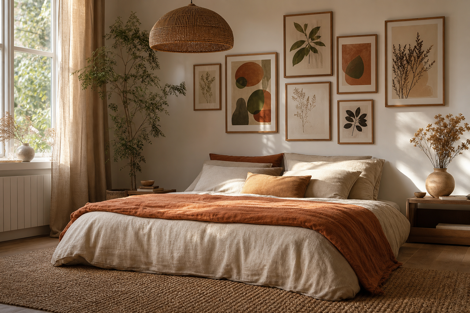
Consistency in at least one element keeps the wall cohesive. Match the frame finish, keep to two colour families, or repeat one subject theme across the grouping. A reliable combination is one high-impact abstract, two minimalist prints, and one illustration with a similar palette.



If you want a gallery wall above a console or desk, hang the centre of the arrangement around 145 cm from the floor. Above furniture, leave 15 to 25 cm between the top edge of the furniture and the bottom of the lowest frame. For more restrained schemes, browse our minimalist wall art; for movement and stronger contrast, the abstract designs category gives you more flexibility.
Framing, Finishes, and the Details That Matter
Frame choice changes the tone of the artwork immediately. Matte black frames make saturated or graphic pieces look sharper. Natural oak frames soften cool-toned prints and work well in rooms with linen, boucle, or pale wood. White frames are useful when you want the art to blend into a light wall instead of reading as a hard outline.
Paper finish matters too. Smooth matte surfaces reduce glare and suit bedrooms, offices, and spaces with direct window light. Slight texture adds depth to soft abstracts and minimal compositions. If you are layering subtle neutrals, texture can do the work that colour is not doing.

For example, a print like White Flower Silhouette benefits from a slim frame and generous mount because negative space is part of the composition. By contrast, more energetic pieces often look stronger with tighter borders and darker frames. If you want a print that bridges subtle texture and movement, our Textured Waves — Abstract Print is a useful middle ground.

Style Ideas for Different Moods and Rooms
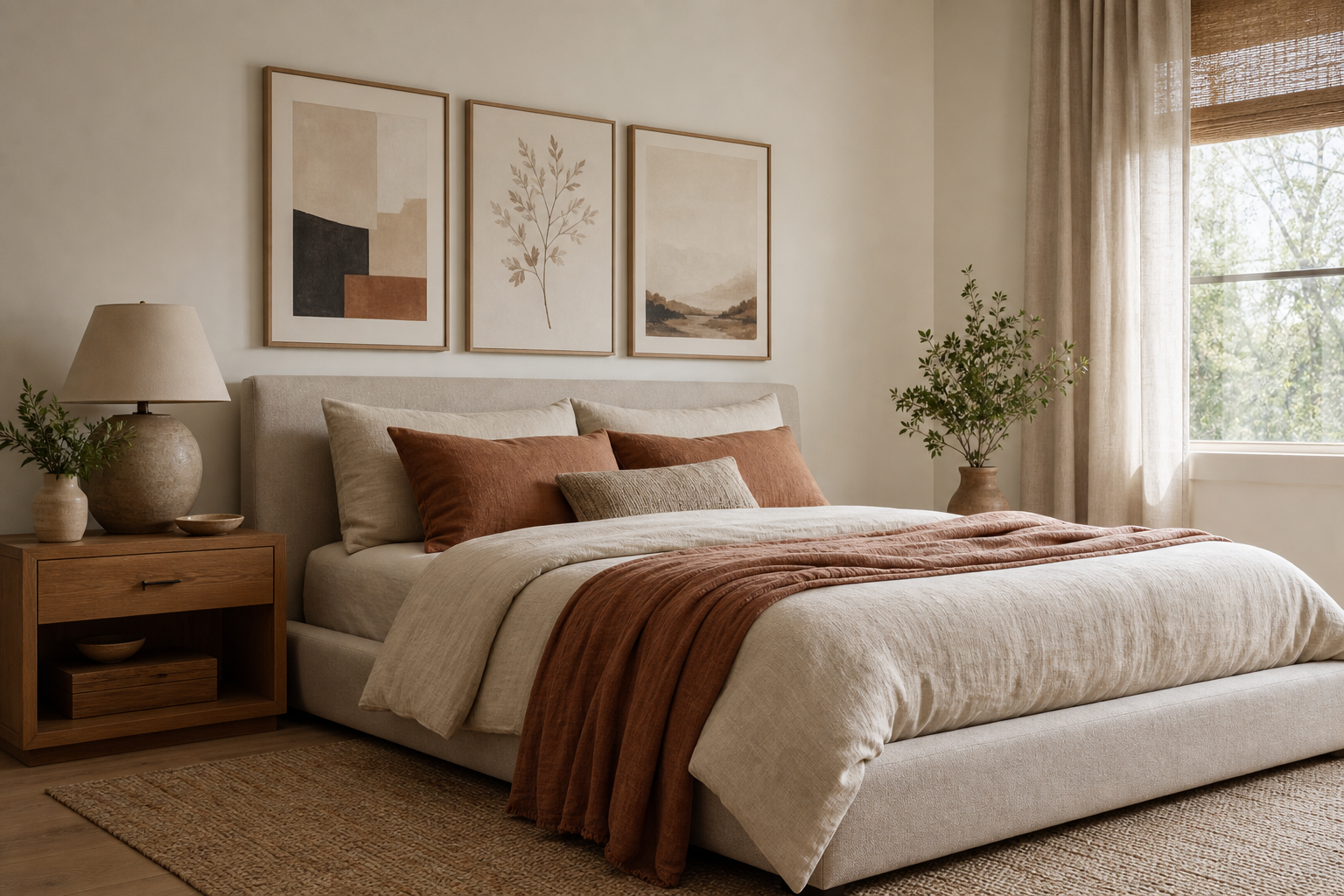
For a calm interior, keep the palette to three main tones — for example warm white, sand, and charcoal — and choose art with soft structure rather than loud colour. Minimalist pieces and pale abstracts work best in bedrooms, reading corners, and tidy guest rooms. A 50 x 70 cm print above a bedside table or a pair of 30 x 40 cm frames over a dresser usually gives enough presence without crowding the wall.
For playful rooms, use one brighter print as the lead piece and repeat one accent colour in cushions, books, or a rug. This works well in creative offices, teen bedrooms, and compact living rooms. Artwork from our illustration wall art category is effective here because it introduces character fast.
For dramatic spaces, raise contrast instead of just adding more colour. Think black frames, deep wall paint, brass or smoked glass finishes, and one luminous print. A moody room can handle bolder imagery such as Colorful Stained Glass Abstract or stronger graphic abstracts without tipping into clutter.

Quick Shop Tips for a Finished Look
Measure first, then shop. Write down the wall width, furniture width, and the maximum art width you want to fill. This avoids the most common mistake: buying a print that looks perfect on screen but undersized in the room. On a blank wall, mark the intended size with painter's tape so you can judge scale from the doorway.
Choose your frame finish before you choose your fourth or fifth print. Once the frame language is clear, building a cohesive set is much easier. If you are mixing categories, keep one visual thread constant — similar background tone, repeated accent colour, or a shared sense of movement.
If you are buying more than one piece, plan the full arrangement before checkout. A set of four usually feels more polished than three mismatched picks bought separately over time. Poster Stars styling works best when each piece has a role: one leads, two support, one softens. That is how poster stars look curated instead of improvised.
Final thoughts
Poster Stars can shape the mood of a room faster than almost any other finishing detail. The difference between "nice wall art" and a room that feels complete usually comes down to scale, spacing, and a clear palette.
Start with the room’s function, choose one strong direction, and build from there. When poster stars are sized well, framed with intent, and placed with clean spacing, the whole interior looks more considered.
Frequently Asked Questions
What frame width works best for modern wall art?
For most modern interiors, a slim frame between 1 and 2 cm wide looks clean and versatile. Go wider only for oversized pieces or more traditional rooms.
Should all the prints in a gallery wall be the same size?
No — mixed sizes usually look better, as long as spacing stays consistent. Use one larger anchor piece and smaller supporting works around it.
Can I hang art on textured walls?
Yes, but use appropriate wall plugs or adhesive systems rated for the frame weight. On heavily textured walls, hardware hanging is usually more secure than strips.
What colours pair best with star-inspired or luminous artwork?
Charcoal, warm white, sand, deep navy, and walnut tones work especially well. These colours let brighter highlights in the artwork stand out without fighting for attention.
How do I style wall art in a small office without making it feel crowded?
Use one medium piece around 50 x 70 cm or a tight pair of smaller frames. Keep the palette limited and leave at least one section of wall blank so the room can breathe.