An 11×14 poster sits in a very useful middle ground. It is larger than a shelf accessory, but small enough to work in apartments, dorm rooms, narrow hallways, and corners that would overwhelm a 24×36 piece. On a wall, 11×14 inches reads as intentional rather than temporary — especially once framed.
It is also one of the easiest formats to shop and style. Ready-made frames are widely available, mats are easy to source, and the footprint works with both vertical and horizontal compositions. If you want wall art that feels considered without needing a major furniture rearrangement, an 11×14 poster from our minimalist collection is a strong place to start.
Why the 11×14 Poster Works So Well
An 11×14 poster works because it solves three common decorating problems at once: scale, budget, and flexibility. In smaller rooms, a single print at this size can fill a visual gap without dominating the wall. In larger rooms, it layers well with mirrors, sconces, shelves, or additional frames. That makes it especially good for renters who may move often and need art that adapts to different floor plans.
Cost matters too. Framing an 11×14 poster is usually far less expensive than custom framing a 20×28 or 24×36 piece, and that changes how willing people are to experiment. You can test a moody abstract print collection in a hallway, or add a quiet fine art print to a bedroom nightstand wall, without committing to a large-format investment.
For styling, the proportions are easy on the eye. Eleven by fourteen has enough surface area for detail, but not so much that weak composition becomes obvious. That is why this size suits everything from photography prints to sparse minimal botanical line work.
Where an 11×14 Poster Fits Best
The best placement for an 11×14 poster is anywhere you need definition rather than drama. Above a desk, it gives the work zone a focal point without cluttering sightlines. Above a bedside table, it adds shape and color while staying lighter than a large over-bed arrangement. In a hallway, it can punctuate a long blank stretch where bigger art would feel too heavy.

Kitchen nooks are another strong match. An 11×14 poster can sit over a breakfast bench, between open shelves, or beside a pantry door where wall width is limited. In living rooms, use it over a narrow console, layered on a mantel, or leaned on a picture ledge with two or three smaller objects.
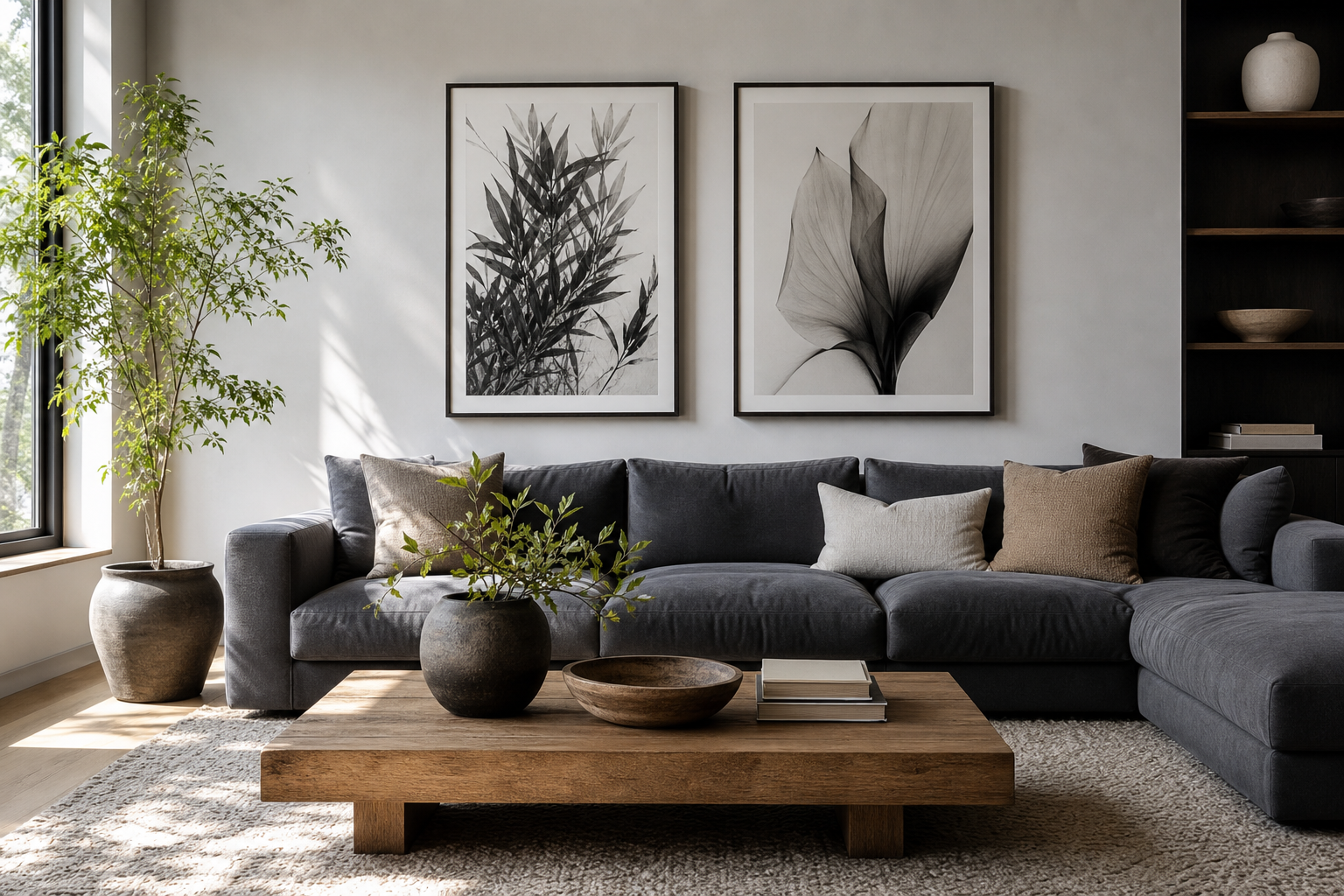
If you want a subject that reads clearly from a few feet away, choose simple forms and contrast. A piece like the minimalist fabric study below works well in compact spots because the composition is calm and legible.

In tighter placements, leave at least 4 to 6 inches between the frame and nearby furniture. That small gap keeps the art from looking squeezed. If the piece sits above a desk or console, aim to hang it so the bottom edge is roughly 6 to 8 inches above the furniture line.
How to Frame an 11×14 Poster
A frame changes the tone of an 11×14 poster more than people expect. Thin black metal gives a crisp, architectural look. Natural oak feels softer and more Scandinavian. White frames blend into pale walls and let the artwork carry more of the contrast. For classic interiors, a narrow walnut frame adds warmth without making a small piece feel formal.
Matting is what makes this size feel elevated. If your print is 11×14, placing it in a larger frame with a mat — for example 16×20 with a 2.5-inch to 3-inch border — gives it more presence. This is especially effective for restrained pieces from our minimalist wall art collection because the extra white space creates breathing room.

Color balance matters. If the artwork is low-contrast — creams, grays, off-whites — choose a frame that adds definition. If the art already has bold color or movement, a simpler frame usually looks better. The 11×14 format responds well to this kind of editing because every border decision is visible.
A textured or tonal print can become much stronger with the right frame treatment.

Styling an 11×14 Poster on Its Own
A single 11×14 poster looks best when you treat it as part of a composition, not as an isolated object. The easiest method is to give it negative space. On a narrow wall, center it and leave at least 8 to 12 inches clear around it if possible. That empty area helps the art feel deliberate rather than undersized.
Hanging height is the other make-or-break detail. Standard gallery height puts the center of the frame around 57 to 60 inches from the floor. If the piece is above furniture, adjust from there so the relationship to the furniture feels connected. Too high, and the frame floats. Too low, and it starts reading like decor sitting on top of the furniture rather than wall art.
For a softer look, lean the frame on a shelf or console and layer it with a vase, a stack of books, or a small lamp. This works especially well with quiet nature-driven imagery such as Zen Garden Stones or understated minimal floral art.
Building a Gallery Wall Around 11×14 Prints
The 11×14 poster is one of the easiest anchors for a gallery wall because it mixes cleanly with both smaller and larger formats. A reliable formula is to combine two or three 11×14 pieces with 8×10 and 16×20 frames. That gives you enough variation to create rhythm without making the wall look chaotic.
Keep spacing consistent. Use 2 to 3 inches between frames for a tight, modern grid, or 3 to 5 inches for a looser salon-style arrangement. Repeating one element — same frame color, same mat width, or one shared palette — is what keeps the layout cohesive. If you are mixing categories, pair a strong photographic or figurative piece with simpler abstract work so the wall has one clear focal point.

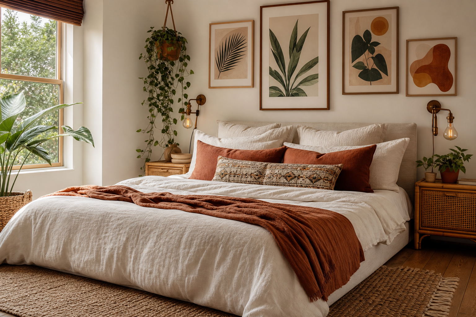
This four-piece mix shows how 11×14-friendly artwork can stay cohesive through color and shape rather than identical subject matter.




If you prefer a cleaner arrangement, build a simple row of three frames over a bed or sofa, each 11×14 and evenly spaced. For a more collected look, offset them with one 16×20 piece at the side. Pieces from our illustration collection or typography art range can work here too, provided the color story stays controlled.
Choosing Art That Suits the Scale
Not every artwork benefits equally from the 11×14 format. This size tends to flatter designs with one strong idea: a single subject, one dominant shape, clear contrast, or a restrained palette. Minimalist studies, cropped photography, impressionist details, and abstract textures usually perform better than very dense scenes with many tiny elements.
That does not mean the art has to be quiet. Bold graphics and saturated color can look excellent in an 11×14 poster because the smaller scale concentrates the impact. A vibrant abstract can energize a study corner, while a softer fine art piece can bring calm to a bedroom wall. The key is readability from 4 to 8 feet away.
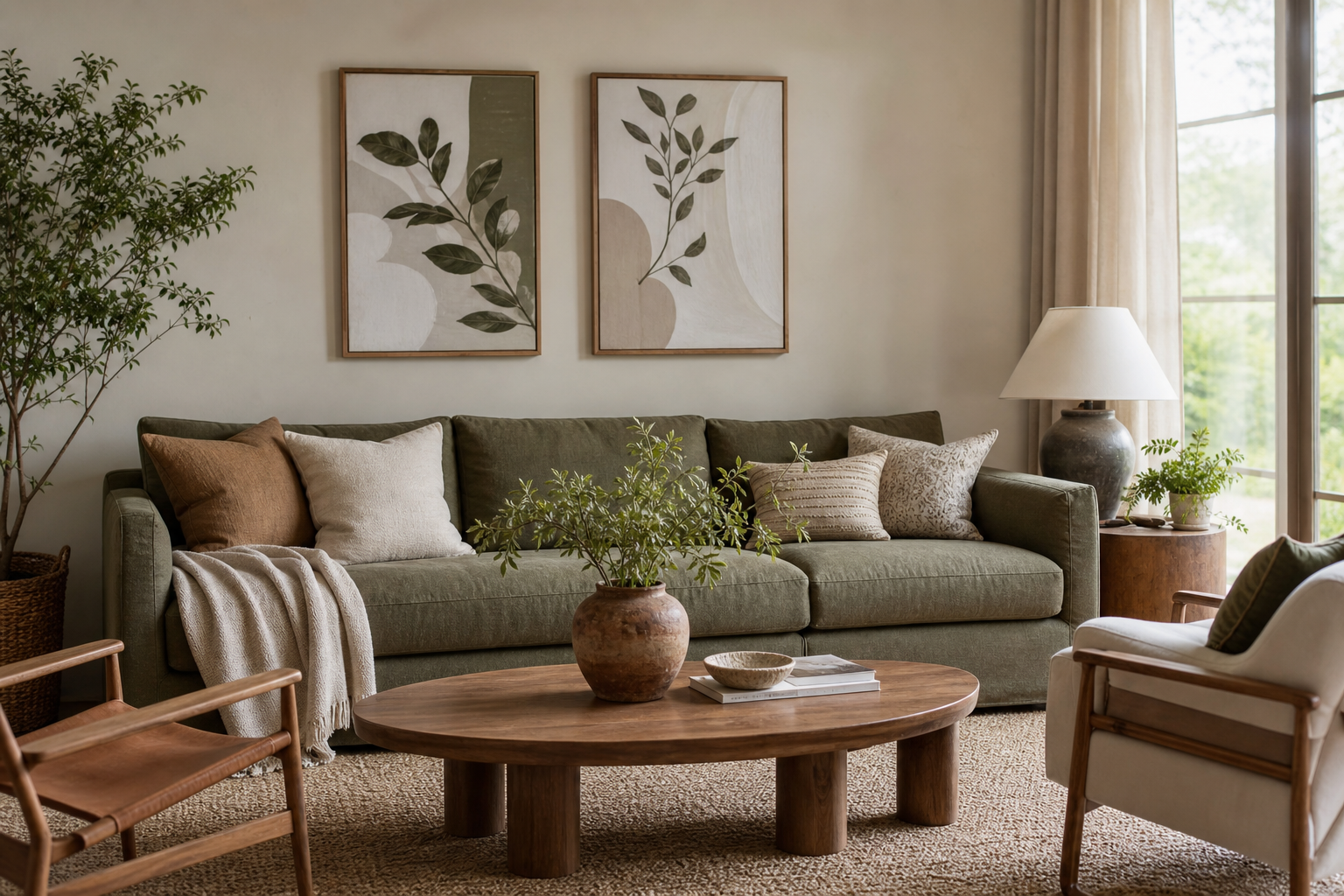
For color-led styling, this piece is useful in rooms that need one clean shot of warmth and movement without overpowering the rest of the decor.

If your room already has patterned textiles, choose art with simpler silhouettes — something from our Colorful Stained Glass Abstract line would suit a more eclectic room, while Woman with a Parasol fits a softer, classic palette. In monochrome rooms, textured neutrals such as concrete-inspired minimalist prints or white textured wall art often look more refined than flat black-and-white graphics.
Final Styling Tips for a Polished Look
An 11×14 poster looks best when the finish choices are consistent. If you are styling more than one frame in a room, repeat either the frame material or the mat style. That repetition can make even mixed art categories feel intentional. Keep frame spacing even, hang with furniture in mind, and avoid filling every gap on the wall just because the size makes it tempting.

Before hanging, tape out the frame dimensions on the wall. Eleven by fourteen can look larger or smaller depending on ceiling height, furniture width, and surrounding decor. That two-minute step prevents most placement mistakes. If you want a finished look fast, start with one framed 11×14 poster, add a mat for extra presence, and build outward only if the room still needs more.
Frequently Asked Questions
Should I choose glass or acrylic for an 11×14 frame?
Acrylic is lighter and safer for rentals, kids' rooms, and gallery walls. Glass gives a slightly sharper finish but is heavier and more fragile.
Can I use an 11×14 poster in a bathroom?
Yes — if the room has good ventilation and the frame is sealed at the back. Avoid hanging it where it will get direct steam or water splashes every day.
What mat width looks best for an 11×14 print?
A 2.5-inch to 3-inch mat usually looks balanced. If you want a more classic, elevated look, go up to a 16×20 outer frame.
How many 11×14 prints should I use over a sofa?
Three is a reliable number for most sofas between 72 and 90 inches wide. Keep the full arrangement around 60% to 75% of the sofa width for proper scale.