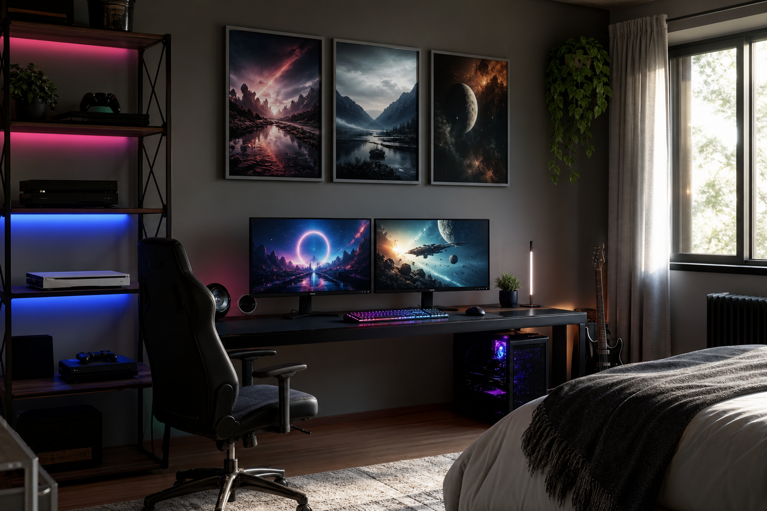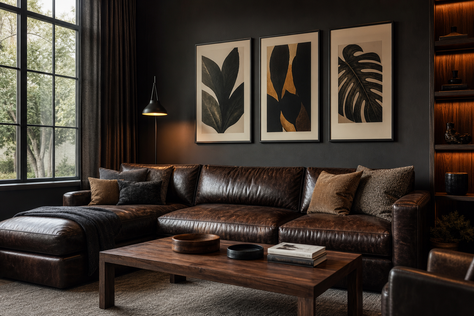
A good man cave poster should say something specific about the person using the room. That usually means starting with real interests — gaming, motorsport, football, old-school Americana, sci-fi, aviation, or clean graphic design — then matching them to the room's finishes. A black media wall, brown leather seating, exposed brick, and metal shelving can handle stronger artwork than a pale guest room. If the room already has plenty of visual weight, choose prints with one dominant subject and a limited palette so the wall feels intentional, not noisy.
What Makes a Great Man Cave Poster
The difference between generic wall art and a memorable man cave poster is relevance. Generic art fills space. Personal art builds identity. If you use the room for late-night gaming sessions, a piece from our gaming art print collection will feel more believable than a random landscape. If the space revolves around a bar cart, vinyl shelf, or vintage speakers, artwork from our vintage print collection often gives the room more depth and age.
A strong choice also supports the mood of the room. High-contrast action scenes create energy. Aged illustrations and heritage imagery slow the room down and make it feel established. Clean graphic pieces from our minimalist art prints work better when the furniture already does the talking. Think of artwork as a 20 to 30 percent contributor to the room's atmosphere — enough to shape the space, but not so much that every wall competes.
Choosing a Style That Fits the Space
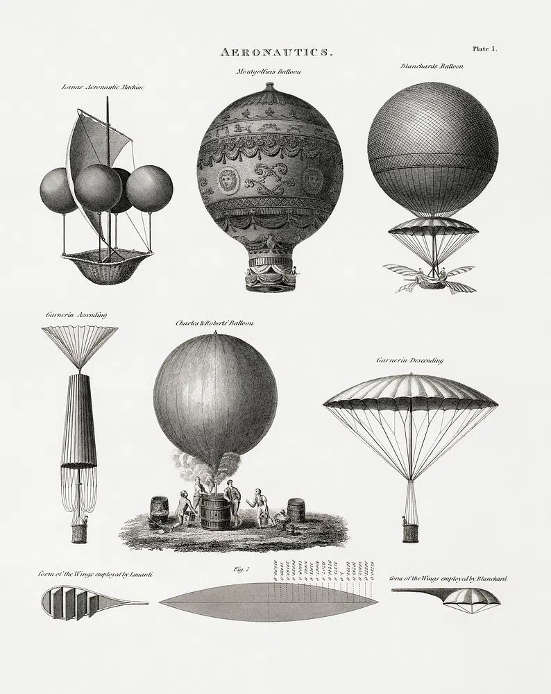
If your man cave leans industrial — black shelving, Edison bulbs, distressed leather, reclaimed wood — vintage or retro imagery usually lands best. Old aviation diagrams, mechanical subjects, and worn color palettes echo the room's materials. The Aeronautics Vintage Print is a good example of artwork that adds character without shouting. It has enough detail to reward a closer look, but it still reads cleanly from across the room.
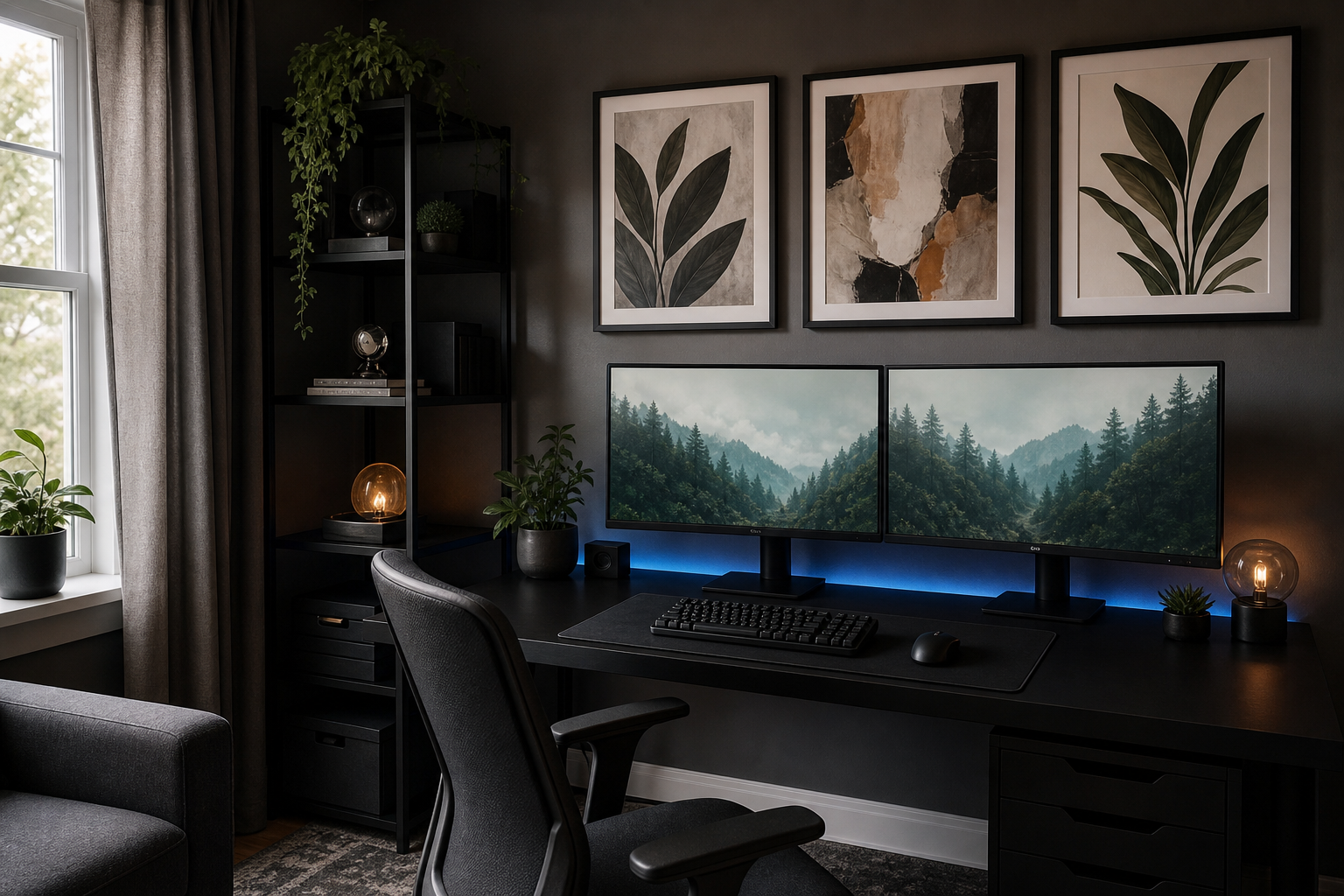
For gaming-led spaces, go with artwork that reflects the setup rather than duplicating it. If you already have RGB lighting, LED panels, and multiple monitors, choose one or two framed prints with cinematic depth or retro nostalgia instead of six loud pieces in the same style. Our Retro Arcade Machines print works well in a game corner with dark shelving and neon accents, while pieces from the broader gaming wall art range suit a more immersive setup.
Sports-themed rooms work best when the art feels curated rather than fan-shop heavy. Action photography, aerial views, and close-crop athletic detail tend to look sharper than overly branded graphics. If your room includes a dart board, mini bar, or large sectional facing a TV, a few polished prints from our sport poster collection can create the right energy without turning the room into a clubhouse.

Picking the Right Size and Format
Scale is where many walls go wrong. Above a sofa, your artwork grouping should cover roughly 60 to 75 percent of the sofa width. For a 210 cm sofa, that means a total arrangement around 126 to 158 cm wide. One oversized man cave poster can work here, but two medium frames or a four-piece grid often feels more balanced if the sofa sits under a large TV or between shelves.
Over a desk or gaming station, keep the width tighter — usually 70 to 110 cm total. That prevents the wall from visually overpowering the setup. In a bar area, narrower vertical prints often perform better than one wide piece because they can sit neatly between cabinets, mirrors, or bottle shelves. On smaller walls, use sets of two or three pieces with 5 to 8 cm spacing so the display reads as one unit.
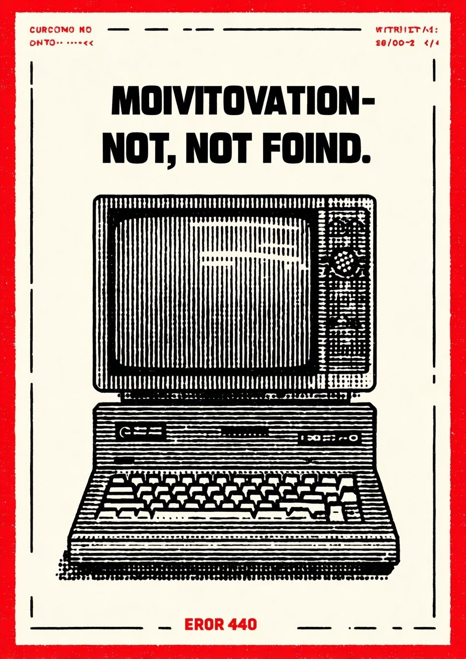
If you want flexibility, start with one anchor piece and add around it over time. A large sports image can lead on one wall, while a smaller humorous or typographic print can support another zone. Typography works especially well near a drinks station, record player, or console shelf because it reads quickly and adds attitude without visual clutter.
Framing and Finishing Touches That Elevate the Look
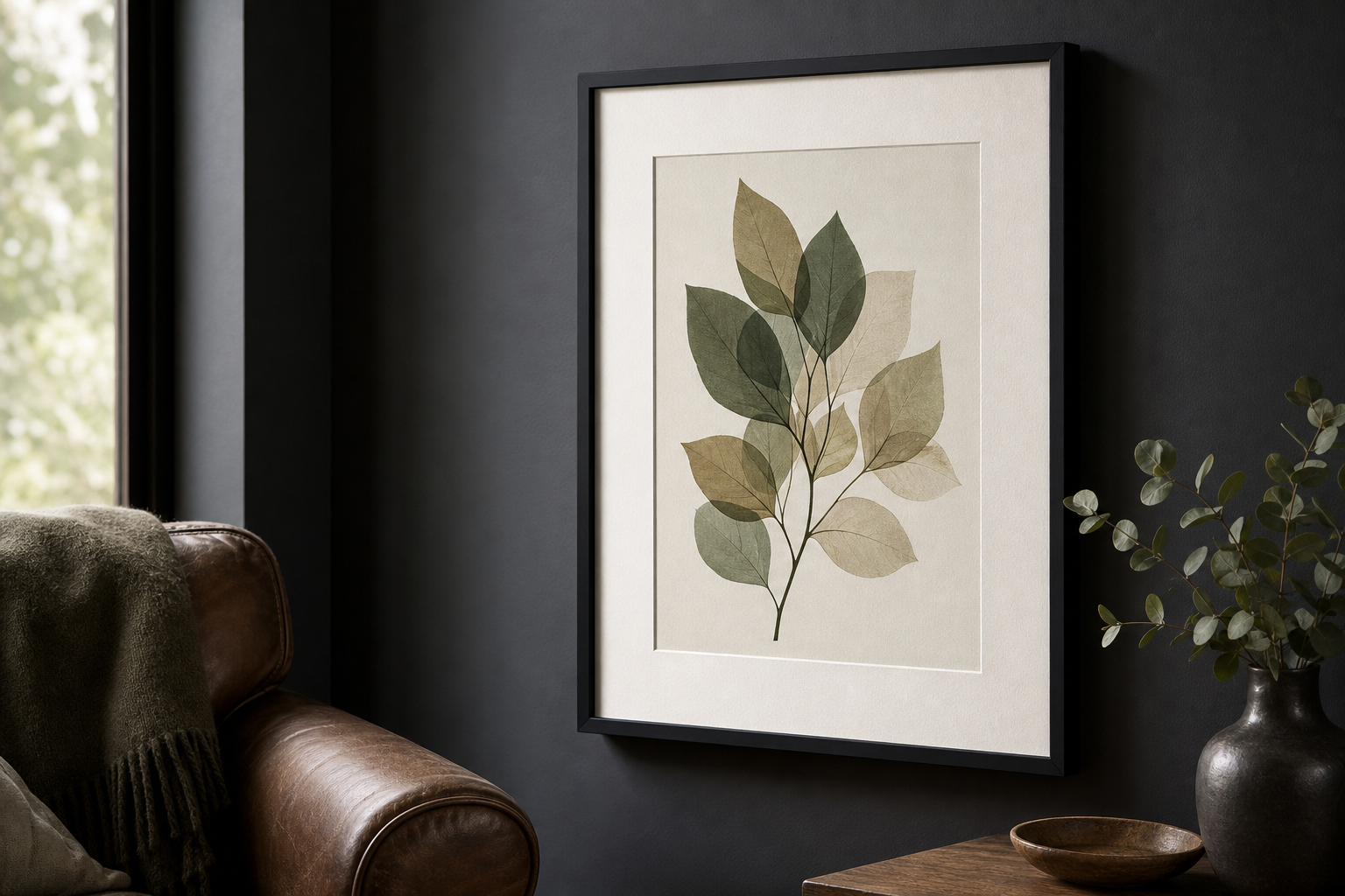
A frame changes the tone more than most people expect. Black frames sharpen sports and gaming artwork. Dark walnut or medium oak warms up vintage prints. Slim metal frames suit industrial interiors, especially with concrete, steel, or smoked glass in the room. If your walls are dark — charcoal, navy, forest green — a thin light mat can give the artwork breathing room and stop it from disappearing into the background.
Poster rails can work in casual rooms, but framed pieces usually look more finished in a man cave. Even affordable prints feel more collected when every frame shares one finish and one profile depth. A consistent 1.5 to 2 cm frame width is enough to create cohesion. If you mix frame colors, do it intentionally — for example, 80 percent black frames and 20 percent wood accents — so the room still feels controlled.
Materials matter too. Matte paper and low-glare glazing are easier to live with in media rooms because overhead lights and screen reflections are already doing enough. In spaces with lamps, neon, or a TV opposite the wall art, glossy surfaces can create distracting hotspots. This is one of the easiest ways to make a modest-budget man cave poster display look more premium.
Best Places to Hang Posters in a Man Cave
The wall above the main seating area is usually the strongest location because it is visible from the entrance and from the primary seat. Hang the center of the arrangement at roughly 145 cm from the floor, then adjust by a few centimeters if the furniture sits unusually high or low. Keep 15 to 25 cm between the top of the sofa and the bottom of the lowest frame so the art feels connected to the furniture.
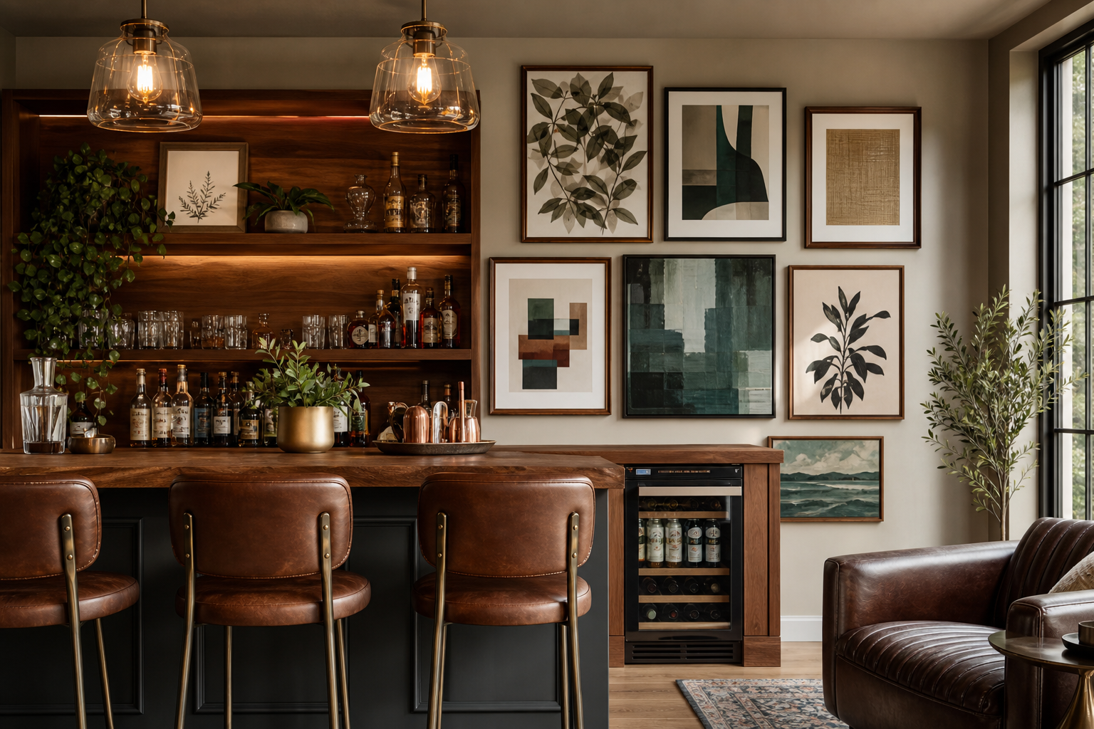
TV walls need more restraint. If the screen is already large, flank it with two narrow vertical prints or keep artwork to the adjacent wall. Around a gaming setup, place art above and slightly beyond the monitor width rather than directly crowding the screens. In a home bar zone, use one statement piece behind the counter or a small row of three aligned frames along the back wall. The aim is to define a zone, not cover every spare patch of plaster.
Humorous pieces can work well in secondary spots — near a mini fridge, dart board, or door — where they act as a quick visual payoff. That is where our funny wall art collection or selective typography from typography posters can add personality without dominating the room.

How to Build a Poster Wall That Feels Collected
A gallery wall looks better when it follows one rule. That rule can be a common color palette, matching frames, a single subject family, or one repeated size like 50x70 cm. Without that structure, the wall tends to feel accidental. A simple formula is one large anchor print, two medium supporting pieces, and one smaller wildcard. That gives you hierarchy without making the arrangement rigid.
Mix subjects with care. Pair a vintage technical print with one sports photograph and one subtle typographic piece, and the room feels layered. Add four different loud action scenes, and the eye has nowhere to rest. Repeat one color across at least two pieces — rust, off-white, deep blue, forest green — so the display holds together. Leave 6 to 10 cm between frames for a relaxed, collected look.
This is also where growth matters. A good man cave poster wall should leave room for additions. Start with four pieces, not ten. Live with them for a few weeks, then add the next one only if it brings a different tone or scale. The result feels assembled over time, which is usually far more convincing than buying a whole wall in one afternoon.
Shop Tips for a Man Cave Poster That Lasts
Buy for the room you want to keep, not the phase you are currently in. Novelty wears off fastest with hyper-specific references and low-quality prints. Broader themes — vintage transport, retro gaming, dramatic sport photography, understated typography — usually last longer because they connect to your interests without depending on a single trend. That is why a carefully chosen man cave poster often ages better than a heavily themed set.
Check three things before buying: paper finish, size options, and whether the artwork can work with at least one future room layout. If you move the piece from above a desk to above a sideboard, it should still make sense. Look for imagery with enough visual contrast to read from 2 to 3 meters away and enough detail to reward a closer view. If a print only works as a joke for one month, it probably does not deserve the frame space.
Final thoughts
A man cave looks best when the artwork reflects how the room is actually used. Match the prints to your habits, keep the scale honest, and frame everything with the same level of care you give the furniture and lighting.
The best man cave poster choices are the ones that still feel right after the novelty fades — personal, well-placed, and easy to live with every day.
Frequently Asked Questions
What frame color works best for a dark man cave?
Black is the safest choice for dark rooms because it keeps the look sharp and unified. Walnut also works well if you have warm woods, leather, or brass in the space.
Should I choose matte or glossy prints for a room with a TV?
Matte is usually better. It reduces glare from screens, ceiling lights, and lamps, so the artwork stays visible from more angles.
How many posters should I hang on one wall?
For most man caves, 1 large piece or 3 to 5 coordinated frames is enough on a single wall. More than that can crowd the room unless the wall is very wide.
Do gaming and vintage prints work together?
Yes — if you connect them with matching frames or a shared color palette. Keep one style dominant and use the other as an accent.
What's the easiest way to hang frames evenly?
Make paper templates in the exact frame sizes, tape them to the wall first, and adjust spacing before drilling. It saves time and helps you judge scale properly from across the room.