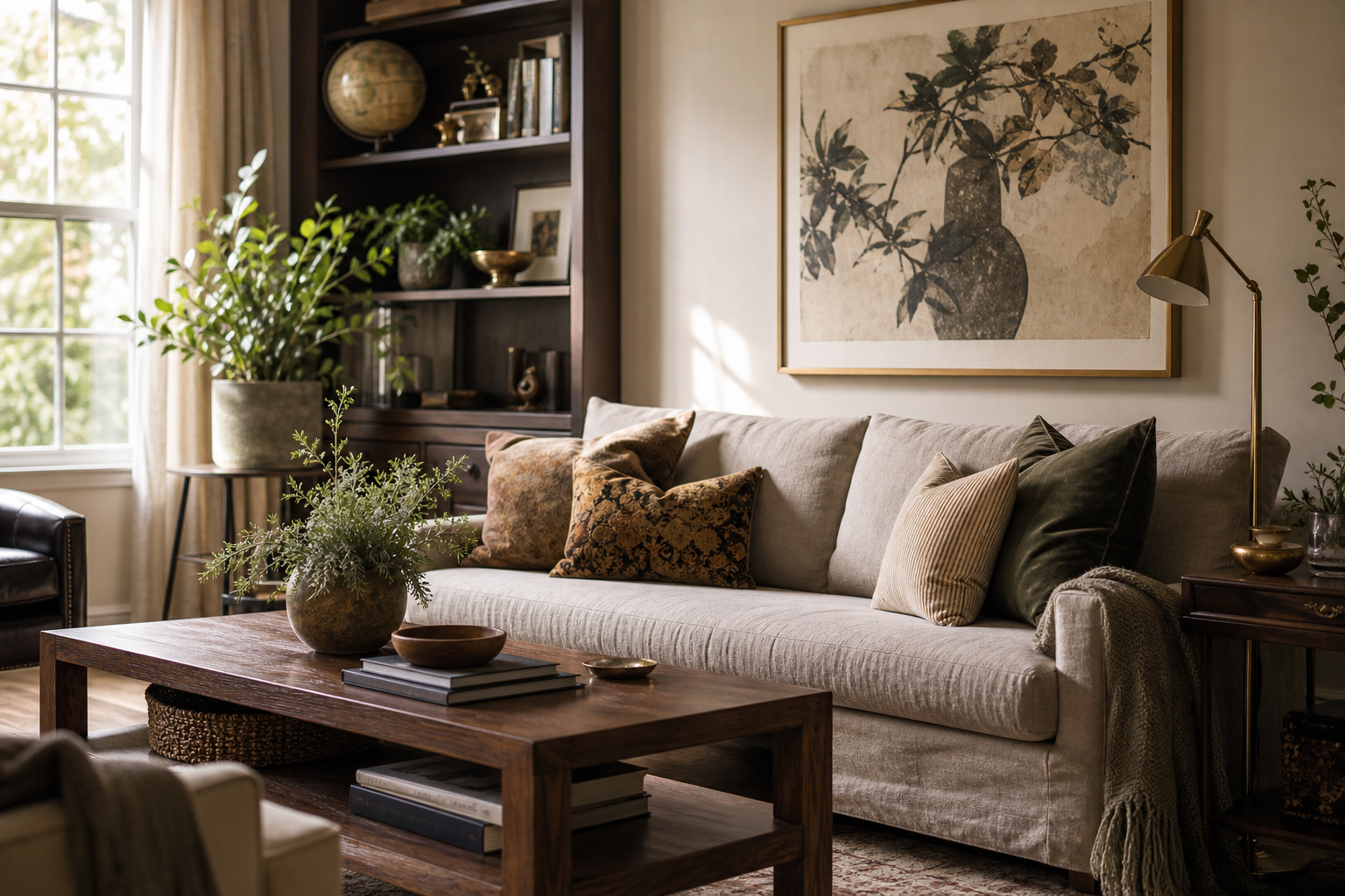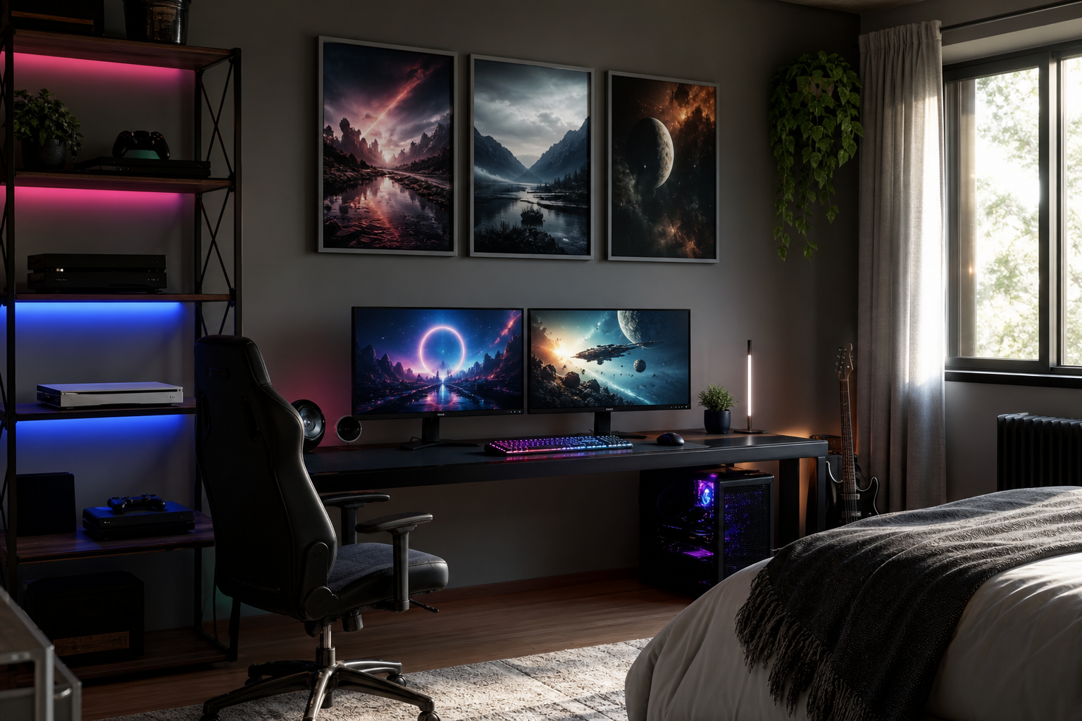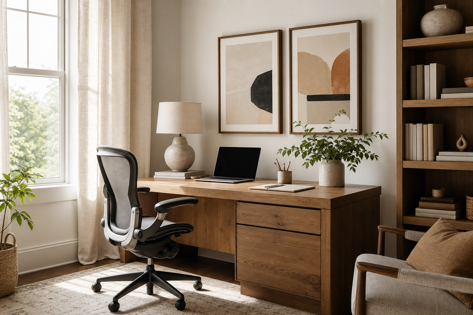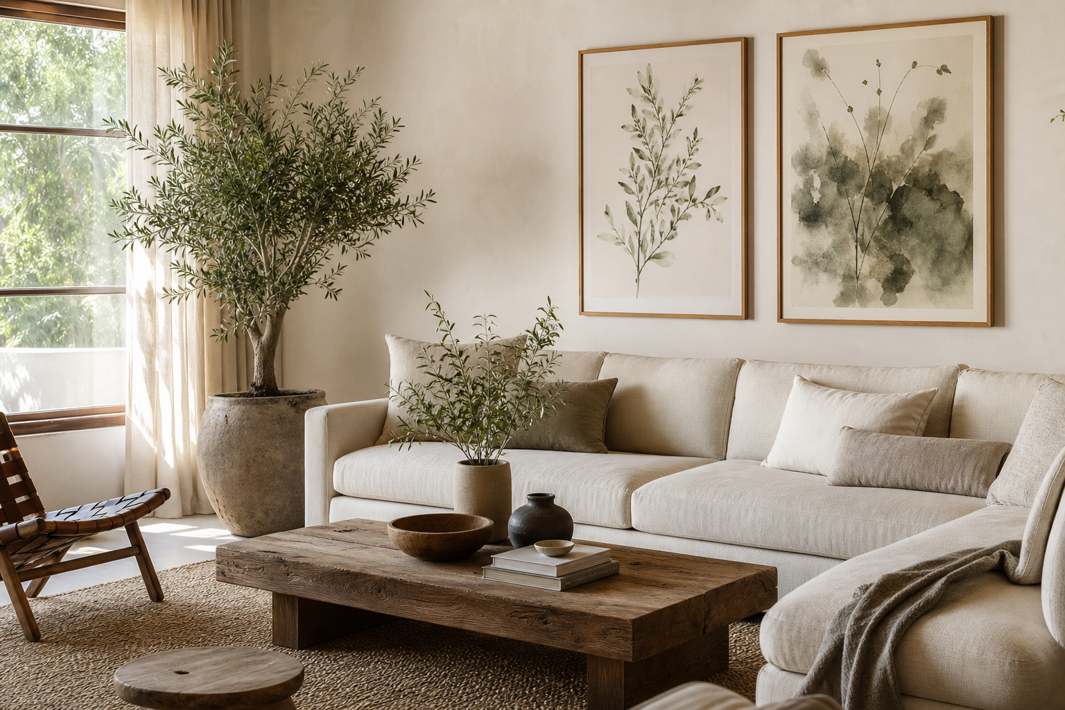
Nature posters work because they add visual quiet without making a room feel empty. A misty forest, a coastal horizon, or a botanical study gives the eye somewhere to rest, which is why these pieces suit spaces designed for slowing down. In practical terms, nature imagery often uses softer transitions, organic shapes, and layered tones rather than hard edges — all details that make interiors feel less rigid.
They are also unusually flexible. A single landscape can sit comfortably in a pared-back minimalist art print collection, while a more detailed floral or wildlife piece can warm up rustic, Scandinavian, or bohemian interiors. If you already mix wood, linen, stone, wool, or rattan at home, our Nature collection and our Botanical collection will usually slot in more naturally than graphic or heavily typographic wall art.
Why Nature Posters Work in Modern Interiors
Modern rooms often rely on clean lines, large surfaces, and restrained palettes. Nature posters prevent that simplicity from feeling cold. A mountain scene introduces depth, a leaf study adds fine detail, and water imagery brings movement. Even one framed print can soften a wall that might otherwise feel too flat.
For homes with neutral foundations, nature posters are especially effective because they echo familiar materials. Sage green picks up indoor plants, sandy beige connects to oak and jute, and slate blue works well with stone, grey upholstery, and brushed metal accents. If you want a room to feel calm rather than styled to excess, start with one tonal landscape or one botanical print rather than a busy multi-colour arrangement.
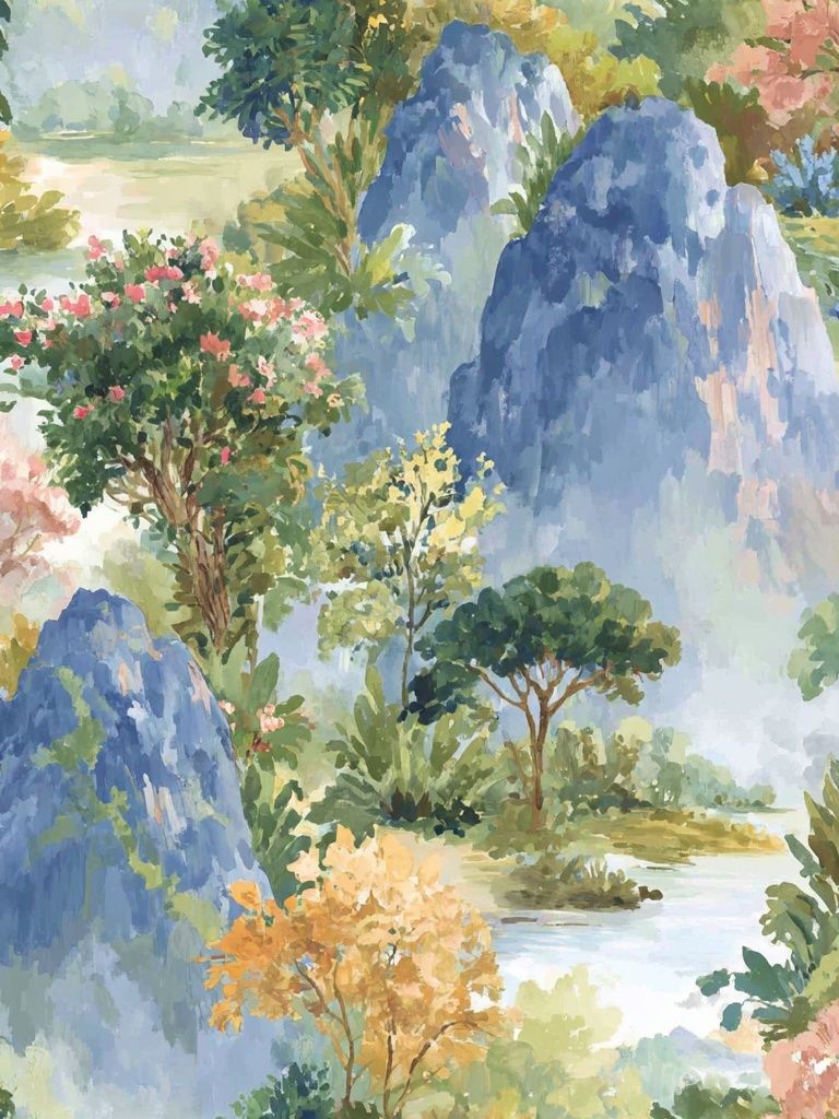
Choosing the Right Scene for the Right Room
Bedrooms benefit from scenes with low contrast and open composition. Think mist, water, distant trees, or soft rolling hills rather than high-drama wildlife. A piece like Serene Landscape — Watercolor Print works well above a headboard because it keeps the atmosphere gentle and uncluttered. In a standard double bedroom, a 50x70 cm print centered above the bed usually feels balanced; for king beds, 70x100 cm has more presence.
Living rooms can take slightly bolder imagery because they need a stronger focal point. Forest paths, mountain views, and layered coastlines add scale above sofas and sideboards. If your seating is 180 to 220 cm wide, aim for artwork that spans roughly 60 to 75 percent of that width. That means one 70x100 cm statement piece, or two 50x70 cm prints hung as a pair with 5 to 7 cm between them.
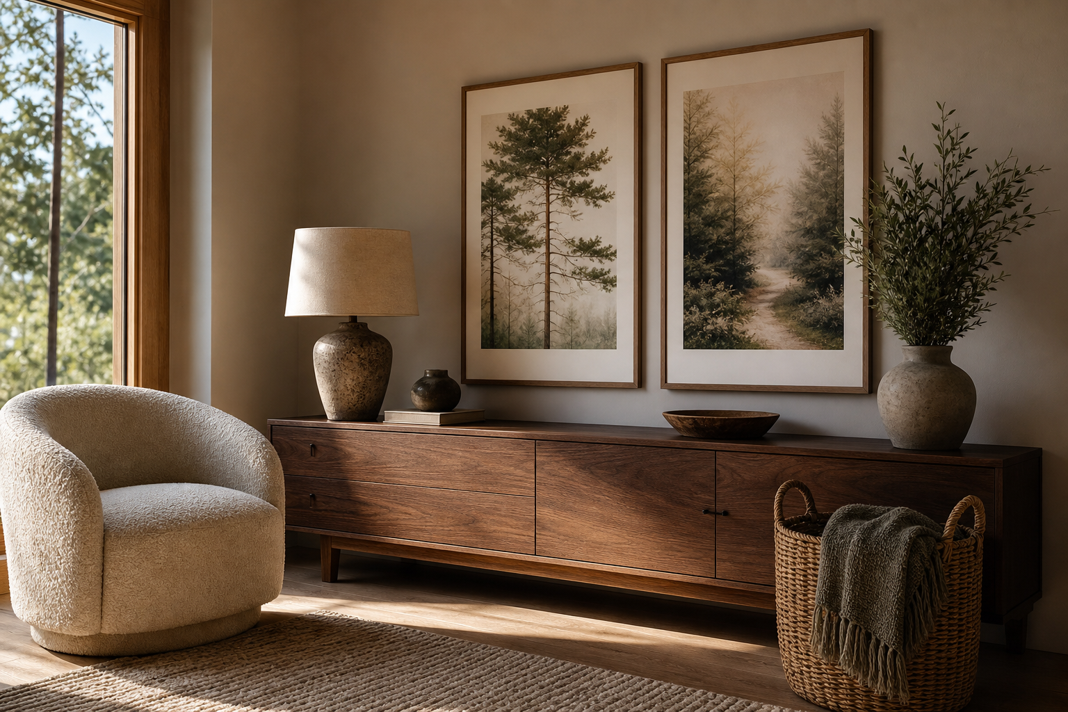
Kitchens and dining areas often suit botanicals, fields, orchards, or sunlit outdoor scenes because they feel fresh and easy. Home offices do well with quiet compositions that improve focus — tree silhouettes, still water, or minimalist coastal pieces are better than crowded scenes with too many focal points. For workspaces, choose art around 40x50 cm or 50x70 cm so it supports the desk area without dominating it.
Wildlife is best used selectively. In a hallway or study, one strong animal image can feel refined. In bedrooms, softer nature-led subjects tend to be more restful. If you want wildlife without too much visual intensity, browse our Animals wall art for pieces with muted backgrounds and natural spacing around the subject.
Colour, Mood, and Composition
Green is the most versatile colour family for nature posters because it ranges from grey-sage to deep olive and works with almost every neutral base. If your room has cream walls, oak furniture, and beige textiles, green art will look integrated rather than decorative. Blue shifts the mood cooler and cleaner, making it ideal for bedrooms, bathrooms, and home offices.
Earthy neutrals — sand, clay, bark, stone — create warmth without noise. These tones are useful if you want your art to blend into a layered interior rather than stand out sharply. Misty compositions are particularly strong in calm homes because their low contrast leaves more visual breathing room. If your walls already include pattern through curtains, rugs, or upholstery, choose artwork with one clear subject and a restrained palette.
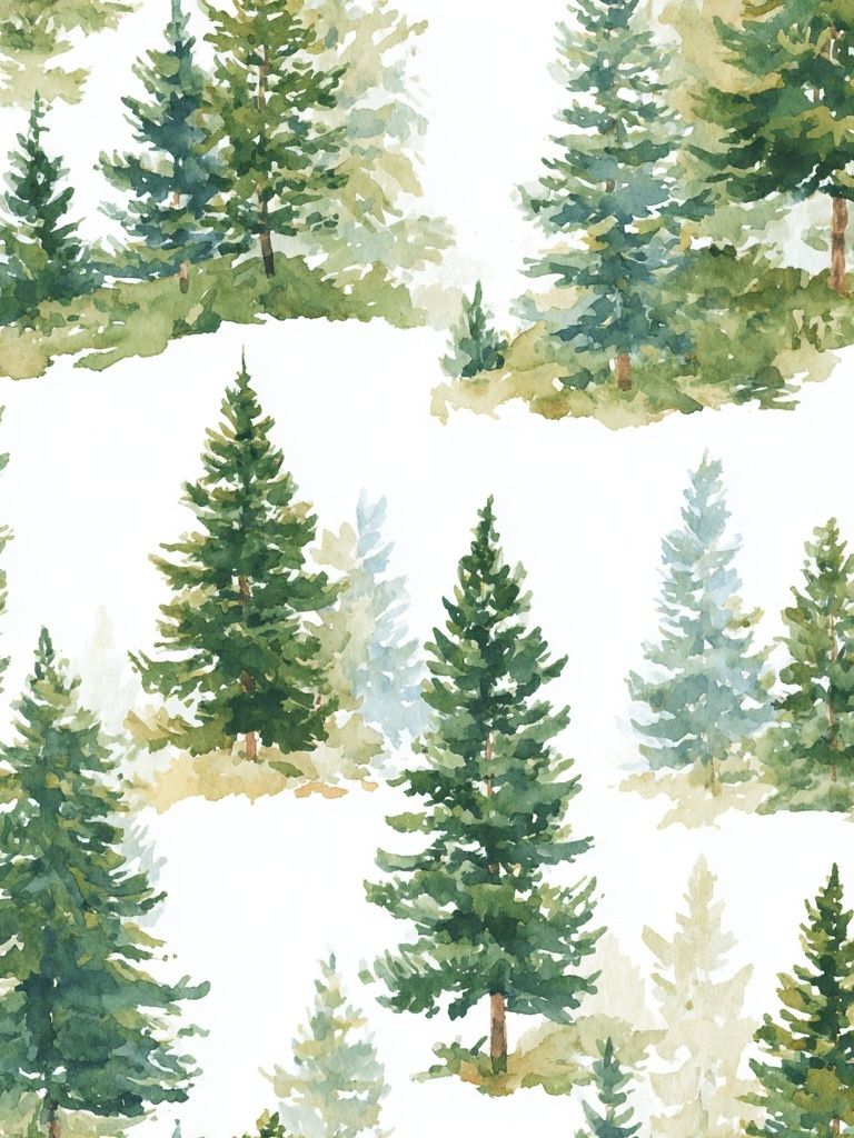
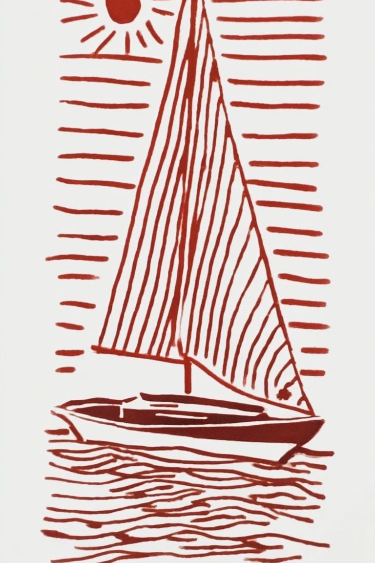
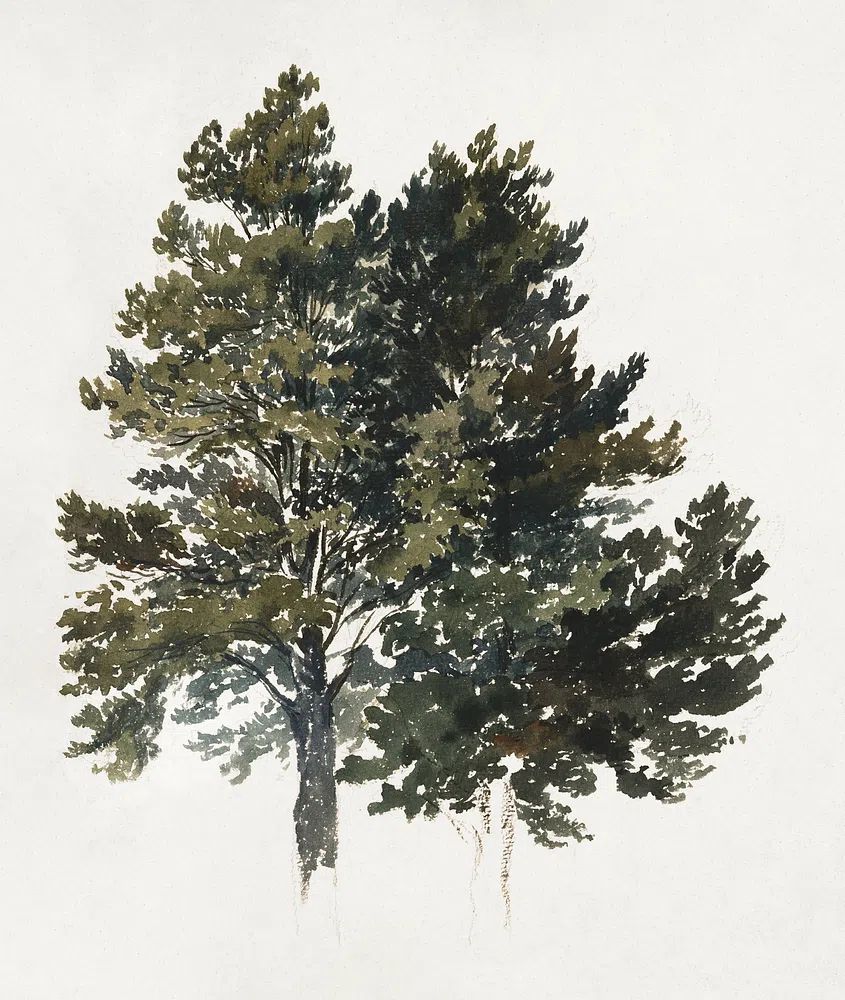
Composition matters as much as colour. Horizontal scenes widen a room visually and suit above-sofa placement. Vertical works are useful in narrow spaces such as hallways, next to windows, or between shelving units. Pieces with a visible horizon line tend to make a room feel more expansive, while close-up botanicals bring intimacy and texture.
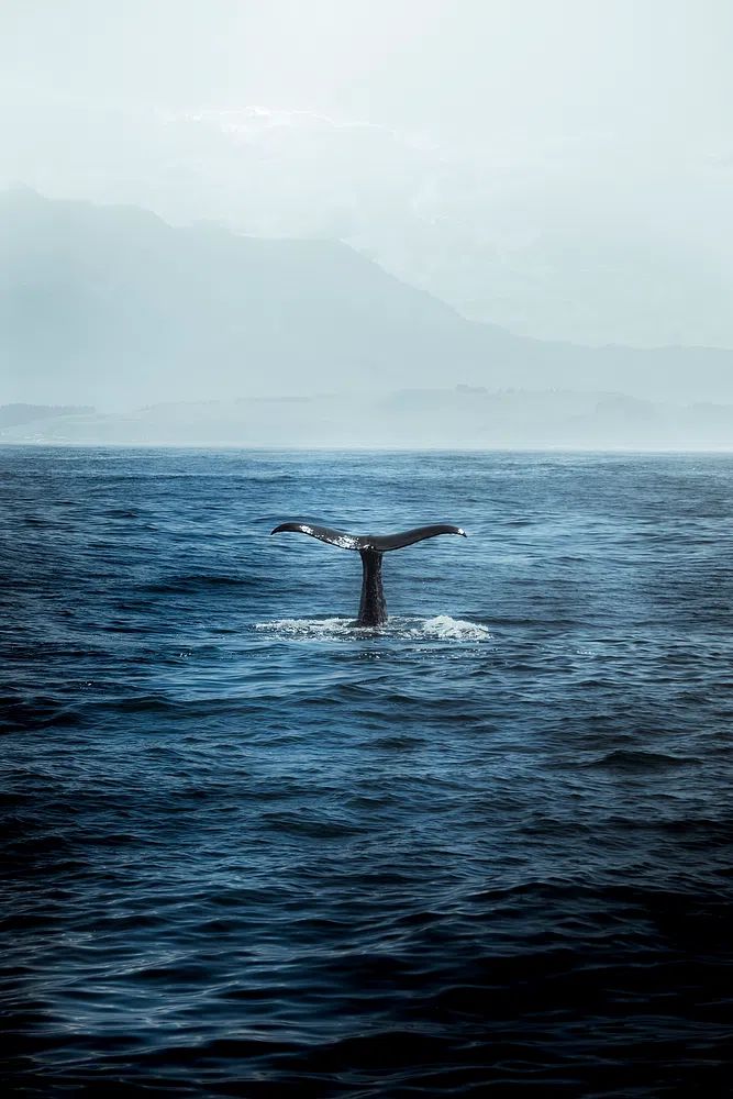
Sizing and Placement That Feel Effortless
The easiest mistake is hanging art too high. Keep the center of the frame around 145 to 150 cm from the floor in most rooms. Above furniture, leave 15 to 25 cm between the top of the sofa, bed, or console and the bottom of the frame. That small gap helps the arrangement feel connected to the furniture rather than floating.
For a single statement piece, use larger dimensions when the wall is doing a lot of visual work. A 70x100 cm print is a dependable size above a console, desk, or smaller sofa. For broader walls, pair two 50x70 cm prints or build a gallery wall using 30x40 cm and 50x70 cm formats. Keep spacing consistent — usually 5 to 8 cm between frames is enough for a tidy, intentional look.
If you want a setup that feels especially calm, limit the arrangement to one subject family. Mix three coastal scenes, two forest studies, or a botanical pair instead of combining every type of nature imagery at once. That is often the difference between a cohesive wall and one that looks collected without a plan.
Frames and Finishes That Elevate the Look
Oak frames are the easiest match for nature posters because they echo wood furniture and natural flooring. Black frames give more contrast and suit photography or sharper compositions, especially in modern interiors. White frames work best when you want the image to feel light and airy against coloured walls or busy shelves.
Matting helps quieter artwork breathe. A white mount around a 30x40 cm print can make it read closer to a 40x50 cm finished piece, which adds presence without requiring a larger image. This is particularly useful for detailed botanicals or fine art-inspired nature pieces where you want a gallery-style finish. If you prefer a softer, painterly effect, explore our Fine Art prints alongside classic nature photography wall art for contrast in texture and mood.
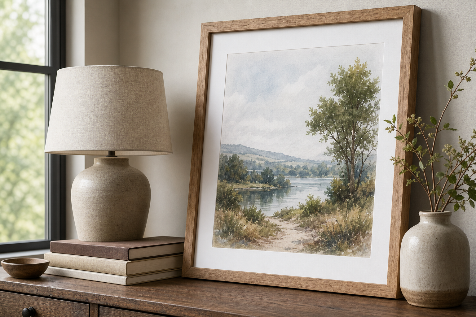
Paper finish changes the feel more than many buyers expect. Matte surfaces usually suit nature imagery best because they reduce glare and keep colours soft. That matters in bright rooms opposite windows, where glossy finishes can reflect too much light and flatten the artwork from certain angles.
Styling Nature Posters Room by Room
In the living room, repeat at least one tone from the artwork elsewhere in the space. If the print includes moss green, echo it in a cushion, throw, or plant. If it has soft blue-grey water, bring in smoked glass or stone accessories. Two to three repeated colour notes are enough to make the room feel considered.
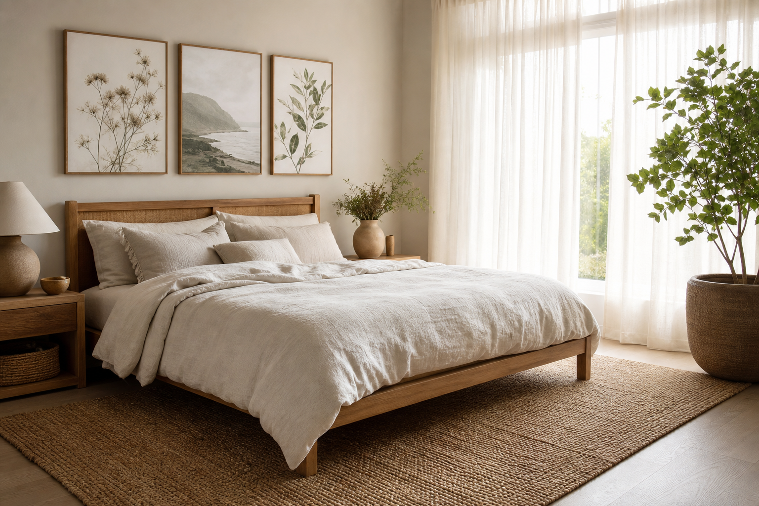
Bedrooms benefit from the fewest competing elements. Above the bed, choose one large landscape or a matched pair with similar tonal range. Keep bedside styling simple — linen bedding, one timber accent, one ceramic object, and maybe a branch or dried stem. If you want a slightly softer decorative route, our Bohemian wall art can work beautifully with botanical and landscape imagery in warm, textured bedrooms.
Home offices need clarity. One print above the desk, one smaller piece on an adjacent wall, and a plant on a shelf is usually enough. In hallways, use vertical works to lead the eye down the space. In dining corners, a pair of nature posters can add atmosphere without distracting from conversation.
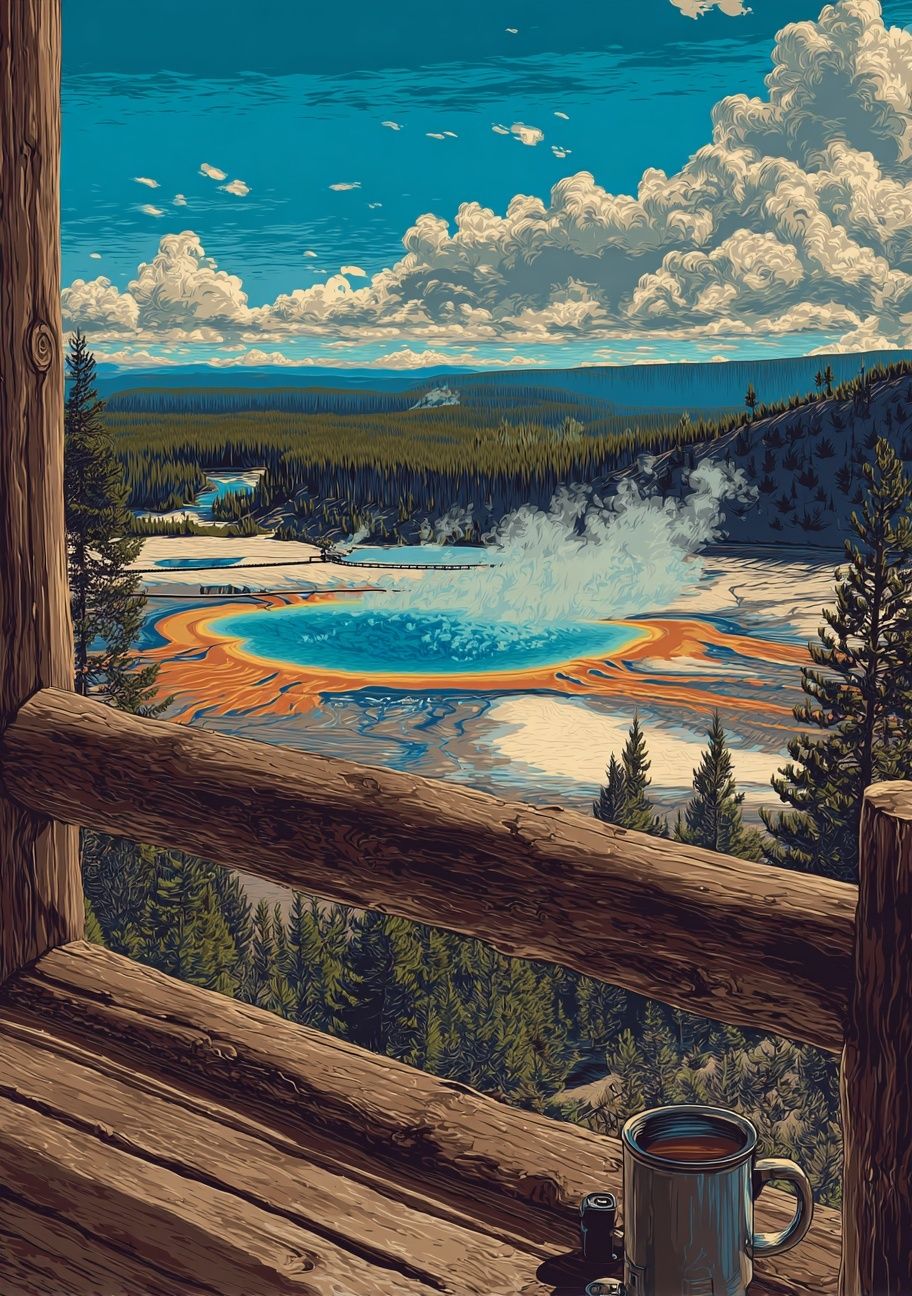
If you are building a mixed arrangement, combine categories deliberately. A forest landscape from Yellowstone National Park — Vintage Print can sit well with softer botanical details, while a more graphic piece from our Minimalist collection helps modernize a traditional room. The key is to keep either the palette, frame finish, or subject consistent.
Final Touches and Smart Ways to Shop
When shopping for nature posters, start with the room's job before the image itself. Bedrooms need lower contrast, offices need focus, and living rooms can carry more scale. Measure the wall first, note the width of the furniture below it, and decide whether the space needs one focal piece or a set. That one step prevents most sizing mistakes.
Nature posters look best when they connect to the room's materials and mood, not just its wall colour. Choose scenes that reflect how you want the space to feel — misty and quiet, fresh and botanical, coastal and open, or earthy and grounded. A calm home rarely comes from filling every surface; it comes from choosing fewer, better pieces and giving them space to work.
Frequently Asked Questions
What frame colour is safest for nature posters?
Natural oak is the most versatile choice because it works with greens, blues, and earthy neutrals. Black is stronger and more modern, while white feels lighter on coloured walls.
Can I mix photography and watercolor nature art on the same wall?
Yes — keep the frames identical and limit the palette to 2 or 3 shared tones. That gives different art styles a common structure.
How do I hang nature posters on a rental wall?
Use removable hanging strips for smaller frames and lightweight pieces. For larger framed works, picture hooks are usually more secure and leave a cleaner repair than oversized adhesive pads.
Do nature posters work in darker rooms?
They do, but choose lighter scenes with sky, water, or mist so the wall art does not disappear into the room. White mats also help lift the overall look.
What pairs well with nature posters besides plants?
Linen, wool, oak, travertine, rattan, and handmade ceramics all reinforce the same natural feel. Even one or two of these materials can make the artwork feel more intentional.