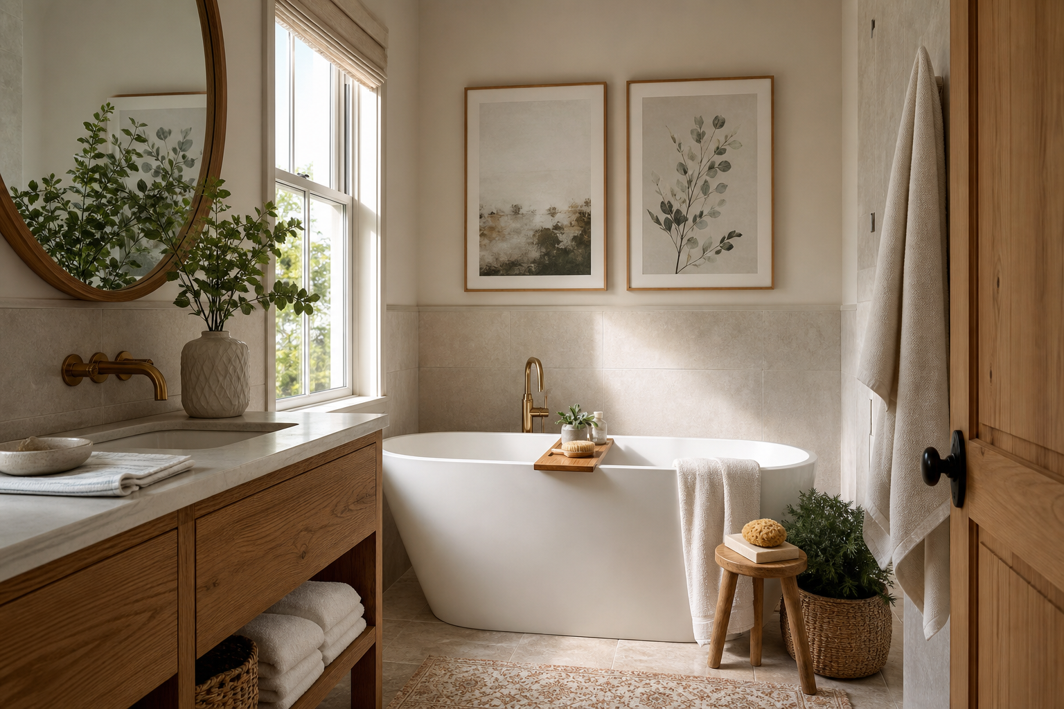
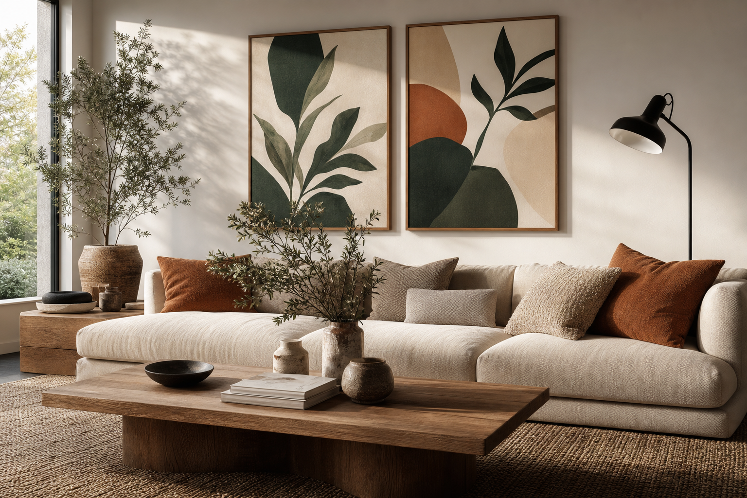
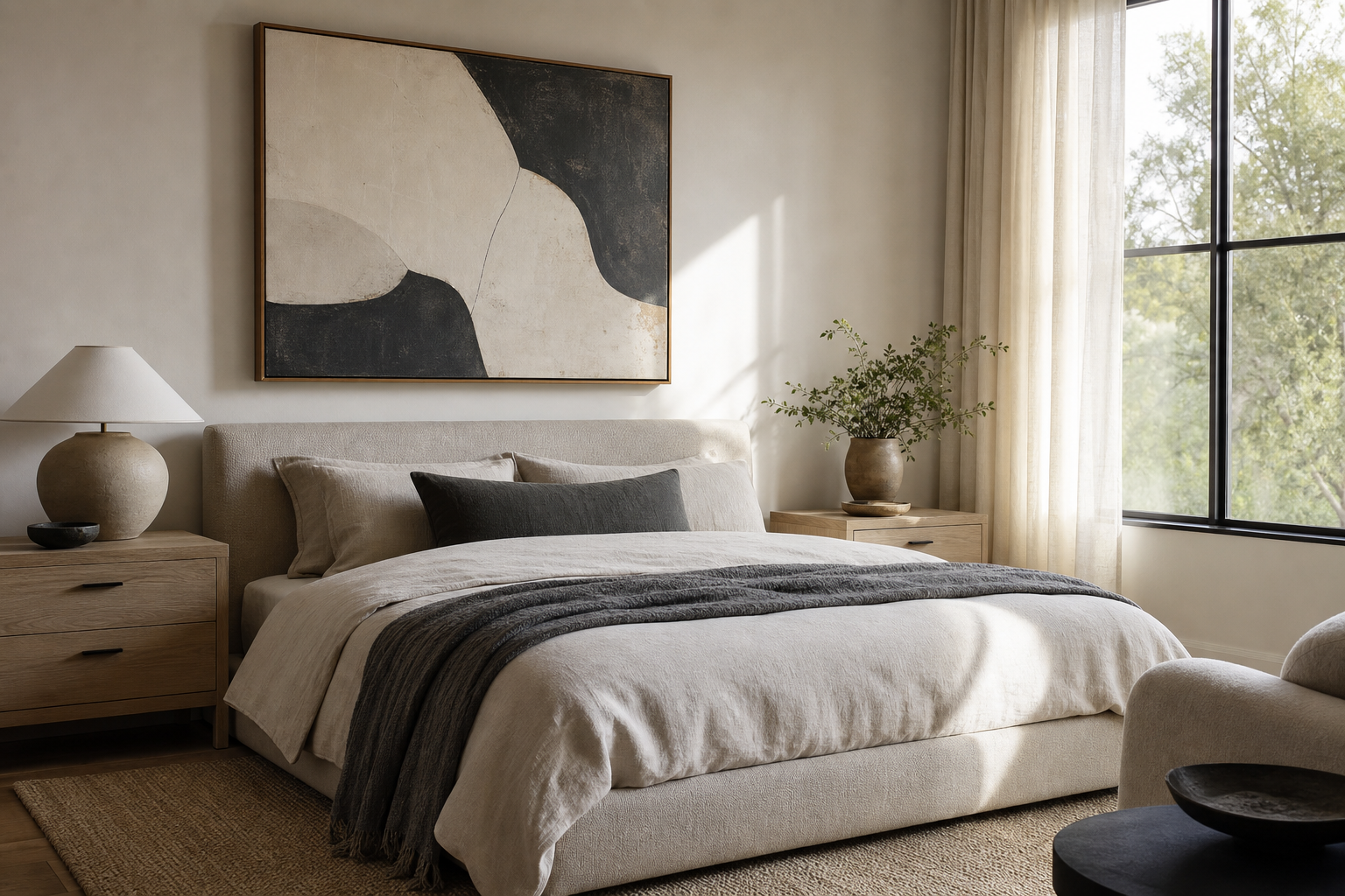
A good poster bedroom starts with restraint. Bedrooms work best when the wall art supports how the room should feel at 10 pm and at 7 am — calm, personal, and visually settled. If every print is fighting for attention, the room feels busy before you even sit down on the bed.
The easiest way to build a poster bedroom with confidence is to make three decisions first: mood, scale, and placement. Once those are clear, everything else becomes simpler — which subjects to choose, whether to frame them, and how to tie them into the rest of the room.
Start with the Mood You Want
The mood should come before the shopping. If you want the room to feel restful, choose artwork with soft contrast, open space, and a limited palette. Misty landscapes, quiet interiors, and minimalist floral forms are more effective in a bedroom than high-saturation graphics or overly detailed scenes. Rooms meant for winding down usually look best when 60-70% of the visible colour stays neutral — white, beige, taupe, grey, or muted green.
If you want a more expressive bedroom, keep the energy focused rather than scattered. One strong colour family — deep blue, rust, olive, or blush — will feel intentional. Mixing four or five accent colours on the wall usually makes a bedroom feel less composed. A curated abstract collection works well here because abstract pieces can add personality without making the room visually noisy.
For a softer, romantic feel, subjects matter as much as colour. Florals, gentle silhouettes, and painterly interiors make the space feel more intimate. If that is the direction you want, explore our romantic wall art alongside quieter pieces from the fine art collection so the room keeps its calm.

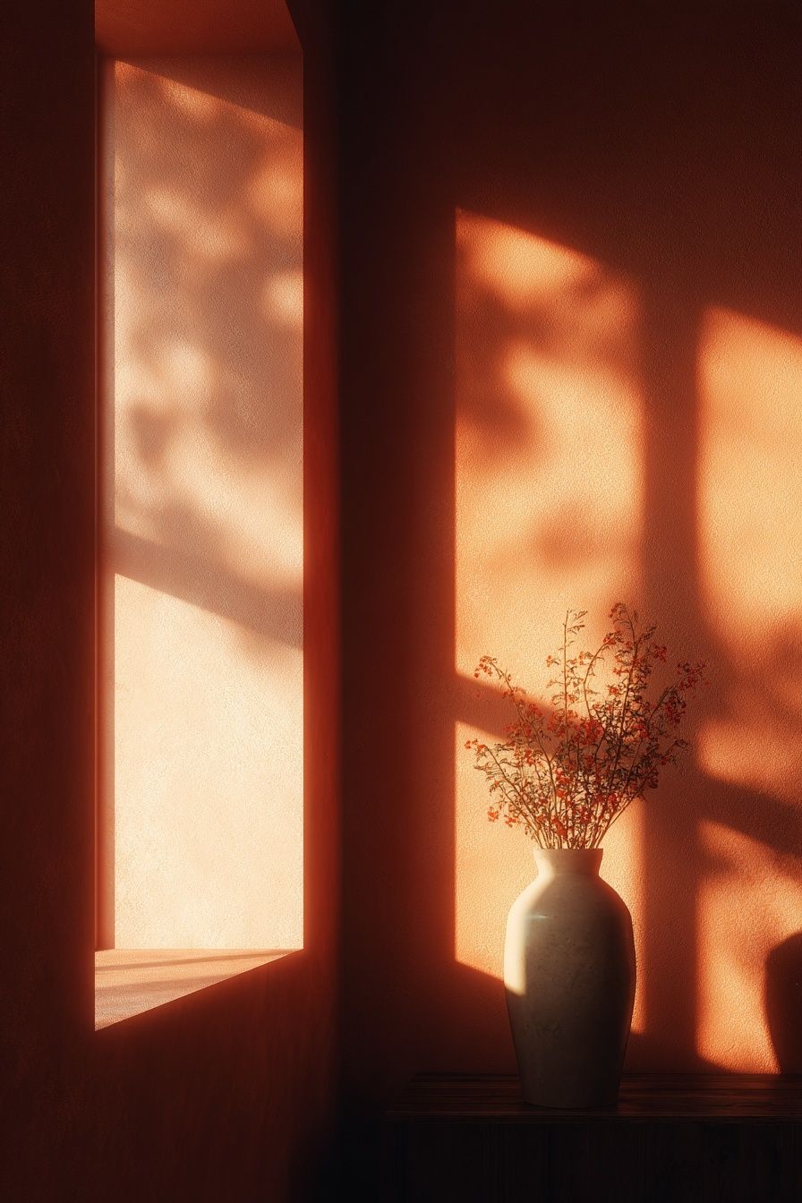
"Window with Sheer Curtain" is a good example of bedroom-friendly art because it has light, texture, and atmosphere without demanding attention. It suits a poster bedroom where the bedding, curtains, and wall art are meant to work as one calm composition rather than separate features.
Choose Posters That Suit the Space
Small bedrooms need fewer, larger signals. One 50x70 cm print above a narrow chest, or two 30x40 cm pieces stacked vertically, often looks better than six small frames trying to fill the wall. Small rooms already contain a lot of visual interruption — doors, wardrobes, lamps, bedding, storage — so artwork should simplify, not complicate.
Medium bedrooms give you more flexibility. Above a double bed, a single 70x100 cm piece can feel grounded, while a pair of 50x70 cm prints creates symmetry. If you prefer a lighter look, try three pieces across — for example, 30x40 cm, 50x70 cm, and 30x40 cm — with 5-7 cm between frames. That spacing is wide enough to let each piece breathe but tight enough to read as one arrangement.
Larger bedrooms can handle more atmosphere and more negative space. Instead of filling every wall, choose one main art wall and let the other surfaces stay quieter. Overscaling helps here. A large landscape, a tonal abstract, or a strong fine art print gives structure to the room quickly. nature art prints are especially useful in bedrooms because they bring movement and softness without clutter.

Colour should also respond to the room itself. North-facing bedrooms often benefit from warmer artwork — sandy neutrals, terracotta, dusty pink, and soft ochre. South-facing rooms can carry cooler tones more easily, such as sage, grey-blue, and charcoal. If your room already has patterned bedding or a textured rug, choose simpler wall art from our minimalist prints so the space does not become over-layered.

Find the Right Wall and Layout
The wall above the bed is usually the strongest place to start, but it only works when the scale is correct. Aim for the total arrangement to cover around 60-75% of the bed width. For a 160 cm bed, that means the artwork grouping should span roughly 96-120 cm. Smaller than that can look accidental; much wider can overpower the headboard.
If the wall above the bed feels too dominant, use the wall beside a dresser, desk, or reading chair instead. Art placed near furniture looks more intentional because it has a visual anchor below it. A single 50x70 cm print beside a wardrobe or above a slim chest can often finish the room more effectively than an oversized arrangement floating on an empty wall.
Gallery walls suit bedrooms when they stay disciplined. Keep to one palette, one frame finish, or one subject family. Mixing botanical line work, moody landscapes, and bold typography can work in a living room, but in a bedroom it often feels restless. If you love variety, unite it with a narrow colour range and consistent margins of 4-6 cm.

For a calm layout, "White Flower Silhouette" works well either as a single piece above a nightstand or as part of a pair with another understated print. Its simple form gives structure to the wall without pulling focus away from the bed, curtains, or lighting.
Frame It or Keep It Relaxed
Frames make a bedroom look finished faster. Oak frames warm up white walls and connect beautifully with bedside tables, flooring, and woven textures. Black frames sharpen softer art and suit rooms with metal lamps, darker bedding, or a more graphic look. White frames nearly disappear on pale walls, which is useful when you want the art to feel light and integrated.
Unframed styling can work too, especially in a younger room, a casual rental, or a very pared-back modern space. The key is to make it look deliberate. If you are using clips, pins, or shelf-leaning arrangements, keep the number of pieces low and the edges neat. One or two relaxed pieces can feel effortless; seven taped-up prints usually feels temporary.

If you want the room to feel more elevated, framed art is worth it. If the priority is flexibility or budget, start unframed with one clear composition and upgrade later. You can also split the difference by leaning smaller framed pieces on a shelf above a chest or desk. For relaxed, textural rooms, bohemian prints for bedrooms pair particularly well with oak or natural wood framing.
Make Posters Feel Intentional with Styling
Wall art looks better when it repeats something already in the room. That can be colour, line, shape, or material. If your print has soft green tones, repeat that green once more in a cushion, throw, or bedside plant. If the artwork is full of curved forms, a rounded lamp, boucle chair, or ceramic vase helps the whole room feel connected.
This is where many bedrooms go wrong: the art is fine, but nothing around it speaks to it. A poster bedroom feels finished when there is at least one visible connection between the wall and the room below. You do not need matching decor — just echoes. Two or three repeated elements are enough.

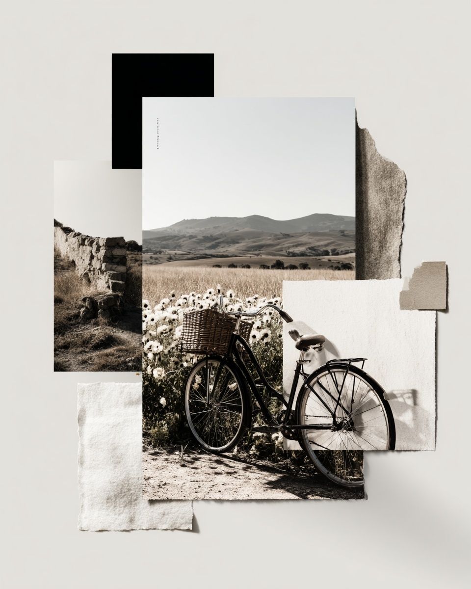
"Serene Landscape" is useful in bedrooms with natural oak, off-white bedding, and soft green or grey accents. It connects especially well with this landscape print in rooms that already use linen, wool, rattan, or matte ceramics.
If your bedding is patterned, go quieter on the wall. If the bedding is plain, the wall can carry a little more shape or colour. Bedrooms with strong headboards — channel-tufted, dark wood, or cane — usually benefit from simpler artwork. Rooms with plain beds can handle more painterly detail, such as pieces from Starry Night or softer interior scenes from Vincent van Gogh's Bedroom.

Easy Poster Bedroom Ideas to Try Next
If you want a low-risk update, start with one of these combinations. First: a calm neutral bedroom — one large landscape print above the bed, oak frame, white bedding, and a stone-coloured throw. Second: a soft romantic setup — two floral or interior pieces in 40x50 cm, evenly spaced over the headboard, with warm lamps and blush or sand textiles. Third: a modern minimal scheme — one graphic line-based piece over a dresser, black frame, crisp bedding, and a single accent colour in the rug or cushion.
Another reliable formula is the "one large, one small" approach. Hang one main print above furniture, then repeat the palette with a smaller framed piece on the adjacent wall or leaning on a shelf. This gives the room rhythm without turning it into a full gallery wall. If you are choosing from different collections, combine one piece from Vase with Flowers with one softer landscape from the nature range to keep the balance between form and atmosphere.
A poster bedroom does not need a complete redesign to feel considered. One correctly sized print, placed at the right height and echoed by one or two materials in the room, can change the entire impression of the space. Most bedrooms look better with fewer pieces, larger scale, and stronger spacing than people first expect.
Final thoughts
The strongest poster bedroom is not the one with the most art — it is the one where the art, furniture, and textiles read as one composition. Start with the mood, choose scale carefully, and let placement do some of the work for you.
If you keep the palette tight and the layout balanced, even a simple arrangement will feel polished. A bedroom should not perform like a hallway or living room. It should settle the space, reflect your taste, and still leave room to rest.
Frequently Asked Questions
What size art should I hang above a double bed?
Aim for a total width of about 60-75% of the bed width. For a 140-160 cm bed, that usually means one 70x100 cm piece or two 50x70 cm frames.
Should bedroom wall art match the bedding exactly?
No. It should relate rather than match — repeat one or two colours or textures instead of buying identical tones across everything.
How high should I hang art in a bedroom?
Above a headboard, leave roughly 15-25 cm between the top of the bed and the bottom of the frame. Over a dresser, 10-20 cm usually looks balanced.
Which frame colour is safest for a calm bedroom?
Oak is the most versatile choice for soft, warm interiors. Black works best when the room already has dark accents, while white suits very light walls and minimal schemes.