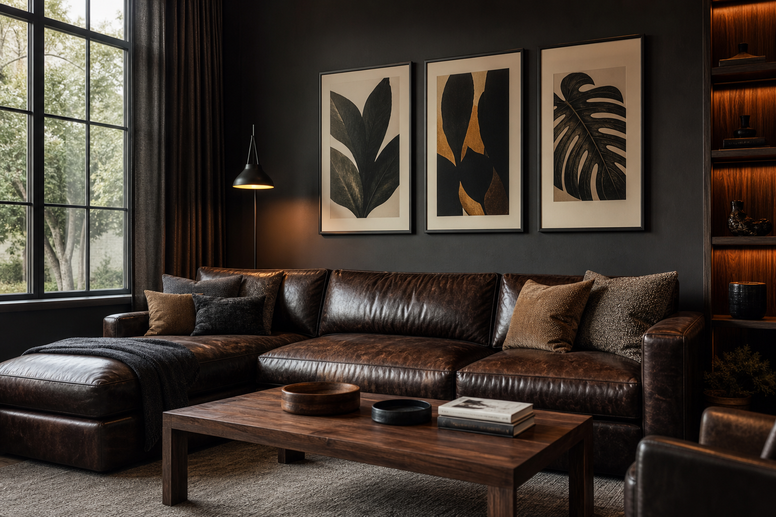
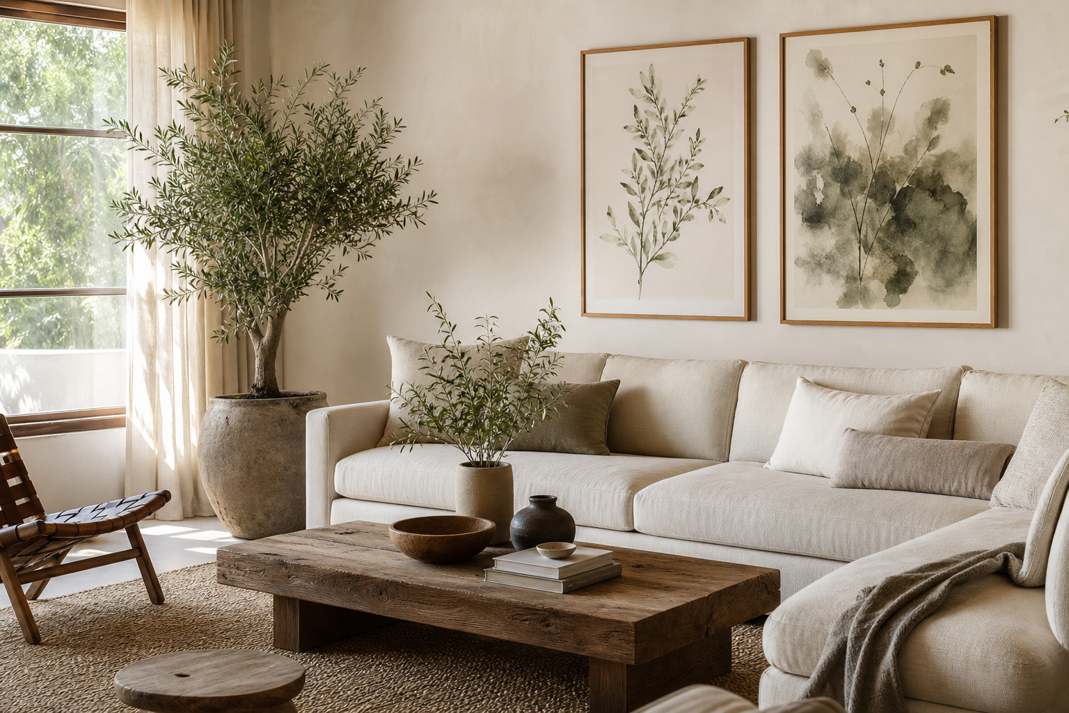
Bathroom posters do something practical rooms often miss: they make the space feel considered. Even a bathroom with only 3 to 5 square meters of floor area can feel calmer and more finished once the walls carry some visual weight. Art softens hard surfaces like tile, mirror glass, and chrome, and it gives the eye a place to rest.
Good bathroom posters also work because they do not need much room to change the atmosphere. A single 30x40 cm print above a toilet, a pair of 21x30 cm frames beside a mirror, or a narrow vertical piece near a towel rail can shift the room from purely functional to quietly styled. In small interiors, that kind of efficiency matters.
Why Bathroom Posters Work So Well
Bathrooms are full of repeated materials — ceramic, stone, painted drywall, metal fittings. Wall art breaks that repetition and adds tone without taking up storage or floor space. That is why bathroom posters are often more effective than adding another basket, candle, or decorative tray.
If your bathroom already leans clean and minimal, start with restrained art rather than busy imagery. Soft tonal pieces from our minimalist collection or airy pieces from our abstract art prints keep the room light. If you want a more collected look, gentle pieces from our fine art collection bring depth without making a small room feel crowded.
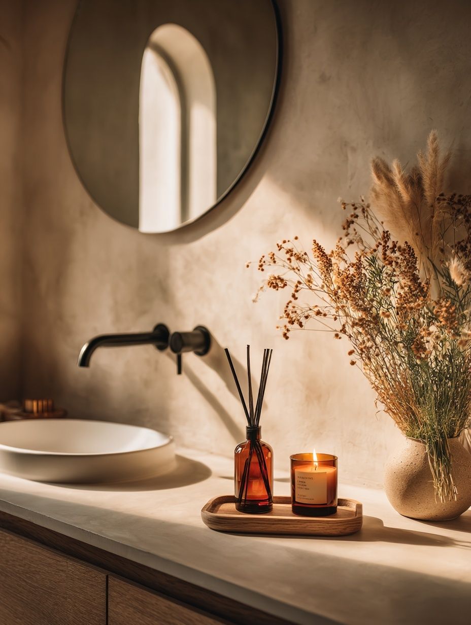
A bathroom is also a strong place to repeat a visual theme already used elsewhere in the home. If your bedroom has quiet neutrals and textured finishes, carry that mood into the bathroom with similar tones. If your hallway uses vintage line work, a subtle piece from our vintage art prints will make the transition between rooms feel more intentional.
Choose the Right Mood for the Room

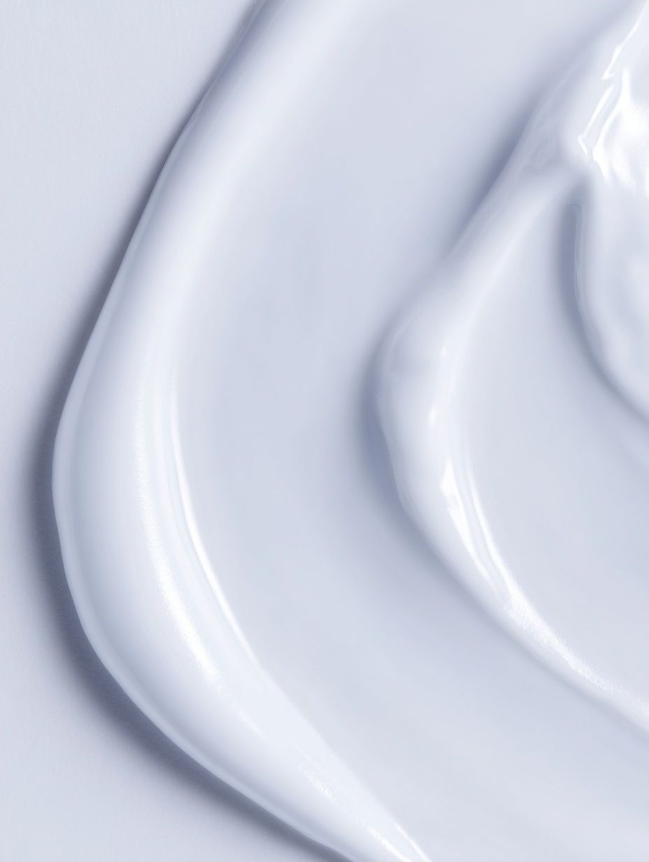
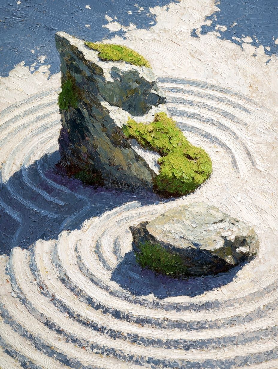
The strongest bathroom styling starts with mood, not size. For a spa-like room, choose prints with soft whites, sand, stone, pale sage, or washed grey. These shades sit well against white sanitaryware and natural wood. Pieces such as White Cream Texture Poster or Zen Garden Stones — Fine Art Print fit especially well in bathrooms that use matte tiles, oak vanities, and brushed brass.
For something more playful, typography and illustration can work — but keep the humor light and the color palette controlled. One witty print is usually enough in a guest bathroom or powder room under 2 square meters. In larger family bathrooms, combine one playful piece with calmer supporting art so the room still feels tidy rather than theme-heavy.
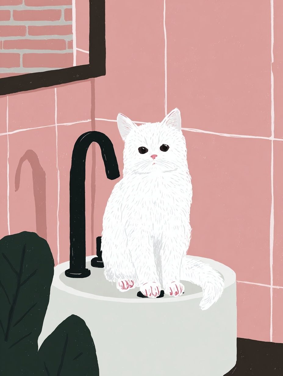
Botanicals, line drawings, and vintage portraits also suit bathrooms because they bring softness without visual clutter. If your bathroom has warmer cream or terracotta undertones, look at our bohemian wall art for earthy striped and handmade-feeling compositions. If the room is cooler — white tile, black fixtures, grey grout — try pared-back pieces from our typography prints or minimalist coastal motifs like Sailing Boat Minimalist Wall Art.
Pick Sizes That Fit Small Wall Spaces
Scale is where many bathrooms go wrong. Art that is too small looks accidental, and art that is too large can overwhelm the room. A good rule is to fill around 60 to 75 percent of the available wall width. So if the wall above your toilet tank gives you about 50 cm of clear width, choose one 30x40 cm frame or two 21x30 cm frames side by side with 5 to 7 cm between them.
Above a towel rail, narrow vertical formats usually work better than wide ones. A 30x40 cm or 40x50 cm print can sit neatly above standard rails that are 50 to 65 cm wide. Beside a mirror, especially if the wall gap is tight, 21x30 cm frames are often enough. On tall narrow walls, one 50x70 cm vertical piece can add presence without taking over.
Avoid hanging art too high just because the room is small. The center of the composition should still land roughly at eye level — usually around 145 cm from the floor in homes with standard ceiling heights. Above fixtures, leave 15 to 25 cm of breathing room so the art feels related to the element below, not detached from it.
Frames, Materials, and Moisture-Friendly Finishes

Bathrooms need practical framing. If the room has poor ventilation or no window, choose sealed frames and avoid anything too delicate or porous. Slim aluminum or well-finished wood-effect frames handle humidity better than unfinished raw timber. Acrylic glazing is lighter and less fragile than glass, which is useful in busy family bathrooms.
Paper art should not sit directly exposed in a high-steam zone. Keep frames away from the immediate splash area around showers and baths, and leave at least 30 cm from sinks where possible. If your bathroom steams up heavily after every shower, place artwork on the wall opposite the moisture source rather than right above it.
This is where tonal, texture-led work really earns its place. Subtle pieces with visible surface character still read beautifully behind glazing and do not rely on fine detail. Prints like Textured Concrete Wall — Minimalist Print or Textured White Abstract Poster feel architectural and clean in a bathroom setting.
Where to Hang Bathroom Posters for the Best Impact
The best placement usually follows one of four zones: above the toilet, beside the mirror, above a towel rail, or on the wall opposite the door. That last option is especially effective because it gives you an immediate focal point when entering the room. In a narrow bathroom, one well-placed piece at the end wall can visually lengthen the space.

When hanging a pair, keep the spacing tight — around 5 to 8 cm. In a bathroom, close spacing looks cleaner and more architectural than wide gaps. If you are working with one statement piece, align it to something real in the room: the center of a vanity, the width of a bath, or the vertical line of a mirror edge. Alignment is what makes bathroom posters feel designed, not added as an afterthought.
A useful approach is to echo shapes already in the room. Round mirrors pair well with rectangular frames because the contrast feels balanced. Long horizontal shelves often work best with portrait-oriented prints above them. If your bathroom includes strong black accents, use black frames to tie the room together. If the finishes are softer — travertine, light oak, linen curtains — oak or light wood frames will feel more natural.
How to Build a Cohesive Bathroom Gallery Look
A bathroom gallery wall works best when the palette is tighter than it would be in a living room. Limit yourself to two or three main tones, then repeat them across all pieces. For example: ivory, taupe, and charcoal; or soft blue, white, and sand. That restraint matters in rooms where mirrors already double the visual information.
Mixing portrait and landscape formats is a good way to avoid stiffness, but keep one common element constant — frame color, mount style, or subject matter. In most bathrooms, a set of 2 or 4 pieces is enough. More than that can quickly look crowded, especially if the room has visible toiletries, towels, and storage already on display.


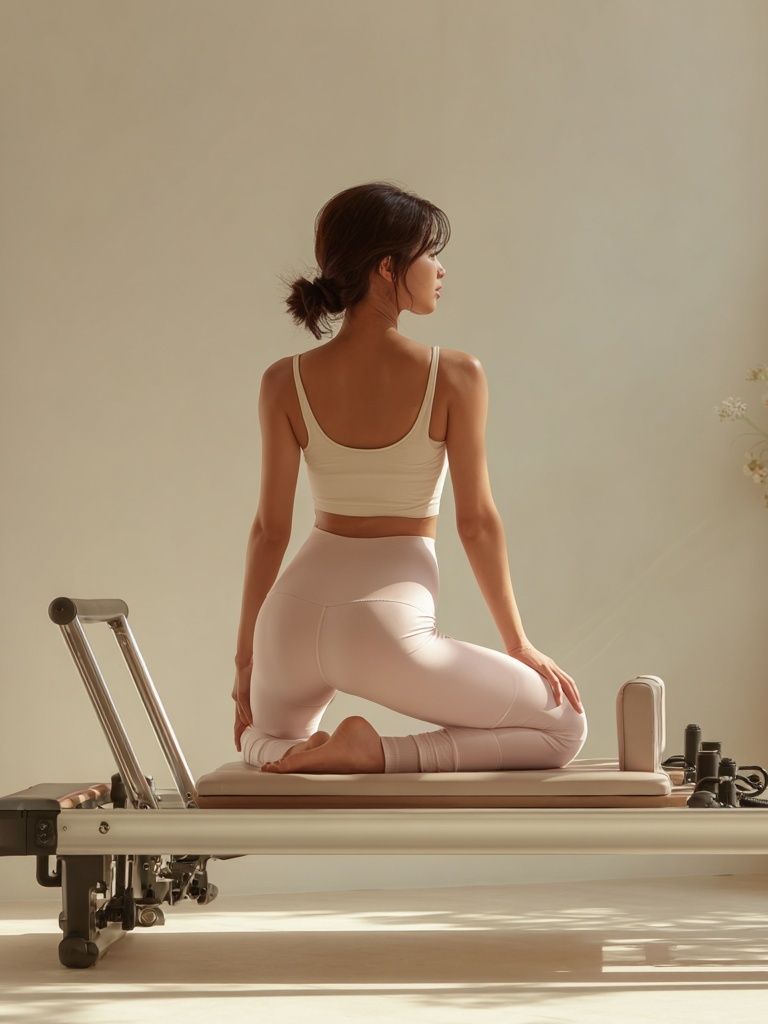
If you want a slightly more decorative mix, combine one image-led piece with one texture print and one lighter graphic work. A pairing like Sunlit Bathroom Sink Photography Poster with a soft abstract and a simple typography piece gives variety without noise. If your room leans classic, a vintage figure such as Elegant Woman Silhouette — Vintage Print can add elegance when balanced by quieter neighboring prints.
For very small bathrooms, think in pairs instead of full salon walls. Two frames stacked vertically beside a mirror, or two small prints above the toilet, often look sharper than a dense cluster. The cleaner the arrangement, the more expensive the room tends to feel.
Wrap-Up: Small Styling Choices That Make a Big Difference
Bathroom posters work best when they respect the room they are in. Choose calm imagery, size it properly, frame it for moisture, and hang it with clear alignment to the fixtures already in place. Those four decisions do more for the finished look than any trend-led accessory.
The best bathroom posters are not loud. They make the room feel settled, lighter, and more complete — whether you choose a single minimal print or a compact gallery in soft neutral tones. Start with one wall, one mood, and one measured decision at a time.
Frequently Asked Questions
What frame color works best in a bathroom?
Match the dominant hardware finish or vanity tone. Black frames suit black taps and modern lines, while oak or light wood works better with warmer, natural bathrooms.
Can I hang art in a bathroom without drilling tiles?
Yes — adhesive hanging strips can work for smaller frames up to around 30x40 cm on smooth painted walls. Avoid sticking anything directly to textured tile or damp surfaces.
Should bathroom art have glass or acrylic glazing?
Acrylic is lighter and safer in compact bathrooms, especially in family homes. Glass gives a crisper finish but is heavier and more fragile.
What colors make a small bathroom feel bigger?
Soft whites, pale sand, misty grey, and washed sage reflect light and reduce visual weight. Keep contrast moderate rather than stark for a more open feel.
How many pieces of wall art are enough in a small bathroom?
Usually one statement print or a pair is enough. In bathrooms under 4 square meters, that amount adds character without making the walls feel busy.