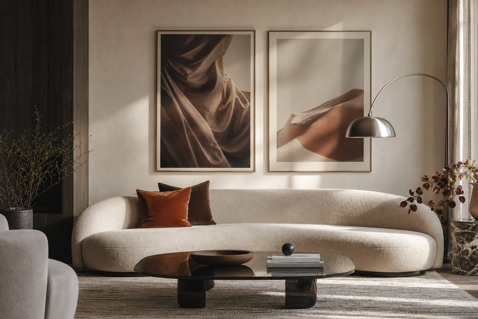
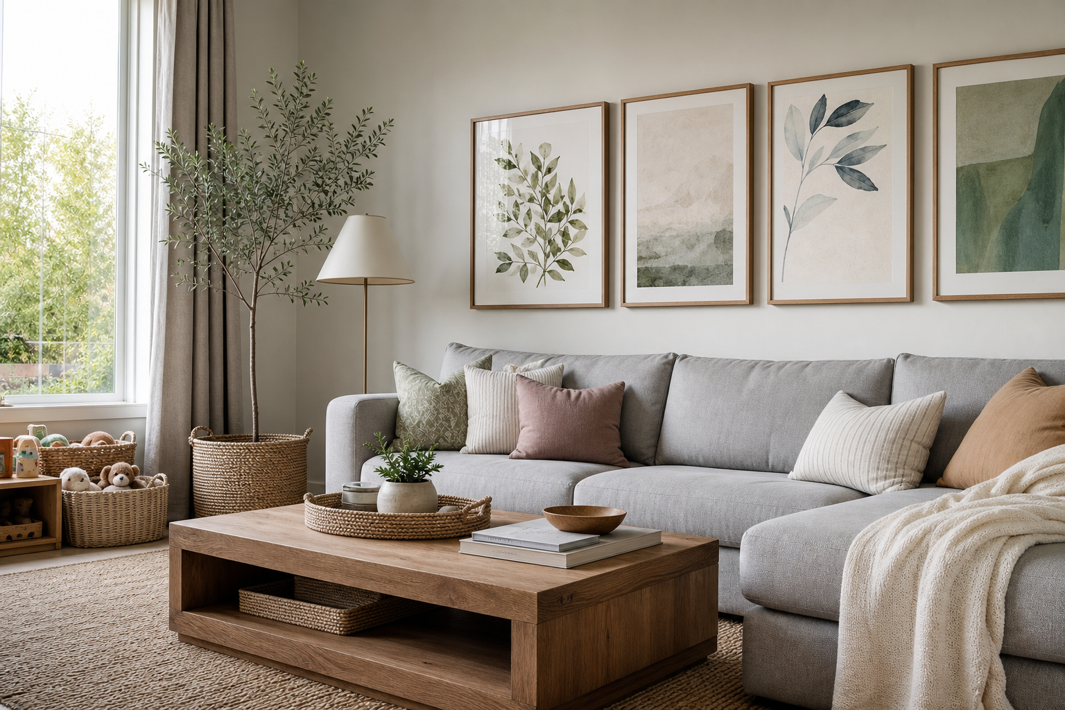
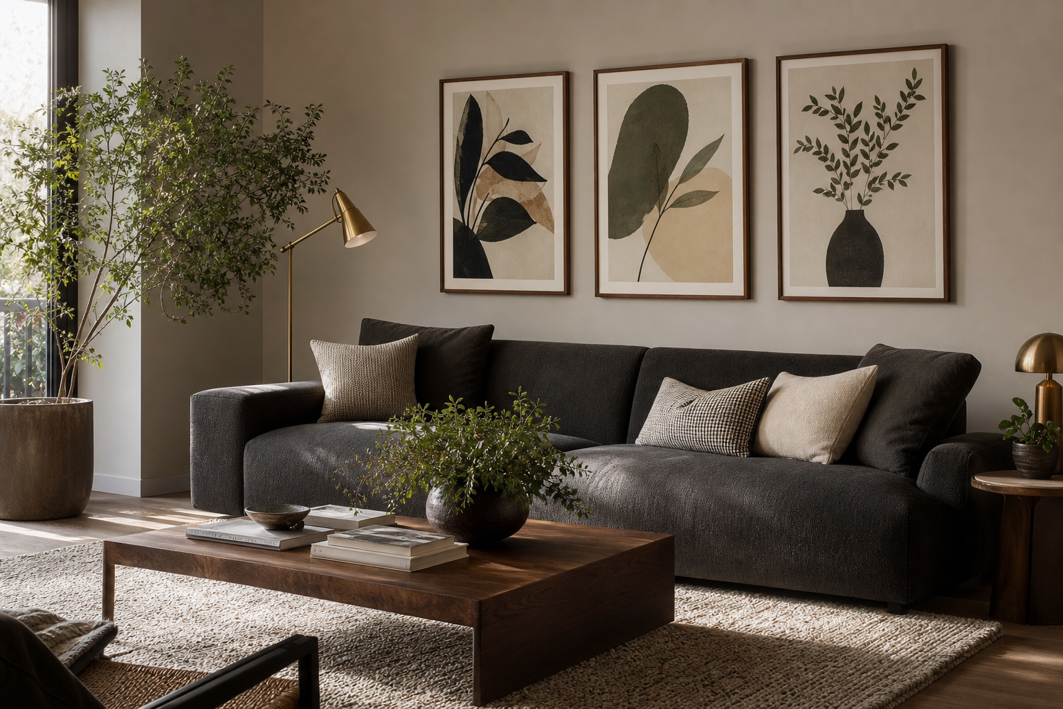
Typography for the living room works because it adds personality without adding visual clutter. A well-chosen phrase, letterform, or graphic text print can act like a focal point in the same way an abstract painting does, but with a more personal point of view. In rooms that already have strong materials — boucle, oak, linen, plaster, brushed metal — text-based art introduces structure and rhythm rather than another busy motif.
Why Typography Works in Living Room Design
Text art feels contemporary because it relies on contrast, spacing, and composition. That makes it especially effective in spaces where furniture is low-profile and the palette is controlled. In a living room with neutral upholstery and only 2 or 3 dominant tones, typography can bring energy through scale alone — a black-on-cream print at 50x70 cm or 70x100 cm has enough weight to anchor a wall without overwhelming it.
Typography for the living room also gives you a more direct way to express mood. A calm room may suit one restrained word or a minimal line of text. A more social, family-centred room can handle something playful, ironic, or warm. If you already like our Minimalist collection, typography is often the easiest next layer because it keeps the room clean while still making it feel lived-in.

The biggest advantage is flexibility. Typography pairs naturally with abstract wall art and soft tonal pieces because the text supplies crisp edges and readable form. It also works in small living rooms where every object needs a job — one framed text print can function as decoration, mood-setter, and visual anchor all at once.
Choosing the Right Words and Tone
The words matter as much as the layout. For a calm living room, keep the message short and open-ended. One-word prints, subtle affirmations, or poetic fragments tend to age better than very specific slogans. If your space is used for reading, quiet evenings, or slow mornings, choose language that feels understated rather than performative.
For playful or family-friendly interiors, typography can be lighter in tone without losing style. A witty phrase works best when the room itself has some softness — rounded lamps, textured upholstery, informal shelving. In those spaces, text adds charm when it feels intentional, not novelty-driven. That is why typography for the living room should match how the room is actually used, not just how it photographs.

If you prefer a more refined tone, look at pieces with generous margins, serif fonts, or restrained colour. Our Hope Typography Poster is a good example of how a single word can feel considered instead of loud. For a room with a more upbeat, conversational mood, Let There Be Play fits naturally into a relaxed seating area or media corner.

Avoid filling the room with too many messages. One strong statement above the sofa and one quieter piece on a side wall is usually enough for a standard 12-20 m² living room. If every print speaks, the room starts to feel noisy.
Finding the Best Style for Your Space
Minimalist typography is the easiest starting point. It suits Scandinavian, Japandi, modern organic, and pared-back contemporary interiors. Look for high contrast, lots of negative space, and a restrained palette — black, off-white, stone, muted brown. These prints sit comfortably beside soft minimalist textures and neutral abstract work.
Bold typography has a different role. It is better for loft-style spaces, graphic interiors, or rooms with stronger black accents. Oversized sans-serif letters, cropped words, and heavy weight fonts can hold their own against leather sofas, steel shelving, and darker wood. The key is to let one bold print lead, then keep the rest of the wall quieter.
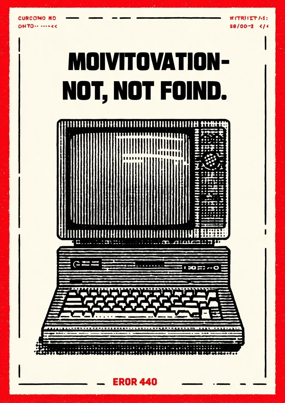
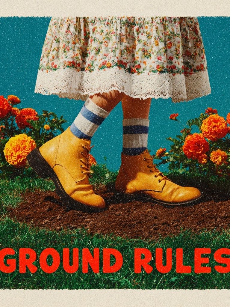
Vintage-inspired typography brings warmth. It works well with walnut, brass, rust, olive, or camel tones and can soften a room that feels a little too polished. If you like retro notes, Ground Rules — Retro Typography Print and Motivation Not Found Retro Print show how type can feel nostalgic without looking themed.



Editorial typography sits somewhere in between. It borrows from magazine layouts — clean grids, disciplined spacing, and elegant type hierarchy. In living rooms with tailored upholstery, marble, smoked glass, or black metal details, editorial-style text prints look especially sharp. Pair them with fashion-led wall art or muted pieces from our Fine Art collection to keep the room layered rather than flat.
How to Size and Place Typography Posters
Above a sofa, the safest rule is width. Your artwork grouping should cover around 60-75% of the sofa width. If your sofa is 210 cm wide, aim for a total arrangement width of roughly 126-158 cm. That could mean one 70x100 cm print, two 50x70 cm prints with a 7-10 cm gap, or a mixed gallery wall that lands within that span.
Hang the bottom edge of the frame around 15-25 cm above the sofa back. Any higher, and the art starts to float away from the furniture. For a single statement piece, 70x100 cm often feels balanced in an average living room. For narrower walls, 50x70 cm is usually enough. If you are styling typography for the living room in a compact apartment, do not assume smaller is always better — one larger print often looks calmer than several small ones.

Typography also mixes well with image-based art when you vary density. If one print is text-heavy, pair it with something quieter such as Textured White Abstract Poster or a soft neutral from the Abstract collection. That contrast keeps the eye moving and stops the wall from feeling too rigid.
Colours, Fonts, and Framing That Feel Cohesive
The most cohesive rooms repeat a visual language 2 or 3 times. If your living room already includes black hardware, choose typography with black letterforms or black frames. If the palette is softer — sand, oat, ivory, clay — look for warm off-whites and lower-contrast typography rather than stark white paper and sharp jet black.
Fonts affect mood immediately. Sans-serif styles feel modern, practical, and clean. Serif fonts feel more literary and refined. Script is harder to use in living rooms because it can read decorative very quickly, especially at a distance of 2-3 metres. For most spaces, one disciplined sans-serif or serif print will age better than anything overly ornate.

Frame choice should connect to the room, not compete with the print. Oak works with warm neutrals, soft modern interiors, and Scandinavian furniture. Black sharpens graphic typography and suits high-contrast spaces. White frames are useful when you want the art to blend into pale walls. If you are mixing text with tactile pieces like textured minimalist prints, keep the frame finish consistent across the grouping so the wall still feels intentional.
Styling a Gallery Wall with Typography
A good gallery wall needs one leader. Start with the typography piece that has the most visual authority — usually the largest format or the strongest contrast. Then add 3 to 5 supporting prints with different densities: one abstract, one soft texture, one object or still-life image, and another quieter text piece if needed.
A practical formula is 40% typography, 40% abstract or minimalist art, and 20% softer supporting imagery. That ratio keeps the arrangement expressive without becoming too message-heavy. For example, you might pair a strong text print with subtle concrete textures and one warm-toned abstract for balance.

Keep spacing consistent — usually 5-8 cm between frames. Consistency matters more than symmetry. If you are leaning frames on a picture ledge, overlap slightly but repeat frame colours so the display still feels structured. In open-plan rooms, a typography-led wall works particularly well because text remains readable from farther away than subtle line art.
Final Tips for a Living Room That Feels Personal
The best typography for the living room is not the loudest piece — it is the one that still feels right after a year of daily use. Choose words that reflect how you want the room to feel, then support them with the right scale, restrained colour, and a frame that matches the furniture. Start with one strong piece, live with it, and build slowly around it.
If you want longevity, stay close to a palette you already use in the room and mix typography with quieter art from our Typography collection and adjacent categories rather than filling every wall with text. A measured approach always looks more expensive, more settled, and more personal.
Frequently Asked Questions
What frame size works best for a 50x70 cm typography print?
A 50x70 cm print usually looks best in a matching frame size without a mount for a cleaner, more modern effect. Add a mount if you want a quieter, more classic presentation.
Can typography art work in a colourful living room?
Yes — just repeat one or two colours already in the room. If your sofa or rug is patterned, choose simpler text art with generous negative space.
Should all typography prints in one room use the same font style?
No, but they should share one common trait such as similar contrast, spacing, or frame colour. Mixing too many font personalities can make the wall feel disjointed.
Is glass reflection a problem for living room wall art?
It can be near large windows or lamps. Position frames away from direct glare or choose placements where the main viewing angle is slightly off-center.
What pairs well with typography above a sideboard or console?
A table lamp, a ceramic vase, and one smaller abstract print nearby usually create enough variation. Keep decor heights staggered so the text art remains the main focal point.