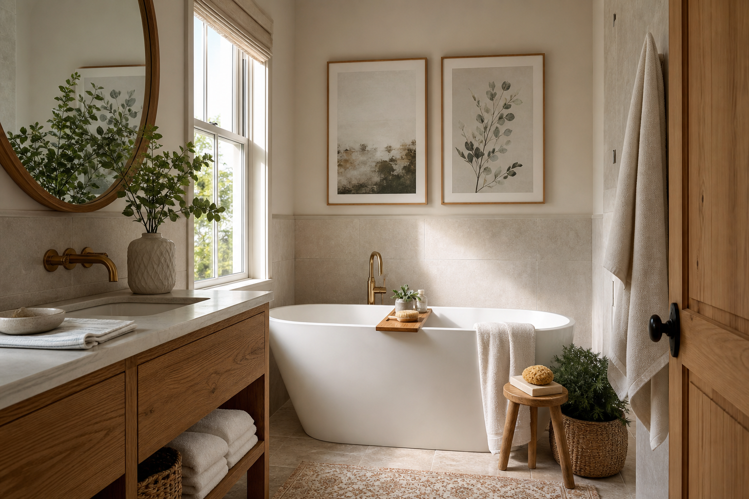
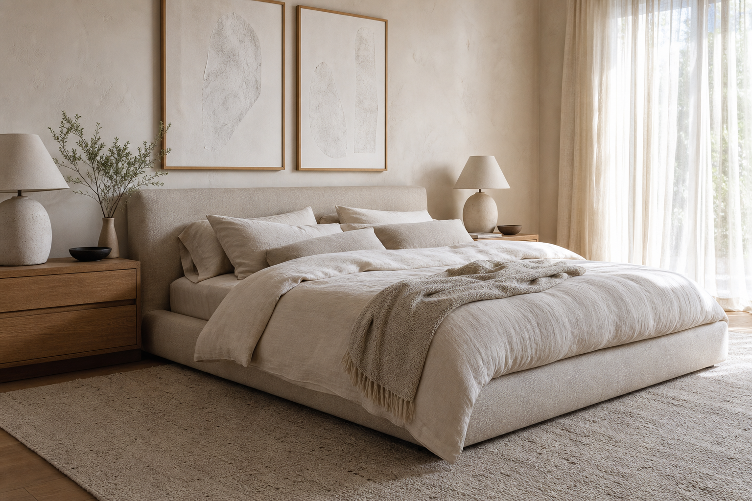
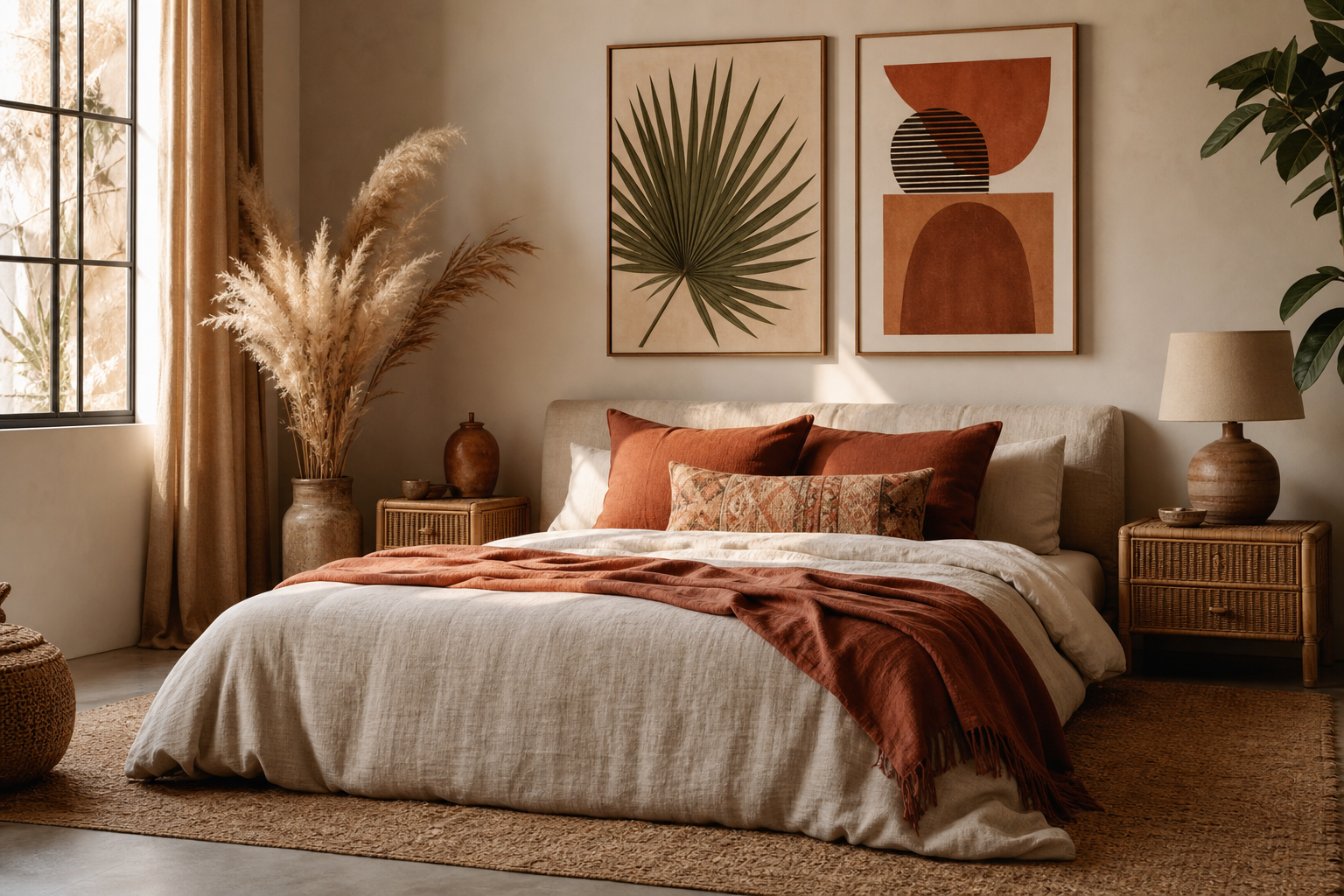
A well-chosen minimalist poster does not compete for attention. It controls the room by reducing visual noise, sharpening proportion, and giving the eye one clear point of rest. In practical terms, that means simple forms, restrained contrast, and enough empty space around the artwork to let it register from across the room.
What Makes a Minimalist Poster Work
The strongest minimalist pieces rely on three things: limited color, clear composition, and negative space. Most effective designs stay within one to three dominant tones, often neutrals such as warm white, sand, charcoal, muted taupe, or dusty black. That restraint is why a minimalist wall art collection feels calm even when the scale is large.
A minimalist poster also needs one readable idea. That could be a single silhouette, one geometric form, a soft texture field, or a sparse botanical line. If the eye has to decode five focal points, the piece stops feeling minimal and starts feeling unfinished. Prints such as White Flower Silhouette and Elegant White Fabric work because they hold to one visual gesture and let material, light, or contour do the rest.

Another detail that matters is contrast. Minimal does not mean faint. A quiet print still needs enough distinction between form and background to be visible at 2 to 4 meters away. Black on warm white, off-white on taupe, or textured gray on cream tends to read better than two tones that are nearly identical. If you want a softer result, texture can replace hard contrast — see the appeal of textured white abstract pieces or tonal works from our abstract art collection.
Choosing the Right Size and Format
A minimalist poster gains impact from scale faster than a busy artwork does. Because the composition is simple, going larger often makes the piece feel more architectural. For a slim entry wall or narrow corner, 30 x 40 cm or 40 x 50 cm usually feels precise without looking lost. Above a desk, 50 x 70 cm is a reliable single-print size. Above a sofa or bed, 70 x 100 cm creates a stronger statement, especially if the furniture is 160 to 220 cm wide.
The usual proportion rule is helpful: your artwork or arrangement should cover about 50 to 75 percent of the furniture width beneath it. For a 180 cm sofa, aim for a total art width of roughly 90 to 135 cm. This is where a minimalist poster excels — one oversized print can do the work of three smaller frames and keep the wall looking quieter.
Portrait orientation suits vertical spaces like entryways, sideboards, and the wall between two windows. Landscape pieces feel steadier over beds, sofas, and long credenzas. Square formats can work well in compact office zones, especially when paired with symmetrical furniture. If you like softer organic imagery, a print such as Sailing Boat Minimalist Wall Art can bring openness without overwhelming a small room.

If you are building a small wall arrangement, keep spacing tight — 5 to 8 cm between frames is enough. Wider gaps make simple works feel disconnected. Two matching 50 x 70 cm frames above a sideboard usually look more intentional than a scattered cluster of mixed small sizes.
Best Rooms for a Minimalist Poster
Living rooms benefit most from minimalist art when the furniture already has texture — boucle, linen, oak, stone, or brushed metal. In that setting, pared-back wall art stops the room from feeling over-layered. A large print from our Minimalist collection or a quiet piece from the Fine Art collection can anchor the space without interrupting the palette.
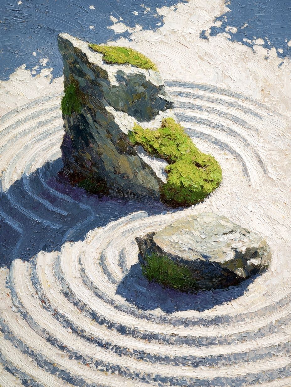
Bedrooms are ideal for softer tonal pieces because they support a slower visual rhythm. Look for washed neutrals, fabric-inspired textures, or calm botanical shapes rather than sharp geometry. That is why pieces like Window with Sheer Curtain or Zen Garden Stones translate so well in sleep spaces — they feel light, not decorative.


Home offices and study corners need slightly more definition. Too little contrast disappears behind screens, shelving, and task lighting. A minimalist poster with one darker shape, a structured line, or a disciplined typography layout tends to hold up better near a desk. If you prefer cleaner graphic edges, explore minimal typography prints for workspaces.
Entryways are often overlooked, but they suit minimalist art particularly well. These areas are usually passed through quickly, so one clear focal point works better than a detailed scene. A single 40 x 50 cm or 50 x 70 cm frame above a slim console is enough to set the tone for the whole home.

Color, Frame, and Finish Choices
The frame should reinforce the restraint of the artwork. Light oak adds warmth and works well with cream, beige, stone, and pale gray interiors. Matte black gives sharper definition and suits black-and-white compositions or rooms with metal accents. White frames are best when the wall color is deeper than the print background — otherwise the edges can disappear.
For a softer, gallery-like finish, choose matte paper and non-reflective glazing where possible. Gloss tends to fight with the quiet surface qualities that make a minimalist poster effective. This matters even more with low-contrast works such as White Cream Texture Poster or Textured Concrete Wall where subtle tonal shifts are part of the appeal.

Color pairing should follow the room, not dominate it. In warm interiors, stay with ivory, sand, clay-gray, and muted brown-black. In cooler interiors, use crisp white, soft slate, fog gray, and blue-tinted charcoal. If your furniture is already highly tonal, one slightly darker print can keep the room from going flat. For that balance, pieces from our mindfulness print collection can also work, especially in calm, neutral schemes with natural materials.
How to Style One Poster or a Small Set
One print works best when there is a clear architectural zone around it. Center it above the furniture, hang it 15 to 25 cm above the top edge, and keep nearby decor low. A tall vase, one table lamp, or a stack of books is enough. If you place multiple accessories directly beneath the frame line, the composition starts to feel crowded.
A diptych is useful when one piece feels too small but a gallery wall would be too busy. Choose two prints with a shared tone, texture, or margin size. Matching frame finishes are important here — mixed frames make minimalist sets look accidental. Two 50 x 70 cm works with a 6 cm gap between them create a width of roughly 106 cm, which is ideal over a 140 to 180 cm console or loveseat.

Three-piece arrangements need more discipline. Use one larger center frame or keep all three identical in size. The cleanest option is three 30 x 40 cm or 40 x 50 cm frames in a straight horizontal line. If you want variation, keep the palette nearly identical and let only the form change.

Common Mistakes to Avoid
The most common mistake is surrounding minimal art with too many competing objects. If the wall has open shelving, patterned cushions, heavy curtains, and high-contrast decor, the print loses its effect. Minimalist work needs breathing room — often at least 20 to 30 cm of visible wall around the frame for the composition to feel intentional.
The second mistake is choosing a print that is too small. A 21 x 30 cm frame above a full sofa usually looks like a placeholder, not a styling decision. If the wall is wide, either scale up or group two or three pieces with consistent spacing.
The third mistake is mixing visual languages. A soft fabric-texture print in pale cream can look awkward inside a thick ornate gold frame. In the same way, an ultra-clean graphic piece may feel disconnected in a heavily rustic room unless there is another modern element to echo it. If your interior bridges styles, transitional pieces from Yoga Practice — Minimalist Print to Yin Yang Teal Abstract Poster can help connect calm shapes with stronger presence.
Final Tips for a Calm, Elevated Look
A minimalist poster works best when every supporting choice is edited: the right scale, one clear frame finish, low visual clutter, and a palette with enough contrast to stay visible. Start with the room function first, then choose art that matches the pace of that space — softer in bedrooms, sharper in offices, larger in living rooms, and more vertical in entryways.
If you want a result that still feels good five years from now, lean toward neutral tones, simple forms, and materials that already exist in your room. Browse our minimalist poster collection first, then expand into quiet abstract prints or Window with Sheer Curtain when you want a little more texture without losing the calm.
Frequently Asked Questions
What frame width works best for minimalist art?
A slim frame between 1 and 2 cm usually looks cleanest. Wider frames can work on oversized pieces, but they should stay visually simple and matte.
Should I use a mat with a minimalist poster?
Yes, especially for 30 x 40 cm and 50 x 70 cm prints. A white or soft off-white mat adds breathing room and makes a simple composition feel more refined.
Can minimalist prints work on colored walls?
They can, as long as there is enough contrast. On greige, olive, clay, or charcoal walls, choose lighter artwork and a frame that clearly separates the print from the paint color.
How high should I hang a single minimalist print?
A good rule is to place the center of the artwork around 145 to 150 cm from the floor. Above furniture, keep the bottom edge roughly 15 to 25 cm above the top surface.
What pairs well with a minimalist poster besides more wall art?
Natural textures work best — linen curtains, oak furniture, ceramic vessels, wool rugs, and stone surfaces. These add depth without making the wall feel busy.