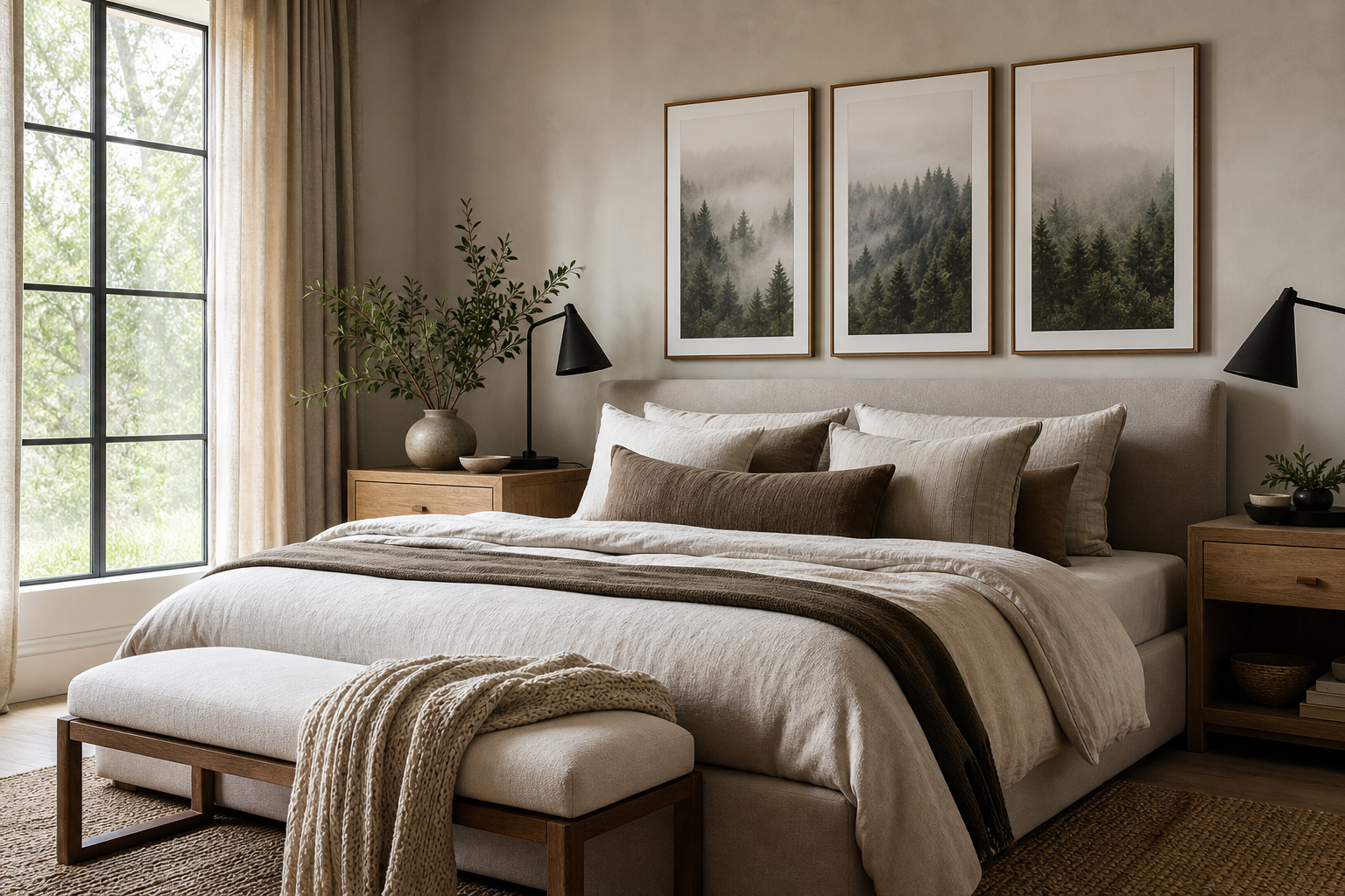
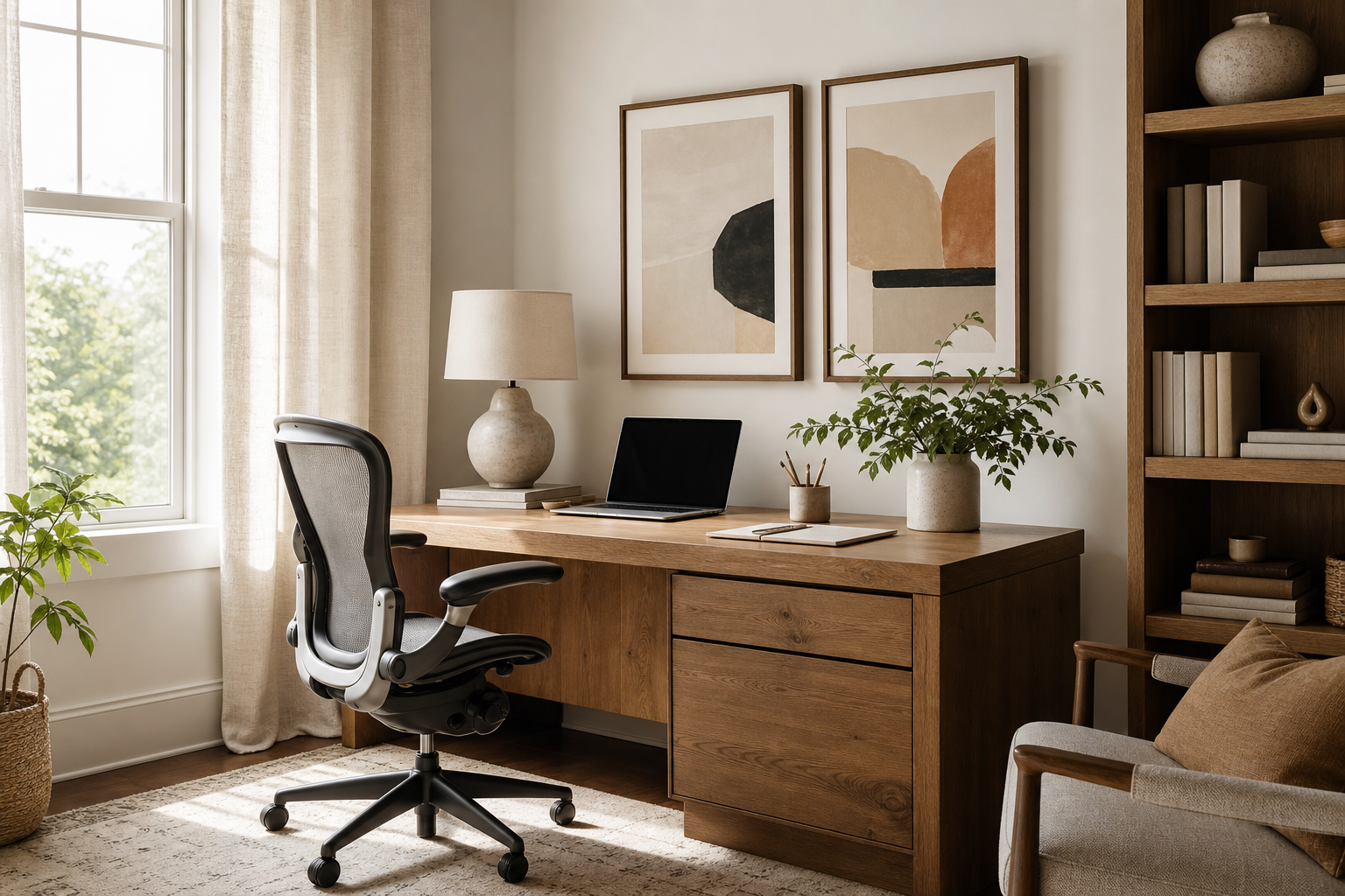
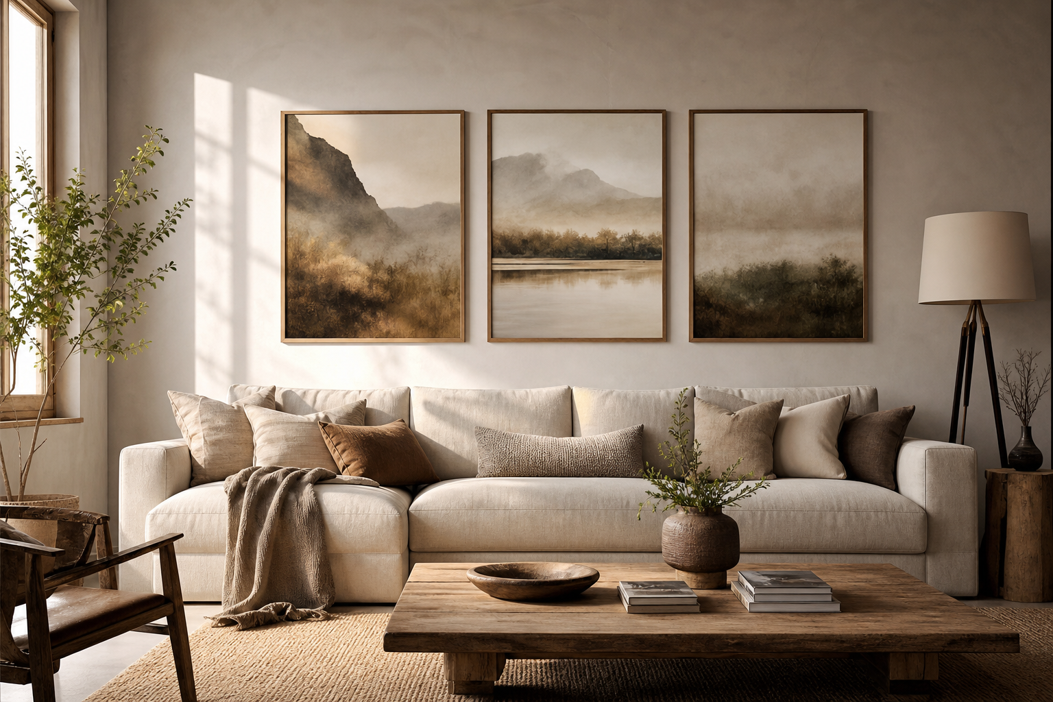
Good photography for the office does two jobs at once: it sharpens the room visually and lowers the background noise of the space. In practical terms, that means choosing imagery that feels intentional from 2 metres away and still rewarding up close. Offices benefit from photographs with clear composition, controlled contrast, and colours that sit comfortably with desks, screens, flooring, and branded materials.
Why Photography Works So Well in Workspaces
Photography gives an office immediate structure because it reads as real, precise, and professional. A meeting room with one large photographic print often feels more finished than the same room with several small decorative objects, simply because a single image can anchor the full wall. In reception areas, this matters even more: visitors form an impression within roughly 7 to 10 seconds, so wall art that looks considered can make the space feel organised before anyone speaks.
Photography for the office also tends to age well. Clean landscapes, architectural studies, and quiet monochrome scenes rarely feel trend-led after one season. If you want a look with broad longevity, start with our Photography collection and mix in pieces from architectural photography prints or minimalist wall art when the interior already has strong lines and restrained colour.

Choosing the Right Mood for Your Team
The best mood depends on how the space is used for 6 to 8 hours a day. For focused work, abstracted nature details and water imagery reduce visual strain better than busy street scenes or crowded portraits. Soft blues, muted greys, sand tones, and low-contrast greens are especially reliable in shared spaces because they do not compete with screens, presentation boards, or branded graphics.
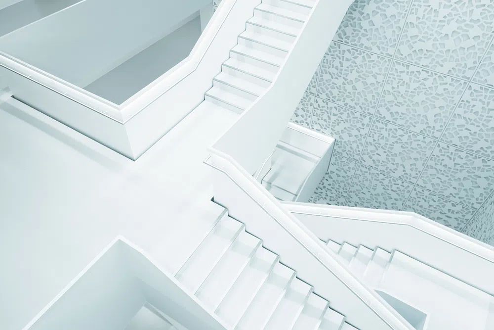
If the office needs to feel sharper and more directional, architectural photography is a strong choice. Clean staircases, facades, skylines, and geometric shadows bring order without becoming cold. A piece like the one linked in Modern White Staircase works particularly well in conference rooms, where crisp lines support a more structured tone.
Nature-led photography is better for teams who want calm without looking domestic. Water, horizon lines, and open landscapes slow the room visually and create depth on flat walls. Sunlit Water Surface is a good example of photography for the office that feels polished rather than ornamental.

For offices that want a more editorial, metropolitan feel, city and building imagery can help. The trick is to choose cleaner compositions over high-energy traffic scenes. Pieces from our office-friendly photography range and the Architecture category are often the safest starting point because they hold a professional tone across different departments.
Best Places to Hang Office Photography
Reception is the clearest place to invest in scale. If the wall behind a desk is 180 to 240 cm wide, a single framed piece around 70 x 100 cm or 100 x 140 cm usually looks balanced. Smaller works can feel underpowered in this zone unless grouped tightly as a pair or quartet.
In meeting rooms, hang art on the wall visible from the doorway or directly opposite the table. That creates a focal point during video calls and gives the room more presence without distracting the speaker. Corridors benefit from repeated formats — for example, three prints at 50 x 70 cm hung with 7 to 10 cm between frames. This rhythm helps long passageways feel intentional rather than empty.

Private offices can handle slightly more personality. A moody city image, a fine-art photograph, or a subtle portrait works well when the room is used by one person and client traffic is moderate. Open-plan spaces need broader appeal, so stick to universal subjects — architecture, landscape, water, sky, or abstract detail.
How to Pick the Right Size and Layout
A simple rule helps: aim for art that covers about 60 to 75% of the width of the furniture below it. Over a 160 cm credenza, that means a total artwork width of roughly 96 to 120 cm. Over a desk, keep the arrangement narrower so it does not overpower the workstation — around 80 to 100 cm total width is usually enough.
Single statement pieces suit reception walls, executive offices, and compact meeting rooms. Pairs work best when you want symmetry — two 50 x 70 cm frames or two 70 x 100 cm frames with a 6 to 8 cm gap create a clean, balanced look. Gallery arrangements make sense in corridors, breakout areas, and larger open-plan zones, but keep the spacing disciplined. Once gaps go beyond 10 cm, the grouping starts to feel fragmented.
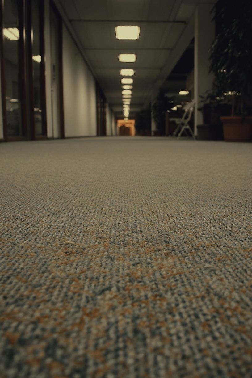
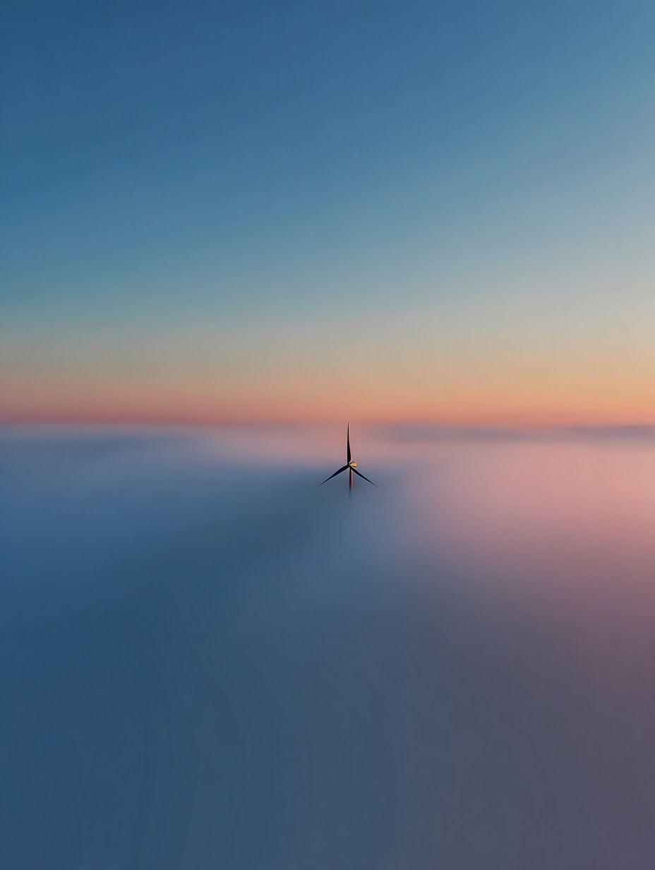
If you prefer a calmer arrangement, choose one dominant image with generous matting or a slim frame. If the office needs more energy, mix four coordinated prints in matching frames. Empty Office Corridor shows how linear perspective can strengthen a narrower wall, while Wind Turbine at Dawn suits larger areas that need a little openness and horizon.
Framing, Finish, and Colour Tips
Frame choice changes the tone immediately. Black metal or thin black wood frames feel crisp and modern, especially with monochrome or architectural images. Oak or ash softens the space and works well in offices with timber desks, acoustic panels, or warmer lighting. In most professional interiors, a frame width between 1 and 2 cm looks refined without pulling focus from the image.
Finish matters under office lighting. In bright rooms with overhead LEDs, a lower-glare finish is usually easier on the eye than a highly reflective surface. If the office has large south-facing windows, avoid very dark images unless they will be lit properly — otherwise the detail disappears for much of the day.
Colour should connect to the room, not fight it. If your office already uses blue upholstery, grey carpet, and white walls, keep the art in the same family with one warmer note such as sand, bronze, or muted amber. For a cleaner visual flow, pair photography with abstract prints or fine art wall pieces only when the palette overlaps clearly.

Styling Ideas for Different Office Types
Creative studios can handle more contrast and a little more atmosphere. Architectural night scenes, moody office imagery, and unusual perspectives feel at home when the rest of the space already has personality. Moody Office Light fits this category well because it feels editorial rather than corporate.
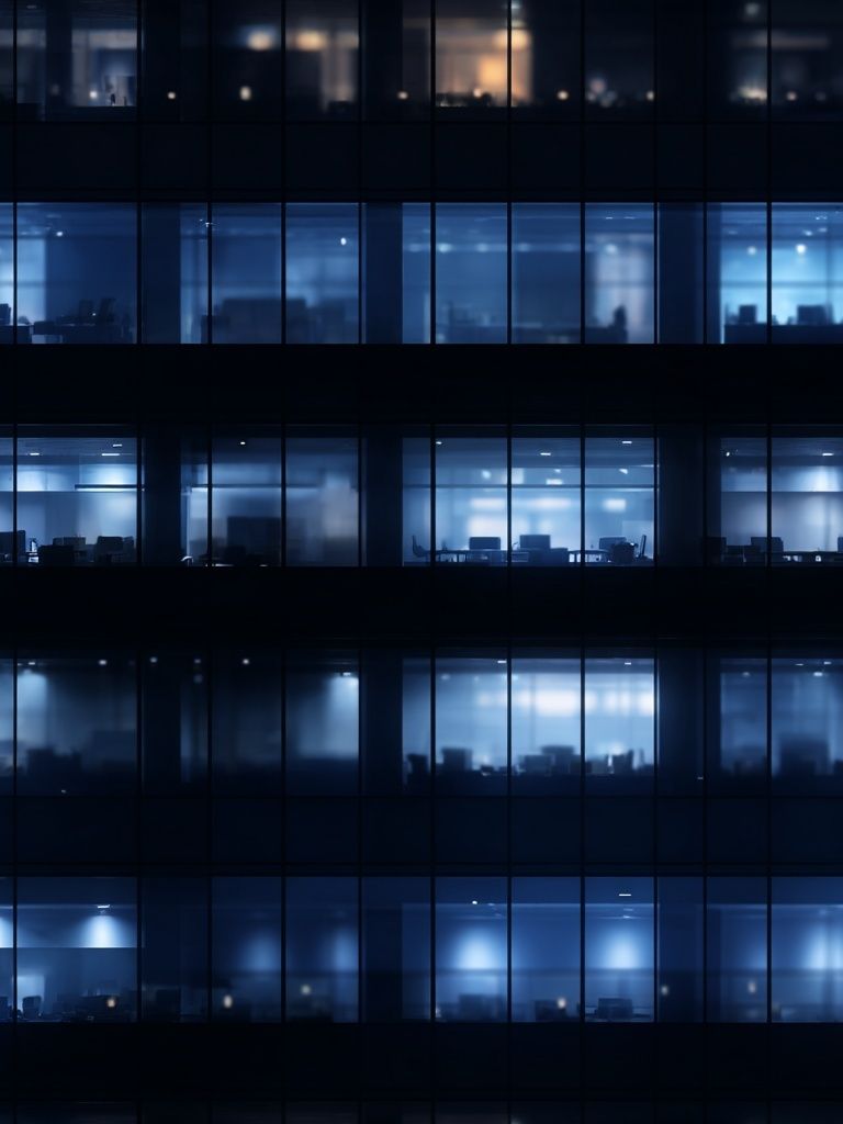
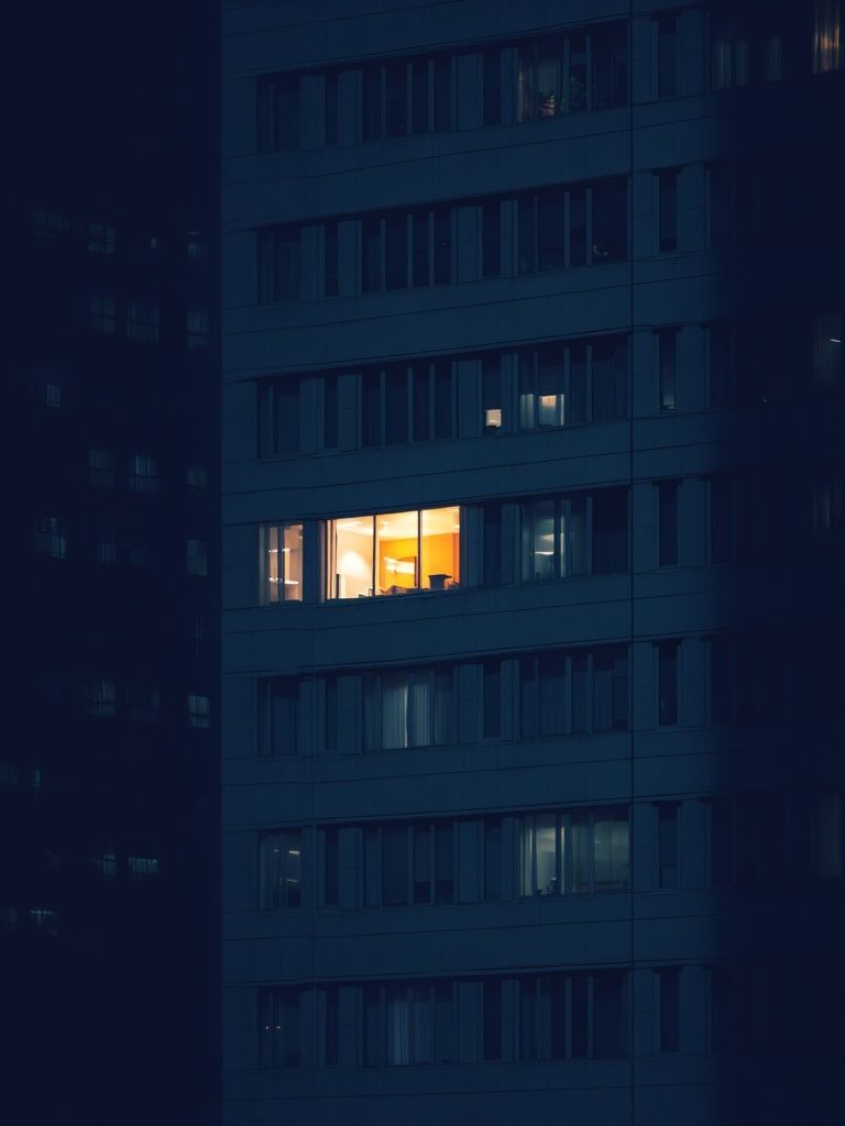
Corporate offices usually benefit from cleaner, broader-appeal images. Think skylines, structured interiors, monochrome details, or quiet landscapes. Illuminated Office Window or Blue Office Windows Night can work in reception or boardrooms where a sharper metropolitan tone makes sense.
Remote work setups need smaller scale and softer energy. One 40 x 50 cm or 50 x 70 cm piece above a desk is often enough in a home office. Choose imagery that supports concentration instead of demanding attention. That is where photography for the office overlaps nicely with home styling — restrained subject matter, limited colour, and strong composition.
Client-facing spaces need the clearest edit of all. Avoid anything overly humorous, niche, or emotionally heavy. Photography for the office in these rooms should feel polished across industries, whether the visitor is from finance, design, healthcare, or tech. Calm water studies, architectural forms, and open landscapes are the safest choices.
Final Checks Before You Buy
Before you order, check four things: scale, light, durability, and brand fit. Measure the wall and the furniture below it, then mark the intended size with painter's tape. View the wall at morning and late-afternoon light levels — an image that looks balanced at noon can feel too dark by 4 pm. If the area has heavy traffic, choose framing and placement that will not be knocked by chairs, bags, or passing equipment.
The best office art still looks right after 2 or 3 years, not just on installation day. That usually means choosing images with strong composition over novelty, and colours that work with future furniture updates. Start with one clear direction — architectural, landscape, monochrome, or nature detail — and repeat it across the space for cohesion.
Final thoughts
The most successful office walls are edited, not crowded. One strong photograph in the right size will almost always outperform several filler pieces, especially in workspaces where focus matters. Aim for imagery that supports the room's purpose, matches the lighting, and feels steady over time.
If you want photography for the office that feels calm, credible, and visually sharp, begin with versatile subjects and disciplined framing. That approach works in reception areas, meeting rooms, private offices, and home workspaces with very little adjustment.
Frequently Asked Questions
What size photography works best above a desk?
For most desks 120 to 160 cm wide, a single 50 x 70 cm print or a pair of smaller frames usually looks balanced. Keep the total width around two-thirds of the desk width.
Should office photography be colourful or neutral?
Neutral usually lasts longer, especially in shared spaces. Add colour through one or two controlled tones rather than highly saturated multicolour scenes.
How high should I hang wall art in an office?
Use eye level as a base — the centre of the artwork is often best at around 145 to 150 cm from the floor. In reception areas above furniture, leave roughly 15 to 25 cm between the furniture top and the frame.
Do black frames or wood frames look more professional?
Both can work. Black frames feel sharper and more contemporary, while light wood feels warmer and softer in offices with natural materials.
What kind of photography is safest for client-facing spaces?
Architecture, landscapes, water details, and understated black-and-white images are the most universally appealing. They read as polished without feeling too personal.