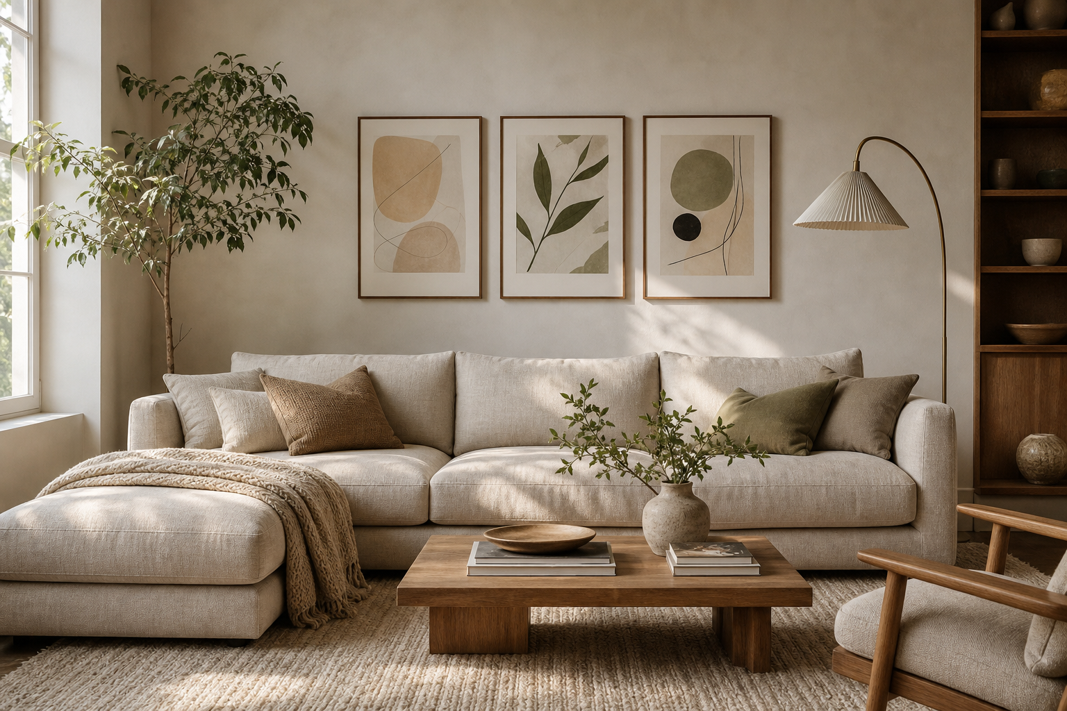
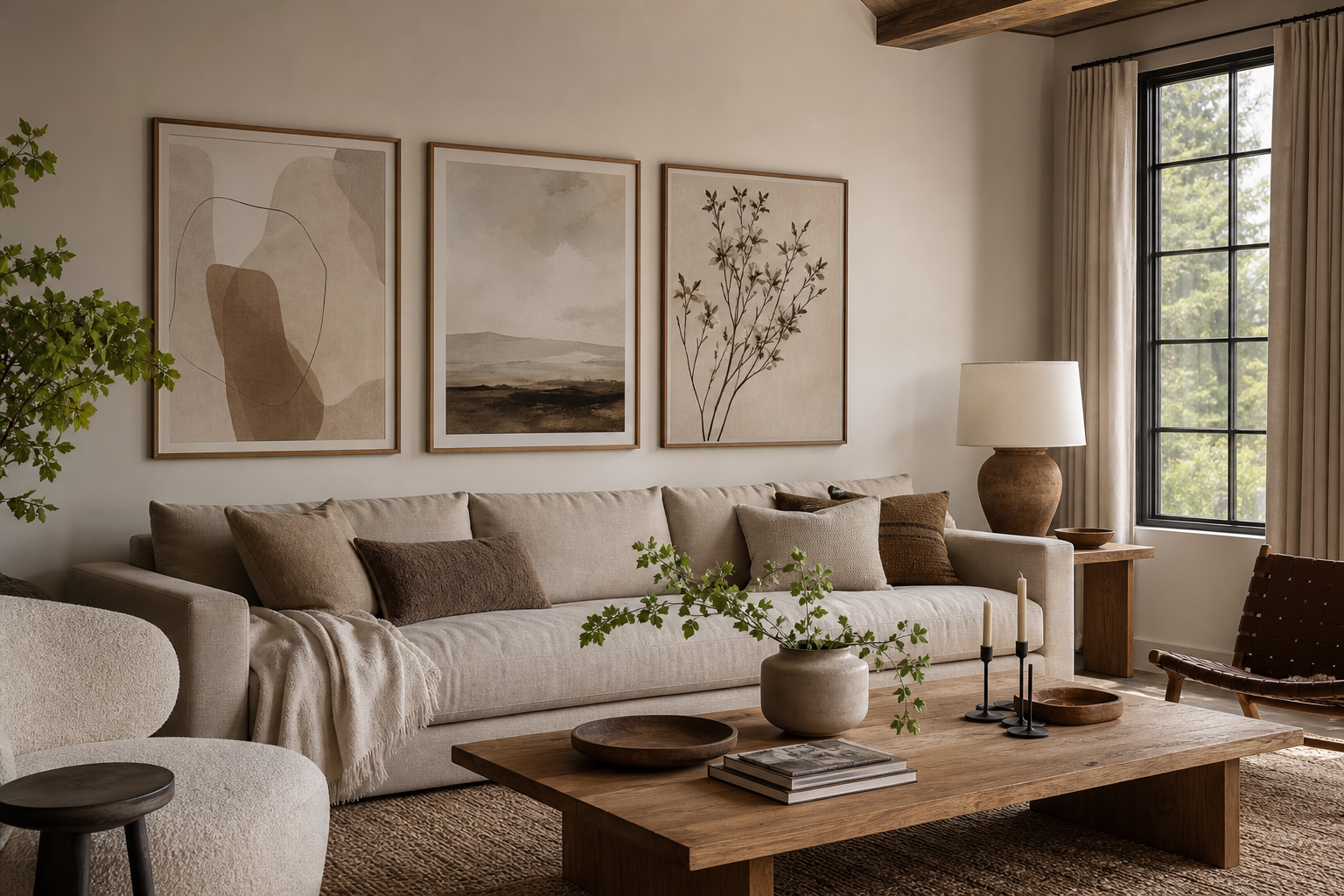
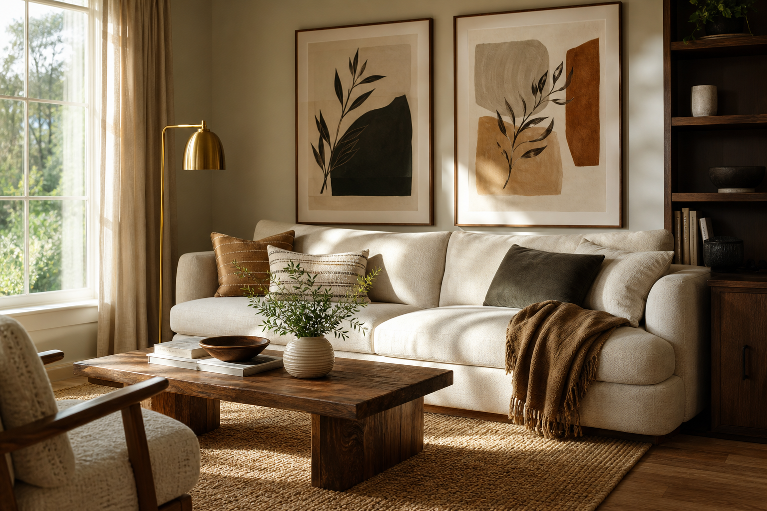
Photography for the living room works because it adds realism, depth, and atmosphere without making the room feel overdesigned. A strong photographic print can bring in movement, architecture, nature, or quiet human presence in a way that feels immediate. That directness suits a space used every day — especially a living room, where comfort matters as much as style.
Unlike highly decorative motifs, photography often reads as clean and contemporary. It can sharpen a soft interior, soften a modern one, and make a neutral palette feel intentional rather than unfinished. If you want wall art that feels personal but still polished, our photography collection is one of the easiest places to start.
Why Photography Feels Right in a Living Room
A living room benefits from art that rewards repeat viewing. Photography does that well because it holds detail: shadow, texture, weather, gesture, distance. A black-and-white image can add structure to a room full of curved upholstery, while a warm-toned travel scene can stop a grey space from feeling flat. Good photography for the living room usually does one of three things clearly: it introduces mood, it echoes the room’s palette, or it creates contrast.
Rooms with simple furniture often benefit from more atmospheric images — misty landscapes, architectural forms, or quiet portraiture. Rooms with bolder shapes or patterned textiles usually look better with photographs that have restraint in composition. If the sofa, rug, and joinery already do a lot visually, the artwork should edit the scene rather than compete with it.

Choose a Style That Matches the Room
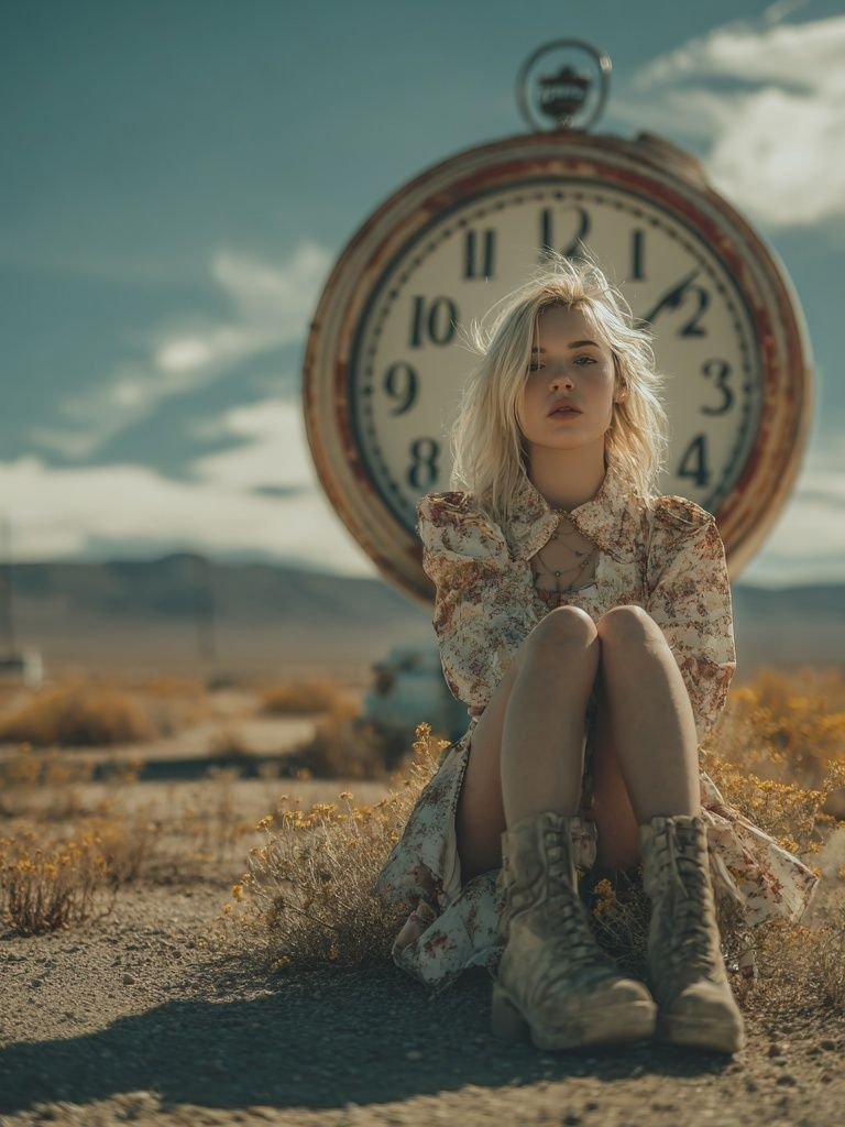
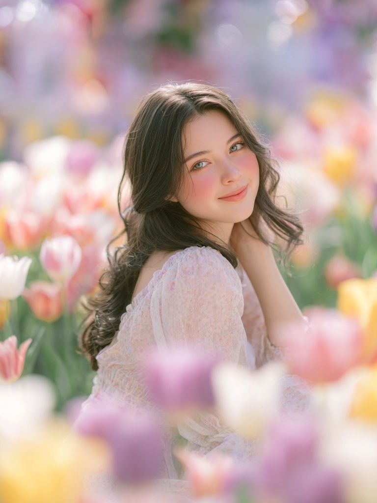
Portrait photography brings intimacy. It works best in living rooms that already feel layered and collected — think books, accent lighting, mixed materials, and softer seating. A piece like Woman Sitting by Vintage Clock adds a narrative quality that suits vintage, transitional, or European-inspired interiors.
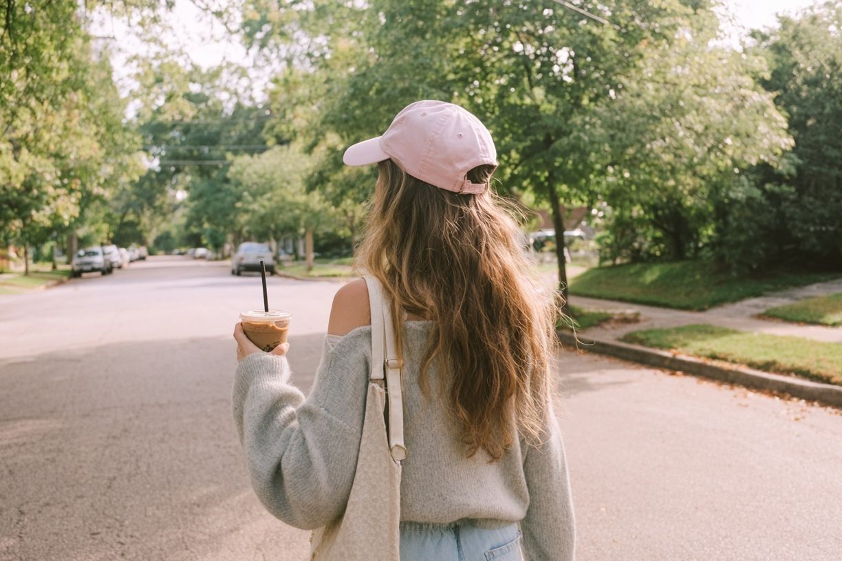
Landscape photography opens a room visually. In smaller living rooms, wide horizons and nature scenes can make the wall feel less enclosed. In larger rooms, they help fill broad spaces without looking heavy. If your furniture is low-profile and the room gets good daylight, a calm scene such as Woman Walking in Nature can reinforce that airy feeling.
Black-and-white photography adds discipline. It is especially useful when the room already contains several colors — rust, olive, navy, caramel — because it keeps the wall from becoming another color block. For cleaner interiors, you can also look beyond traditional photography and mix in pieces from our fine art collection or minimalist art prints to keep the overall arrangement quiet.
Travel and architectural photography bring structure. They work well in living rooms with sharper silhouettes, stone finishes, black accents, or modern lighting. If you prefer imagery with lines, geometry, and built form, our architecture wall art offers a strong bridge between photography and interior styling.
Getting the Scale and Placement Right
The most common sizing mistake is choosing artwork that is too small. Above a sofa, aim for art that spans 60% to 75% of the sofa width. For a 200 cm sofa, that means a total art width of roughly 120 to 150 cm. That could be one 70 x 100 cm piece, two 50 x 70 cm frames side by side, or a three-piece arrangement with even spacing.
Hang the artwork so the center sits around 145 cm from the floor as a starting point, then adjust to the furniture. Above a sofa or sideboard, keep the bottom edge 15 to 25 cm above the top of the furniture. Above a fireplace, stay tighter — usually 10 to 20 cm above the mantel — so the art feels connected rather than floating.
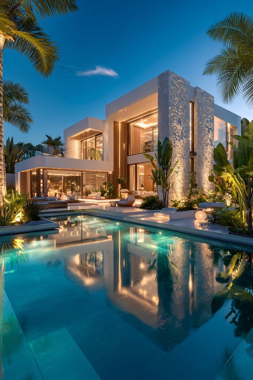
Large empty walls need either one generous anchor piece or a deliberate multi-frame composition. A single undersized print in the middle of a wide wall can make the room feel incomplete. For broad walls, one oversized image such as Modern Luxury Villa at Dusk or a paired arrangement of two vertical works often looks more resolved.
How to Build a Cohesive Photo Wall
A successful photo wall depends on consistency more than matching. The easiest way to create that consistency is to repeat one element across all pieces: the same frame color, the same mount width, a shared tonal palette, or a common subject. If every image is different in both color and composition, the wall starts to read as cluttered.
For a symmetrical setup above a sofa, use two or three frames in identical sizes — for example, three 50 x 70 cm pieces with 5 to 7 cm between each frame. For a looser gallery wall, keep the gaps tighter than most people expect: 4 to 6 cm usually looks cleaner than 10 cm. Start with the largest piece slightly off-center, then build around it.
A good formula is to mix one focal image, two supporting images, and one quiet piece that gives the eye a rest. That quiet piece could be a minimal texture study or a soft-toned fine art print. A gallery that combines photographic interiors, architecture, and tonal calm can work especially well in modern homes.
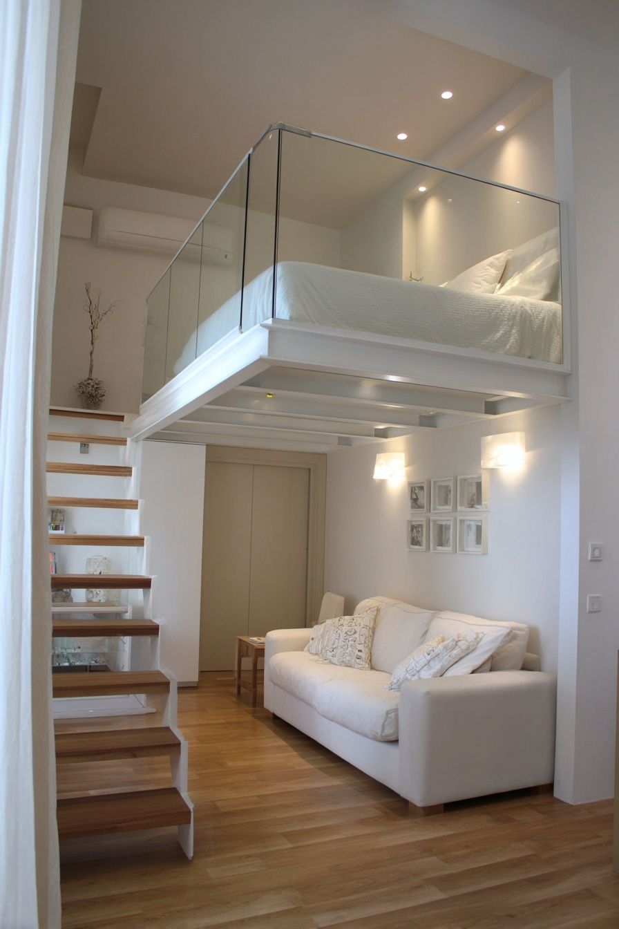

If you want the wall to feel curated rather than themed, mix photography with adjacent categories. A photographic interior like Japandi Interior Living Space pairs naturally with Textured White Abstract because both rely on softness, space, and restrained color.

Frames, Finishes, and Paper Choices
Frames change the tone quickly. Black frames add definition and suit monochrome, architecture, and higher-contrast photography. Oak frames warm up cooler images and work well with Scandinavian, Japandi, and relaxed contemporary interiors. White frames feel lighter but need enough contrast with the wall to avoid disappearing.
Mounts make photography look more gallery-like. A white mount of 4 to 8 cm around the image gives the work breathing room and helps smaller prints feel more substantial. If you have a modest-size piece but a large wall, a wider mount can improve presence without needing to jump immediately to a much bigger frame.
Finish matters too. Matte prints tend to suit living rooms better than glossy ones because they reduce glare from windows and lamps. That matters in rooms with changing daylight or glass doors opposite the artwork. A soft image like Window with Sheer Curtain benefits from a calm, matte presentation, while a graphic piece from our abstract collection can handle a crisper framing treatment.

Using Light and Color to Set the Mood
Natural light should guide your choice. Bright south-facing rooms can handle deeper contrast, darker photography, and black frames because the light prevents them from feeling heavy. Dimmer rooms usually benefit from lighter-toned images, visible negative space, and warmer neutrals. In those spaces, photography for the living room should lift the atmosphere rather than absorb it.
Match undertones, not exact colors. If your room has warm beige upholstery, travertine, walnut, or brass, look for images with sand, cream, tobacco, olive, or sun-washed tones. If the room leans cooler — grey stone, chrome, charcoal, or crisp white — black-and-white photography and cooler architectural subjects tend to feel more natural. A room with lots of texture often needs quieter imagery, while a smoother, sleeker room can take bolder contrast.
Use one image to echo the room and another to create tension. For example, a soft neutral interior can benefit from one calming photograph and one more graphic architectural print such as Modern White Staircase. That combination keeps the room from becoming too flat while still staying cohesive.

Wrap-Up: Simple Styling Tips Before You Buy
Before you buy, check three things: scale, tone, and viewing distance. Measure the wall and the furniture beneath it, then tape out the artwork size on the wall. From 2 to 3 meters away, the piece should still feel present. If it disappears at that distance, go larger.
Then look at the room as a whole. The best photography for the living room does not need to match every cushion or finish — it just needs to support the atmosphere you want. If the goal is calm, choose restraint in color and composition. If the goal is energy, choose stronger contrast or a sharper subject. Start with one excellent piece, then build outward only if the wall still needs more.
Frequently Asked Questions
What size photography print works best above a 3-seat sofa?
For a standard 210 to 230 cm sofa, aim for art around 120 to 160 cm wide in total. That usually means one 70 x 100 cm frame, two 50 x 70 cm frames, or a larger multi-piece arrangement.
Should living room photography be framed with or without a mount?
A mount gives the image a more refined, gallery-style finish and helps smaller works feel more substantial. If the image is highly detailed or dramatic, no mount can look more contemporary and direct.
Can I mix photography with abstract or minimalist art in one wall arrangement?
Yes — it often improves balance. Keep one shared element consistent, such as frame color, tonal range, or spacing, so the grouping feels intentional.
How do I reduce glare on framed photography in a bright room?
Choose a matte print surface and avoid placing the work directly opposite strong windows if possible. Hanging the piece slightly off the brightest reflection line also helps.
What frame color is safest if I may add more art later?
Black and natural oak are the easiest long-term options. Both work across photography, fine art, and abstract pieces, so expanding the arrangement later is much simpler.