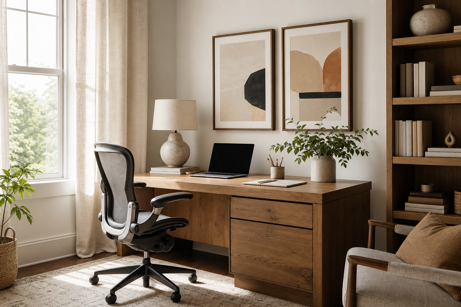
Why Art Matters in a Productive Workspace
The walls around your desk affect how long you can concentrate without mental fatigue. A blank office can feel sterile after 2 or 3 hours, while an overloaded wall can pull your attention every few minutes. The sweet spot is visual structure: art that gives the eye a place to land, supports the room's mood, and reinforces the kind of work you do. That is the practical value of home office art that boosts productivity — it helps shape a workspace that feels intentional rather than improvised.
In most home offices, the best art choices reduce visual noise instead of adding it. Clean compositions, limited palettes, and subjects with a clear focal point tend to work better than busy scenes with dozens of competing details. If your workday already involves dense information, look first at our Minimalist collection or abstract art prints with controlled color and form. Both give the room personality without turning your wall into another screen demanding attention.
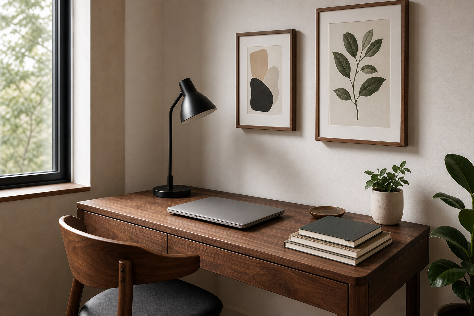
A productive workspace also benefits from emotional tone. If your office doubles as a guest room or bedroom corner, art can create a mental boundary between "living" and "working". Architecture prints often feel structured and professional, while mindfulness wall art can soften high-stress rooms where meetings, deadlines, and constant notifications dominate the day.
Choose Colors That Support Focus
Color affects pace. Cooler hues like blue, sage, stone, and muted teal typically support sustained focus because they lower visual intensity. If your work requires precision — writing, coding, bookkeeping, studying — lean into soft neutrals and desaturated tones. A palette that stays within 3 or 4 related shades usually feels calmer than one with strong contrast on every wall.
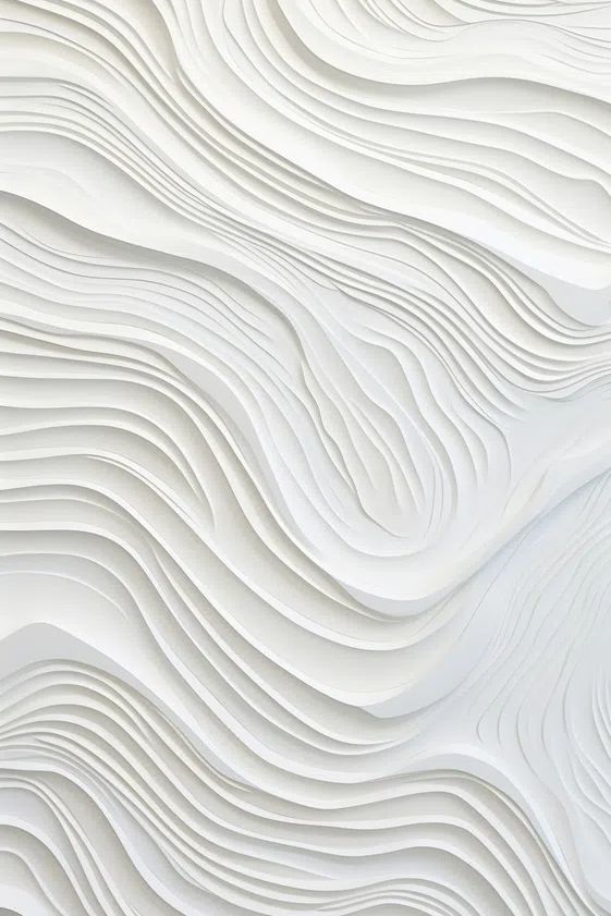
For that reason, home office art that boosts productivity often works best in balanced tones rather than loud primaries. Textural whites, dusty blues, and gentle grays keep the room bright without becoming flat. A piece like Textured White Abstract suits an office that needs clarity, especially when paired with light oak, matte black, or white shelving.

If your work is more creative — design, brainstorming, strategy, content planning — add one measured hit of energy. Amber, terracotta, warm yellow, or a controlled coral accent can help the room feel active. The key is ratio: keep roughly 70% of the office neutral, 20% in supporting mid-tones, and only 10% in higher-energy colors. That prevents stimulation from tipping into distraction.
For a stronger but still grounded option, pieces from our Mid Century Modern range or selected typography wall art can introduce sharper contrast in small doses. One well-placed accent piece is usually enough in a room under 120 square feet.
Pick Subjects That Keep You Inspired
Subject matter matters as much as color. In a work setting, the strongest themes are those that encourage momentum, perspective, or calm without inviting a long stare. Abstract forms are reliable because they create atmosphere instead of narrative. You can read them quickly, absorb the mood, and get back to work.
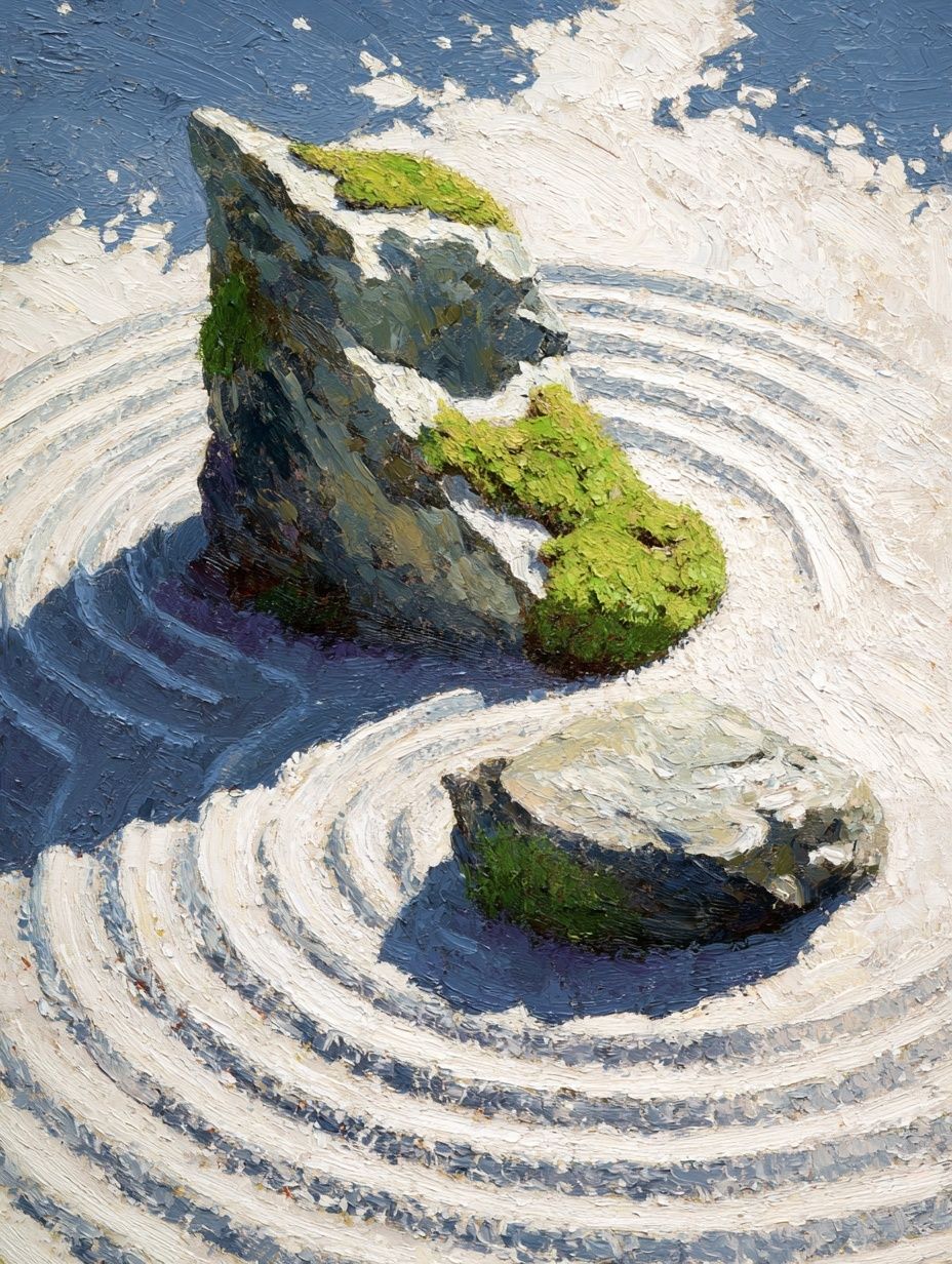
Nature-based imagery is another strong choice, particularly if your office lacks a window view. Water, horizon lines, trees, and stone compositions can reduce the hard edges of screens and office furniture. If you want a steady, quiet focal point near your desk, Zen Garden Stones is especially effective because the composition is simple and the subject is restful.
Typography works when it is restrained. One short phrase, one clean layout, one clear intention. Too many words on the wall can feel like more tasks. If you like verbal reminders, keep them concise and place them where they support your routine — not directly in your main line of sight during focused work. For deeper visual calm, browse our Fine Art collection and architecture prints for structured, modern offices.
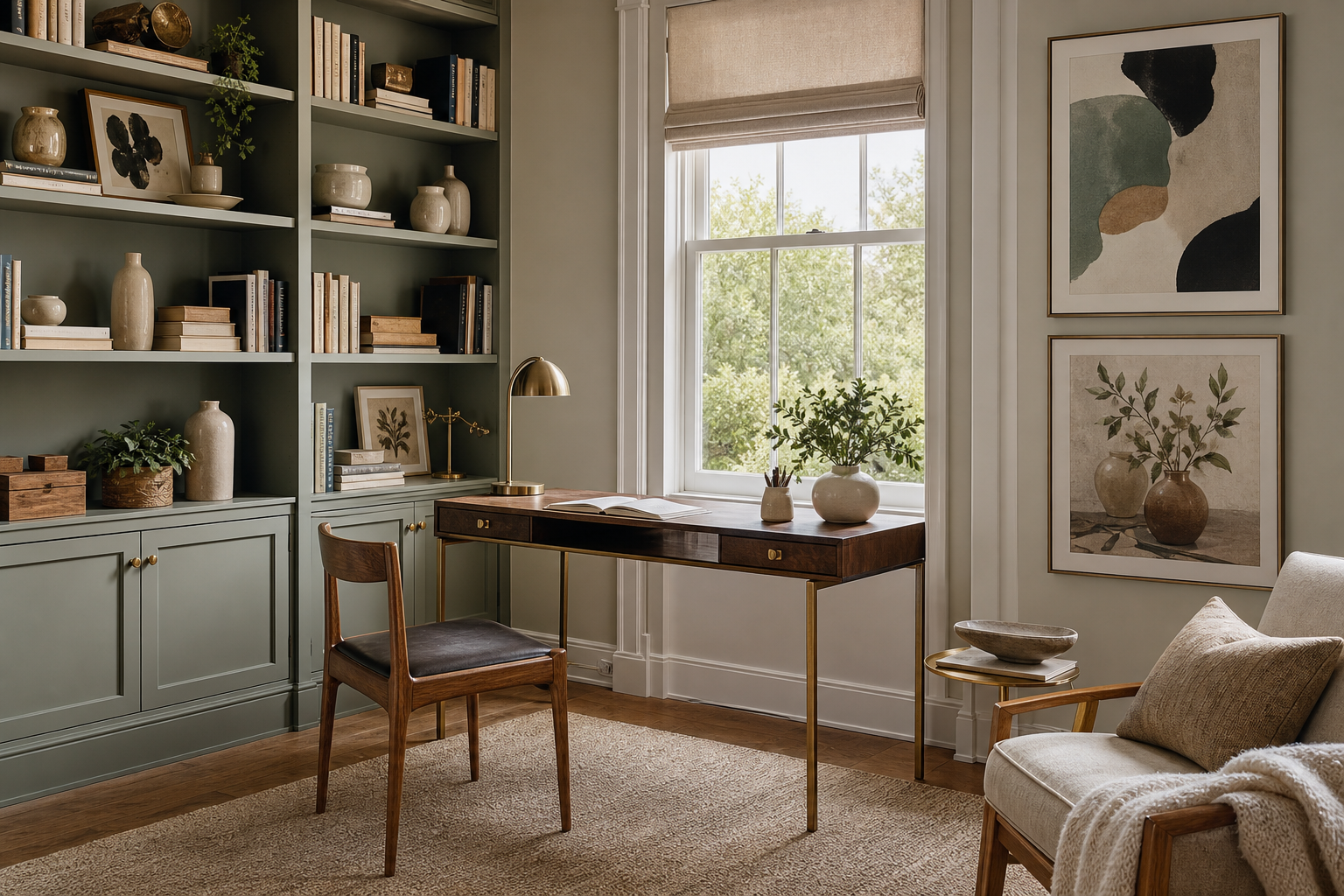
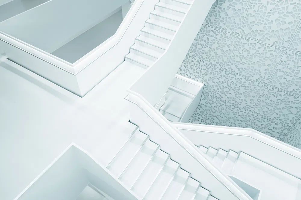
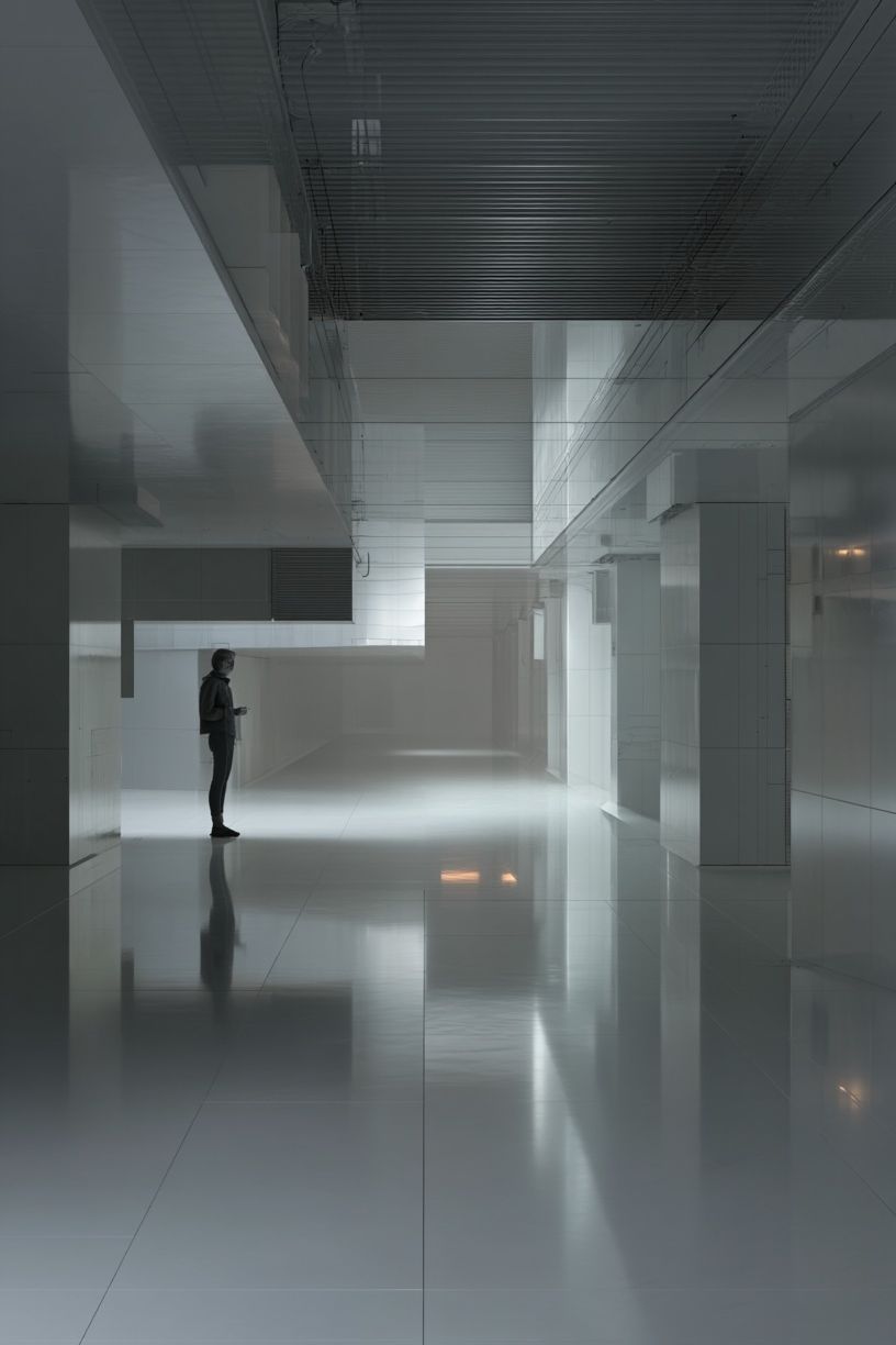
City scenes and architecture can be useful for analytical work because they communicate order, rhythm, and ambition. Straight lines, facades, staircases, and geometric interiors create a subtle sense of progress. That makes them a smart fit for consulting, finance, project management, and executive-style home offices.
Where to Place Art for the Best Effect
The most effective placement is usually behind the desk, across from the desk, or slightly off to the dominant eyeline. Each position changes how the art functions. Behind the desk creates a polished backdrop for video calls. Across from the desk gives you a restorative view during short focus breaks. Off to one side helps the room feel finished without competing with your monitor.
If you are hanging one main piece above a desk, leave 8 to 10 inches between the desktop or shelf and the bottom of the frame. That gap keeps the arrangement connected to the furniture instead of floating too high. For seated viewing, the center of the artwork should often land around 57 to 60 inches from the floor, adjusted slightly for lower desks and compact rooms.
Architecture pieces are especially strong across from the desk because they give the eye depth and structure. A print such as Modern White Staircase works well in narrow offices where you want the wall to feel more open.
Avoid placing highly detailed work directly beside your screen if you struggle with distraction. That side wall is better for low-contrast art, tonal abstracts, or a small pair of prints with plenty of breathing room. Save the more graphic or motivational pieces for the wall behind you or near the room entry, where they set tone without interrupting concentration.
Sizing, Framing, and Layout Tips
Scale is where many home offices go wrong. Art that is too small makes the room feel temporary. Art that is too large can visually crowd a narrow workspace. Above a desk that is 40 to 48 inches wide, one print around 16x20 inches or 18x24 inches usually feels balanced. Above a desk that is 55 to 65 inches wide, step up to 24x36 inches or build a pair of 16x20 inch frames.
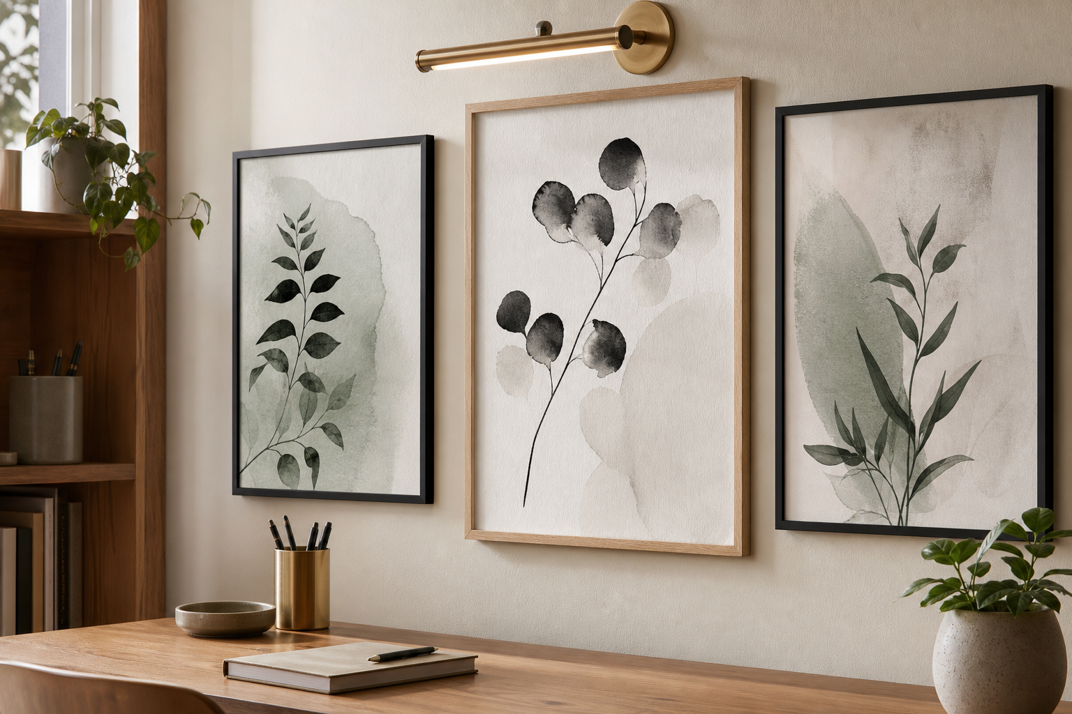
If you prefer a gallery wall, keep it tight and disciplined. In a work setting, 4 pieces are often enough. Use even spacing of 2 to 3 inches, align the outer edges, and stick to one frame finish. Black, oak, and white frames are the easiest choices because they connect well with most desks, shelving, and task lighting.


Frame finish changes the whole mood. Matte black reads crisp and professional. Natural oak softens the office and adds warmth. White frames work best in bright spaces with pale walls, but they need enough contrast in the artwork to avoid disappearing. If your office already includes metal shelves, a black desk lamp, or dark monitor arms, black frames will usually make the room feel more coherent by repeating that linework.
Simple Ways to Style a Home Office That Feels Work-Ready
Art works best when the rest of the office supports it. Start with light. A desk lamp at 2700K to 3000K adds warmth for early mornings and evening work, while indirect daylight keeps colors accurate during the day. Place art where it can catch natural light from the side rather than direct glare from a window behind you.
Then look at what sits below the art. A desk with visible cable clutter, random stationery, and uneven stacks will cancel out the calm effect of even the best print. Keep only 3 to 5 daily-use items on the desktop: lamp, notebook, pen cup, water glass, and one tray. That allows the wall art to do its job as a focal point.
For offices that need a little more personality, combine one stronger piece with smaller supportive accents. A motivational typography print near shelving can work well if the main desk wall stays quieter. If you want a sharper, more energetic corner, Work Hard Typography Poster suits side walls, reading nooks, or the area near filing cabinets rather than the center of your visual field.
Final Touches and Smart Poster Picks
Choosing home office art comes down to matching the room to your work rhythm. If you spend 6 to 8 hours doing deep-focus tasks, choose low-contrast abstracts, nature imagery, or calming fine art. If your work is presentation-heavy and client-facing, clean architecture and minimalist pieces give the office a more polished, credible backdrop. If you need a spark of momentum, add one typography or color-led print — not five.
A good final test is simple: sit at your desk, look up every 20 minutes, and ask whether the wall feels calming, energizing, or noisy. The best home office art that boosts productivity does one of the first two and never the third. Start with one strong piece, scale it properly, and build around it with restraint. That is how a home office starts looking better — and working harder.