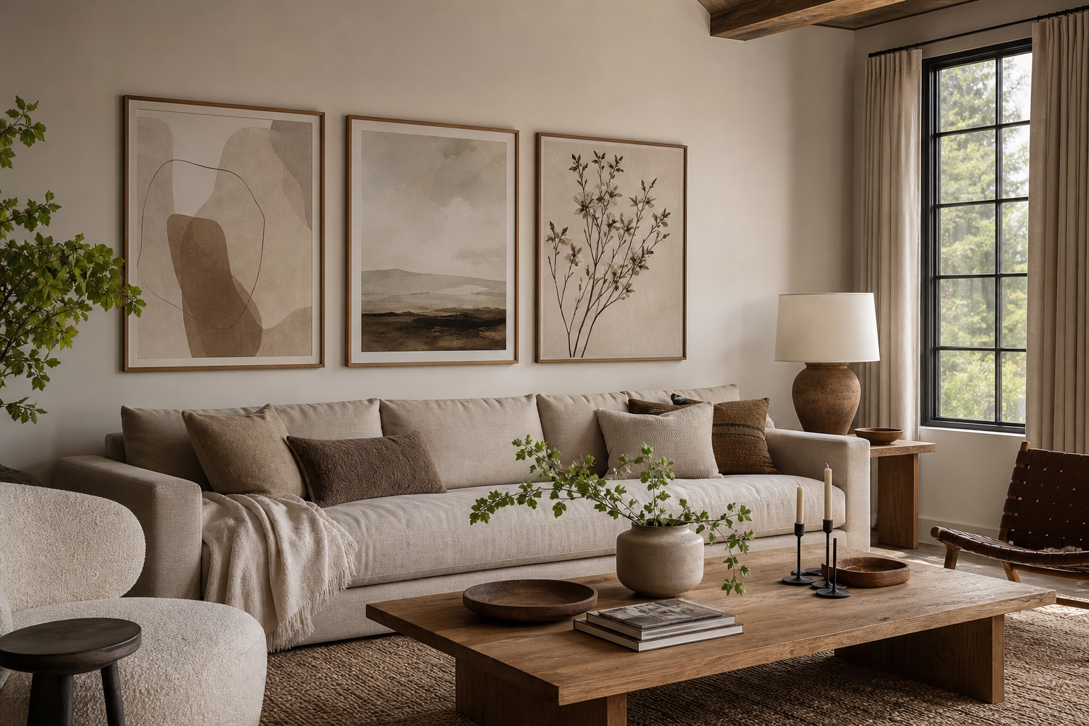
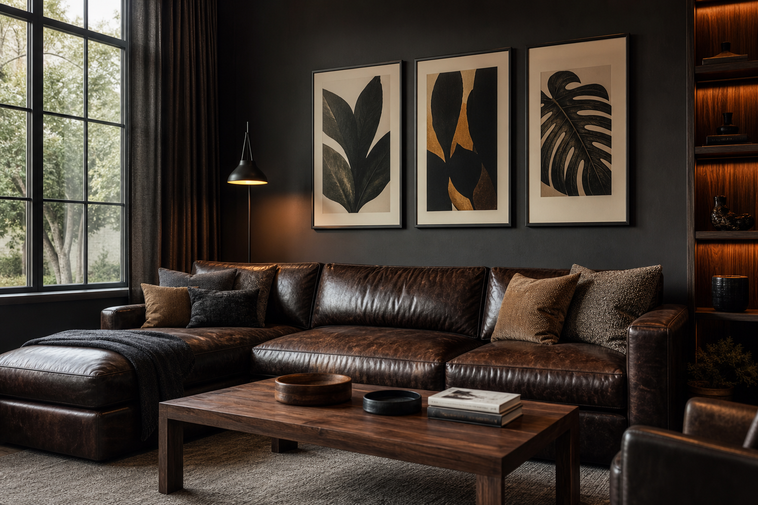
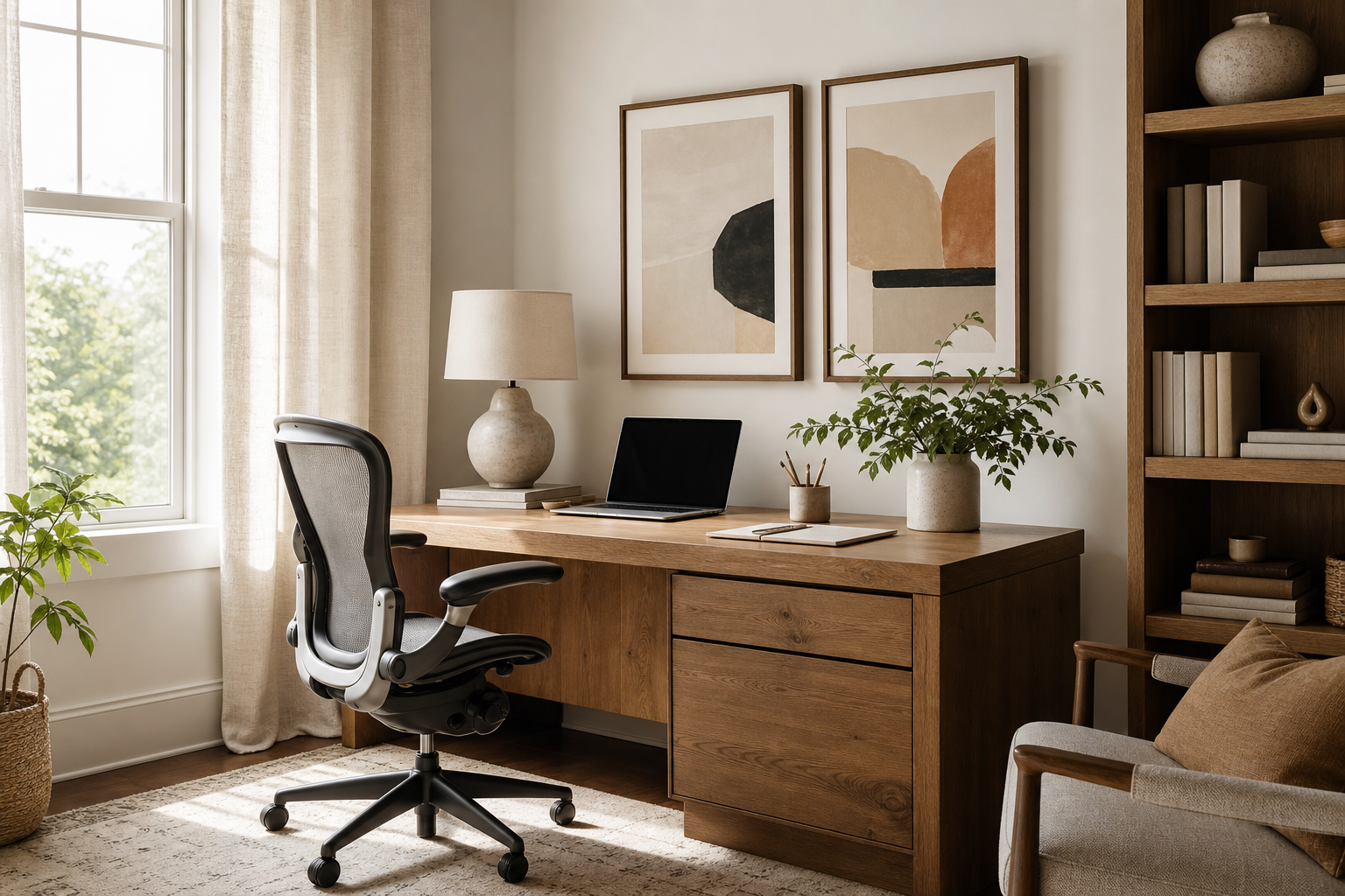
A well-chosen office poster changes more than a blank wall. It gives the room direction. In a workspace, that matters because your eye keeps scanning the environment while you work. If the wall is empty, the room can feel temporary. If the wall is noisy, focus drops fast. The right office poster adds structure, tone, and a sense that the space has been set up on purpose.
Why an Office Poster Changes the Feel of a Room
Visual order helps a room feel professional, even in a spare home office. A single framed print above a desk creates a focal point within 2 to 3 seconds of entering the room, which makes the whole setup feel more deliberate. In practical terms, that means a workspace with one clear art anchor often reads cleaner than a room with multiple small accessories scattered across shelves.
In work settings, wall art also shapes energy. Soft abstracts and tonal textures can reduce visual tension, while sharper geometry or architectural photography can make a space feel precise and driven. If you want a room that feels calm but not flat, start with an edited minimalist collection or browse abstract art prints for modern offices that keep the composition simple.
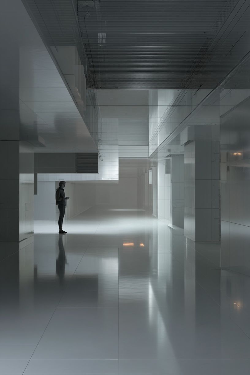
A good office poster can also signal what kind of work happens there. A consulting space may benefit from restrained lines and neutral contrast. A creative studio can take more movement and color. A client-facing background for video calls usually works best with art that has one clear subject and low text density. That is why architectural wall art and quiet fine art prints for office interiors tend to outperform overly busy pieces in professional rooms.
Choosing the Right Style for Your Work Environment
Minimal style works when the office already has enough visual information — shelving, monitors, cables, books, or samples. In that case, a low-contrast office poster with texture or shape adds depth without competing. Think ivory, stone, charcoal, or sand tones. These sit well with walnut desks, matte black lighting, and white walls.

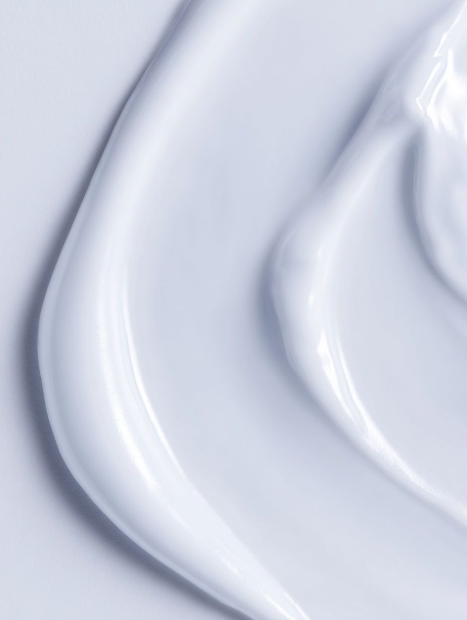
For that quieter approach, White Cream Texture Poster is useful because it adds texture rather than story. It works especially well in rooms where the desk is less than 160 cm wide and you want the wall art to support the furniture, not dominate it.
Typography can work in an office, but it needs restraint. One print with a strong phrase can sharpen attitude in a private office or studio. More than that, and the wall starts feeling like signage. If you like text-based design, stay with one larger piece or a pair with plenty of breathing room. You can explore typography prints with a cleaner office look rather than crowding a wall with several slogans.
Abstract pieces are often the safest choice for shared workspaces because they bring movement without telling people what to think. Teal, rust, black, or warm beige abstracts suit collaborative rooms and meeting corners especially well. Vintage and fine art work better when the office has more personality in the furniture — wood veneer, brass, leather, smoked glass, or older architectural details.




Finding the Best Size and Placement
Size is where many office walls go wrong. Art that is too small makes the room feel unfinished. As a rule, a piece above a desk should cover about 50% to 75% of the desk width. For a 120 cm desk, aim for art around 60 to 90 cm wide. For a 160 cm desk, 80 to 120 cm wide usually looks balanced.
If you hang one office poster above a desk, keep the bottom edge 15 to 25 cm above the tabletop or just above monitor height. That keeps the composition connected to the workstation. If the room uses a standing desk, measure from the desk in its usual working position rather than its lowest setting. In meeting areas, place the center of the artwork around 145 cm from the floor — slightly lower than many people expect, but visually much more grounded.
A narrow vertical wall beside a filing cabinet or bookcase suits architectural imagery, because the lines echo the furniture. Wide horizontal walls behind a sofa in a home office lounge area handle a pair or grid better than a single small print. For a tighter room, one strong office poster is usually more effective than four unrelated pieces.

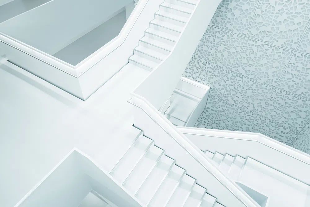
If you want a print that reinforces order through line and structure, Modern White Staircase — Minimalist Print is a strong option for narrow walls and monochrome offices. It brings shape without clutter.
Frames, Finishes, and Color Palettes That Work
The frame can make a modest print look expensive or make a strong print look cheap. In office settings, black, oak, and slim brushed metal frames are the most reliable. Black frames sharpen contrast and suit white walls. Oak softens cooler rooms and pairs well with beige, olive, and off-white palettes. Thin metal works best in very modern interiors with glass desks, chrome accents, or cool gray flooring.
Paper finish matters more under office lighting than most buyers expect. Gloss can throw reflections from overhead LEDs and windows, especially across dark prints. A matte or softly textured finish tends to look calmer from multiple angles and reads better on video calls. That is useful in hybrid work rooms where the wall behind you appears on camera several hours a day.
Color coordination should stay simple. Use one dominant neutral, one support tone, and one accent at most. A good ratio is 70/20/10 — for example, 70% warm white and oak, 20% charcoal, 10% muted teal. If your office already has colorful books or branded materials, choose quieter art. If the room is mostly neutral, the office poster can carry the accent color.

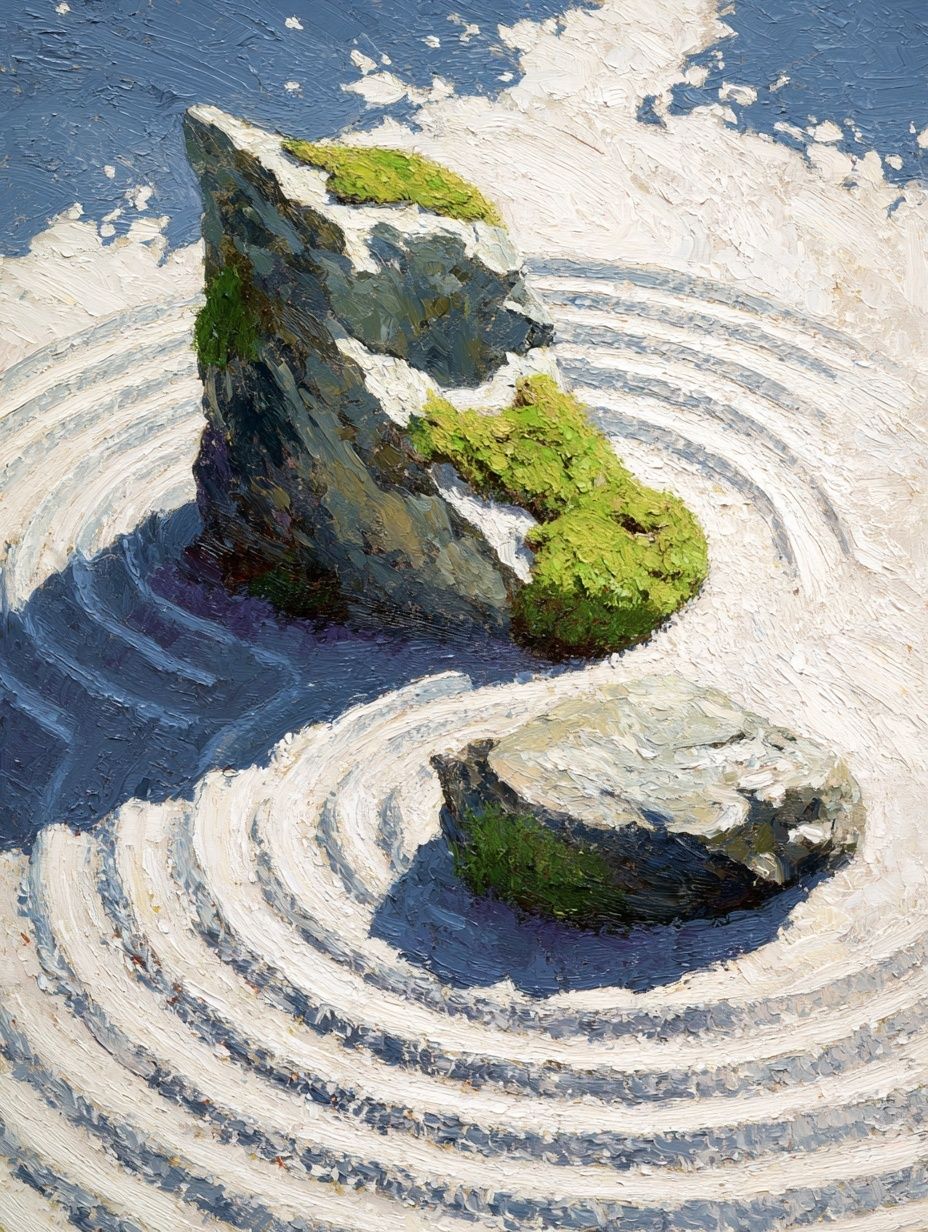
For neutral palettes, Textured Concrete Wall — Minimalist Print and textured minimalist prints fit naturally with restrained office materials. If you want more organic calm, Zen Garden Stones — Fine Art Print works well with wood, linen, and sand-colored interiors.
How to Use Posters to Support Focus and Mood
Different themes affect the pace of a room. For focused tasks — writing, planning, analysis — look for art with repetition, symmetry, or low-contrast texture. These hold attention lightly in the background. For creative work, choose pieces with directional movement or more tonal variation. They can make the room feel less rigid without becoming distracting.
An office poster meant to support calm should avoid too many sharp color changes. Blue-gray, sage, warm white, and taupe are reliable because they sit in the background after a few minutes. For confidence and momentum, deeper tones such as black, rust, dark teal, or sepia are more effective than bright red or saturated neon, which can feel tiring over an eight-hour day.
Themes matter too. Architecture suggests ambition and structure. Textures suggest calm and concentration. Fine art landscapes or still scenes soften a space that feels too corporate. Motivational typography can work in moderation, especially in studios, but it should feel designed rather than loud. If you want a more playful edge, Motivation Not Found Retro Print fits creative offices better than formal executive rooms.

Easy Shop Tips for Building a Cohesive Office Wall
The easiest way to build an intentional wall is to choose one lead piece and support it with one or two quieter companions. If the main print has movement or bold contrast, pair it with simpler textures. If the lead print is subtle, you can add one secondary piece with a little more color. Keep at least one common thread across all prints — color temperature, frame finish, or subject matter.
For a small gallery wall, use either two equal frames side by side or a 2x2 grid. Leave 5 to 8 cm between frames for a tight, professional look. Mixed frame colors usually feel messy in offices unless the room is strongly eclectic. Matching frames create instant order, even if the subjects vary.
Buy for the room you are building, not just the wall you have today. A strong office poster should still work if you move from a corner desk to a full study, or from a spare-bedroom office to a studio workspace. That is why restrained styles from our vintage print collection or layered abstract office art tend to last longer than trend-driven graphics.
Final thoughts
A successful office poster gives a workspace clarity. It helps the room feel planned, supports the kind of work you do there, and adds personality without draining attention. The best results usually come from simple decisions made well: the right size, one clear palette, and art that suits the pace of the room.
If your office feels unfinished, start with one piece above the desk or one pair on the main wall. A carefully chosen office poster often does more than a dozen smaller accessories — and it keeps the room looking sharper for longer.
Frequently Asked Questions
What size frame works best for a small home office?
For compact offices, 40x50 cm and 50x70 cm frames are the safest starting points. They add presence without overwhelming walls under about 2.4 meters wide.
Should office wall art match the desk color exactly?
No. Aim for coordination, not a perfect match. Repeating one tone from the desk or shelving is enough to make the room feel connected.
Can I use more than one office poster behind my desk on video calls?
Yes, but keep the arrangement symmetrical and avoid high-contrast text. Two matching vertical frames or one large horizontal piece usually reads best on camera.
What frame color is most versatile for office prints?
Black is the most flexible because it works with white walls, wood furniture, and metal lighting. Oak is a close second if your office has warmer tones.
How do I hang art if I do not want to drill into the wall?
Use high-quality adhesive strips rated for the frame weight and wall surface. Clean the wall first and wait at least 24 hours before placing the frame under tension.