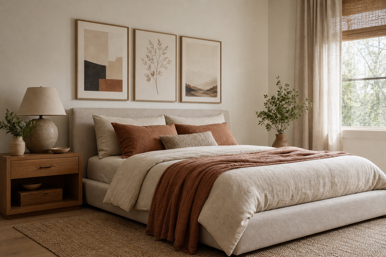
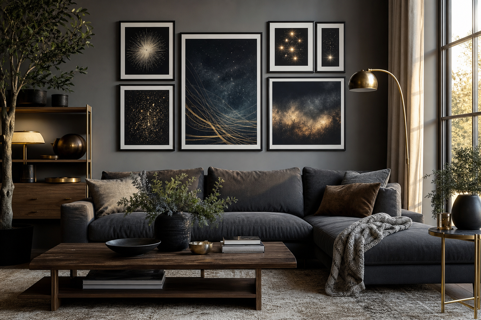
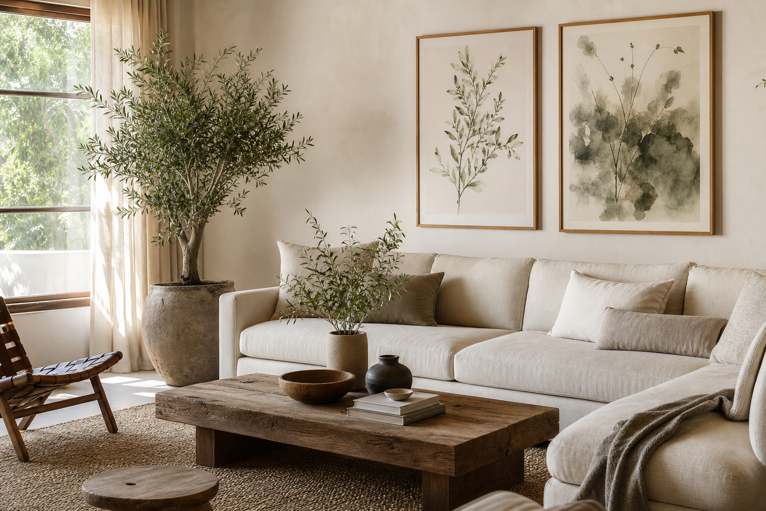
A well-chosen nature poster does two jobs at once: it fills a wall and it regulates the mood of the room. Landscapes, botanical studies, coastlines, forests, and wildlife tend to soften hard architectural lines and balance materials like metal, glass, and concrete. That is why nature-based wall art works just as well in a pared-back apartment as it does in a layered family home.
Why a Nature Poster Works in So Many Rooms
A nature poster is versatile because the subject matter already feels familiar. Green foliage, open skies, water, and organic forms are easy for the eye to process, which makes them especially effective in rooms where you want a slower, steadier atmosphere. In bedrooms, that often means soft watercolor trees or hazy horizons. In living rooms, it can mean larger scenic pieces that anchor the seating area without making the space feel heavy.
Nature imagery also bridges styles. If your room leans Scandinavian, a restrained landscape from our Nature collection or a simple piece from our Minimalist art prints keeps the look clean. If the room is warmer and more layered, detailed foliage from our Botanical collection or a painterly work from Fine Art wall art adds depth without visual clutter.

Choosing the Right Style: Botanical, Landscape, or Minimal
Botanical pieces are the easiest way to bring structure to a room. Leaves, stems, and floral silhouettes have clear shapes, which makes them especially useful in kitchens, hallways, and home offices where wall art should feel fresh but not distracting. If you already have natural textures such as rattan, linen, or oak, botanical work usually clicks into place quickly.
Landscape art is best when you need a stronger focal point. Mountains, coastlines, fields, and forest paths create visual depth, so they help a narrow wall feel larger and a plain room feel more finished. A piece like Serene Landscape — Watercolor Print suits calm bedrooms and understated living rooms because the composition has presence without sharp contrast.
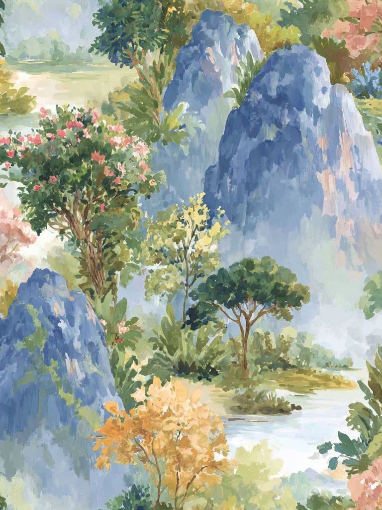
Minimal nature art works in compact rooms, modern interiors, and spaces that already have a lot happening — bookshelves, patterned textiles, open storage, or mixed materials. Instead of dense detail, it relies on one strong motif: a tree line, a horizon, a boat on water. If that sounds right for your space, browse Vintage Bicycle in Nature — Minimalist Print and similar pieces that keep the palette restrained and the silhouette clean.
When you want variety without losing cohesion, combine adjacent categories rather than unrelated ones. Nature photography from our Photography collection can sit beautifully next to a watercolor landscape if both share the same color temperature — for example, cool greens and muted blues.
How to Pick the Best Size and Placement
The fastest way to make wall art feel expensive is to get the scale right. Above a sofa, your arrangement should cover roughly 60% to 75% of the furniture width. For a 200 cm sofa, that means a total art span of about 120 to 150 cm. Above a bed, aim for a similar proportion, keeping at least 15 to 20 cm of breathing room on each side.
For a single nature poster, common safe sizes are 50x70 cm for medium walls and 70x100 cm for larger anchor positions. In a hallway, 30x40 cm or 40x50 cm often works better because the viewing distance is shorter. Hang the center of the piece at around 145 cm from the floor in most rooms, then adjust slightly for furniture placement.

If you are styling a group, keep spacing tight and consistent — usually 5 to 8 cm between frames. A four-piece arrangement works well when you want rhythm without the looseness of an eclectic gallery. Start with one dominant landscape, then support it with quieter studies or close-up natural forms.
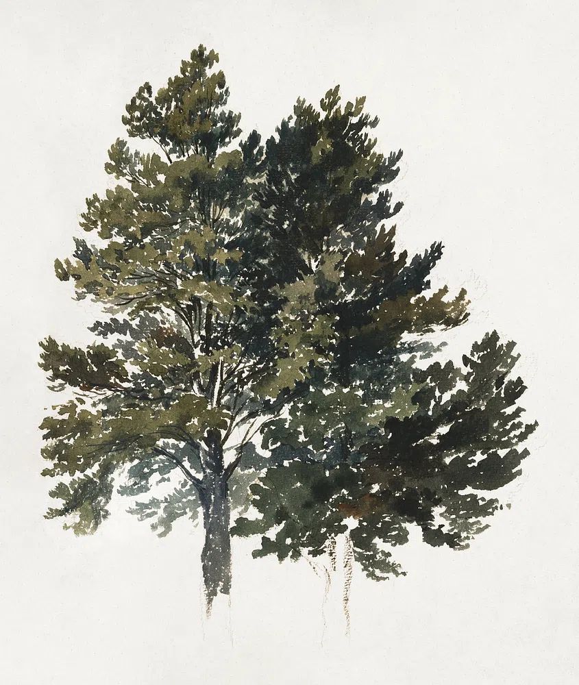
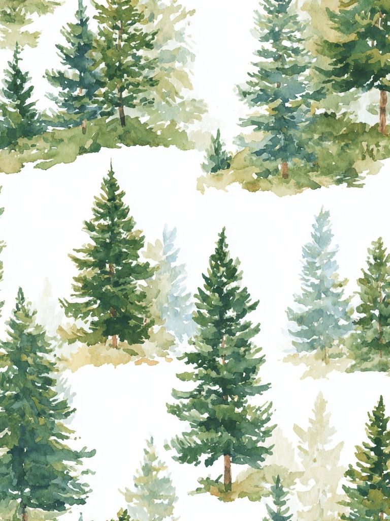
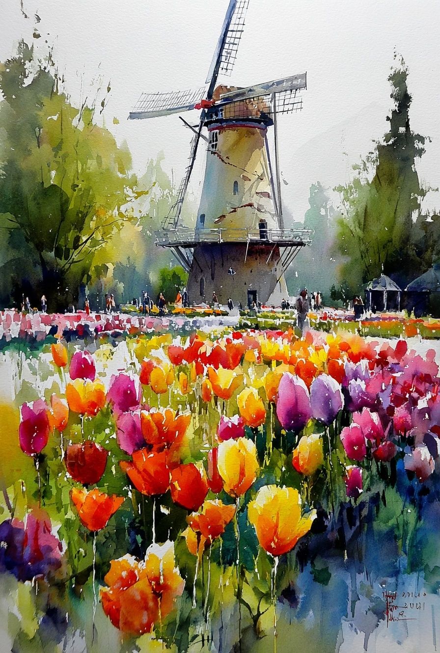
For a taller, narrower wall, choose one vertical print rather than forcing a horizontal scene into the space. Walking in the Misty Forest — Watercolor Print is a good example of artwork that naturally suits transitional spaces like stair landings or hallway ends.
Framing and Finishing Touches
Frame material changes the tone more than most people expect. Oak and ash frames make a nature poster feel lighter and more Scandinavian. Black frames create sharper contrast and suit photography or modern minimal rooms. White frames are useful when the artwork already carries enough color and you want the wall to feel airy rather than outlined.
A mat border is worth using when the print has delicate detail or a softer watercolor edge. A 5 cm mat can make a 50x70 cm print feel more substantial and give quieter imagery room to breathe. For photography, a full-bleed presentation often feels more contemporary, especially with cleaner, darker frames.

Room styling should echo the print rather than compete with it. If the artwork shows misty greens and faded blues, repeat those tones once or twice through a throw, vase, or rug — not in six different places. Two supporting accents are usually enough to make the wall art feel integrated.
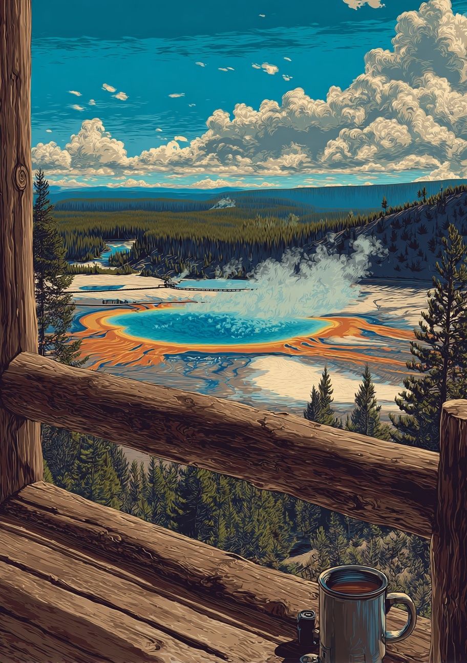
Vintage-inspired landscape pieces are especially effective with wood, leather, and antique brass. If you like that direction, Yellowstone National Park — Vintage Print works well in studies, living rooms, and entryways where you want character without ornate styling.
Color Palettes That Feel Fresh and Timeless
Green is the obvious starting point, but the best rooms use green in moderation. Sage, olive, moss, and eucalyptus tones are more adaptable than bright leaf green because they sit comfortably beside cream, taupe, charcoal, and natural wood. That makes a nature poster easier to live with over time, even if your textiles or furniture change.
Muted blues and stone greys are ideal if you want a cooler, cleaner feel. Water and sky imagery can brighten a room that gets strong afternoon sun, especially when paired with white walls and light timber. For warmer interiors, look for earthy rust, sand, ochre, and soft brown notes inside the artwork rather than trying to add warmth only through furniture.
If your room already contains strong color, choose nature art with one dominant tone and one accent tone. Too many competing hues make the wall feel busy. A simple rule is 70% neutral base, 20% natural color from the artwork, and 10% darker contrast from the frame or nearby decor.
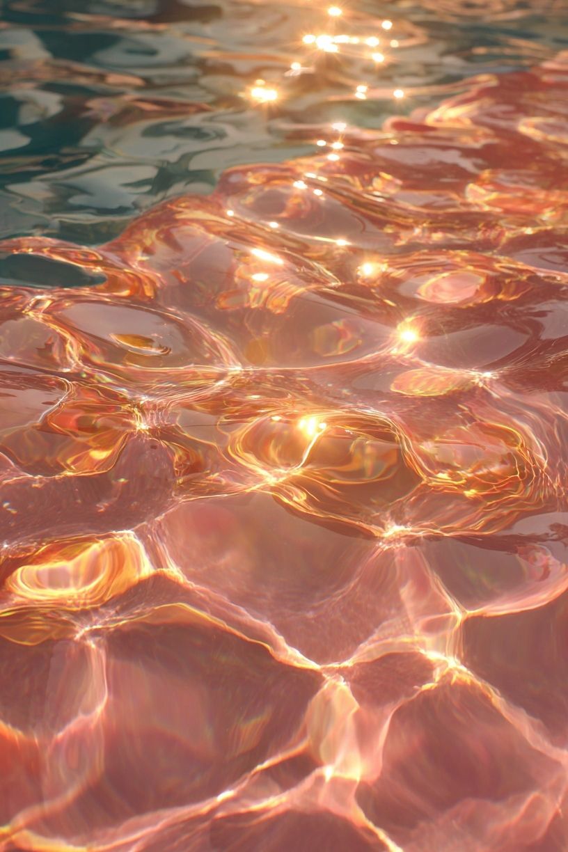
Water-based images are especially useful in rooms that need visual lightness. Sunlit Water Surface — Photography Print brings movement and reflection without adding clutter, which makes it a smart choice for compact bedrooms and home offices.
Where to Style Nature Posters for the Biggest Impact
Bedrooms benefit from the calmest imagery. Choose soft landscapes, distant horizons, or gentle tree studies above the headboard, keeping the palette low-contrast. Avoid highly dramatic wildlife or high-saturation scenes if the goal is rest. Pieces from our Mindfulness selection can also pair well with subtle nature themes in sleep-focused spaces.
Living rooms can handle the largest scale. One 70x100 cm print centered above the sofa works in a simple scheme, while a pair of 50x70 cm works better if you want symmetry. In a room with lower ceilings, horizontal landscapes visually widen the wall.
Hallways and entryways are good places for more atmospheric or directional imagery — trails, paths, forests, and open roads. They give the eye somewhere to travel and can make transitional spaces feel intentional. Kitchens respond well to botanical pieces or lighter countryside scenes that add freshness without darkening the wall.

Home offices do well with either one larger landscape behind the desk or two smaller vertical works on the side wall. The goal is visual reset, not distraction. A restrained mountain scene or quiet forest view helps break up a screen-heavy environment while keeping the room professional.
Final Styling Tips for a Calm, Collected Finish
Start with the room, not the print. Look at your furniture width, wall color, and existing materials first, then choose a nature poster that repeats at least one element already present — green from a plant, oak from a table, blue-grey from a rug, black from a lamp. That is what makes the result feel designed rather than added later.
Keep the overall mix simple: one main mood, one frame finish, and one clear placement strategy. If you want to explore more options, begin with nature wall art and refine by whether your space needs softness, structure, or a stronger focal point. The best nature poster does not shout for attention — it steadies the room and makes everything around it look better.
Frequently Asked Questions
What frame color works best with a nature print?
Oak is the safest all-round choice for nature imagery because it adds warmth without overpowering softer greens and blues. Black works best when the artwork is photographic or you want stronger contrast.
Should I use glass or a matte finish for a nature poster?
Use glass or acrylic glazing in brighter rooms to protect the print and sharpen the presentation. A mat border helps watercolor and fine-art styles feel more refined, especially in larger sizes.
Can I mix botanical and landscape prints on one wall?
Yes — keep them connected by palette or frame style. A shared color range and equal spacing will make different subjects feel cohesive.
What size should I choose for a small bedroom?
A single 40x50 cm or 50x70 cm print usually fits well above a narrow dresser or beside the bed. For above the headboard, measure the bed width and stay within about 60% to 75% of that span.
How do I hang art if I rent my home?
Use removable picture strips for lighter frames and check the weight limit before hanging. For larger pieces, lean the framed artwork on a shelf or dresser for a relaxed, low-commitment look.