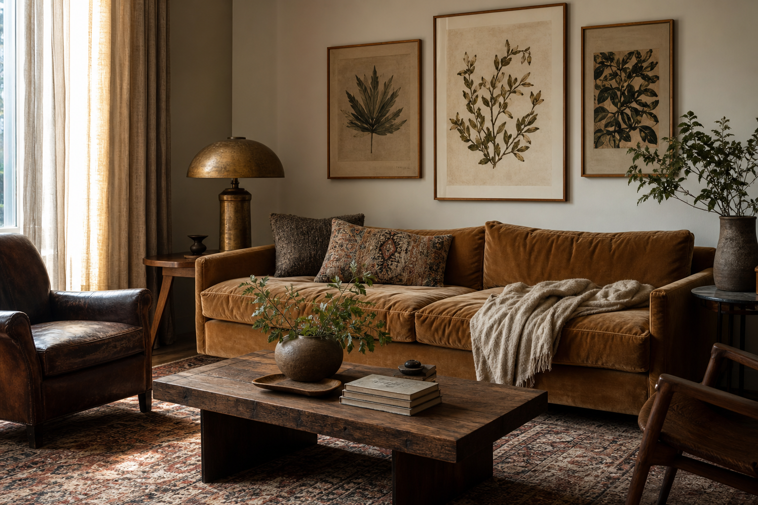
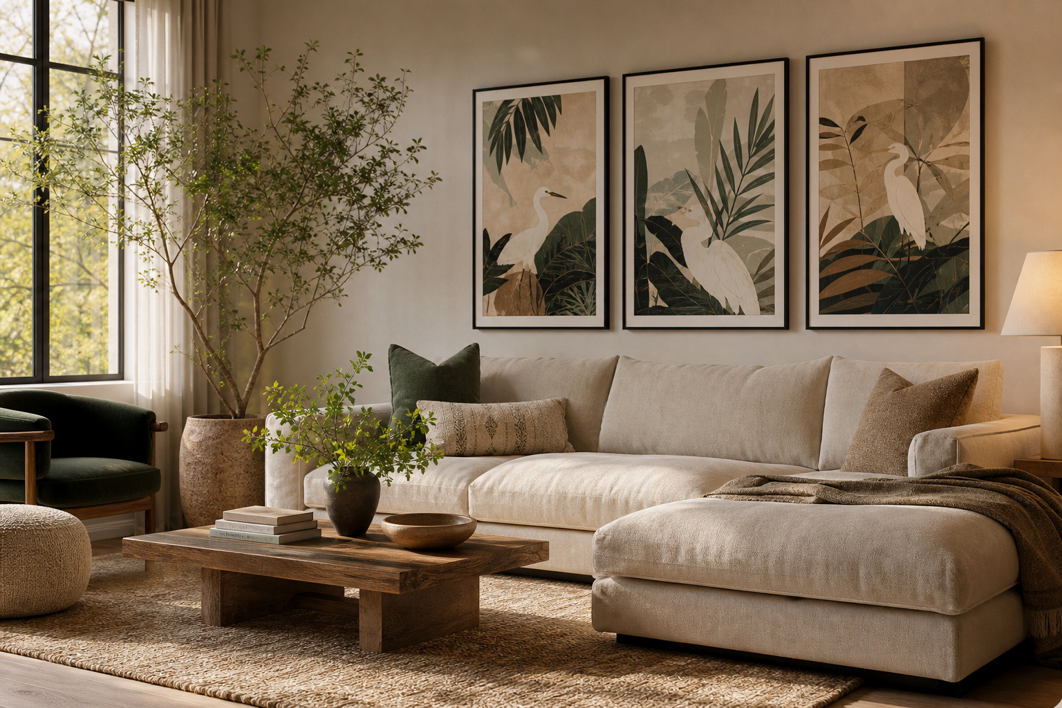
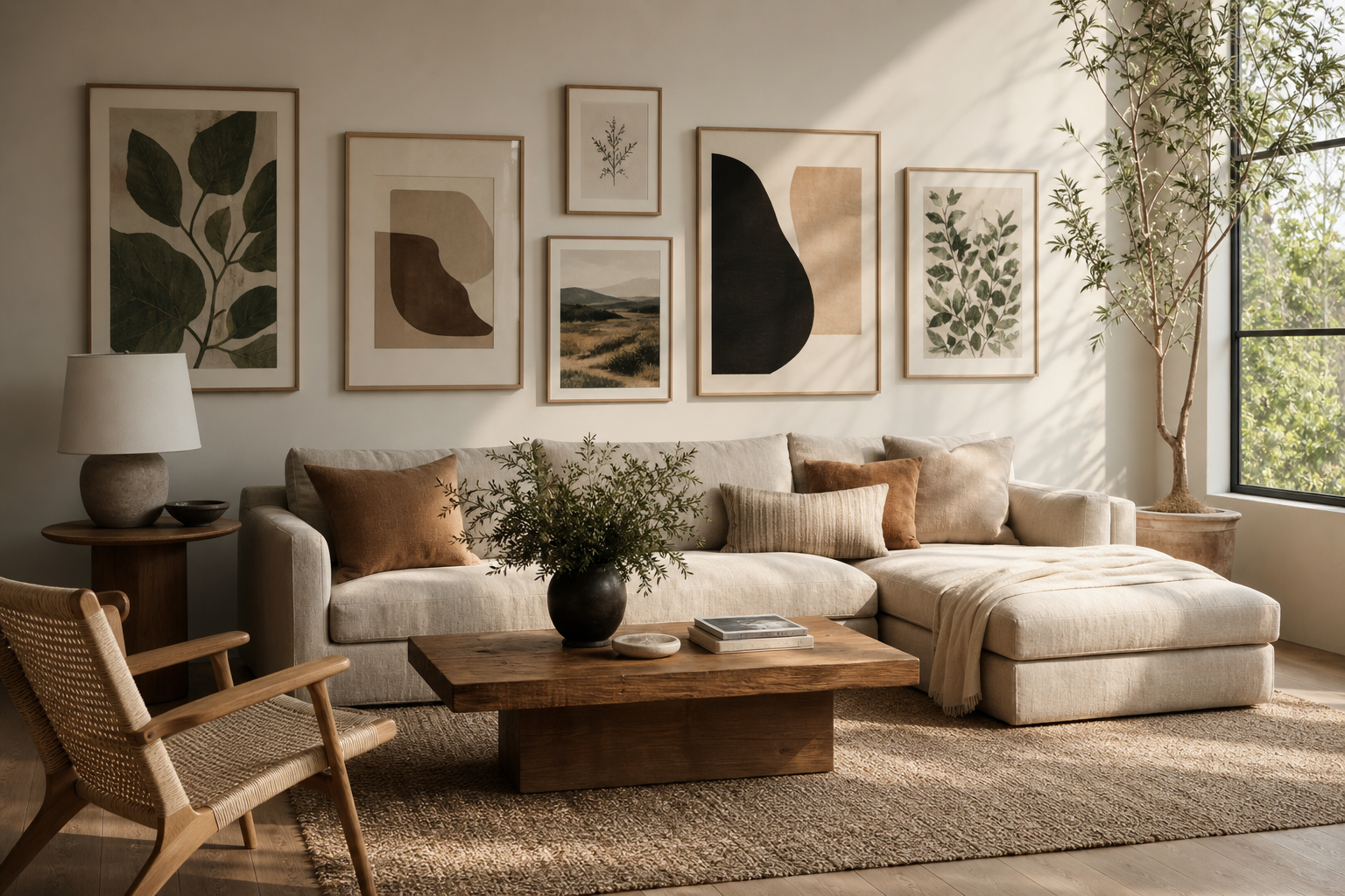
Nature works especially well in the room people use most. A living room handles conversation, rest, reading, and everyday movement, so the wall art needs to feel steady rather than demanding. That is why our Nature collection and our Botanical collection suit this space so well: organic subjects soften hard lines, calm down visual noise, and add structure without making the room feel formal.
The best version of nature for the living room is not always the loudest landscape or the most colorful floral. Softer styling usually comes from imagery with clear breathing room: tree silhouettes, washed landscapes, shoreline textures, and repeating leaf patterns. These subjects introduce shape and rhythm, which is useful in rooms full of rectangular elements like sofas, media units, rugs, and shelves.
Why Nature Belongs in the Living Room
Nature imagery creates visual balance because it brings irregular forms into a room built from straight edges. A branch curves, a horizon fades, water reflects light unevenly — those details make a space feel more relaxed. In practical terms, one large nature print above a 200 to 240 cm sofa can reduce the need for extra decorative clutter on side tables and shelving.
If your living room feels cold, start with art before replacing furniture. A muted forest scene or botanical pattern can warm the room faster than adding three or four accessories in different corners. Pieces like Majestic Trees — Watercolor Print or Serene Landscape — Watercolor Print work because they add atmosphere without fighting the rest of the scheme.
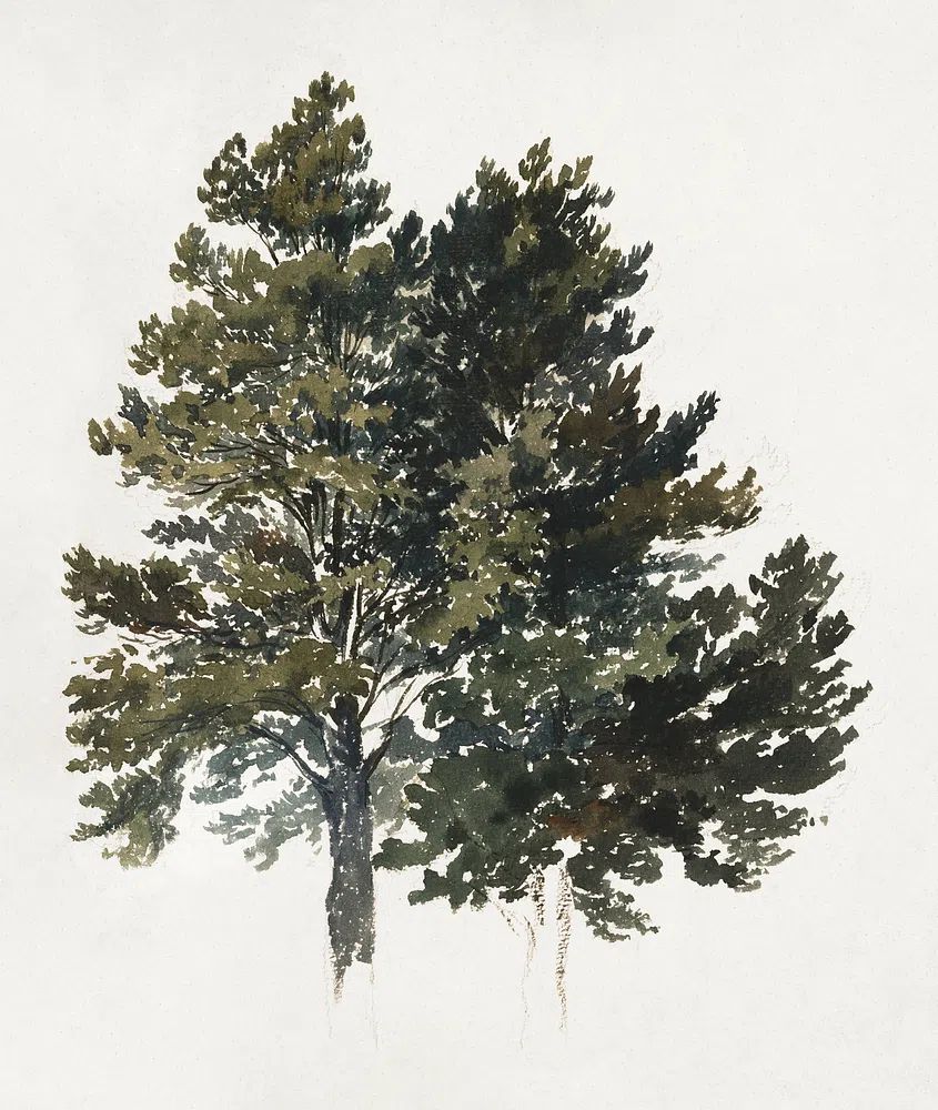
Another reason nature for the living room feels convincing is scale. Nature-themed work tends to hold up well in larger formats — 50x70 cm, 61x91 cm, even 70x100 cm — because the subject matter already has depth. A misty landscape can fill a wall and still read as calm. That is harder to achieve with busier graphic art, which often becomes more intense as the size increases.
Choosing the Right Nature Mood

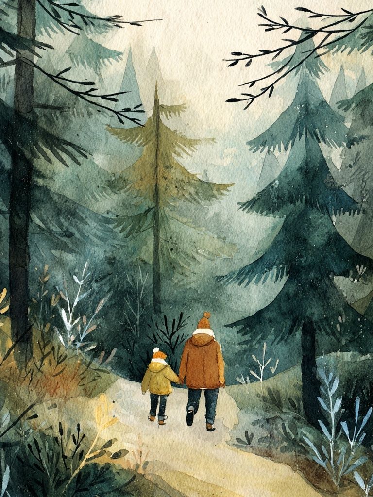
Not all nature art creates the same mood. Forest imagery tends to feel cocooning and grounded, especially in rooms with deeper textiles like bouclé, wool, velvet, or brushed cotton. If your living room gets limited natural light, forest scenes with soft fog or watercolor edges can add depth without making the room feel heavy. Walking in the Misty Forest — Watercolor Print is a good example of a piece that creates presence through tone rather than contrast.
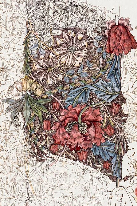
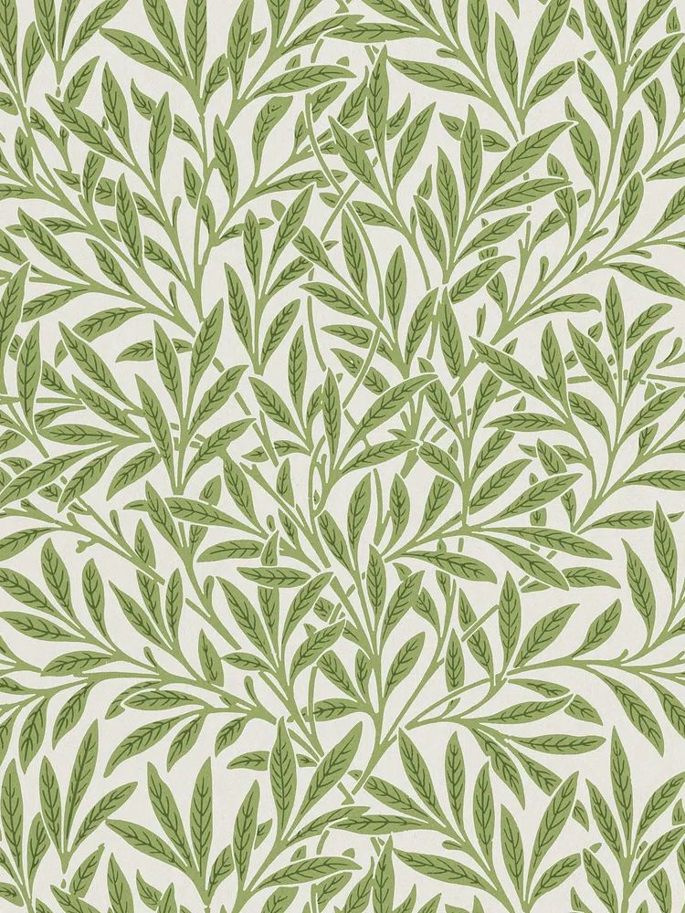
Botanicals bring more pattern and detail. They suit traditional interiors, English-inspired rooms, and spaces with layered textures such as pleated lampshades, wood furniture, and vintage ceramics. If you want nature to feel decorative rather than scenic, Honeysuckle by William Morris or William Morris's vintage willow leaves give you that dense, crafted look.
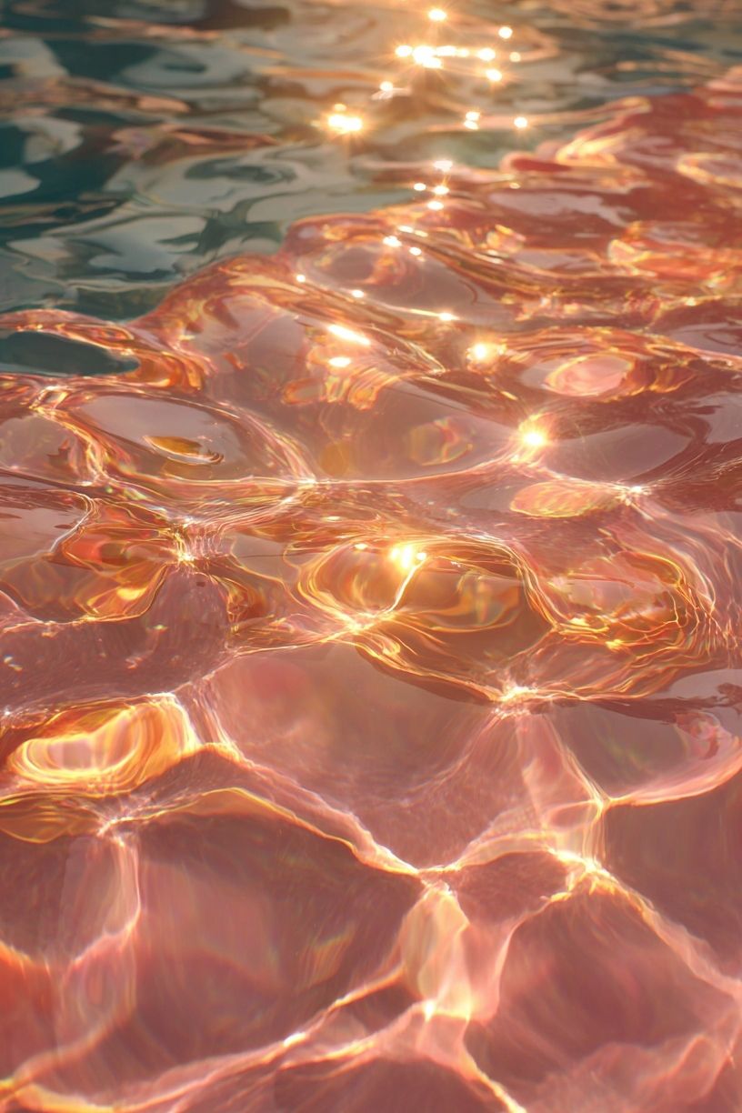
Coastal and water-based images feel lighter and more open. They work well in smaller living rooms because they visually expand the space. Photography like Sunlit Water Surface — Photography Print brings movement and reflection into the room, while calmer fine art pieces from our Fine Art collection can make the overall look more contemplative.

Abstract organic forms sit somewhere in between. If your room already leans modern, browse our Minimalist art prints for pieces that reference nature through line, shape, or stone-like composition rather than literal scenery. This route keeps the room clean while still introducing a softer rhythm.
Colors That Make the Space Feel Alive
Color matters more than subject when you are matching art to a living room you already own. Earthy greens are the easiest bridge color because they connect well with oak, walnut, beige upholstery, black metal, and cream walls. A room with warm neutrals usually benefits from green tones that sit slightly gray rather than bright emerald.
Muted blues are effective when a space needs airiness. They pair naturally with stone, pale wood, and off-white textiles, and they stop a south-facing room from feeling too warm. If your sofa is taupe, sand, or light gray, blue-based landscapes and water imagery often feel more integrated than strong green botanicals.
For a richer scheme, use nature art with terracotta, ochre, or faded gold details. Those tones echo clay, bark, dried grass, and evening light, so they make the room feel alive without turning vivid. Botanical designs from our botanical wall art often carry these colors naturally, especially in heritage-inspired patterns.
A useful rule is to repeat one color from the art at least twice in the room. If the print includes sage green, echo it in a cushion and a ceramic vase. If it includes faded blue, pick that up in a throw or rug stripe. You do not need a full color match — staying within 10 to 15 percent of the same tone family is usually enough to create cohesion.
Where to Place Nature Art for the Best Impact

The wall above the sofa is the natural focal point, so it deserves the strongest piece. For one artwork, aim for a width that spans around 60 to 75 percent of the sofa width. Over a 220 cm sofa, that means art around 132 to 165 cm wide in total presence, including frame. For a pair, leave 5 to 8 cm between frames so they read as one composition rather than two isolated pieces.
Shelves are better for smaller nature works with intimate detail — botanicals, floral studies, or softer photography. Leaning a 30x40 cm or 40x50 cm frame on a shelf creates a more relaxed effect than hanging every piece. This works particularly well if you are already layering books, ceramics, and small plants.
Corners are underrated. A narrow wall beside a window or reading chair can hold a vertical print that changes the feel of the whole room. Something like Mountain Landscape — Watercolor Print or a slim photography piece can make an unused edge feel intentional. Nature for the living room does not have to sit only above the main sofa wall to be effective.
If you prefer a gallery arrangement, keep the content closely related. Mixing four very different subjects — one whale, one floral pattern, one forest, one village scene — often weakens the calm effect. A stronger approach is to choose one family of imagery and vary scale instead.
Framing, Finishes, and Layering Ideas

Frame choice changes how natural the artwork feels. Oak frames are the most forgiving option because they connect immediately with wood furniture and woven textures. Black frames sharpen the image and suit modern interiors, while white frames work best when the room already has plenty of contrast from darker furniture or architectural lines.
Matte finishes are usually the better fit for living rooms. They reduce glare from windows and lamps, especially if the artwork sits opposite a light source. In practical terms, that means the art stays readable from different seats in the room — not just straight on from the center.
Layering matters as much as the print itself. Nature art looks strongest when it is supported by one or two related materials nearby: a leafy plant, a rough ceramic vase, a linen lampshade, or a rattan detail. Add too many natural references, though, and the room starts to feel staged. A good balance is one wall-art focal point, one plant with height, and one textured object cluster on a table or shelf.
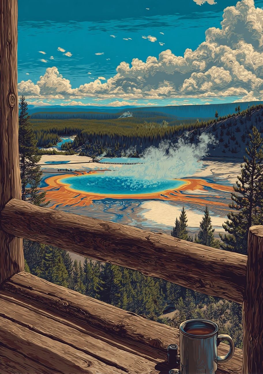
If you want a slightly more collected look, pair scenic prints from Yosemite National Park. Original image or the broader Photography collection with one decorative botanical pattern. The contrast between open landscape and denser foliage gives the room depth while keeping the palette connected.
How to Build a Living Room That Feels Restful
A restful room is usually edited, not under-decorated. Start with one clear nature direction — forest, botanical, coast, or soft abstract organic — and repeat it two or three times across the space. That could mean landscape art, a moss-toned cushion, and a smoked green glass vase. It does not mean covering every wall with leaves and branches.
Keep the strongest nature element at eye level, then let the rest of the room support it quietly. If your art has delicate tones, lower the contrast in the rest of the room with warm whites, oatmeal, stone, muted brown, or dusty green. If the artwork is more detailed, simplify the surrounding accessories so the wall has room to breathe.
Final thoughts
Nature for the living room works best when it feels integrated into the architecture and furniture rather than added on at the end. Choose imagery that matches the room's light, repeat one or two tones from the artwork, and give the main piece enough scale to anchor the space.
The softer look usually comes from restraint: fewer pieces, better placement, natural framing, and textures that echo the subject matter. That is enough to make the room feel calmer, warmer, and more complete.
Frequently Asked Questions
What size nature art works best above a standard sofa?
For most sofas between 200 and 240 cm wide, aim for art or a grouped arrangement that covers 60 to 75 percent of the sofa width. Hang it so the center sits roughly 145 cm from the floor.
Should I choose botanical patterns or scenic landscapes for a small living room?
Scenic landscapes usually make a small room feel more open because they create visual depth. Dense botanical patterns work better as smaller accents or in rooms with more wall space.
Which frame color is safest if I already have mixed wood tones?
Medium oak is the easiest choice because it sits comfortably between light and dark woods. Black also works if you want a cleaner outline and already have black accents in lighting or hardware.
Can I mix photography and painted nature prints in one room?
Yes — keep the palette consistent and limit the mix to two styles. For example, pair a soft landscape photograph with one muted botanical artwork rather than several competing finishes.
How high should I hang art if I have tall ceilings?
Tall ceilings do not mean artwork should float higher. Keep the center near eye level, then use a larger size or a stacked arrangement to fill more vertical space.