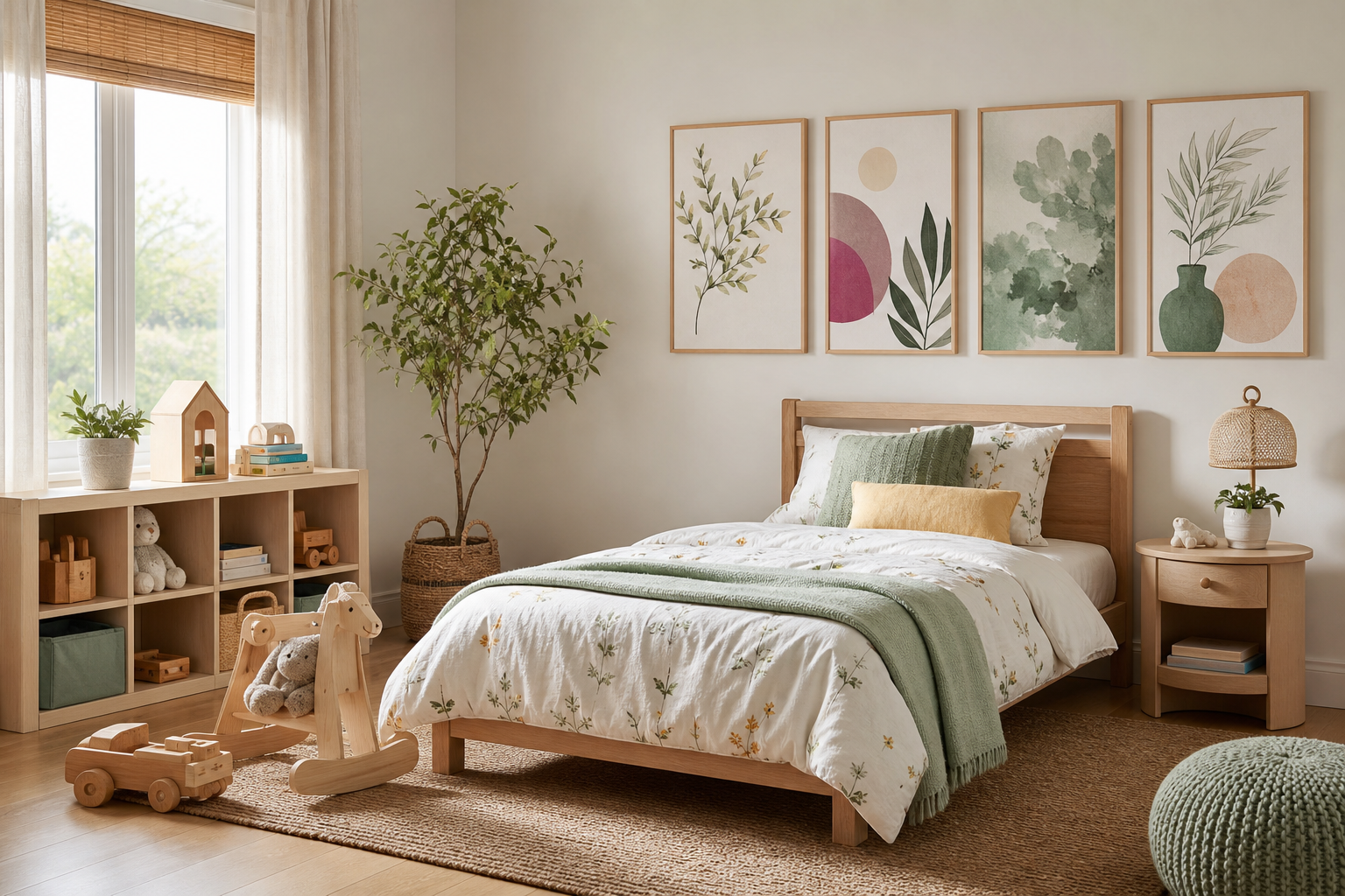
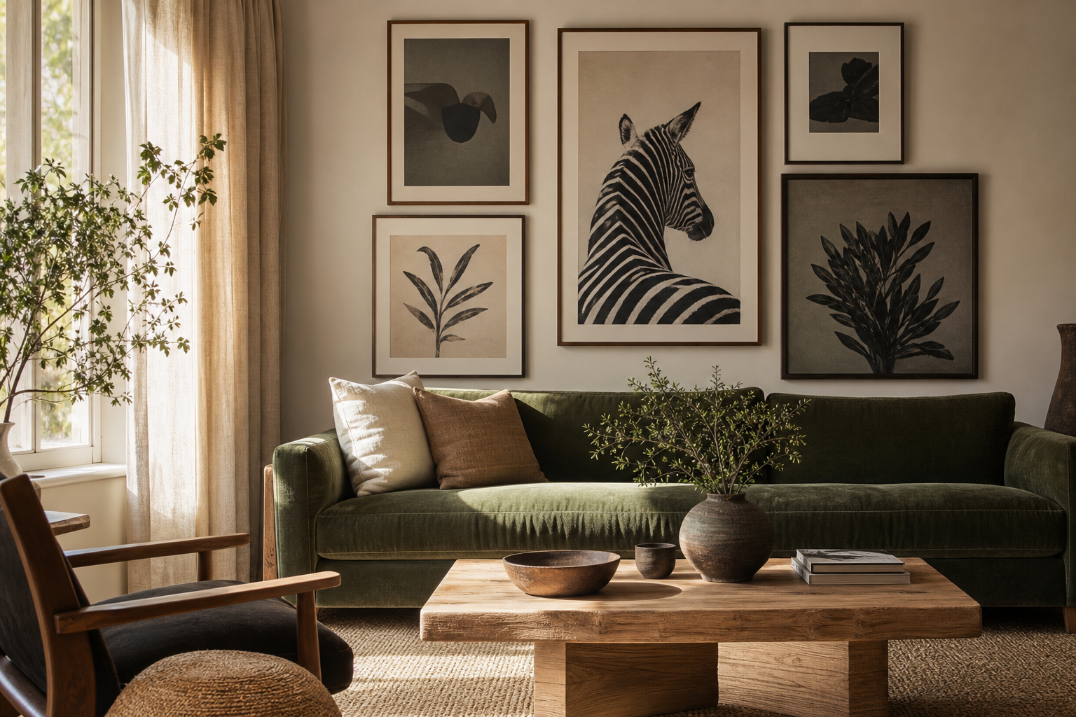
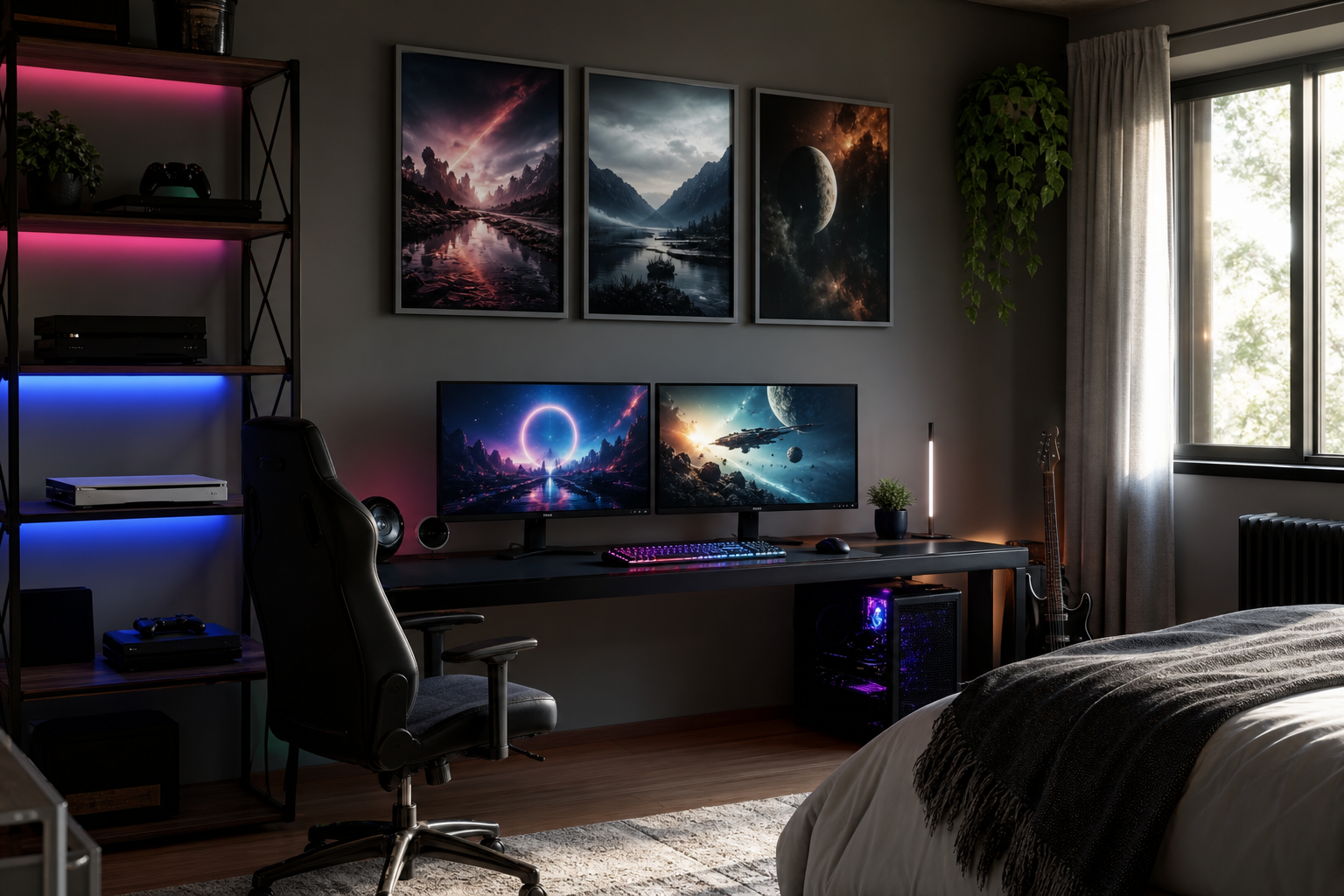
Minimalist posters work because they reduce visual noise without making a room feel empty. A well-chosen piece gives the eye a place to rest, which is why simple compositions often feel stronger than busy ones. In practical terms, minimalist posters usually rely on one to three dominant tones, generous negative space, and a subject that reads clearly from 2 to 3 meters away.
What Makes Minimalist Posters Work
The core principle is restraint. A print with 60 to 80 percent open space will often feel calmer than one filled edge to edge, especially in smaller rooms where every object competes for attention. That is why our minimalist collection and selected pieces from abstract art prints with soft composition work so well in modern interiors — the image does not need to shout to shape the room.
Another reason minimalist posters succeed is contrast used in a controlled way. Black on off-white, warm beige against chalk white, or a single curved line over a flat field creates definition without clutter. Texture also matters more than many buyers expect. Subtle grain, plaster-like surfaces, and fabric-inspired imagery add depth even when the palette stays nearly monochrome.

Pieces such as Textured White Abstract show how tone-on-tone art can still hold attention. You are not relying on bright color; you are relying on material effect, light response, and shape. That is a smart move in rooms where you want the walls to feel finished but not dominant.
Choosing the Right Mood for Your Space
Minimalism is not one mood. A soft white floral silhouette feels gentle and quiet, while a crisp architectural image feels sharper and more structured. If your room already has rounded furniture, boucle, linen, or light wood, choose art with organic lines or diffused texture. If your space has black metal, glass, or angular furniture, cleaner geometry usually lands better.
Calm minimalist posters tend to use warm neutrals, soft grays, sand, or faded stone. For a more refined mood, look for stronger contrast and precise edges. For a playful version of minimalism, a single unexpected form — such as bubbles, a sailboat, or an airy stripe — can keep the room from feeling too serious. This is where architectural wall art and mindfulness-inspired prints can sit surprisingly well beside minimalist pieces, provided the palette stays restrained.

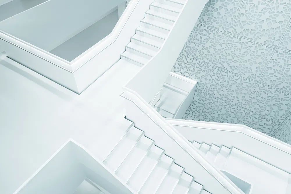
A simple way to define mood is to match art to the room's dominant material. White plaster walls pair beautifully with White Flower Silhouette or fabric-inspired prints. Concrete, steel, and walnut interiors suit staircase or structure-led imagery better.



Best Rooms for Minimalist Wall Art
Bedrooms are the most natural setting for minimalist posters because the goal is visual quiet. Above a 150 cm queen bed, art should usually span 90 to 120 cm total — either one larger piece or two medium frames with 5 to 8 cm between them. Soft imagery, low contrast, and warm neutrals help the room stay restful.
Living rooms benefit from minimalist wall art when the furniture already has presence. If your sofa is 220 cm wide, aim for artwork covering about 145 to 165 cm above it. That ratio — roughly two-thirds to three-quarters the sofa width — keeps the arrangement intentional. Oversized blank walls are exactly where minimalist posters shine, because a controlled composition reads as deliberate rather than under-decorated.
Home offices are another strong fit. A single print above a desk can reduce distraction better than a dense gallery wall, especially in compact work areas under 10 square meters. Architectural pieces from Modern Minimalist Architecture or clean symbolic works from Yoga Practice — Minimalist Print bring focus without turning the wall into background noise.
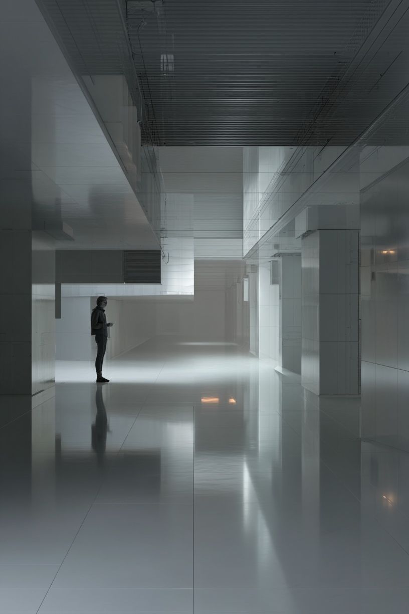
Hallways are often overlooked, but they suit minimalist posters especially well because people view them in motion. Clear shapes, simple lines, and higher contrast read best from quick angles. In narrow corridors, one vertical frame every 120 to 150 cm can be more effective than clustering multiple small pieces.
How to Size and Place Them Like a Pro
Scale is where most minimalist walls go wrong. Because the artwork itself is visually quiet, it often needs more physical size than people expect. A 30 x 40 cm frame above a full sofa usually looks timid. In that position, start at 50 x 70 cm for a single piece, or build a pair of 40 x 50 cm or 50 x 70 cm frames.
Hang art so the center sits about 145 cm from the floor in standard spaces. Above furniture, leave 15 to 25 cm between the top edge of the furniture and the bottom of the frame. That gap keeps the art connected to the furnishing instead of floating too high. If you are grouping minimalist posters, keep spacing tight — 5 to 7 cm between frames is usually enough. Wide gaps can make a sparse arrangement feel accidental.

For a cleaner look, limit yourself to one dominant axis. That might mean aligning all top edges, all centers, or all outer margins. Mixed alignment introduces energy, which can undermine the quiet effect that minimalist posters are meant to create.

Frames, Paper, and Finishing Details
Frame choice changes the whole tone of minimalist art. Thin black metal frames feel crisp and architectural. Natural oak brings warmth and suits Scandinavian or softer interiors. White frames can work, but only if there is enough tonal contrast between wall, mount, and artwork to avoid the piece disappearing.
Matting is useful when the artwork is delicate or low contrast. A mount of 5 to 8 cm adds breathing room and makes a 30 x 40 cm print feel more substantial without increasing image complexity. This is especially effective with pale designs such as Elegant White Fabric or tactile neutrals like White Cream Texture Poster.
Paper finish matters too. Matte stock is usually the better option for minimalist posters because it reduces glare and lets texture read properly from different angles. In bright rooms with large south-facing windows, glossy finishes can bounce too much light and flatten subtle details. If you want the art to feel polished rather than precious, keep the frame slim, the glass clean, and the palette consistent with nearby textiles and furniture.
Styling Minimalist Posters in Real Homes
The easiest way to style minimalist posters is to repeat one or two visual cues from the room. If your sofa has curved arms, echo that softness with fluid shapes. If the room is built from chalky whites, clay, and pale wood, choose prints that stay within that range and add contrast through texture instead of color.

Layering matters. Minimalist art looks strongest when the surrounding styling is edited but not sterile. One ceramic vase, a stack of two books, a wool throw, or a stone side table is enough to support the wall without competing with it. If the room already includes patterned rugs or bold upholstery, use simpler prints with stronger negative space to restore balance.
You can also mix categories while keeping the same visual language. A print from Window with Sheer Curtain — Fine Art Print can sit beautifully beside pieces from minimalist posters if the tones are soft and the framing is consistent. The same applies to meditative silhouettes and quiet abstracts — different subjects, same restraint.
A Simple Way to Build a Considered Wall
If you want the easiest route, start with one statement piece and let it set the palette. A large neutral artwork above the sofa, bed, or console often does more than four smaller pieces scattered across the room. In a compact apartment, one 70 x 100 cm print can create more presence than a gallery wall of six small frames.
If you prefer a set, stop at two to four works and keep one thread consistent — tone, texture, frame finish, or subject. That is enough to make the wall feel curated. When in doubt, edit harder. Minimalist posters succeed because every choice earns its place.
Final thoughts
The best minimalist posters do not fill a wall — they shape how the whole room feels. With the right scale, restrained palette, and clean placement, they can make a bedroom calmer, a living room more refined, or a home office more focused.
Choose fewer pieces, size them with confidence, and let texture do more of the work. A considered wall is rarely complicated. It is simply well judged.
Frequently Asked Questions
What frame color is safest for minimalist wall art?
Natural oak and matte black are the most versatile choices. Oak softens neutral art, while black adds definition on pale walls.
Can minimalist prints work on colored walls?
Yes — just increase contrast. On greige, sage, or clay walls, choose artwork with lighter grounds or stronger line work so it does not blend in.
Should I use glass or acrylic for larger frames?
Acrylic is lighter and safer for sizes above 50 x 70 cm, especially in bedrooms and hallways. Good-quality acrylic also reduces the risk of breakage during hanging.
How do I hang art if I am renting?
Use removable picture strips for lighter frames and check the weight limit carefully. For larger pieces, leaning art on a picture ledge is often the cleanest rental-friendly option.
What pairs well with minimalist posters besides more wall art?
Ceramics, linen, brushed wood, travertine, and simple lighting all complement minimalist pieces. Stick to two or three materials to keep the room cohesive.