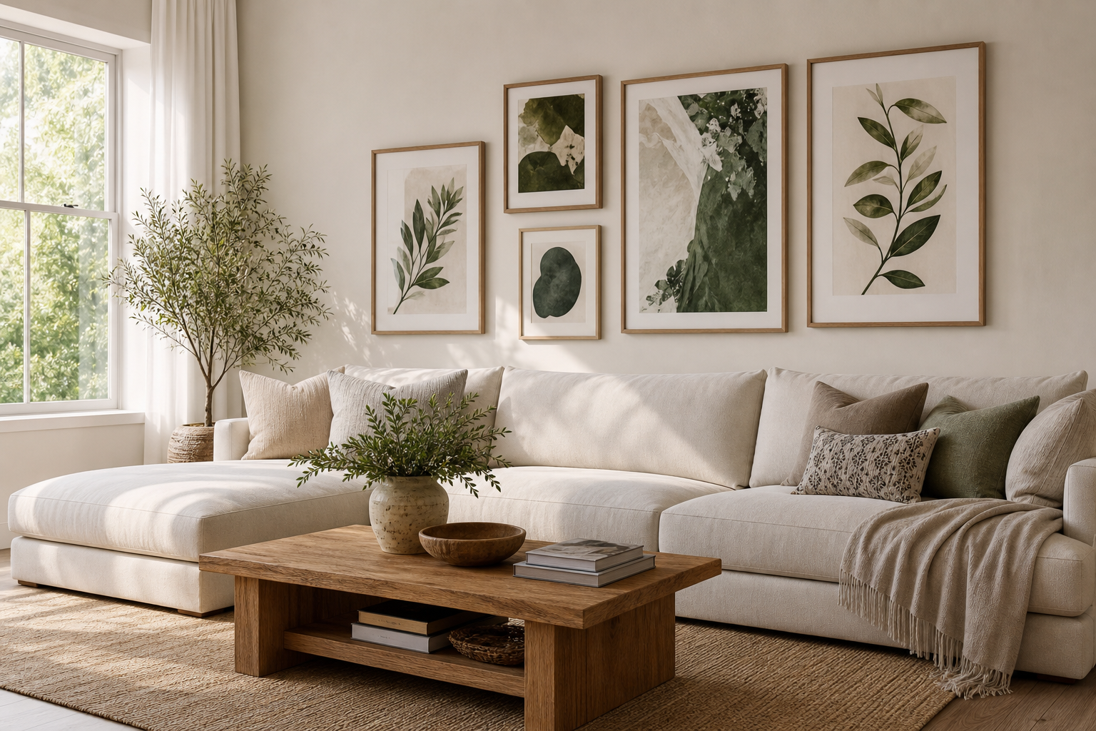
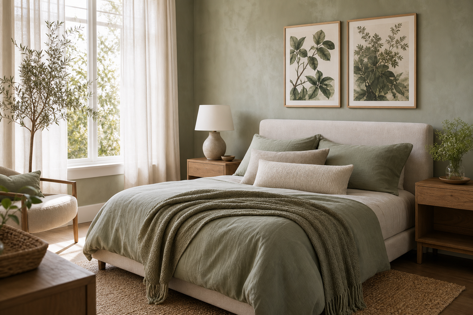
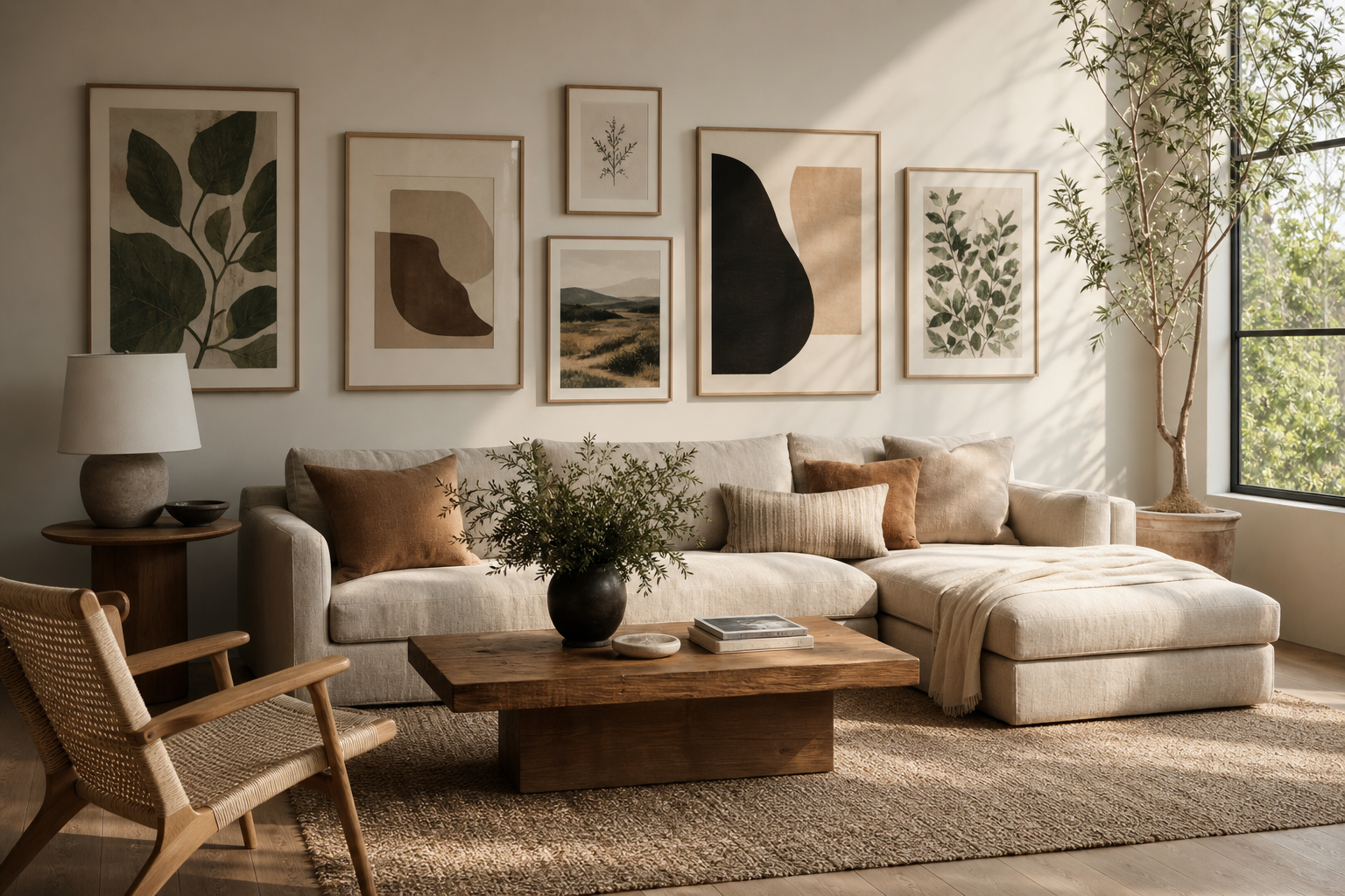
A well-chosen boho poster brings softness, pattern, and character to a room faster than almost any other wall detail. The style works because it is layered rather than rigid: sunbaked neutrals, hand-touched textures, vintage motifs, and shapes that feel slightly imperfect. If you want walls that look collected instead of decorated, boho is one of the easiest directions to get right.
What Gives a Boho Poster Its Look
The visual language of a boho poster is usually built on four things: earthy colour, organic form, visible texture, and a relaxed composition. Think clay, sand, rust, olive, faded rose, and warm ivory rather than sharp black-and-white contrast. Curves, arches, branches, petals, woven patterns, and textile-inspired motifs all help the art feel grounded.
A strong place to start is the Bohemian collection mixed with selected pieces from our botanical art prints and abstract wall art. That combination gives you the three ingredients boho rooms need most: nature, pattern, and looseness. Botanical details add life, abstract forms stop the space from looking too themed, and bohemian textures add warmth.
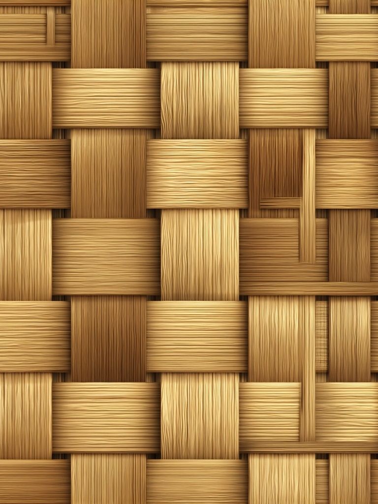
Texture matters as much as colour. Prints that reference bamboo, textiles, ceramics, or weathered surfaces create the look of layers even on a flat wall. That is why pieces like Woven Bamboo Texture feel so effective in boho interiors — they echo rattan, jute, linen, and unfinished wood already used in the room.
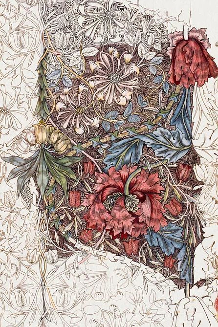
Vintage-inspired decoration also plays a role. Floral repeats, heritage textile patterns, and faded ornamental details make a boho poster feel lived-in rather than newly purchased. If your space already has cane furniture or natural wood, older-looking botanical patterns from Honeysuckle by William Morris or other pieces in our botanical collection can add that collected quality immediately.
Choosing the Right Boho Mood for Your Space
Not every boho room needs the same palette. Neutral boho works best when you want calm. Use shades within a 20 to 30 percent contrast range — cream, oat, sand, taupe, and muted brown — so the wall feels soft instead of busy. In smaller rooms, this keeps the visual weight light.

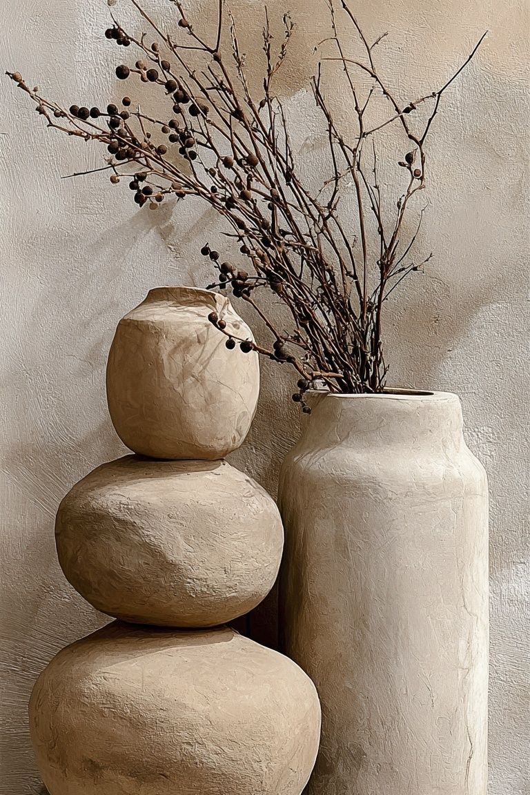
For a desert-inspired version, bring in terracotta, clay pink, cinnamon, ochre, and dusty olive. This mood pairs especially well with tactile prints and ceramic subjects. A piece such as Ceramic Vases with Dried Branches works well when you want something figurative but still understated.
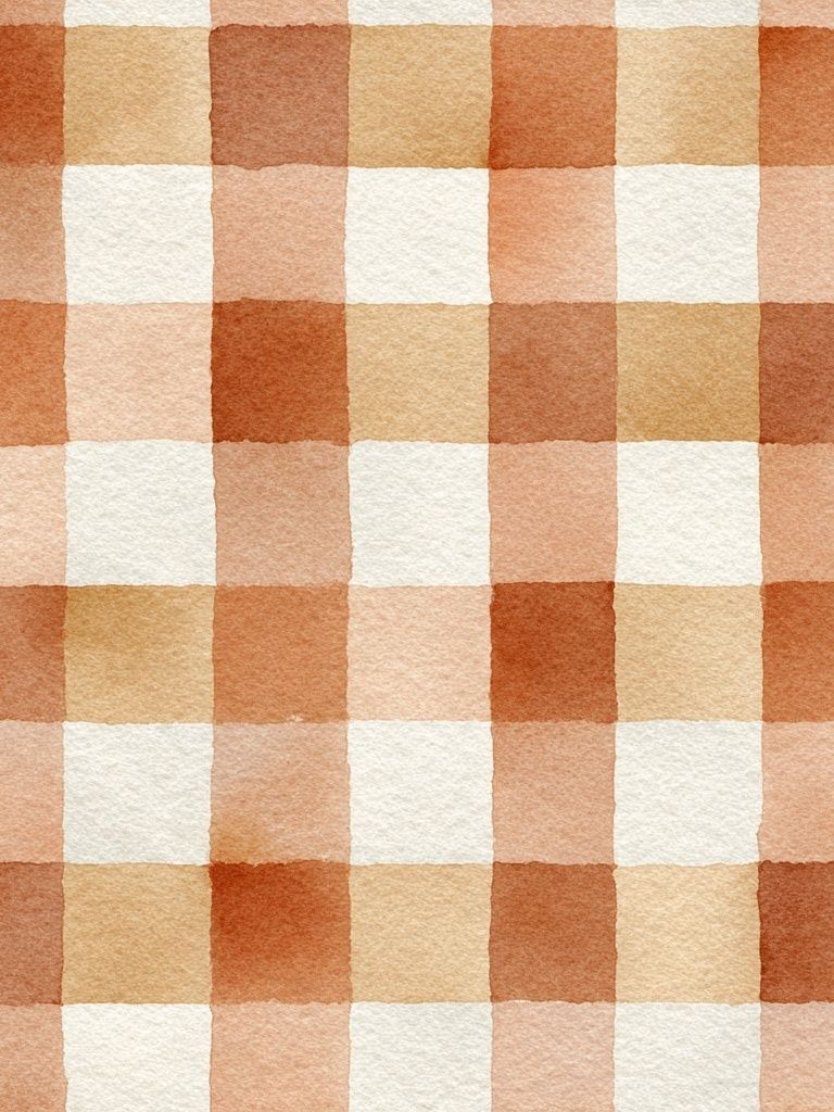
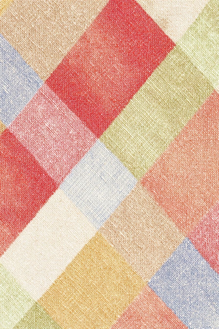
If you prefer a more maximalist boho mood, pattern is the tool to use. Add one dominant patterned piece, one smaller floral or textile print, and one calmer abstract design. A 60/30/10 balance works well here — 60 percent quiet base tones, 30 percent medium pattern, 10 percent strong accent colour. Our Colorful Patchwork Textile is a good example of a statement piece that can lead the palette.
Soft feminine boho sits somewhere between botanical and vintage. Blush, faded plum, dusty coral, muted green, and cream work well together, especially with curved line work and floral themes. If the room has soft upholstery or warm brass details, a delicate print from the minimalist collection can keep the arrangement from tipping too ornate.
Where a Boho Poster Works Best
Boho wall art works best in places where softness matters. Bedrooms are the most natural fit because the palette tends to be gentle and the layered styling complements bedding, rugs, and curtains. Above a queen bed, one 50x70 cm piece centered over the headboard is enough for a simple look. For more presence, use either two 50x70 cm prints side by side or a trio made from 30x40 cm and 50x70 cm sizes.
Living rooms suit boho styling when the wall needs warmth rather than formality. Above a 200 to 240 cm sofa, aim for art that spans roughly 120 to 160 cm in total width — about two-thirds of the furniture width. That could be two 50x70 cm frames, or one larger centerpiece paired with smaller works. Browse our fine art prints if you want a more painterly layer mixed into the arrangement.

Entryways, reading corners, and home offices also benefit from a boho poster because these areas often need personality in a compact footprint. In an entryway, one vertical 30x40 cm or 40x50 cm print above a bench keeps the look intentional without crowding the wall. In a reading nook, a single floral or textile-inspired work can visually connect a floor lamp, side table, and textured throw.
For home offices, boho works especially well when the furniture is simple. A desk setup with oak, black metal, or white surfaces can feel less stark with warmer wall art. Prints like Floral Birds — Bohemian Print or a restrained piece from our nature-inspired wall art add calm without making the workspace sleepy.
How to Frame and Pair Boho Artwork
Frame choice can change the entire tone of a boho poster. Light oak, ash, walnut, and matte black are the most useful options. Oak gives the softest result and works well with beige, terracotta, and olive palettes. Walnut adds richness and suits deeper reds and patterned pieces. Matte black is useful when the wall needs definition, but keep it to one or two frames in a boho arrangement so it does not dominate.
Mats are worth using when the art is detailed. A white or warm off-white mat of 4 to 8 cm gives floral and textile-based prints more breathing room. For a 30x40 cm artwork, placing it in a 40x50 cm frame with a mat often looks more expensive and more balanced than using a frame that matches the print edge exactly.
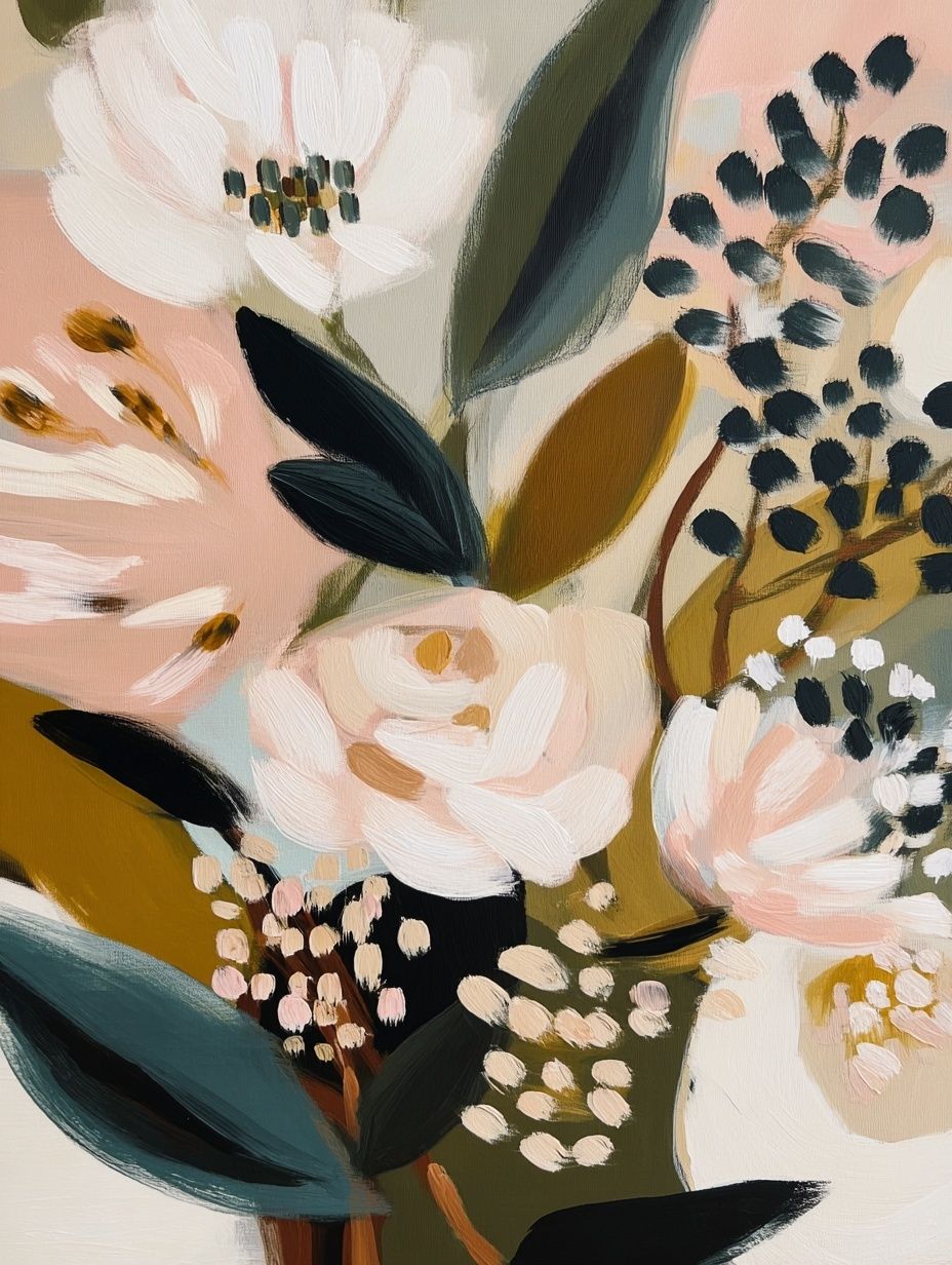
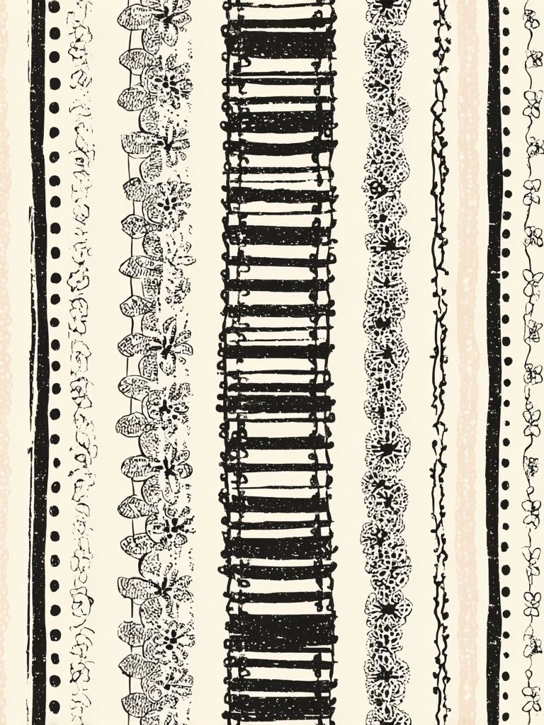
Pairing works best when you mix one of each visual type: one pattern, one organic subject, and one calm grounding piece. For example, a floral print can sit next to a striped or geometric design, then be anchored by a quieter textured image. Floral Bouquet — Bohemian Print pairs naturally with Bohemian Stripes — Minimalist Print because the floral detail stays loose while the stripe keeps the arrangement structured.
If you want an even softer mix, blend bohemian pieces with restrained minimalism. Prints from the minimalist art category such as fabric, vase, or silhouette motifs give the eye a place to rest. That contrast is what makes a boho poster wall look curated rather than crowded.
Building a Relaxed Gallery Wall
A relaxed gallery wall should still follow a plan. Start with 3 to 5 pieces, not 8 or 10. Too many frames too early can make boho styling look messy rather than collected. A practical formula is one 50x70 cm hero piece, two 30x40 cm supporting prints, and one small decorative object nearby such as a woven wall accent or shelf with ceramics.

Keep the spacing loose but controlled — 5 to 8 cm between smaller frames, and up to 10 cm around a larger center piece. Align at least one edge, either the bottom line or a vertical side, so the grouping feels intentional. Boho works with asymmetry, but it still needs a visual anchor.
Mixing subjects is the key to depth. Combine a boho poster with abstract forms, line-led botanicals, and textile references so the wall feels layered in the same way the room does. If your furniture already includes rattan, boucle, linen, or rough timber, echo those materials through imagery rather than adding more décor objects. That keeps the result lighter and cheaper to achieve.
A useful rule is to repeat at least two colours across all pieces. If one print includes rust and cream, make sure another contains one of those shades. That simple overlap makes very different artworks sit together naturally.
Finishing Touches and Styling Tips
Lighting decides whether wall art feels atmospheric or flat. Warm bulbs around 2700K to 3000K suit boho interiors better than cool white light. Place a floor lamp or wall sconce 60 to 90 cm from the arrangement to bring out texture in wood frames, woven accents, and linen upholstery nearby.
Keep the surrounding styling edited. If the wall is patterned, simplify the shelf below it. If the art is soft and tonal, bring in one stronger tactile element — a chunky woven basket, a ceramic vase, or a darker wood stool. A boho poster should feel connected to the room, not swallowed by objects around it.

When shopping, choose the art first, then build the extras around it. It is easier to match a cushion or vase to a print than the other way around. Start with one boho poster you genuinely want to look at every day, then add one supporting print and one contrasting piece. That three-step approach almost always looks more refined than buying a full set in one go.
Final thoughts
A successful boho wall is less about filling space and more about layering the right ingredients: warm colour, natural texture, soft structure, and a little irregularity. Start with one strong boho poster, add support from botanical or abstract pieces, and keep the palette tied together by two or three repeating tones.
The best arrangements feel relaxed, but they are never random. Good spacing, thoughtful framing, and the right room placement will make even a small art grouping feel settled and complete.
Frequently Asked Questions
What frame colour works best for boho wall art?
Light oak is the safest choice for most boho interiors. Walnut works well with deeper terracotta, burgundy, and vintage-inspired prints.
Can I mix boho prints with minimalist art?
Yes — it usually improves the balance. One or two simpler minimalist pieces help patterned boho artwork feel cleaner and more intentional.
What size should I choose for a small reading corner?
A 30x40 cm or 40x50 cm print is usually enough. If the chair is oversized, go up to 50x70 cm for better proportion.
Do boho prints need matching frames in a gallery wall?
No, but they should relate. Use two finishes at most — for example oak and walnut — so the wall still feels cohesive.
How high should I hang art above a bed or sofa?
Leave about 15 to 25 cm between the furniture and the bottom of the frame. That keeps the art visually connected to the piece below it.