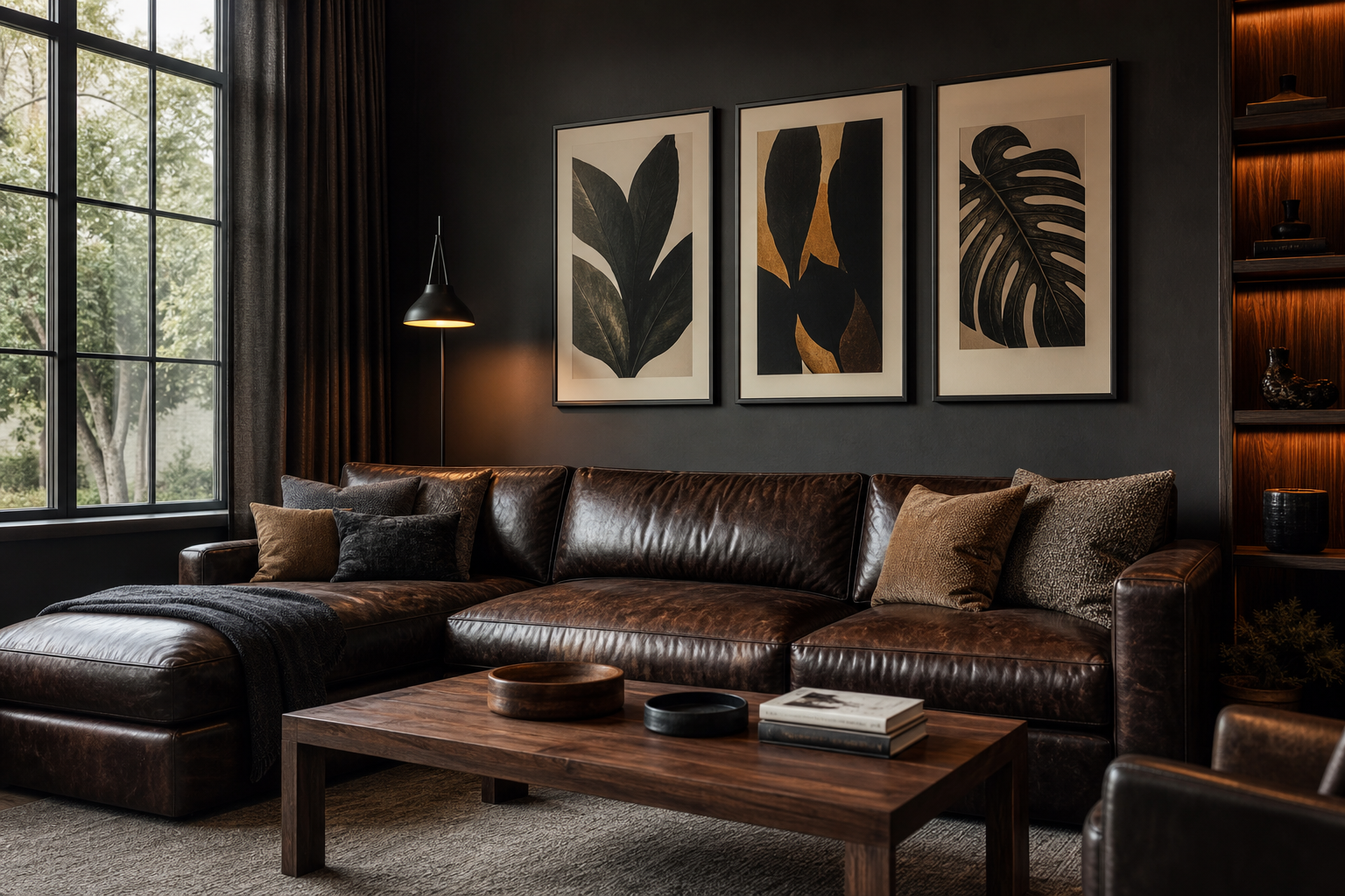
The best man cave posters do one job first: they make the room feel claimed. A generic print fills a wall, but a personal piece tells people what the room is for — watching the game, listening to records, relaxing after work, or showing off the subjects you never get tired of. In most man caves, stronger images work better than delicate ones: high contrast, clear subject matter, and palettes that hold up in lower light.
What Makes a Great Man Cave Poster
A great print for this kind of room usually has one of three qualities: a bold focal subject, a nostalgic reference, or a graphic composition that reads from across the room. If your seating is 8 to 12 feet from the wall, fine details disappear fast. That is why action photography, strong silhouettes, vintage illustrations, and crisp typography tend to outperform overly subtle artwork.
For a room with darker finishes — charcoal paint, walnut, black metal, brown leather — lean into art with deep blacks, muted creams, rust, forest green, or faded reds. If your space is lighter, with concrete, pale wood, or gray upholstery, the same man cave posters can carry more visual weight and stop the room from feeling flat. our vintage collection is especially useful here because aged tones sit naturally with wood, metal, and worn leather.
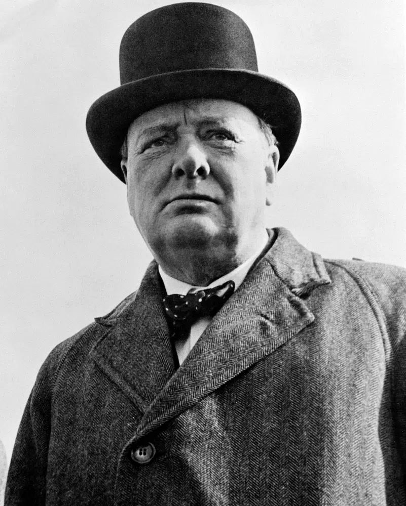
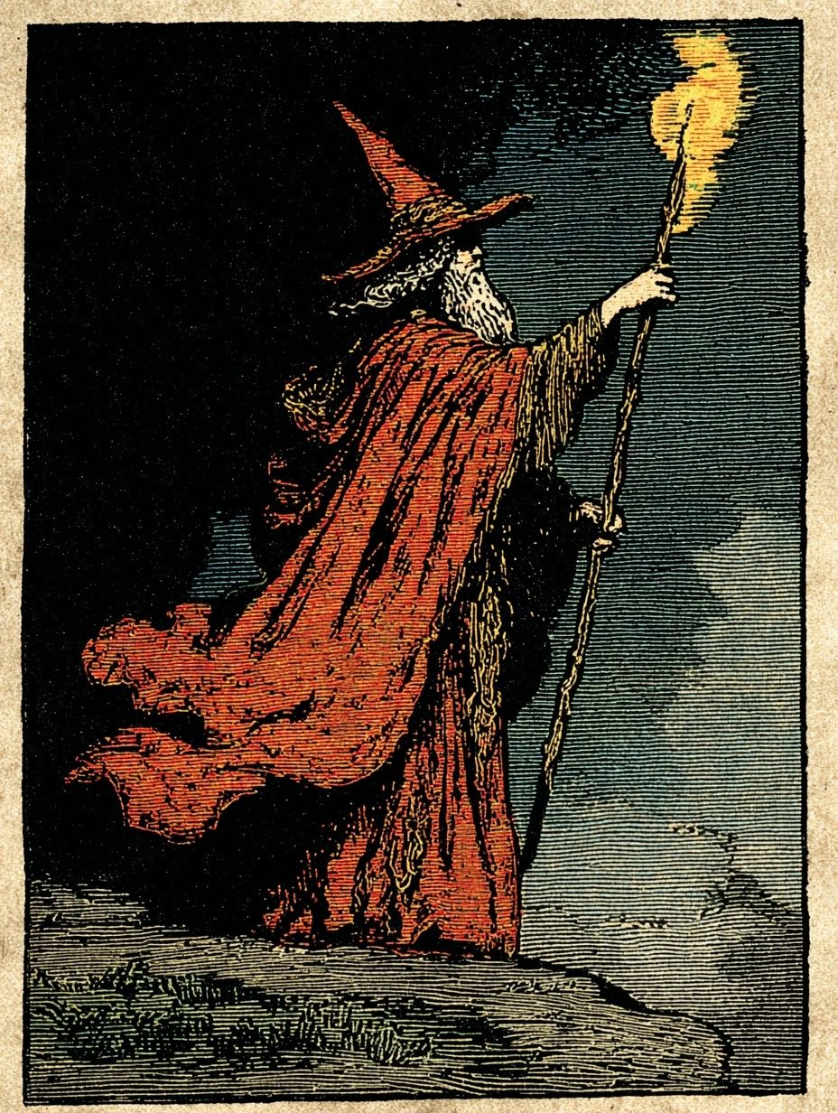
Vintage portraiture, old diagrams, and archival-style prints bring character without looking busy. A piece such as Winston Churchill Portrait works well above a drinks cabinet, desk, or reading chair because it adds presence without demanding a full gallery wall.
Choosing a Theme That Fits Your Interests
The strongest man cave posters usually come from one lane, not five at once. Pick a primary theme that matches how you actually use the room. If the room revolves around match days, start with sport wall art. If it is where you keep your records and speakers, build around our music prints. If you want a layered, collected look, vintage illustration is the easiest bridge between different interests.
Sports art works best when it feels dynamic rather than decorative. Look for motion, close crops, or aerial compositions that emphasize the geometry of the game. Music-themed pieces should do the same — stage lighting, instruments, silhouettes, and live-performance energy all suit a man cave more naturally than bright novelty graphics.

If you want a room with more than one interest, combine themes by mood instead of subject. A black-and-white concert photograph can sit next to a sepia vintage print if both have similar contrast and frame color. A football action image can pair with a bold typography print if both share the same black, cream, and red palette. typography wall art is useful for filling these gaps because it can connect sports, music, and vintage pieces into one coherent set.

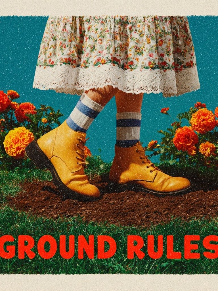
For a more playful, slightly irreverent setup, a retro slogan piece can sharpen the room without making it feel like a home office. Ground Rules works particularly well near a bar cart, dartboard, or game table because the tone is casual and social.
Finding the Right Size and Layout
Size matters more than people expect. A small 21 x 30 cm print on a 240 cm-wide wall will look lost. Over a standard 3-seat sofa, aim for artwork that spans roughly 55 to 70 percent of the sofa width. If your sofa is 210 cm wide, your total art width should land around 115 to 145 cm. That can be one 70 x 100 cm statement piece, two 50 x 70 cm frames, or a gallery wall built inside that range.
One large print is the cleanest option for a compact room. It keeps the wall calm and gives the eye a clear landing point. Pairs are ideal above a console, sideboard, or desk where symmetry helps the room feel intentional. Gallery walls work best when the man cave has a casual, collected atmosphere — especially with vintage, sport, and music mixed together.

Hang the center of the arrangement about 145 cm from the floor in a room where people mostly sit. If the art goes above furniture, keep the bottom edge 15 to 25 cm above the back of the sofa or console. Tighter spacing — around 5 to 7 cm between frames — looks more polished than wide gaps, especially when you want man cave posters to read as one installation rather than separate pieces.

A strong action print like Ice Hockey Action Photography Poster is ideal as a single focal piece. It has enough movement and contrast to anchor a media wall or fill the space above a compact loveseat without needing support from smaller frames.
Framing and Finishing Touches
Frames are what make wall art feel permanent. In most man caves, black, dark walnut, or matte oak frames are the safest choices. Black frames sharpen photography and typography. Walnut softens vintage art and adds warmth to gray or black rooms. If your furniture already has a lot of black metal, wood frames prevent the room from feeling cold.
Glazing matters if the room has a TV, spotlights, or windows opposite the art. Acrylic or low-glare glazing cuts reflection and keeps dark prints readable at night. If you are hanging near a bar area, choose easy-clean frames and avoid placing paper art directly above a sink or drinks station where humidity can creep in over time.

Typography and graphic designs can also benefit from wider mats — around 3 to 5 cm — because the extra border gives the work a cleaner, more premium look. If you prefer a cleaner visual language overall, minimalist art prints and abstract wall art are useful supporting categories for side walls, hall corners, or office nooks connected to the main room.
How to Match Posters with Your Man Cave Decor
Good styling is mostly about repetition. Pull one or two colors from the artwork and repeat them elsewhere in the room — a rust throw, green glass bottle, black lamp, tan leather chair, chrome speaker detail. That is what makes wall art feel integrated instead of added late.
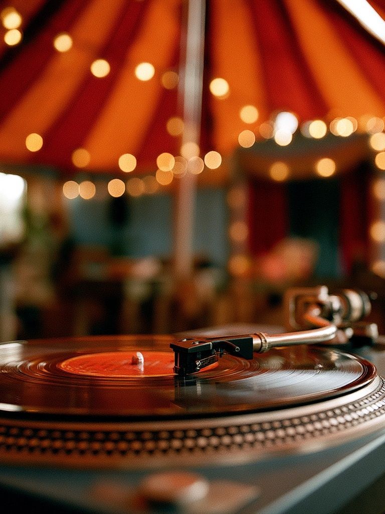
If your room is heavy on brown leather and dark wood, music and vintage pieces often feel especially natural. Record-player photography, old-world illustration, and moody portrait art all share the same lived-in warmth. Vinyl Turntable Photography is a smart choice near a listening area because it mirrors the function of the space instead of fighting it.
Lighting changes everything. Warm bulbs around 2700K to 3000K flatter vintage tones and wood frames. Cooler light can work with sports photography and graphic black-and-white pieces, but too much cool light makes a room feel more like a gym than a retreat. If you use LED strips behind a TV or shelves, keep the art wall separately lit with a focused floor lamp or picture light so the prints still hold their own.
Easy Ways to Refresh the Room Over Time
You do not need to finish the room in one weekend. In fact, man cave posters usually look better when the collection grows gradually. Start with one anchor piece, then add two supporting prints after you have lived with the room for a few weeks. That approach makes it easier to see whether the space needs more energy, more balance, or more contrast.
One simple rotation method is 60-30-10. Keep 60 percent of the wall art fixed, rotate 30 percent seasonally, and leave 10 percent for impulse finds. In practice, that might mean your main sports print stays up all year, while one music piece and one typography piece change every few months. This keeps the room fresh without forcing a full redesign.

Rotating art is also easier if you standardize frame sizes. Choose one or two formats — for example 50 x 70 cm and 30 x 40 cm — and keep spare prints stored flat. Then you can swap by subject: sport during tournament season, music during winter hosting months, vintage or typography when you want the room to feel calmer. the music collection and the sport collection are both strong categories for building that kind of flexible set.
Wrap-Up: Build a Space That Feels Like Yours
The most successful man cave posters are not the loudest ones — they are the ones that reflect what you come into the room for. A sports photograph, a vintage portrait, a turntable image, or a sharp typography print can all work if the mood matches the furniture, lighting, and pace of the space.
Start with one piece that feels undeniably right, hang it at the proper scale, frame it well, and build from there. Personal rooms rarely come together by chasing trends; they work because every choice feels connected to the person using them.
Frequently Asked Questions
What frame color works best for a dark man cave?
Matte black is the safest choice for sport, music, and typography prints. Walnut is better if the room has leather, wood shelving, or vintage-inspired decor.
Can I mix photography and vintage illustration on the same wall?
Yes — keep the frame finish consistent and limit the palette to 2 or 3 dominant tones. Similar contrast levels help mixed subjects look intentional.
How many prints should I use above a sofa?
Usually 1 large piece or 2 medium pieces are enough. If you use more than 4 frames, the arrangement should still stay within about 55 to 70 percent of the sofa width.
What paper finish is easiest to live with in a room with lamps and screens?
A matte finish is the most practical because it reduces glare from TVs, ceiling spots, and side lamps. It also suits vintage, sport, and music imagery particularly well.
What pairs well with sports wall art if I want a more mature look?
Try vintage prints or restrained typography instead of adding more action shots everywhere. That mix gives the room energy while keeping it polished.