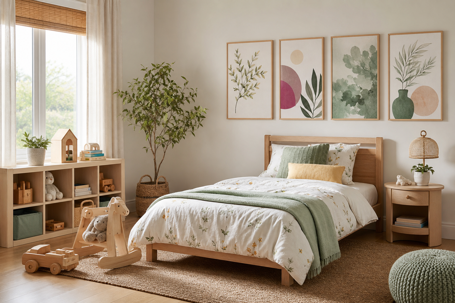
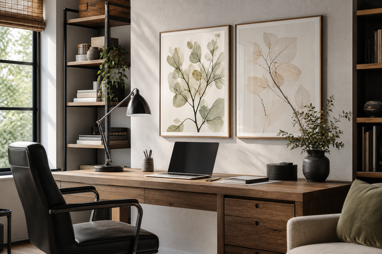
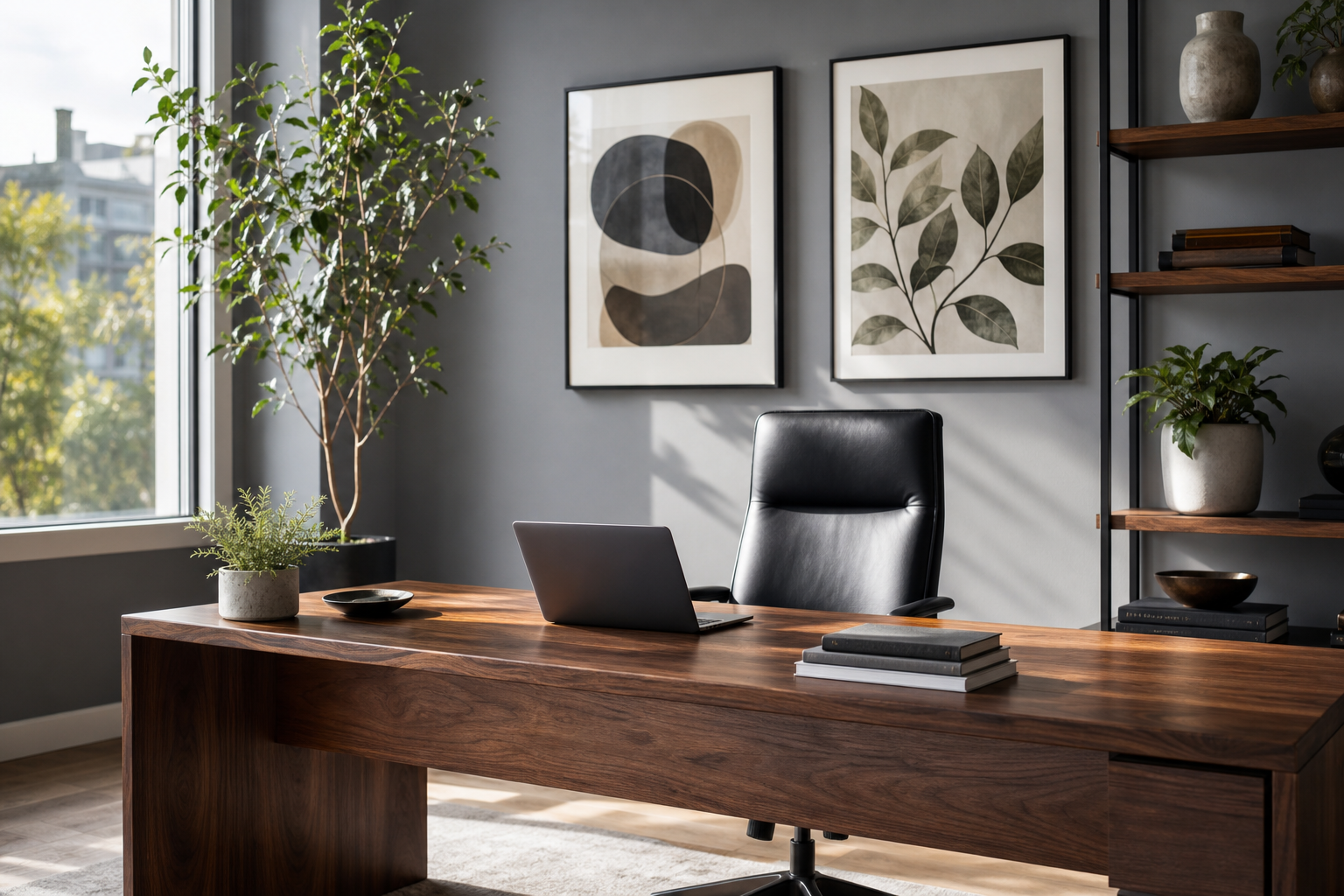
Bringing "kids for the office" into a workspace is less about decorating like a playroom and more about choosing art that softens the room. The right pieces add warmth, approachability, and a little imagination — useful qualities in reception zones, studios, counseling offices, and home workspaces where you want people to feel at ease. Instead of loud primary colors across every wall, think one or two framed prints with clear shapes, gentle humor, and a restrained palette.
What "Kids for the Office" Really Means
"Kids for the office" works best when the art feels family-friendly rather than overtly juvenile. That usually means illustrations with clean outlines, watercolor animals, simple character scenes, or uplifting motifs that read well from 1.5 to 3 meters away. A private office can handle slightly more personality, while a client-facing room benefits from calmer subjects and fewer saturated tones.
A practical rule is to keep the artwork playful and the furniture structured. Pair child-inspired wall art with a desk in oak, walnut, black metal, or matte white, and keep at least 60 to 70 percent of the room neutral. That contrast lets the art do its job without making the room feel improvised. If you are starting from scratch, our Kids collection and Illustration art prints are the strongest places to look for office-friendly options.

Choosing Art That Feels Playful, Not Cluttered
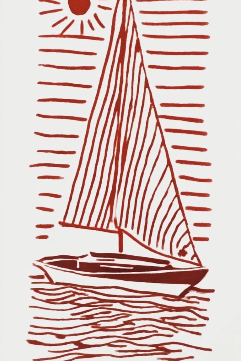
The cleanest approach is to choose subjects with one focal figure and open background space. Watercolor animals, simple boats, suns, or childlike nature scenes bring softness without visual noise. Art with too many small elements can feel busy in an office, especially when placed near calendars, monitors, books, and storage.
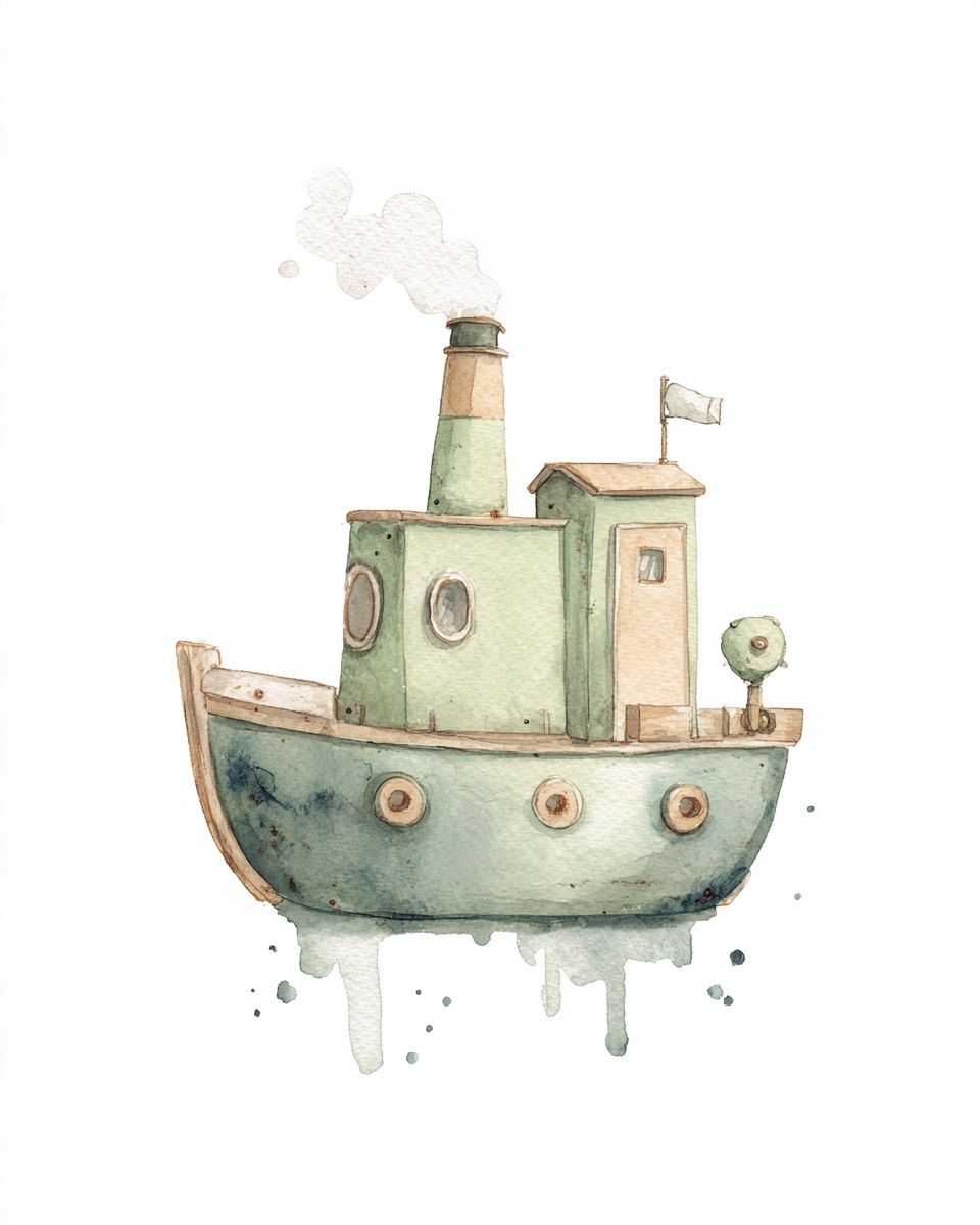
For example, Curious Zebra — Cartoon Print works because the silhouette is readable and the subject is upbeat without being chaotic. The same applies to Whimsical Tugboat Watercolor Poster, which adds character through shape rather than clutter. If you prefer something even quieter, blend playful themes with restrained compositions from our Minimalist collection.

A useful color benchmark is to limit each print to two or three dominant tones, then repeat one of them elsewhere in the room — a sage notebook, a sand fabric chair, a muted blue lamp. That repetition makes "kids for the office" look curated instead of accidental. Avoid mixing five or six unrelated bright colors in one sightline, especially on smaller walls under 2 meters wide.
If you want a playful set that still reads as orderly, build around soft watercolor and minimal illustration styles.

Where Kids-Inspired Posters Work Best
These prints perform especially well in reception areas, creative studios, pediatric-adjacent offices, counseling spaces, and home offices shared with family life. In a reception space, one medium print at 50x70 cm behind a side chair or console usually has more impact than a crowded gallery wall. It feels welcoming the second someone walks in, but still leaves the room breathing space.
In a private office, place a single framed piece behind the guest seating rather than directly behind the desk if video calls are frequent. That keeps the background polished on camera. In a home workspace, child-inspired art can bridge the gap between professional and personal — particularly if the office also serves as a study nook or sits off a living room.

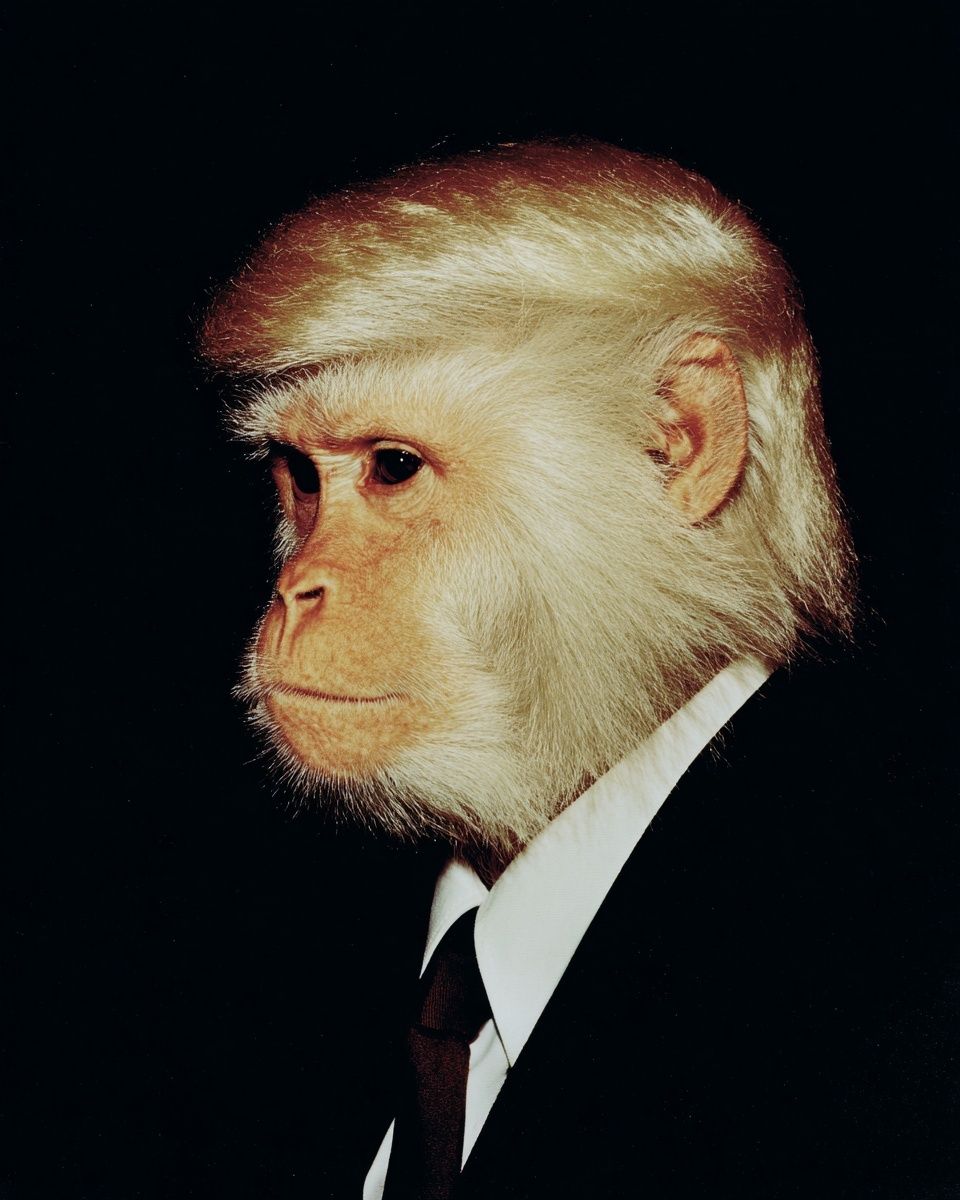
For creative teams, a pair of coordinated prints can loosen the atmosphere without undermining credibility. Teddy Bear with Balloons — Watercolor Print suits soft, welcoming interiors, while Monkey in Suit — Funny Print fits a more humorous studio or brainstorm room where wit is part of the brand voice.
Keep placement consistent. Hang the center of the frame around 145 cm from the floor in standard offices, or slightly lower — around 140 cm — in lounge-like waiting areas with low seating. Above a desk, leave 20 to 30 cm between the desktop line and the bottom of the frame. Above a credenza or console, 15 to 25 cm usually looks balanced.
Sizing, Framing, and Finish for a Polished Look
The fastest way to make playful art feel office-ready is framing. Thin oak, black, or white frames between 1 and 2 cm wide keep the work crisp and intentional. Avoid glossy novelty frames, oversized colored borders, or thick shadow boxes unless the room is highly styled already. In most offices, simple frames win because they reduce visual interruption.
For size, use this guide: - 30x40 cm for narrow wall sections, shelves, or layered styling - 50x70 cm for the main art statement in a small office - 70x100 cm for a larger reception wall or behind a sofa in a studio lounge
If you are hanging art above furniture, aim for the total artwork width to cover roughly 60 to 75 percent of the furniture width below. So a console that is 120 cm wide looks best with one 70 cm piece or two smaller frames spanning around 75 to 90 cm together.

Matte finishes are the safer office choice because they cut glare from overhead lighting and screens. In rooms with strong daylight or glass partitions, matte paper can reduce reflections by a noticeable margin compared with glossy finishes. This matters in conference rooms and deskside walls where glare can flatten the artwork and make details harder to read.
Building a Balanced Palette Around the Posters
The most successful rooms use playful art as an accent, not the full palette plan. Start with a neutral base — warm white walls, light oak, walnut, stone, soft gray, oatmeal, or black metal. Then pull one or two colors from the artwork into small accessories. That might mean dusty blue from a boat illustration, muted yellow from a sun motif, or soft green from botanical details.
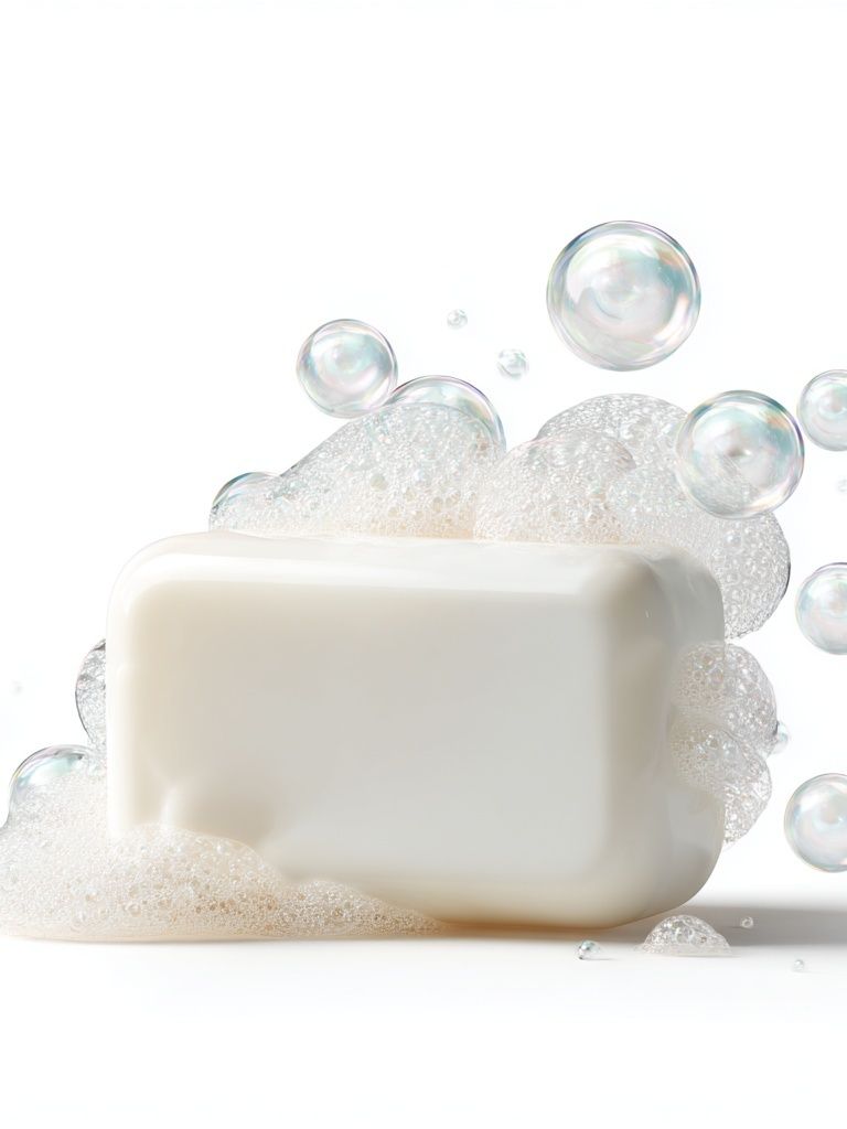
A good ratio is 70 percent neutral, 20 percent natural material, 10 percent playful color. That balance keeps the office composed. If your walls are already colorful, choose quieter illustrations such as Soap Bubbles Minimalist Print or Cute Baby Turtle Nursery Print to avoid competition.

Wood tones help "kids for the office" feel grounded. Pale oak makes pastel art look airy, while walnut adds more structure and maturity. Black accents — chair bases, lamp stems, frame edges — sharpen softer illustrations and prevent the room from drifting into nursery territory. If you need a playful piece with a calm emotional tone, Little Girl and Elephant — Watercolor Print is a strong example of softness balanced by clear composition.
How to Keep It Professional and Personal
The key is editing. One strong print can do more than four average ones. If you are using playful office art in a client-facing space, avoid overly loud slogans, hyper-saturated neon, or crowded character scenes that compete with signage and work materials. Pick artwork that supports the room rather than dominating it.
It also helps to match the art to the function of the room. A reception area benefits from gentle, reassuring subjects. A creative studio can take more humor and energy. A home office usually sits somewhere between the two. If you want a slightly more offbeat take, Vintage Computer in Nature — Digital Art Print can bridge professional and playful in tech or design-led interiors.

Final thoughts
"Kids for the office" works when the room still follows professional design rules: restrained color, clear spacing, quality framing, and art that has one readable idea. The playful element should humanize the office, not overpower it.
Choose one or two pieces that soften the atmosphere, place them where people naturally pause, and let the rest of the room stay structured. That is what makes child-inspired office art feel intentional, warm, and fully grown-up.
Frequently Asked Questions
What frame color works best for kids-inspired office art?
Oak is the most versatile for soft illustrations, while black gives playful prints a sharper, more professional edge. White works best on colored walls or in very bright spaces.
Can I mix kids prints with more minimal office art?
Yes — pair one playful illustration with one or two quieter pieces in a related palette. Keep spacing and frame style consistent so the wall feels unified.
Are these prints suitable for small offices?
Yes. In compact rooms, a single 30x40 cm or 50x70 cm frame usually looks better than a multi-piece arrangement that crowds the wall.
How do I stop playful art from looking too childish?
Use mature materials around it — wood, linen, metal, and matte frames. Also avoid combining too many novelty subjects in the same area.
What wall color pairs best with playful office artwork?
Warm white, soft greige, pale gray, and muted beige are the safest choices. They let gentle colors in the artwork stand out without making the room feel busy.