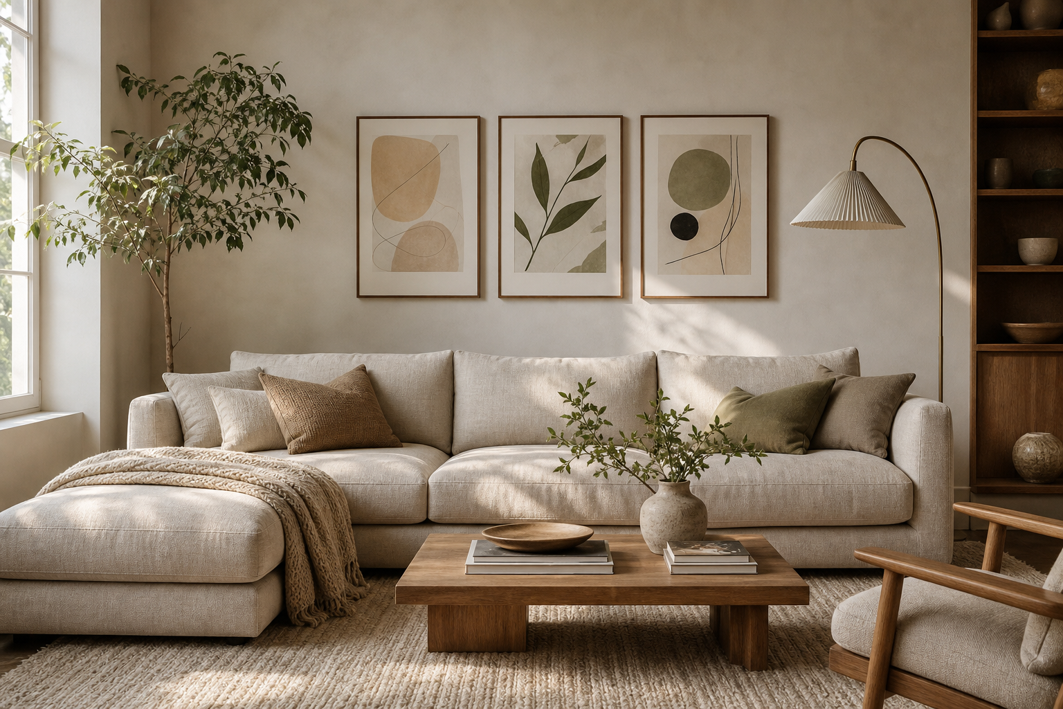
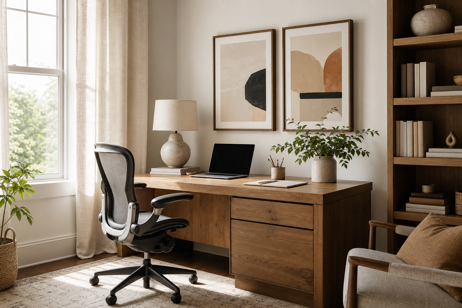
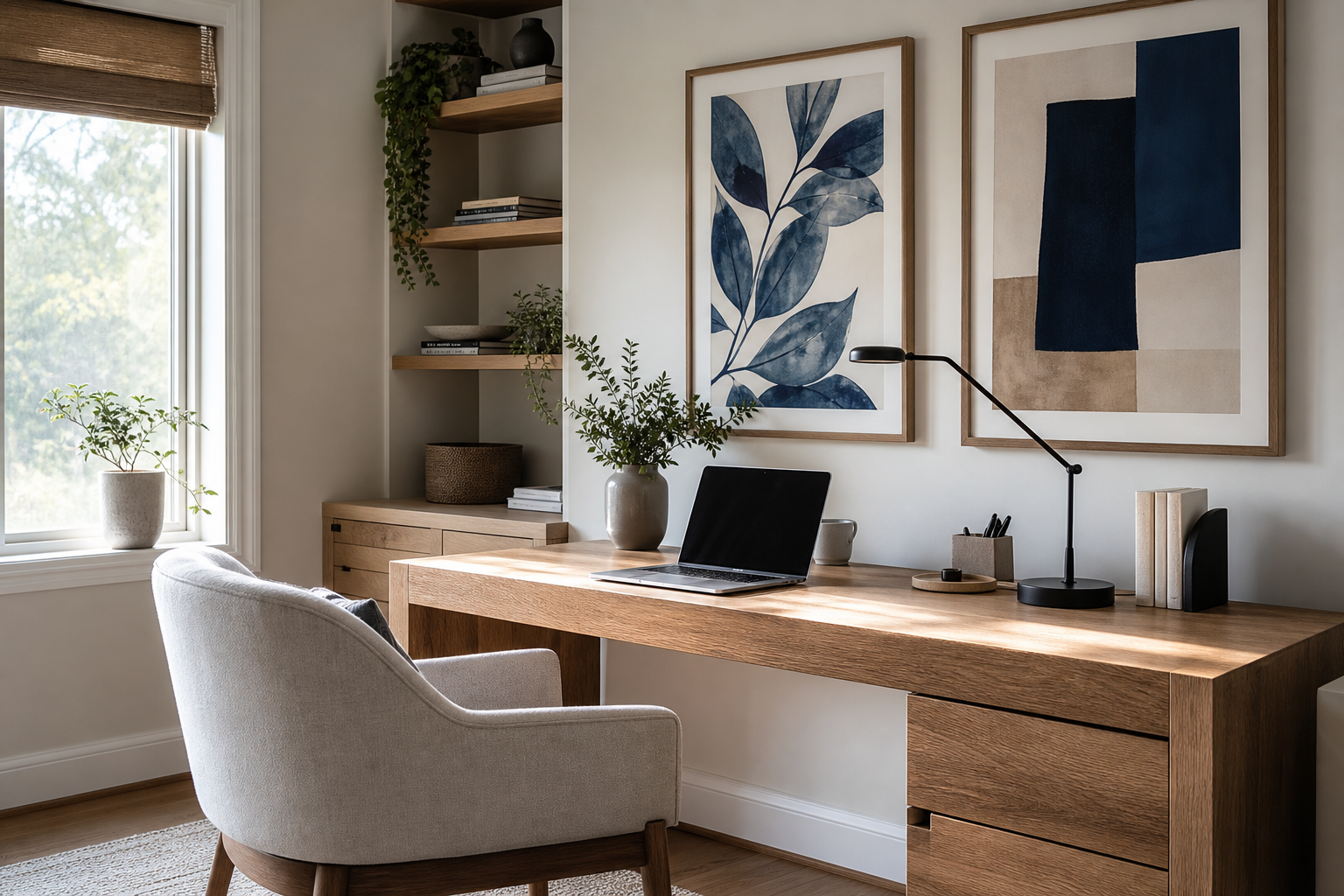
The best illustration for the office does two jobs at once: it improves how the room feels and it supports how the room works. A blank wall can make a workspace feel temporary, while the right artwork gives structure, rhythm, and a sense of intent. In practical terms, that often means calmer visual noise, a stronger first impression for clients, and a more finished environment for the people using the space every day.
Why office illustration matters
Artwork changes how a room reads within seconds. In an office, that matters because people spend 6 to 10 hours looking at the same walls, screens, and surfaces. A considered illustration for the office can soften harsh architecture, break up repetitive desk layouts, and create visual landmarks in open-plan rooms. Reception areas benefit from pieces that signal taste and professionalism, while work zones need imagery that adds character without pulling attention every few minutes.
Illustration is especially useful because it sits between decoration and communication. Compared with highly detailed fine art, it often feels cleaner and more direct. Compared with pure typography, it feels less instructive and less aggressive. That balance makes pieces from our Illustration collection a strong fit for focused spaces, especially when paired with quieter work from the Minimalist category or tonal pieces from our Abstract selection.
A good office wall scheme also supports brand feel without turning the room into signage. Creative studios often use bolder shapes or playful imagery, while law firms, consultancies, and architecture offices usually benefit from restrained palettes and cleaner line work. In home offices, the goal is slightly different: the art needs to look good on video calls from 1.5 to 3 metres away and still feel pleasant when you are sitting directly beneath it.
Choosing the right style for your office
Minimalist illustration works best where concentration is the priority. Think single-subject compositions, limited colour, and generous negative space. These are ideal above a desk, beside shelving, or in narrow wall sections where a busy image would feel cramped. Pieces from Textured Concrete Wall or Textured Waves bring visual depth without demanding attention.
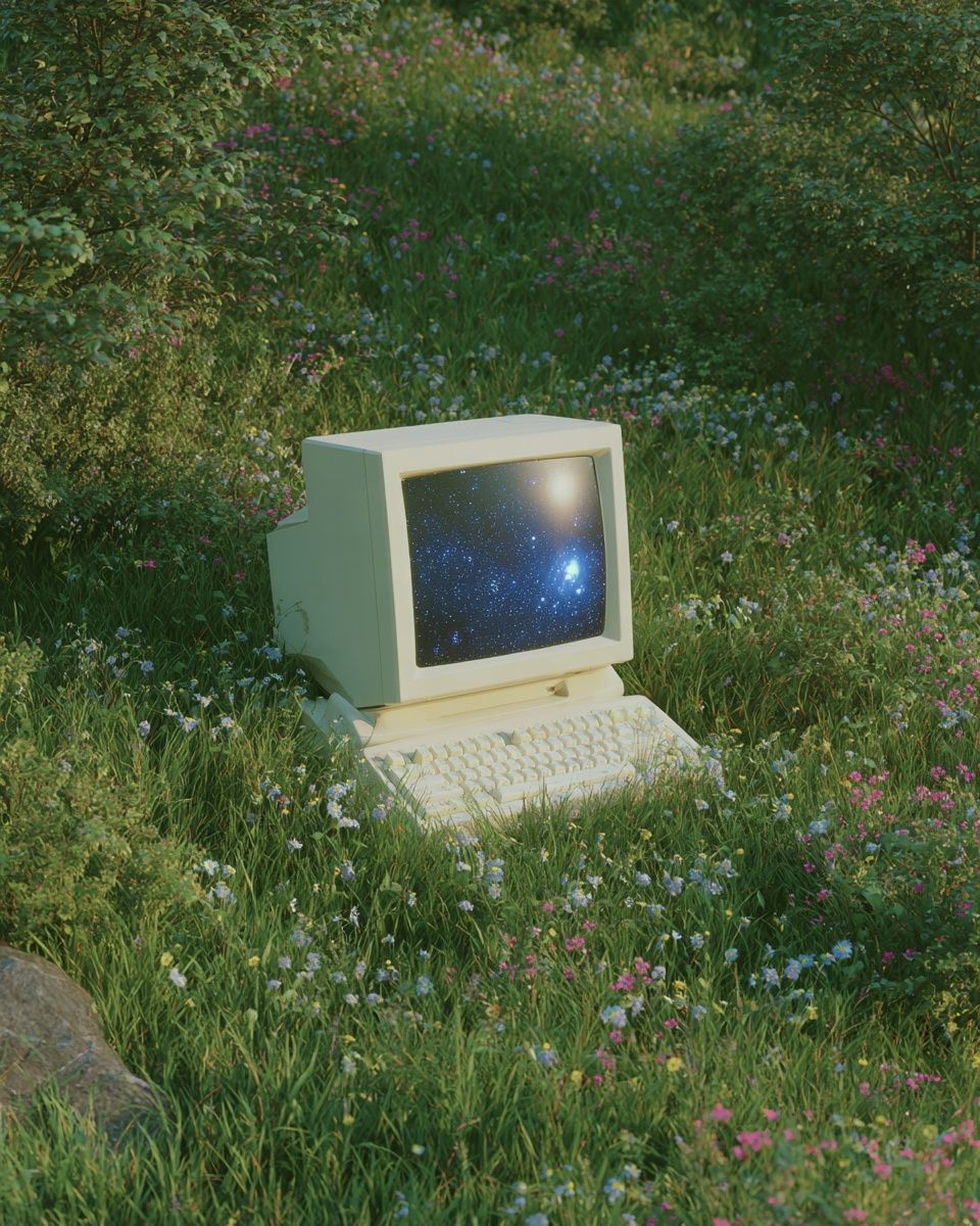
Editorial-style illustration is a strong choice for offices that need personality and polish. It has enough character to feel intelligent and current, but not so much detail that it becomes clutter. A piece like Vintage Computer in Nature suits creative desks, studio corners, or technology teams because it nods to work culture without becoming literal office decor.
Abstract illustration is useful when you want mood more than message. Soft forms, layered textures, and restrained contrast can make meeting rooms feel less sterile. Bolder abstract work, used in moderation, adds energy to brainstorming zones or collaborative spaces. If your office already has strong materials such as black metal, oak, glass, or concrete, abstract prints often bridge those finishes better than figurative art.
Playful illustration should be used selectively. It works in breakout spaces, design studios, and home offices where warmth matters as much as discipline. In client-facing rooms, keep the humour subtle and the palette controlled. One playful print can humanise a room; five can make it feel unfocused.

Sizing and placement that actually work
Scale is where most office art schemes go wrong. A single small frame above a 160 cm desk often looks lost, while oversized work in a tight room can feel oppressive. As a rule, wall art should cover around 50 to 75 percent of the width of the furniture beneath it. Above a desk that is 140 cm wide, aim for one piece around 70 x 100 cm, or a pair of 50 x 70 cm frames with 5 to 8 cm between them.
In reception areas, larger is usually better. Art viewed from 3 to 5 metres away needs enough visual weight to hold the wall. A 70 x 100 cm frame, a 100 x 140 cm statement piece, or a grid of four coordinated works often feels appropriate. Meeting rooms benefit from medium-to-large pieces on the main wall, especially the one visible behind the speaker on video calls.
For home offices, think in sightlines. The best placement is usually either directly above the desk at eye level when standing, or on the adjacent wall that stays visible during work breaks. Hang the centre of the composition around 145 cm from the floor in most rooms. If the art sits above furniture, leave 15 to 25 cm of breathing space between the top of the desk, credenza, or shelf and the bottom of the frame.



Colour palettes that support focus
Colour affects energy faster than subject matter. If the office feels overstimulating already — bright screens, cables, glass reflections, heavy movement — use calm neutrals and muted tones on the walls. Off-white, sand, charcoal, dusty blue, and soft clay tend to work well because they reduce contrast and make a room feel more settled.
For focused desk zones, choose artwork with one dominant tone and one secondary accent. That ratio keeps the piece interesting without becoming busy. A print like Blush Watercolor Abstract brings warmth to cooler interiors, while Yin Yang Teal Abstract adds definition without the visual urgency of bright red or sharp yellow.
Bolder colours do have a place in office design. Use them where you want energy: innovation rooms, social corners, or a hallway that otherwise feels flat. The key is containment. One saturated piece on a neutral wall is purposeful; several competing bright pieces create fatigue. If you want a livelier scheme, anchor it with quiet neighbours from our Fine Art collection or pared-back work from the Minimalist range.


Framing and finishing touches
Frames are not a detail in an office — they determine whether the artwork feels intentional or improvised. Black aluminium frames suit modern commercial spaces, especially with glass, steel, and crisp white walls. Oak frames warm up home offices and soften minimalist art. White frames work well when the wall colour is stronger and you want the art to feel integrated rather than outlined.
Matting is worth using when the illustration has delicate line work or generous negative space. A mount of 3 to 6 cm gives smaller pieces more presence and makes them read better in professional settings. If the office gets strong daylight, choose glazing that reduces glare, especially in rooms used for video calls or presentations. Matte paper finishes also help avoid distracting reflections from overhead lights.
Pairing matters just as much as framing. Two pieces with a shared palette can look more refined than a large mixed set. If you are combining styles, repeat one element across all pieces — colour temperature, frame finish, or composition type. That is often enough to make illustration, abstract work, and the occasional Typography print sit together cleanly.
How to build a cohesive office art story
The strongest office walls are not built one empty space at a time. They follow a simple visual system across the whole workplace. Start by choosing one lead style — for example, editorial illustration, soft abstract, or minimalist line work. Then add variation through scale and subject rather than changing the visual language in every room.
In open-plan offices, use larger anchor pieces in shared zones and quieter works in focused areas. A reception wall might carry the boldest image, meeting rooms can use medium-format illustrations with restrained colour, and desk bays can rely on smaller pieces or pairs. This approach creates movement through the space without making each room feel unrelated.
For home offices, keep the palette tight. Two to four pieces are often enough for one room. Match the art to what is already fixed: flooring, joinery, desk finish, curtain colour, and task chair upholstery. If the room includes warm oak and cream walls, lean into sand, black, soft blue, and faded green rather than introducing sharp primary colours.

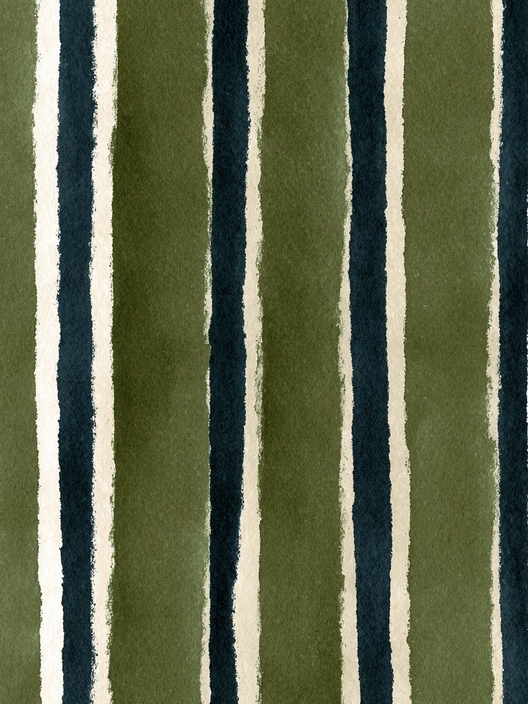
One useful formula is 60-30-10. Let 60 percent of the scheme be calm neutrals, 30 percent be supporting tones, and 10 percent be the accent colour that gives the room personality. That same ratio works well when choosing art across several rooms. If you need one statement piece to lead the office story, quieter works such as Elegant White Fabric or Watercolor Striped Pattern help maintain balance around it.

Wrap-up: simple ways to shop smarter
The smartest way to choose illustration for the office is to start with function, not trend. Decide whether the room needs more calm, more character, or more polish. Then match style, colour, and size to that goal. A focused workspace usually needs fewer, larger pieces with restrained palettes. A creative studio can carry more contrast and more playful illustration, as long as the framing and spacing stay disciplined.
When in doubt, choose one strong anchor piece and build around it with quieter companions. That approach gives your office a clear visual centre and makes future additions easier. The best illustration for the office should still look right six months from now, after the novelty wears off and the room returns to its daily job.
Frequently Asked Questions
What frame colour works best in a modern office?
Black suits most contemporary offices with metal, glass, or grey finishes. Oak is better if the space has warm wood tones or a softer residential feel.
Should office art be hung at the same height as home art?
Usually yes — aim for the centre around 145 cm from the floor. In reception areas or above long furniture, adjust slightly higher if people mostly view the wall while standing.
What paper finish is most practical for office artwork?
Matte or lightly textured paper is the easiest choice because it reduces glare from overhead lighting and windows. It also helps colours look more consistent across the day.
Can I mix illustration with typography in one office?
Yes, but keep typography limited and purposeful. One text-based piece can add structure, while too many can make the room feel like branding instead of decor.
How many pieces should I use in a small home office?
Usually 1 to 3 pieces is enough. One 50 x 70 cm or 70 x 100 cm frame often looks cleaner than several small frames competing around a desk.