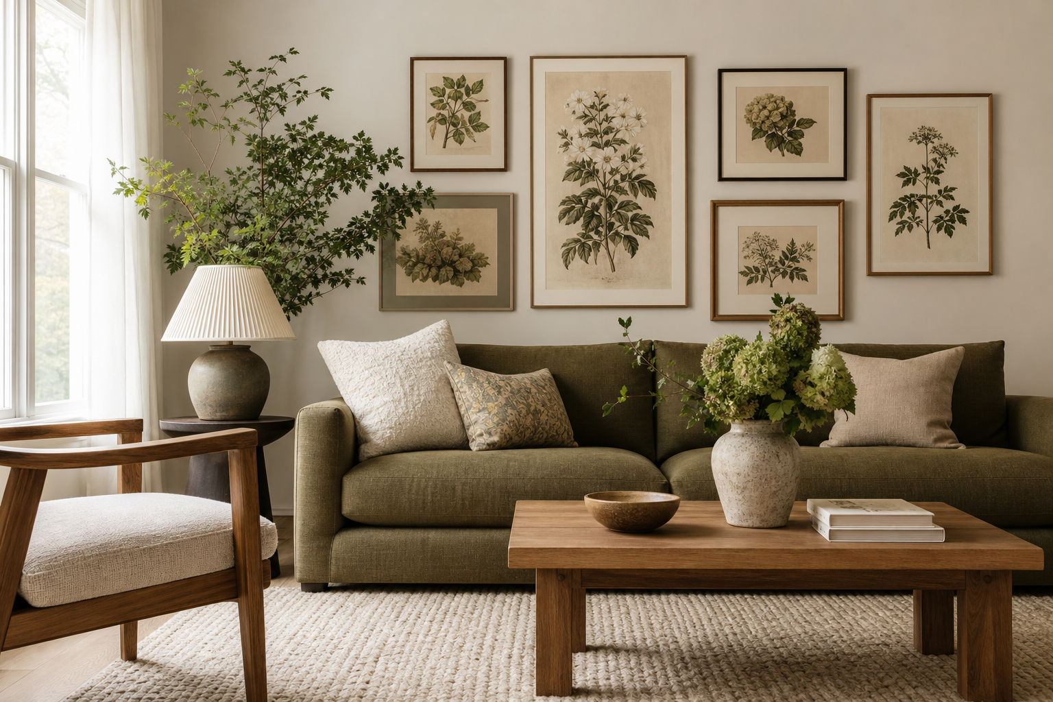
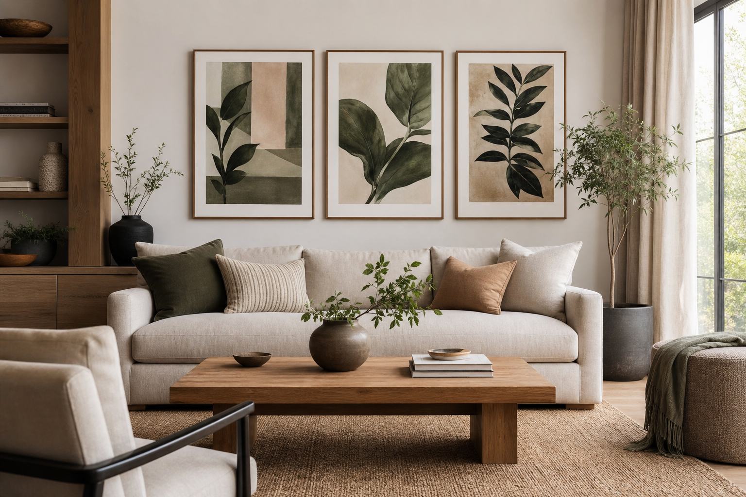
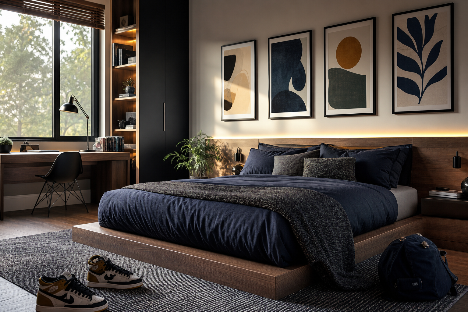
Japanese fall flowers have a quieter presence than spring blossom. Instead of bright pink spectacle, they lean into finer contrasts: dusky reds, faded golds, clear whites, and petals that often look more sculptural than soft. That restraint is exactly why japanese fall flowers work so well in interiors. They bring seasonality without making a room feel themed.
In Japan, autumn flowers are closely tied to timing. Many appear for a brief window from late September into November, and their appeal comes from that short-lived shift in colour and mood. In wall art, this translates beautifully into spaces that already favour calm materials such as oak, linen, paper shades, brushed black metal, and warm off-white walls.
What Makes Japanese Fall Flowers Distinctive
The best-known autumn blooms in Japan include chrysanthemum, cosmos, red spider lily, bellflower, and bush clover. What links them is not excess, but precision. Chrysanthemums have layered, radial structure. Cosmos feel airy and light on tall stems. Red spider lilies create drama with narrow, curling petals and a strong silhouette. Together, they show how japanese fall flowers balance delicacy with definition.
That balance makes them especially effective in art with breathing room. A single floral study with generous negative space often feels more Japanese in mood than a dense bouquet. If you are drawn to botanical work with clear line, subtle ageing, and natural rhythm, our botanical collection and minimalist art prints are the best places to start.

A useful styling rule is to treat autumn florals as seasonal accents, not a full-room takeover. One medium print at 50 x 70 cm can shift the tone of a corner. A pair of 30 x 40 cm pieces can frame a console or reading chair without crowding the wall. This is where softer historic botanical designs can work well, especially if your room already includes earthy timber and natural textiles.
The Palette: Soft Golds, Rusts, and Deep Petals
The colour range of japanese fall flowers is warmer than spring florals, but still controlled. Think muted saffron, tea-stained cream, terracotta, plum, burgundy, and dusty pink rather than saturated orange. A strong autumn floral scheme usually sits in the 60-30-10 balance used in interiors: about 60% neutral base, 30% warm mid-tones, 10% deep accent.
For walls, that means keeping your main room palette quiet and letting the artwork carry the richer notes. Off-white walls, oat upholstery, and pale wood give floral prints room to breathe. If your room already has colour, pull from petals rather than leaves. A rust cushion, a burgundy vase, or a smoked-red candle holder will echo the art more elegantly than adding bright green.
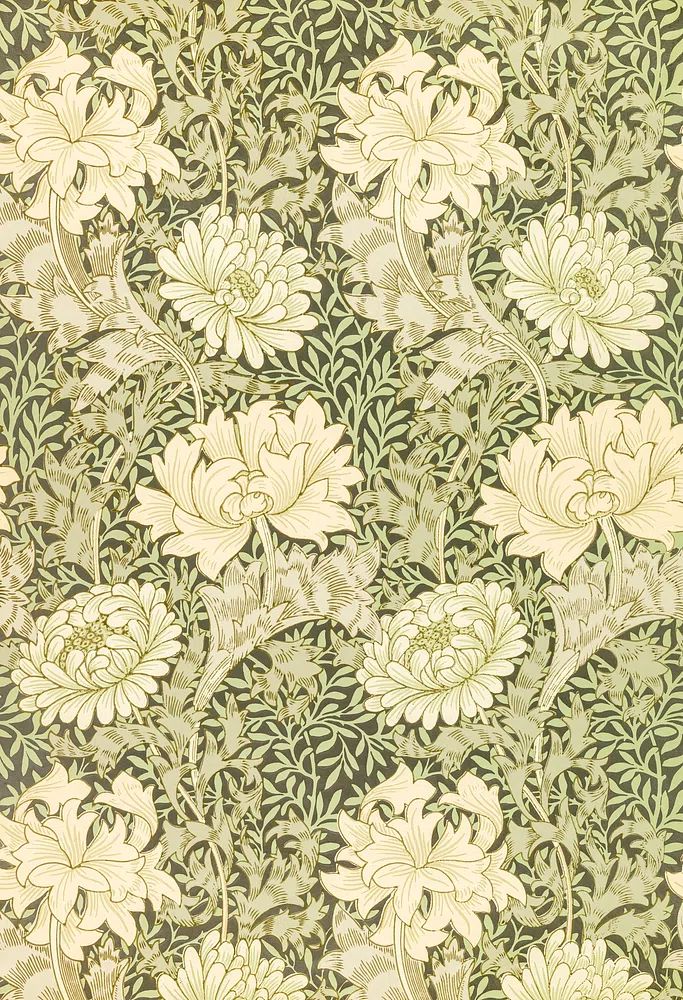
Chrysanthemum-based works are especially useful here because their forms read clearly from a distance, while their colours stay refined. A vintage floral with ochre, olive, and brick can bridge summer neutrals into autumn without making the room feel dark. If you want a slightly more decorative approach, explore bohemian floral pieces alongside classic fine art prints to soften the mix.
Symbolism and Seasonal Meaning
In Japanese culture, autumn flowers often carry emotional weight beyond decoration. Chrysanthemum is associated with longevity, nobility, and the imperial tradition. Cosmos, whose Japanese name "akizakura" means "autumn cherry blossom", are loved for their lightness and melancholy beauty. Red spider lily is more complex — striking, poetic, and often tied to remembrance, parting, and seasonal transition.
That symbolism matters when choosing art for different rooms. In an entryway, a chrysanthemum print can feel poised and welcoming. In a bedroom, cosmos-like florals suit a softer, more reflective mood. In a hallway or study, deeper reds and sharper petal forms create a more dramatic pause. The point is not to match every traditional meaning literally, but to use the emotional register of the flower well.
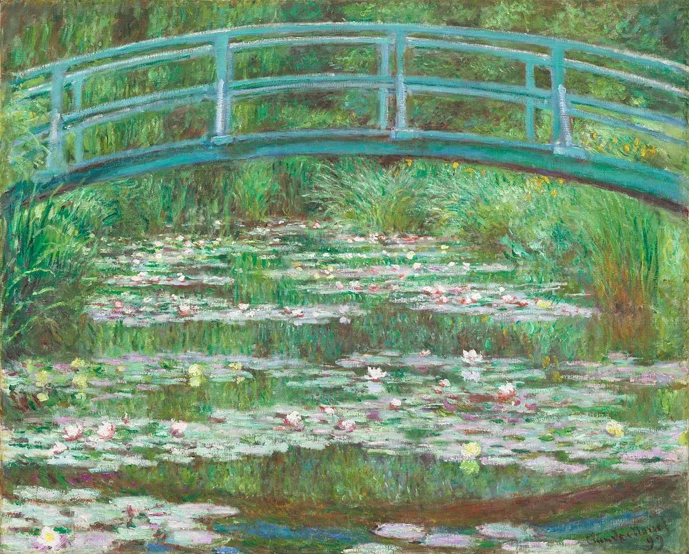
If you want to build on that Japanese atmosphere without becoming overly literal, pair floral works with pieces that reference water, garden structure, or line-based composition. The Japanese Footbridge by Monet is one example of a complementary scene — gentle, layered, and seasonally resonant without repeating the same subject matter.
How to Style Japanese Fall Flowers as Wall Art

For a calm result, choose one of three formats: a single statement piece, a vertical pair, or a compact salon-style trio. A single 70 x 100 cm print works above a sofa at least 180 cm wide. A pair of 40 x 50 cm prints suits a bed between 140 and 160 cm wide. A trio of 30 x 40 cm pieces fits nicely over a narrow console in an entryway.
Frame choice changes the mood more than most buyers expect. Oak feels soft and organic. Black adds definition and works well with red spider lily or darker florals. White frames are clean, but they can flatten the warmth that japanese fall flowers naturally bring, especially on pale walls. If the artwork includes aged cream backgrounds or heritage detailing, wood usually gives the best result.
Placement matters too. Hang the centre of the arrangement around 145 cm from the floor in hallways and living rooms. Above furniture, leave 15 to 25 cm between the top of the piece and the furniture line. That keeps the floral art connected to the room rather than floating too high.
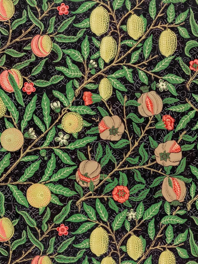
For a more decorative interior, textile-inspired botanicals can be effective because they echo the repeat and rhythm found in Japanese surface design. William Morris's vintage pomegranate flowers and William Morris's blue floral print both work well when a room needs more pattern, while still staying within an autumnal register.
Pairing Florals with Other Autumn Motifs
Japanese fall flowers rarely need to stand alone. They pair naturally with autumn leaves, birds, quiet landscapes, and ceramic forms. The strongest combinations usually mix one floral print with one non-floral element to avoid visual overload. A good ratio is 2:1 — for example, two botanical pieces and one landscape, or two restrained landscapes and one floral focal point.

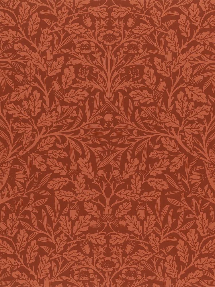
Textures help as much as subjects. Washi-like paper texture, woven baskets, ribbed ceramics, and matte frames all reinforce the seasonal mood. So do motifs like acorns, willow leaves, and birds in flight. If you want that layered effect, Acorns oak leaves design and Swallows in Flight pair neatly with floral work because they add movement and structure without competing for attention.
For homes that lean more contemporary, combine a floral with a pared-back nature study from our nature print selection. For more decorative spaces, keep the palette consistent rather than the subject identical. Rust, moss, cream, and plum can tie together florals, birds, and foliage even when the compositions differ.
Shop the Look: Choosing Pieces That Feel Seasonal, Not Busy
The easiest way to keep autumn styling elegant is to limit the number of dominant colours in the art. Two warm tones plus one dark accent is usually enough. Once a print includes four or five equally strong colours, it becomes harder to integrate with upholstery, rugs, and wood finishes.
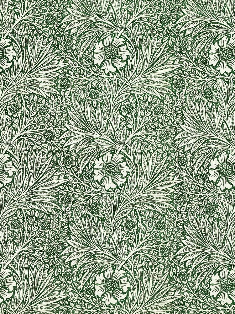
A second rule is to choose florals with visible structure. Chrysanthemum, marigold, oak leaves, and branching forms hold up well from a distance. Very tiny all-over florals can feel charming up close but read as clutter across the room. If you refresh your decor seasonally, look for pieces that still make sense from September through early winter rather than artwork that feels tied to one week of the year.
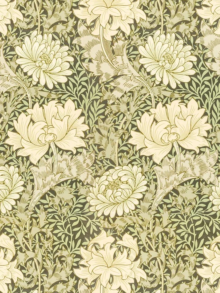
If you are building a refined seasonal wall, start with one anchoring floral, then add one supporting piece from either William Morris's chrysanthemum pattern or Ceramic Vases with Dried Branches. That combination keeps the mood warm and grounded, while avoiding the overly busy effect that comes from repeating the same flower in every frame.
Final thoughts
Japanese fall flowers offer something autumn interiors often miss: softness with structure. They bring seasonal colour, but in measured doses — rust instead of orange, plum instead of bright red, quiet symbolism instead of obvious decoration.
Used well, japanese fall flowers can shift a room into autumn with just one or two considered pieces. Focus on restrained colour, clear form, and enough empty space around the art for the season to feel calm rather than crowded.
Frequently Asked Questions
What frame colour works best for autumn floral art?
Oak is the safest choice for warmth and softness. Black works well if the floral design has strong outlines or deeper reds.
Can I mix Japanese-inspired florals with modern furniture?
Yes. Keep the furniture simple, then use the artwork to add seasonal character. Clean-lined oak, walnut, black metal, and boucle all work well.
Which size should I choose for a narrow hallway?
Try 30 x 40 cm or 40 x 50 cm pieces. In a tight passage, vertical formats usually feel lighter and more balanced than wide horizontal works.
Do autumn floral prints work only in living rooms and bedrooms?
No. Entryways, dining corners, and home offices suit them especially well because they add warmth without needing much wall space.
How can I make seasonal art feel timeless?
Choose florals with muted colour, natural backgrounds, and classic framing. Avoid overly bright palettes and overly literal holiday styling.