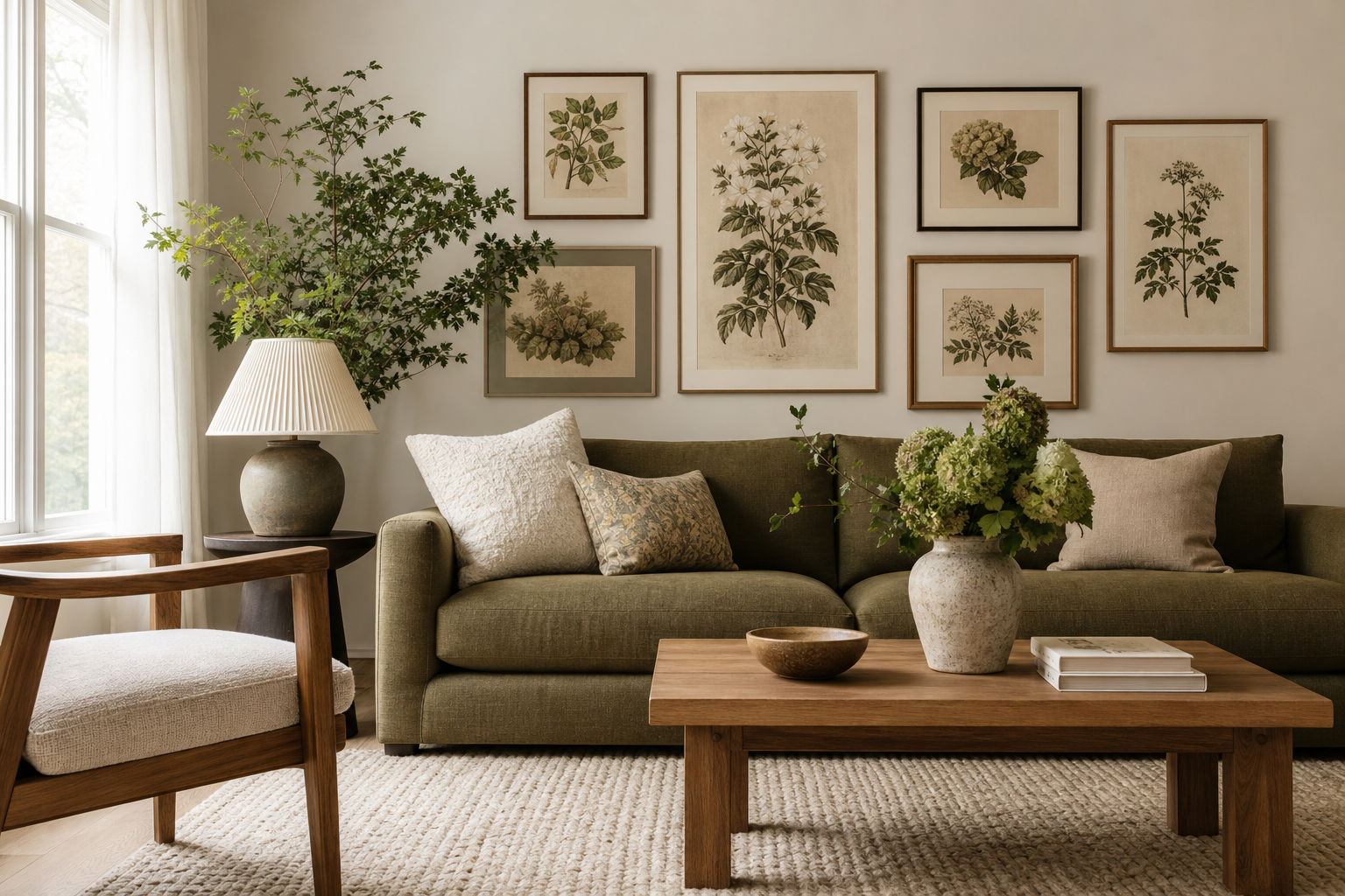
A strong botanical scheme does two things at once: it adds organic detail and it gives a room structure. This botanical prints guide is built around that balance, so you can choose pieces that feel decorative without looking busy. Whether you lean traditional, minimal, or layered, botanical art works best when the subject, frame, and scale all support the room rather than compete with it.
Why Botanical Prints Work Everywhere
Botanical art has a rare flexibility because the subject matter is familiar, but the styling can shift widely. A detailed antique flower study suits a period home with mouldings and dark wood, while a pared-back leaf drawing sits comfortably in a modern apartment with white walls and black accents. That range is why our botanical collection mixes so easily with minimalist art prints and even vintage wall art.
Colour also makes botanical work especially useful. Greens, muted rose tones, ochres, and soft neutrals are easy to repeat elsewhere in the room through cushions, ceramics, throws, or rugs. If you want a space to feel calmer, plant-based imagery usually lowers visual intensity compared with geometric or high-contrast graphic art. In practical terms, that makes it easier to live with large-format wall art over time.
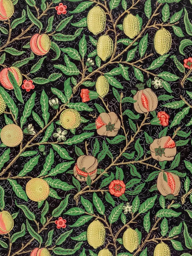
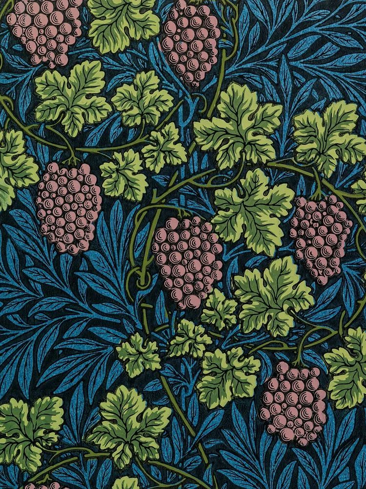
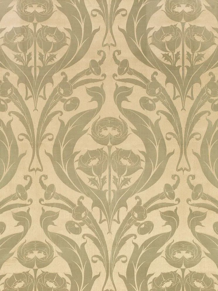
Vintage-inspired designs are often the safest starting point because they already carry depth and pattern. A piece like William Morris's vintage pomegranate flowers brings both floral detail and a grounded palette, which helps bridge classic and contemporary furniture.
Choose the Right Botanical Style for Your Space
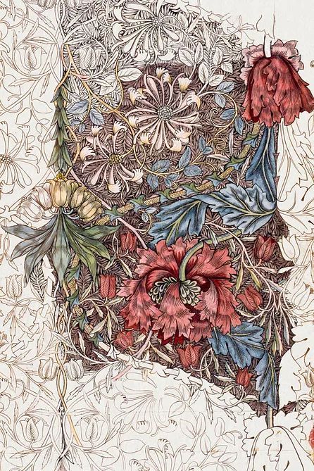
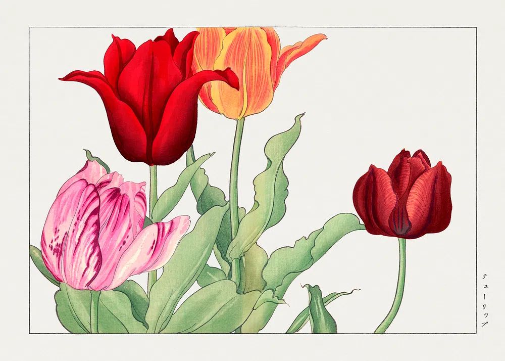
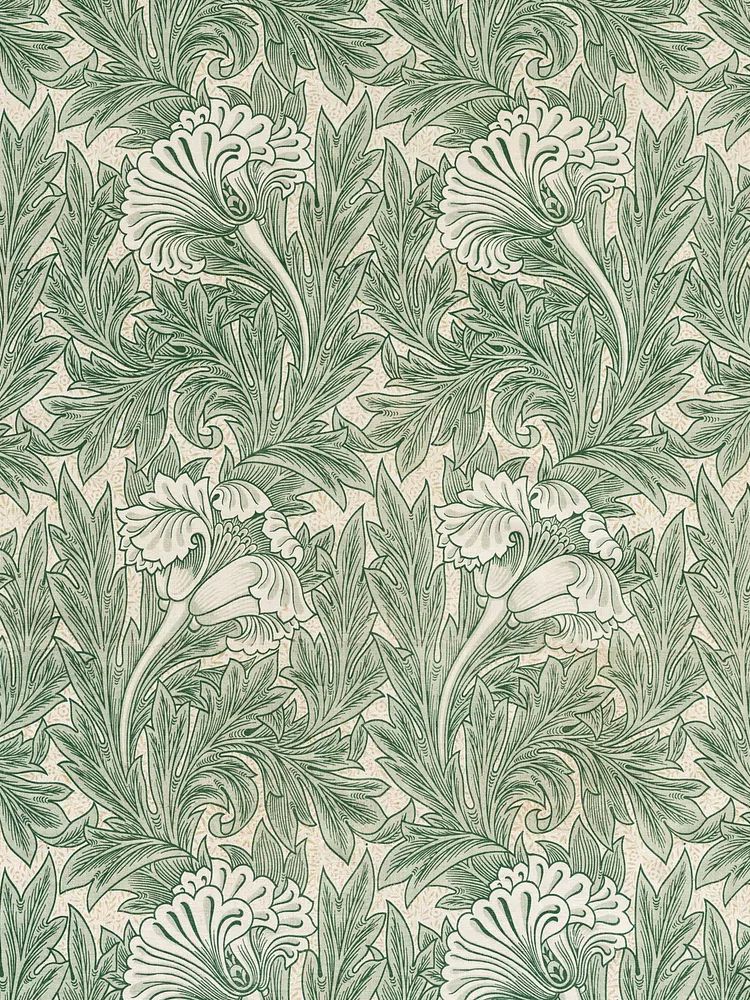
Not every botanical print creates the same mood. Vintage illustrations and heritage florals feel rich, layered, and decorative. They work well in living rooms, dining spaces, and hallways where you want more visual texture. Prints such as Honeysuckle by William Morris or the vintage green tulip print suit walnut, oak, brass, and linen especially well.
Minimal botanical styles are quieter. Think simple stems, looser compositions, or limited palettes. These are ideal for bedrooms, home offices, and smaller flats where heavy pattern can crowd the walls. If your furniture is already expressive, a restrained piece from the botanical range or our fine art selection will keep the room balanced.
For warmer, more relaxed interiors, dried grasses, bouquets, and earthy floral subjects work best. They connect naturally with woven textures, clay ceramics, and sandy paint colours. A good example is a wheat or bouquet composition, which feels softer and less formal than a highly detailed Victorian pattern.
Get the Scale and Placement Right
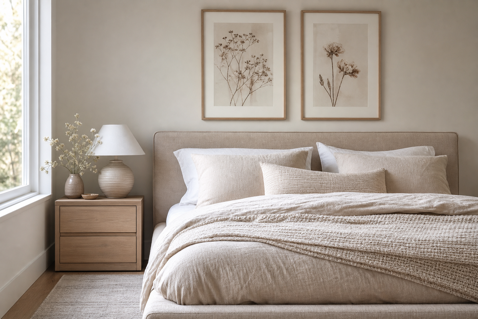
Most styling mistakes come down to size, not art choice. Over a sofa, your arrangement should usually cover 60% to 75% of the furniture width. For a 200 cm sofa, aim for wall art spanning roughly 120 to 150 cm. Over a bed, stay closer to 50% to 70% of the headboard width to keep the composition light enough for a restful room.
Hanging height matters just as much. The centre of the arrangement should land around 145 to 150 cm from the floor in most homes. If the print hangs above furniture, leave 15 to 25 cm between the top of the furniture and the bottom of the frame. That small gap keeps the art connected to the furniture rather than floating awkwardly above it.
Single large prints work well when the subject has enough presence on its own. A detailed heritage pattern or dense floral piece can hold a wall without extra support. Pairs are useful in bedrooms and hallways because they create order fast. Gallery walls work best when you have at least one common thread — frame finish, botanical subject, or a repeated colour family.
If you want one statement piece for a narrower wall, choose a vertical composition with strong natural rhythm. the Vintage Rose Botanical print is a good example of a subject that can anchor a smaller zone such as the side of a chimney breast, reading nook, or hallway return.

Frame Colours, Finishes, and Matting
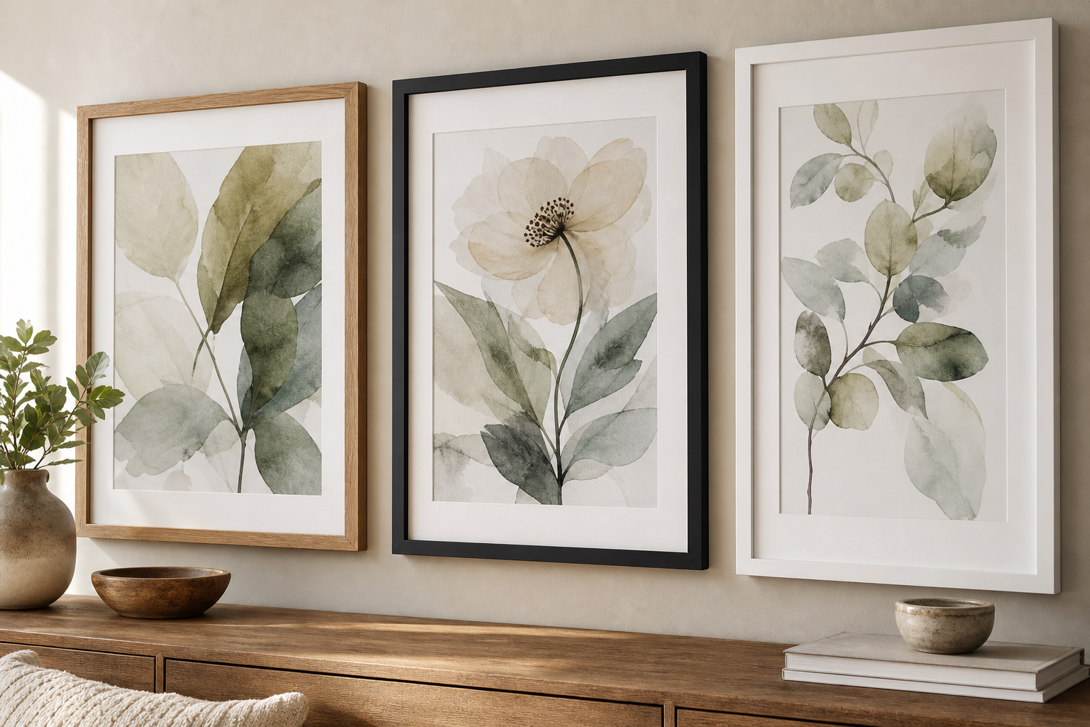
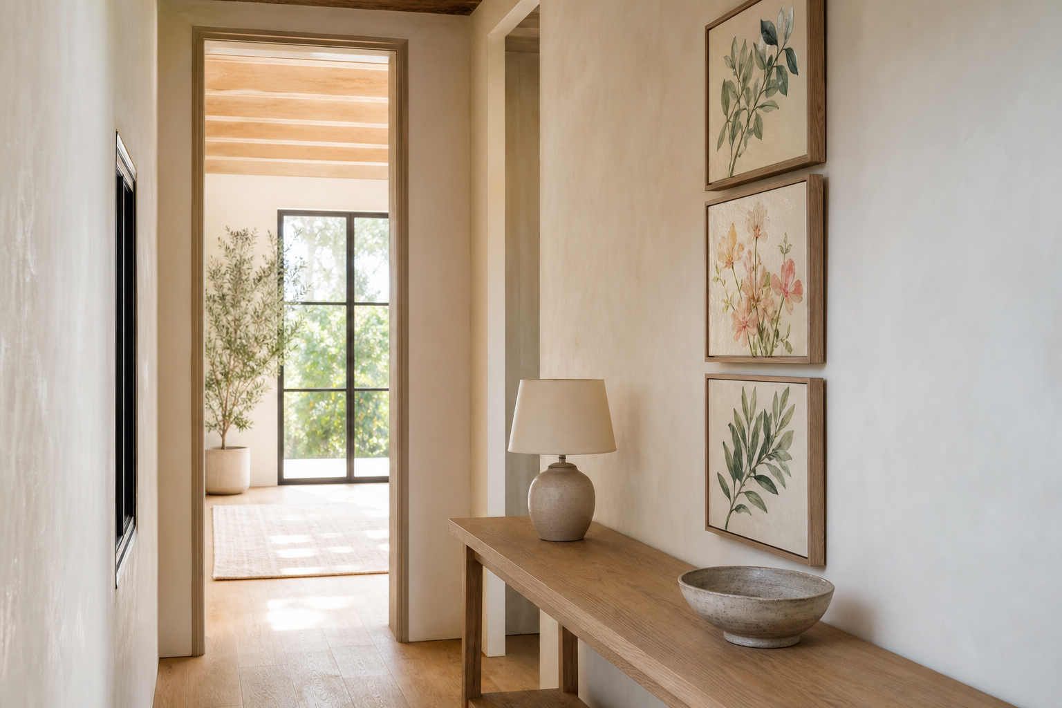
Frames change the mood faster than most people expect. Natural wood frames make botanical art feel warmer and more organic, especially with beige, sage, terracotta, or cream walls. Oak and ash suit Scandinavian and contemporary homes, while darker walnut makes vintage florals feel more formal.
Black frames sharpen softer botanical subjects. They are useful when you want antique-inspired art to feel cleaner and more architectural. In a room with black lighting, cabinet handles, or metal legs, black frames create a crisp visual link. White frames, by contrast, are best when you want the art to feel lighter and less ornate — especially on coloured walls.
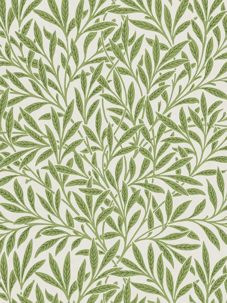
A mat border gives the artwork space to breathe. For A3 and 30 x 40 cm prints, a 4 to 6 cm mat usually looks balanced. For 50 x 70 cm pieces, you can go up to 8 cm. Mats are especially effective with detailed works such as William Morris's vintage willow leaves because they prevent the pattern from feeling cramped inside the frame.
If your room already includes woven textures, cane, jute, or rustic ceramics, adding one piece from our bohemian collection can soften a stricter botanical arrangement without breaking the theme.
Room-by-Room Styling Ideas
In kitchens, keep botanical art compact and practical. One or two 30 x 40 cm prints near a breakfast nook, shelf, or sideboard are usually enough. Herbs, fruiting branches, and floral studies feel fresh here, especially with cream tiles, wood boards, and brushed brass fixtures.
Bedrooms benefit from quieter subjects and softer contrast. Hang a pair above bedside tables, or centre two medium prints above the headboard. Keep the palette within 2 to 3 dominant tones — sage, dusty rose, warm ivory, for example — so the wall remains restful rather than decorative for its own sake.
Living rooms can take more scale. A trio above a sofa, a 2 x 2 grid over a sideboard, or a large single artwork above a mantel all work. If your furniture is simple, choose richer pattern-based designs like Marigold by William Morris to add density. If the room is already layered with pattern, use looser nature-led art from the nature collection to create breathing room.
Bathrooms and hallways are ideal for botanical prints because they often lack softness. In a hallway, a vertical run of three smaller frames can guide the eye down a long wall. In a bathroom, choose simpler compositions and keep frames sealed and away from direct steam.
How to Build a Cohesive Botanical Gallery Wall
A good botanical gallery wall needs one rule you do not break. That rule can be matching black frames, all vintage subjects, all muted greens, or even equal spacing throughout. Once one element stays fixed, you can vary scale and subject without losing control.
Start with 4 to 6 pieces if this is your first attempt. Use one largest anchor piece, two medium works, and the rest smaller accents. Keep spacing between 5 and 8 cm for a tighter, tailored look. If you want the wall to feel more relaxed, widen that to around 8 to 10 cm — but keep it consistent.
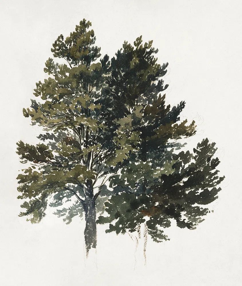
Mixing subject matter works best when the palette overlaps. A bouquet, a floral pattern, a leaf study, and a softer landscape can sit together if they share muted greens, browns, or dusty pinks. That is where combining botanical art prints with selected pieces from nature wall art becomes useful.

One easy formula is one heritage floral, one bouquet, one textural plant study, and one softer natural scene. That creates contrast without visual argument.
Final Styling Tips and Where to Start
The easiest way to use this botanical prints guide is to begin with the room that already has the clearest palette. If your living room already includes olive, rust, cream, or wood tones, start there and pick one print that repeats at least one of those colours. Then build outward with a second piece only after you see what the wall still needs — more pattern, more scale, or more lightness.
If you are buying your first set, stay disciplined: choose one frame finish, one main colour direction, and one botanical style family. That simple restraint makes even mixed subjects look intentional. The best botanical interiors do not use the most art — they use the right art at the right size, placed with confidence.