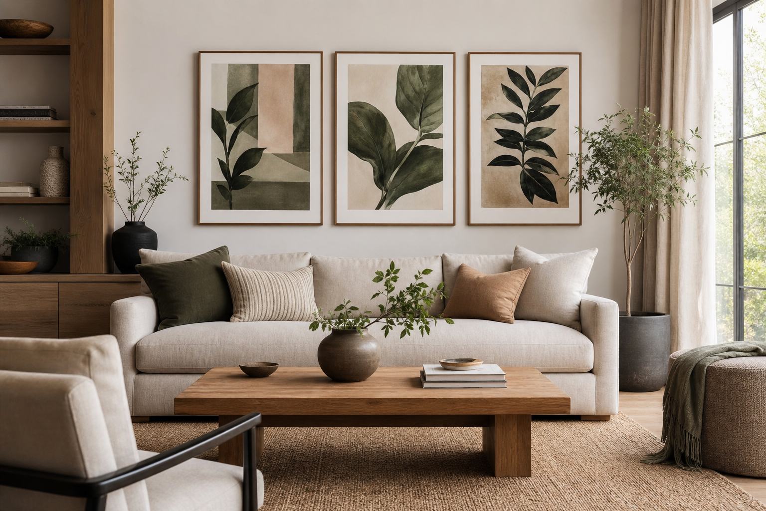
A good poster size guide starts with proportion, not preference. The print can be beautiful on its own and still look wrong if it is too small for the wall or too large for the furniture beneath it. Measure the wall width, note the width of the sofa, bed, console, or desk below, and then choose art that fills roughly 60% to 75% of that furniture width. Above a 200 cm sofa, for example, your art arrangement should usually span about 120 to 150 cm in total.
Start with the Wall, Not the Poster
Think in three dimensions: wall width, wall height, and viewing distance. In a narrow hallway, a 70 x 100 cm frame may dominate the entire passage. In a living room where you view the wall from 2.5 to 4 meters away, the same size can feel surprisingly small. This is why any useful poster size guide begins with the room itself. If you are standing close to the wall every day, smaller formats such as 30 x 40 cm or 40 x 50 cm are often enough. If the wall is seen from across the room, move up to 50 x 70 cm, 61 x 91 cm, or grouped formats.
Leave breathing room around the art. A print that nearly touches shelves, lamps, door frames, or curtain lines will feel cramped even if its dimensions are technically correct. Aim for at least 15 to 25 cm of clear wall on each side when hanging a single piece. This matters especially with crisp compositions from our Minimalist collection and clean-lined architecture wall art, where negative space is part of the effect.
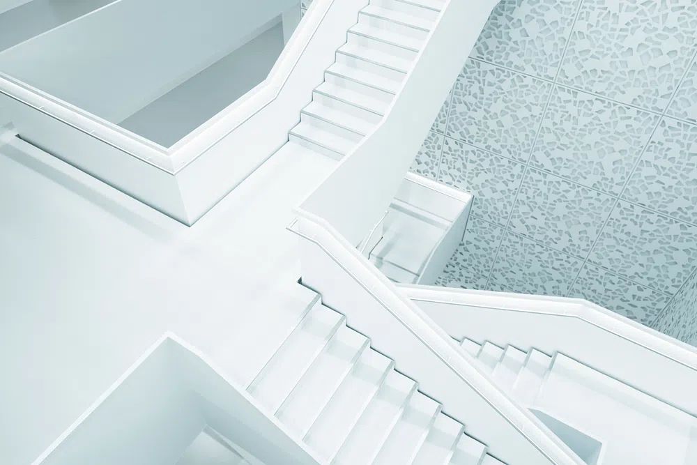
A vertical print works best when the wall is tall and narrow — between windows, beside a wardrobe, or at the end of a corridor. A horizontal piece makes more sense over a sofa, sideboard, or bedhead where the furniture naturally creates a wide visual base. If you want a calm, spacious result, look at works like Modern White Staircase or Modern Minimalist Architecture, both of which suit rooms where scale and clean geometry matter more than decorative clutter.
Small Rooms: Bedrooms, Hallways, and Nooks
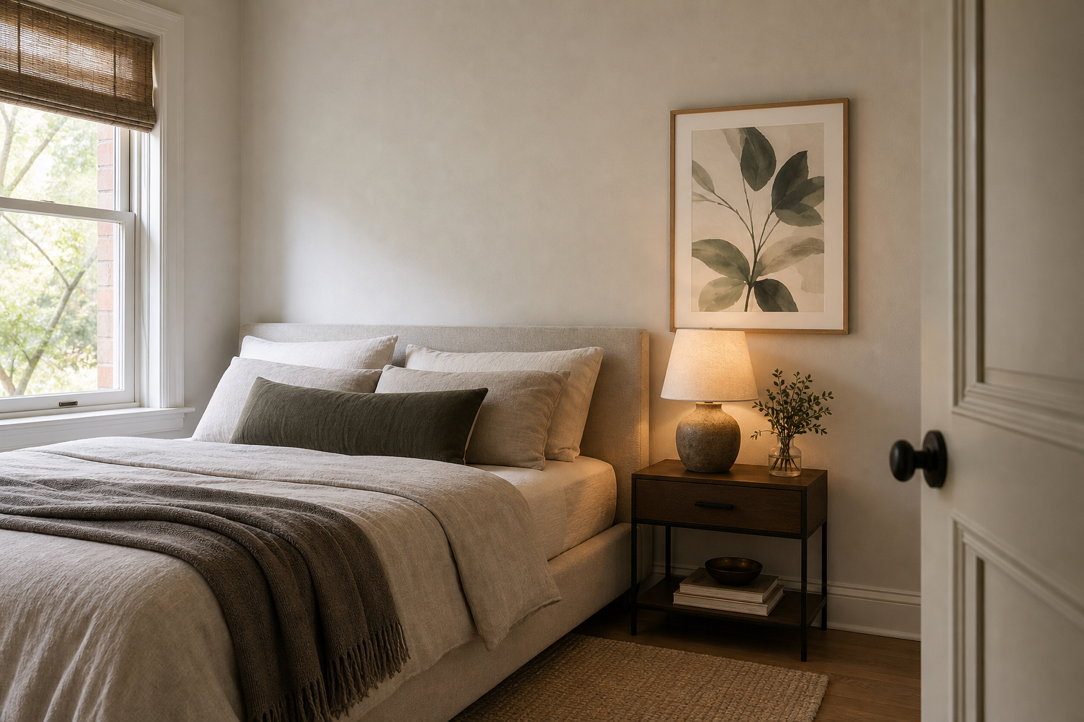
In small rooms, oversized art can lower the perceived ceiling and make the wall feel busy. The best sizes are usually 21 x 30 cm, 30 x 40 cm, and 40 x 50 cm. For a narrow hallway, a single 30 x 40 cm print centered at eye level often looks cleaner than a large frame that crowds the walkway. In bedrooms, one 40 x 50 cm print above each bedside table can be more balanced than one central piece above the bed.
For awkward nooks — reading corners, dressing areas, or the strip of wall beside a chest of drawers — use one vertical print or a pair of smaller works stacked with 5 to 8 cm between them. This keeps the composition tidy without making the corner feel accidental. Soft abstract pieces from our Abstract collection work well here because they add color without visual noise.

Color affects perceived scale. Pale works, restrained line work, and low-contrast prints tend to sit lightly on the wall, which helps in compact rooms. If you prefer texture over strong imagery, Textured White Abstract is a smart choice for smaller bedrooms and calm hallway schemes. If you want warmth, earthy pieces from our Bohemian collection can soften narrow spaces without demanding oversized dimensions.
Living Rooms and Open-Plan Spaces
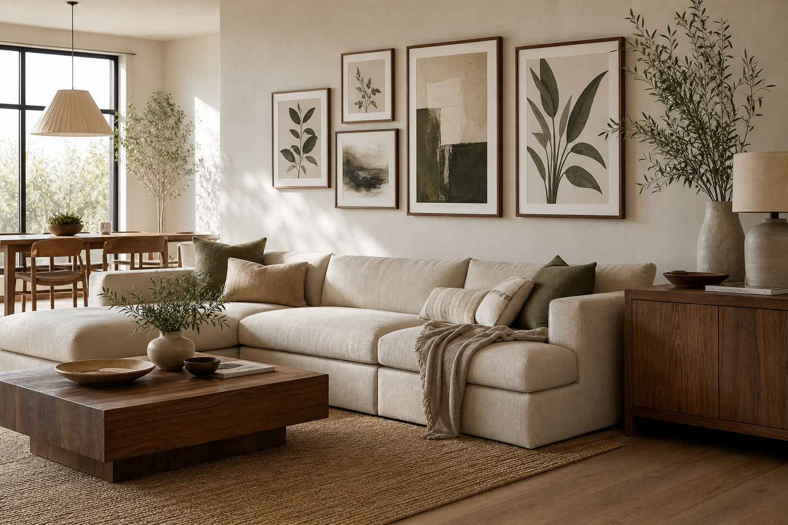
Large rooms need visual weight. On a long wall, a lone 30 x 40 cm print will disappear. For living rooms, the most reliable choices are a single 61 x 91 cm or 70 x 100 cm print, two 50 x 70 cm pieces side by side, or a four-piece grid. Over a sofa, the total arrangement should cover about two-thirds of the sofa width. Over a console, keep the composition slightly narrower than the furniture for a tailored look.
Architectural subjects are particularly effective in open-plan spaces because they hold their own against large furniture, rugs, and lighting features. A structured image like Modern Loft Living Room or Modern Luxury Villa at Dusk can anchor a seating zone without looking fussy.
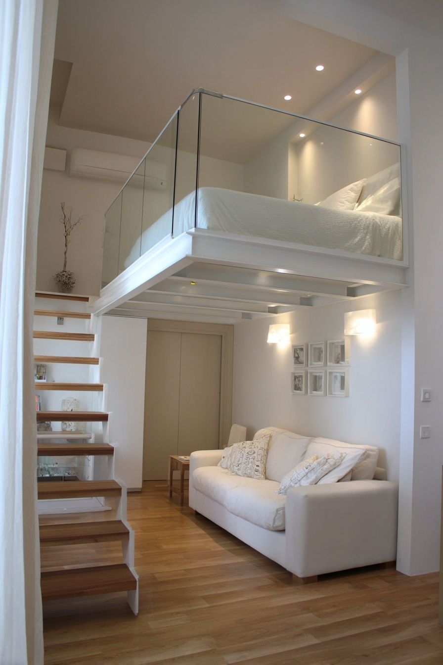

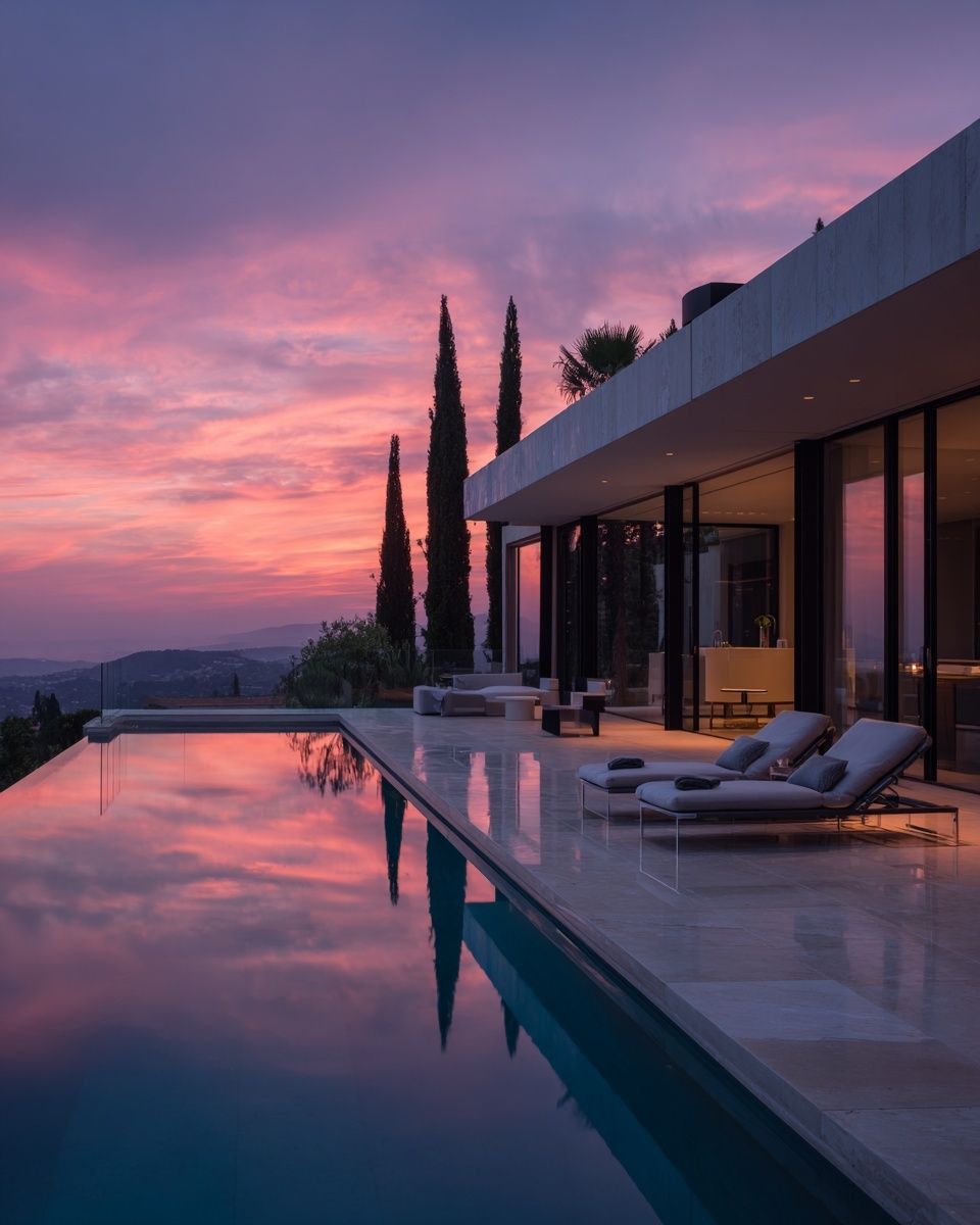

If you prefer one strong focal point, choose a piece with depth and contrast. If the wall is especially long — 300 cm or more — a grouped arrangement usually works better than one isolated frame. The grouping creates rhythm across the wall and helps the room feel intentional rather than under-decorated.
Kitchen, Bathroom, and Home Office Sizing
Functional rooms have tighter visual limits. In kitchens, upper cabinets, splashbacks, open shelving, and appliances already break up the wall, so art should stay compact. A 21 x 30 cm or 30 x 40 cm frame is usually enough between shelving runs or beside a breakfast nook. In bathrooms, keep to 21 x 30 cm, 30 x 40 cm, or one slim vertical format where wall space is limited by mirrors and towel rails.
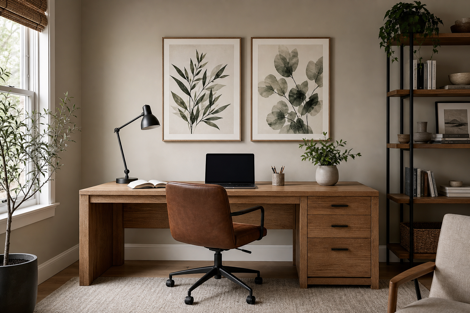
Home offices can handle slightly larger pieces, but the desk should still dictate scale. Above a 120 cm desk, one 40 x 50 cm print or two 30 x 40 cm prints usually look balanced. If the desk is 160 cm wide, you can move up to one 50 x 70 cm piece or a pair of medium frames. Mid-century shapes and graphic abstracts are especially useful in workspaces because they feel ordered. See our Mid Century Modern prints for compact, geometric options.

Moisture and mess also affect framing choices. Kitchens and bathrooms benefit from simple, sealed frames with acrylic glazing instead of delicate finishes. Home offices often look best with matte black, oak, or white frames that echo the desk or shelving. If you want visual energy in a work corner, a controlled color piece such as Colorful Stained Glass Abstract adds impact without needing oversized scale.
Single Statement Print or Gallery Wall?
A single oversized print is best when the wall is uninterrupted and the room already has enough furniture and texture. One 70 x 100 cm print above a console can look cleaner than four small frames. This works especially well with bold architectural images, strong landscapes, or iconic fine art from our Fine Art collection.
A gallery wall is better when you need flexibility. It can stretch across an awkward wall, wrap around a corner of furniture, or combine vertical and horizontal formats in a way one large print cannot. Use even spacing — typically 5 to 7 cm between frames — and treat the whole cluster as one large rectangle when deciding total width and height.
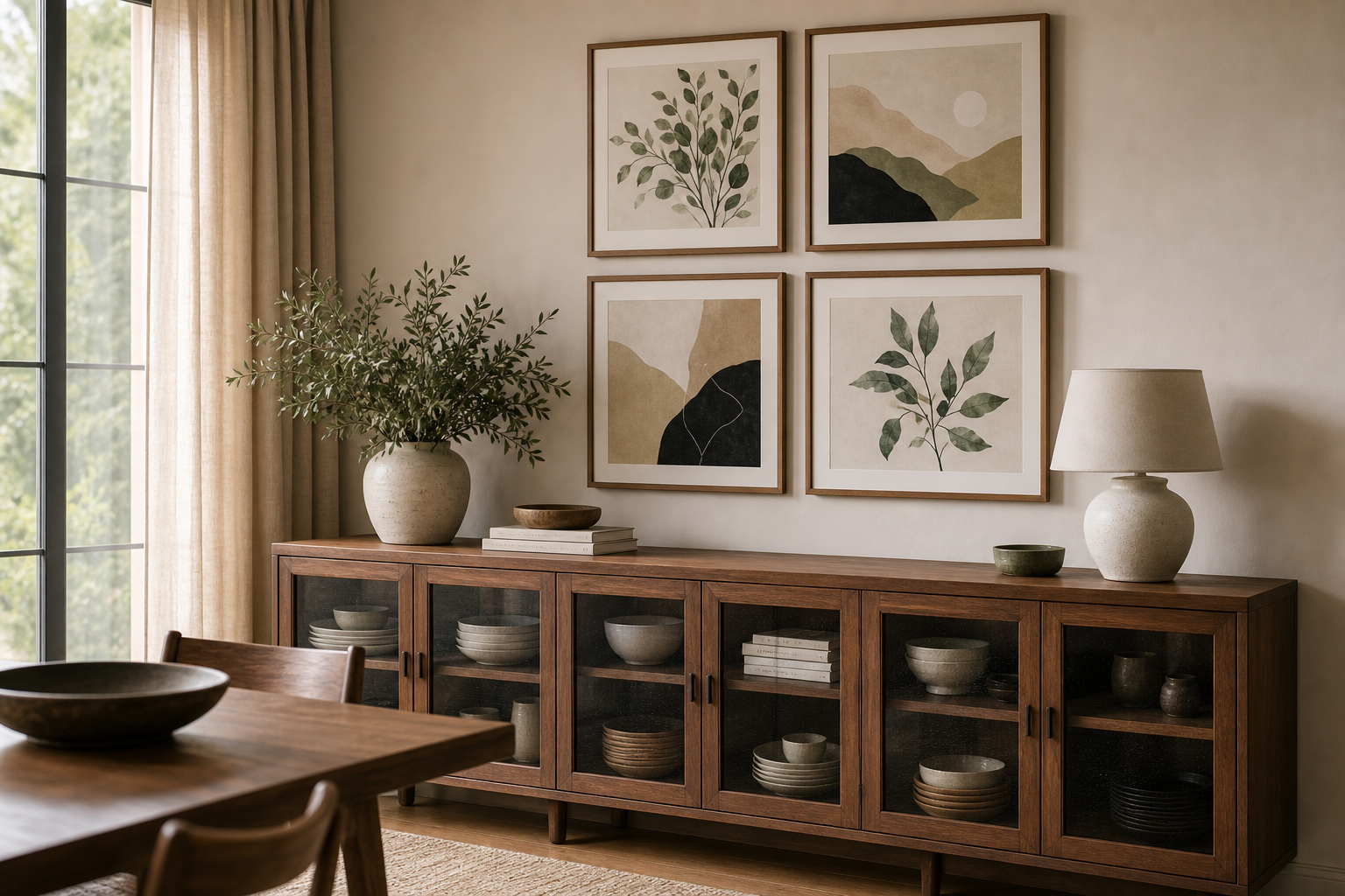
A useful rule in this poster size guide is simple: choose one statement piece when the wall itself is the feature, and choose a gallery wall when the room needs structure. In practical terms, a four-piece set of 30 x 40 cm frames can often fill the same visual area as one very large print, but gives you more freedom to mix tone and subject.
Framing, Spacing, and Final Placement Tips
Hang most wall art so the center sits around 145 to 150 cm from the floor. In dining rooms, hallways, and living rooms, that standard works well. Over furniture, the bottom of the frame should usually sit 15 to 25 cm above the top edge of the sofa, headboard, or console. Anything higher starts to feel disconnected.
Frame thickness changes visual weight. Thin black or oak frames suit smaller prints and modern rooms. Wider frames can make modest art feel more substantial, but they also increase the total footprint by 2 to 6 cm per side. Factor that into your measurements. If your print is already close to the ideal maximum width above a bed or desk, a very chunky frame can push it out of proportion.
Keep layouts consistent. If one frame in a gallery wall has 5 cm spacing and another has 10 cm, the arrangement will look improvised. The same applies to matting: either use mats consistently across the set or skip them. Minimal interiors often benefit from strict uniformity, while bohemian rooms can take a softer, more layered approach with pieces such as Ceramic Vases with Dried Branches adding warmth at medium scale.
Quick Shop Tips for Choosing the Right Size
Before buying, measure the furniture width, mark the target art width at 60% to 75% of that number, and compare that area to standard frame sizes. For small rooms, start with 30 x 40 cm or 40 x 50 cm. For desks and compact walls, think in pairs. For living rooms and open-plan layouts, move confidently into 50 x 70 cm, 61 x 91 cm, 70 x 100 cm, or grouped formats.
This poster size guide works best when you match size to room function, not just personal taste. If the wall is narrow, keep it restrained. If the room is broad and the viewing distance is long, go larger than you think. Well-scaled art looks more expensive, more settled, and easier to live with — even before style, color, or subject come into play.