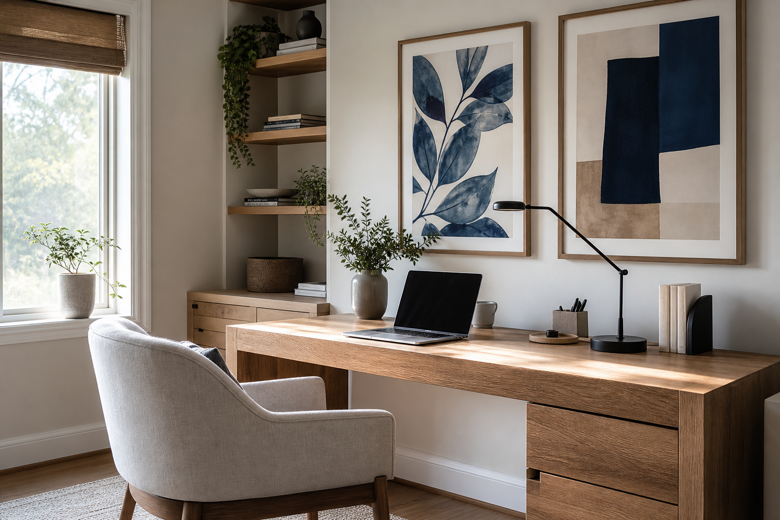
Good home office wall art does two jobs at once: it gives the room identity, and it helps your brain settle into work mode. In a room full of screens, cables, and practical furniture, the wall is often the largest visual surface. What you place there changes the pace of the space. Calm compositions lower visual noise, while strong structure and balanced colour can make a desk area feel more intentional.
The most effective home office wall art is rarely the loudest piece in the room. It works best when it supports concentration for 4 to 8 hours at a time. That usually means art with clear shapes, a limited palette, and enough detail to feel refined without pulling your eye away from the screen every few minutes. If your office doubles as a guest room or corner workspace, art also helps mark the boundary between "living" and "working" without adding bulky furniture.
Why Wall Art Matters in a Home Office
A workspace with bare walls can feel temporary, even if the desk and chair are well chosen. Art gives the room a finished visual anchor. That matters because the brain reads unfinished environments as low-priority spaces. A framed piece above the desk, or a pair of balanced works nearby, can make the office feel established and worth maintaining.
For focus, the mood of the image matters more than the trend. Soft abstraction, architectural photography, and restrained line work tend to support sustained attention better than highly detailed scenes. If you want your desk area to feel calmer, start with our minimalist collection or a few pieces from abstract art prints with gentle movement. Both categories give you visual texture without the crowding effect of busy imagery.
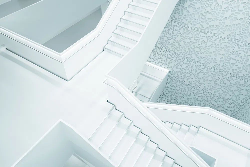
Architectural subjects are especially strong in a home office because they suggest order. Repeating lines, symmetry, and negative space create structure on the wall, which can subtly reinforce structure in your workflow. A piece like Modern White Staircase brings that effect with crisp geometry and a restrained palette.
Picking a Style That Matches How You Work
If your work is analytical — finance, writing, coding, admin — choose art that reduces distraction. Minimalist compositions, tonal textures, and monochrome forms are reliable options. They keep the wall interesting, but they do not demand attention. Pieces from White Cream Texture or Textured Concrete Wall fit this type of office well, especially with black, oak, or white desks.
If your work is creative — design, branding, illustration, brainstorming — add a little more movement. Abstract pieces with visible brushwork or colour transitions can make the room feel alive without becoming chaotic. The key is to keep the palette edited. Two dominant tones and one accent colour is usually enough for a small office.
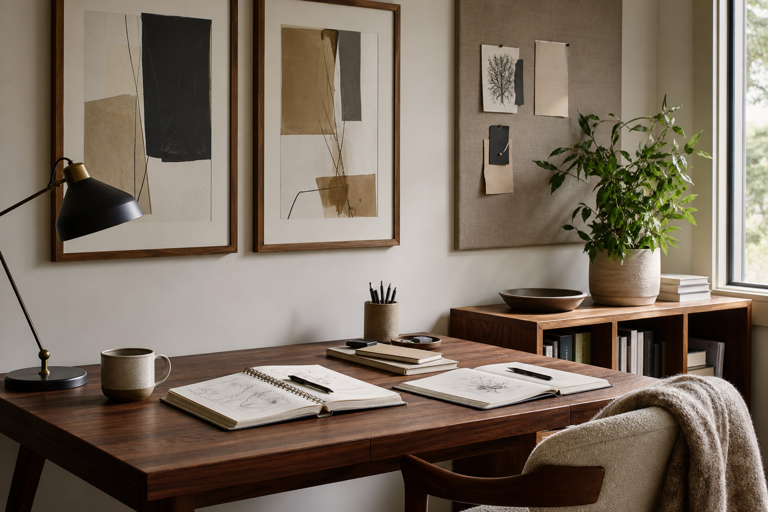
For a professional, client-facing office seen on video calls, aim for art that reads cleanly from 1.5 to 2 metres away. Strong silhouettes, architectural imagery, and understated fine art work better on camera than tiny details. our fine art prints and architecture wall art both perform well in this context because they look composed in the background.
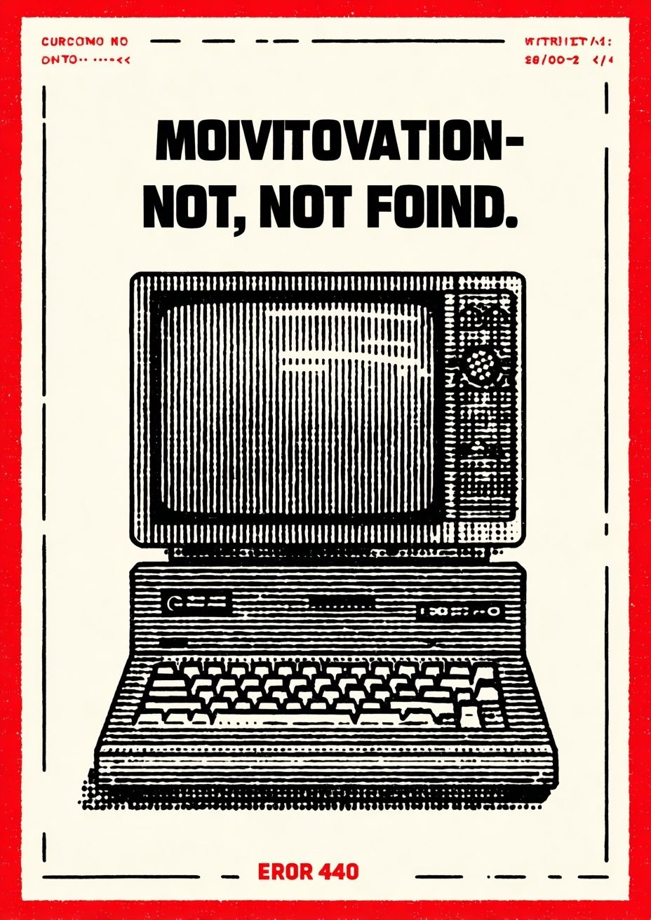
Typography can work in a home office, but use it carefully. One text-based piece is enough in most rooms. If every frame includes words, the wall starts to compete with your own thoughts. A single witty or direct statement can add personality, especially in a work zone that feels too sterile.
Best Colours and Subjects for Focus
Colour has a measurable effect on visual fatigue. In practical terms, the most comfortable colours for a screen-heavy office are softened neutrals, dusty blues, muted greens, warm whites, charcoal, and low-saturation terracotta. These tones feel grounded and are easy to live with through long workdays. High-contrast red-and-black schemes, neon accents, and very bright primaries tend to feel more stimulating than supportive.
Subjects matter too. Water, stone, fabric texture, open architectural forms, and quiet abstract shapes all work well because they suggest calm without becoming sentimental. If you want a softer mood, look at Zen Garden Stones or the pieces in our mindfulness collection. If you prefer a sharper, more modern look, abstract works with rhythm and repetition often strike the right balance.


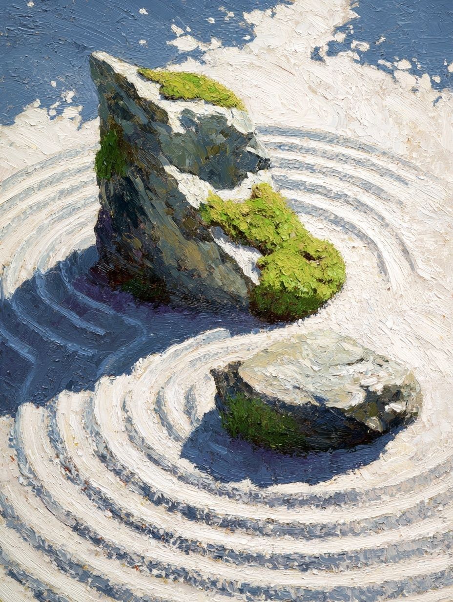
Blue and green are especially useful when your office gets heavy afternoon light. They visually cool the room and can counterbalance the heat of screens, lamps, and wood tones. By contrast, if your office faces north and feels flat, warmer whites and blush or sand tones can stop the space feeling clinical. That is where pieces like Blush Watercolor Abstract or Window with Sheer Curtain come into their own.
Sizing and Placement Above Your Desk
Scale is where many offices go wrong. Art that is too small above a desk looks accidental. As a rule, your main piece or grouped arrangement should span 60 to 75% of the desk width. For a 120 cm desk, aim for wall art that covers roughly 72 to 90 cm. For a 160 cm desk, 95 to 120 cm gives better balance.
Hang the centre of the composition around 145 cm from the floor in a standard room, then adjust for seated sightlines. If the piece is directly above the desk, leave 15 to 25 cm between the desktop surface and the bottom of the frame grouping. That spacing keeps the wall connected to the desk without feeling cramped.
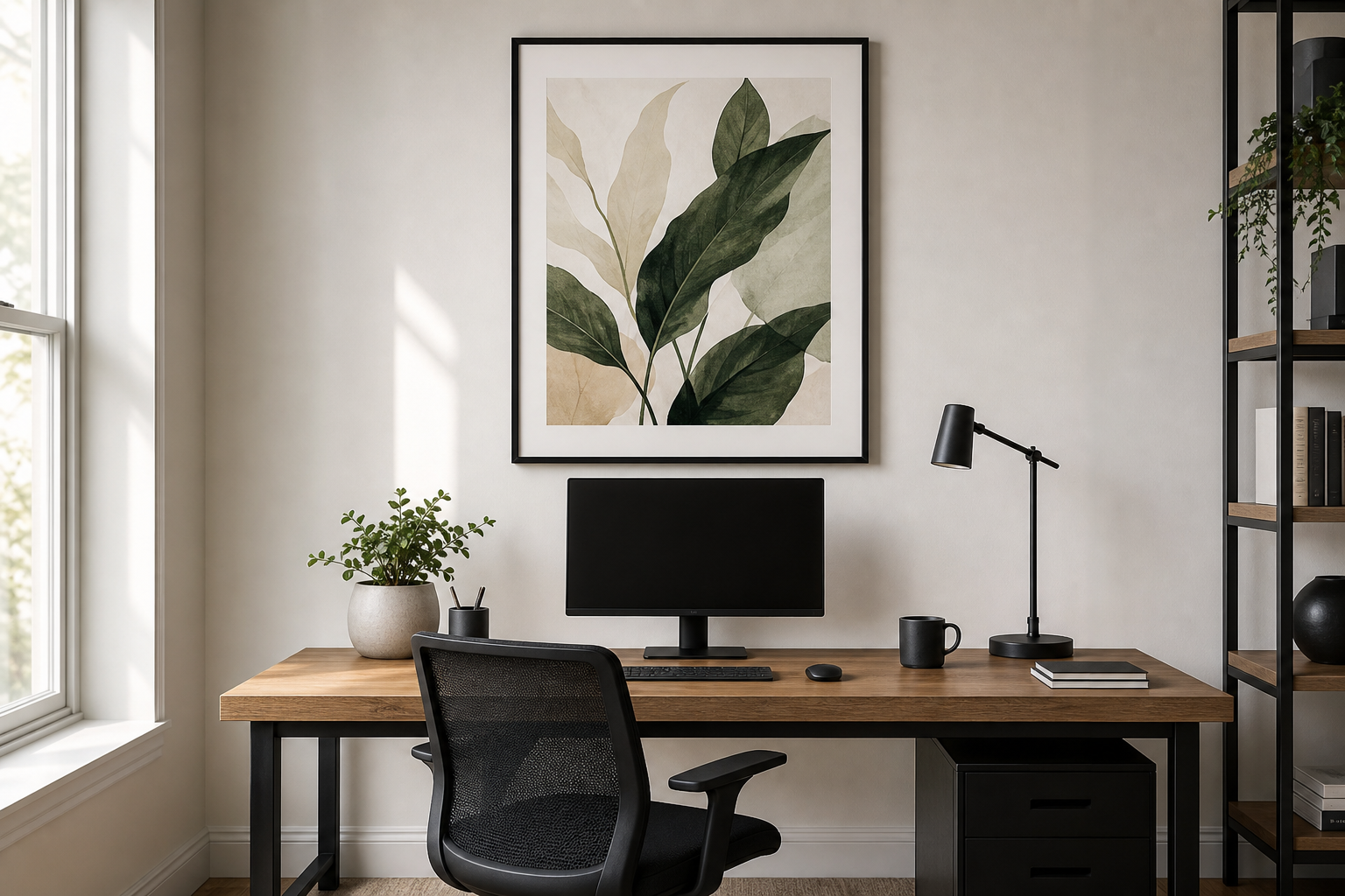
Framing also changes the effect. Thin black or oak frames look sharper and more architectural. White frames lighten the wall and suit softer schemes. If your office already has many hard edges — monitor, shelves, storage units — consider art with visible texture or organic curves to offset that rigidity. A piece such as Textured Waves — Abstract Print can soften a strict setup without losing a professional feel.

If your desk faces the wall, place the strongest piece where your eyes naturally land when you pause from the screen. If the desk faces into the room, use the wall behind you as a backdrop for calls and keep the composition simpler and more symmetrical.
How to Build a Balanced Gallery Wall
A gallery wall works in a home office when it is edited, not crowded. Three to five frames is usually enough for a compact room. In larger offices, six to eight can work if the spacing is consistent. Keep gaps between frames at 5 to 8 cm so the group reads as one composition rather than scattered objects.
The easiest formula is one anchor piece plus supporting works. Use the largest frame for mood, then add smaller pieces that repeat a colour, line style, or subject. For example, one architectural print, one textured abstract, one quiet fine art piece, and one restrained typography design can feel layered without becoming messy. If you like words on the wall, pull from our typography collection, but treat text as the accent rather than the full story.
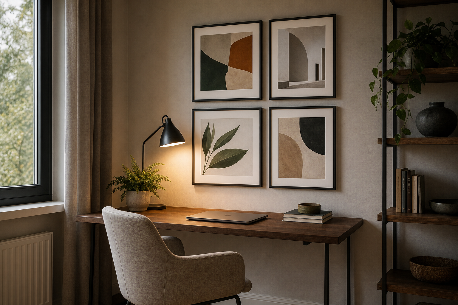
Match the visual weight, not just the frame size. A pale minimal print can sit beside a darker photo if the matting and frame depth keep the pair balanced. Stick to one frame finish across the grouping if you want a cleaner look. Mixing black, oak, and gold in a small office usually feels busy.
Finishing Touches for a Polished Work Zone
Lighting decides whether your art feels integrated or forgotten. If possible, add one warm task lamp at 2700K to 3000K and let daylight do the rest during working hours. Avoid placing glazed frames where a window creates strong glare across the image. Even a 20 cm shift left or right can make a major difference in visibility.
Smaller styling details matter too. Repeat one tone from the art in the room — a blue notebook, a sand ceramic vase, a black lamp base, an oak shelf. That repetition makes the wall art feel chosen for the room rather than added later. In practical terms, two or three repeated materials are enough: for example oak, black metal, and linen.

If your office is compact, leave some walls empty. Negative space is productive space in visual terms. Not every surface needs filling. The best home office wall art gives the eye a place to rest, sets the tone for the day, and still leaves room for the work itself.
Final thoughts
The strongest home office wall art is calm, scaled properly, and connected to the way you actually work. Choose pieces that support your attention span, suit your light conditions, and fit the size of your desk wall — not just what looks good in isolation.
A focused office does not need many pieces. One well-placed print or a disciplined gallery of four can define the room, improve the backdrop, and make the workspace feel complete. That is when home office wall art stops being decoration and starts working for you.