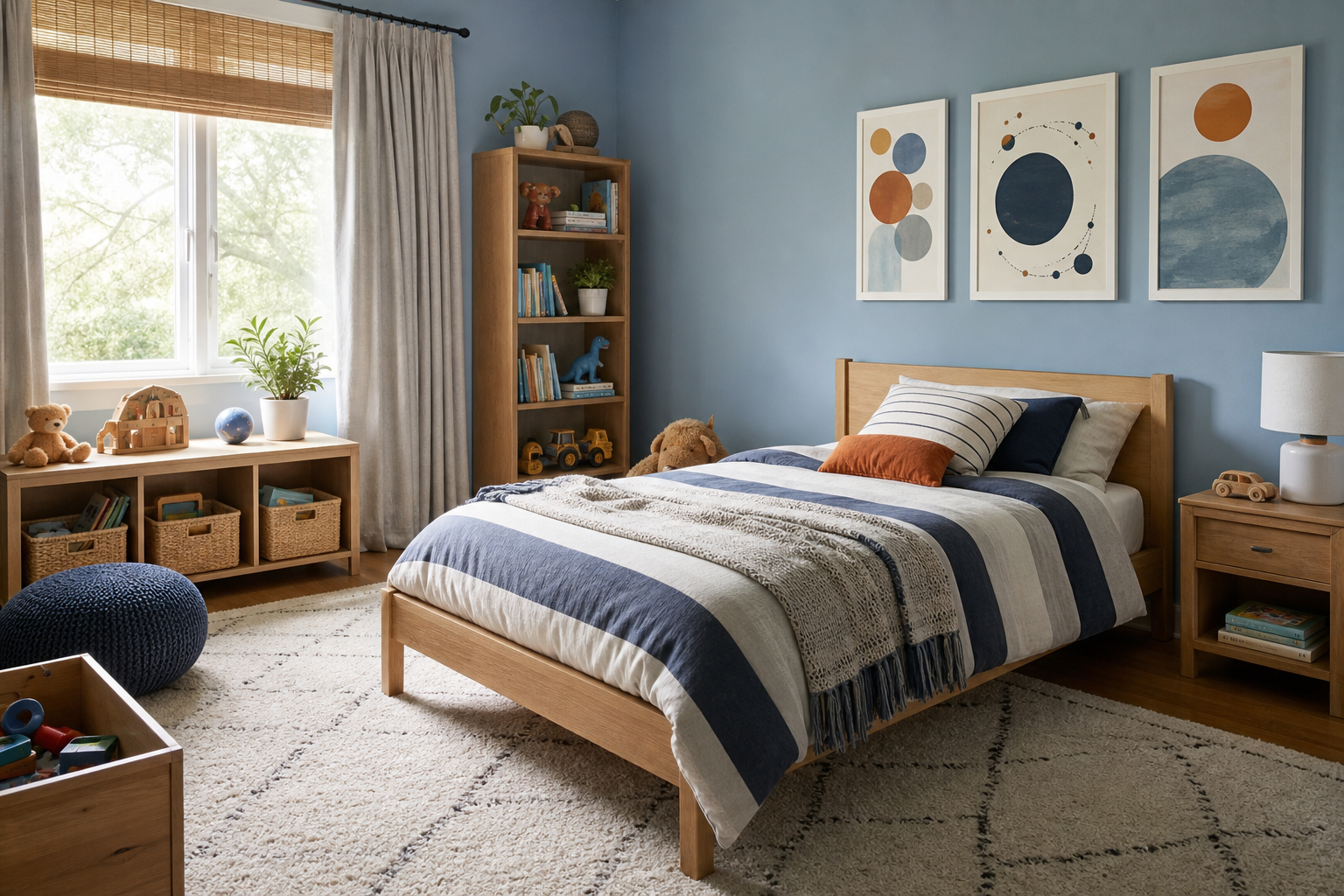
The best kids room poster ideas work for more than one age. A room should feel playful at 4, still comfortable at 8, and not childish by 11. That usually means choosing artwork with broad subjects, steady color palettes, and layouts that are easy to update without repainting the whole room.
Start With a Theme Your Child Won’t Outgrow Too Fast
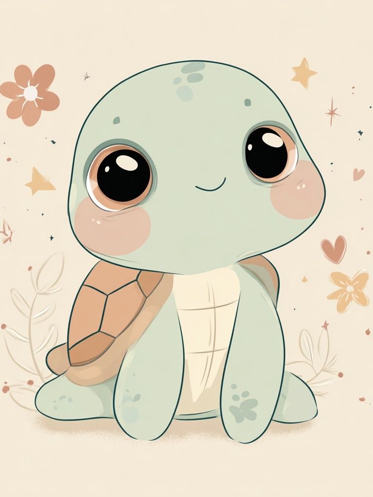
Themes last longer when they are based on interests with range rather than narrow characters or short-lived trends. Animals, nature, transport, space, alphabets, and simple illustration styles can shift easily from nursery to school-age room. A zebra, a turtle, or the solar system still makes sense years later — the only thing that changes is how you style the rest of the room around it.
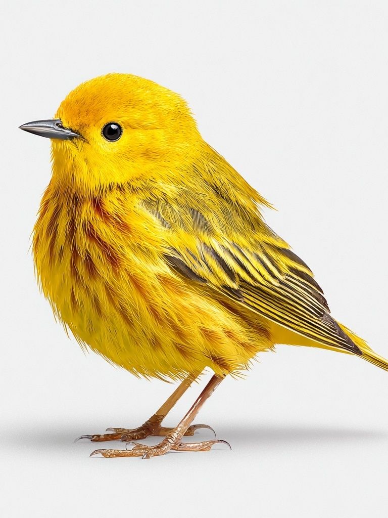
If you want a theme that grows especially well, start with animal art. It feels friendly in a nursery, educational in an early learning space, and visually strong in an older child’s room. Pieces from our animal wall art collection and our kids art prints are easy to mix because they can lean either soft and playful or more graphic and bold depending on the frame and surrounding colors.

Space is another smart direction because it has built-in longevity. For toddlers, planets and rockets feel imaginative. For older kids, the same subject feels curious and ambitious rather than babyish. A room with one or two prints from our space art collection can move from soft nursery styling to a more study-focused setup with almost no effort.

Abstract shapes and simple illustrations are useful if you want flexibility. They bridge age gaps well and blend with other pieces over time. You can start with one whimsical print, then add more structured pieces from our illustration collection or quieter designs from our minimalist art prints as the room matures. This is where the strongest kids room poster ideas usually begin — with a theme broad enough to evolve.
Choose Colors That Feel Playful but Still Calm
A child’s room does not need every bright color at once. A better formula is about 70% calm base tones, 20% supportive color, and 10% high-energy accents. In practice, that could mean warm white walls, pale sage bedding, a rust rug, and two prints with yellow or blue details. The room still feels cheerful, but it is much easier to sleep in and easier to style.
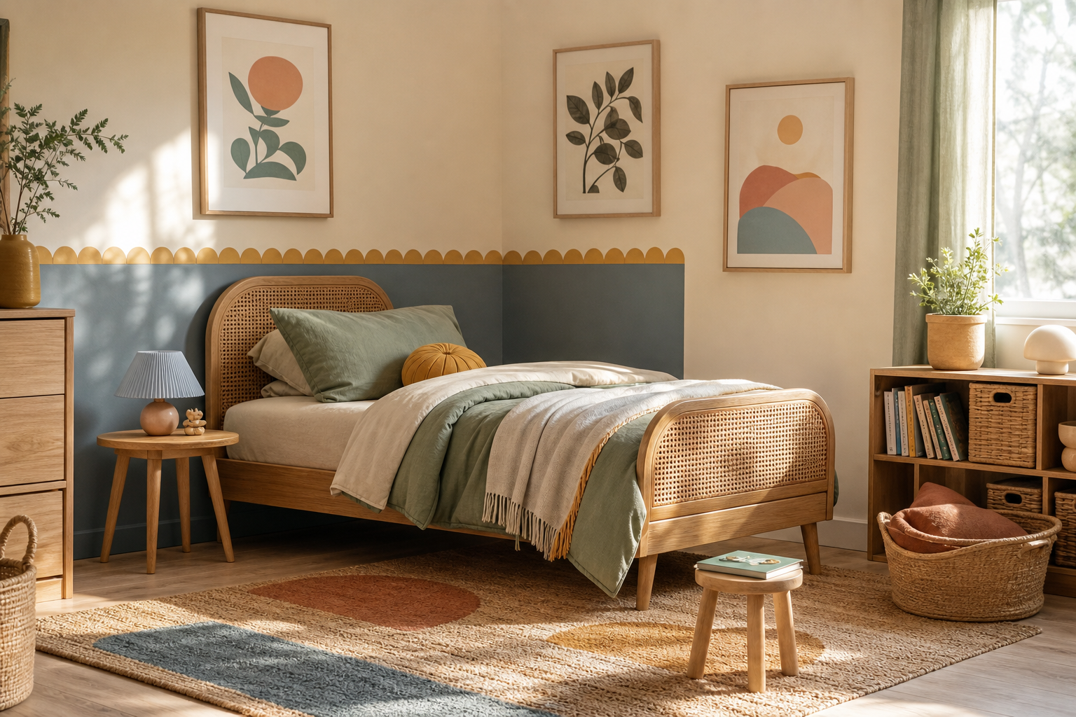
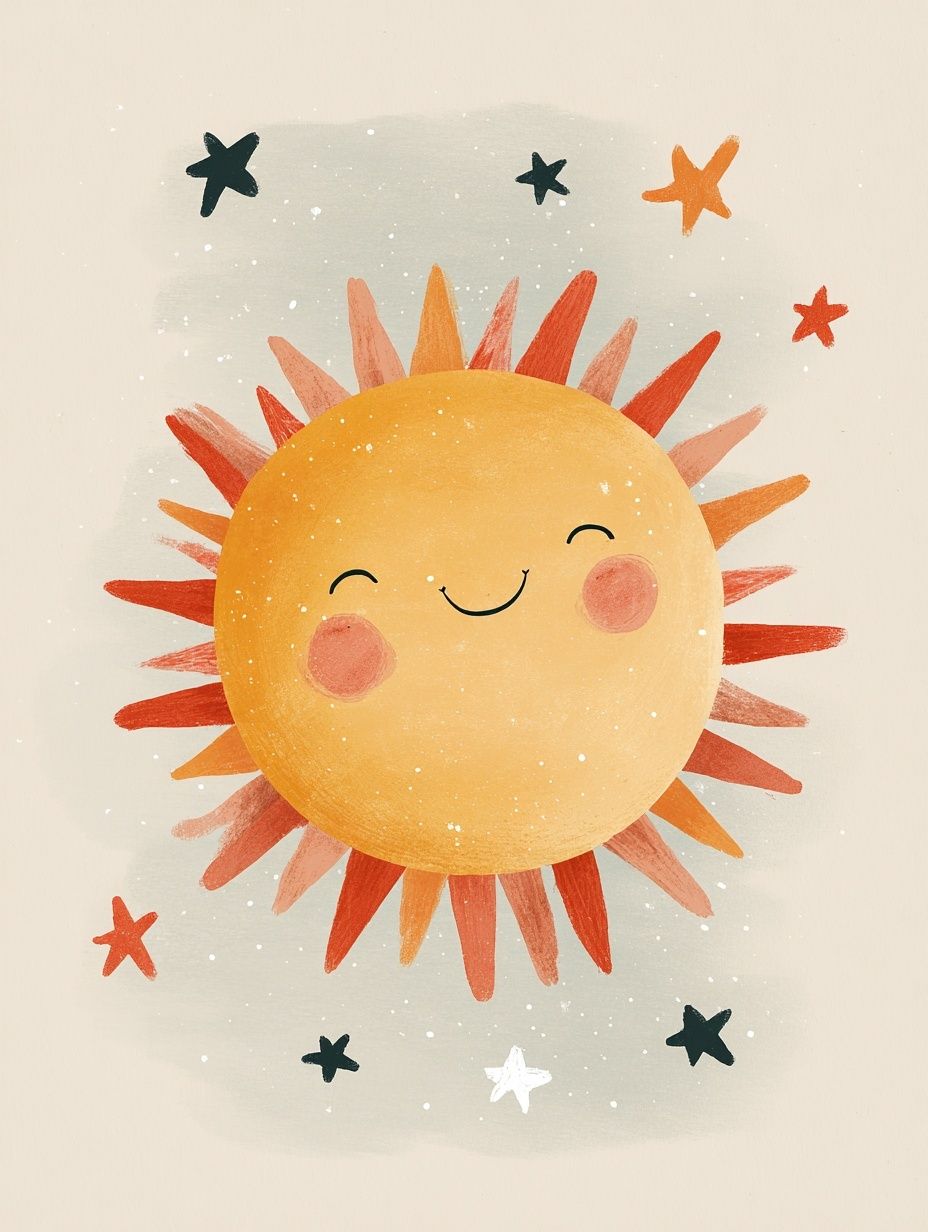
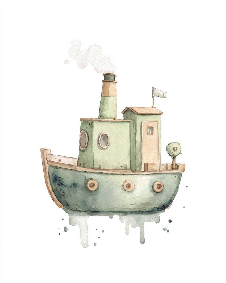
When you choose art, pull one or two colors already present in the room. If the rug has ochre dots, repeat that color in the wall art. If the bedding is pale blue, add one print with sky or sea tones. This repetition makes a room feel intentional. For example, Smiling Sun Nursery Print works well in rooms with warm neutrals, while Whimsical Tugboat Watercolor Poster suits blue, white, and sandy palettes.
A simple way to manage color is to mix one hero print with quieter supporting pieces. If one artwork is bright, keep the next two softer. That balance matters in shared rooms especially, where the wall can quickly become busy. Good kids room poster ideas use color to connect the room, not compete with the toys.
Pick the Right Poster Sizes for Small and Big Rooms
Size has more impact than most parents expect. In a small nursery, one 30x40 cm print above a dresser can feel complete. In a larger bedroom, that same size may look lost over a 140 cm bed. As a rule, wall art placed above furniture should cover roughly 50% to 75% of the furniture width. For a 90 cm toddler bed, that often means one 50x70 cm print or two 30x40 cm pieces side by side.
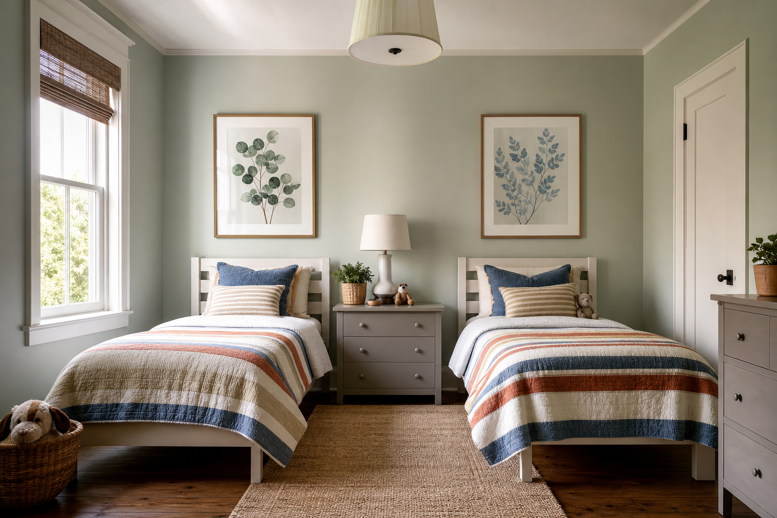
In tighter rooms, use vertical prints between a window and a bookshelf, or a pair of smaller pieces above a toy chest. In bigger rooms, use one oversized focal point above the bed and keep the rest of the walls simpler. Shared rooms benefit from mirrored layouts — for example, one print above each bed in matching frames to create structure without making both sides identical.
Mini prints work well in rows above shelves, desks, or reading nooks. Oversized art is strongest when the wall is otherwise quiet. If you already have patterned wallpaper, choose fewer, larger pieces. If the walls are plain, a grouped arrangement gives more personality. Among practical kids room poster ideas, getting the scale right is what makes the room feel designed rather than improvised.
Frame It Well for a Finished, Durable Look
Framing is what makes kids wall art feel lasting. A simple oak, white, or black frame can take the same print from temporary decor to something that belongs in the room for years. Oak works especially well with soft Scandinavian-style spaces, white frames disappear nicely into pale walls, and black frames help more colorful prints feel sharper and more structured.
Safety matters in children’s spaces. Lightweight frames are usually the easiest choice, especially above beds, changing tables, or desks. Acrylic glazing is often more practical than glass in active rooms because it is lighter and less fragile. Keep the bottom edge of framed art at least 20 to 25 cm above a headboard or shelf so the placement feels intentional and protected from bumps.
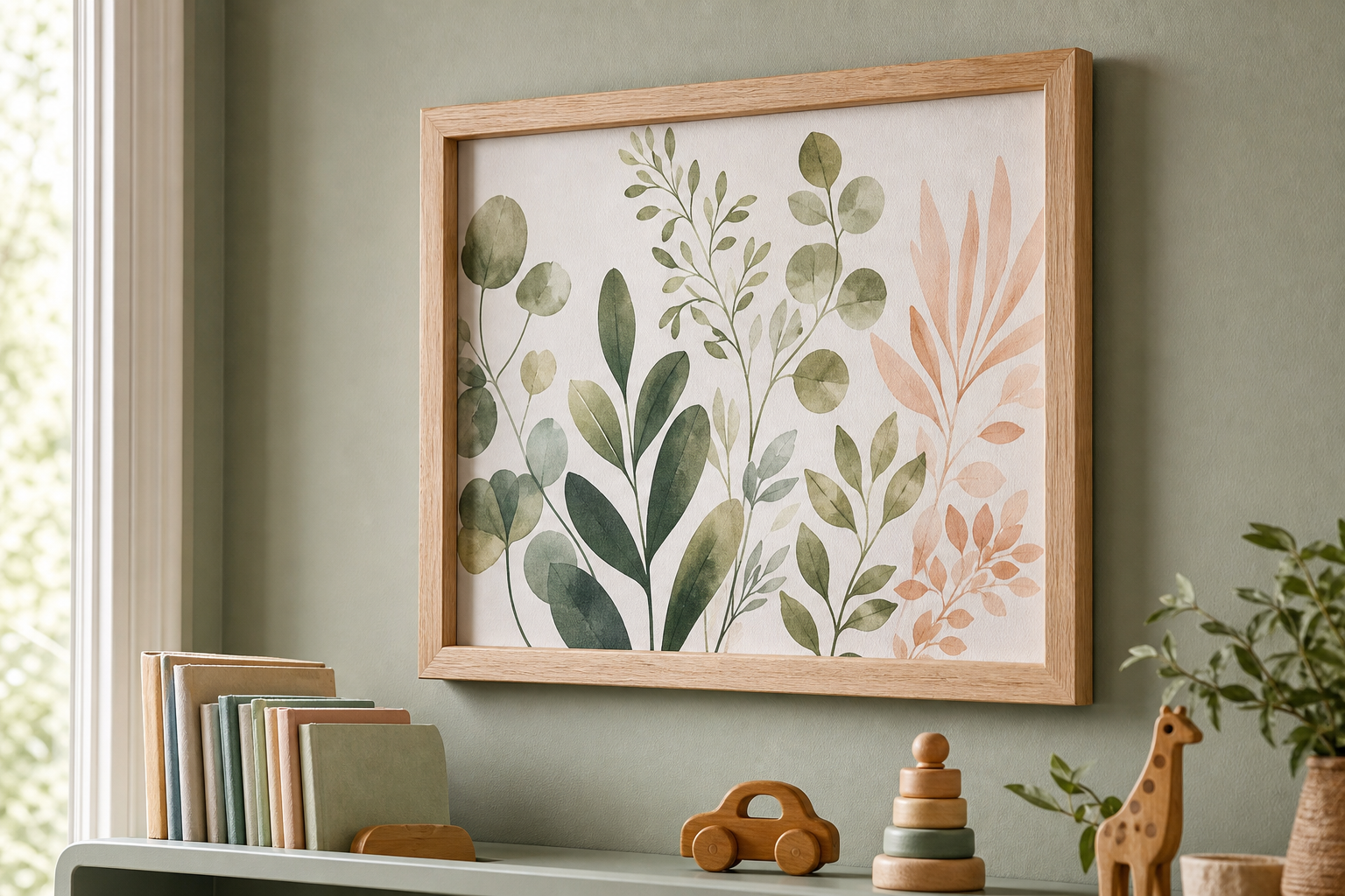
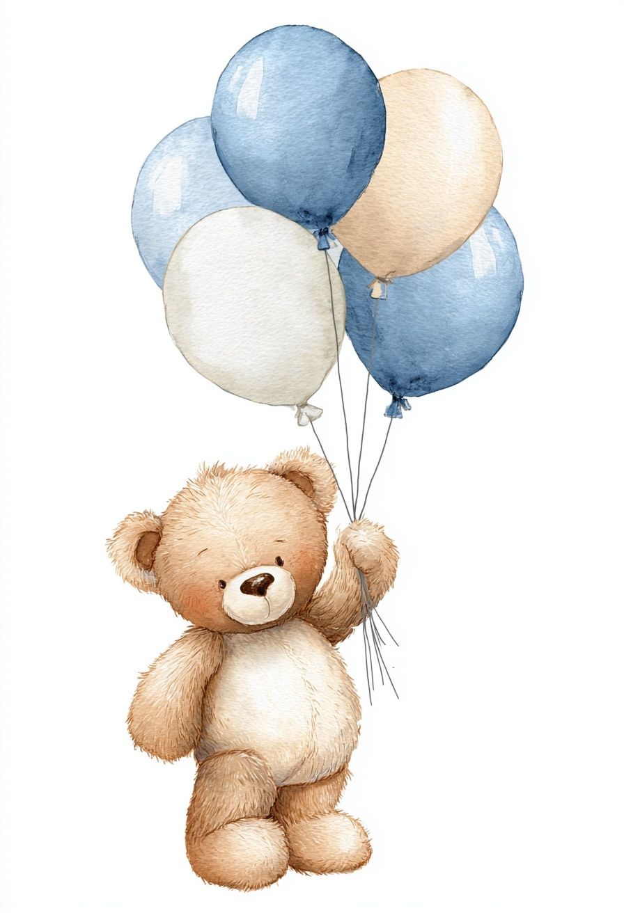
Frames also help bridge age changes. A playful print in a cleaner frame looks more refined immediately. That is why a character-led piece such as Teddy Bear with Balloons — Watercolor Print can still feel polished when paired with a simple frame and neutral wall color.
Create a Gallery Wall That Feels Fun, Not Fussy
A kids gallery wall works best when it follows one simple rule: vary the images, keep the structure consistent. That means you can mix animals, learning-focused prints, and whimsical illustrations — but keep the frame finish, spacing, or alignment steady. Leave 5 to 8 cm between pieces, and start by arranging the center line first rather than working outward randomly.
The easiest formula is a grid of four or six pieces. A 2x2 arrangement above a dresser is clean and easy to update. A looser salon-style layout can work too, but only if one anchor point holds it together, such as all frames lining up at the bottom edge. If every frame floats at a different height, the result often feels messy instead of playful.
You can pair a more expressive print with simpler supporting pieces to avoid visual overload. For example, Guitar Girl and Cats Illustration Poster adds energy, while softer animal or nursery prints keep the wall grounded. Another good mix is one educational piece, two animal illustrations, and one more imaginative artwork from Little Girl and Elephant — Watercolor Print or Cute Ducklings with Flowers — Kids Print.
Style Posters Around Beds, Desks, and Reading Corners
Placement should support how the room is used. Above the bed, choose one focal piece or a balanced pair. Over a desk, go for art that feels a little more focused — space, maps, shapes, or cleaner illustrations tend to work better than very busy scenes. In a reading corner, softer imagery with animals, sky themes, or gentle color palettes helps the area feel calm.
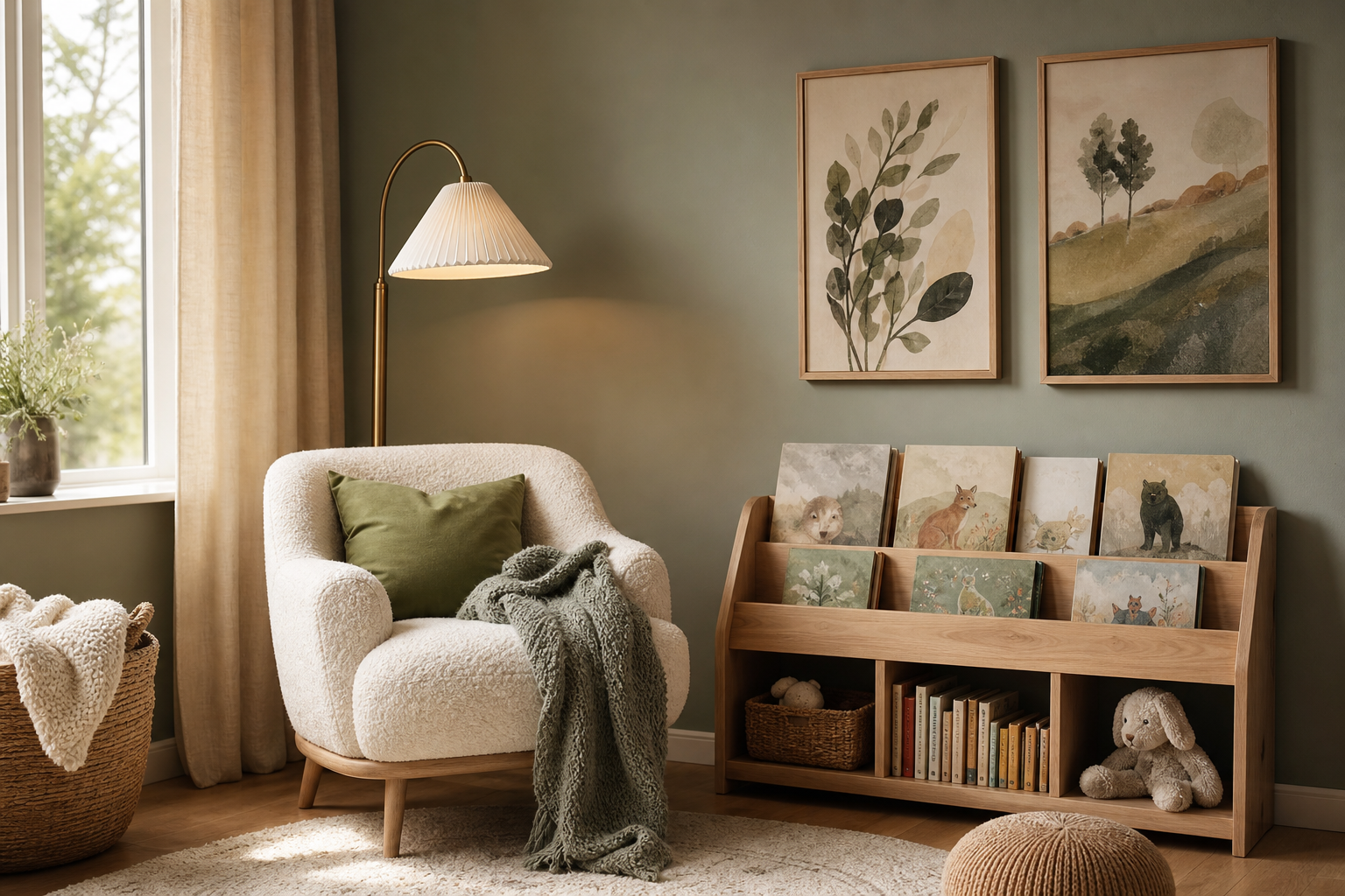
In a nursery, place art where adults see it during routines — above the changing table, near the glider, or across from the crib rather than directly above it. In a school-age room, artwork near the desk or book storage becomes part of the child’s daily environment. In a shared room, use wall art to define zones: one print over each bed, or one small cluster by each child’s shelf.
These details are where the most practical kids room poster ideas pay off. The artwork is not only decorative; it helps shape the room into clear, comfortable zones. If you want an easy place to start, build one focal wall and one secondary moment. That is usually enough.
Wrap-Up: Easy Poster Choices That Make Room Updates Simple
The most successful kids room poster ideas are the ones that leave room for change. Start with two or three versatile prints, use a calm color base, and frame them well. Then update in small steps — swap one print, add a new pair above a desk, or move a nursery piece to a reading corner as the room evolves.
A child’s room does not need a full redesign every few years. A better approach is to build from flexible themes, reliable sizing, and artwork that can shift with the furniture. That is what keeps the room feeling personal now and still right later.