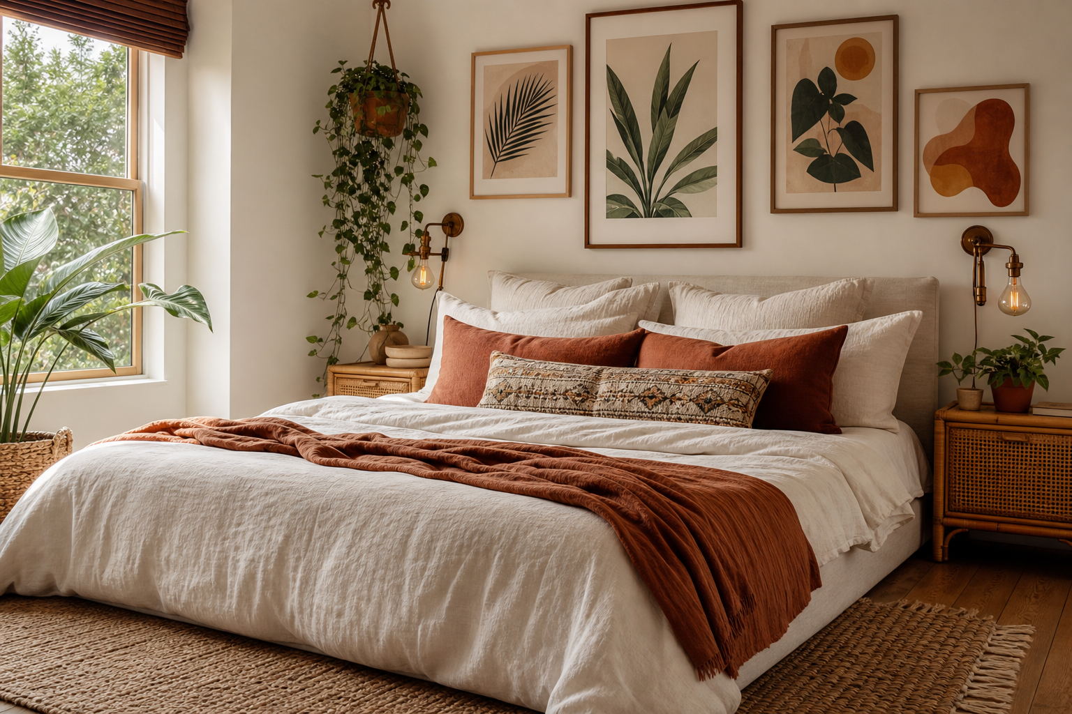
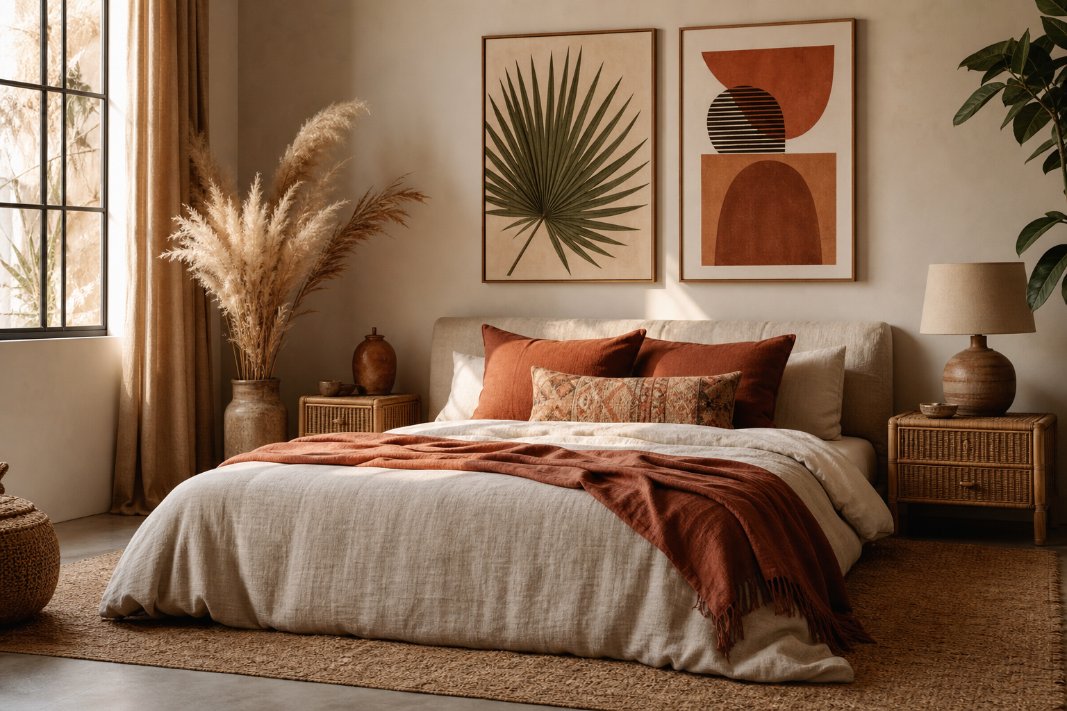
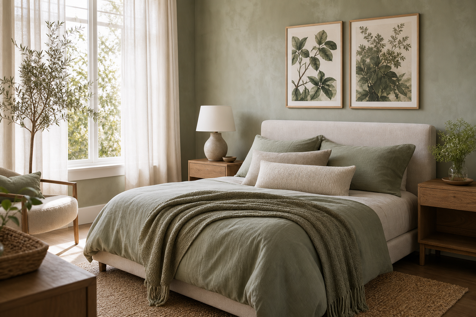
Open-plan rooms work best when the walls feel connected, not copied. Good open plan wall art gives each zone its own purpose while keeping the whole room visually consistent. The goal is simple: the sofa area should feel grounded, the bed area should feel calm, and the desk area should feel clear enough to focus.
Start with one visual thread
The easiest way to make open plan wall art feel cohesive is to choose one shared element and repeat it across the room. That element can be a colour family, a subject, or a frame finish. In practical terms, pick one main direction and let 60 to 70 percent of the art follow it. That leaves enough variation to keep the room from looking staged.
If your room already has a soft palette — oatmeal, black, walnut, off-white, muted clay — start with our Minimalist collection or abstract art prints with restrained colour. These categories are especially useful in open-plan spaces because they create rhythm without demanding equal attention from every wall. If your furniture has more shape and contrast, Mid Century Modern prints can add structure through clean forms and edited colour blocks.
A strong visual thread can also come from tone rather than exact colour. For example, one piece above the sofa might include charcoal and sand, the bedroom piece can lean cream and warm grey, and the desk print can use the same charcoal in a lighter, simpler composition. That is enough to make open plan wall art feel intentional across separate zones.



Style the sofa wall as the anchor
The sofa wall is usually the largest and most visible art moment in the room, so it should set the tone for everything else. Aim for artwork or a grouped arrangement that spans about 60 to 75 percent of the sofa width. For a 200 cm sofa, that means roughly 120 to 150 cm of total art width. That proportion feels balanced without swallowing the furniture.
Hang the centre of the arrangement at around 145 cm from the floor in most homes, then adjust slightly for lower seating. Above the back of the sofa, keep the bottom edge of the frame 15 to 25 cm above the upholstery. If the gap is much larger, the art starts to float away from the furniture.
Single oversized art works well when you want a quiet, architectural feel. A pair or triptych works better if you need to stretch horizontally across a long wall. In open-plan layouts, the sofa wall often benefits from art with a little visual weight — textured abstract work, structured line, or architectural imagery — because it anchors the social side of the room.

A piece like the one below works well when you need depth and movement without visual noise. It gives the sofa wall enough presence to lead the room.

If you prefer a more built-space feel, Modern Minimalist Architecture or Modern White Staircase can sharpen the living zone with clean lines. Both suit rooms where the sofa area needs a crisper edge than the sleeping area.
Make the bed area feel calm and finished
Art above the bed should be slightly quieter than the sofa wall. If both zones compete at the same volume, the room feels restless. A good rule is to scale the bed arrangement to 50 to 70 percent of the bed width. For a 160 cm bed, aim for 80 to 110 cm total width. That can be one large piece, two matching verticals, or a row of smaller frames with generous margins.
Symmetry helps the bed zone feel restful. Even in a more eclectic room, a centred composition above the headboard creates order. Softer subject matter also helps. Look for gentle texture, pale contrast, or imagery with breathing room — not dense detail from edge to edge.

For a bedroom wall, Window with Sheer Curtain is a smart choice because it echoes softness through both subject and palette. It brings lightness above the bed without turning the sleeping zone into a visual dead spot.

You can also build calm through collections. our Fine Art selection and Bohemian prints with softer texture both work well above beds because they carry gentle movement and tactile colour rather than hard contrast.
Keep the desk zone light and focused
The desk area needs the least visual weight. In most open-plan rooms, it is a functional edge rather than the hero wall. Art here should add personality but stay compact — think one frame, a vertical pair, or a small ledge arrangement no wider than the desk itself.
Keep the art 10 to 20 cm above the desk surface or shelf line if the desk is visually exposed. If the desk sits beside the bed or behind the sofa, use that art to bridge the two zones. This is a good place for a simpler print with a little structure, especially if the other walls are more layered.

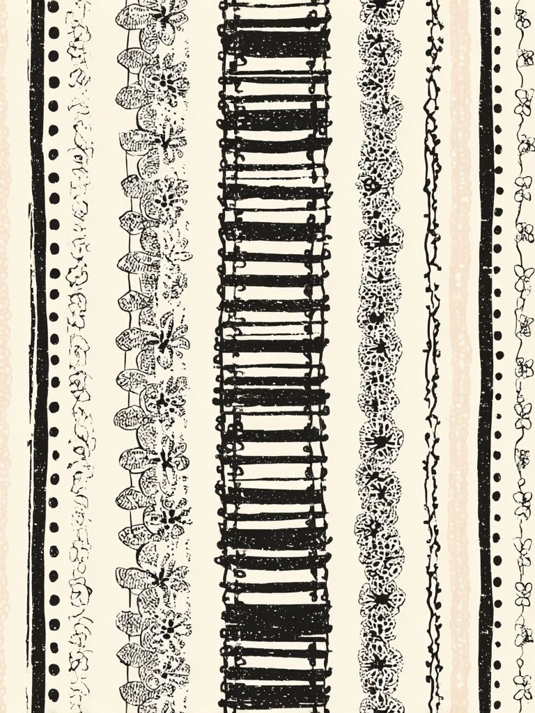
Typography can work here, but choose it carefully. Bold wording above a desk can dominate a small zone fast. If you want something quieter, Water Drop Minimalist Typography Poster has the clean look of a graphic print without the heavy visual pull of dense text.

If your workspace sits in view of the sofa, small architectural pieces from the Architecture collection can also help connect the desk wall to the more structured look of the living area.
Balance scale, spacing and sight lines
The most common mistake with open plan wall art is treating every wall as a separate project. In one connected room, your eye reads the art as a sequence. That means spacing matters not just within each arrangement, but between zones.
Leave enough blank wall between the sofa art and bed art so each area can breathe. In most medium rooms, 40 to 90 cm of clear wall is enough to create separation. Within a gallery or pair, keep frame gaps consistent — usually 5 to 8 cm for smaller works, 7 to 10 cm for larger ones. Inconsistent spacing makes the room feel accidental.
Think about sight lines from the spots you use most. Sit on the sofa and check what you see beyond it. Lie in bed and notice whether the desk wall feels too busy. Stand at the room entrance and look for one dominant focal point, not three competing ones. Good open plan wall art should guide the eye across the room in steps.
Use framing and colour to unify the space
Frames do more work in open-plan rooms than most people realise. If the art styles vary, matching frames can still make the room feel edited. Black frames sharpen modern spaces. Oak or light wood frames soften them. White frames can work, but they often disappear on pale walls unless the artwork has stronger contrast.
Matting is useful when your pieces differ in scale. A smaller print with a 5 to 8 cm mat can hold its own next to a larger un-matted piece. This is especially helpful when the desk art is naturally smaller than the sofa wall arrangement. Shared mat colour — usually off-white or soft ivory — also keeps the room from feeling pieced together over time.
For colour, repeat two or three tones across all zones. One can be neutral, one can be dark for definition, and one can be a muted accent such as rust, olive, or ochre. If you want a warmer layered result, Ceramic Vases with Dried Branches is useful in a bedroom or transition wall because it carries earthy tones without becoming heavy.
Pull the room together with a final styling checklist
Before you hang anything, lay the full scheme out on the floor and look at it as one composition. Check that the sofa wall is the largest statement, the bed area is softer, and the desk is the most restrained. That hierarchy solves most open-plan styling problems before the first nail goes in.
Use painter's tape to mark frame sizes on the wall at full scale. Step back 2 to 3 metres if possible. If one arrangement feels too small, increase width before height. If the room feels busy, remove one piece rather than shrinking all of them. Open plan wall art works best when each zone has a clear role and the whole room shares a common visual language.

Start with one strong anchor, then build the rest with restraint. A connected room does not need matching art everywhere — it needs repeated cues, controlled scale, and enough empty space for each zone to read clearly.
Final thoughts
The best open plan wall art feels composed from across the room and comfortable up close. If the sofa wall leads, the bed wall softens, and the desk wall supports, the room will feel finished rather than fragmented.
Choose one thread, keep proportions disciplined, and repeat frame and colour details with intent. That is what turns three separate walls into one cohesive interior.
Frequently Asked Questions
What size art works best above a small two-seat sofa?
For a sofa around 140 to 170 cm wide, aim for art or a grouped layout between 85 and 120 cm wide. Keep the bottom of the frame 15 to 20 cm above the sofa back.
Should the art above the bed match the art above the sofa?
No. It should relate, not match. Use the same frame finish or repeat one or two colours so the pieces feel connected without looking duplicated.
Can I mix portrait and landscape formats in one open-plan room?
Yes — it often improves balance. Use wider formats above the sofa, more centred or symmetrical pieces above the bed, and smaller vertical formats near a desk.
What frame colour is safest for an open-plan space?
Black is the most versatile if you want crisp definition, while oak feels softer and warmer. If you mix frame colours, repeat each finish at least twice so it looks deliberate.
How do I hang art if the desk sits directly next to the bed?
Leave a visual gap between the two zones by keeping the desk art narrower and slightly lower in impact. A single small print or vertical pair usually works better than a wide arrangement.