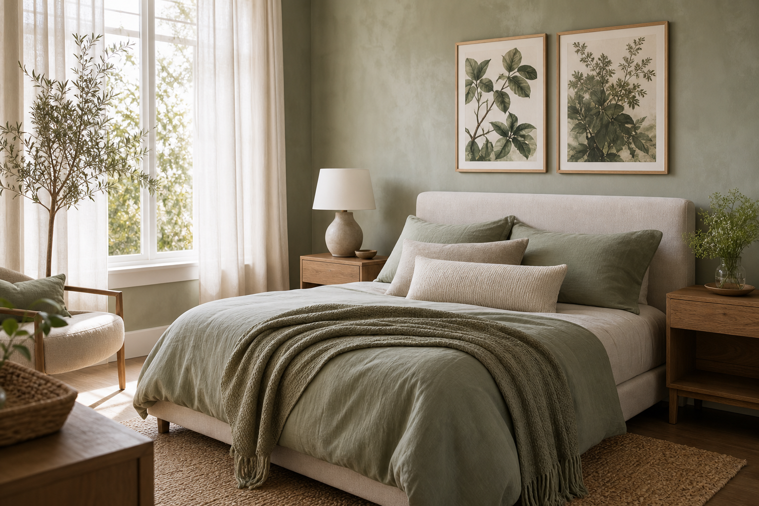
Botanical wall art suits bedrooms because it brings in shape, pattern, and natural reference without adding visual noise. Leaves, stems, flowers, and garden studies feel quieter than busy abstracts or high-contrast graphic work, especially when the palette stays within soft greens, warm neutrals, dusty pinks, or faded blues. In a room designed for rest, that matters.
A bedroom also benefits from artwork with an organic rhythm. Repeating leaf forms and curved stems soften the hard lines of a bed frame, wardrobe, or window trim. If you already lean toward natural materials — oak, linen, rattan, cotton, matte ceramics — our botanical collection will usually feel more integrated than sharper graphic styles. For a lighter, pared-back take, minimalist floral and botanical prints can create the same calm effect with less detail.
Why Botanical Prints Work So Well in Bedrooms
Plant-inspired art supports the mood most bedrooms need: gentle, settled, and visually breathable. A good botanical composition has enough detail to feel interesting up close, but not so much contrast that it dominates the room from the doorway. That balance is why botanical wall art works particularly well above beds, dressers, and reading corners.
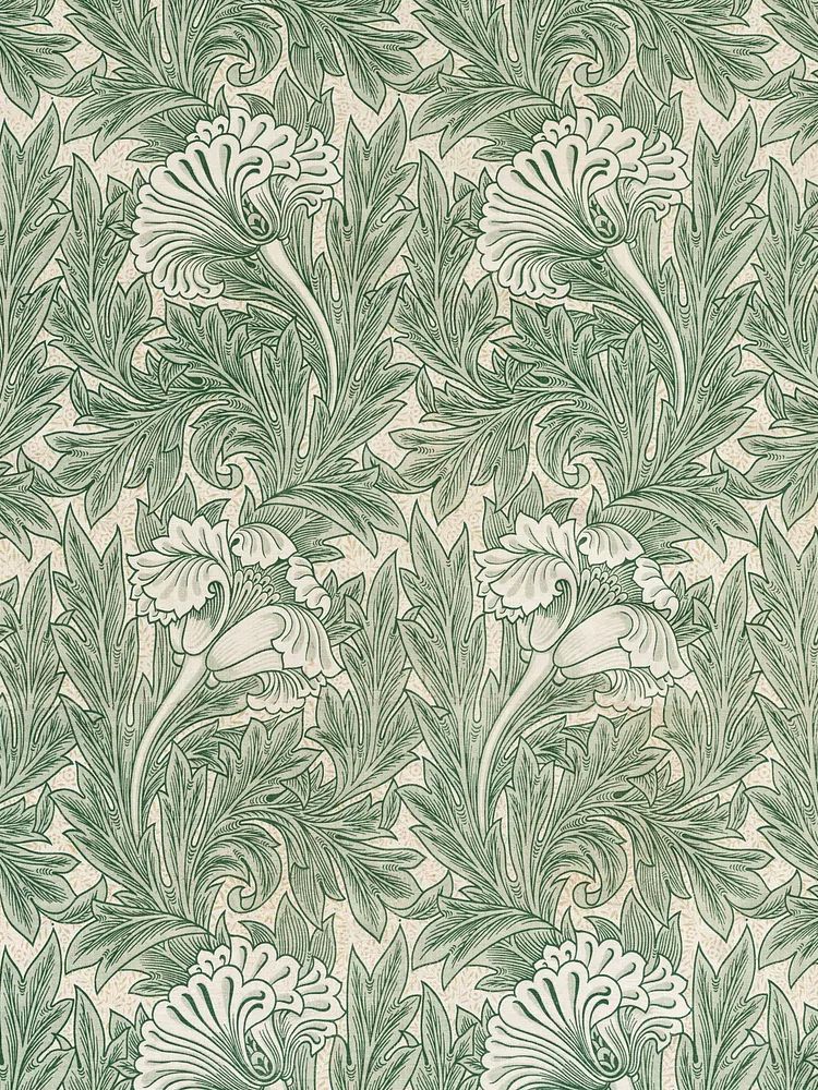
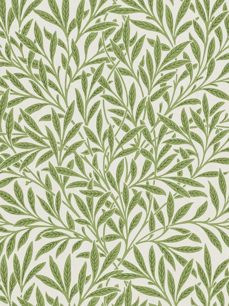
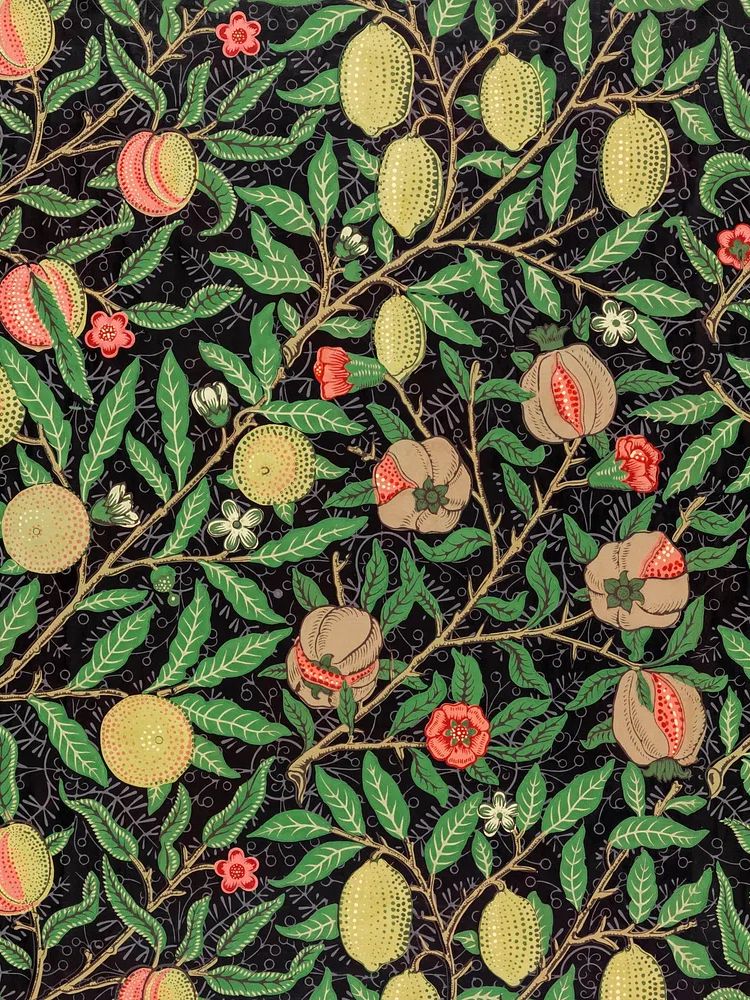
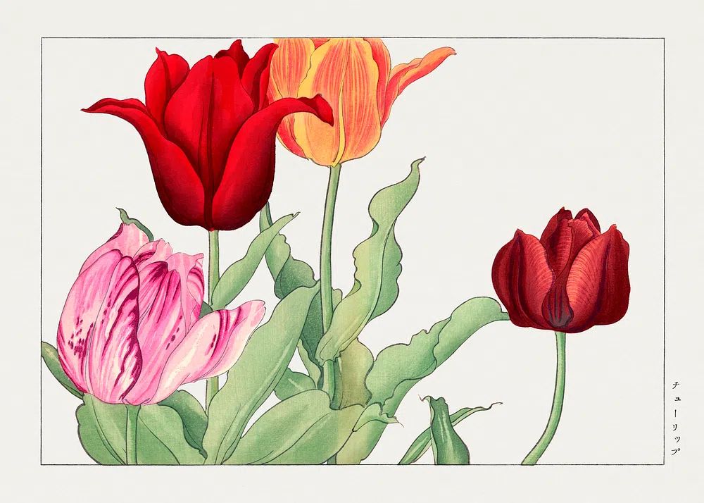
Traditional botanical pieces also have a timelessness that helps a bedroom age well. A patterned William Morris print, a single stem study, or a faded floral illustration will still make sense when you change bedding or wall colour two years from now. If you want a classic starting point, Green Tulip by William Morris and Vintage Rose Botanical both bring softness without feeling overly sweet.

Choosing the Right Mood: Soft, Moody, or Fresh
The mood comes down to colour temperature, background tone, and line density. Soft botanical styling uses faded greens, cream backgrounds, and delicate stems. This works well in bedrooms with beige upholstery, off-white walls, pale wood, and natural linen. A print like White Flower Silhouette gives you a botanical reference with very little visual weight.
Moody botanical styling leans deeper — olive, forest, burgundy, aubergine, antique gold. These tones suit darker painted bedrooms, walnut furniture, brass lamps, and velvet cushions. Vintage patterns and denser florals feel especially strong here because they hold their own against richer materials. If your room has deeper wall colour or black accents, try pieces from our fine art selection alongside more detailed botanical work to keep the bedroom layered rather than flat.
Fresh botanical styling is brighter and more open. Think spring greens, soft yellow, airy whites, and watercolor effects. This direction works well in smaller bedrooms because it reflects more light and keeps the walls from feeling heavy. nature-inspired prints can also support this look when you want your plant artwork to feel less decorative and more landscape-led.
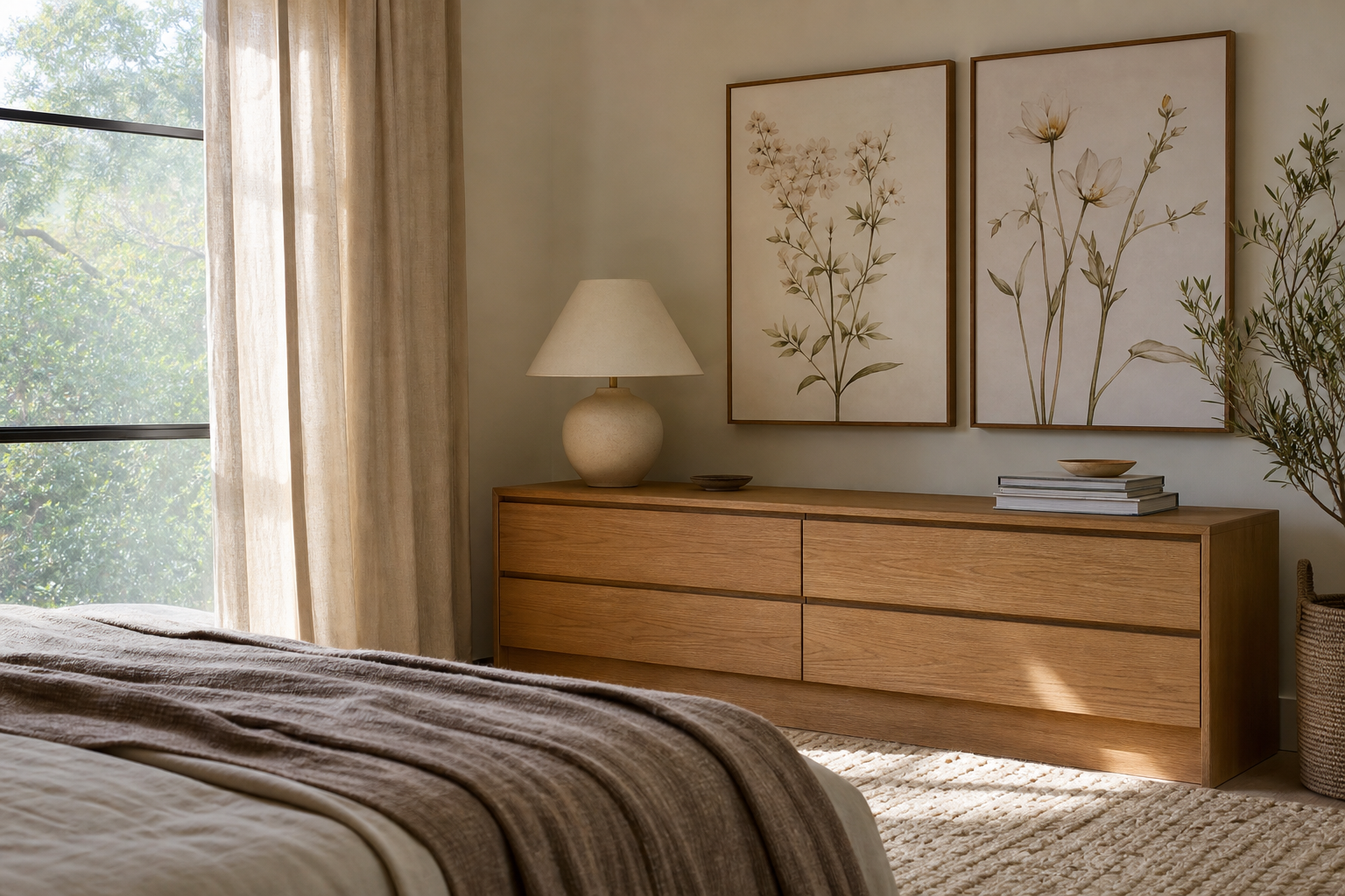
A simple way to choose the right direction is to match the darkest tone in the artwork to one existing element in the room. In a soft bedroom, that might be sage bedding. In a moodier room, it could be a dark wood bedside table or black metal sconce. This keeps the botanical wall art connected to the space rather than floating above it.

Getting the Scale and Placement Right
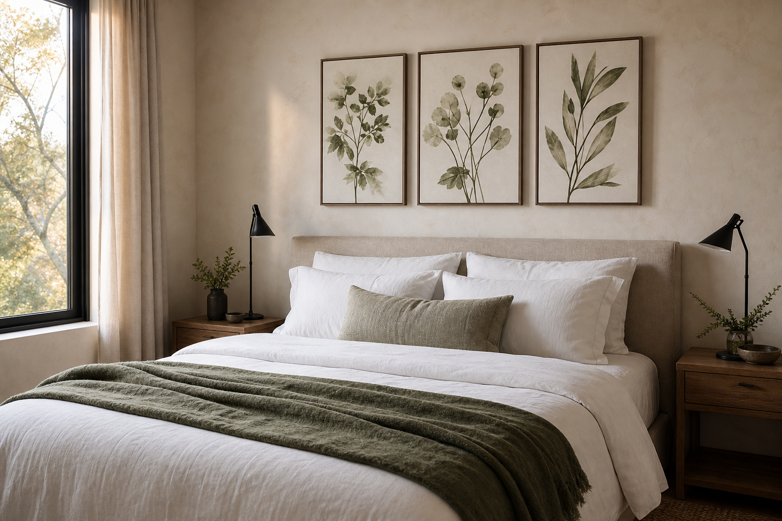
Above the bed, the easiest rule is width. Your artwork grouping should cover roughly 60% to 75% of the bed width. For a standard 150 cm double bed, aim for a total arrangement width of around 90 to 112 cm. For a 180 cm king bed, 108 to 135 cm usually looks balanced. Much narrower and it feels undersized; much wider and it starts to crowd the headboard.
Height matters too. Hang the bottom edge of the frame or grouping about 15 to 25 cm above the headboard. This keeps the art visually connected to the bed. If the wall is tall, resist the urge to place everything too high. In bedrooms, lower placement nearly always feels calmer and more grounded.
One large piece works well in compact rooms because it reduces visual breaks. A 50x70 cm or 70x100 cm print can be enough on its own over a double or king bed, depending on ceiling height. Two matching 50x70 cm prints also work well if you want symmetry. For a looser arrangement above a dresser or bench, try three frames with 5 to 7 cm spacing between each piece.
If your bedroom is narrow, vertical formats can help draw the eye upward beside a wardrobe, mirror, or window. If the room is wide and low, horizontal balance matters more — use a pair of frames or one broader piece with visual spread. Bedroom posters should support the architecture, not fight it.
Framing Botanical Wall Art for a Polished Finish
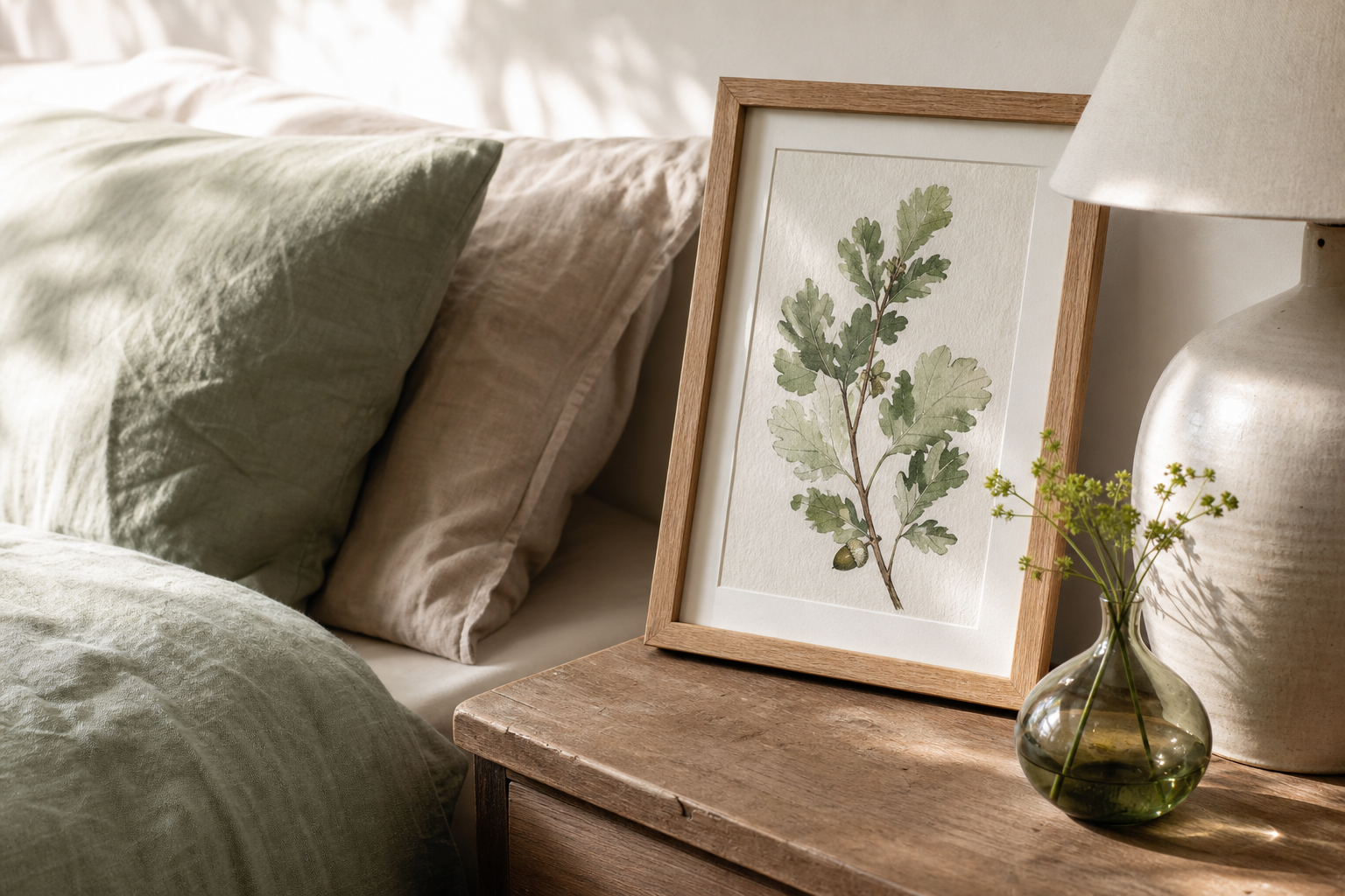
Frames decide whether the art feels airy, formal, rustic, or modern. Light oak frames are the safest option for bedrooms because they echo natural materials and soften detailed botanical imagery. Black frames give sharper definition and work best when the room already includes black lighting, iron hardware, or stronger contrast. White frames are useful when you want the wall art to blend into pale walls and feel less prominent.
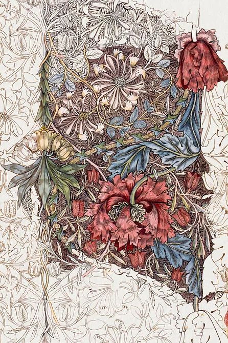
For vintage botanical prints, wood tones usually outperform gloss finishes. Oak, walnut, or a muted antique-style frame adds warmth and keeps the room from feeling clinical. If the artwork has intricate linework or pattern — such as Honeysuckle by William Morris — a mount can help. A 3 to 5 cm white border gives the image space and makes a detailed print feel more considered in a bedroom setting.
Material consistency is what makes a bedroom feel finished. If your bedside tables are oak and your curtain rod is brass, choose a frame that picks up one of those tones. If the bed is upholstered and the room is very soft overall, a slimmer frame profile — around 1 to 2 cm — tends to look cleaner than a heavy moulding.
Easy Ways to Build a Botanical Gallery Wall
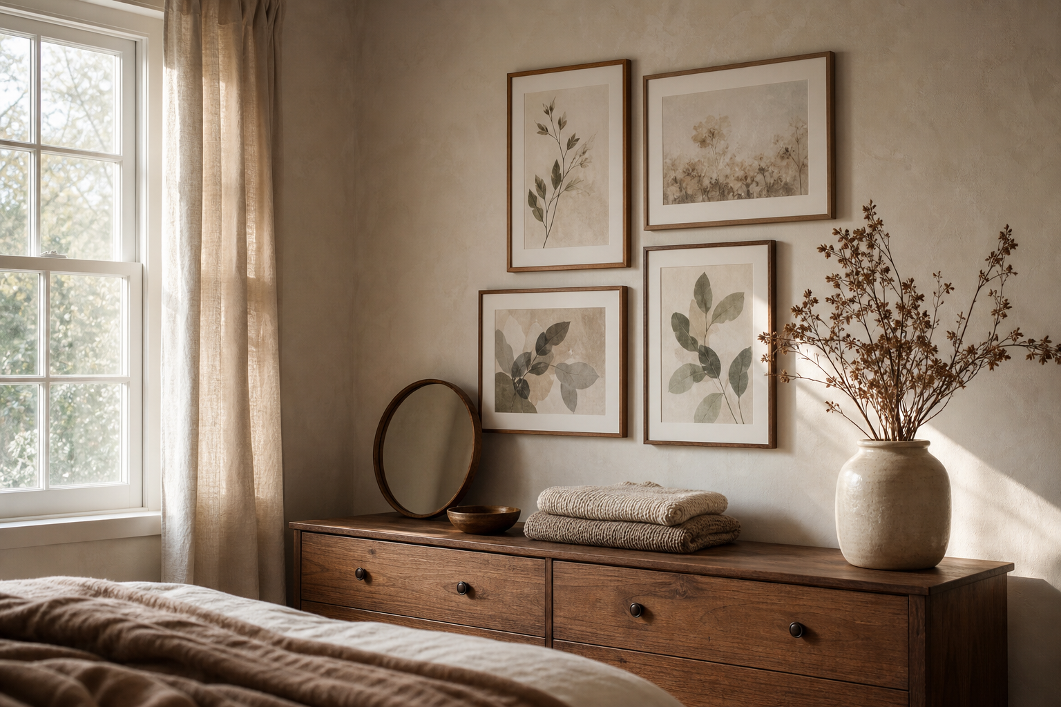
The easiest botanical gallery wall starts with one anchor piece and three supporting works. Use one larger print at 50x70 cm, then add three smaller pieces at 30x40 cm or 21x30 cm. This gives structure without making the bedroom wall feel crowded. Keep spacing consistent — 5 to 8 cm between frames is a reliable range for most bedrooms.
To stop the arrangement from becoming too busy, limit yourself to one of these mixes: all florals, florals plus leaves, or botanicals plus one landscape. Too many subjects create clutter. A good bedroom mix might include a floral study, a leafy pattern, a stem silhouette, and one softer landscape from our nature collection to open the composition.
If you want a more decorative look, combine classic botanical pieces with one bohemian accent. bohemian floral art works best when the bedroom already has textured throws, cane furniture, or terracotta accents. Keep the palette connected — for example, green, rust, cream, and muted pink across all four works.
Styling Tips to Tie the Whole Bedroom Together
Botanical wall art looks strongest when at least two other elements in the room repeat its palette or texture. If the artwork includes sage and cream, echo that in bedding and curtains. If it includes terracotta or muted rose, bring that into a cushion, throw, or bedside ceramic. You do not need to match exactly — staying within the same tonal family is enough.
Texture matters as much as colour. Crisp black-and-white botanical prints can feel cold in a bedroom unless you add softer materials around them. Linen duvets, boucle cushions, wool rugs, woven baskets, and matte ceramics all help the artwork settle into the room. For a calmer look, keep shiny finishes to a minimum and let the botanical shapes do the work.
A final useful rule: if the room already has a patterned headboard, printed bedding, or wallpaper, choose simpler botanical artwork. If the room is plain, you can go richer with detailed florals or heritage patterns. That is where botanical wall art earns its place — it can either quietly support a restful bedroom or provide the main layer of visual interest, depending on what the space already has.
Final thoughts
The best botanical bedroom styling comes from restraint. Choose a mood first, scale the artwork to the furniture, and frame it in a finish that matches the room’s materials. Once those three decisions are right, the rest becomes easy.
Botanical wall art works best when it feels connected to the bed, the light, and the textures around it. Start with one strong piece or a simple set of three, keep the palette calm, and let the room breathe.