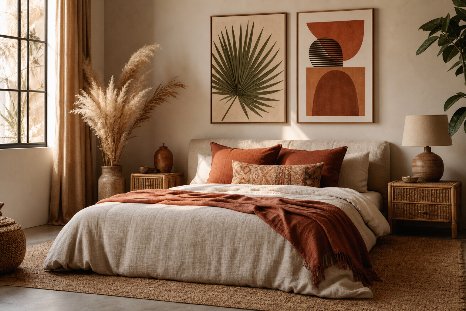
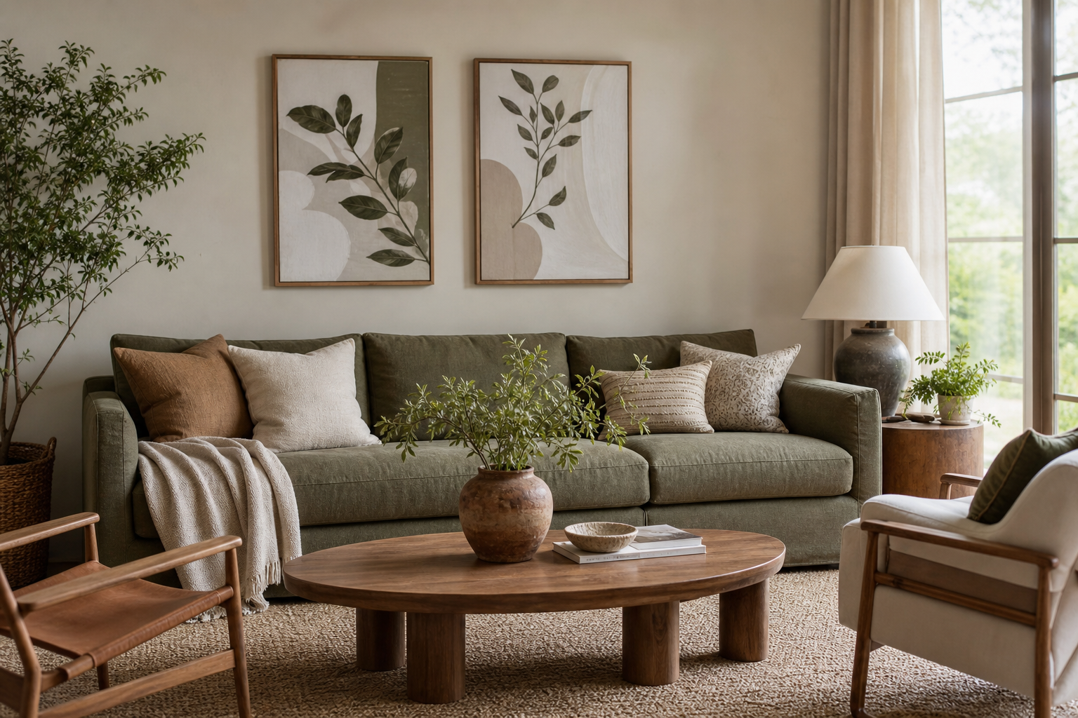
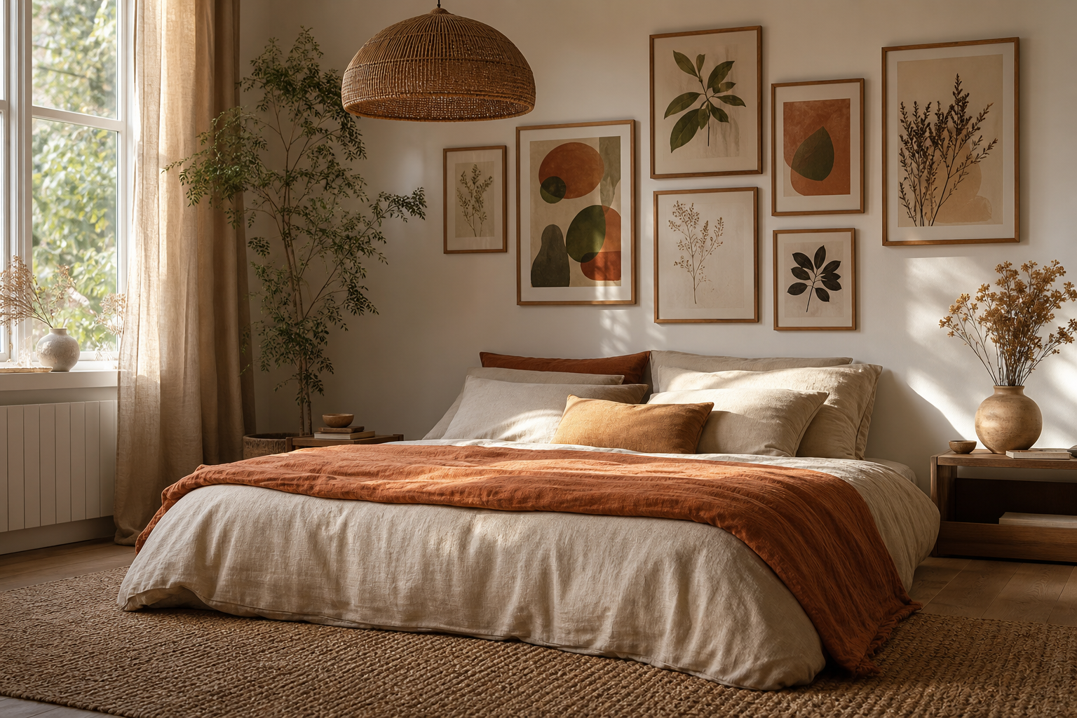
A well-chosen bohemian poster gives a room warmth before you add a single cushion or plant. The style works because it mixes softness, age, and texture: sun-faded color, handmade-looking forms, and compositions that feel collected rather than matched. If you want the look to feel authentic, start with pieces that reference natural materials, imperfect symmetry, and motifs like florals, ceramics, woven patterns, birds, or quietly expressive portraits.
What Makes a Bohemian Poster Feel Authentic
An authentic boho look is rarely polished to the point of precision. The strongest pieces have irregular brushwork, visible texture, muted pigment, or vintage-inspired subject matter. A bohemian poster should feel like it belongs with linen, cane, clay, and wood — not high-gloss lacquer or sharply graphic neon. That is why designs from our Bohemian collection often pair naturally with pieces from the Vintage collection and softer works from our Illustration art prints.
A useful test is distance. Stand about 2.5 meters from the wall and ask whether the artwork still feels soft. If the contrast is too harsh or the lines too clinical, it can pull the room toward modern minimalism rather than boho ease. Motifs such as dried botanicals, woven surfaces, and hand-drawn florals are especially effective because they echo real materials already found in bohemian interiors.
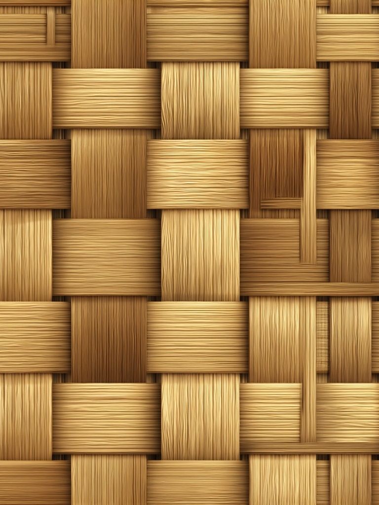
Texture-led art is one of the easiest ways to ground the style. Woven Bamboo Texture works well because it brings in the look of natural fiber without adding visual clutter. If your room already has patterned bedding, kilim cushions, or a rug with a strong border, textured wall art can calm the composition while still feeling rich.
Choosing the Right Colors and Mood
The best boho palettes sit in the middle range: not too pale, not too saturated. Terracotta, sand, ochre, rust, olive, clay pink, and dusty burgundy all create warmth without heaviness. A good baseline is 60% warm neutrals, 30% earthy mid-tones, and 10% darker contrast such as walnut, espresso brown, or muted black. That ratio keeps a room layered rather than flat.
If your walls are white or soft cream, a bohemian poster in terracotta or olive will add instant depth. If the room already has warm beige walls, use slightly darker art with reddish undertones so the prints do not disappear into the background. Floral, paisley, and abstract stripe motifs are particularly strong here because they introduce movement while staying relaxed.
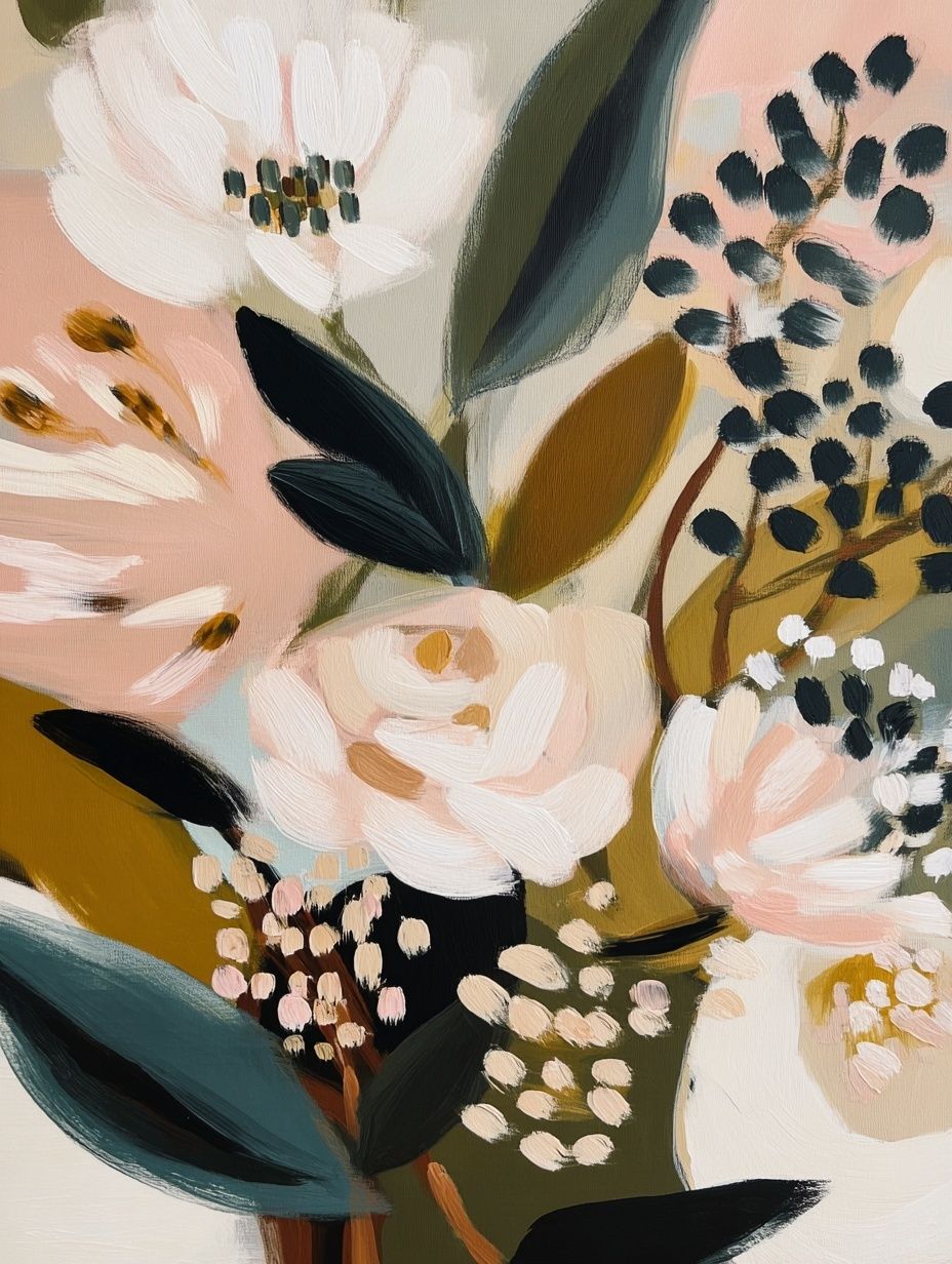
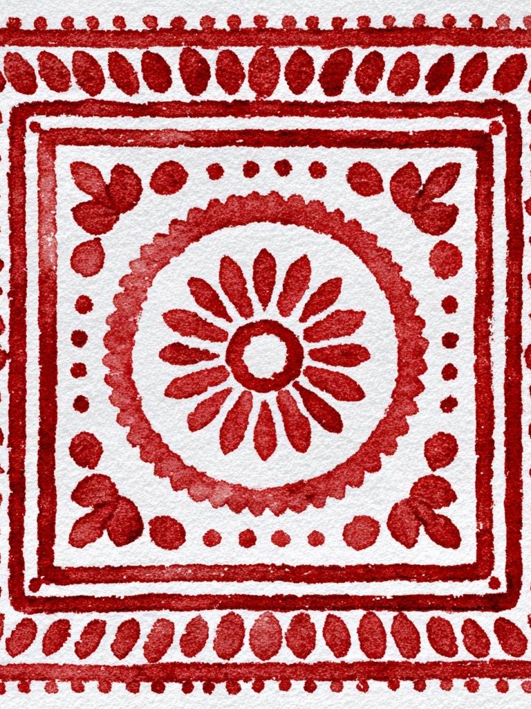
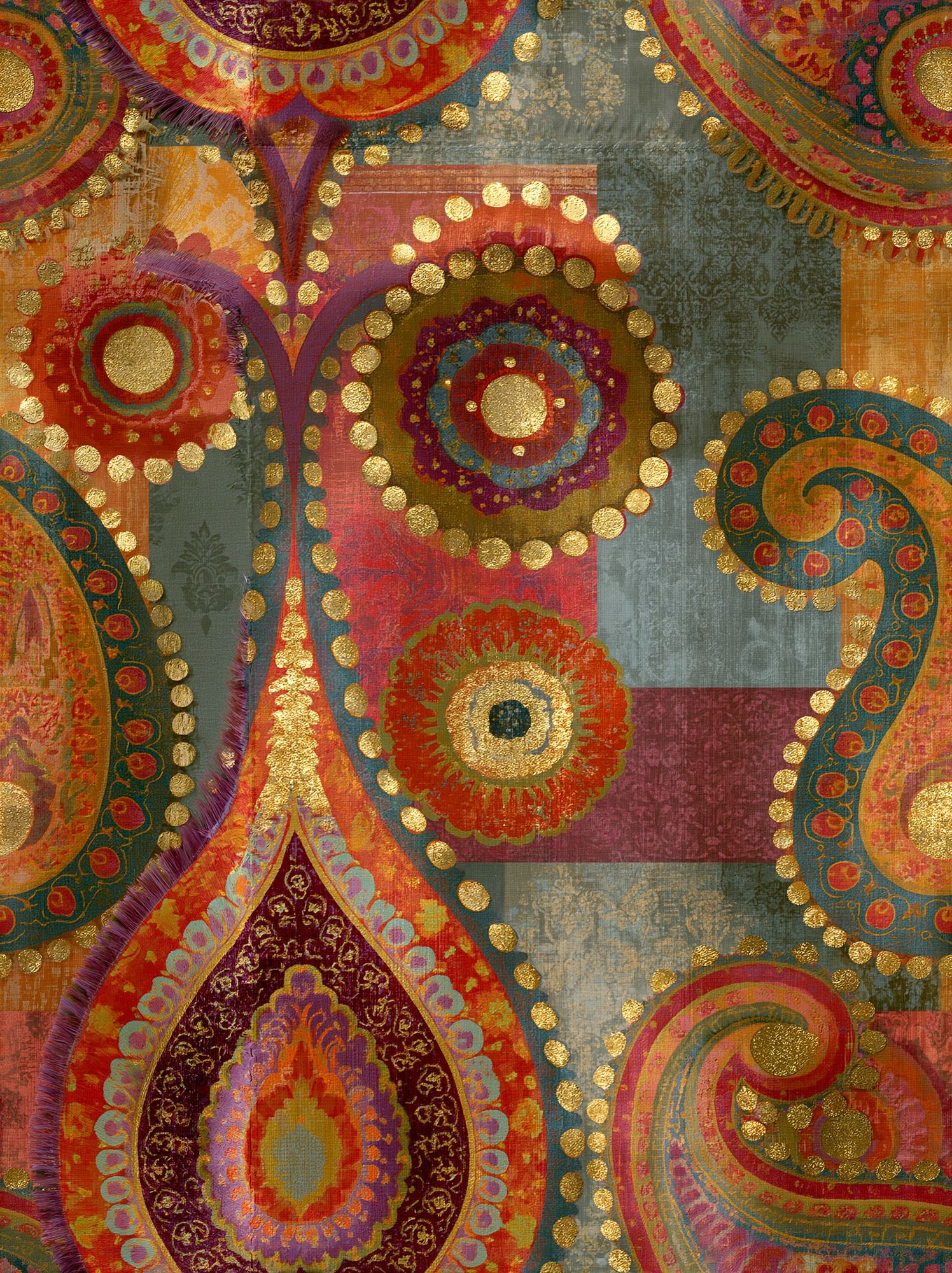
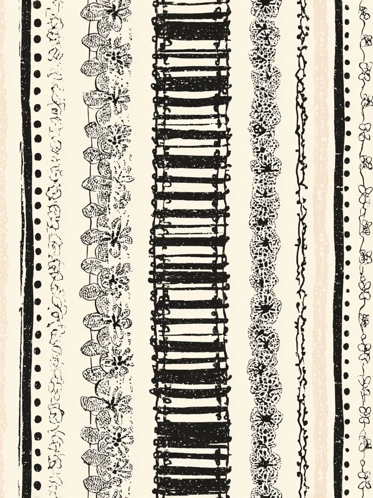
For a calmer mood, choose prints with two or three dominant tones rather than six or seven. Floral Bouquet — Bohemian Print is ideal for a softer bedroom palette, while Ornate Paisley Mosaic can carry more energy in a living space. If you want to lighten the scheme, blend in a few pieces from our Minimalist collection with off-white backgrounds and subtle line work.

Where a Bohemian Poster Works Best
Bedrooms are often the easiest place to start because the style naturally supports softness. Above a 140 to 180 cm bed, one larger print in 50x70 cm or 70x100 cm creates a focal point without needing a full gallery wall. A pair of vertical 40x50 cm frames also works well if you want a more balanced look. Keep the total arrangement about two-thirds the width of the headboard for proper proportion.
In living rooms, a bohemian poster works best where there is already a tactile anchor — a sofa, console, or armchair with a throw. Above a 200 cm sofa, aim for art spanning roughly 120 to 140 cm wide. That could mean one oversized print, two medium frames, or a cluster of three to five smaller pieces. Hallways benefit from vertical formats because they draw the eye upward and make narrow walls feel intentional rather than leftover.
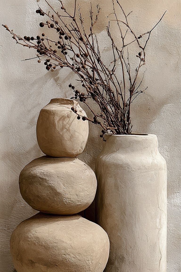
Reading corners and quiet entry spaces are good places for more character-led images. Ceramic Vases with Dried Branches fits beautifully near oak shelves, baskets, or a floor lamp with a linen shade because it mirrors objects already used in the room.
How to Pair It With Other Wall Art
Boho walls look best when everything is related, not identical. A simple formula is 70% shared mood and 30% contrast. That means your pieces can vary in subject — florals, portraits, birds, abstract texture — as long as the palette and tone stay connected. Mix one patterned design with one quieter image and one textural piece rather than placing four equally busy works side by side.
Mirrors, woven wall hangings, and small shelves can break up a gallery wall effectively. The trick is to repeat one material at least twice. For example, if you use a rattan mirror, echo that warmth with oak or walnut frames. If you add a brass sconce, keep metallic finishes subtle and aged rather than polished. Pieces from the Fine Art collection can bring softness, while selected works from our Abstract prints add shape without making the wall feel rigid.

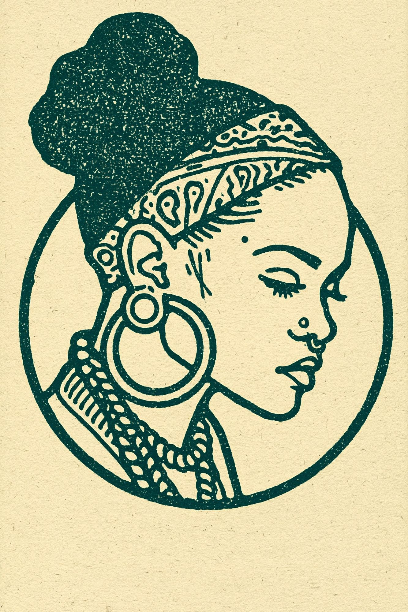
One of the strongest pairings is a figurative print next to a more grounded still-life or texture piece. Bohemian Woman Portrait adds presence, while something quieter nearby keeps the arrangement from becoming theatrical.
If you prefer a lighter, more airy mix, add a botanical silhouette or delicate line-based work from White Flower Silhouette or blend in birds and nature illustrations such as Swallows in Flight. This is especially useful in small apartments where dense color can feel too heavy.
Framing, Sizes, and Layout Ideas
Frame choice changes the feel of a bohemian poster more than most people expect. Oak, walnut, and matte black are the safest finishes. Oak feels casual and sun-warmed. Walnut makes earth tones look deeper and more collected. Matte black adds definition, but use it sparingly — one black frame in every three or four is usually enough in a boho arrangement.
For sizing, use the wall width as your guide. On walls under 120 cm wide, stick to 30x40 cm or 40x50 cm pieces. For walls around 150 to 220 cm wide, 50x70 cm is the most versatile size. Large walls can handle 70x100 cm, especially if furniture beneath the art is low-profile. Keep 5 to 8 cm between small frames and 8 to 12 cm between larger ones so the grouping reads as one composition.
A solo statement piece works best when the design has enough visual texture to hold the space on its own. Pairs are ideal over beds, sideboards, and desks because they create symmetry without looking formal. Larger gallery walls suit transitional areas like hallways or living rooms where you want a layered, collected effect over time.

Styling Tips for a Warm, Layered Finish
Once the wall is in place, support it with materials that repeat the same visual language. Linen curtains, boucle or woven cushions, jute rugs, ceramic vessels, and aged wood all reinforce the artwork. You do not need every boho element at once. Two or three repeated textures are enough to make the room feel coherent.
Plants help, but shape matters. Use looser silhouettes — olive branches, eucalyptus, trailing pothos, or dried stems — rather than highly sculptural plants that lean modern. Lighting should be warm, ideally around 2700K, which flatters clay, rust, and sand tones far better than cooler bulbs. If your bohemian poster includes richer reds or ochres, place it where side light from a window or lamp can pick up those tones in the evening.
Keep surfaces edited. Boho rooms feel layered, not crowded. A useful rule is to leave about 30% of shelves and tabletop space empty so framed art and objects can breathe. If the wall is already detailed, choose simpler accessories beneath it — one ceramic vase, one stack of books, one woven basket.
Final Touches: Choosing a Bohemian Poster That Lasts
The most lasting boho interiors are built around pieces that can move with you from room to room. Choose a bohemian poster with a palette that works across at least two settings — for example, rust and cream for both bedroom and living room, or olive and sand for hallway and home office. Timeless subjects such as florals, ceramics, portraiture, and woven-inspired patterns age better than trend-led graphics.
Quality matters because soft, earthy art relies on nuance. Fine detail in faded reds, warm neutrals, and textured surfaces is what keeps the piece from looking flat at close range. Start with one strong anchor piece, then build slowly with complementary works from Ceramic Pots — Bohemian Print or soft vintage-style designs like Ethereal Woman with Pot. The goal is not to perfect the room in a day — it is to create a wall that still feels right after the furniture, textiles, and seasons change.
Frequently Asked Questions
What frame color works best for boho wall art?
Oak is the easiest choice because it adds warmth without feeling heavy. Walnut is better if your room has pale walls and needs more contrast.
Can I mix a bohemian poster with black-and-white art?
Yes, but keep black-and-white pieces to a minority of the arrangement. One monochrome print for every three warmer pieces usually keeps the wall balanced.
What size should I choose for a narrow hallway?
Vertical 30x40 cm or 40x50 cm prints are usually the safest fit. Hang the center of the frame around 145 cm from the floor for comfortable viewing.
Do boho prints work with modern furniture?
They do if you repeat warmth elsewhere through wood, textiles, or ceramics. A clean sofa with one woven throw and earthy wall art often looks more refined than a fully themed room.
How do I stop a boho gallery wall from looking messy?
Limit the palette to three to five core tones and repeat at least one frame finish throughout. Lay the arrangement on the floor first and keep spacing consistent before hanging.