Why Fine Art Works So Well in a Bedroom
Fine art for the bedroom does more than fill an empty wall. It sets the emotional temperature of the room. Compared with purely decorative pieces, fine art tends to carry more depth in composition, brushwork, and subject matter, which makes the space feel considered rather than staged. In a room built for rest, that extra sense of intention matters.
Bedrooms also benefit from art that invites a slower look. Gentle landscapes, softened abstracts, and impressionist scenes all give the eye somewhere to settle without demanding constant attention. If you want a room that feels softer and more personal, start with our Fine Art collection and narrow the selection to subjects you would genuinely want to wake up with every day.
A strong bedroom scheme usually relies on fewer, better pieces. One carefully chosen print in a 50x70 cm or 70x100 cm format often has more presence than several small decorative frames with no visual connection. That is why fine art for the bedroom works best when it supports the architecture of the room instead of competing with it.

"Window with Sheer Curtain" is a good example of bedroom-appropriate fine art because the subject already speaks the language of the space: light, quiet, softness, fabric, and stillness. If your room has neutral bedding, pale walls, or natural oak furniture, a piece like this creates continuity rather than contrast.
Choosing a Mood: Soft, Romantic, Minimal, or Modern
The subject of the artwork should match the feeling you want from the room. For a soft bedroom, look for diffused landscapes, floral compositions, and painterly scenes with low contrast. For a romantic bedroom, figurative works and floral imagery feel intimate without becoming overly sweet. For a more minimal room, abstract shapes with restrained colour and open space tend to work best.
If your interior leans classic, impressionist-inspired pieces from Woman with a Parasol or Water Lilies can bring movement and elegance without making the room feel formal. If your space is simpler and more architectural, browse our abstract art prints or our Minimalist collection for cleaner compositions that keep the mood airy.
Romantic does not need to mean pink or ornate. A single floral or figurative print in muted tones can create warmth more effectively than a heavily themed room. Likewise, modern bedrooms often benefit from one textured abstract rather than a glossy, high-contrast statement piece.





Finding the Right Colours for Restful Walls
Colour affects how active the room feels. In bedrooms, the most successful art palettes usually sit in the 20 to 40 percent saturation range: dusty blue, sage, warm grey, faded terracotta, cream, taupe, and blush. These shades hold attention gently. They do not flatten the room, but they also do not spike visual energy.
If your walls are white or light greige, choose art with at least one shared tone from your textiles — for example, oatmeal linen, soft charcoal, muted olive, or pale sand. Repeating one colour across bedding, curtains, and artwork creates visual rhythm. A room feels calmer when the colours echo each other in two or three places.
For cooler bedrooms, nature scenes from our Nature collection work especially well because greens, misty blues, and weathered neutrals naturally read as restorative. A piece such as Serene Landscape can soften a crisp room with just enough colour variation to stop it feeling flat.

Blush, cream, and dusty rose are useful if you want warmth without heaviness. "Blush Watercolor Abstract" fits bedrooms with beige, walnut, light oak, or ivory schemes because it adds colour in a very low-pressure way. In contrast, very bright primaries and sharp black-white graphics can feel too alerting above a bed unless the whole room is designed around that tension.
How to Size and Place Art Above the Bed
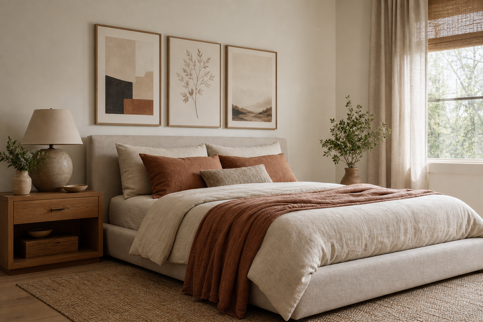
The easiest rule is width. Art above the bed should span around 60 to 75 percent of the headboard width. If your bed is 160 cm wide, your wall art arrangement should usually land somewhere between 96 and 120 cm wide. That could be one 100x70 cm piece, two 50x70 cm frames side by side, or a small gallery of three to five balanced works.
Hang the artwork so the bottom edge sits roughly 15 to 25 cm above the headboard. Any higher, and the art feels disconnected from the bed. Any lower, and it starts to look cramped. If you have low ceilings, keep the gap closer to 15 cm to anchor the composition.
One large piece works best in small or visually busy rooms because it reduces fragmentation. A pair works well when you want symmetry — especially in bedrooms with matching nightstands and lamps. If the room is long and minimal, a horizontal layout can make the wall feel more generous.

A peaceful choice for above-bed placement is Zen Garden Stones, especially in a larger format. The composition is stable and grounded, which helps a bed wall feel settled rather than restless.

Framing Choices That Make the Artwork Feel Finished
Frames should support the art and the room at the same time. In bedrooms, matte finishes are usually better than high-gloss because they reduce reflections from lamps and windows. Oak frames warm up cool palettes. Black frames sharpen pale or abstract works. White frames blend into light walls and keep the look quiet.
Matting is useful when the artwork has delicate detail or softer edges. A white mat of 5 to 8 cm gives the image breathing room and makes even a modest 30x40 cm print feel more substantial. If your walls are already textured or your room has patterned bedding, a matted frame can create the visual pause the artwork needs.
Bedrooms with linen, boucle, wood, and plaster finishes tend to suit tactile pieces from Textured Waves or Ceramic Vases with Dried Branches. The common thread is material softness — nothing too shiny, harsh, or high-contrast.

Creating a Bedroom Gallery Wall Without Visual Noise
A bedroom gallery wall needs tighter editing than a hallway or living room. Limit the palette to two or three dominant colours, and keep frame finishes consistent. Four to six pieces is usually enough for a calm arrangement above a dresser or along a side wall. More than that can start to feel busy unless the artworks are very restrained.
The simplest way to build cohesion is to mix subjects, not styles. For example, combine one floral, one landscape, one abstract, and one minimal still-life — but keep them all in muted tones. This gives the wall personality without turning it into a collage of competing moods.
If you want a softer bohemian layer, our Bohemian collection introduces organic forms and earthy colours that pair naturally with fine art. If you want a more serene, gallery-like result, stay close to classic fine art prints and nature scenes with similar tonal values.

Before hanging, lay the arrangement on the floor and leave 5 to 8 cm between frames. That spacing is close enough to read as a group, but open enough to keep each piece visible. Start from the center artwork and build outward.
Final Tips for Styling Fine Art in a Bedroom
Choose art that can live with you for years, not just art that matches this season's duvet cover. The best bedroom pieces have a little emotional pull — a landscape that reminds you of travel, a floral that softens the room, or an abstract that gives the wall depth without noise. That is what makes fine art for the bedroom feel personal rather than purely decorative.
Keep the full setup simple: one palette, one frame finish, one clear mood. If you are unsure where to begin, start with a single restful piece from Starry Night or browse Vincent van Gogh's Bedroom for art that already has a natural relationship to interior space. Once the first piece feels right, the rest of the room becomes much easier to build around.
Final thoughts
The most successful bedroom walls are not the loudest ones. They are the ones that support rest, reflect your taste, and feel visually settled from morning to night. Fine art for the bedroom works best when scale, colour, and framing all pull in the same direction.
Start with the mood you want, then choose one or two pieces that reinforce it clearly. A bedroom does not need many artworks — just the right ones, placed with intention.
Frequently Asked Questions
What frame colour is safest for a bedroom if I change decor often?
Natural oak is the most flexible choice. It works with white, beige, grey, sage, blush, and darker wood furniture without looking dated.
Can I hang art above the bed without a headboard?
Yes. Use the same width rule, but hang the artwork slightly lower so it still feels connected to the bed area — usually with the center around 145 cm from the floor.
Do bedrooms need glass on framed prints?
Glass or acrylic helps protect the print from dust and humidity. Acrylic is lighter and often better for larger bedroom frames above the bed.
What art pairs best with beige bedding and white walls?
Muted abstracts, soft landscapes, and floral fine art in cream, taupe, sage, dusty blue, or blush work especially well. Avoid very stark black-and-white pieces unless the room already has strong contrast.