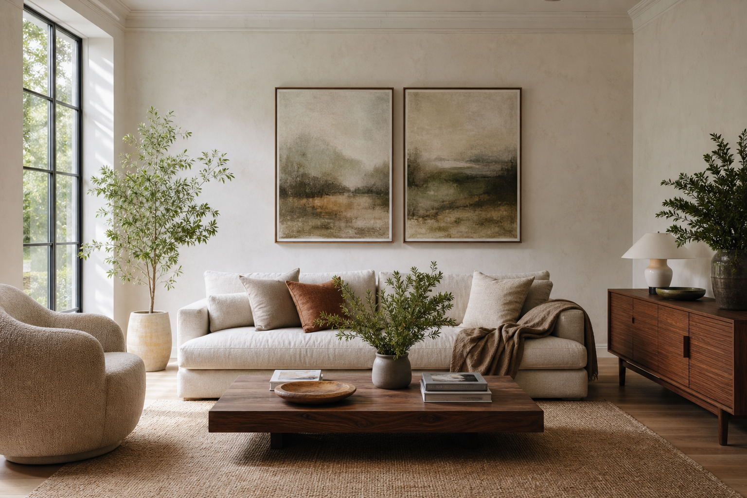
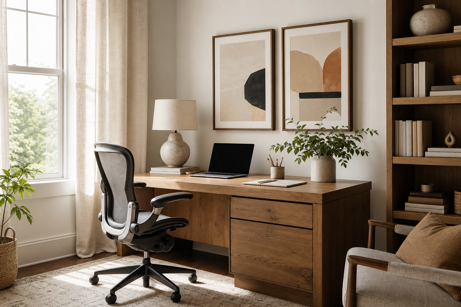
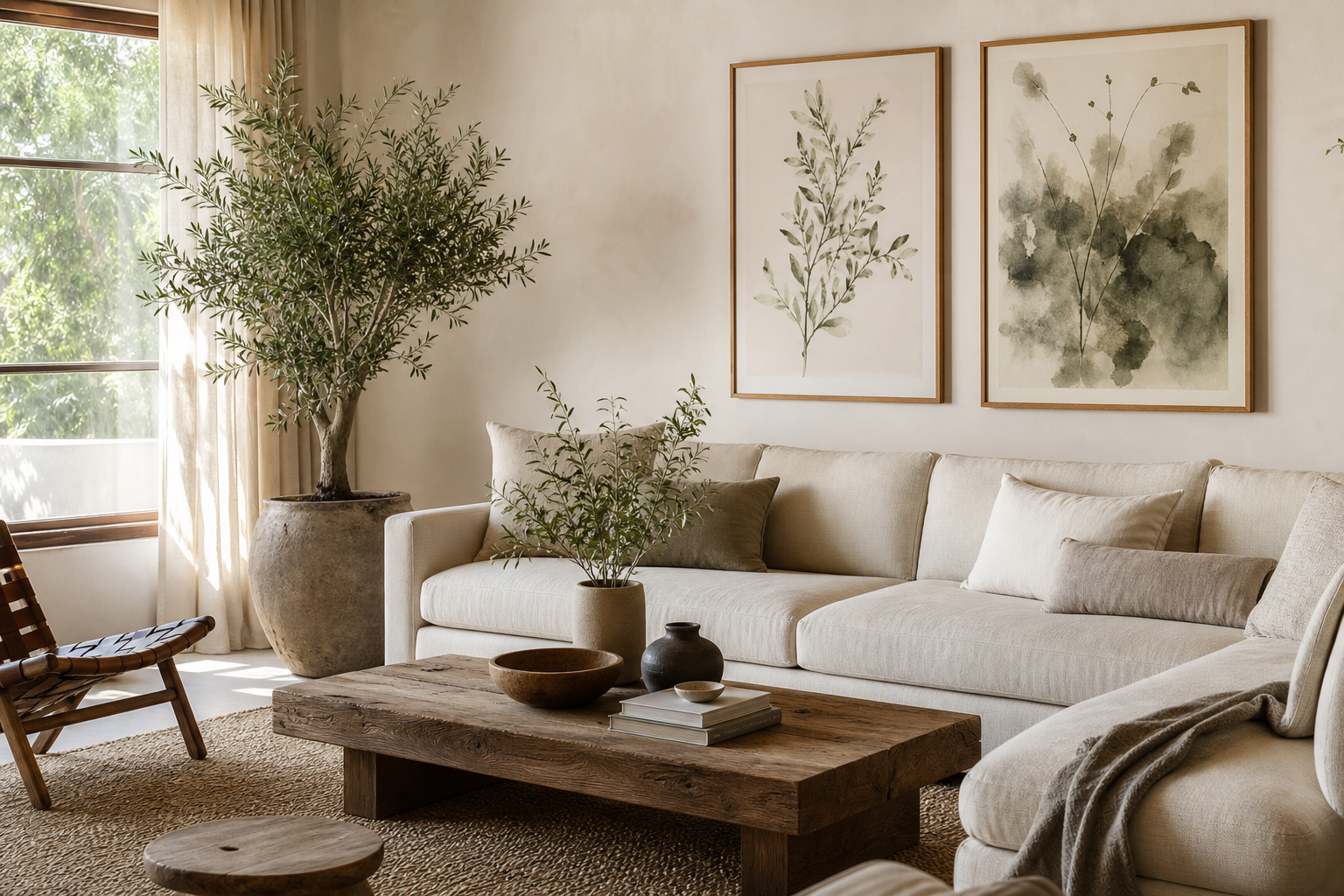
Dreamlike fine art portraits give a room atmosphere without adding visual noise. They soften hard architectural lines, bring emotion into neutral spaces, and create a focal point that feels collected rather than loud. If your home leans toward plaster whites, washed woods, stone, linen, or smoky paint tones, dreamlike fine art portraits often work better than graphic art because they add depth through light, texture, and expression instead of contrast alone.
What Makes a Portrait Feel Dreamlike
A portrait feels dreamlike when the image suggests more than it explains. Soft focus, blurred movement, side lighting, cropped composition, and negative space all create that effect. You will often see hazy edges, downturned eyes, windblown hair, veils, florals, or silhouettes that pull the image away from strict realism and toward mood.
In practical terms, the most successful dreamlike fine art portraits usually share one of three visual structures: a centered face with diffused light, a profile or turned-away pose with lots of empty background, or a figure partially obscured by fabric, shadow, or motion. That restraint matters. When fewer details compete for attention, the portrait reads as calm and atmospheric from 2 to 4 meters away.
If you want that softer gallery look, start with pieces from our Fine Art collection or dreamy portrait photography in our Photography collection. Painterly works bring a romantic, timeless quality, while photographic portraits tend to feel more contemporary and cinematic.

A strong example is Dreamlike Portrait Photography. The image has the right kind of quiet tension — enough presence to anchor a wall, but enough softness to sit comfortably in a bedroom, reading corner, or dining nook.
Choosing Portraits for the Mood of Your Room
The room should decide the intensity of the portrait. In bedrooms, choose low-contrast imagery with pale backgrounds, closed eyes, or gentle profiles. These details lower visual energy and help the wall feel restful, especially above a 140 to 180 cm bed where the artwork sits in constant view. A romantic piece like Woman in Yellow Flowers suits spaces with textured bedding, brushed brass, and soft cream walls.

For living rooms, you can go slightly moodier. A portrait with deeper shadows or stronger silhouette holds up better above a 200 to 240 cm sofa, where the artwork needs more visual weight. Try pairing a moody portrait with walnut, black accents, and a wool rug so the space feels layered rather than delicate. Dreamlike Profile Photography works especially well in rooms that need a single elegant focal point.
For more eclectic interiors, a portrait can bridge styles. If your room mixes vintage furniture with clean contemporary lines, combine expressive figurative work from our Fashion collection with softer fine-art pieces. A stylized portrait such as Bohemian Woman Portrait can also warm up minimal spaces that feel too stark.

Color Palettes That Keep the Look Elegant
Color determines whether dreamlike fine art portraits feel serene or theatrical. The easiest route is a palette built around three tones: one dominant neutral, one mid-tone accent, and one shadow color. For example, ivory, dusty rose, and charcoal create softness with enough contrast to stop the room from feeling flat.
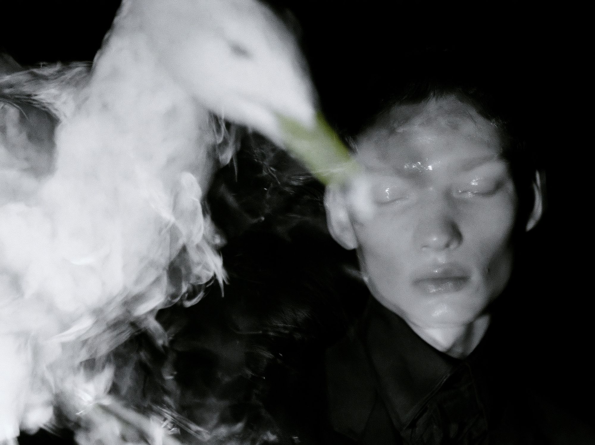
Muted neutrals are the safest choice for long-term styling. Sand, taupe, greige, stone, faded brown, and soft black sit well with oak, travertine, boucle, and linen. In these schemes, black-and-white portrait art can be especially refined because it brings shape without introducing another color family. Dreamlike Portrait Black-White is ideal if the room already has strong materials and you want the wall art to feel clean and composed.
Dusky pastels are better when you want warmth. Faded blush, sage, lavender-grey, or washed ochre complement portraits with florals, sunset light, or painterly backgrounds. If you prefer a romantic look, build from art outward: choose one portrait first, then repeat two of its colors in a cushion, throw, rug, or curtain trim. Repetition at 2 or 3 points around the room makes the composition feel intentional.

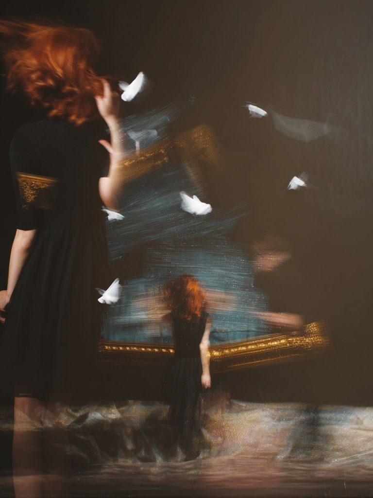

Monochrome rooms benefit from one soft interruption. A pale portrait with a blush undertone or warm sepia cast prevents a grey or beige space from looking one-note. If your decor already includes earthy ceramics or dried stems, you can also borrow from our Bohemian collection to add a slightly organic note without losing the refined mood.
Sizing and Placement for Maximum Impact
Scale is where many good interiors go wrong. For a portrait above furniture, aim for artwork that spans roughly 60 to 75 percent of the furniture width. Above a 160 cm console, that means a single piece around 100 to 120 cm wide, or a pair totaling a similar span with 5 to 8 cm between frames.
Oversized portraits work best when the image itself is quiet. A large-format soft-focus portrait above a bed or sofa can be dramatic without feeling aggressive because the detail level stays restrained. If the image has stronger contrast or complex background elements, keep the size more moderate — for example 50x70 cm or 70x100 cm — so it does not dominate the room.
Hang the center of the composition at about 145 cm from the floor in walk-through spaces. Above a sofa or headboard, keep the bottom edge 15 to 25 cm above the furniture. That small gap visually connects the art to the room rather than leaving it floating.

If you want a more layered arrangement, use two vertical portraits side by side or one portrait with one quieter companion piece. A pairing such as Dreamlike Silhouette next to a softer landscape or abstract work keeps the wall airy while still giving it structure.
Framing Choices That Enhance the Artwork
Frames should support the softness, not sharpen it. Thin oak, matte black, dark walnut, and soft gold are the most reliable finishes for dreamlike fine art portraits. Oak keeps the look light and Scandinavian; black adds definition in pale rooms; walnut brings warmth and suits older homes; brushed gold works best with painterly or feminine pieces, as long as the finish is muted rather than glossy.
Matting makes a major difference. A white or warm-white mat of 5 to 8 cm gives the image breathing room and instantly lifts the presentation toward a gallery finish. This is especially useful for smaller works like 30x40 cm and 50x70 cm portraits, which can otherwise look visually slight on larger walls.
For romantic or painterly portraiture, a slightly wider mat helps emphasize the artwork's softness and stops the frame from feeling too abrupt. A piece like Woman with a Parasol becomes more elegant with generous negative space around it. If your home is more modern, skip ornate frame profiles and stick to simple edges under 2 cm wide.

How to Build a Gentle Gallery Wall
A gentle gallery wall works best when one element stays consistent. That can be palette, frame finish, subject matter, or print size. For dreamlike fine art portraits, consistency in tone matters more than matching every frame exactly. You can mix photography, painterly figures, and minimal abstract pieces if they share the same low-contrast atmosphere.
A reliable formula is 40 percent portraits, 40 percent abstract or landscape pieces, and 20 percent textural or botanical imagery. On a six-piece wall, that could mean two portraits, two soft abstracts, one floral piece, and one quiet architectural or window scene. This mix avoids making the arrangement feel too literal or too face-heavy.
Use spacing of 6 to 8 cm between frames for a collected, editorial look. Start with the largest portrait slightly off-center, then balance the layout with lighter supporting pieces around it. If you want a poetic companion print, Window with Sheer Curtain pairs beautifully with portraiture because it echoes softness through light and fabric rather than repeating the same subject.

Shop Tips for Creating a Cohesive Collection
When building a set, choose your anchor piece first. It should be the portrait that best captures the feeling you want — quiet, romantic, introspective, or slightly mysterious. Once that piece is fixed, choose supporting works that repeat either the same palette, the same light quality, or the same emotional tone.
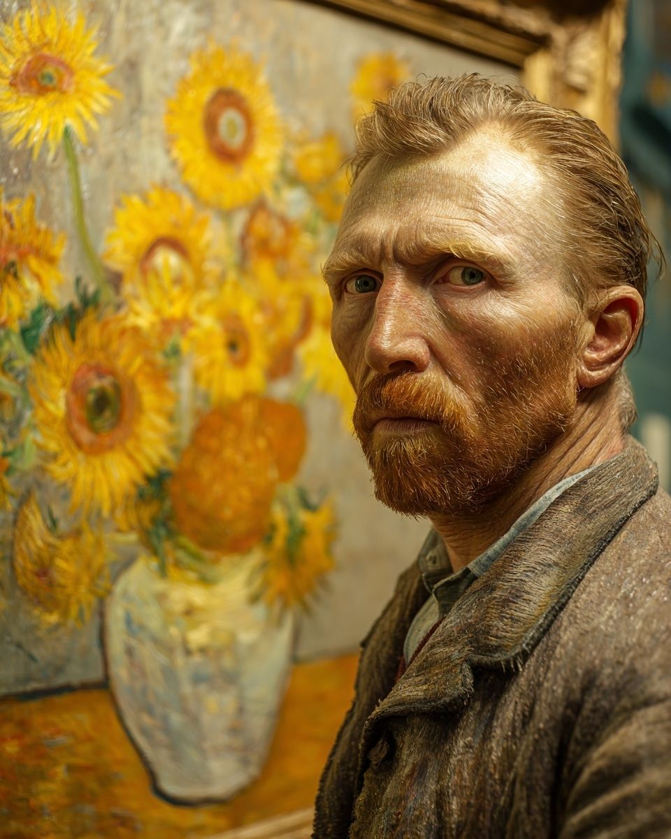
One simple shopping method is the "one strong, two soft, one bridge" formula. Pick one focal portrait, two quieter companion works, and one bridging piece that links them through color or texture. That bridge might come from our Minimalist collection if you need space and balance, or from Vincent van Gogh — Portrait Print if you want a more classic, museum-like note in the mix.
Avoid buying four portraits that all compete for attention. At least half of the collection should feel visually lighter than the anchor. That contrast is what gives dreamlike fine art portraits their effect in a room — they need calm around them to feel atmospheric rather than crowded.
Final thoughts
Dreamlike fine art portraits work because they add emotion in a restrained way. They bring softness, movement, and depth to interiors that might otherwise feel flat, especially when the palette is muted, the frame is simple, and the scale fits the wall.
Choose portraits with intention, repeat their tones elsewhere in the room, and leave enough negative space for them to breathe. Done well, dreamlike fine art portraits make a home feel quieter, more layered, and far more personal.
Frequently Asked Questions
What frame color is safest if I want the artwork to work in different rooms later?
Natural oak is the most flexible. It suits warm neutrals, soft whites, and muted color palettes without making the portrait feel too stark.
Can I mix black-and-white portraits with warm-toned art prints?
Yes — keep one shared element consistent, such as frame finish or mat color. A black-and-white portrait often works as a visual anchor among warmer pieces.
Should portrait art face into the room?
If the subject is in profile, positioning the gaze inward usually feels more balanced. It helps guide the eye back into the space instead of toward the edge of the wall.
What wall color works best behind dreamlike portraits?
Soft white, mushroom, greige, pale taupe, and muted clay are the easiest options. These tones support subtle contrast and keep the artwork looking refined rather than washed out.