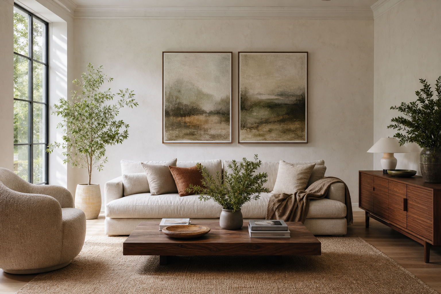
Fine art reproductions are designed to do more than fill wall space. A strong reproduction captures the tonal range, brushwork character, and atmosphere of an original artwork closely enough to feel considered at eye level, not just from across the room. That is what gives a home display a museum-like finish rather than a decorative, mass-produced look.
The quickest way to spot quality is to look at three things: detail, colour, and longevity. A standard print may look flat in darker passages, oversaturated in mid-tones, or slightly blurred around edges. Well-made fine art reproductions hold subtle transitions — pale sky against cream walls, layered greens in a landscape, soft shadow in fabric — without losing sharpness or depth. If you are building a room around art, those differences matter every day.
What Makes a Fine Art Reproduction Feel Authentic?
Authenticity in a reproduction is rarely about imitation alone. It comes from faithful scanning or image restoration, balanced colour management, and a print surface that suits the work. Impressionist scenes, for example, benefit from texture and softness, while photographic architectural works often look best with cleaner edge definition and crisper contrast.
A useful test is viewing distance. If a piece still looks rich from 30 cm away, not just 3 m away, it is doing its job. Fine art works with layered brushwork, such as pieces from our Fine Art collection, should show variation in tone rather than a uniform block of colour. That is especially important in blue-heavy classics like Starry Night, where poor reproduction can make the night sky look muddy instead of luminous.

Subject matter also affects how authentic a print feels in an interior. A piece with historic character or painterly movement often reads more convincingly than generic wall decor because it brings composition, scale, and visual rhythm with it. That is why traditional landscapes, portraits, and still scenes from our Vintage selection and museum-inspired art prints often anchor a room better than trend-driven graphics.
Choosing Museum-Quality Materials
Paper is the first material worth checking. Heavier stocks in the 200 to 300 gsm range usually feel more substantial and resist waviness better than thinner paper. For most fine art reproductions, a matte or lightly textured surface is the strongest choice because it reduces glare and supports a softer, more gallery-like finish. Highly glossy paper can flatten delicate brushwork and create reflections that compete with the artwork.
Inks matter just as much. Archival pigment inks are preferred for colour stability and nuanced tonal control. They typically produce deeper blacks, smoother gradients, and better fade resistance than low-cost dye-based alternatives. If a reproduction will hang in a bright room, that added resistance is practical — especially near south-facing windows, where UV exposure is strongest over time.
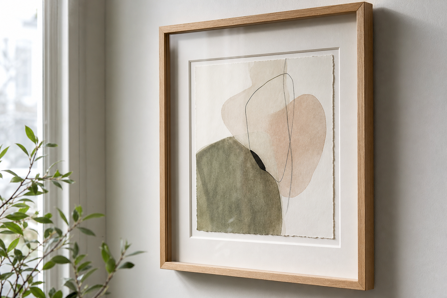
The finish should suit the artwork, not follow a rule. Soft landscapes such as Water Lilies or Window with Sheer Curtain work beautifully on matte stock because the muted finish echoes their gentle atmosphere. For cleaner lines and stronger structure, pieces from our Architecture collection can take a slightly sharper print surface without losing refinement.




How to Frame Fine Art Reproductions
Framing does half the work of making art feel elevated. The most reliable formula is simple: give the piece breathing room. A mount between 5 and 8 cm wide instantly adds visual calm to smaller works, while larger reproductions — around 50 x 70 cm or 70 x 100 cm — can handle broader matting or a deeper frame profile.
Wood tone changes the character of the artwork. Light oak feels relaxed and Scandinavian, black feels graphic and gallery-like, and walnut adds warmth and historical weight. If the art contains soft creams, greens, and blues, a natural oak frame keeps the look airy. If the piece has dramatic contrast or darker architecture, a black frame can sharpen it effectively. You can see this approach work well across both our Minimalist art prints and more painterly pieces from the fine art category.
Glazing is often overlooked. Standard glass is common, but anti-glare acrylic or museum-style glazing makes a visible difference in bright rooms and hallways. It cuts reflections, reduces visual noise, and lets the image sit forward. Oversized framing also helps a reproduction feel intentional — one 70 x 100 cm piece above a console often looks stronger than three small frames spread too far apart.

Styling Reproductions in Real Homes
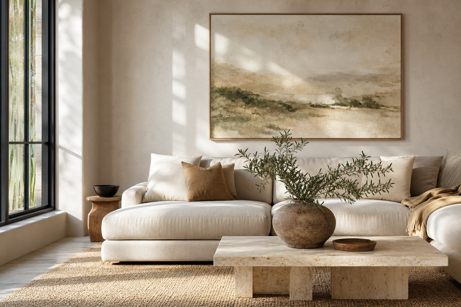
In a living room, hang the centre of the artwork roughly 145 cm from the floor, or keep it 15 to 25 cm above a sofa back for a connected look. Large-format fine art reproductions work especially well in rooms with low visual clutter because they create a focal point without needing extra accessories. A painterly scene above a linen sofa, paired with one ceramic lamp and a low stack of books, often feels more polished than a crowded gallery wall.
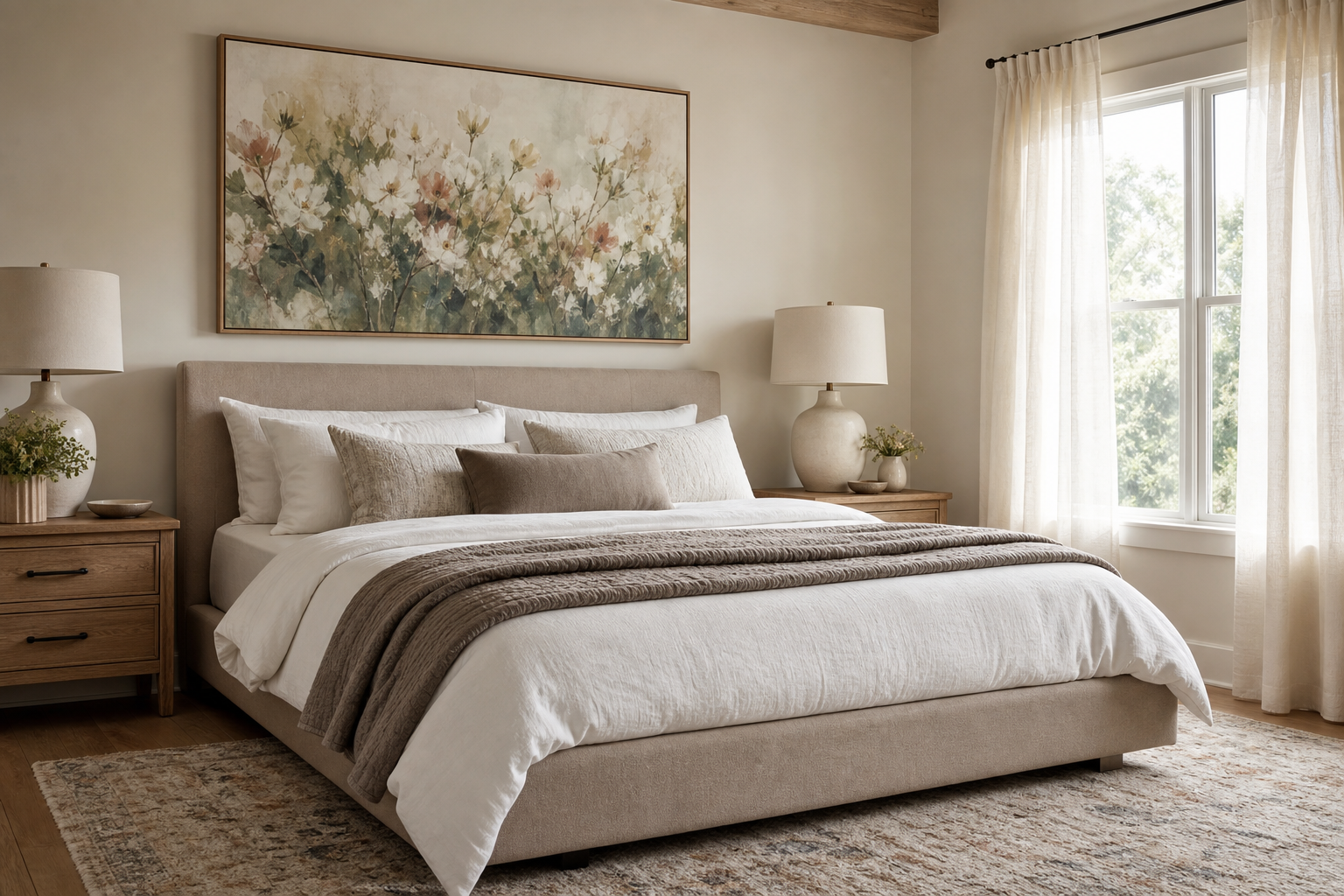
Bedrooms benefit from quieter subject matter and softer palettes. Place art above the headboard only if the width is around 60 to 75 percent of the bed width — for a queen bed, that is usually a framed piece around 90 to 120 cm wide. Hazy florals, water scenes, or gentle interiors from our Nature collection and fine art reproductions in classic styles feel restful without becoming bland.
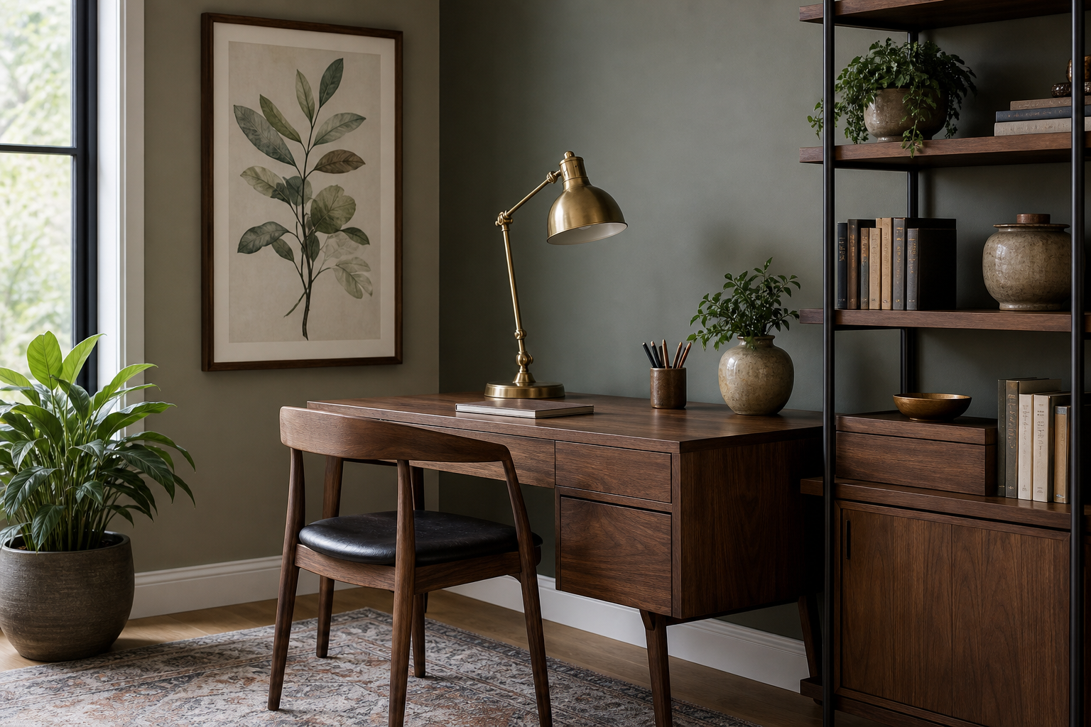
Hallways and home offices can handle more structure. Architectural prints, studies, and portraiture bring focus to narrower walls. In a home office, a vertical piece around 50 x 70 cm beside a desk adds presence without overwhelming the space. If you prefer a more scholarly tone, Study Museum Fine Arts, Boston is a strong example of art that suits reading corners, desks, and library-style shelving.

Matching Artwork to Mood and Palette
If the room is meant to feel calm, choose compositions with open space, low contrast, and colours that stay within two or three main tones. Misty landscapes, watery blues, pale sage greens, and softened creams all help. Pieces like Woman with a Parasol or landscape works from the Nature category support that quieter effect.
If you want drama, increase contrast before you increase colour. A dark frame, a stronger subject, or a piece with deep navy, charcoal, or rust will shift the mood faster than adding five accent items around the room. That is where classic portraiture, bold architecture, or selected pieces from our Abstract collection can be useful — especially in dining rooms, entryways, and offices.
Contemporary interiors often look best with one traditional element and one clean element. That might mean an impressionist reproduction in a slim black frame, or a vintage portrait paired with minimal furniture. The tension between old and modern is what keeps the room from feeling staged.
Where to Start When Building Your Collection
Start with one piece you would still want in five years. Size matters more than most first-time buyers expect, so choose the largest scale your wall can comfortably hold. In many homes, 50 x 70 cm is the safest starting point, while 70 x 100 cm gives a stronger gallery feel in living rooms, hallways, and dining areas.
Then build around theme or tone, not strict matching. You do not need four paintings from the same era. You need a visual thread: similar lightness, related colours, or a shared sense of calm or drama. A floral figure, a landscape, an interior study, and a city scene can still work together if they share muted colour and framing consistency.
A strong first group can mix one hero piece with supporting works. For example, you might begin with Starry Night as the focal point, then add softer companions from our Fine Art range or a contrasting but compatible piece from the Architecture collection. Keep the frames aligned in material or colour, and vary only the image content. That creates cohesion without making the wall feel formulaic.
Final thoughts
Fine art reproductions feel special when every part of the equation is considered: accurate image quality, archival materials, generous framing, and placement that suits the room. The result is not just decorative wall art — it is a piece that adds depth, culture, and structure to your home.
If you are choosing your first work, begin with scale, then mood, then finish. One well-framed reproduction in the right place will usually do more for a room than several smaller pieces chosen too quickly.