A strong desktop wallpaper galaxy does more than decorate a screen. It adds visual depth, softens the hard edges of a digital workspace, and gives even a compact desk setup a broader, more atmospheric feel. The best versions work like good wall art: they create a focal point, control contrast, and make the entire environment feel more intentional.
That cosmic mood also translates well beyond the monitor. If you want your desktop to connect with the room around it, look at pieces from our Space collection or mix in graphic pieces from our Abstract collection for a cleaner, more modern look.
Why a Galaxy Wallpaper Works So Well on Desktop
Galaxy imagery naturally creates depth because it layers dark negative space with points of light, haze, and color gradients. On a 24-inch to 32-inch monitor, that sense of distance helps the screen feel less flat than a plain color background. Even a subtle starfield can make icons look more anchored, because the eye reads the background as receding space rather than a solid block.
A desktop wallpaper galaxy also performs well under different lighting conditions. In bright daytime light, darker space scenes reduce glare better than white or pale wallpapers. At night, indigo, charcoal, and muted violet backgrounds feel easier on the eyes than high-brightness imagery with large white areas. That matters if you spend 6 to 10 hours a day at your desk.
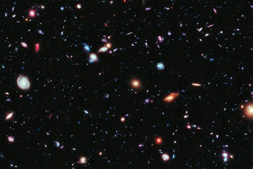
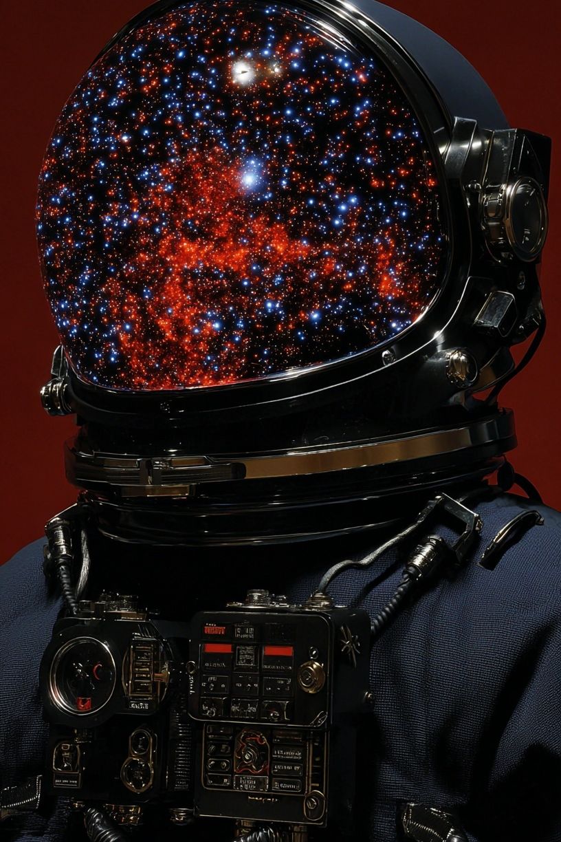
If you like a screen background that feels immersive without becoming busy, choose imagery with one clear focal zone and at least 40% open space around it. A drifting planet, a distant nebula, or a soft band of stars can hold attention without interfering with folders, menus, or dock elements. That same balance is what makes Astronaut Helmet with Cosmic Reflection and other space-inspired works feel polished on the wall as well as on screen.
Choosing the Right Galaxy Look for Your Screen
Not every galaxy wallpaper gives the same result. A colorful nebula works well if you want drama and movement. These usually feature magenta, electric blue, or orange clouds against black space, and they suit creative workspaces where you want energy on screen. The tradeoff is that saturated areas can make white desktop icons harder to read unless you keep those icons grouped in darker corners.
Dark starfields are the most versatile option. They are calm, high-contrast, and easy to live with long term. A near-black field with small white stars and one soft glow near the edge often looks cleaner than a highly detailed cosmic collage. If your apps, files, and menu bars are already visually dense, this is usually the best choice.
Minimal space scenes sit between decorative and practical. Think one moon, one orbit line, or a sparse horizon against deep navy. These pair especially well with Minimalist art prints and simple desk setups in black, walnut, or white finishes.

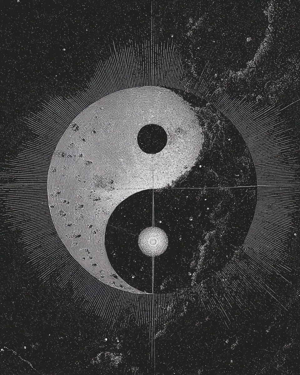
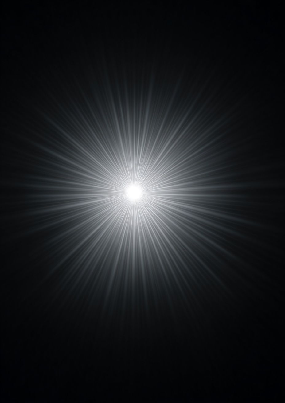
Abstract cosmic designs are useful when you want the feeling of space without literal planets or spacecraft. Radial light bursts, orbital shapes, and gradient fields can suggest a galaxy while staying more refined. If that direction fits your room, browse our Radiant Light Burst print or Yin Yang Cosmic Art for a more stylized cosmic mood.

Color Palettes That Keep Your Desktop Beautiful
Blue and black is the safest palette for daily use. Deep navy backgrounds with pale stars keep contrast strong while staying low-noise. They also work well with both white and light gray icons. If your operating system uses a dark mode interface, this palette usually looks the most seamless.
Purple adds mood, but it needs control. A wallpaper with 10% to 20% violet haze can feel rich and atmospheric. A wallpaper that is 70% bright purple tends to dominate the screen and compete with open windows. For a better balance, choose gradients that fade from black into blue-violet rather than wallpapers saturated from edge to edge.
Soft gradients are often better than harsh highlights. A bright white galaxy core may look striking in a preview, but on a real desktop it can wash out folder names and create a hotspot that draws the eye every few seconds. Look for feathered transitions instead of sharp glare. That is also why serene sky-based pieces like Aesthetic sky desktop wallpaper, dark feel easier to live with than overly contrast-heavy designs.

If you want a gentler cosmic look, blend galaxy visuals with natural night imagery. Pieces from our Nature collection and celestial works like Starry Night Tree can bring in the same nighttime calm with slightly more organic texture.
Matching Your Wallpaper to Your Workflow
Your workflow should decide how detailed the wallpaper can be. If you keep fewer than 10 desktop icons and work mostly in full-screen apps, a richer galaxy scene is fine. If you use the desktop as active storage with 20 to 50 visible files, choose a darker and simpler background with minimal bright clusters behind text labels.
Light versus dark theme matters. Dark wallpapers pair best with dark mode because the transition between wallpaper, taskbar, and app chrome feels smoother. If you use light mode for spreadsheets, writing, or browser-heavy tasks, you can still keep a galaxy wallpaper — just choose one with cleaner edges and avoid backgrounds that are so dark they make the white app windows feel disconnected.
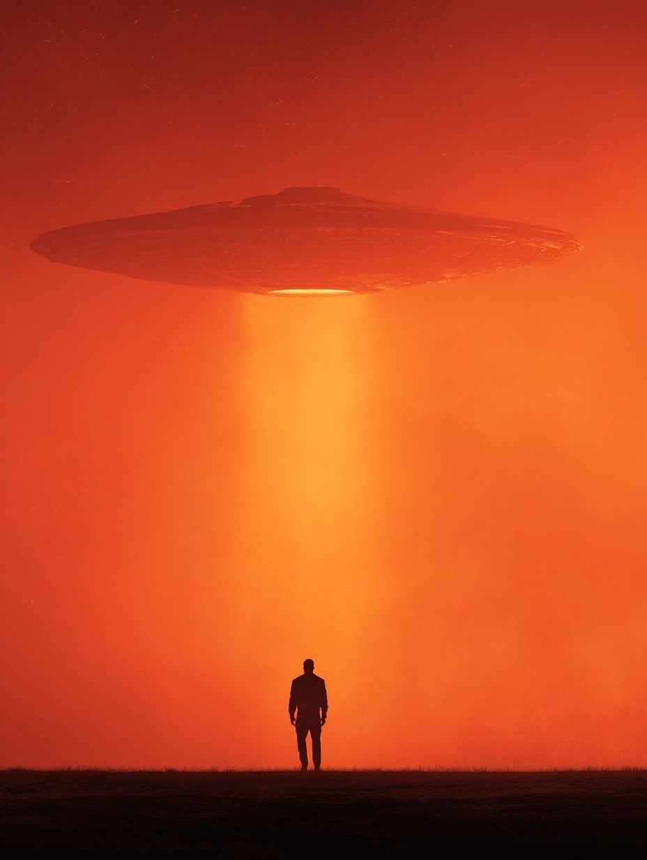
Multi-monitor setups need extra thought. On dual 27-inch monitors, a continuous panoramic wallpaper works only if the main focal point does not land behind the bezel. A safer option is one wallpaper per screen in the same palette: for example, a denser nebula on the main display and a quieter starfield on the secondary display. If you want a visual bridge between screen and room, combine the setup with one statement piece from our Space Shuttle Silhouette print or a graphic night-sky work from the Fine Art collection.

How to Pick the Best Resolution and Crop
Resolution determines whether the wallpaper feels polished or cheap. For a standard 16:9 monitor, use at least 1920 × 1080 pixels. For 27-inch and 32-inch displays, 2560 × 1440 or 3840 × 2160 looks noticeably sharper. On an ultra-wide 21:9 monitor, aim for 3440 × 1440 or higher. Stretching a small image across a larger screen softens stars, blurs detail, and makes gradients band.
Aspect ratio matters as much as pixel count. A beautiful galaxy image can fail if its focal point gets cropped off-center or pushed under desktop icons. Before setting any desktop wallpaper galaxy, preview how the image sits with your taskbar, dock, or menu bar visible. If the brightest area lands exactly where your folders live, choose another crop.
Keep important visual elements within the center 60% of the frame. That leaves room for operating-system overlays and gives you flexibility across laptops, desktop monitors, and external screens. If you like more artful compositions, look at how screen-friendly pieces such as Space desktop wallpaper, HD background or abstract celestial layouts from our Illustration collection manage focal balance without crowding the edges.
Styling Your Desktop Around the Cosmic Mood
A good wallpaper looks better when the rest of the desktop follows the same logic. Start with folder organization. Keep active files in one or two columns, not scattered across the full screen. On a galaxy background, clean alignment matters because the wallpaper already carries visual texture.
Then match accent colors to the image. If your wallpaper uses midnight blue and violet, set folder tags, widget highlights, or cursor accents in one related shade rather than three unrelated ones. Limit your palette to two main tones and one neutral. For example: navy, muted purple, and silver-gray. That is enough to make the desktop feel designed rather than improvised.
You can also echo the same mood in the physical room. One or two framed celestial or abstract pieces near the desk create continuity without turning the space into a theme room. A monitor showing a desktop wallpaper galaxy alongside dark-toned wall art, matte black accessories, and soft indirect lighting usually feels more refined than a desk packed with novelty space decor.

Final Thoughts and Quick Wallpaper Tips
The best galaxy wallpaper is the one that still looks good after a full workweek. Choose depth over clutter, contrast over brightness, and a crop that respects how you actually use your screen. If the background helps icons stay readable and makes the desk feel calmer, it is doing its job.
Refresh your wallpaper every few months instead of every few days. That keeps the desktop feeling intentional rather than distracting. If you want the screen and the room to feel connected, build from one visual language — space, abstract light, or minimal night-sky imagery — and carry it through with a few well-chosen pieces.
Frequently Asked Questions
What file type works best for desktop galaxy wallpapers?
PNG is useful for preserving crisp gradients and small star details, while high-quality JPG files are lighter and load faster. If banding appears in dark areas, try a higher-quality PNG.
Should I use a bright galaxy wallpaper on a work computer?
Only if your desktop stays mostly clear. Bright cores and saturated nebulae can make labels harder to read and pull focus away from tasks.
How often should I change my wallpaper?
Every 8 to 12 weeks is a good rhythm. It keeps the desktop fresh without turning the background into a constant source of novelty.
What wall art pairs well with a galaxy desktop setup?
Minimal celestial prints, dark abstract work, and restrained night landscapes pair best. Stick to one palette family — blue, black, gray, or muted violet — for a cleaner result.
Is a dark wallpaper better for battery life on a laptop?
On OLED displays, darker wallpapers can reduce power use slightly. On standard LCD screens, the difference is minimal, so choose based on readability first.