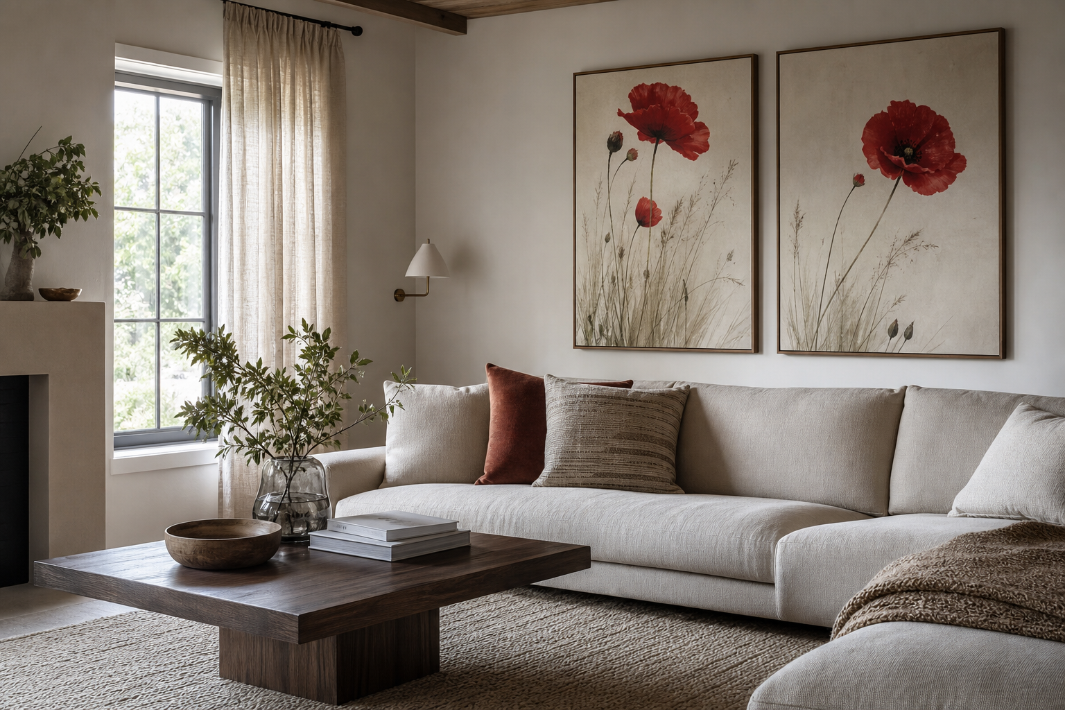
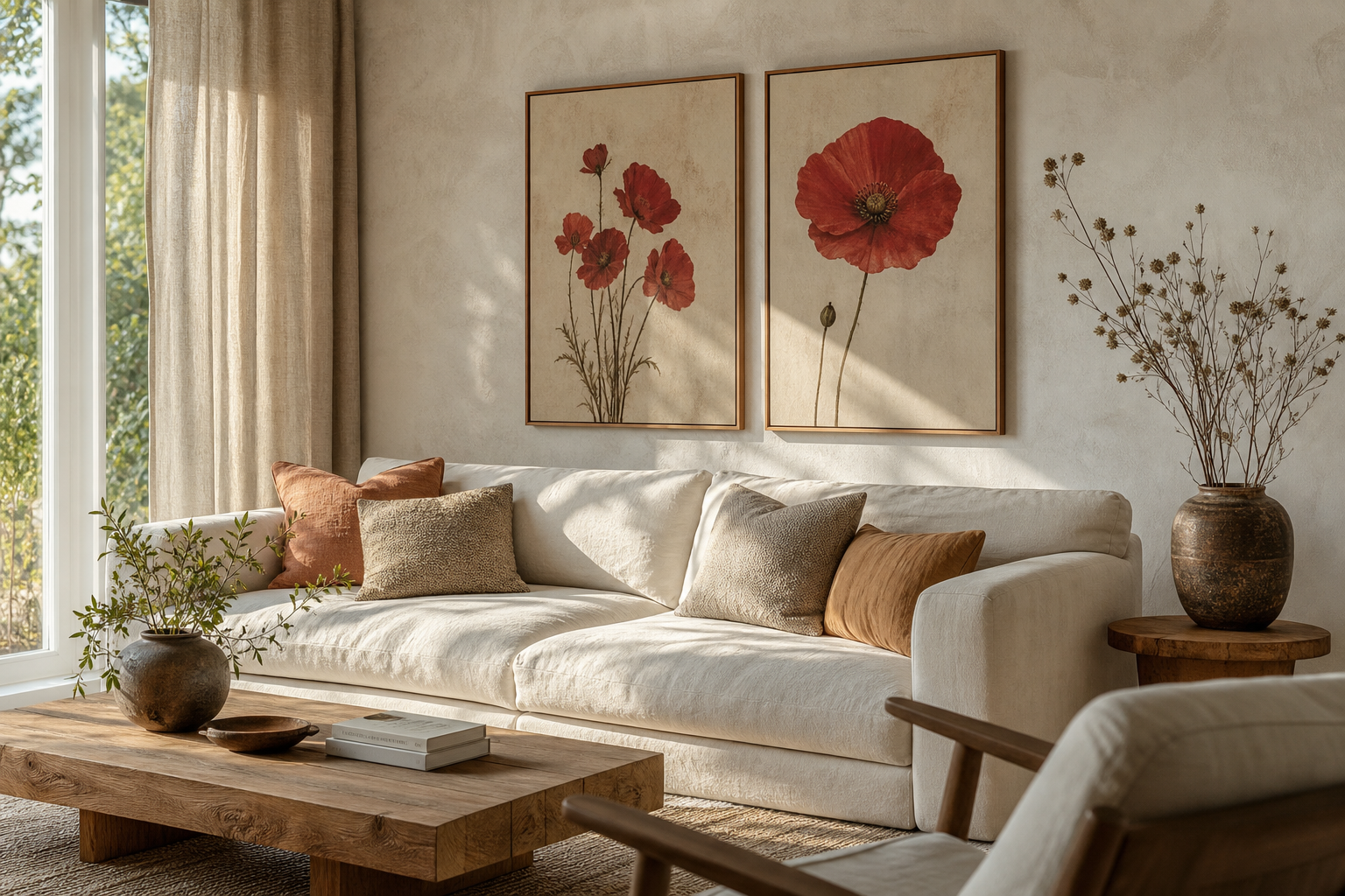
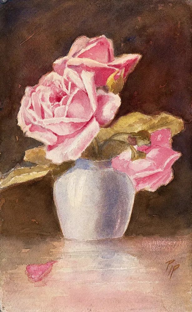
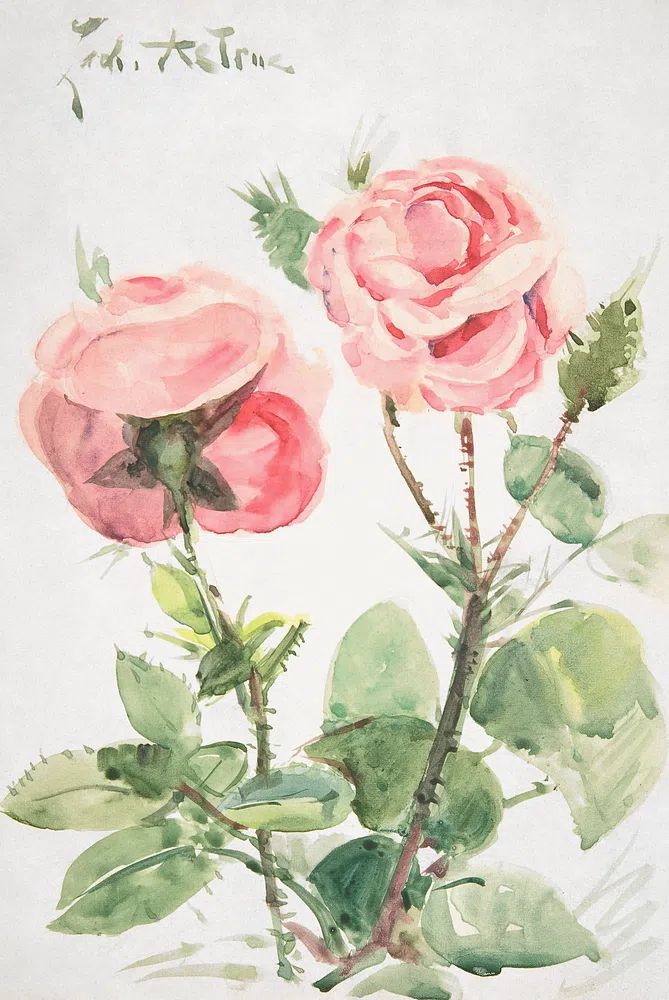
The Botanical collection has plenty of gentle florals, but the crimson roses ll poster print stands apart because it uses a richer register of red than most flower art. Instead of reading sweet or delicate, it creates contrast, depth, and a more deliberate focal point. That makes it useful in rooms that need one strong visual anchor rather than several competing accents.
What Makes Crimson Roses II Stand Out
The appeal of the crimson roses ll poster print starts with color density. Deep crimson sits between classic red and wine tones, so it carries warmth without turning loud. On a white wall, it becomes high contrast. On a taupe, mushroom, or dark olive wall, it feels layered and atmospheric. That flexibility is why rose imagery can move beyond traditional styling and work just as well beside minimalist art prints or more decorative pieces from our Fine Art collection.
Rose subjects also bring a structure that many abstract florals lack. Petals create natural movement, but the bloom itself remains compact and recognizable, which helps a wall feel composed. If you like floral art but want something cleaner than busy botanical patterns, compare it with restrained pieces such as White Flower Silhouette or Vase with Flowers — Minimalist Print. Crimson Roses II gives you a stronger emotional note while still keeping the subject grounded.

If you want the room to feel romantic without becoming overly soft, this is the right kind of floral. It has the emotional pull of rose imagery, yet the deeper tone gives it enough edge for modern interiors. That balance is what makes the crimson roses ll poster print especially effective in homes that mix classic shapes with sharper finishes like black metal, smoked glass, or clean-lined upholstery.
Where to Hang It for the Best Effect
The best placement is where the print can read at a distance of 6 to 10 feet. Above a bed, it works well as a centered focal point in 50x70 cm or 70x100 cm, depending on the width of the headboard. A useful rule is to keep the art width at roughly 60 to 75 percent of the furniture below it. For a 160 cm bed, a 100 cm wide framed piece or a paired arrangement usually looks balanced.
In a living room, this floral works best above a sofa, sideboard, or fireplace where the red can echo smaller accents in the room — a cushion, a rug detail, or a ceramic object. If your sofa is 200 cm wide, aim for art spanning around 120 to 150 cm total. You can keep the crimson roses ll poster print as the hero piece and flank it with quieter companions from our Nature collection or lighter florals from the botanical wall art range.
Hallways are often overlooked, but they are one of the strongest placements for bold florals. A narrower wall benefits from a vertical piece because it draws the eye forward and adds presence without taking floor space. In entryways, hang the center of the frame at around 145 cm from the floor for a natural sightline. If the wall is dim, choose a lighter mat or a pale surrounding wall color so the reds stay visible.

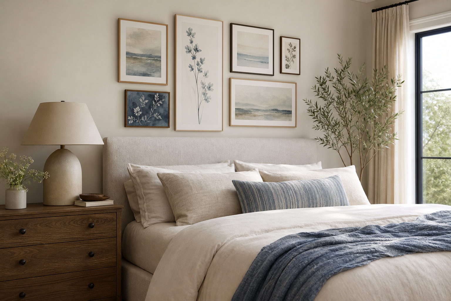
Gallery walls are another strong option, especially if you want a less formal look. Place the rose print slightly off-center and support it with quieter works that do not compete with the red. This is where tonal and subject variation matters more than matching everything exactly.


How to Pair the Print With Your Color Palette
The safest backdrop is a warm neutral. Soft ivory, stone, greige, oatmeal, and light taupe allow crimson to look full rather than harsh. Cool bright white can work too, but it creates a sharper editorial contrast. If you want the room to feel calmer, choose neutrals with at least a hint of beige or clay.
Dark palettes make the print feel dramatic. Charcoal, forest green, ink blue, and chocolate brown all pull out the depth in red roses. This works particularly well in bedrooms and dining areas where lower light is already part of the mood. Add one material with warmth — walnut, aged brass, or cognac leather — so the room does not turn flat.
Blush and dusty pink are effective accent colors because they connect to the floral subject without copying it exactly. Keep them to about 10 to 15 percent of the visible palette — one throw, one vase, or a small textile detail is enough. Too much pink can make the composition feel thematic rather than refined. For a more heritage-inspired look, patterned botanicals like William Morris's vintage pomegranate flowers show how red and muted earthy tones can sit together convincingly.
Warm woods are almost always a good decision with crimson florals. Oak keeps the look fresh and Scandinavian-leaning, while walnut deepens the mood and adds formality. If you like layered floral rooms, also look at classics in our Marigold by William Morris and vintage chrysanthemum flower for companion tones that do not fight with red.
Frame Choices That Change the Mood
A black frame gives the print the crispest outline. It suits modern apartments, darker interiors, and rooms with metal details. If the image itself is richly saturated, a slim black frame of 1.5 to 2 cm usually looks sharper than a heavy profile. The result is graphic and deliberate.

Oak changes the mood completely. It lightens the presentation and makes rose imagery feel more relaxed, more Nordic, and easier to place in everyday interiors. Oak is especially useful if your room already has pale floors, linen curtains, or cream upholstery. It stops the red from feeling too formal.
Walnut is the most luxurious option. It brings out the darker undertones in crimson and works well with moody paint colors, velvet, and vintage-inspired furniture. If you are styling a bedroom or reading corner, walnut often creates the richest result. White frames are the least dramatic choice, but they can work in spaces that already have a very soft palette and need the floral image to blend instead of dominate.

Styling Ideas for Different Interior Styles
In minimalist rooms, keep everything around the print simple. One large floral piece above a bed or console is enough. Use plain textiles, a restrained palette, and one or two sculptural objects. The crimson becomes the focal color, much like a single statement element in a gallery-like space. Pairing it with minimalist wall art elsewhere in the room keeps the overall look clean.
Romantic interiors benefit from softness in texture rather than more floral imagery. Think upholstered headboards, sheer curtains, rounded lamps, and muted pink-beige bedding. If you want to reinforce the mood, small accents from our Love Romantic collection can work in adjacent spaces, but the room stays stronger when the rose print remains the main emotional note.
Vintage spaces can handle more layering. Mix the piece with antique brass, carved wood, patterned textiles, and older botanical references. A good companion direction is the decorative richness found in Honeysuckle by William Morris or Chrysanthemum by William Morris. These pairings create continuity through floral subject matter while varying scale and detail.
Maximalist rooms should focus on color rhythm, not clutter. Repeat the crimson tone two or three times across the space — for example in art, a cushion, and a rug border — then counter it with darker greens, browns, or dusty neutrals. That makes the wall art feel intentional instead of buried.

Shop the Look: Tips for Choosing Size and Placement
For small walls — between 60 and 90 cm wide — choose a print size around 30x40 cm or 40x50 cm. For medium walls above chests, desks, or benches, 50x70 cm is the most flexible choice. For larger walls above a sofa or bed, 70x100 cm gives the crimson roses enough visual weight to hold the space.
Leave breathing room around the frame. A gap of 15 to 25 cm above furniture usually looks polished, and side margins should not feel squeezed. If you are building a pairing or gallery arrangement, keep spacing between frames consistent at 5 to 8 cm. That single detail makes even eclectic combinations look professionally styled.
If your room already has a lot of pattern, go larger and simpler with one main floral. If the room is plain, the print can either stand alone or sit with quieter support pieces. Always check the undertone of your wall color before ordering — cool gray can flatten rich reds, while warmer neutrals and deeper saturated paints tend to make them look fuller.
Final thoughts
The crimson roses ll poster print works because it combines a familiar subject with a stronger mood than most floral wall art. It can read romantic, architectural, vintage, or modern depending on frame choice, scale, and the colors around it.
Treat it as a focal piece, not filler. Give it enough wall space, repeat its tones sparingly across the room, and choose materials that support its depth. Done well, it adds drama without overwhelming the interior.
Frequently Asked Questions
What frame width works best for a bold floral print like this?
A slim to medium frame — around 1.5 to 2.5 cm wide — usually looks best. Wider frames suit larger sizes such as 70x100 cm, while smaller prints benefit from a cleaner profile.
Can I hang it in a room with low natural light?
Yes, but use lighter surrounding colors or good lamp light to keep the reds visible. A black frame in a dark room can look striking, though oak often feels brighter.
Should I use a mat border with rose artwork?
A mat helps if you want a more classic, airy presentation. Choose off-white rather than bright white so the deep reds stay warm.
What wall finish looks best behind floral art — matte or satin?
Matte walls are usually better because they reduce glare and let the artwork hold attention. Satin paint can reflect light across the frame and weaken contrast.
What pairs well with crimson floral art if I do not want more flowers?
Try line work, soft landscapes, still life pieces, or subtle abstract forms. The best companions are quieter in both color and detail so the floral remains the focal point.