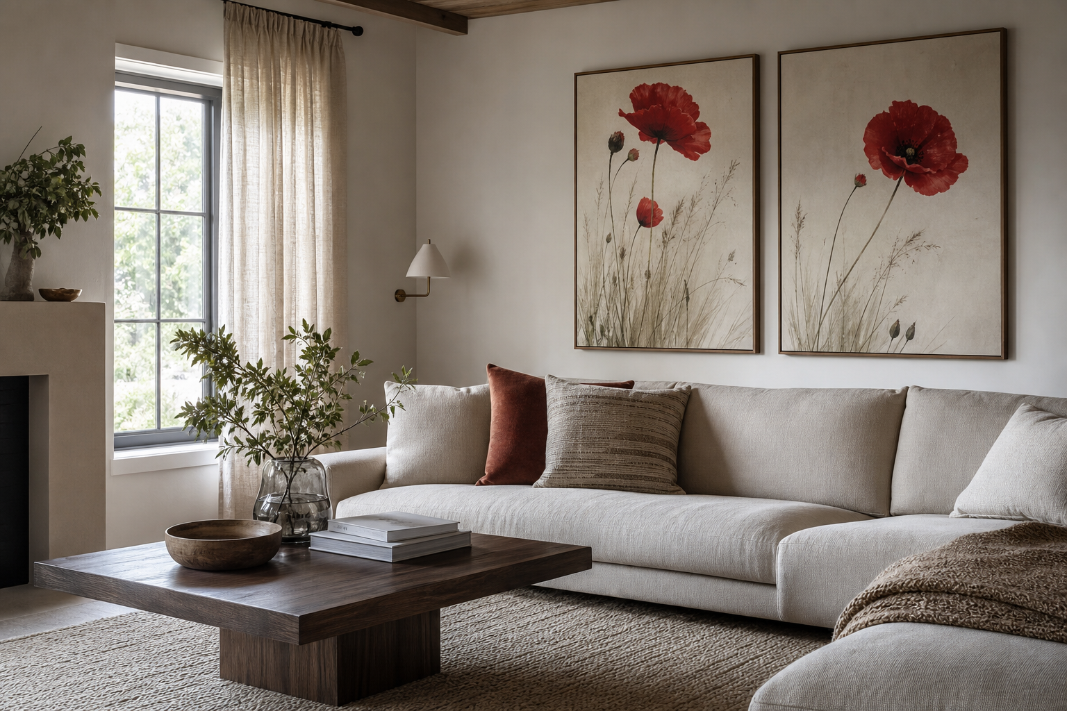
A crimson poppies poster print earns attention fast because it combines two things most rooms need: strong colour and an organic shape. The red carries energy, while the flower form keeps that energy from feeling harsh. In practical terms, it works like a focal point that brings warmth into rooms dominated by beige, grey, oak, or white.
Why crimson poppies work so well in interiors
Poppies have a loose, airy silhouette, so even a bold red floral does not feel blocky or heavy. That matters on walls. Geometric art can sharpen a room; a crimson poppies poster print softens it while still adding contrast. If your space has straight furniture lines — a squared sofa, flat-front cabinets, slim metal lighting — floral movement helps balance those harder shapes.
Red also performs well against common interior finishes. It stands out against warm white paint, limestone tones, pale wood, walnut, and muted green. If you already gravitate toward our botanical collection, poppy imagery is one of the easiest ways to introduce stronger pigment without making the room feel overly decorated.
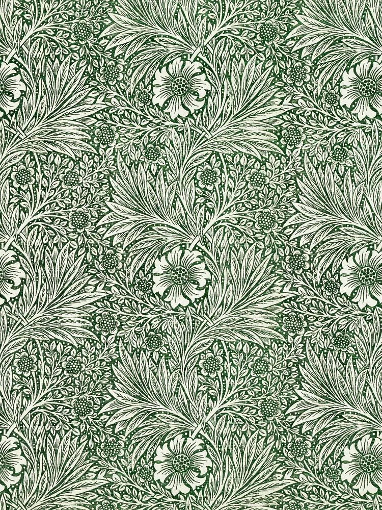
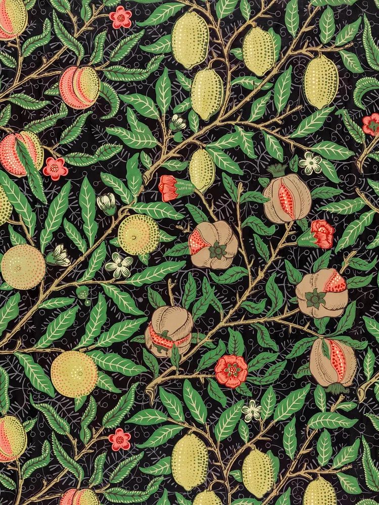
For a more heritage-leaning look, pair poppies with patterned or archival-inspired pieces from our vintage wall art selection or layered floral designs from the bohemian collection. The result feels collected rather than showroom-perfect.
Choosing the right wall and room
The best wall is usually the one with enough negative space around the print. Above a sofa, bed, console, or reading chair is ideal because the furniture visually anchors the artwork. In a living room, hang the print 15 to 25 cm above the sofa back so it feels connected to the seating rather than floating separately.
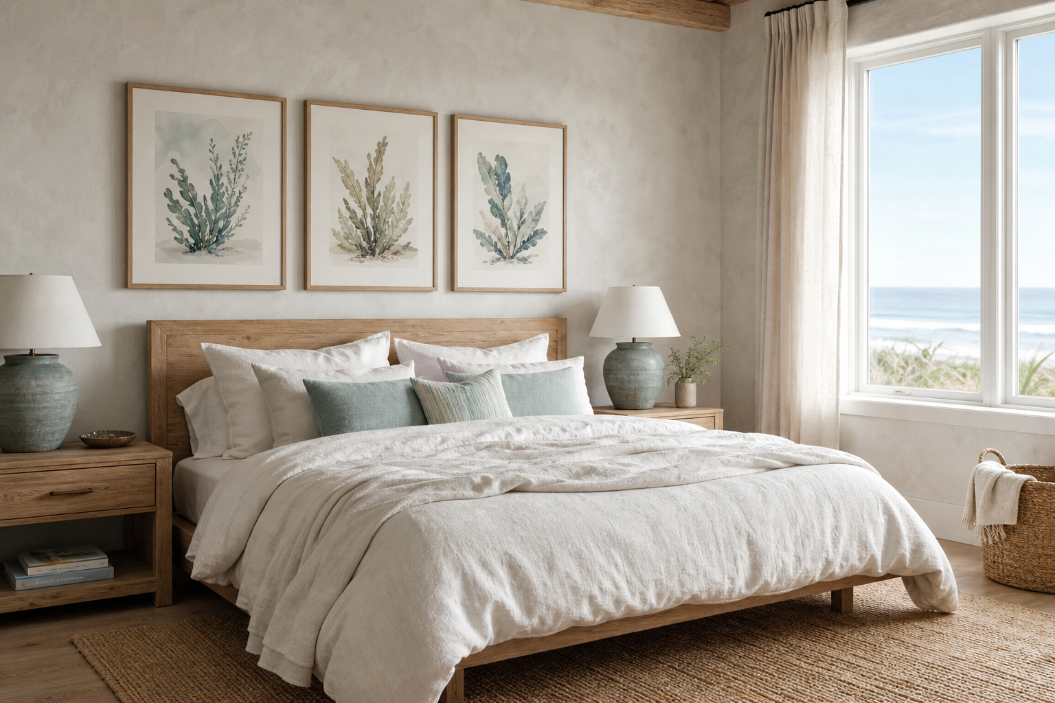
Bedrooms suit crimson poppies especially well when the rest of the palette is restrained. A soft oatmeal headboard, off-white bedding, and one red floral artwork create a calm room with a clear point of interest. In hallways, a single medium print can bring life to a narrow passage where furniture is minimal. In reading nooks, the floral subject adds intimacy without becoming distracting.

If you want the room to feel classic, place the artwork near traditional materials — walnut, brass, linen, and aged ceramics. If you want it to feel fresher, use black accents, cleaner lines, and more open spacing. Rooms that already feature plants or floral textiles are a natural fit for botanical floral prints with historic character because they continue the nature story without introducing a new visual language.
Sizing, placement, and spacing tips
Size makes the difference between "carefully styled" and "too small for the wall". For a standard sofa around 180 to 220 cm wide, a single print in 50x70 cm or 70x100 cm usually works best. Aim for artwork that spans roughly 50 to 75% of the furniture width beneath it. Over a queen bed, 70x100 cm makes a clear statement; in a hallway, 30x40 cm or 40x50 cm is often enough.
Hang the centre of the artwork at about 145 to 150 cm from the floor in open wall areas. If the print sits over furniture, priority shifts to the relationship with the furniture, not the room average. Keep 15 to 25 cm between the frame and the top of a console, headboard, or sofa.
Spacing matters even more if you style the crimson poppies poster print with other pieces. Leave 5 to 8 cm between smaller frames and 8 to 12 cm between larger ones. If one floral print is the hero, let it be the largest piece and support it with quieter works from nature-inspired prints or subtle pieces in our fine art range.
Frame choices that elevate the artwork
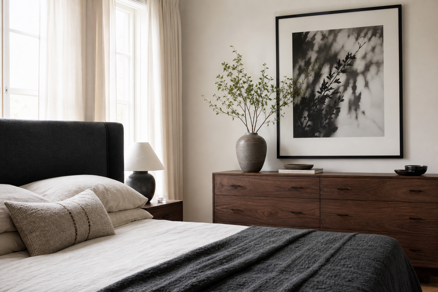
Black frames make crimson feel cleaner and more modern. Oak frames soften the red and tie it into Scandinavian or rustic interiors. Walnut adds depth and works especially well if the poppies have darker stems, shadowed petals, or an antique-style background. White frames create a lighter, fresher look, but only if the wall colour is deep enough to keep the piece from disappearing.

Frame width should match the scale of the print. For 30x40 cm and 40x50 cm sizes, a slim frame around 1 to 1.5 cm feels crisp. For 50x70 cm and larger, 2 to 3 cm gives the artwork enough structure. If you add a mount, keep it generous — about 5 to 8 cm — so the red has room to breathe.
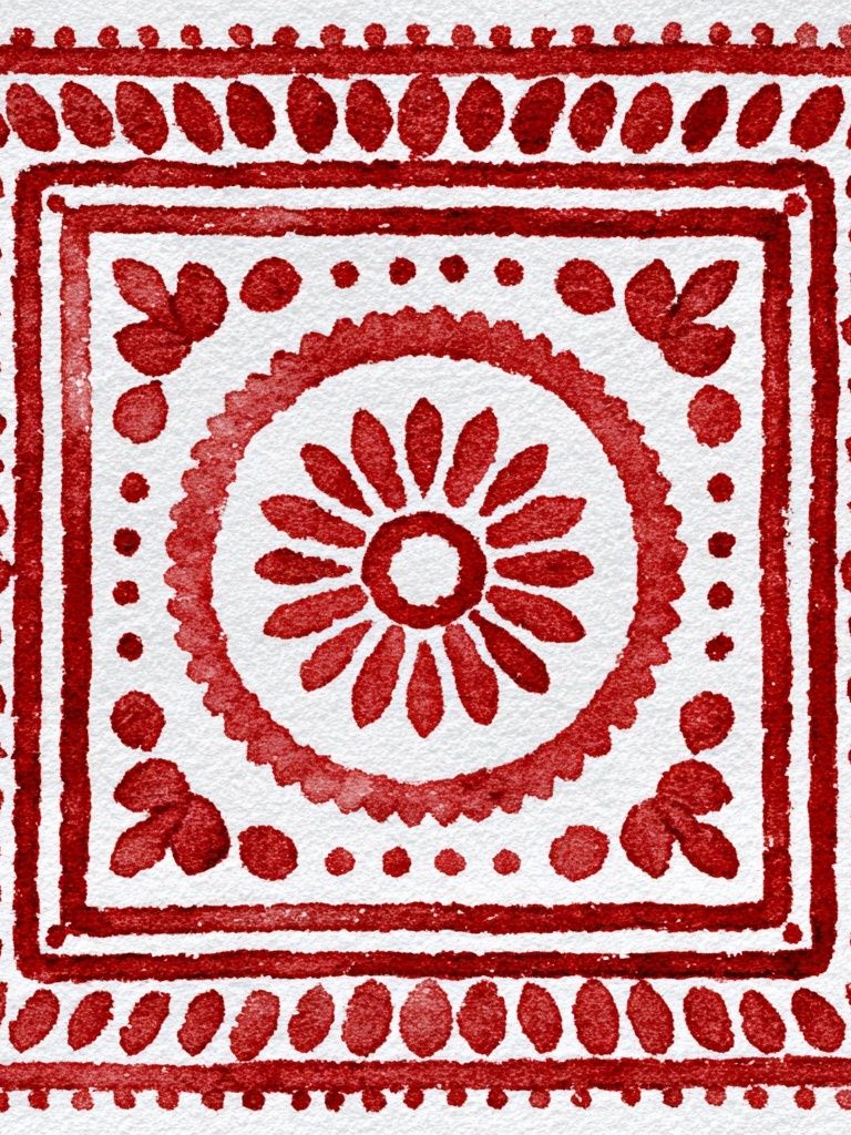
Pattern-heavy rooms benefit from simpler frames. If your room already includes textiles like heritage botanical patterns or richly layered red floral decorative designs, avoid ornate framing and let the artwork itself carry the detail.
Colour palettes that pair beautifully with crimson
The easiest palette starts with warm neutrals: chalk white, sand, camel, taupe, and oat. These shades reduce visual competition and make crimson feel richer. Add one or two grounding materials — oak, jute, travertine, or brushed brass — and the floral note looks intentional, not seasonal.
Green is the most natural partner. Olive, sage, eucalyptus, and moss all support a red floral without turning the room into a holiday palette. Keep the green muted rather than bright. A ratio of roughly 70% neutral, 20% natural wood or stone, and 10% crimson or green accents keeps the room balanced.
Terracotta and rust also pair well with a crimson poppies poster print, especially in softer bohemian interiors. Use these tones in textiles rather than on every surface — one rust cushion, one clay vase, one woven throw. For more layered floral references, explore rich botanical designs with warm undertones or more open floral compositions like fine art prints with floral colour accents.

How to make the print feel curated, not crowded
Start by reducing the clutter directly around the artwork. If the wall already has a mirror, shelves, a sconce, and a busy fabric behind it, the floral piece will lose impact. Give it a cleaner field. One framed print, one vase, and one stack of books often look stronger than six decorative objects.
Gallery walls can work, but the crimson poppies piece should lead the arrangement. Place it slightly off-centre, then build around it with quieter companions — soft landscapes, delicate botanicals, or low-contrast illustrations. Avoid pairing it with too many equally red pieces. One strong red focal point is usually enough for every 8 to 12 square metres of room area.

Shelves need a different approach. Lean the artwork at the back, then place lower objects in front that do not block more than 15 to 20% of the frame. A narrow bud vase or candle works; a large lamp usually does not. If you want a companion piece, look for gentle contrast such as a soft landscape watercolor rather than another assertive floral.

Final styling notes and shop tips
A crimson poppies poster print looks best when you choose for the room first, not the image first. Check three things before buying: wall width, nearby material tones, and how much red already exists in the room. If the space already has a patterned rug, coloured curtains, and strong upholstery, choose a cleaner floral composition. If the room is mostly neutral, you can afford a bolder piece.
This kind of print also makes a strong gift because it suits several interiors at once — modern, classic, bohemian, and softly traditional. If you are building a fuller wall story, start with botanical art prints and then add one or two supporting pieces from flower-filled nature scenes or decorative floral-and-bird artwork to echo the theme without repeating it exactly.
Frequently Asked Questions
What frame glaze works best for a crimson floral print?
Anti-reflective acrylic is a smart choice in bright rooms with windows opposite the wall. Standard glass works well in lower-glare spaces and gives a slightly sharper finish.
Can I style red floral art in a small room?
Yes — keep the size moderate, such as 30x40 cm or 40x50 cm, and limit competing red accents nearby. A single concentrated colour hit often makes a small room feel more finished, not smaller.
Should I use a mat around the print?
If the artwork has strong red coverage, a white or warm off-white mat helps it feel calmer and more premium. A 5 to 8 cm mat is usually enough for medium sizes.
What wall paint finishes suit botanical prints best?
Matt or eggshell finishes tend to flatter framed art because they reduce glare. High-gloss walls can bounce too much light back onto the frame.
How do I hang the print without damaging the wall?
For lighter frames, use high-quality picture strips rated for the exact weight. For larger framed pieces, use a wall hook and anchor suited to plasterboard, brick, or concrete.