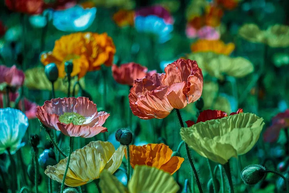
A crimson poppies i poster print within our botanical collection does more than add colour. It introduces contrast, movement, and a natural focal point in one piece. Red florals have a way of catching the eye faster than muted artwork, especially on white, greige, taupe, or soft stone walls where the bloom shapes stand out clearly.
Why Crimson Poppies Feel So Striking
Poppies are visually effective because their form is loose rather than rigid. The petals often look slightly crinkled, with soft irregular edges that create movement from a distance. In wall art, that gives a room energy without the heaviness of dense abstract blocks or dark geometric patterns. A crimson poppies i poster print works particularly well when you want one area of the room to feel warmer and more alive.
Red also carries more visual weight than most colours used in contemporary interiors. Even if the artwork occupies only 15% to 20% of a wall surface, it can anchor the whole composition. Crimson sits in a useful middle range — richer than bright scarlet, deeper than coral, and easier to pair with timber, black metal, and warm neutrals. That makes it a strong alternative to safer florals often seen in pale blush or sage.
If you like floral art but want something less delicate, look at pieces in our fine art collection and bohemian floral prints that use stronger contrast and fuller colour. They tend to feel more architectural on the wall, which suits modern rooms with simple furniture lines.
Where a Crimson Poppies Print Works Best
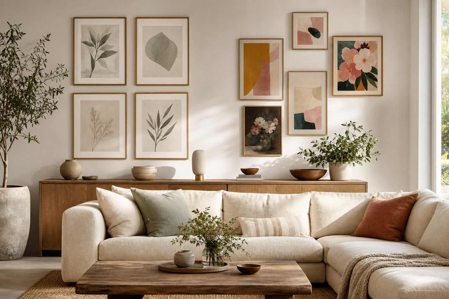
A living room is the easiest place to use bold floral art because the print can act as the main feature above a sofa, sideboard, or fireplace. For a standard 3-seat sofa measuring 200 to 240 cm wide, choose artwork around 100 to 140 cm wide in total presence. That could mean one large statement piece or a grouped arrangement. The red tones help break up long neutral walls and connect well with rust cushions, dark wood, and black floor lamps.

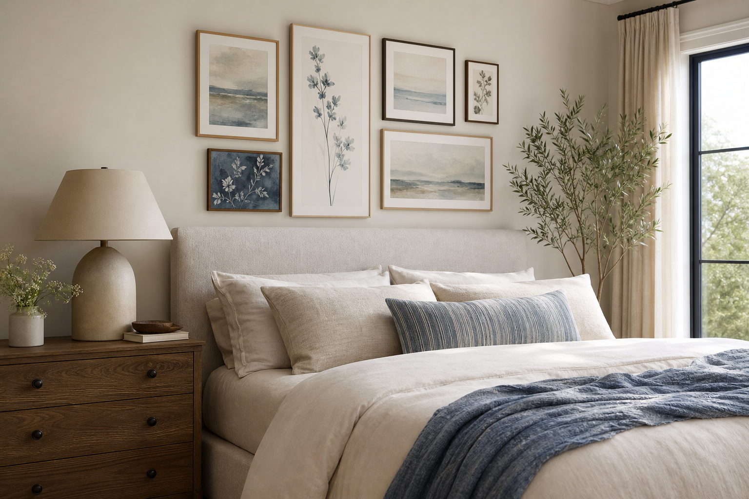
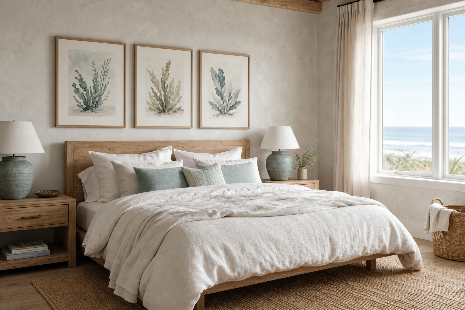
Bedrooms also benefit from poppy artwork, especially above an upholstered headboard in linen, bouclé, or velvet. In that setting, crimson reads softer than many people expect because fabrics absorb some of the colour intensity around it. A width of 70 to 100 cm above a double bed usually feels balanced. If you prefer a quieter bedroom, keep bedding in ivory, oat, charcoal, or muted clay so the art remains the only strong red note.
Hallways and home offices are often overlooked, yet they are ideal for a crimson poppies i poster print. Narrow spaces need a clear focal point, and red floral imagery can make a transition area feel intentional rather than empty. Above a console table, use a print around 50 x 70 cm or 61 x 91 cm. In a workspace, position it where it is visible from the desk but not directly behind the monitor — that keeps the wall interesting without creating visual competition during work hours.
For adjacent styling, a poppy print pairs naturally with nature-inspired wall art and selected minimalist prints that give the eye room to rest.
How to Style the Colour Without Overpowering the Room
The simplest rule is to let the red appear in only two or three places across the room. If the artwork is the strongest red element, repeat that colour once in a small object — such as a book spine, cushion piping, or ceramic vase — and stop there. When red appears in five or six scattered accents, the room starts to feel busy rather than composed.
Walls in white, warm off-white, pale taupe, sand, and light greige are the strongest backdrop for crimson floral art. On these shades, the petals look saturated and crisp. Medium oak, walnut, smoked ash, and black-stained wood also support the colour well because they add depth without competing. If the room already includes black metal legs, picture lights, or shelving, the artwork will feel integrated faster.
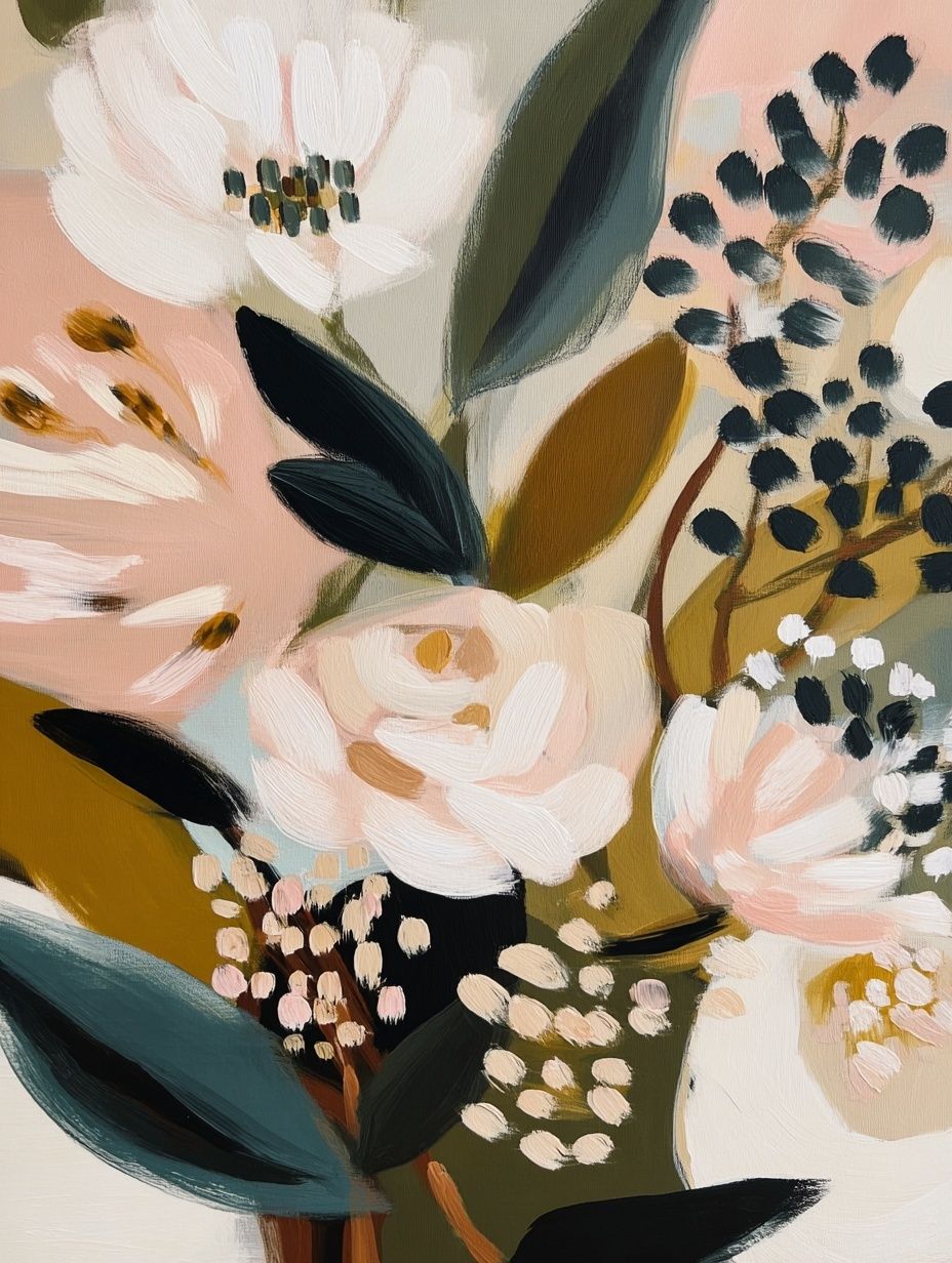



A useful balance formula is 70% neutral base, 20% secondary warm tones, 10% bold accents. In practice, that could mean ivory walls and sofa, camel wood and tan leather details, then crimson artwork plus one small accessory. If you want extra depth, introduce a muted complementary tone such as olive, dusty green, or deep plum. These shades soften the intensity of red while keeping the palette sophisticated.
Avoid matching everything too literally. A room with red art, red curtains, red cushions, and red rug borders usually feels forced. Better pair a floral focal point with quieter surrounding pieces from green botanical prints or rich floral studies with natural depth if you are building a multi-piece wall.

Framing Choices That Elevate the Artwork
Frame choice changes the mood of floral art more than most buyers expect. A slim black frame — around 1.5 to 2 cm wide — gives crimson florals a cleaner, more contemporary edge. This works well in apartments with metal accents, plaster walls, and streamlined furniture. It sharpens the silhouette of the print and makes the colour read slightly bolder.
Oak and walnut frames add warmth and are often the better choice if the room includes natural timber furniture. Oak keeps the look lighter and more Scandinavian; walnut makes it richer and more tailored. In rooms with beige upholstery, travertine, or brass, walnut can create a more finished look than black. If your interior leans traditional or vintage, wood frames also connect naturally with vintage-inspired wall art and classic floral motifs.
White frames are more situational. They can work on coloured walls or in bright rooms with little contrast, but on plain white walls they may lose presence unless the print itself has a strong border or dark detailing. For glazing, matte finishes usually reduce reflection best in sunny spaces, while standard clear acrylic works well in hallways, bedrooms, and shaded living rooms.
Size, Placement, and Gallery Wall Ideas
For a single statement piece, aim for artwork that spans roughly 60% to 75% of the furniture width beneath it. Above a 180 cm sideboard, that means about 108 to 135 cm wide. Above a bed or sofa, this ratio keeps the piece feeling connected to the furniture rather than floating too small on the wall.
Hanging height matters just as much as size. The centre of the artwork should usually sit around 145 cm to 152 cm from the floor in rooms with standard ceiling heights. Above furniture, leave 15 to 25 cm between the top edge of the sofa, headboard, or console and the bottom of the frame. That tighter gap creates a more professional, intentional arrangement.
A crimson poppies print also works well inside a gallery wall if you let it be the visual anchor. Place it slightly off-centre, then surround it with calmer companions in green, cream, ochre, or sepia. Keep spacing between frames at 5 to 8 cm for a tidy look. A strong mix could combine floral detail, landscape softness, and a more decorative textile pattern.

For example, a poppy-led arrangement can sit comfortably alongside Marigold by William Morris or Woman in Yellow Flowers because both add floral richness without repeating the exact same shape. If you want more breathing space, balance the red with a quieter landscape such as a soft watercolor landscape print.

Shop the Look: Bringing the Final Composition Together
The best rooms built around floral art do not try to compete with it. Start with one clear focal point, keep the surrounding palette controlled, and use frame finishes that connect to your furniture. A crimson floral piece looks strongest when the room already has texture — linen, wood grain, wool, ceramic, or matte metal — because those materials make the colour feel grounded rather than decorative.
If you are building a broader wall story, start with our botanical wall art as the base, then add one or two supporting pieces from fine art floral prints or Floral Bouquet — Bohemian Print for warmth and variation. The result feels layered, modern, and personal without losing clarity.
Final thoughts
A crimson poppies i poster print is effective because it combines softness of subject with strength of colour. It can warm a neutral room in minutes, create a focal point on a plain wall, and bring floral art into more modern interiors without feeling overly sweet.
Choose the size in proportion to your furniture, keep the palette disciplined, and frame it with intent. Done well, crimson poppies feel less like a seasonal accent and more like a permanent design decision.
Frequently Asked Questions
What frame mount or border works best with a bold floral print?
A white mount of 4 to 6 cm can give the artwork more breathing room, especially in smaller sizes like 30 x 40 cm or 50 x 70 cm. It also helps bold reds feel more refined.
Can red floral wall art work in a room with cool grey tones?
Yes — add one warm bridge tone such as walnut, camel, or brushed brass so the red does not feel isolated against the grey. That small shift makes the palette feel intentional.
Is a large floral print suitable for a narrow hallway?
Yes, if the frame is not too deep. Choose slimmer profiles and sizes like 50 x 70 cm to maintain clear walking space and avoid a bulky look.
What type of lighting flatters crimson artwork best?
Warm white lighting around 2700K to 3000K usually makes crimson tones look richer and less harsh. Avoid very cool bulbs, which can flatten red and make it appear duller.