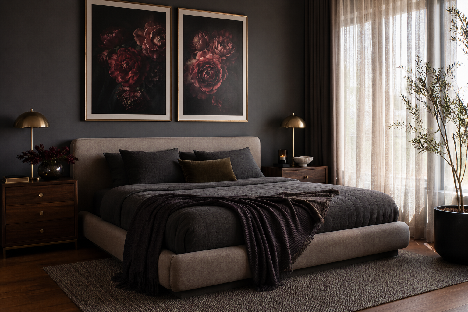
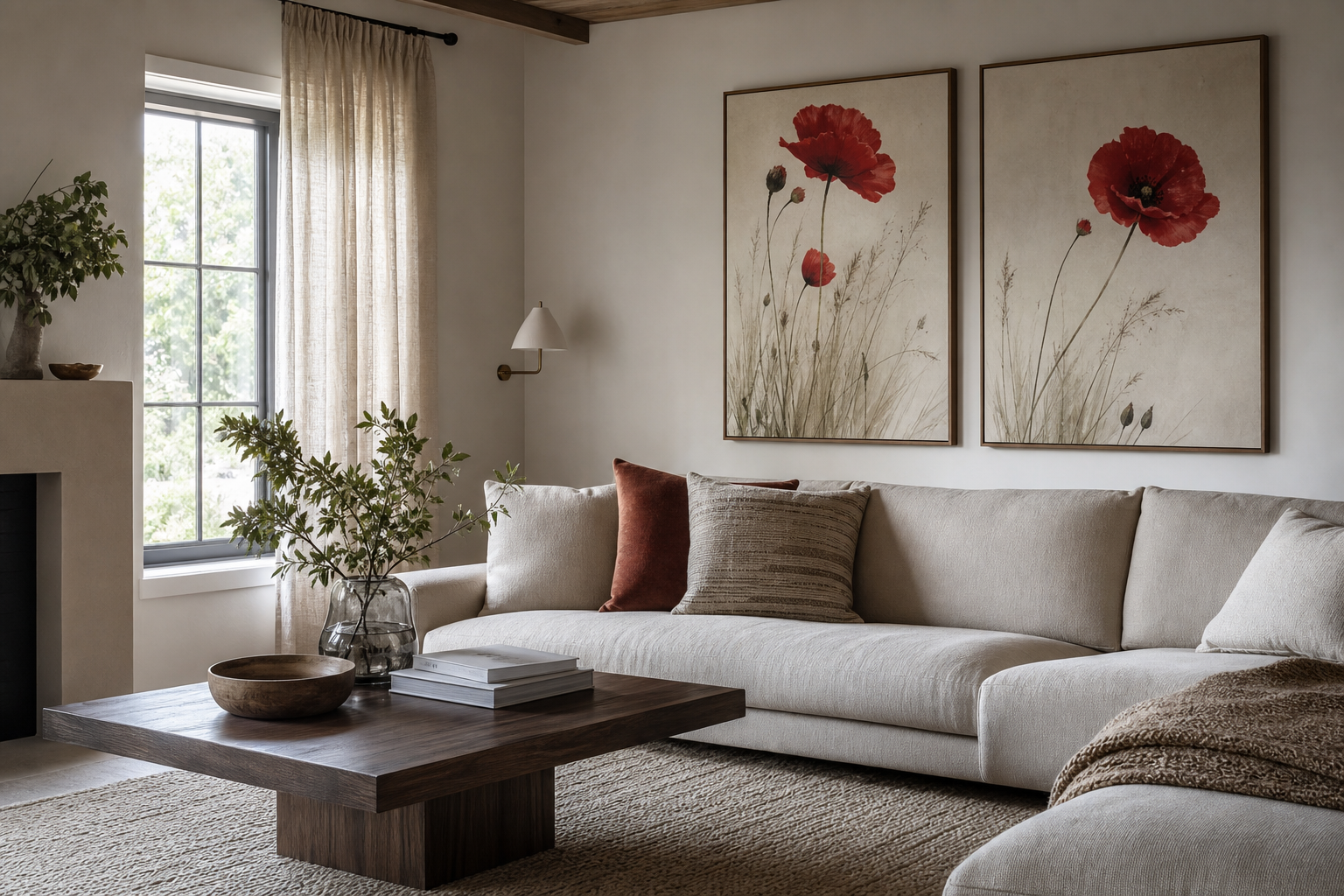
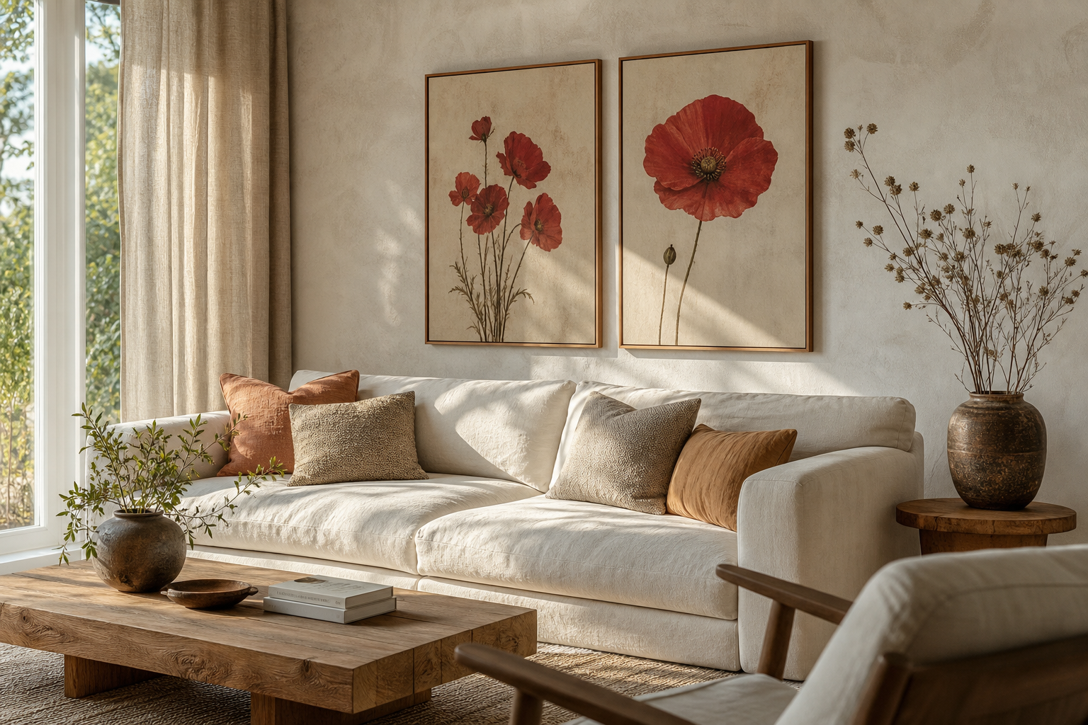
A crimson roses poster print brings two things to a room immediately: saturated color and a clear emotional tone. Deep red florals read as romantic, but they also add weight and contrast, which is why they work so well in interiors that need a focal point. Against pale walls, the red feels vivid; against darker walls, it feels layered and luxurious.
Unlike softer pink botanicals, a crimson roses poster print has enough visual density to anchor a wall on its own. That makes it especially useful above a bed, over a console, or in the center of a gallery arrangement where one stronger piece needs to hold the composition together.
Why Crimson Roses Feel So Timeless
Crimson rose imagery has stayed relevant because it combines classic botanical subject matter with a stronger, more theatrical palette. Red sits naturally against neutrals like ivory, taupe, walnut, and black, so it crosses between traditional and modern spaces with very little adjustment. That is the advantage of floral art with deeper tones — it decorates without feeling overly delicate.
In design terms, deep red works best when it covers only 10% to 20% of the visible palette in a room. That small percentage is enough to sharpen beige upholstery, warm up gray paint, or echo darker wood finishes. If you already like pieces from our Botanical collection, crimson florals are often the easiest next step because they add more drama without changing the room's overall style.
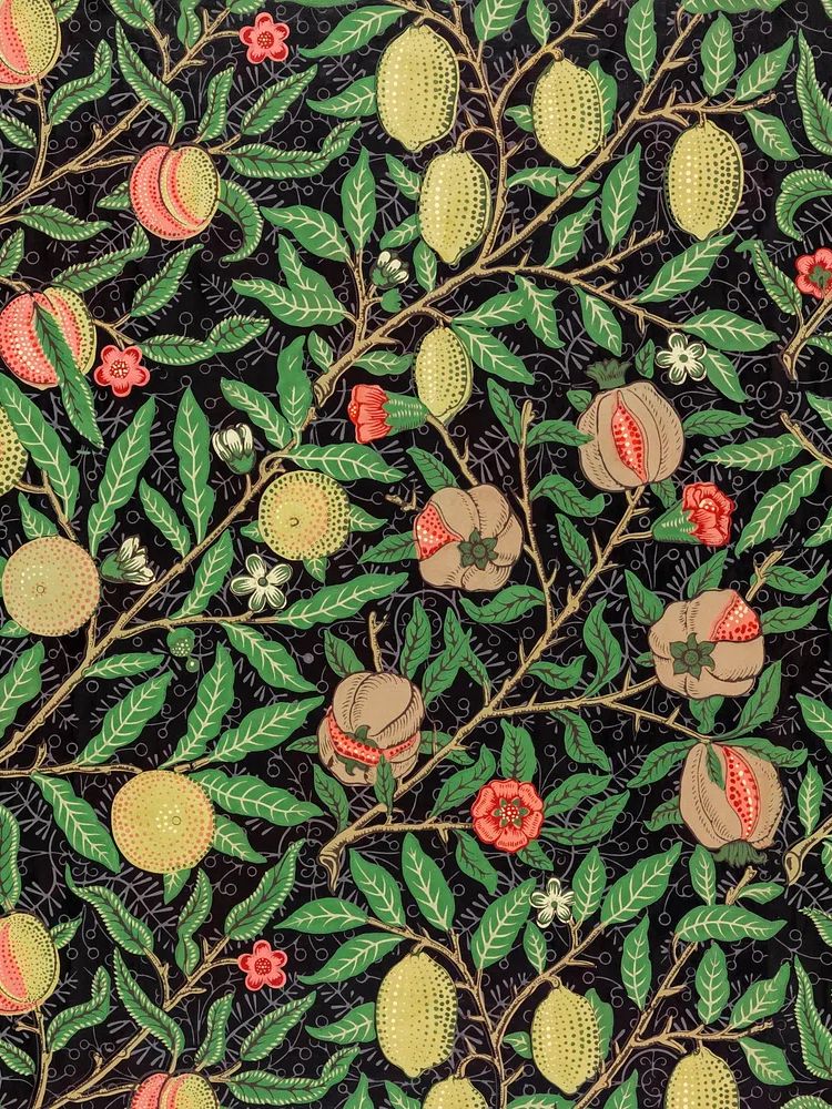
If you want the floral story to lean more historic, Arts and Crafts patterns and vintage botanicals are especially effective companions. William Morris designs, for example, add intricacy and rhythm around a bolder rose piece, which helps the wall feel collected rather than flat.
Where This Print Works Best
A bedroom is the most natural setting for crimson rose art because the subject already carries warmth and intimacy. Hang it 15 to 20 cm above the headboard, and keep the artwork width at roughly 60% to 75% of the bed width. Over a 160 cm queen bed, that means a piece or grouped arrangement around 95 to 120 cm wide looks balanced.

Living rooms benefit from this print when the furniture is simple and the wall needs character. Above a 200 cm sofa, aim for a total art width between 120 and 150 cm. If the room already has heavy visual elements — a dark rug, bookcase, or stone fireplace — choose one larger floral piece rather than several small frames. For softer spaces, pair the rose image with works from our Fine Art selection or with muted pieces like Window with Sheer Curtain to keep the arrangement breathable.
Entryways and reading corners are also strong placements because the deep red gives instant presence in a compact area. A narrow console, wall sconce, and one floral print can make a 90 cm wall section feel finished. If the surrounding decor is understated, adding one romantic accent from our Love Romantic collection can reinforce the mood without overfilling the space.
How to Style a Crimson Rose Poster
The safest palette is neutral plus one dark note. Think warm white walls, camel or taupe upholstery, and black or walnut details. In that setup, crimson acts as the accent color, so you only need two or three supporting elements — a burgundy cushion, a smoked-glass vase, or a dark wood frame — to make the art feel integrated.
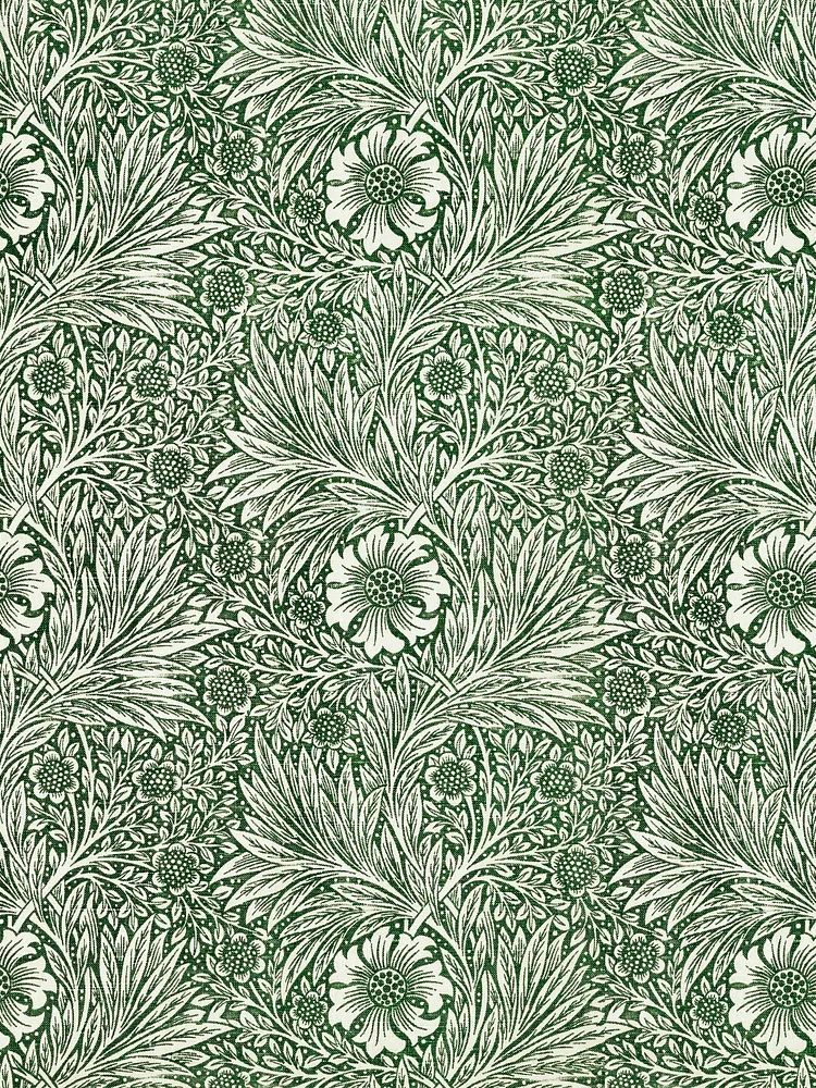
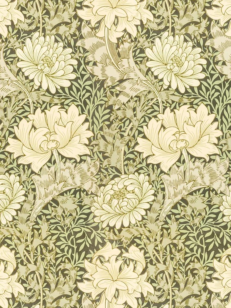
For a more dramatic room, build around deep tones: olive, espresso, charcoal, and oxblood. These shades reduce contrast and make the floral image feel enveloping instead of loud. Botanical patterns can help here, especially if they carry similar warm undertones. Pieces such as Marigold by William Morris or William Morris's vintage chrysanthemum flower work well because they add ornamental detail without competing for the exact same visual role.


Texture matters as much as color. Velvet, brushed brass, dark-stained wood, and linen all flatter rose imagery because they echo its richness without making the room feel themed. Avoid pairing crimson florals with too many shiny red accessories — that can make the scheme feel literal. One floral artwork, one textile accent, and one metallic finish is usually enough for a polished result.

Choosing the Right Size and Format
Scale decides whether the print feels intentional or lost. For a small wall section between 70 and 100 cm wide, a 30x40 cm or 40x50 cm frame works well. Over furniture, move up quickly — 50x70 cm is the most flexible single-print size, while 70x100 cm creates a stronger focal point in larger rooms.
Portrait orientation suits a single stem, clustered bloom, or more vertical floral composition. Landscape works better above sofas, sideboards, or benches where the furniture line is long and horizontal. If your wall is wide but you do not want one oversized piece, use a pair of prints with 5 to 8 cm spacing between frames. Keep the total width within about two-thirds of the furniture underneath.
When mixing this piece into a gallery wall, let it be the darkest or richest artwork in the group. That gives the eye a clear starting point. Surround it with quieter works from our Vintage art prints or softer landscape pieces from the Nature collection so the composition has contrast in both subject and intensity.
Framing Ideas That Enhance the Artwork
Black frames give crimson florals the cleanest, sharpest edge. They suit modern rooms, especially when the walls are off-white, mushroom, or gray-green. A slim black frame, around 1.5 to 2 cm thick, keeps the emphasis on the artwork while still making the red feel crisp.
Oak or walnut frames create a warmer effect. They are especially good in bedrooms and reading corners where you want the art to feel collected rather than graphic. If the image has a lot of dark background, adding a white mat of 4 to 6 cm helps separate the florals from the frame and makes the piece read larger on the wall.

Antique gold can work beautifully, but only if the room already includes warm metals or vintage references. In a very contemporary space, gold can push floral art into a more formal direction than you may want. If you like that romantic, heritage look, pair the rose piece with works such as Elegant Woman Portrait or classic pattern-based botanicals like Honeysuckle by William Morris.

Final Touches: Build a Cohesive Floral Look
A cohesive floral wall is usually built from variation, not repetition. Start with one hero piece in the deepest tone, then add one patterned botanical, one softer painterly image, and one lighter artwork to open the arrangement. That high-low contrast keeps the display from becoming visually heavy. If you want a refined starting point, look at combinations across our botanical wall art range and fine art prints rather than choosing four equally saturated floral pieces.
For a romantic arrangement, include one non-botanical work with a gentle emotional note. Winter Lovers by the Window is a good example because it softens the composition without pulling attention away from the main floral statement. The result feels styled rather than matched.
Final thoughts
A crimson floral print works best when you treat it as a focal accent, not background decoration. Give it enough scale, keep the surrounding palette controlled, and repeat its warmth through texture rather than too much red.
If you want the room to feel richer, pair the rose imagery with classic botanicals, soft fine art, and one romantic detail. That balance is what turns a single dramatic print into a complete wall story.
Frequently Asked Questions
What wall color works best with crimson floral art?
Warm white, soft taupe, olive, and charcoal are the most reliable choices. These shades either sharpen the red or deepen it without making the room feel busy.
Should I choose glass or acrylic for framing?
Glass gives a clearer, more premium finish, while acrylic is lighter and safer for larger sizes like 70x100 cm. For bedrooms or hallways, acrylic is often the more practical option.
Can crimson floral art work in a small room?
Yes — use one medium-size piece, such as 40x50 cm or 50x70 cm, and keep the rest of the wall simple. Strong color often gives small rooms more purpose, not less space.
What other decor pairs well with a rose-themed print?
Try dark wood, linen, velvet, smoked glass, and brass. Fresh greenery or dried branches also help the floral subject feel grounded rather than overly styled.