A strong b w portrait poster print adds instant structure to a room. It creates contrast, gives the eye a focal point, and often feels more personal than landscape or abstract art because the human face brings emotion into the space.
What makes a b w portrait poster print especially useful is its range. It can sit comfortably in a minimal apartment, a layered vintage interior, or a sharper contemporary room without fighting the palette. That flexibility is why monochrome portrait art remains one of the easiest ways to make a wall feel finished.
Why Black-and-White Portraits Never Feel Outdated
Black-and-white portrait art lasts because it removes one variable: color trend. When the image relies on light, shadow, expression, and composition instead of seasonal hues, it stays relevant far longer than highly color-driven wall decor.
Monochrome portraits also work across style categories. In a pared-back room, they echo the restraint of our minimalist collection. In a more classic scheme, they pair naturally with vintage art prints. In modern spaces, they connect well with black-and-white photography wall art because the tonal range feels clean and deliberate.
A good portrait print also introduces depth without clutter. Deep blacks, soft midtones, and negative space can make even a small 30x40 cm print feel substantial. On a wider wall, one larger piece at 50x70 cm or 70x100 cm can hold attention with less visual noise than a busy multicolor arrangement.
Choosing the Right Mood for Your Space
Mood comes first. A portrait with direct eye contact feels stronger and more editorial, while a turned profile or downward gaze reads softer and more reflective. If the room is already busy with patterned textiles, shelves, or mixed materials, choose a simpler composition with more negative space.
Crop matters more than many buyers expect. Tight crops — face and shoulders — create intimacy and drama. Wider compositions that include hands, furniture, or surrounding architecture feel more atmospheric and easier to live with in relaxed spaces like bedrooms or reading corners.

Lighting inside the image changes the whole effect. High-contrast portraits suit crisp interiors with black accents, smoked glass, or metal finishes. Softer grayscale portraits fit rooms with oak, linen, boucle, and matte ceramics. If you like a more nostalgic look, portraits with a slightly aged surface or historical styling often sit well beside fine art wall decor and classic decorative pieces.
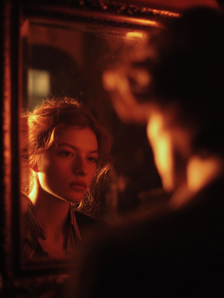
For a more fashion-led mood, choose a portrait with poise and stronger silhouette. A piece like Retro Fashion Portrait works well when you want monochrome elegance with a sharper editorial edge rather than a purely documentary feel.
Best Rooms for a B&W Portrait Poster Print
Living rooms are the most natural fit because a portrait can anchor the main seating zone. Above a sofa, aim for artwork that covers roughly 60 to 75 percent of the sofa width. For a 200 cm sofa, that means a combined visual width of about 120 to 150 cm. A single large portrait or a two-piece arrangement usually works better than many small frames.
Bedrooms benefit from quieter portrait choices. Above a dresser or opposite the bed, select images with gentler expression and softer tonal transitions. This creates presence without making the room feel too intense. If your bedroom already includes light neutrals, a monochrome portrait introduces contrast without disrupting the calm.
Hallways and entryways are good places for bolder portraits because people experience them briefly and at close range. A narrow console with a 40x50 cm or 50x70 cm framed portrait above it adds immediate character. In a home office, portraits can feel particularly focused and intelligent, especially when paired with restrained pieces from our abstract art collection.

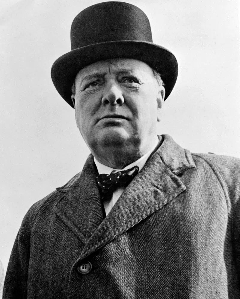
If you want a more heritage-inspired look, a classic piece such as Winston Churchill Portrait can work especially well in offices, libraries, or darker hallways with wood tones and leather accents.
How to Pair It with Color, Texture, and Decor
The easiest way to style monochrome portrait art is to let materials do the warming. Black and white can read cool if everything around it is also sleek and hard. Add oak, walnut, linen, travertine, boucle, or brushed brass to keep the space balanced.
In neutral rooms, use the portrait as the deepest contrast point. A black frame, dark lamp base, or charcoal cushion can repeat the darkest tones so the art feels integrated rather than isolated. Three small black accents in the room are often enough to make the wall art feel intentional.
If your space already has color, monochrome portraits can act as a visual pause. Rich olive, rust, burgundy, and navy all pair well with black-and-white imagery because the print does not compete. In fashion-forward interiors, even one precise accent color can elevate the portrait. Think of how a monochrome face print sits near pieces from our fashion wall art collection — clean, graphic, and confident.


Texture pairing is just as important as color pairing. A crisp monochrome portrait looks stronger against matte painted walls than glossy surfaces. If the room includes glass, chrome, or lacquer, soften the composition with woven shades, a wool rug, or natural wood furniture so the wall does not feel too cold.
Sizing, Framing, and Placement Tips
Scale is the difference between "placed" and "floating." Small art on a large wall usually looks accidental. For a solo statement, 50x70 cm is a reliable starting point. In larger rooms or above substantial furniture, 70x100 cm gives a more gallery-like effect.
Frame finish should follow the room's visual weight. Black frames create a sharper line and suit modern, industrial, or high-contrast spaces. Oak frames feel softer and work well in Scandinavian or relaxed interiors. White frames can work, but only if the portrait has enough tonal depth to avoid fading into the wall.

Hang the center of the artwork at roughly 145 to 150 cm from the floor in most homes. Above furniture, leave 15 to 25 cm between the top of the sofa, headboard, or console and the bottom of the frame. That spacing keeps the art connected to the furniture instead of drifting too high.
If you prefer a softer photographic scene rather than a formal portrait, Woman Sitting by Vintage Clock is useful for rooms where you want human presence with more surrounding space and less direct intensity.

Simple Ways to Build a Gallery Wall Around It
A portrait should usually be the anchor, not one equal piece among many. Start with the portrait as the largest element, then add two to four supporting prints around it. Keep 5 to 8 cm between frames for a compact arrangement, or 8 to 12 cm for a more relaxed composition.
The safest pairing is one portrait, one abstract, one minimal piece, and one quieter photographic or fine art image. That mix gives variation without visual competition. For example, a portrait can sit comfortably with Textured White Abstract and White Flower Silhouette because both supporting works add breathing room.
A common mistake is using too many faces in one grouping. Limit the arrangement to one dominant portrait, or at most two if one is much smaller. Otherwise, the wall starts to feel crowded and visually noisy.

If you want a ready-made mix with varied rhythm, pull from portrait, abstract, and minimal categories rather than staying inside one lane. That gives the gallery wall a collected look instead of a set-bought feel.
Final Styling Tips for a Personal, Finished Look
The most successful portrait walls balance emotion with restraint. Choose a portrait that suits the room's pace — softer for bedrooms, more direct for entryways and offices — then repeat its tones through frame color, textiles, and one or two darker accents nearby. That is usually enough to make the space feel considered.
A b w portrait poster print works best when it has room to breathe. Give it proper scale, keep surrounding decor edited, and mix in warmer materials so the monochrome palette feels rich rather than stark. If you want to build from one strong focal piece, start with a portrait you would still want to look at five years from now — that is the clearest sign you have chosen well.
Frequently Asked Questions
Should I choose matte or glossy for a black-and-white portrait print?
Matte is usually the better choice for portraits because it reduces glare and keeps shadow detail visible. It also suits softer, more refined interiors.
Can I mix a black frame with oak furniture?
Yes — black frames and oak furniture work well together because the contrast feels clean while the wood adds warmth. Repeat black in one or two smaller accents so the frame feels connected.
What size works best for a narrow hallway?
A vertical 40x50 cm or 50x70 cm print is usually the safest fit. It gives presence without making the wall feel cramped.
Do black-and-white portraits work on colored walls?
They work especially well on muted colors like sage, taupe, clay, and deep blue. The grayscale image stands out clearly while still feeling sophisticated.