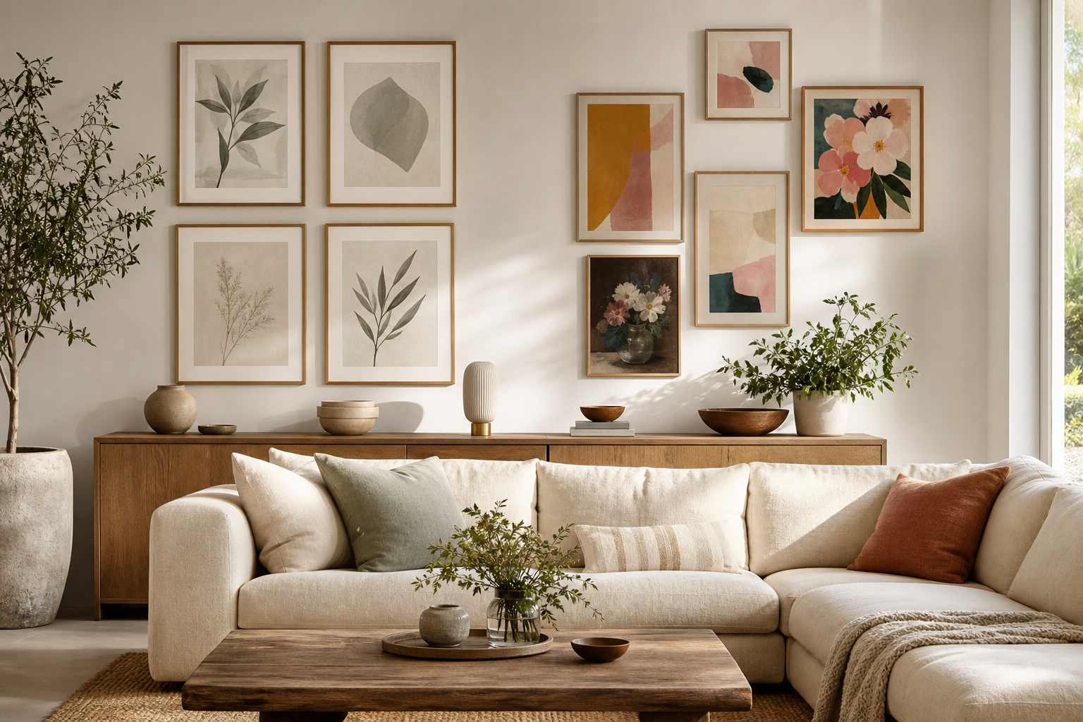
The choice between an art print vs poster usually comes down to four things: paper weight, print method, finish, and how long you want the piece to look sharp on the wall. From a distance, the two can seem similar. Up close, the difference is easy to spot in colour depth, surface texture, edge quality, and how the piece behaves once framed.
If you are decorating a first apartment, a dorm, or a room that changes often, a poster can be the practical option. If you want a more polished result for a living room, bedroom, or gift, an art print often justifies the extra spend. You will see both formats across our Fine Art collection, minimalist wall art, and abstract wall art, but the way they are produced matters as much as the design itself.
What Makes an Art Print Different from a Poster?
An art print is typically produced on heavier paper using higher-resolution printing and more carefully balanced colour reproduction. Common paper weights sit around 200 to 300 gsm, which gives the sheet more body and a flatter, more premium look once framed. A standard poster often uses lighter stock — around 120 to 170 gsm — which makes it more affordable to print in larger quantities and easier to ship in volume.
A poster is usually designed for accessible, decorative impact. That does not mean low quality by default. It means the priority is often strong visual effect at a lower price point. An art print aims for more nuanced detail — subtle shadow transitions, cleaner fine lines, richer blacks, and better archival performance over time. In an art print vs poster comparison, this is the first real dividing line: one is built for cost-efficient display, the other for a more elevated finish.
A good example of where finer detail matters is traditional artwork with layered brushwork and tonal variation. Pieces like Starry Night — Fine Art Print benefit from a print surface that can hold texture and colour transitions without looking flat.

Paper, Ink, and Finish: Why Materials Matter
Paper changes everything. Heavier stock feels more substantial in the hand, resists rippling better, and usually sits more neatly behind glazing. Matte papers are popular for art prints because they reduce glare and give colours a softer, more gallery-style finish. Glossy or semi-gloss surfaces can make colours appear punchier, but they also reflect windows and lamps more aggressively — especially in rooms with direct south-facing light.
Ink quality is just as important. Better pigment reproduction creates more depth in muted neutrals, skin tones, washed blues, and earthy reds. That is why delicate minimalist designs and painterly works often look stronger as prints than as lightweight posters. If you like restrained palettes, pieces from our minimalist collection and fine art prints tend to show this difference clearly.
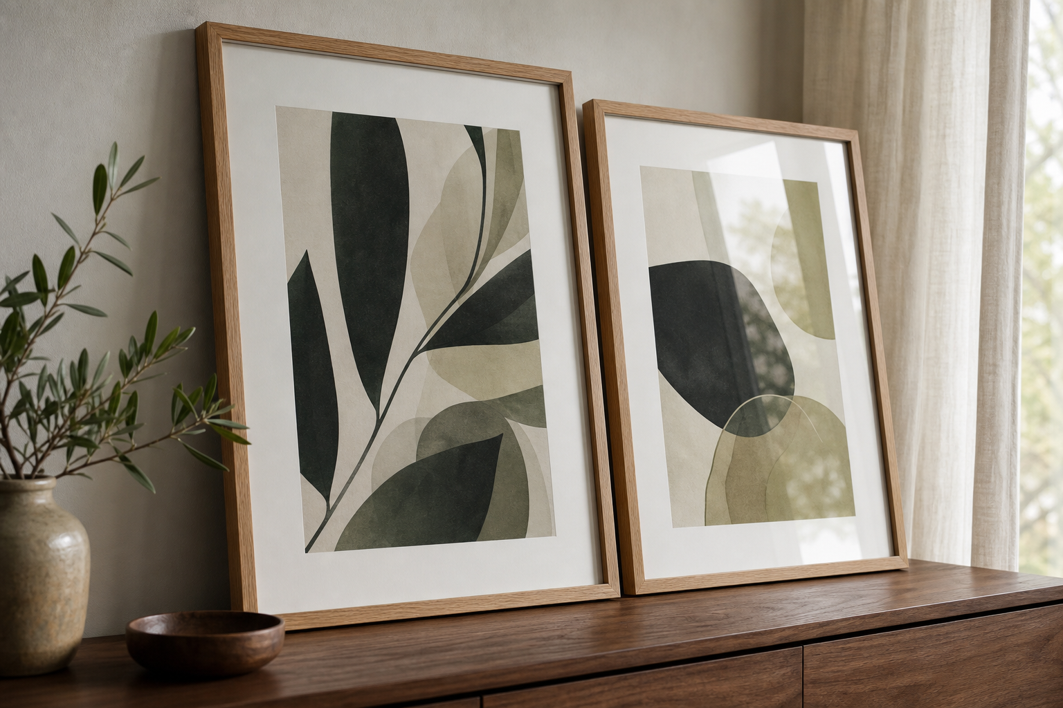
Texture-driven designs are useful here because the surface quality is part of the experience. A piece such as Textured White Abstract Poster works best when the print retains its tactile visual depth rather than collapsing into a flat white block.

Price, Value, and Longevity
Posters win on entry price. If you need to cover a large wall on a modest budget, they are hard to beat. You can often style a 50x70 cm or 70x100 cm poster for a fraction of the cost of a heavier art print in the same size. That matters when you are building a gallery wall of six to eight pieces or decorating temporary spaces.
Art prints tend to offer better long-term value. Heavier paper handles framing more cleanly, pigments stay stable for longer, and the piece is less likely to show waves, corner wear, or sun fading after a year or two. In humid spaces, thin poster paper can buckle more easily, especially if it is taped directly to the wall or clipped without support. Framed behind glass and kept out of harsh direct light, a quality art print can hold its look for many years.
In a practical art print vs poster decision, ask how permanent the room is. For a rented bedroom, trend-led home office, or short-term seasonal refresh, posters make sense. For a main living space or a gift you want to feel considered, an art print usually delivers more value per year of use.
When to Choose a Poster
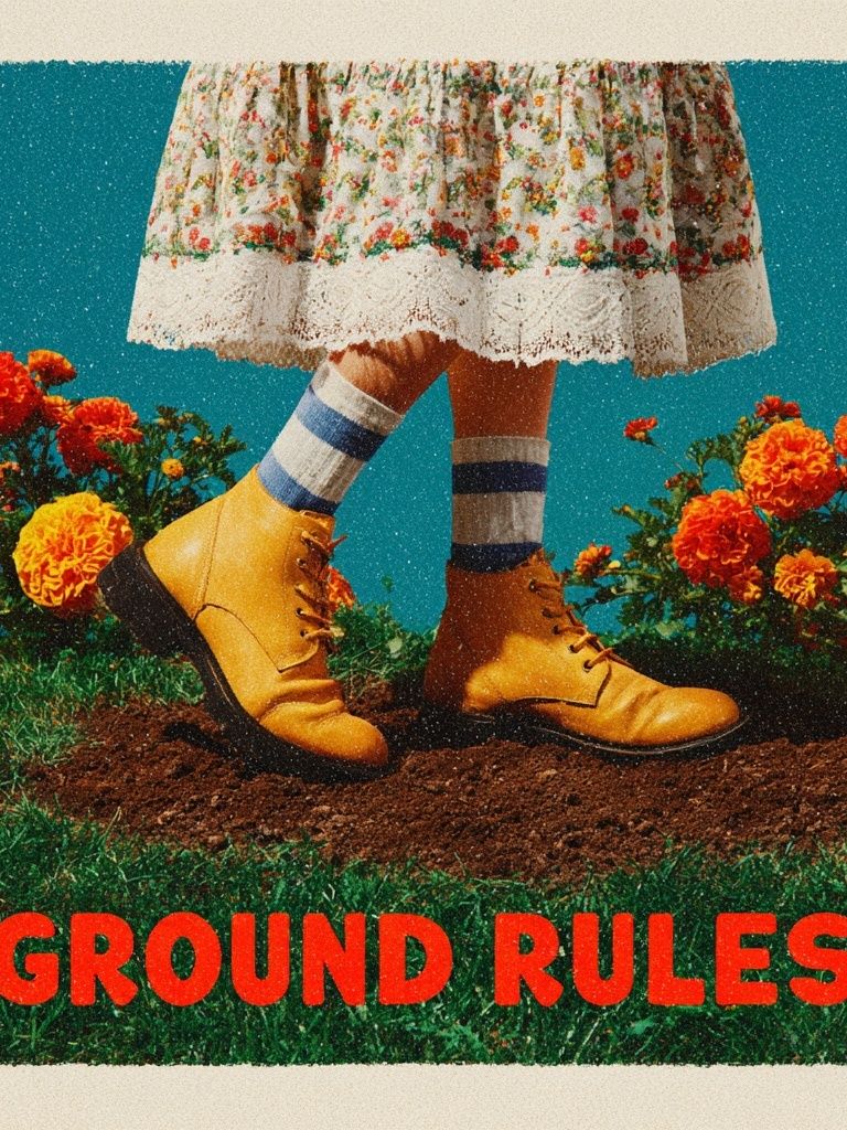
Choose a poster when scale and flexibility matter more than archival feel. Posters are ideal for large blank walls, student rooms, first homes, and trend-driven updates where you may want to swap art every 6 to 12 months. They also work well when you want one bold visual move — a graphic abstract, a typography piece, or a playful colour hit — without committing to a high framing budget.
That is where category choice becomes useful. Strong graphic styles from typography prints or abstract designs often read beautifully as posters because the impact comes from shape, contrast, and colour rather than micro-detail. If you are building a casual arrangement over a desk or sideboard, mixing graphic and painterly work keeps the display from looking too uniform.

When an Art Print Is the Better Fit
Choose an art print when the room needs more refinement. Bedrooms, living rooms, dining spaces, and thoughtfully layered gallery walls usually benefit from the depth and finish of a better print. The difference is especially visible in soft colour palettes, painterly scenes, and quiet compositions where tonal detail carries the piece.
Art prints also make better gifts. The heavier sheet, more premium surface, and stronger framing result feel intentional. A landscape, floral, or classic work from our Fine Art range can suit interiors for years rather than one season. If you are styling around natural woods, linen, stone, and warm neutrals, impressionist and minimal fine art pieces are often the most convincing choice.
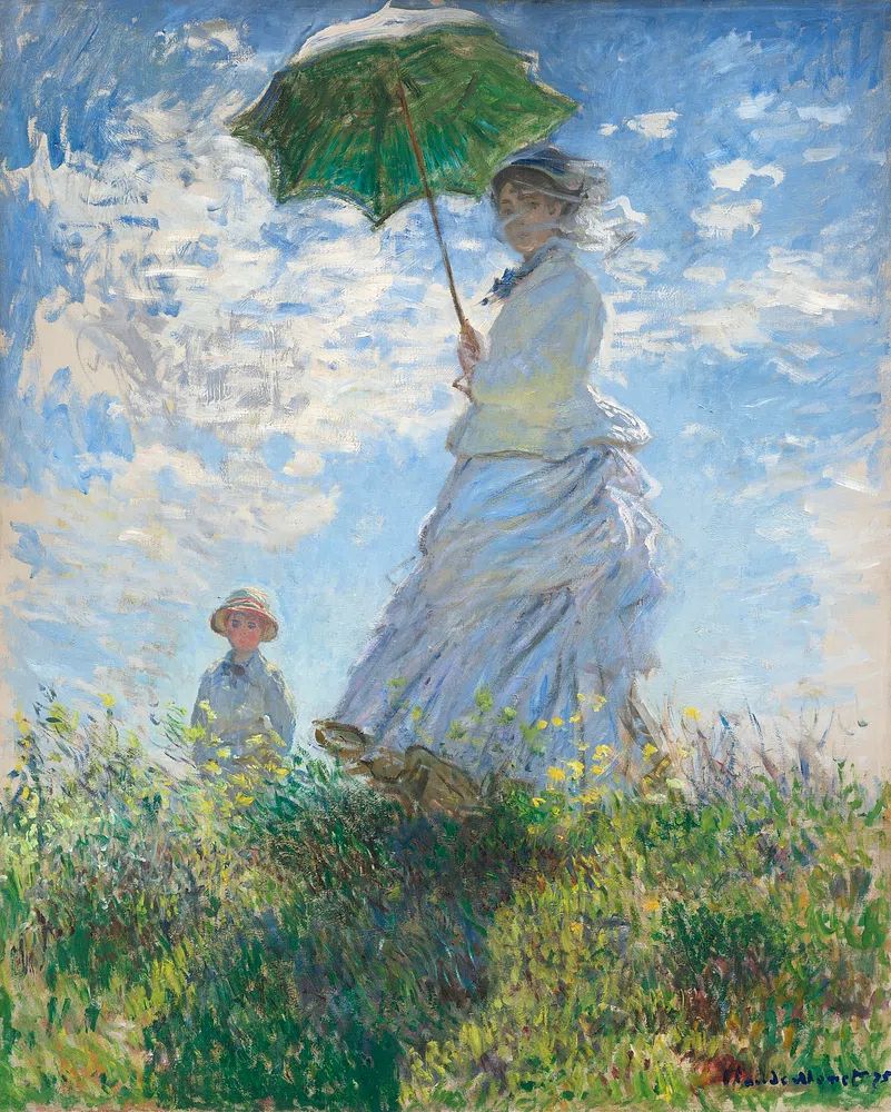
A delicate work like Woman with a Parasol — Impressionist Print has enough subtle movement and atmospheric colour that the upgrade to art print quality is easy to appreciate. The same is true for calm, understated pieces such as Zen Garden Stones — Fine Art Print, which rely on quiet tonal contrast rather than loud graphic punch.
Framing, Sizing, and Styling Tips
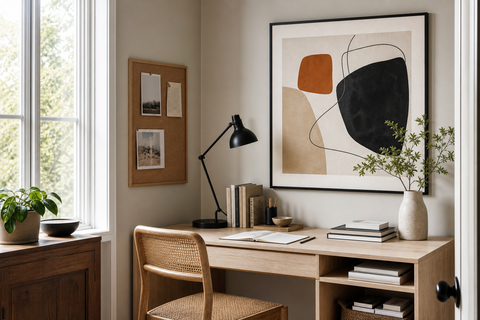
Posters look better when the styling stays simple. Use clean black, white, or oak frames in standard sizes such as 30x40 cm, 50x70 cm, or 70x100 cm. A narrow frame profile keeps the look contemporary and prevents a lower-cost piece from trying too hard. If you are hanging unframed work, reserve that for casual spaces like dorms or studios — and use magnetic hangers or clips instead of tape to avoid curled corners.
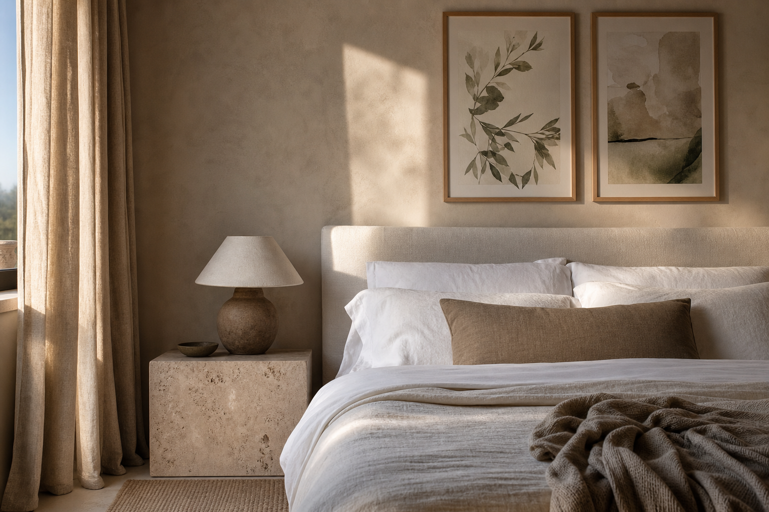
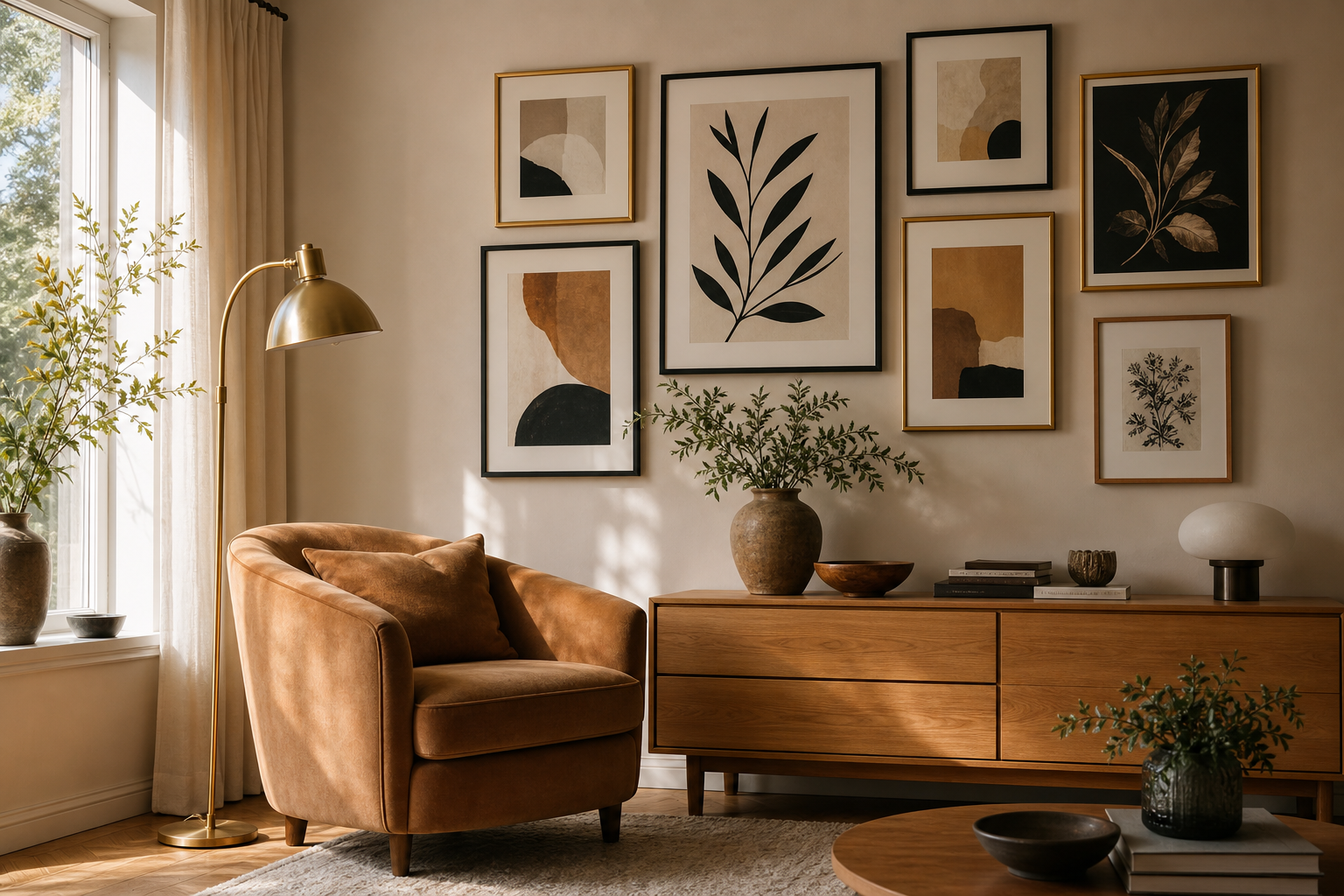
Art prints can handle more formal presentation. Add a mount for smaller sizes like 30x40 cm to give the work more breathing room, or use a wider mat around detailed compositions. In living rooms, hang the centre of the artwork about 145 cm from the floor, or keep the bottom edge 15 to 25 cm above a sofa or console. For gallery walls, maintain 5 to 8 cm between frames for a collected look.
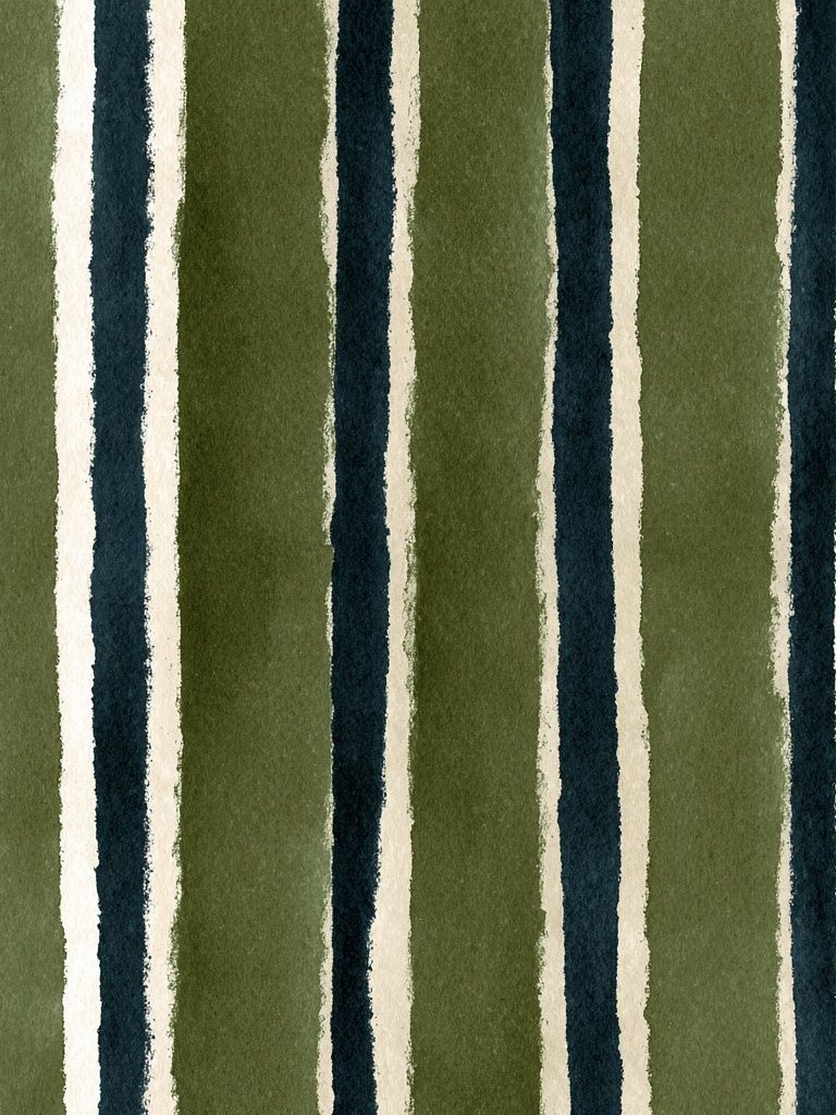
Minimal and textural pieces are especially useful when testing frame styles. Elegant White Fabric — Minimalist Print pairs naturally with pale oak and off-white mats, while bolder works from the abstract category can take slimmer black frames for stronger contrast.

If you want a balanced arrangement, combine one larger anchor piece with two to four secondary works. A 70x100 cm focal print above a sofa can be supported by smaller 30x40 cm or 40x50 cm pieces elsewhere in the room. This works especially well when you mix categories — for example, one painterly work from Fine Art with one restrained piece from Minimalist and one graphic accent from Typography.
The Bottom Line: Which One Should You Buy?
If you want affordable scale, easy updates, and a more relaxed styling approach, buy a poster. If you want better paper, cleaner colour, stronger longevity, and a more finished interior look, choose an art print. That is the clearest way to answer the art print vs poster question without overcomplicating it.
A simple rule helps: choose posters for flexibility, choose art prints for permanence. If the piece is going in a high-use room, being professionally framed, or meant to stay up for years, the upgrade is worth it. If you are experimenting with style, decorating on a tighter budget, or filling a large wall fast, a well-chosen poster is still an excellent design tool.