--- title: "How to Style a Cottage Garden Poster Print" slug: "cottage-garden-poster-print" description: "Discover how to style a cottage garden poster print with the right palette, framing, placement, and room ideas for a soft, timeless look." keywords: - "cottage garden poster print" - "cottage garden wall art" - "botanical print styling" - "vintage floral wall decor" - "romantic gallery wall"
A cottage garden poster print works because it feels relaxed rather than decorated to perfection. The best versions combine soft florals, a little asymmetry, and the kind of colour that looks gently aged instead of sharp or glossy. That makes them easy to live with in bedrooms, hallways, kitchens, and reading nooks where you want warmth without visual clutter.
This style also has range. A cottage garden poster print can lean botanical, romantic, vintage, or lightly rustic depending on the frame, the wall colour, and the prints around it. If you want a good starting point, look at our botanical collection and vintage floral wall art together rather than treating them as separate looks. Cottage styling usually sits somewhere between the two.
What Makes the Cottage Garden Look So Appealing
The appeal starts with shape and detail. Cottage garden imagery tends to feature climbing stems, layered petals, small birds, winding branches, and slightly irregular compositions. Those details soften a room because the eye keeps moving across the artwork instead of stopping at one hard focal point. That is why these prints feel especially natural in homes with linen curtains, painted timber furniture, and woven textures.
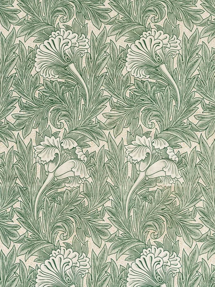
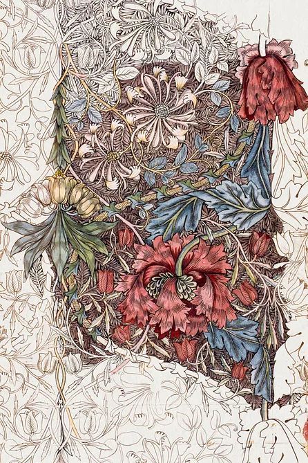
A second reason is familiarity. Traditional floral motifs from artists such as William Morris still work because they carry pattern, history, and muted colour in one piece. Prints like Honeysuckle by William Morris or William Morris's vintage chrysanthemum flower echo the layered feel of a real garden bed — nothing too sparse, nothing too polished.

If you prefer a lighter interpretation, choose art with more white space and looser brushwork. A floral watercolour with pale stems and soft edges feels fresher than a dense heritage pattern, especially in smaller rooms under 12 square metres where heavy pattern can close the space in.
Choosing the Right Colour Palette
The strongest palette for this look is built around 4 core tones: soft sage, warm cream, dusty blush, and muted olive. These give a cottage garden print enough contrast to show detail, while keeping the room calm. If your walls are already white, add warmth with ivory textiles and light oak or antique brass accents so the print does not feel too cool.
For paint and furnishings, stay with low-saturation colour. Think greens with a grey undertone, pinks with a touch of brown, and whites that lean butter or chalk rather than blue. A simple rule is 60-30-10: let 60% of the room stay neutral, 30% carry your soft supporting colour — sage upholstery or floral cushions, for example — and 10% deliver a richer accent such as marigold, berry, or moss.

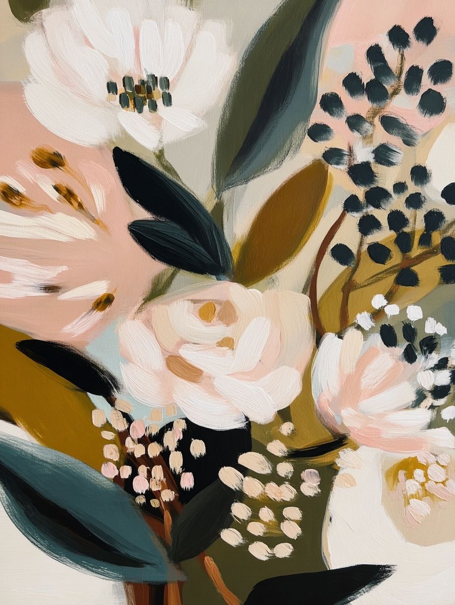
If your print includes stronger tones such as terracotta, mustard, or deep green, repeat them only once or twice in the room. A cushion edge, ceramic jug, or lampshade trim is enough. Too many repeats make the room feel themed rather than collected. For easier colour matching, browse soft bohemian florals and painterly fine art prints alongside botanical pieces.

Where a Cottage Garden Poster Print Works Best
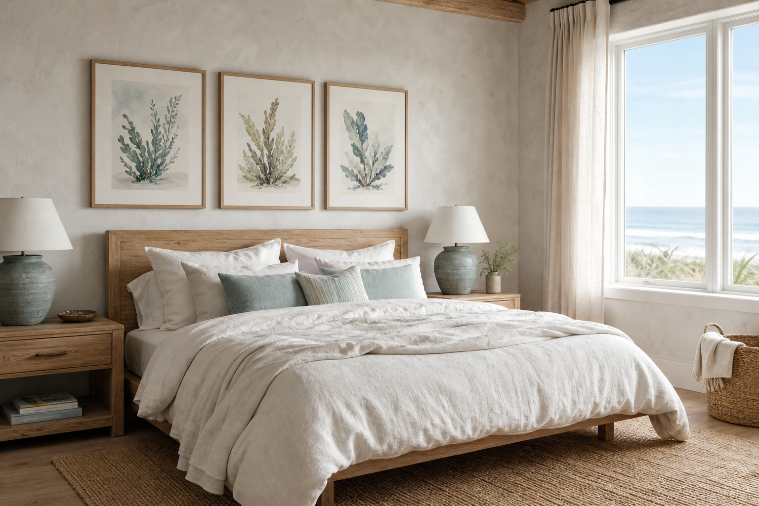
Bedrooms are the most natural fit because the style supports rest. One medium print in 50x70 cm above a queen bed works well when centred 15 to 20 cm above the headboard. If the bed is king-size, use either a larger 70x100 cm piece or a pair of narrower prints with 6 to 8 cm between frames so the arrangement holds enough visual weight.
Hallways are useful when you want charm in a narrow space. Here, vertical prints around 30x40 cm or 40x50 cm keep the wall feeling taller. Choose artwork with visible stems, trailing leaves, or bird motifs to create movement down the corridor. Swallows in Flight is especially effective in an entry or landing because it adds lift without adding density.
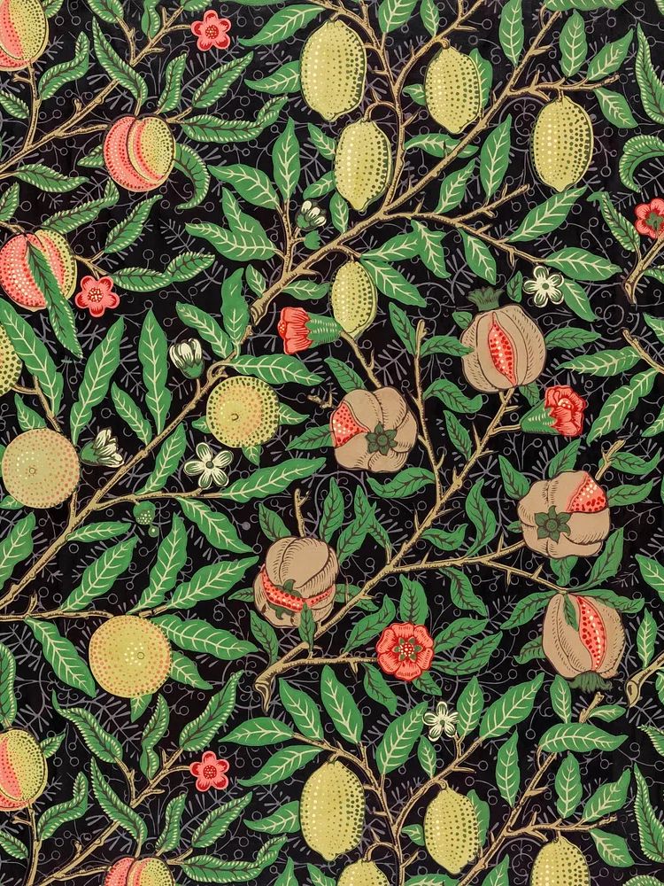
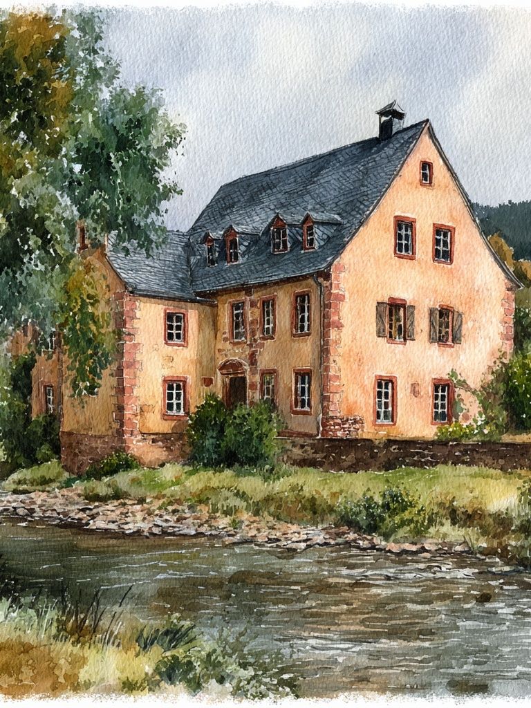
Kitchens and breakfast corners suit cottage garden art when the palette is fresh rather than dark. Place one print above a plate shelf, next to a dresser, or at the end of a galley run where there is less steam exposure. Nature-led options such as Charming Cottage by the River or William Morris's vintage willow leaves help the room feel connected to the outdoors.

Reading corners are ideal for one smaller piece because they already rely on texture — throws, upholstery, books, and lamp light. In these spots, the print should complement rather than dominate. Keep the bottom of the frame roughly 120 to 145 cm from the floor depending on chair height, so it reads as part of the seated space.
Framing and Finish Ideas
The frame decides whether your print feels classic, bright, or vintage. For a cleaner cottage look, use narrow oak or painted wood frames between 1.5 and 2 cm wide. For a more traditional look, choose antique gold, walnut, or lightly distressed cream. Black can work, but only if the artwork itself is pale and airy — otherwise the contrast becomes too severe.
A mount can make a major difference. Adding a white or warm off-white mount of 5 to 8 cm around a floral print gives it breathing space and helps a detailed image feel more elevated. This is especially useful with denser designs such as Marigold by William Morris or Chrysanthemum by William Morris.
Finish matters too. A matte paper or matte-glazed frame usually suits cottage styling better than a high-gloss finish because it reduces reflections and keeps the colours soft. In bright south-facing rooms, this is practical as well as aesthetic — glare can flatten delicate pinks and greens. If the room is dim, use lighter frames and more white margin rather than shinier glass.

How to Build a Calm Gallery Wall Around It
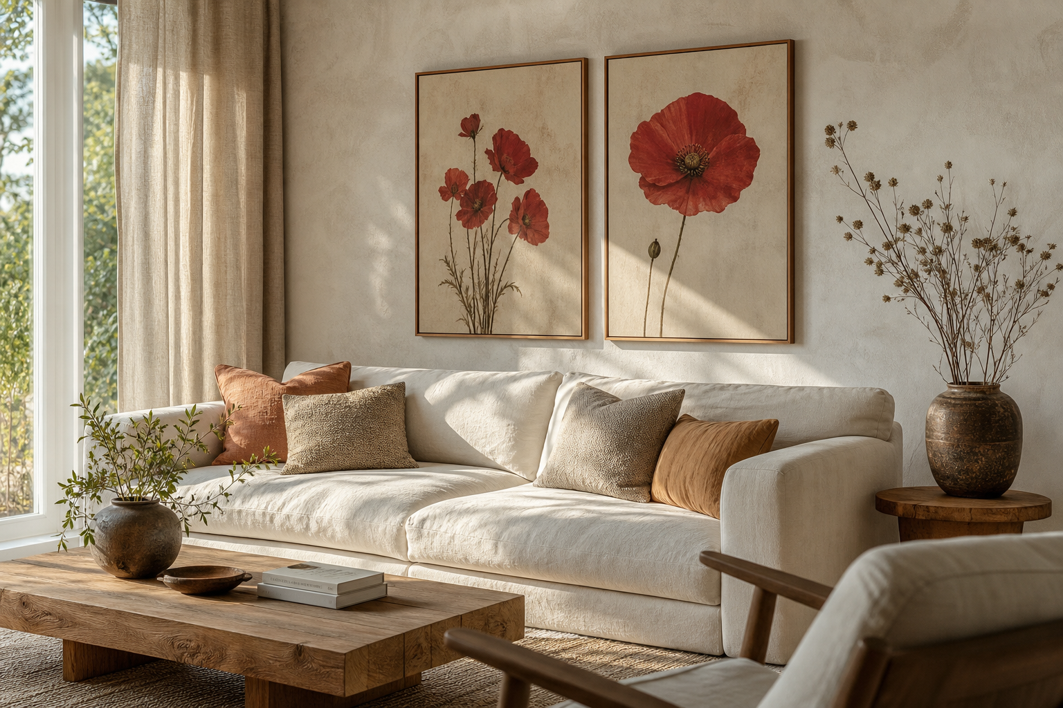
A calm gallery wall needs one anchor piece, then supporting prints that vary in subject but not in mood. Start with your main cottage garden artwork in 50x70 cm or 40x50 cm. Add two to four secondary pieces around it — birds, foliage, a countryside view, or a small patterned floral — while keeping the palette within the same muted range.
Spacing is what keeps it quiet. Leave 5 to 7 cm between small and medium frames, and up to 8 cm between larger ones. If everything is too close, the wall reads busy. If everything is too far apart, it stops feeling collected. Aim for an overall arrangement width that covers about two-thirds of the furniture below it, whether that is a sofa, console, or bed.
A good mix for this style is one floral focal point, one bird illustration, one landscape, and one pattern-based botanical print. That gives variation without breaking the story of the wall.

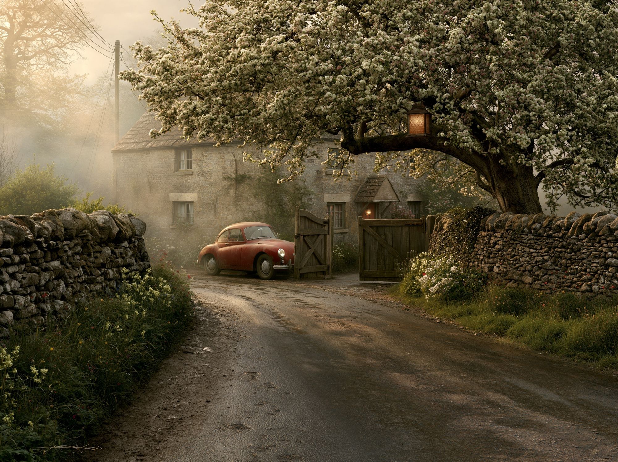

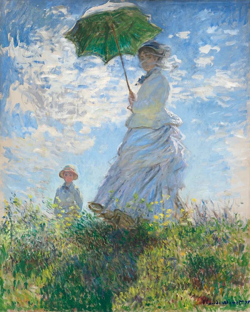
If you want the arrangement to feel less formal, let one frame sit 2 to 3 cm lower than the opposing piece rather than lining every top edge perfectly. Cottage style benefits from small imperfections. For larger grouped displays, combine ideas from nature illustration prints and soft landscape wall art so the wall feels layered rather than repetitive.
Styling Tips for a Soft Seasonal Refresh
Spring styling is simple: pair the print with cut branches, pale ceramics, and lighter fabrics such as washed cotton and linen. Even one bunch of blossom or green foliage repeated near the artwork makes the colour feel intentional. Keep surfaces uncluttered — one vase, one candle, one stack of books is usually enough.
In summer, introduce a little more contrast. Straw textures, faded checks, and blue-green glass work well with floral art because they bring in the garden-and-veranda feeling without changing the wall itself. If your print has warm pink or peach notes, small accents in coral or terracotta can make it feel brighter.
Autumn and winter do not require swapping the art. Instead, deepen the styling around it with olive throws, heavier curtains, warm wood, and amber-toned lampshades. Cottage garden imagery holds up well through colder months because it keeps some life in the room when the palette outdoors turns grey.

Final Thoughts and Shopping Tips
The best cottage garden wall styling is restrained. Choose one cottage garden poster print with colours that already exist somewhere in your room, give it a frame that matches the age and mood of the space, and avoid crowding it with too many competing patterns. Soft greens, creams, blush tones, and natural wood will do most of the work for you.
When shopping, pay attention to room light first, then detail level. Bright rooms can handle denser florals and darker greens, while lower-light spaces benefit from watercolour pieces, lighter mounts, and more visible background space. If you want a dependable place to start, combine one floral from the botanical range with one scenic piece from our fine art landscape selection for a balanced, timeless result.
Frequently Asked Questions
What frame colour suits a cottage garden print best?
Light oak, walnut, antique gold, and painted cream are the safest choices. Pick a tone that repeats a material already in the room, such as wood flooring, brass hardware, or painted furniture.
Can I hang a cottage garden print in a kitchen?
Yes — just keep it away from direct steam and splashes. A side wall, breakfast nook, or dresser corner is usually better than the space right above a hob or sink.
What size should I choose for a small bedroom wall?
A 30x40 cm or 40x50 cm print works well above a bedside table or chest. For above-bed placement, 50x70 cm is often the best single-print size in a compact room.
Do cottage garden prints work with modern furniture?
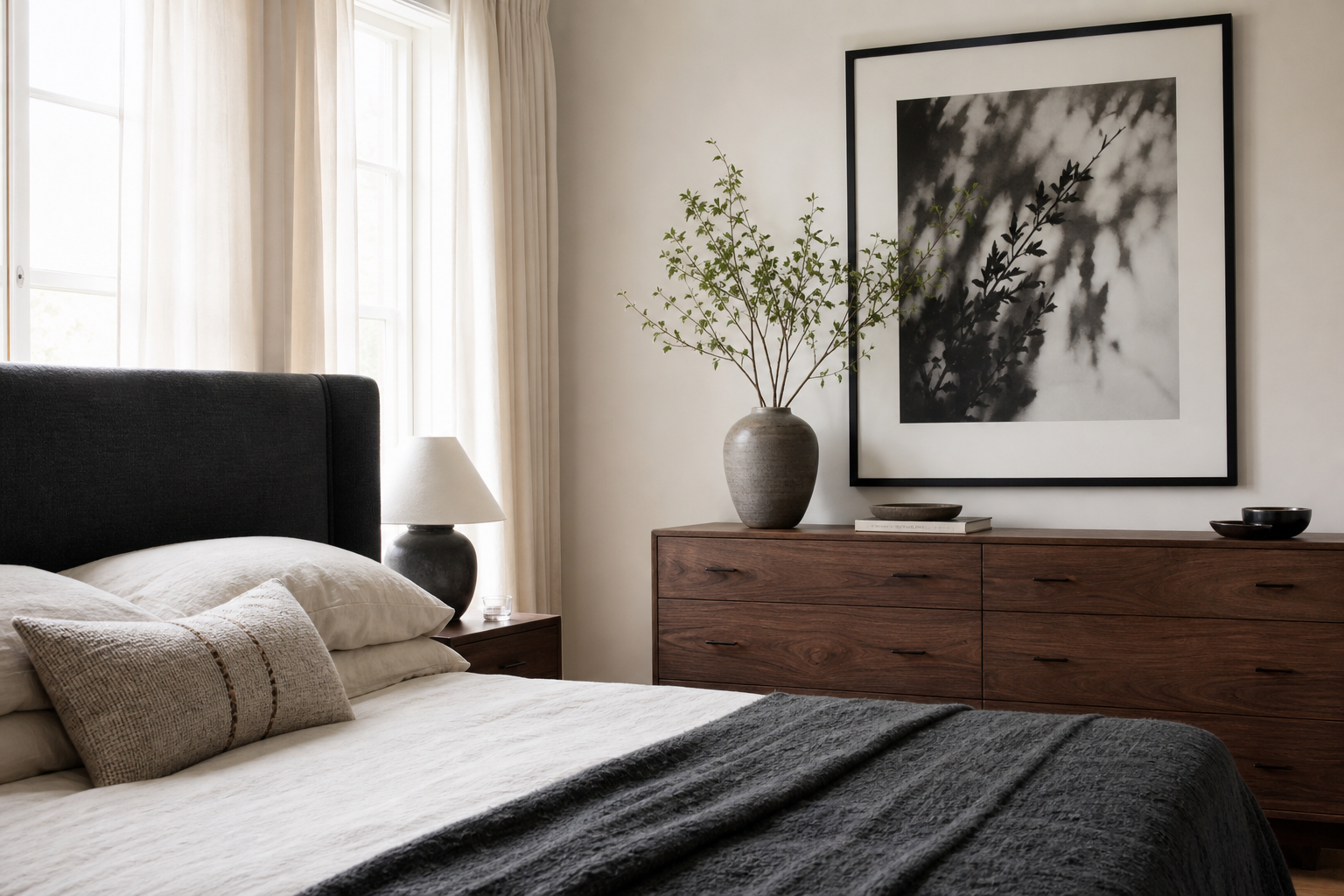
They do if you keep the palette soft and the frame simple. A modern bed or sofa looks warmer instantly when paired with muted florals and natural textures.
What other subjects pair well with floral cottage art?
Bird illustrations, countryside views, leafy botanicals, and gentle impressionist landscapes all work well. They keep the theme connected without repeating the same flower motif on every wall.