A well-chosen coastal village poster print brings in three things at once: architecture, landscape, and atmosphere. You get the structure of clustered houses and harbour lines, the softness of sea and sky, and the easy pace that coastal interiors often try to capture without looking staged. That mix is why this subject stays relevant long after sharper trend motifs have dated.
Why a Coastal Village Print Feels So Timeless
Coastal villages work because they are detailed without being busy. Narrow lanes, painted shutters, stone walls, fishing boats, and cliffside homes create visual interest, but the overall effect is usually calm. A coastal village poster print often has a built-in balance of solid shapes and open space — roughly a 60/40 split between architecture and sky, water, or shoreline — which makes it easy to live with in both small and large rooms.
Harbour scenes and painted cottages also bridge styles better than overt nautical decor. Instead of anchors, rope motifs, or bright marine stripes, a village view feels more collected and architectural. That makes it easier to pair with our architecture prints or softer travel-inspired wall art when you want a room to feel layered rather than themed.
If you like the charm of Mediterranean facades, stepped streets, and sea-facing houses, choose artwork with visible buildings rather than just open water. Prints such as the nested hillside composition in Santorini Cliffside Village Travel Print or the softer painterly feel of Charming Italian Village — Watercolor Print show why village imagery feels enduring: it has place, scale, and story.

Choosing the Right Colour Palette
The easiest way to style coastal art well is to pull no more than three colours from the print and repeat them around the room. In most coastal village pieces, that means a faded blue, a chalky white, and a warm sand or stone tone. This 3-colour approach keeps the artwork connected to the room without turning every surface into a seaside reference.
If your space is mostly neutral, pick up the palest tones first. Off-white walls, oat linen, light oak, and sandy jute make a blue-and-white village print feel integrated immediately. If your room already includes cooler colours, match the art to grey-blue upholstery, weathered wood, or brushed nickel finishes rather than adding brighter turquoise accents that can make the scheme feel more holiday rental than home.
For warmer interiors, look for coastal scenes with terracotta roofs, sun-faded plaster, or creamy stonework. That lets you mix the print with walnut, antique brass, or textured ceramics more naturally. A good reference point is to keep colour saturation low — think 20 to 30 percent muted rather than glossy or highly vivid — so the room stays refined.

A useful pairing strategy is to connect a coastal village print with one neighbouring category rather than many. our vintage collection adds age and softness, while nature prints with ocean subjects bring in movement and open space. That single-category pairing keeps the scheme disciplined.
Where It Works Best in the Home
Living rooms are the most natural fit, especially above a sofa, sideboard, or fireplace. For a standard 200 to 230 cm sofa, choose artwork around 100 to 140 cm wide in total so it fills roughly two-thirds of the furniture width. A single large print feels clean; a pair or trio works better if you want the wall to feel more collected.
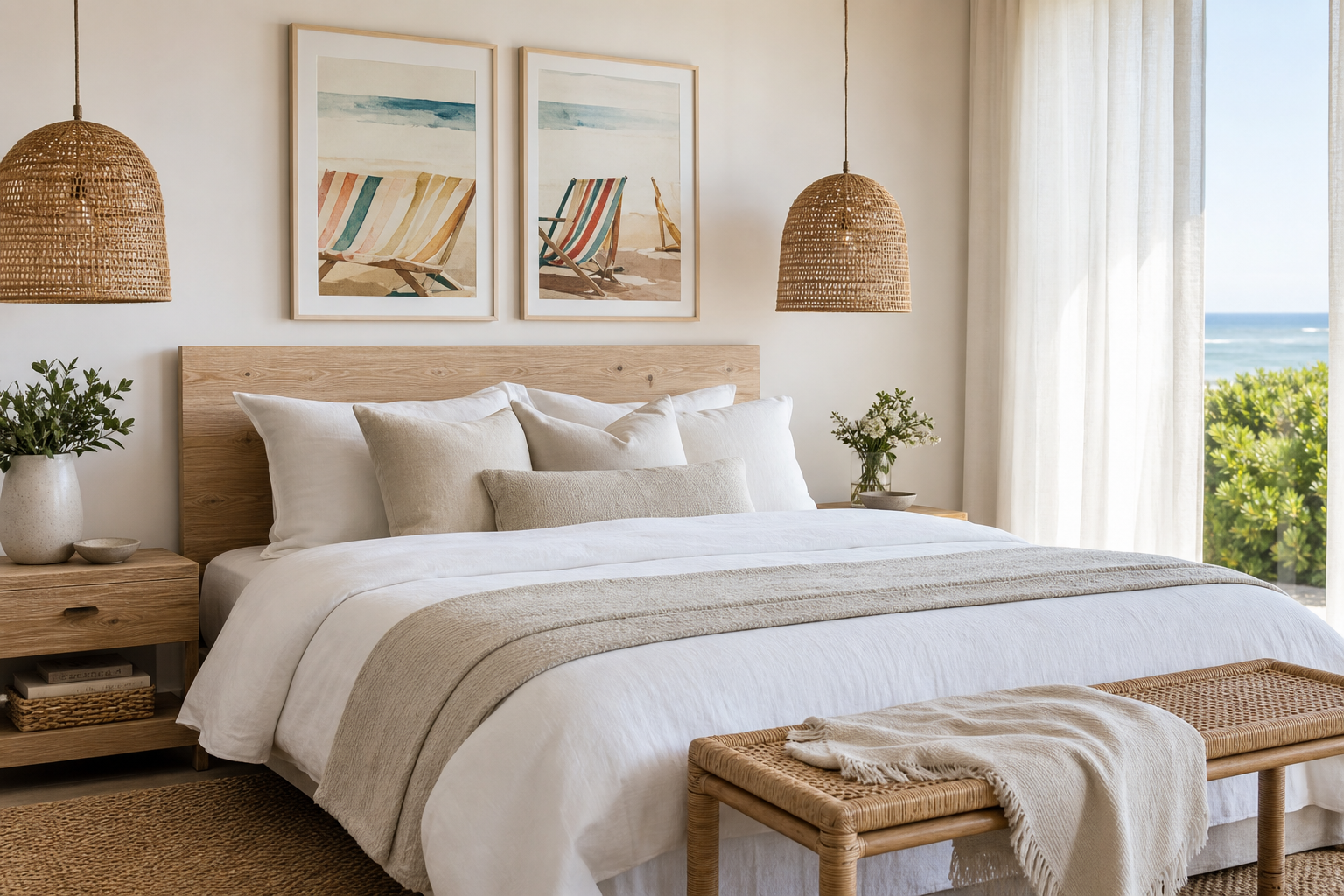
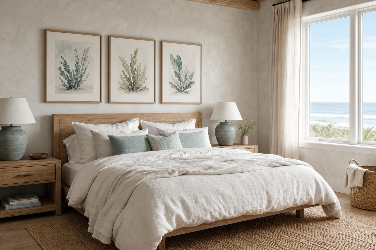
Bedrooms benefit from the quieter side of coastal imagery. Hang a coastal village poster print above the headboard if the composition is soft and airy rather than high contrast. In a 150 cm double bed setup, a frame around 70 x 100 cm usually looks balanced, while a triptych should span about 110 to 130 cm overall. Keep bedding simple — white, flax, soft blue, or fine stripe — so the wall art remains the focal point.
Hallways and landings are ideal for narrower vertical scenes with visible houses, steps, or lighthouse details because they reward close viewing. Kitchens also suit coastal village art surprisingly well, especially near breakfast nooks, shelves, or dresser walls. In these spaces, sun-washed architecture ties in nicely with painted cabinetry, ceramics, and open wood shelving.
Holiday homes can handle a stronger coastal mood, but restraint still matters. One or two well-placed pieces will feel more elegant than an entire room of shore references. If you want a little more variation, mix village imagery with Lighthouse Coastal Toile Print or a map-based travel piece from our Maps Travel collection.

Sizing, Framing and Finish Tips
Scale is what makes wall art feel intentional. As a rule, leave 15 to 25 cm between the top of a sofa and the bottom of the frame, and hang the centre of the artwork at about 145 cm from the floor in most standing-view spaces. If you are styling over a console or chest, keep the artwork at least 10 cm narrower than the furniture on each side.
Frame choice changes the mood quickly. Pale oak gives a coastal village scene a Scandinavian lightness. White frames sharpen blue-and-white compositions but can disappear on white walls unless you use a mount. Mid-tone walnut adds contrast and works especially well when the print includes earthy stone or terracotta. Black frames are best reserved for more graphic coastal scenes, since they can feel too severe against softer watercolour or vintage imagery.
Paper finish matters more than many buyers expect. A matte finish suits coastal subjects because it softens glare and keeps the colours chalky rather than glossy. In bright rooms with direct window light, matte paper also makes fine building details easier to see through the day. If you use glazing, choose low-reflection acrylic or glass where possible.

How to Build a Coastal Gallery Wall
A coastal gallery wall works best when the village scene is the anchor, not one of six equal voices. Start with your main coastal village poster print, then add three supporting pieces that vary by subject and scale. A reliable formula is one architectural village view, one open-water or wildlife image, one coastal linework or toile-style print, and one travel or map piece.




Keep the palette tight across all four pieces. If one print introduces a stronger accent — coral, mustard, or deep navy — repeat that colour once in the room through a cushion, vase, or throw, not in every frame. Spacing should stay consistent: 5 to 7 cm between smaller frames, 7 to 10 cm for larger arrangements.
Use layout to control formality. A neat 2 x 2 grid looks polished in dining rooms, hallways, and modern living spaces. A looser salon-style arrangement suits cottages, rustic homes, or rooms with beams and older architectural details. If the wall already includes shelving, sconces, or a mirror, keep the art arrangement simpler so the whole composition does not compete.

Styling for Different Interior Looks
In modern interiors, keep the frame slim and the surrounding palette restrained. One large coastal village scene above a low-profile sofa or sideboard is often enough. Pair it with clean-lined furniture, boucle or linen upholstery, and minimal accessories so the artwork adds place without clutter.
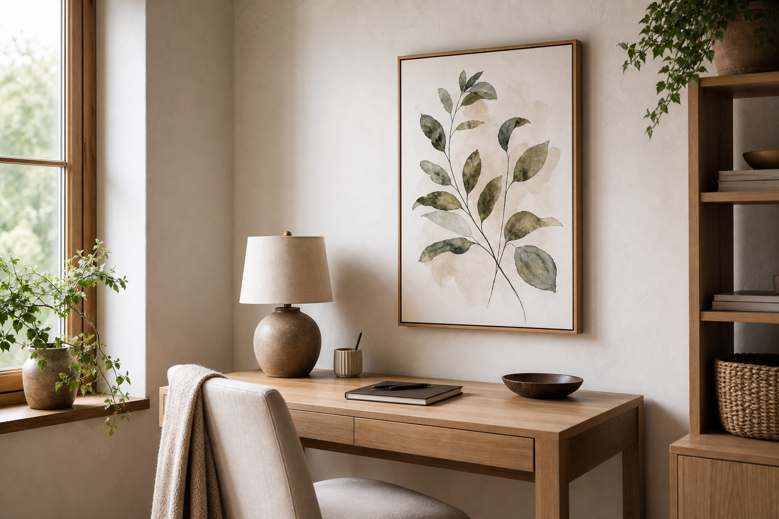
For rustic rooms, lean into texture rather than obvious motifs. Reclaimed wood, limewashed walls, woven baskets, and ceramic vessels all support coastal architecture beautifully. A print with stone houses or slightly faded tones will sit more naturally here than anything too crisp or saturated. The gentle age in Coastal Retreat — Vintage Print is a good example of that softer approach.
Scandi spaces benefit from high lightness and simple contrast. Choose white walls, pale timber, soft grey-blue textiles, and one or two black accents at most. Village scenes with clear shapes and open sky work well because they echo the uncluttered structure of Scandinavian styling. You can also mix in a quiet architectural piece such as Charming Pink and Blue House Poster if you want a more playful companion.
Traditional interiors can carry more detail. Layer the print with pleated lampshades, painted furniture, stripe upholstery, or antique brass. In these spaces, a coastal village artwork feels strongest when it has painterly depth rather than a highly graphic finish. That keeps the room elegant and avoids the look of novelty beach decor.


Final Thoughts: Keeping the Look Relaxed and Refined
The best coastal rooms do not announce their theme too loudly. A coastal village poster print works because it suggests escape, architecture, and calm in one image, especially when the colours stay muted and the styling stays measured. Choose a piece that matches the undertone of your room first — cool chalky blue, warm sand, or sun-faded stone — then build around it with texture more than decoration.
If you want the look to last, focus on one strong print, a sensible frame, and a palette that already exists in your home. That is usually enough to make a coastal village poster print feel personal, polished, and easy to live with for years.
Frequently Asked Questions
What frame size should I choose if I want a mount around the print?
Add 10 to 20 cm to the print size overall for a balanced mount. For example, a 50 x 70 cm print often looks polished in a 60 x 80 cm frame with a wide off-white mount.
Do coastal prints work on coloured walls?
Yes — especially on soft sage, pale grey-blue, warm white, or sandy beige walls. Keep the wall colour muted so the artwork remains the clearest focal point.
Is matte or glossy better for a coastal scene?
Matte is usually better because it reduces glare and keeps sea, sky, and painted buildings looking soft. Glossy finishes can make subtle village tones appear harsher under direct light.
What other subjects pair well with a coastal village print?
Maps, lighthouses, quiet ocean photography, and architectural house studies all work well. Pick one secondary subject and repeat it once or twice rather than mixing too many seaside references.