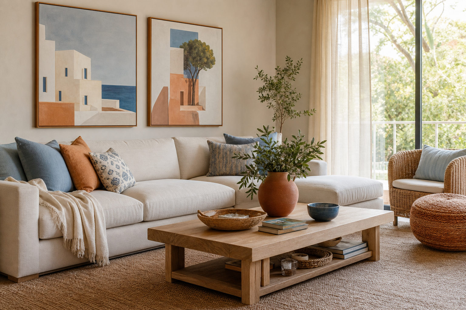
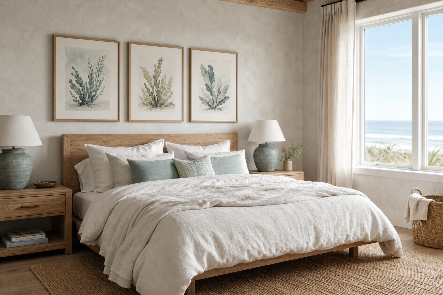
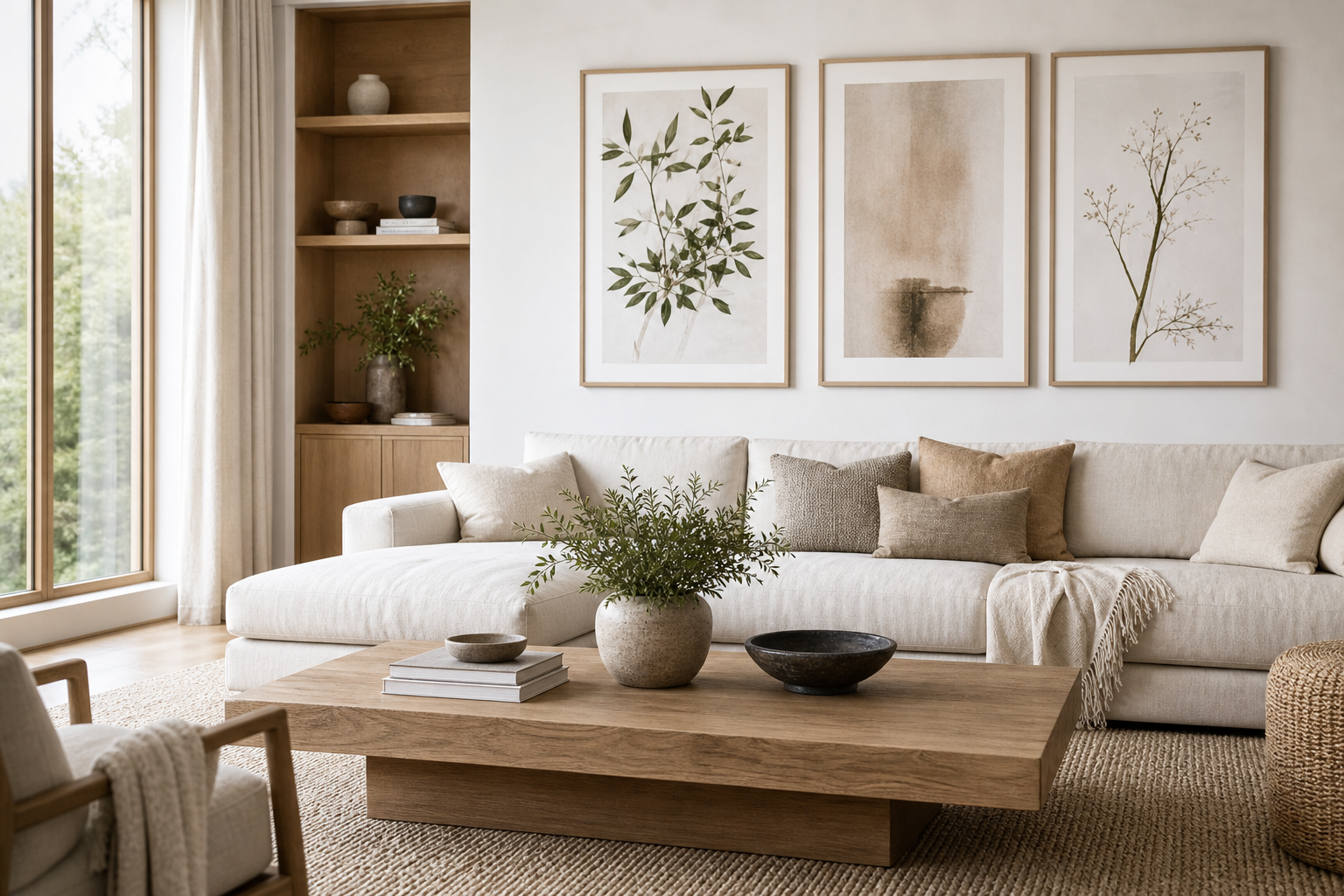
A beach chairs poster print does something few subjects manage so easily: it makes a room feel relaxed within seconds. Empty chairs facing the sea suggest rest, open time, and a destination with no schedule. That is why this kind of image works so well in interiors that need softness without becoming dull.
It also has strong visual structure. Beach chairs create clean lines, repeated shapes, and a natural horizon, so the composition feels ordered even when the colors are playful. If you want wall art that reads as calm from across the room, a beach chairs poster print gives you both clarity and atmosphere.
Why Beach Chairs Work as Wall Art
Coastal images often succeed because they combine space and color. In a beach-chair scene, you usually get three strong horizontal zones — sand, sea, and sky — which naturally settle the eye. Add the simple geometry of chairs, and the result feels balanced rather than busy.
That makes this subject useful in rooms where you already have texture from linen, jute, cane, or wood. A detailed floral or crowded city scene can compete with those materials. A beach image, especially one with open sky and water, tends to support them instead. If you already like airy pieces from our Photography collection or subtle coastal-inspired works from our Nature prints, this theme sits comfortably in that same visual family.

A strong beach-chair image also avoids one common coastal styling mistake: making a room feel too themed. You are not decorating a holiday rental brochure. You are choosing one recognizable summer symbol and letting it carry the mood. That is why a single framed coastal photograph can often look more sophisticated than a room filled with anchors, shells, and overt nautical motifs.
Choosing the Right Mood: Breezy, Bold, or Vintage
Not every coastal room wants the same energy. For a breezy look, choose pale sand, faded aqua, white, and sun-washed blue. These prints work especially well with oak, slipcovered seating, and off-white walls in shades close to warm ivory. If your room already has low-contrast materials, pair the beach-chair image with restrained companions such as Textured Waves or the clean tonal finish of our Minimalist collection.
For a bolder direction, look for saturated stripes — cobalt, coral, yellow, or red. Bright chairs create a focal point in otherwise neutral rooms, and they can pull color from cushions or a rug without requiring a full redesign. This works especially well in compact spaces where one strong piece has to do most of the visual work.
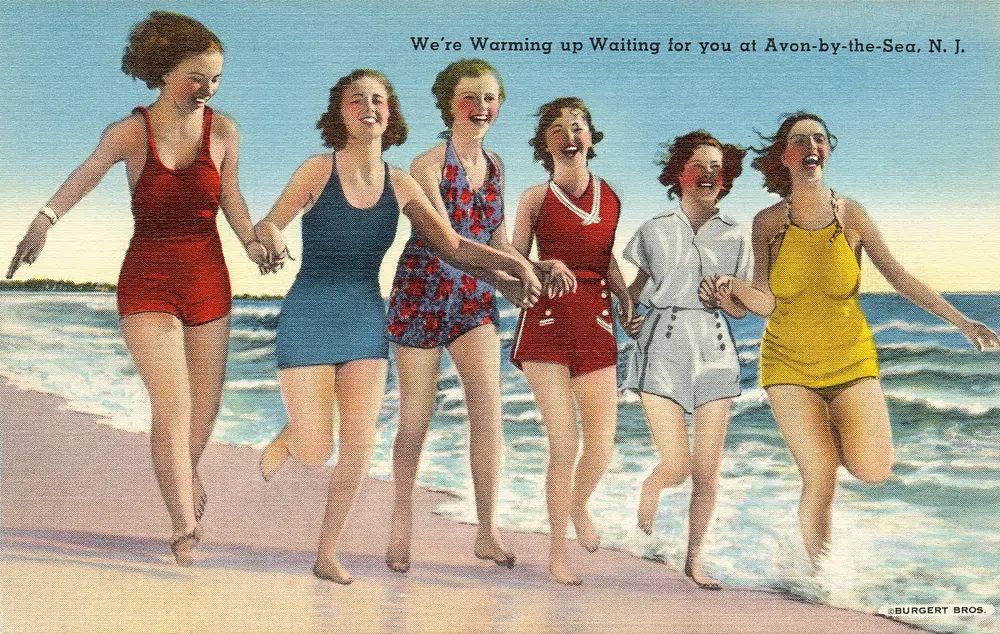
Vintage is the third route, and it is often the easiest to mix with collected interiors. A retro beach image brings slightly faded color, old-holiday charm, and less gloss than a contemporary travel photograph. If your home includes antique wood, brass, or woven accents, start with pieces from our Vintage wall art collection.
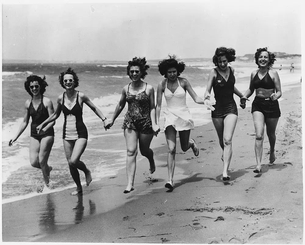


A travel-inspired variation can also work beautifully if you want the room to feel more destination-led than purely coastal. In that case, prints such as Santorini Cliffside Village or the sun-heavy palette of our Maps Travel collection can support a beach-chair print without repeating the same subject.
Where a Beach Chairs Print Looks Best
Living rooms are the most natural fit because the subject reinforces what the room is for — sitting down and switching off. Above a sofa between 180 and 240 cm wide, choose a print or framed piece that spans roughly 50 to 75 percent of the sofa width. That usually means art between 90 and 140 cm wide for a convincing, anchored look.

Bedrooms are another excellent place for this subject because the imagery is inherently quiet. Above a queen bed, a horizontal piece around 100 x 70 cm or 120 x 80 cm feels balanced. In guest rooms, beach scenes are particularly effective because they instantly communicate ease and hospitality without becoming too personal.
Hallways and bathrooms can handle brighter versions. A narrow hallway benefits from an image with strong perspective — rows of chairs, a receding shoreline, or a wide stretch of sea. In bathrooms, choose simple framing and keep the palette crisp: blue, white, sand, and a touch of sun-faded yellow.
If you want a stronger holiday feel, combine a beach-chair print with one destination-based piece such as Rio de Janeiro Tropical Print or a vintage coastal scene like Local Ocean Isle Beach Surf. That pairing works well in second homes, sunrooms, and coastal-inspired entryways.
Sizing and Placement Tips for an Easy Upgrade
A coastal print works best when it has enough scale to show the horizon clearly. If the piece is too small, the chairs become tiny details and the calming effect gets lost. For most walls, start at 50 x 70 cm minimum. If the wall is above a sofa, bed, or sideboard, 70 x 100 cm or 100 x 140 cm often feels more complete.
Hang the center of the artwork around 145 cm from the floor as a reliable starting point. Above furniture, leave 15 to 25 cm between the top of the furniture and the bottom of the frame. That gap keeps the art connected to the room rather than floating too high.
If you are using more than one piece, keep spacing tight — usually 5 to 8 cm between frames for small and medium sizes, and 8 to 10 cm for larger frames. That matters with beach imagery because the scene already contains a lot of open space. Wide gaps between frames can make the wall feel disconnected instead of airy.
Framing and Styling for a Coastal Finish
Frame choice changes the tone more than most people expect. Light oak gives a beach chairs poster print a fresh Scandinavian feel, especially with white walls and woven textures. White frames feel crisp and beach-house clean. Natural wood with visible grain makes the look softer and more organic.

Add a white mat if you want the image to feel more elevated and less casual. A mat width of 5 to 8 cm suits medium pieces well and gives bright colors room to breathe. Skip heavy black frames unless the photo itself has strong contrast — they can make a soft coastal image feel too sharp.
Supporting decor should stay tactile rather than literal. Think washed linen, seagrass, pale ceramics, and one or two sun-worn colors repeated in cushions or throws. If you want complementary art nearby, use abstract pieces with wave-like movement such as Golden Sunrise Minimalist Poster or beach-adjacent subjects with a similar palette.

How to Build a Summer Wall Around One Print
Start with the beach-chair image as the anchor, then add three supporting pieces that vary the subject but keep the palette connected. A simple formula is 1 hero image, 1 water study, 1 vintage travel print, and 1 texture-led neutral piece. That gives enough contrast without losing the coastal mood.
For example, you can build around the main image with a water photograph, a retro beach destination print, and a soft abstract. This prevents the gallery from becoming repetitive. The beach chairs hold the story; the other works add rhythm.

A compact gallery wall above a console or bench usually works well at widths between 120 and 180 cm. Keep the beach-chair print slightly larger than the others so the eye lands there first. If you prefer a cleaner layout, use a row of four matching frames in sizes like 40 x 50 cm.
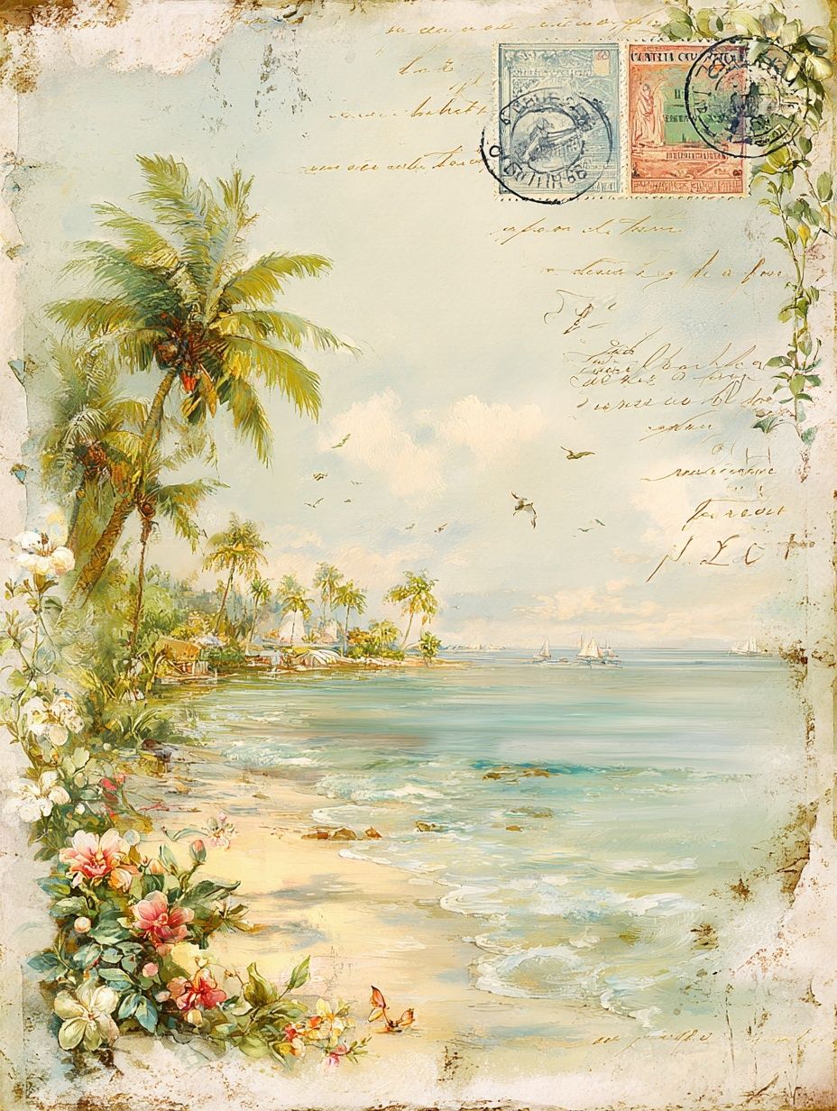
You can also bring in subtle texture pieces from our Bohemian collection if the room already includes rattan, boucle, or cane. A natural surface print like Woven Bamboo Texture can soften the transition between photographic coastal art and warmer interior materials.
Final thoughts
A beach chairs poster print is one of the simplest ways to give a room more lightness, color, and emotional ease. It reads as summer without being overly decorative, and it works across modern, vintage, Scandinavian, and relaxed coastal interiors.
Choose the mood first — breezy, bold, or retro — then match the size to your wall and finish it with a frame that suits the rest of the room. When the colors echo your textiles and the scale is right, that one coastal image can make the whole space feel calmer.
Frequently Asked Questions
What frame color works best with a beach chairs print?
Light oak and white are the safest choices for coastal interiors. Use oak for warmth and texture, and white if you want a cleaner, brighter finish.
Can I hang a beach print in a bathroom?
Yes, but keep it away from direct steam if possible. A well-framed print on a wall with good ventilation will hold up better over time.
What colors pair well with beach-chair artwork?
Soft blue, sand, off-white, sage, and sun-faded coral work well. Pull one or two shades from the artwork into cushions, towels, or a throw for a more finished look.
Should I use glass or acrylic for larger frames?
Acrylic is lighter and often safer for large sizes such as 70 x 100 cm and up. It is especially practical for bedrooms, hallways, and homes with children.
How do I stop a coastal wall from looking too themed?
Limit obvious seaside motifs and mix the main print with abstract, textured, or vintage pieces. Natural materials and restrained color repetition keep the result polished rather than literal.