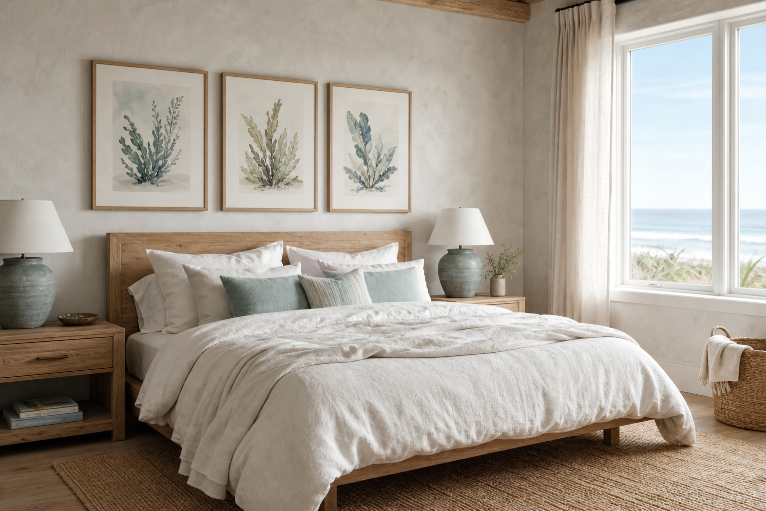
The coastal gardens i poster print works because it brings together two decorating cues that rarely date: botanical softness and seaside lightness. Instead of pushing a theme too hard, it lands in the middle ground many modern homes need — airy, natural, and easy to live with. That balance makes it especially suitable for spaces built around oak, off-white paint, pale stone, and woven textures.
What Makes Coastal Gardens I Feel So Fresh
Freshness in wall art usually comes down to palette and spacing. A coastal-botanical piece feels lighter when the color range stays narrow — think sandy beige, soft sage, sea-glass blue, muted ivory, and sun-faded green rather than saturated navy or bright tropical tones. If your room already has linen upholstery or white walls, this kind of print keeps the visual temperature calm instead of busy.
The coastal gardens i poster print also suits relaxed interiors because it reads as nature without becoming rustic. It can sit comfortably alongside our botanical collection or more open, airy pieces from nature wall art with softer scenery. In practical terms, that means you can place it in a modern apartment, a coastal-style house, or a Scandinavian-inspired room and not have to redecorate around it.
A useful styling rule is to repeat at least one color from the artwork in two other places in the room. If the print has soft green notes, echo them in a cushion and a vase. If it leans sandy and cream, repeat those tones in a rug and lampshade. Three repeated touches are enough to make a wall print feel integrated rather than added later.

Where to Hang a Coastal Gardens Print
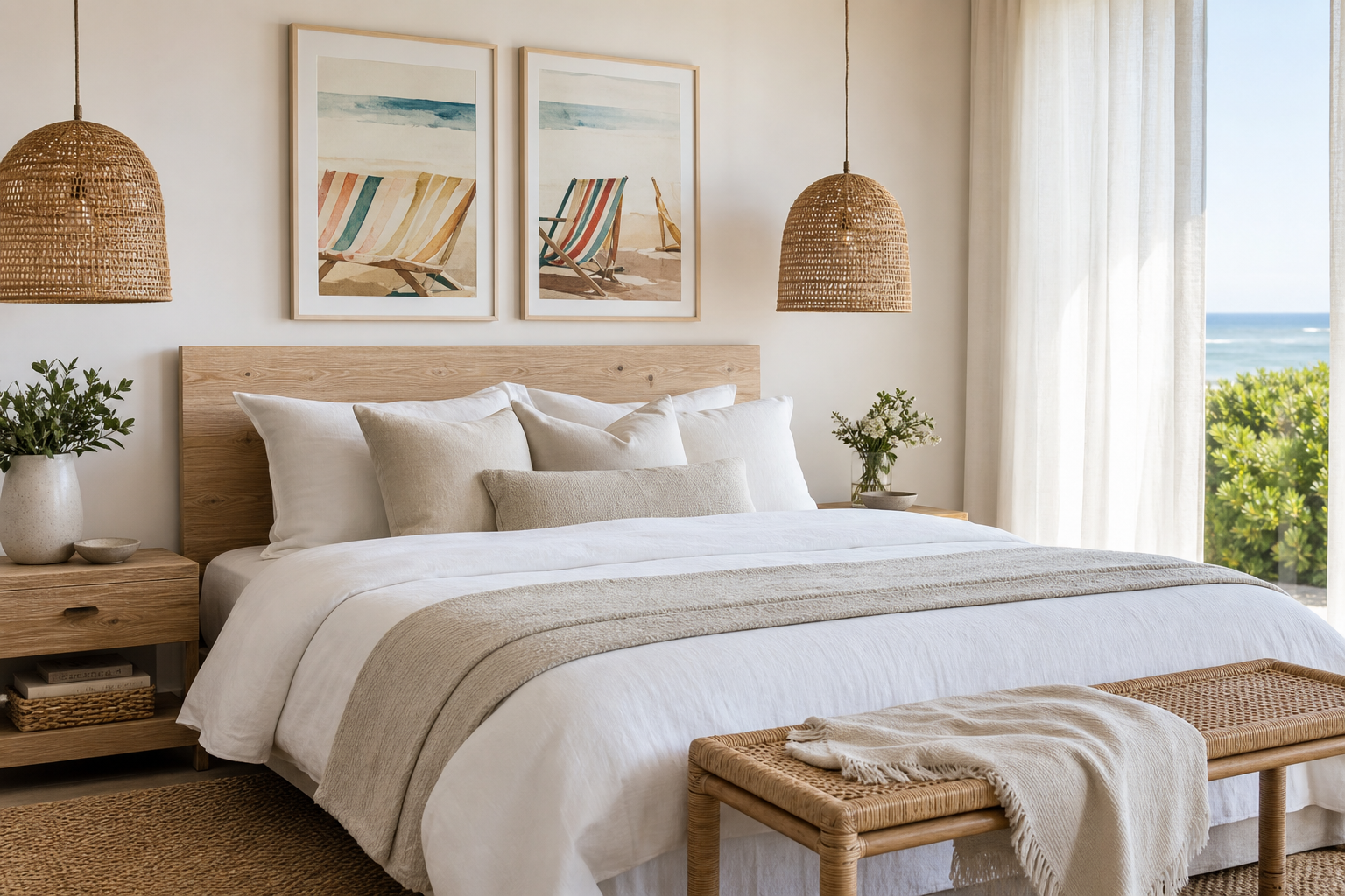
Bedrooms are usually the strongest match. Over a queen bed, choose a print around 50 x 70 cm or 61 x 91 cm if you want a single focal point with enough presence. Keep the artwork width at roughly 50 to 70 percent of the bed width so the wall feels anchored but not crowded. In a calm bedroom scheme, pair it with simple bedding and avoid more than two accent colors.
Living rooms come next, especially above a sofa or sideboard. If your sofa is 200 cm wide, aim for one large piece between 100 and 140 cm across, or a pair that together fills that same span. Coastal art looks best when hung with the center at around 145 cm from the floor, though you can drop slightly lower above furniture — usually leaving 15 to 20 cm between the frame and the top of the sofa or console.
Hallways and kitchens are often overlooked, but they suit this style well because the subject matter keeps narrow spaces from feeling heavy. In a hallway, a vertical format can add height where ceiling lines feel flat. In a bright kitchen, especially one with white cabinetry and wood shelving, a gentle coastal-botanical print softens hard finishes like tile, glass, and stone.
If you want a stronger seaside note nearby, a product such as Lighthouse Coastal Toile Print can work in adjacent rooms while keeping the home visually connected.

How to Style It with Natural Materials
Natural materials do most of the work in coastal interiors, so the art should support them, not compete with them. Oak, ash, rattan, seagrass, travertine, limewash, cotton, and linen all complement the gentle structure of botanical coastal imagery. The finish mix matters: if everything is smooth, the room can feel flat; if you layer at least three tactile surfaces, the wall art gains depth.
A reliable combination is matte wood, woven fiber, and washed fabric. For example, set the print above a light oak console, add a rattan table lamp, and place a linen runner or soft cotton throw nearby. Those materials echo the easy character found in Woven Bamboo Texture and similar pieces from our bohemian wall art collection without making the room look overtly themed.

Stone is another strong partner, particularly if you want the room to feel more refined than beachy. Travertine, limestone, and chalky ceramics sharpen the look and stop soft art from becoming too casual. If your furniture already has heavy wood grain or warm rattan, add one stone or glass surface nearby to create contrast.

Choosing the Right Frame and Size
Frame choice changes the tone more than most buyers expect. Light oak keeps the print casual and Scandinavian. White frames make it crisp and bright — useful in smaller rooms or spaces with limited natural light. Natural wood with visible grain adds warmth, while a thin black frame gives cleaner definition if the room needs contrast.
For size, use the 2/3 rule. The artwork should fill about two-thirds of the furniture width below it. Over a 150 cm sideboard, that means a frame or grouped arrangement around 90 to 110 cm wide. If you are styling a narrow wall between a window and a doorway, a 30 x 40 cm or 40 x 50 cm print can be enough. On broad blank walls, 70 x 100 cm has a stronger architectural effect and often looks more intentional than several small frames.
Matting is worth considering if the artwork has delicate detail. A white mount of 5 to 8 cm gives breathing room and makes a modest print feel more premium. This works especially well when the room includes softer fine-art references such as Window with Sheer Curtain or painterly nature pieces like Serene Landscape — Watercolor Print.
Avoid frames that are too ornate for this look. Coastal botanical styling usually benefits from simple profiles between 1 and 2 cm thick. Anything heavier can pull the print into a more traditional direction unless the room already has antique furniture.
Building a Gallery Wall Around Botanical Prints
A good gallery wall around a botanical coastal piece needs one thing above all: a controlled palette. Start with the hero print, then add three to five supporting pieces that share at least two colors or one mood. Keep the spread between frames at 5 to 8 cm for a neat arrangement, or 8 to 10 cm if you want a looser, more relaxed feel.
One smart approach is to mix subjects while keeping the color story tight. Pair botanical forms with coastline scenes, soft watercolors, or airy landscape work. That gives the wall more movement than using only plant studies. You can draw from our vintage coastal prints, illustration pieces with organic line work, and fine art prints with a softer brushy finish to keep the arrangement layered rather than repetitive.




If you prefer a calmer grid, use four pieces in matching frames at identical sizes — 40 x 50 cm is one of the easiest formats to hang. If you want something more collected, use one larger anchor print with three smaller companions. In either case, hang the center of the full grouping at eye level, not the center of the top row.
Shop Tips for a Relaxed Coastal Look
The easiest mistake with coastal styling is overcommitting to obvious motifs. Keep the room at about 70 percent neutral base, 20 percent natural texture, and 10 percent accent color. That ratio gives the wall art room to breathe and stops shells, stripes, driftwood tones, and sea imagery from stacking up too literally.
When shopping, choose one element to carry the "coastal" message and let the rest stay quiet. If the art already brings seaside character, the furniture can remain simple. A piece like Coastal Retreat — Vintage Print works well in a more nostalgic room, while Whale Tail in Ocean — Photography Print adds a cooler, cleaner note for more modern interiors.

Lighting matters as much as the art itself. Warm bulbs around 2700K flatter sandy and botanical tones better than colder LEDs. If the wall gets strong direct sun, use glazing that reduces glare and avoid hanging the piece where UV exposure is strongest for long periods each day.

Final thoughts
The appeal of the coastal gardens i poster print is its restraint. It gives you seaside calm, botanical softness, and enough texture to warm up a modern room without forcing a theme. That makes it useful in bedrooms, living rooms, hallways, and kitchens where you want lightness more than decoration for decoration's sake.
Style it with pale wood, linen, woven textures, and simple framing, and it will hold the room together with very little effort. If you build outward from a soft palette and balanced sizing, the result feels collected, bright, and easy to live with.
Frequently Asked Questions
What frame color works best if my walls are pure white?
Light oak is usually the safest choice because it adds warmth without looking stark. White also works well if you want the art to blend more quietly into the wall.
Can I hang this kind of print in a bathroom?
Yes, if the bathroom has good ventilation and the frame is kept away from direct moisture. Use glazing and avoid placing it above areas that stay damp.
What size should I choose for a narrow hallway?
For most hallways, 30 x 40 cm or 40 x 50 cm works cleanly without overwhelming the wall. Vertical formats are especially useful when you want to add height.
Does coastal botanical art pair well with darker wood furniture?
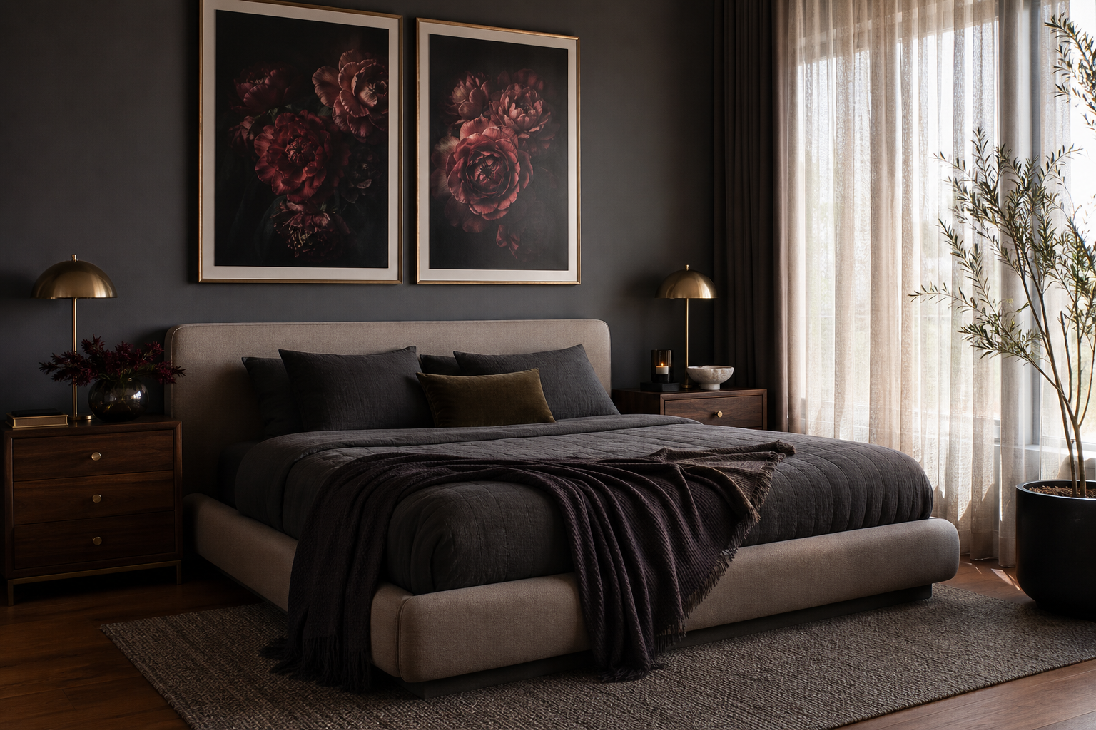
It does, but balance the depth with lighter textiles such as cream linen or a natural jute rug. That contrast keeps the room from feeling too heavy.
How far apart should I hang multiple frames in a gallery wall?
Keep 5 to 8 cm between frames for a tidy look. If the arrangement is more relaxed and mixed-size, up to 10 cm still feels cohesive.