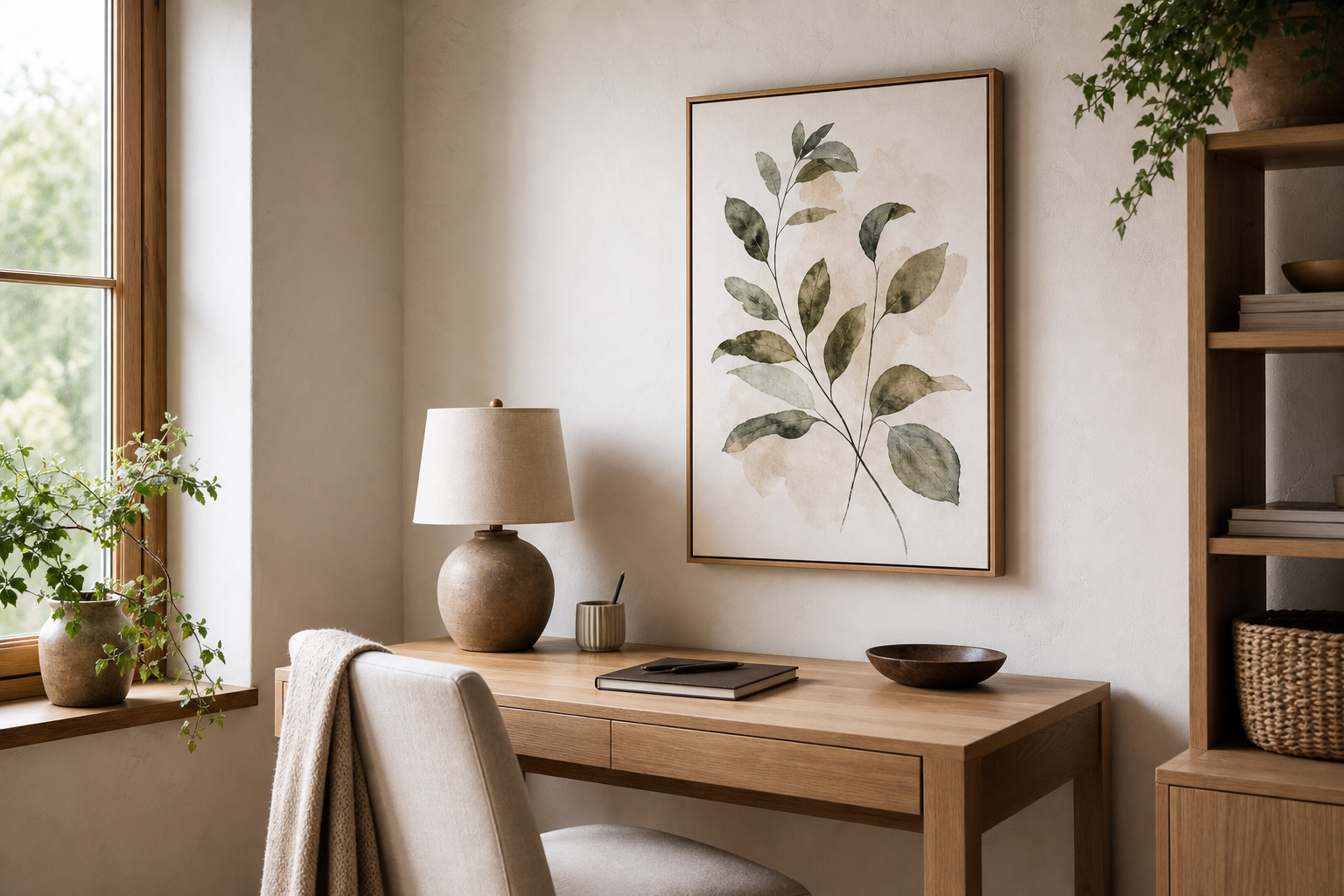
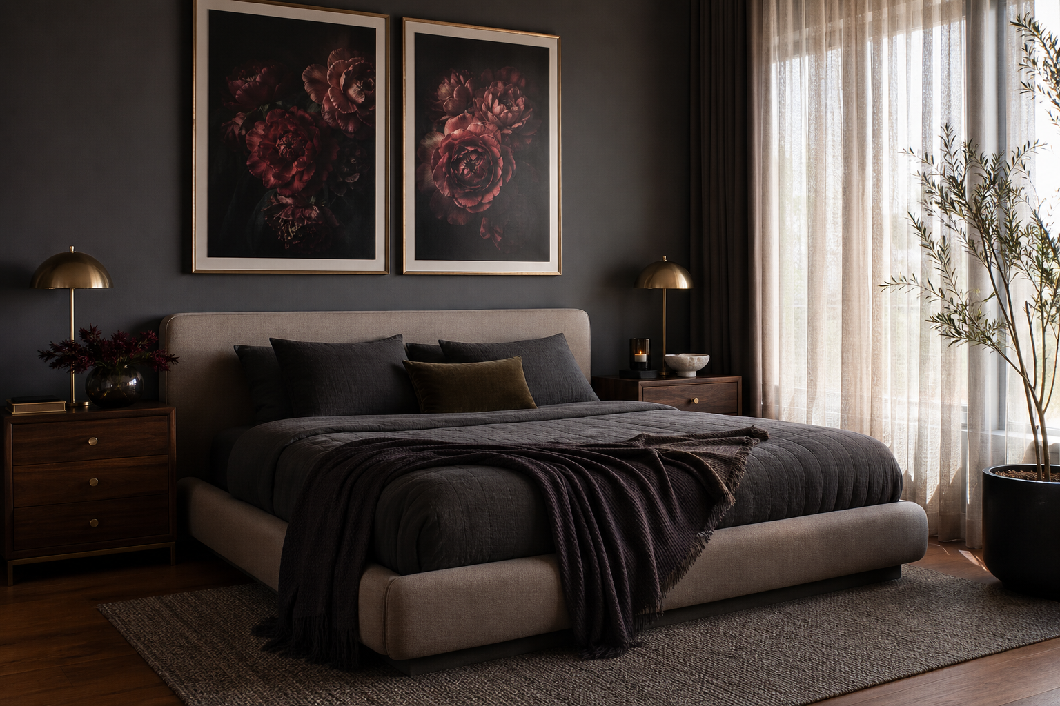
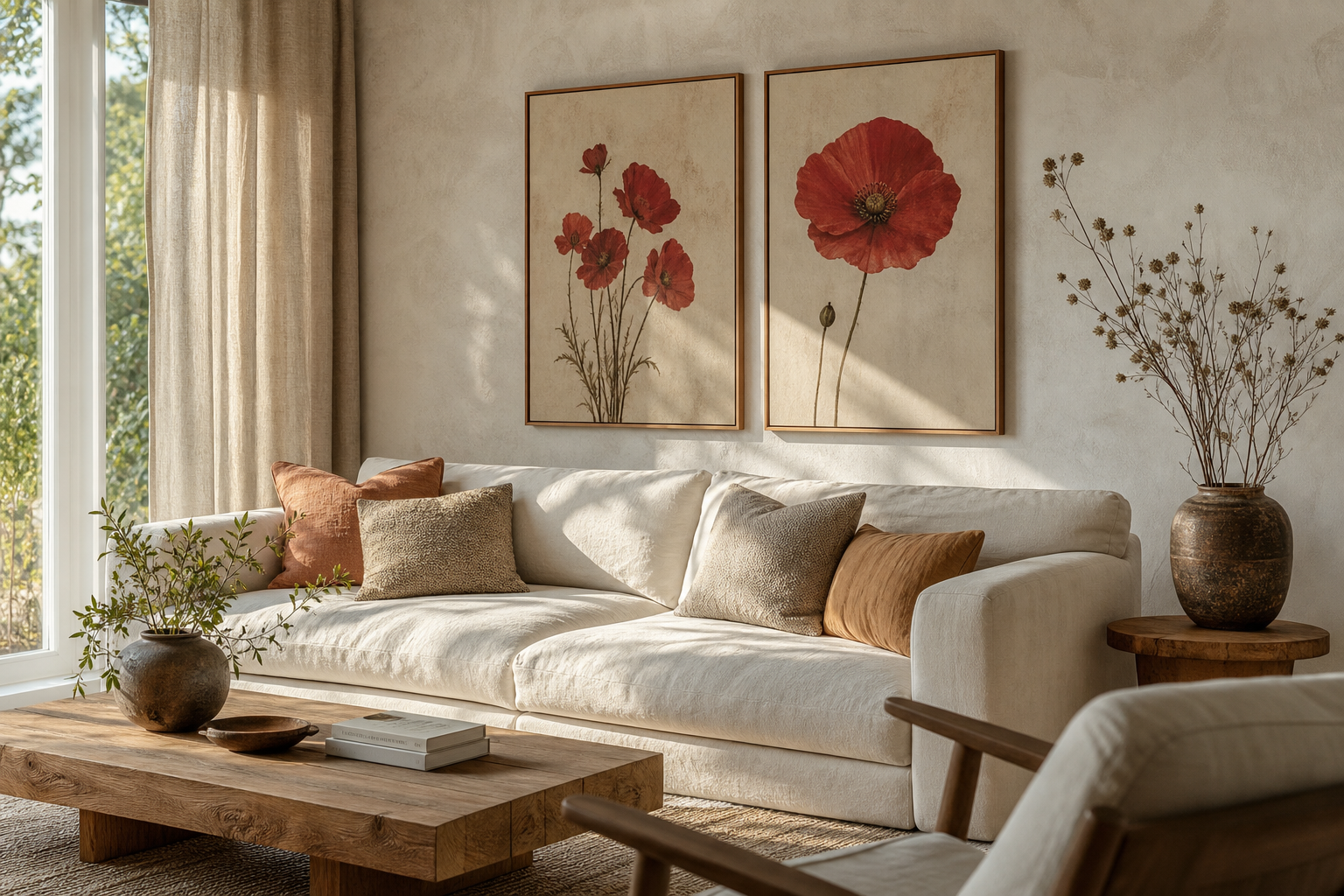
A citadel poster print brings height, structure, and atmosphere to a room in a way softer subjects rarely do. Strong towers, cliff edges, storm skies, and fortified silhouettes give a wall clear visual architecture — which is why this kind of piece works so well in rooms that need a focal point. If your space feels flat, a citadel poster print can add depth without introducing clutter.
Why a Citadel Poster Print Feels So Striking
Citadel imagery works because it combines scale with detail. From a distance, you see a bold outline — towers, battlements, steep walls. Up close, you notice stone texture, light shifts, and dramatic weather. That makes it ideal for medium-to-large wall art, especially in sizes like 50x70 cm or 70x100 cm, where both the silhouette and the finer details stay readable.
Historic and fantasy architecture also carries a built-in sense of permanence. In interiors, that reads as grounded and composed, particularly against plain painted walls. A room with soft upholstery, low furniture, and minimal accessories often benefits from one commanding architectural piece rather than three smaller decorative works. If you lean toward our illustration collection, citadel scenes bring more narrative weight than generic landscapes while still feeling refined.
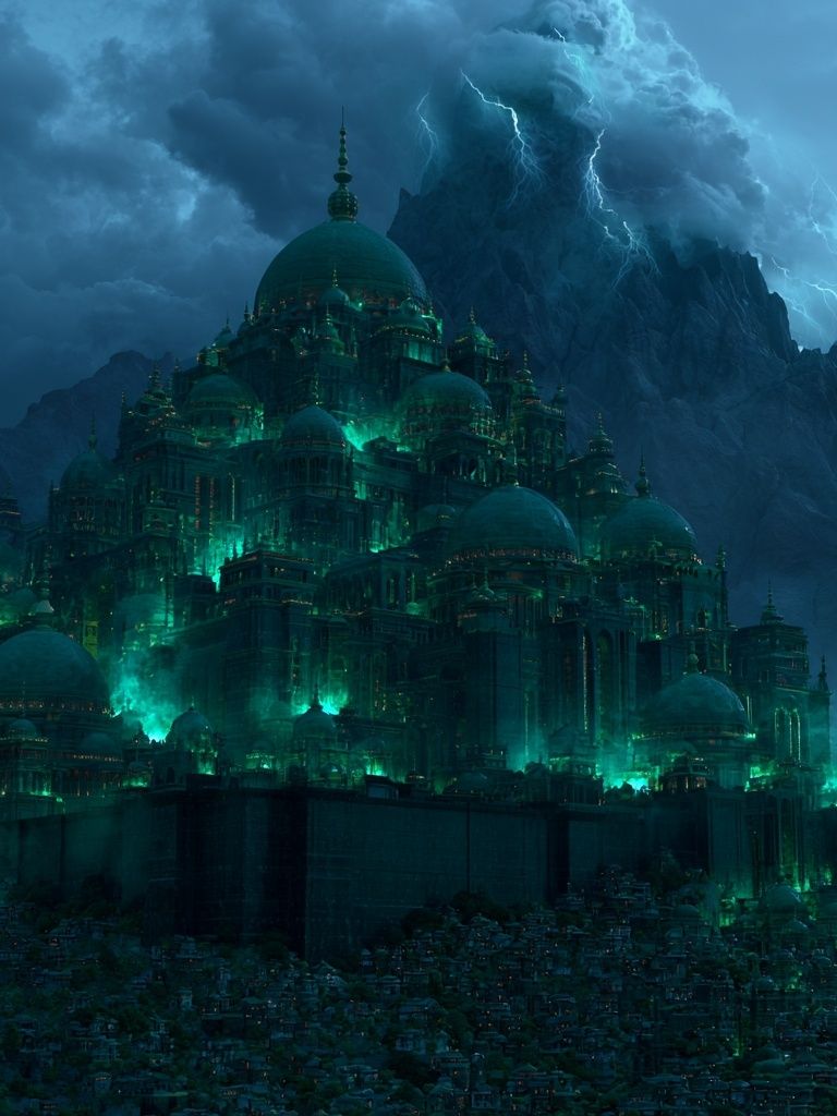
A darker citadel image can also do the job of contrast in a neutral room. If your palette is mostly ivory, taupe, stone, or warm grey, a moody fortress scene introduces shadow and vertical tension. That is similar to how minimalist wall art uses negative space — but here the effect is more atmospheric and layered.
Choosing the Right Palette Around It
The easiest palette starts with stone-based neutrals: chalk, limestone, sand, slate, and weathered taupe. These shades echo masonry and aged walls, so the art feels integrated rather than placed on top of the room. Keep the largest surfaces quiet — walls, rugs, sofas — then bring in depth with 10 to 20 percent darker accents through cushions, ceramics, or a painted sideboard.
Deep green is one of the strongest pairings for citadel imagery because it supports the sense of landscape and age. Olive, forest, and moss tones work particularly well with pieces that include cliffs, mountains, or storm light. Blue is the cooler route — choose inky navy, petrol, or slate blue rather than bright cobalt. Those deeper tones sharpen the drama without pulling attention away from the print itself.

Warm metallics are useful in small amounts. A brushed brass lamp, bronze candleholder, or antique gold frame detail can stop a grey-blue scheme from feeling cold. Aim for one or two metal finishes only. Once you introduce chrome, brass, black steel, and copper together, the room starts to lose the disciplined look that architectural art needs.
If you want a cleaner, more contemporary result, pair a citadel scene with restrained shapes from our abstract collection or quieter line-based work from Scandinavian-inspired minimalist prints. The contrast between detailed architecture and simple surrounding forms keeps the wall balanced.
Best Frames for an Architectural Look
Black frames are the most reliable option for a citadel print because they sharpen edges and give the image a precise boundary. A slim black frame — around 1 to 2 cm wide — suits modern and industrial interiors. A slightly deeper matte black frame works better when the artwork is dark and detailed, because it adds enough weight to hold the composition on the wall.
Oak frames soften the mood. If your room has linen upholstery, beige plaster walls, or light wood floors, natural oak stops a dramatic fortress image from feeling too severe. This is especially useful with softer fantasy scenes and painterly skies, such as Mountain Citadel Fantasy Print, where the warmth of the wood picks up natural tones in the image.
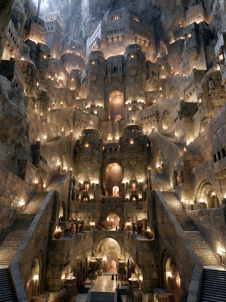
Slim metal frames suit the most futuristic versions of this theme. If the art leans more angular, luminous, or sci-fi, a narrow dark metal frame looks crisp and deliberate. Pieces like Futuristic Citadel — Sci-Fi Print or Gothic Sci-Fi Citadel Poster tend to benefit from that cleaner outline.
Use a mount when the artwork is visually dense. A white or off-white border of 5 to 8 cm gives the image breathing room and makes a 50x70 cm piece feel more elevated. Float framing works best when the print has painterly edges or when you want a gallery-style presentation, but for most citadel interiors, a simple frame plus mount is the more versatile choice.

Where It Works Best in the Home
Living rooms are the strongest placement because they usually offer the widest uninterrupted wall. Above a sofa, aim for artwork that spans roughly 60 to 75 percent of the furniture width. For a 200 cm sofa, that means a total art width of about 120 to 150 cm. One 70x100 cm print can work on its own, or two smaller coordinated pieces can create the same presence.
Hallways and entryways suit vertical citadel compositions particularly well. The architecture in the image mirrors the narrow proportions of the space. Keep the center of the frame at about 145 cm from the floor in standard homes, and make sure there is at least 15 to 20 cm of breathing room above a console table or bench.
Studies and home offices benefit from the focus and structure this subject brings. A citadel print behind a desk creates a strong backdrop for video calls without reading as generic office decor. If your workspace already includes dark timber, iron, leather, or shelving, the look comes together quickly. For a more narrative style, our gaming art prints can also complement architectural fantasy scenes without breaking the mood.
Bedrooms need a slightly calmer approach. Choose one atmospheric piece above the bed rather than a crowded arrangement, and favour softer tones — misty blues, weathered stone, dusk greens. A dramatic print still works here, but the frame should stay slim and the surrounding bedding should be simpler.

How to Build a Gallery Wall Around It
A citadel piece should usually be the anchor, not one item among equals. Start with the largest work in the centre or slightly off-centre, then build around it with smaller pieces in related tones. Good companions include maps, abstract landscapes, restrained monochrome works, and heritage-inspired illustrations. Keep at least one common thread across every piece — colour, frame finish, or subject matter.
A reliable formula is one large print, two medium prints, and two small prints. Leave 6 to 8 cm between frames for a tight arrangement, or 8 to 12 cm if the wall is large and the furniture below is substantial. If your anchor piece is dark and dramatic, balance it with at least one lighter print so the grouping does not become visually top-heavy.
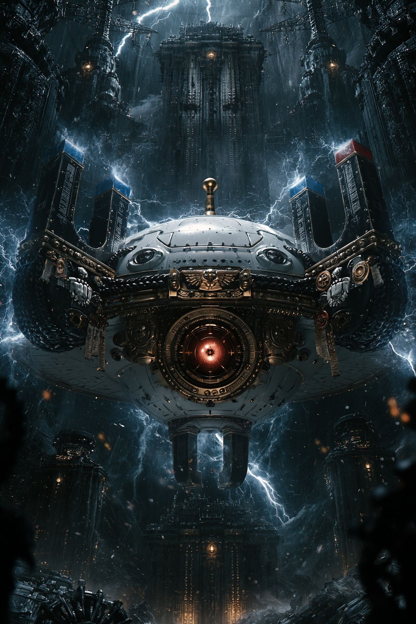
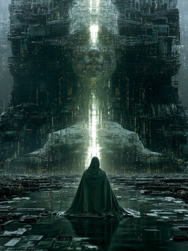
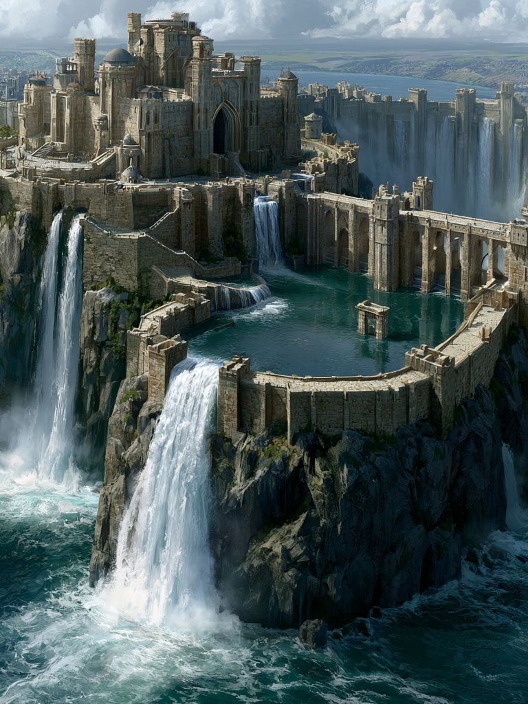

For a more cinematic arrangement, combine a fortress image with one or two landscape-driven works and one simplified graphic piece from abstract wall art. If you prefer a pure fantasy direction, pairing Stormbound Citadel Sci-Fi Poster with another architectural scene and one character-led print can work — but keep character art smaller so the citadel remains the visual leader.
Shop the Look: Simple Styling Tips
Start with size, because scale decides whether the art looks intentional. For walls under 150 cm wide, a 30x40 cm or 50x70 cm print is usually enough. For walls above a sofa, bed, or long console, 70x100 cm has more authority. If you are hanging a pair, leave 6 to 10 cm between them and treat the outer edges as one overall composition.
Lighting matters more than most people expect. A citadel scene gains depth under warm directional light — around 2700K to 3000K — especially if the print includes storm clouds, stone, or metallic highlights. Place a floor lamp or picture light so it grazes the frame rather than hitting the glazing head-on, which reduces reflections.
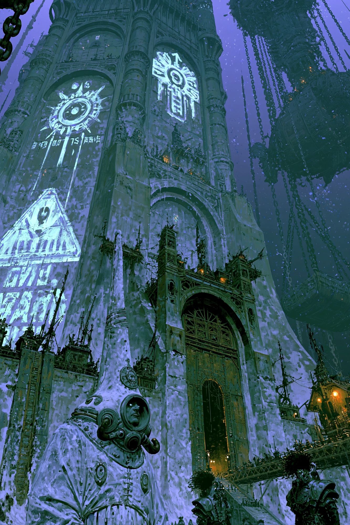
Finish the area with two or three supporting materials, not ten accessories. Stoneware, dark wood, aged brass, wool, and linen all reinforce the architectural mood. If the room already contains a lot of pattern, let the wall art be the only detailed focal point. If the room is sparse, add one textured rug or heavy curtain so the citadel print does not feel visually isolated.
Final thoughts
A citadel poster print works best when the room around it respects its structure. Keep the palette disciplined, choose a frame with clear intent, and give the piece enough wall space to breathe. That is what turns dramatic architectural art into a polished interior feature rather than a themed accent.
If you want the look to feel collected, anchor the room with one strong citadel scene and build slowly from there. A considered mix of scale, texture, and tone will always outlast a crowded wall.
Frequently Asked Questions
What frame glazing works best for a citadel print?
Anti-reflective acrylic or glass is the practical choice if the print hangs opposite a window. It preserves darker details better than standard shiny glazing.
Can I style a citadel print in a small apartment?
Yes — use one vertical 30x40 cm or 50x70 cm piece in an entryway, desk nook, or narrow wall. Keep surrounding decor minimal so the image does not compete for space.
Should the frame match my furniture or my hardware?
Match the dominant visual element in the room. If you have oak floors and wood furniture, oak frames feel cohesive; if black lighting and iron accents dominate, a black frame usually looks sharper.
What wall colour makes a citadel print stand out most?
Soft stone, pale greige, muted olive, and deep charcoal all work well. The best choice depends on contrast — darker prints need lighter walls, while misty or pale citadel scenes can handle richer paint colours.