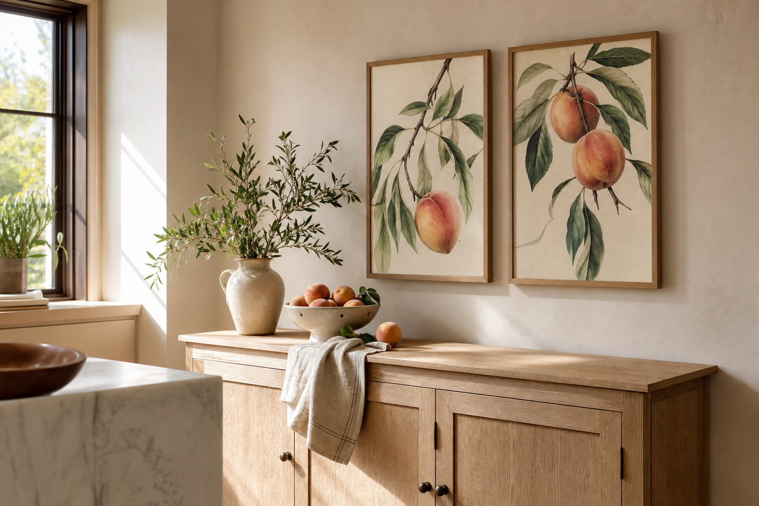
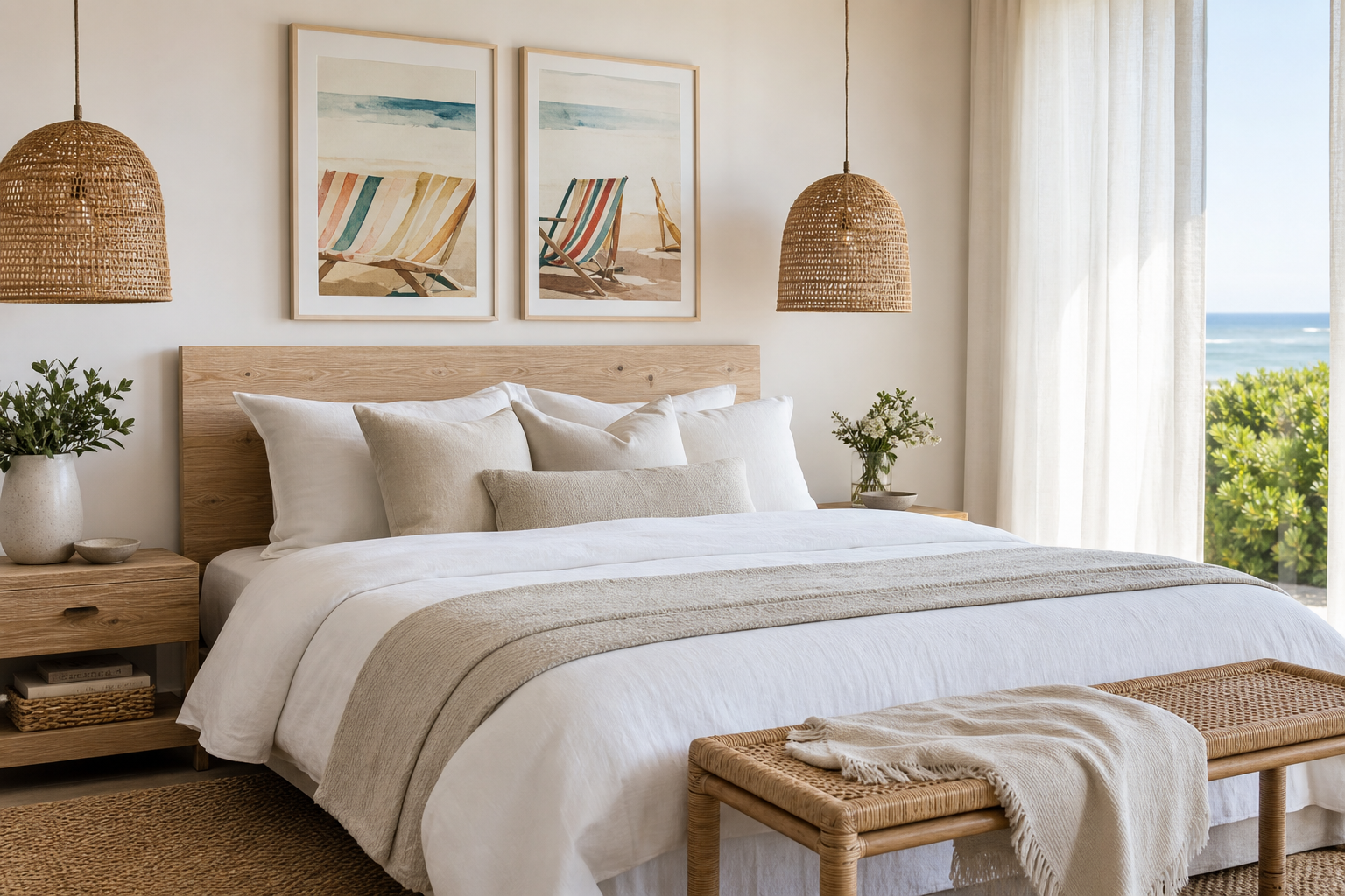
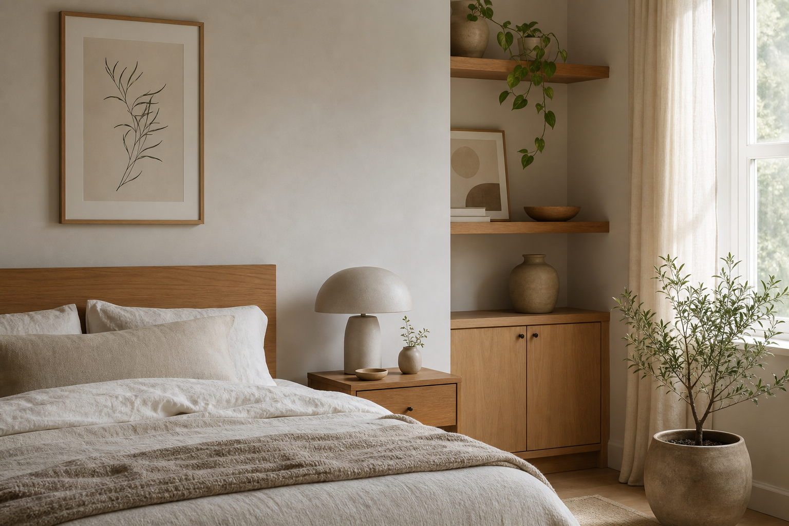
The appeal of a botanical rose i poster print comes down to balance. It brings floral detail without feeling sugary, vintage character without looking dated, and colour without taking over the room. That combination makes it one of the easiest floral pieces to style for years rather than a single season.
A well-chosen rose print also has more structure than many soft florals. Petal layers, stems, and natural shading create a clear focal point, which is why pieces in our botanical collection often work so well in bedrooms, hallways, and reading corners that need visual interest without visual noise.
What Makes Botanical Rose I Feel So Classic
The botanical rose i poster print feels classic because it borrows from botanical illustration rather than trend-led floral decor. Botanical studies were designed to show a plant with accuracy and grace, so the composition tends to feel measured, clean, and refined. You get detail in the bloom and leaves, but the overall effect stays calm.
That sense of restraint is what separates a timeless floral from a busy one. A rose rendered with soft background space, natural stem movement, and muted colour reads more like collected art than decorative filler. It sits comfortably alongside vintage-inspired wall art and also blends naturally with quieter pieces from our minimalist art prints range.
If you want a close companion in the same mood, a piece like the rose-led botanical work below carries that same gentle, archival feel.
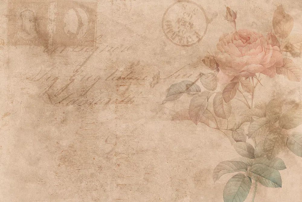
Prints with a heritage feel also tend to age better visually. Cream, dusty pink, sage, and faded green remain easy to live with because they sit within a low-contrast palette. That is why botanical florals often outlast bolder trend colours by several years in real interiors.
Where It Works Best in the Home
A rose botanical works best in spaces where you want softness and composure. In a bedroom, hang it 15 to 25 cm above the headboard or top edge of a dresser so it feels connected to the furniture below. This placement keeps the wall art grounded and prevents it from floating too high on the wall.
Living rooms benefit from the same softness, especially when the furniture is angular. A floral print above a sofa can offset straight lines in modern furniture and add warmth to neutral upholstery. In narrower areas such as hallways, a single vertical botanical piece can break up long blank walls without making the space feel crowded.
Reading corners are another natural fit. A framed rose print near an armchair, shelf, or window adds interest at eye level and makes the area feel deliberate. If you already use landscape works from our nature wall art collection or painterly pieces from fine art prints, a rose study acts as a softer counterpoint.
Choosing the Right Size and Placement
Size changes the mood. A 30x40 cm print feels intimate and works well on narrow walls, above a small sideboard, or layered on a picture ledge. A 50x70 cm version has enough presence to stand alone above a console or chest of drawers. For larger walls above a queen bed or a 200 cm sofa, 70x100 cm gives the artwork enough weight to hold its own.
As a rule, wall art should cover around 60 to 75% of the furniture width beneath it. If your bench is 120 cm wide, aim for a framed piece or grouped arrangement between 72 and 90 cm wide. That proportion keeps the display balanced rather than undersized.
A botanical rose can work as a solo statement, but it also pairs well with adjacent florals or understated line work. If you prefer a paired arrangement, leave 5 to 8 cm between smaller frames and 7 to 10 cm between larger ones. This keeps the composition cohesive instead of scattered.
Framing Ideas That Enhance the Artwork
The best frame for a rose botanical is usually the one that supports the delicacy of the image instead of competing with it. Light oak, ash, and matte gold are the most reliable choices. Oak keeps the look relaxed and Scandinavian; matte gold adds formality and suits more traditional rooms.
White mats are especially useful with vintage-style botanical art. A mat of 4 to 7 cm gives the bloom room to breathe and sharpens the presentation. This works particularly well if the artwork includes fine stem details or softer pigment transitions that can get visually lost in a frame without spacing.

Black frames can work, but only if the room already has stronger contrast — black lamps, iron curtain rods, or darker side tables. In very soft interiors, black can feel heavier than the artwork itself. If your room leans light and airy, staying with oak, natural wood, champagne metal, or off-white framing usually gives a better result.
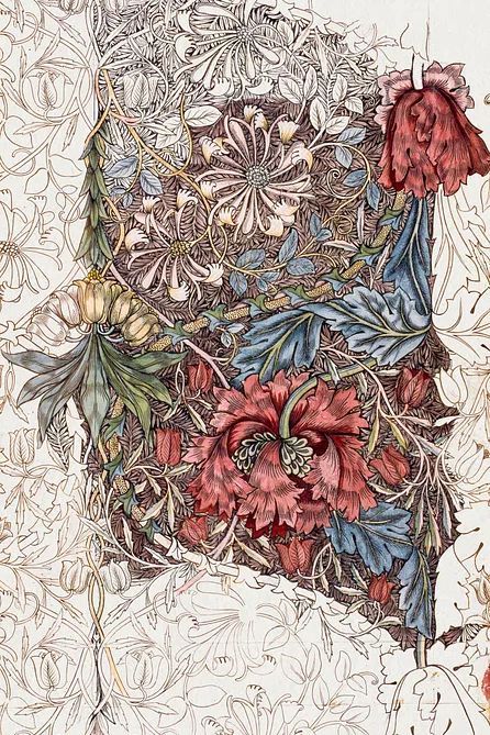
For a more decorative botanical pairing, textile-inspired florals can be useful nearby, especially if the room includes patterned upholstery or layered fabrics.
Colour Pairings and Styling Notes
Rose botanicals look strongest against restrained palettes. Warm white, bone, flax, soft taupe, and pale greige all allow the floral tones to read clearly. If you want more depth, add sage, dusty olive, muted terracotta, or faded plum in small amounts through cushions, ceramics, or a throw.
Material choice matters as much as colour. Linen curtains, brushed cotton bedding, oak or walnut furniture, and matte ceramics all support the organic quality of botanical imagery. High-gloss finishes and very bright synthetic colours tend to work against the softness that makes a floral study feel refined.
A good styling ratio is roughly 80% neutral base and 20% accent colour. In practical terms, that could mean white walls, beige upholstery, natural wood, then a few rose or sage notes repeated two or three times across the room. Repetition is what makes the art feel integrated rather than added on at the end.
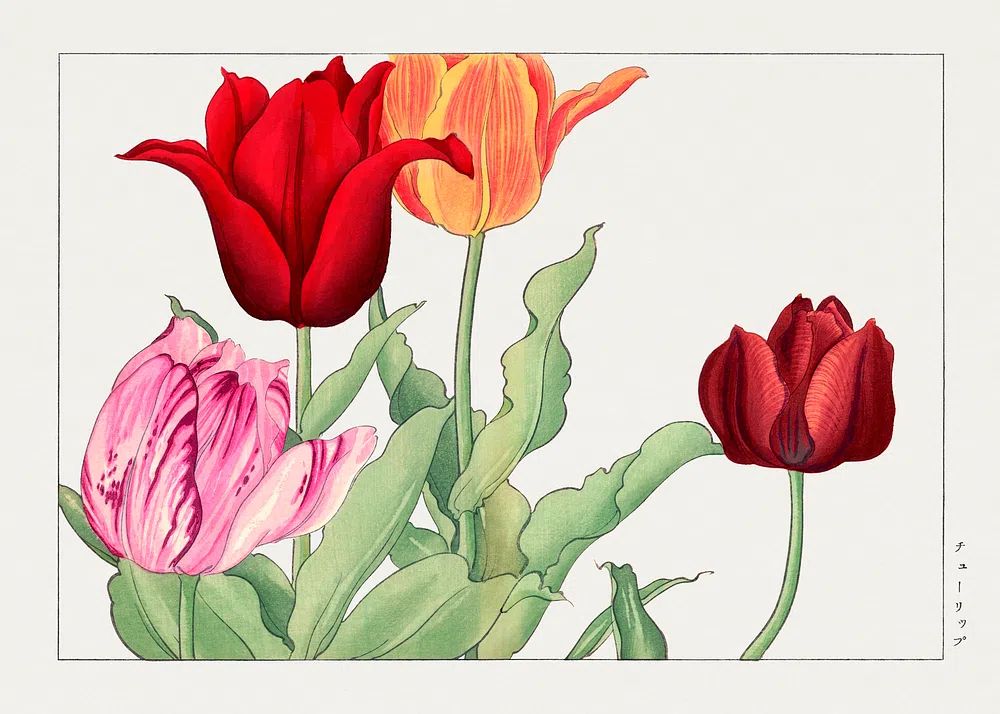
If you want to build a fuller floral story, these four pieces sit comfortably in the same world without becoming overly sweet.


You can also draw on quieter illustration-led works from our illustration print collection when you want a gallery wall to feel lighter and less obviously floral.
How to Build a Calm Gallery Wall Around It
The easiest way to build around a botanical rose is to keep one visual rule consistent. That might be the frame finish, the mat size, the palette, or the subject family. Consistency in one area gives you enough freedom in the others.
Start with the rose piece as the anchor, then add two to four supporting works. Good companions include another botanical with different structure, a minimalist floral silhouette, a quiet bird illustration, or a muted landscape. Keep at least one-third of the arrangement light in tone so the wall does not become visually dense.
For a tight grid, use matching sizes such as four 30x40 cm frames. For a more relaxed salon arrangement, combine one 50x70 cm anchor with smaller 30x40 cm and 21x30 cm pieces. Keep the total gap spacing consistent — usually 6 cm is enough for small to medium frames.
One particularly clean pairing is a rose botanical with a simplified floral form. It preserves the botanical mood while introducing contrast.

If you want a slightly richer, heritage-led grouping, look at decorative florals in our William Morris's vintage pomegranate flowers or keep the palette airy with Tulip Bouquet botanical wall art. For a more focused floral statement, Vintage Rose Botanical is the clearest direct companion.
A Simple Way to Add Elegance Without Overdoing It
A rose botanical works because it is expressive in detail but restrained in mood. That makes it one of the safest ways to add elegance to a plain wall, especially if your room already relies on neutrals, natural fibres, and soft light. It gives the eye something beautiful to land on without forcing the whole room into a floral theme.
If you are choosing just one floral piece, the botanical rose i poster print is a strong place to start. It can stand alone in a 50x70 cm frame, or become the anchor for a calmer gallery wall built from botanical prints and a few understated companions. The key is simple — keep the palette soft, the framing refined, and the spacing intentional.
Frequently Asked Questions
What frame width works best for a botanical rose print?
A slim to medium profile — around 1.5 to 2.5 cm — usually suits it best. Thicker frames can overpower delicate botanical detail unless the print is quite large.
Should I use glass or acrylic for framing?
Acrylic is lighter and safer for larger sizes like 70x100 cm, especially in bedrooms or hallways. Glass offers a slightly sharper finish for smaller framed pieces.
Can floral wall art work in a modern home?
Yes, if the palette is muted and the frame is clean. Pair it with simple furniture, plain textiles, and limited accent colours to keep the look current.
What other subjects pair well with a rose botanical without looking too themed?
Try soft landscapes, bird illustrations, or minimalist line-based florals. They echo the natural mood without repeating the same shape too closely.
How high should I hang it in a hallway?
Place the centre of the frame around 145 to 150 cm from the floor in most homes. In a narrow hallway, keeping the artwork slightly lower often feels more welcoming and proportionate.