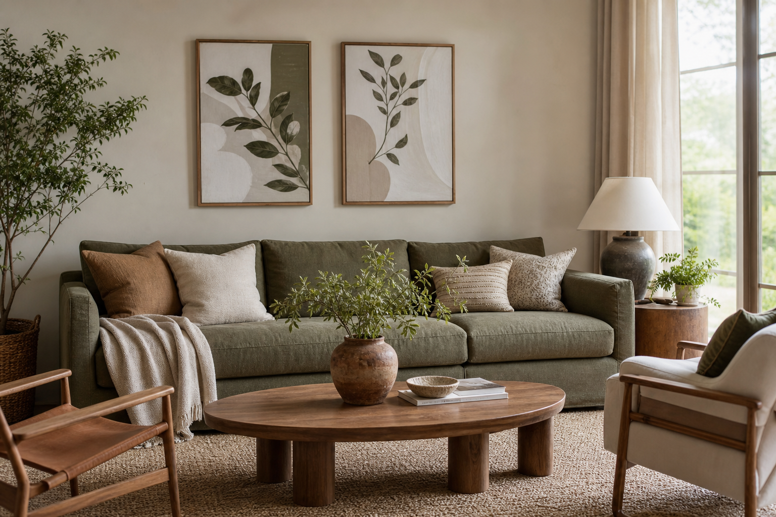
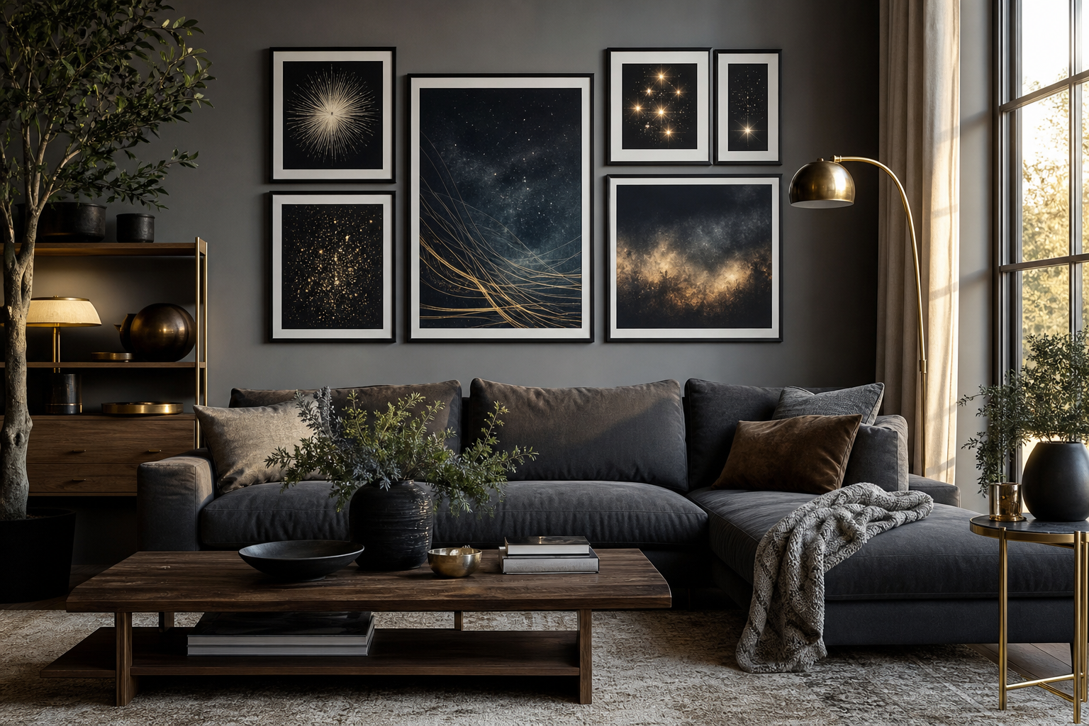
A botanical peaches poster print has two strengths that many floral prints do not: it brings recognizable fruit imagery and a naturally softened color range. Peach tones sit between blush, apricot, coral, and muted orange, which makes them easier to place than stronger reds or citrus yellows. That balance is why a botanical peaches poster print works in both relaxed country interiors and cleaner modern rooms.
Why Botanical Peach Art Feels So Fresh
Botanical fruit studies have a long decorative history, especially in 18th- and 19th-century illustration, where fruit was painted with scientific detail but styled for domestic display. Peaches feel current because they carry that vintage structure while still reading light and seasonal. Unlike heavier still life subjects, they do not dominate a wall with deep shadow or dark contrast.
If you want that archival, illustrated look, start with pieces from our botanical collection and mix them with one or two warmer fruit-led works from the Food Drink wall art range. The result feels collected rather than themed, especially when the peach image is the softest piece in the arrangement.
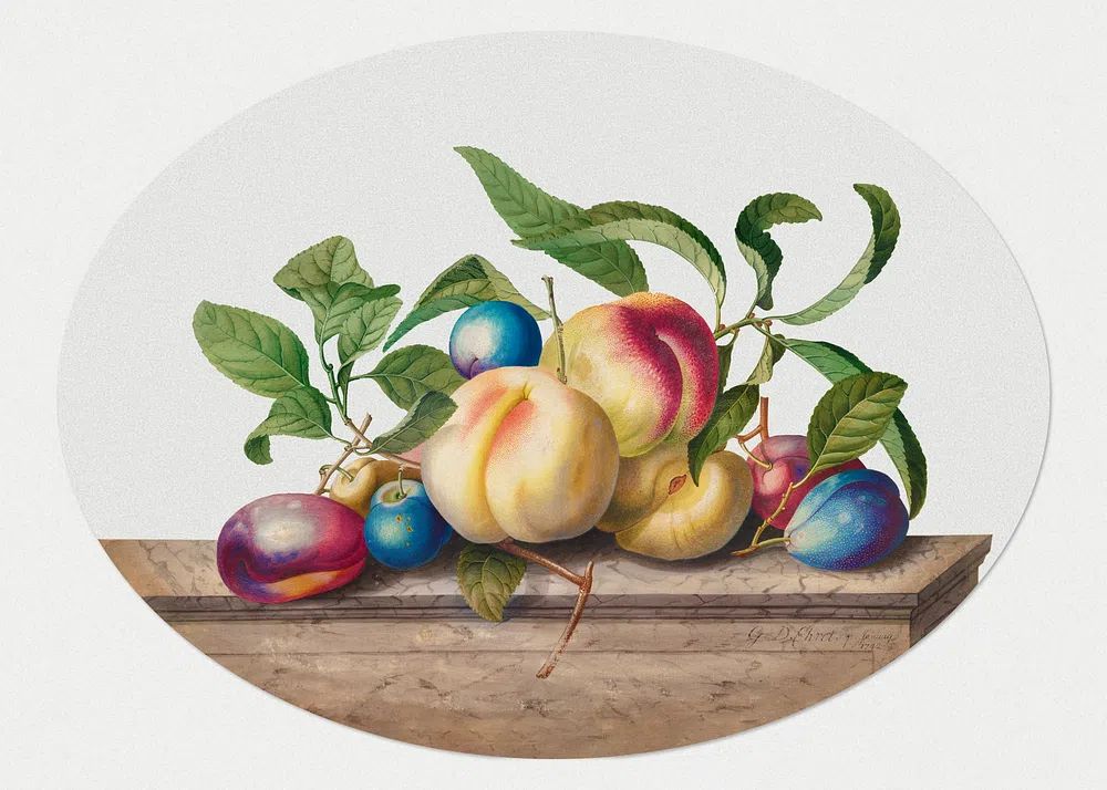
A good example is the historic detail and gentle color in this fruit study. It suits interiors that need warmth without introducing loud saturation.
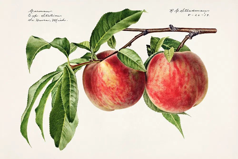
Botanical peach imagery also works because it bridges categories. It can sit beside vintage-inspired prints for a traditional kitchen, or beside illustrative wall art for a more playful, graphic room. That flexibility is useful when you are styling a home that already includes wood furniture, ceramics, woven textures, or brass accents.
Choosing the Right Palette and Mood
Peach art changes character depending on the colors around it. Pair it with ivory, oat, and sandy beige, and it reads soft and understated. Add olive green, terracotta, and walnut brown, and it becomes richer and more rustic. Bring in charcoal, black frames, and off-white walls, and the same print can feel sharper and more editorial.
For a calm scheme, keep the room within a 60-30-10 color ratio: 60% neutral base, 30% warm supporting tones, 10% accent color. In practice, that could mean warm white walls, oak furniture, then peach and olive in the artwork and accessories. This is where a botanical peaches print often performs better than a bright citrus image — it adds color without breaking the room's calm.

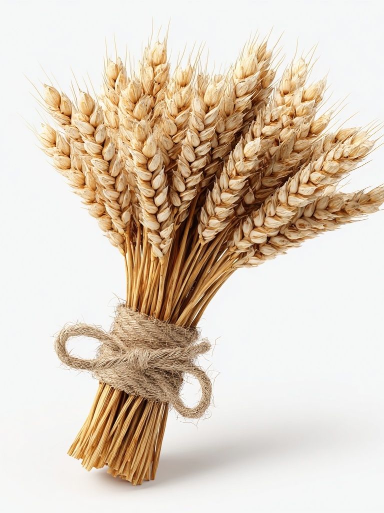
If you want the mood to feel more elegant than cheerful, pair peach tones with faded greens and dusty rose rather than bright white and yellow. Prints such as Vintage Rose Botanical Poster and Wheat Bouquet — Botanical Print help shift the palette toward a more grown-up, layered finish.
Where a Peach Poster Works Best
Kitchens and dining areas are the most natural home for peach artwork because fruit imagery feels connected to the room's purpose. A 30x40 cm print works well above a breakfast shelf, while a 50x70 cm piece suits a narrow dining wall or the space above a sideboard. Leave 15 to 25 cm between the top of furniture and the bottom of the frame so the composition feels connected rather than floating.
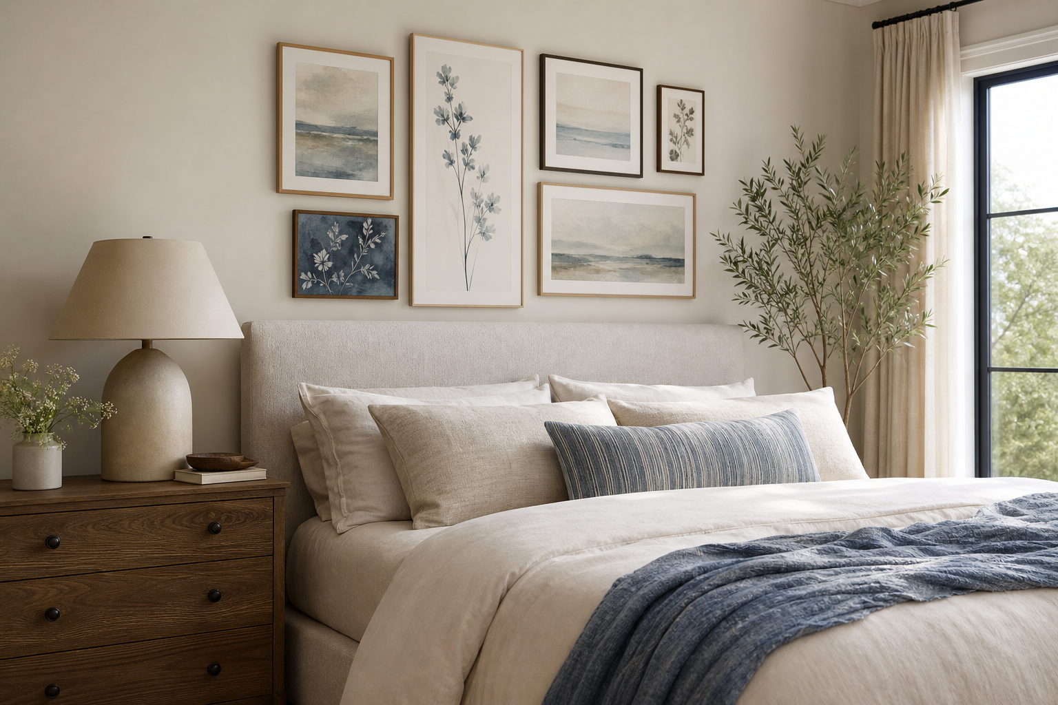
Bedrooms are a strong second option. There, a botanical peaches poster print reads less culinary and more romantic, especially with linen bedding, soft plaster tones, and light wood. In a bedroom, peach art works best when it is not the only warm element — repeat the color in a throw, lampshade, or ceramic vase to make the palette intentional.

Gallery walls are another smart placement. Use the peach print as the warm anchor, then build around it with botanical, floral, and still life pieces. This works especially well if you combine one fruit study with line-rich patterns and softer landscape shapes.

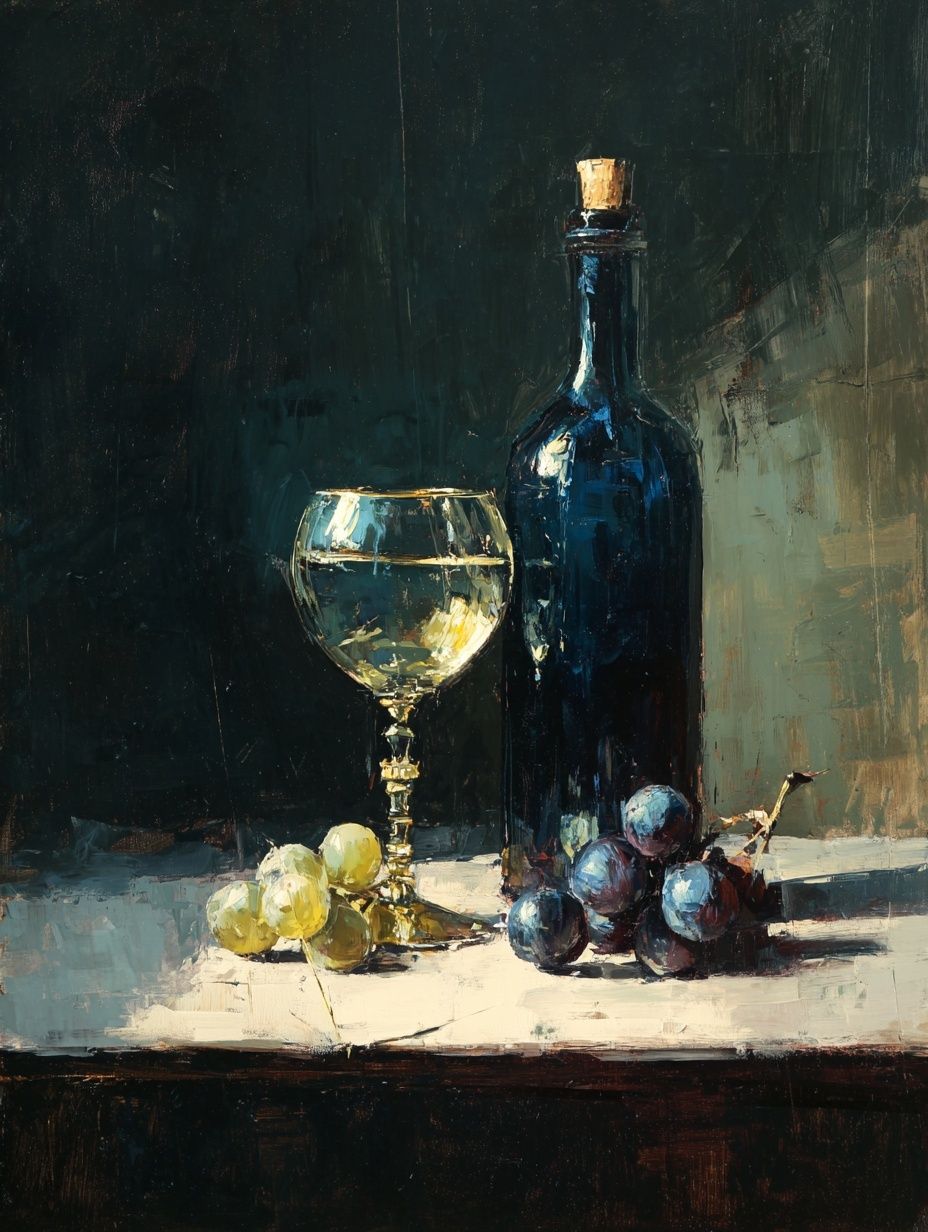

For a dining corner or shelf wall, this still life can deepen the peach palette and add a painterly counterpoint to more delicate botanical illustration.
How to Frame and Size It Well
Frame choice changes the whole effect. Light oak frames make peach prints feel airy and Scandinavian, black frames sharpen the illustration and suit modern kitchens, while antique gold adds formality and suits traditional dining rooms. If the artwork includes fine line detail, use a mat mount of 3 to 5 cm to give it breathing room.
Size should match wall width, not just your taste. As a rule, wall art should cover roughly 50% to 75% of the furniture width beneath it. Over a 120 cm sideboard, a single 50x70 cm frame works well, or two 30x40 cm pieces hung side by side with 6 to 8 cm spacing. For a small nook, an A4 or 21x30 cm print can be enough if the surrounding decor is restrained.
Paper finish matters more than many buyers expect. A matte finish reduces glare near windows and lets the peach tones stay soft rather than glossy. This is particularly useful in kitchens or breakfast corners where light shifts throughout the day. If you like heritage-style detailing, look at layered companions such as William Morris's Vintage grapes vines or William Morris's vintage pomegranate flowers to echo the organic line work.
Styling With Other Prints and Decor
Peach art pairs best with prints that share either botanical detail or a similar warmth. Good partners include roses, wheat, tulips, vines, and fruit still life. The connection does not need to be literal — one peach study can sit beside floral pattern work if the colors and line density feel related.

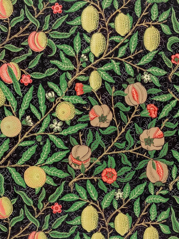
This is where decorative botanical pattern can help fill out the composition and add visual rhythm.
When styling the shelf or console beneath the art, repeat three materials at most. For example: oak, ceramic, and linen. Add one curved object — a bowl or vase — to echo the roundness of the fruit. If the print has cream background tones, choose off-white ceramics rather than bright white, which can make vintage artwork look too stark.
You can also pull supporting pieces from our fine art selection if you want a more collected look. A soft figurative piece or muted still life stops the wall from becoming too botanical. The key is contrast in subject, not conflict in color.
Seasonal Styling Ideas for Year-Round Appeal
In summer, let the peach print lean fresh and light. Pair it with striped linens, pale woods, glass vases, and greenery. Keep the surrounding palette in cream, sage, and light terracotta. This gives the room a market-fresh feel without becoming overtly seasonal.
In autumn, deepen the scene with rust textiles, walnut wood, amber glass, and darker ceramics. The same peach image will look fuller and richer when placed against mushroom, camel, or olive surroundings. You do not need to swap the artwork — only the nearby objects.

For year-round use, avoid accessories that are too theme-specific. Instead of obvious summer motifs, work with timeless materials: woven trays, linen runners, hand-thrown ceramics, and natural wood. That keeps the fruit image decorative rather than novelty-driven.
Shop Tips for a Peach Poster That Lasts
Look first at clarity. A strong peach print should show clean edges in the leaves, tonal variation in the fruit, and enough background space that it does not feel crowded from a distance of 1.5 to 2 meters. If the image looks muddy online, it will feel flatter on the wall.
Second, check whether the artwork suits your room's light. North-facing rooms flatten warm tones, so choose a peach image with stronger coral or apricot notes. South-facing rooms intensify warmth, so a more muted botanical study often looks more balanced.
Finally, buy with companions in mind. If you know the piece will become part of a pair or gallery wall, select other works from Vintage botanical art print. School or Tulip Bouquet — Botanical Print so the line quality and vintage feel stay consistent. A botanical peaches poster print lasts longest stylistically when it is treated as part of a wider material and color story, not as a one-off accent.
Final thoughts
A botanical peaches poster print works because it is warm, detailed, and easy to place across different rooms. It can soften a modern kitchen, add romance to a bedroom, or anchor a gallery wall with just enough color.
The best styling choices are simple: keep the palette warm but controlled, choose a frame that matches the room's character, and repeat the print's peach and leaf tones in a few nearby objects. That is enough to make the artwork feel integrated rather than added at the end.
Frequently Asked Questions
What frame color works best with peach botanical art?
Oak is the safest option for a soft natural look, while black adds contrast and antique gold gives a more formal vintage finish. Match the frame to the room's hardware and wood tones for the cleanest result.
Can I use a botanical peach print in a small kitchen?
Yes — choose a smaller size such as 21x30 cm or 30x40 cm and place it above a shelf, breakfast nook, or narrow sideboard. Matte paper is especially useful in compact kitchens with strong daylight or overhead glare.
What other subjects pair well with peaches on a gallery wall?
Roses, grapes, wheat, tulips, and classic still life all work well. Mix one or two fruit-led pieces with botanicals so the wall feels layered rather than repetitive.
Should I hang it alone or with other prints?
If the wall is under 80 cm wide, a single print often looks cleaner. On larger walls, pair it with 1 to 3 supporting prints and keep spacing between frames around 6 to 8 cm.